Stop settling for built-in title cards and add in some real (after) effects!
Hey there, video editors. Have you ever seen a great short film with lackluster titles? Do you constantly get requests for “video editing” projects that turn out to require a bunch of compositing and motion graphics work? It seems like you need to branch out from your normal software into...After Effects. But isn't that just for motion designers?

You know editing—specifically Adobe Premiere—but you WANT to learn After Effects. In fact, you NEED to learn After Effects. Those advanced techniques can take your work to a whole new level, and open up tons of creative possibilities that you never even thought were possible! As a video editor, it's time to dabble in motion graphics.
Well, I’m here today to help you take that first step with a little series called After Effects Tips for Video Editors. We’re going to take a nice-looking edit with some so-so titles and we’re going to level it up. In this first video, we’ll be talking about:
- What video editors should look for in their projects
- Motion design solutions in Premiere Pro
- How to get to started in After Effects as a video Editor
In the next two videos we’ll spend most of our time in After Effects, first checking out compositing techniques to fix or remove unwanted or distracting elements from our footage, and then we’ll learn a bit about title design basics and how to enhance these titles so it looks like they were made by someone who actually knows what they’re doing. (to be linked up later)
Craft Better Titles - After Effects Tips for Video Editors
What video editors should look for in their projects
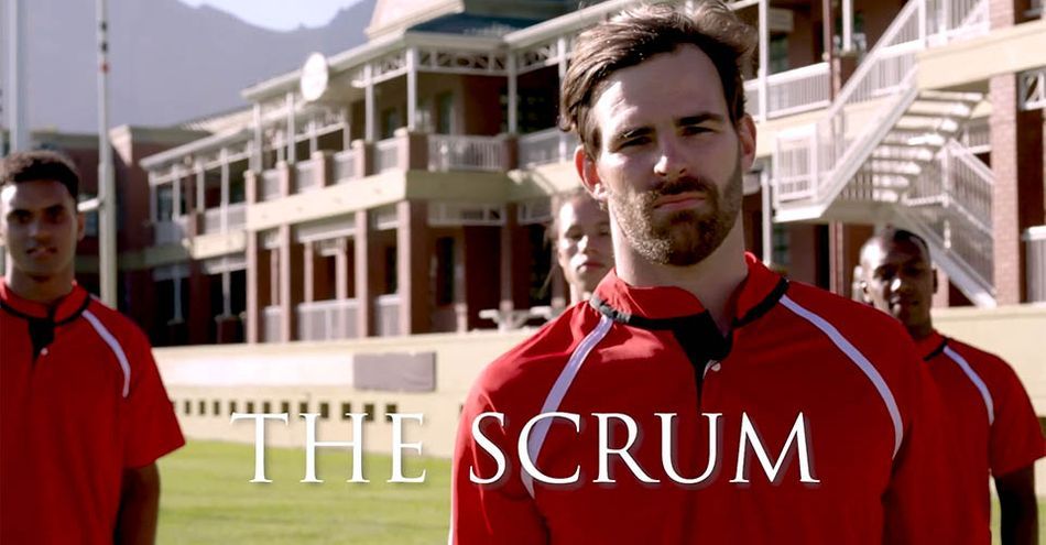
So this is the intro sequence for a new series centered around a rugby team. It’s what I could make from stock footage, okay? And as you can see, we’ve got some high-profile names attached, so we really need to raise the bar on this thing.
I want you to pay REALLY close attention, and maybe even make some notes about all the things you would change if this were your project.
Across the board, the titles are kinda boring. The choice of typeface isn’t doing us any favors, and I’d love to explore some other ways to make these more visible without just relying on the dreaded DROP SHADOW.
We’ll be giving these titles a pretty major overhaul, so let’s take a close look at the footage itself. Some of these issues may seem minor, but remember, this is an intro sequence, and your viewers are going to watch this over and over again, so we want to make sure it looks as good as it can, right?
We'll go into fullscreen so we can really spot any issues. There are multiple signs to fix, and sometimes objects in the foreground will crossover which means we'll need to rotoscope. There are a few elements in the background that can distract the eye, namely some sharp reflections and light sources. Our editor did a good job with color here, but we can definitely make our star pop a little more.
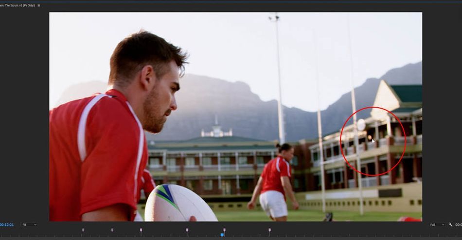
How many of those did you notice? Or maybe you caught some other things that I didn’t mention? One of the big things I want you to learn from this video is to start really developing the eye to SEE this stuff, even if you don’t quite know how to fix it yet.
Motion design solutions in Premiere Pro
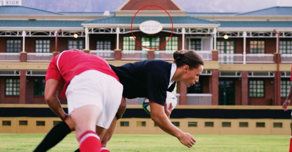
The tools in Premiere are great for obscuring something you’re not allowed to show—such as people who didn’t sign releases, or logos you don’t have clearance for. But if you want an element disappear or replace something in a clean and photo-realistic way—so it’s not just creating a different kind of distraction—it’s After Effects time.
As I mentioned earlier , you can probably make use of color correction tools as a solution for some of the things on our list. Advanced color correction is a whole other rabbit hole, though, so I’ll leave that to an expert, and … a different tutorial.
Obviously, the ideal is that you control some of those things during shooting rather than "fixing it in post." Another thing I should point out is that these clips are all 4K, but I’m working in a 1920x1080 timeline. This means I have a lot of room to scale and reposition my clips, and as long as you’re keeping your actors nicely framed, you might be able to fix some of these simply by adjusting the Motion settings for the clip, which you can access in the Effect Controls panel.
Speaking of easy fixes, let's shift back to our titles now, and I’m going to start by looking through some Motion Graphics templates to see if maybe there’s one that fits my project. These are editable templates that are already designed and animated, and you just need to update them with your own content. Sometimes that’s as simple as typing new words and picking a color.
You can browse and purchase these on the Adobe Stock site, but you can also find them without leaving Premiere. If you don’t have the Essential Graphics panel open already, you can find it the Window menu. I’ll make sure I’m on “Browse,” then click Adobe Stock. I can filter by “free” and type in “Main Title.” Once I find one that works, I can just drag it straight into my timeline.
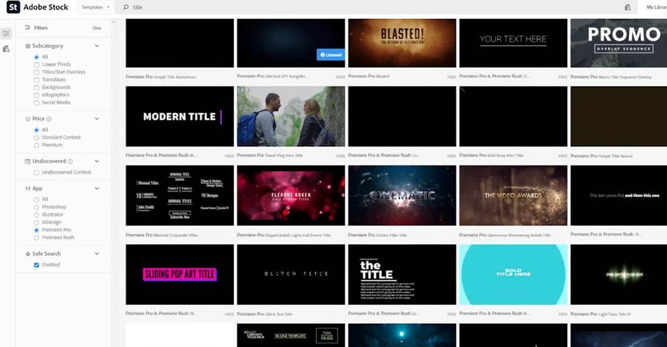
I’m not sure it’s exactly the vibe I was after for this piece, but it’s pretty cool, and it took me literally seconds to add this complex animated title to my project. There are tons more available, both for free and for purchase, so it’s worth looking to see if something already exists in the right style.
These Motion Graphics templates are also great for repeated elements, or things like titles that might get updated a lot.Don’t just hear “templates” and think it’s a dirty word. They can help you work efficiently and take advantage of your tools!
But hey, you’re here to learn how to do this yourself, right? Let’s take a look at that.
How to get to started in After Effects as a video Editor
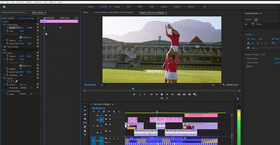
While we can keyframe the Transform properties of these titles here in Premiere, we can’t actually animate anything WITHIN the titles themselves. That's why After Effects is such a powerful tool.
There are multiple ways to easily work between Premiere and After Effects, and which one is “correct” will kind of depend on what you’re doing. You don't just want to open the program and feel around; After Effects isn't a simple grab-and-go tool. Instead, you'll want to think through the animation ahead of time, maybe even mock up some storyboards, so you can approach each composition with a plan.

If you're already used to keyframing from Premiere, After Effects won't be completely new for you. Watch the video to see how we take all the same concepts you've used before and elevate them with a more diverse toolset. We’re keeping the After Effects stuff simple today, but if you’d like get serious about learning more, we have some great news for you just a few paragraphs down.Ok, bonus time! So we made our own animated title. If we’d like to apply this same effect to the other titles, you could certainly do that one by one, but for something simple like this, it’s actually pretty easy to create our own totally custom Motion Graphics template…but that's only covered in the video above! Are you ready to go?
That’s it for today. We really just scratched the surface of what’s possible here, but hopefully I’ve gotten you thinking about some possibilities, starting to develop your eye for details, and seeing that After Effects might be more approachable than you imagined.
I’d encourage you to try out some of these ideas over a few clips of your own. You can explore some different looks and styles, and see where you can get with even the basic techniques we looked at today. Hey, maybe you can even open up one of your recent projects and look for ways you can make the next one even better.
How can you get started in After Effects?
After Effects is a powerful tool, like a lightsaber, and requires a certain amount of practice and patience to master. It can seem intimidating from the outside, which is why we developed After Effects Kickstart to launch you on your journey.
After Effects Kickstart is the ultimate After Effects intro course. Over eight weeks, we’ll start you from the ground up on the most popular tool for motion graphics. Whether you’ve played with After Effects before or never even downloaded the app, we’ve got you covered. By the end of this course, you’ll be comfortable using After Effects for MoGraph projects, and gain an understanding of the industry—from its history to its possible future—to prepare you for a career.
ENROLL NOW!
Acidbite ➔
50% off everything
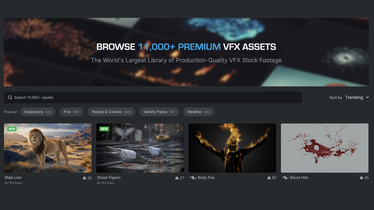
ActionVFX ➔
30% off all plans and credit packs - starts 11/26
Adobe ➔
50% off all apps and plans through 11/29
aescripts ➔
25% off everything through 12/6
Affinity ➔
50% off all products
Battleaxe ➔
30% off from 11/29-12/7
Boom Library ➔
30% off Boom One, their 48,000+ file audio library
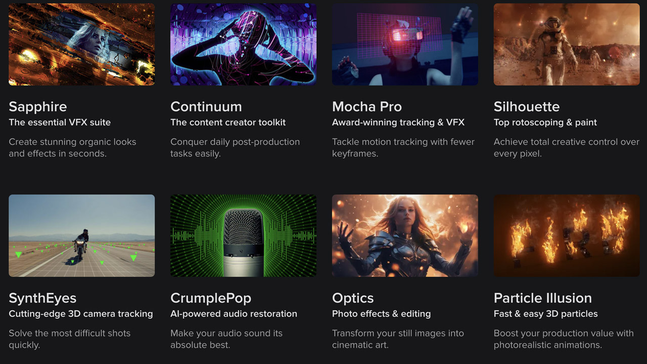
BorisFX ➔
25% off everything, 11/25-12/1
Cavalry ➔
33% off pro subscriptions (11/29 - 12/4)

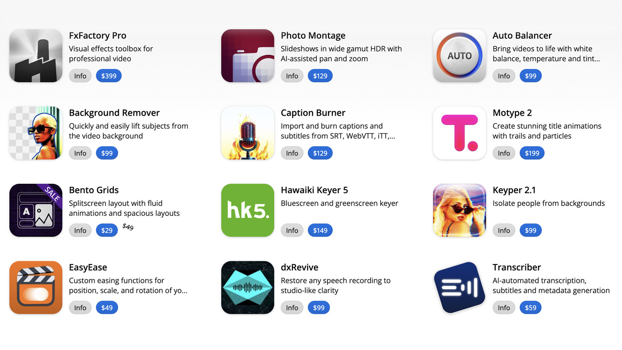
FXFactory ➔
25% off with code BLACKFRIDAY until 12/3
Goodboyninja ➔
20% off everything

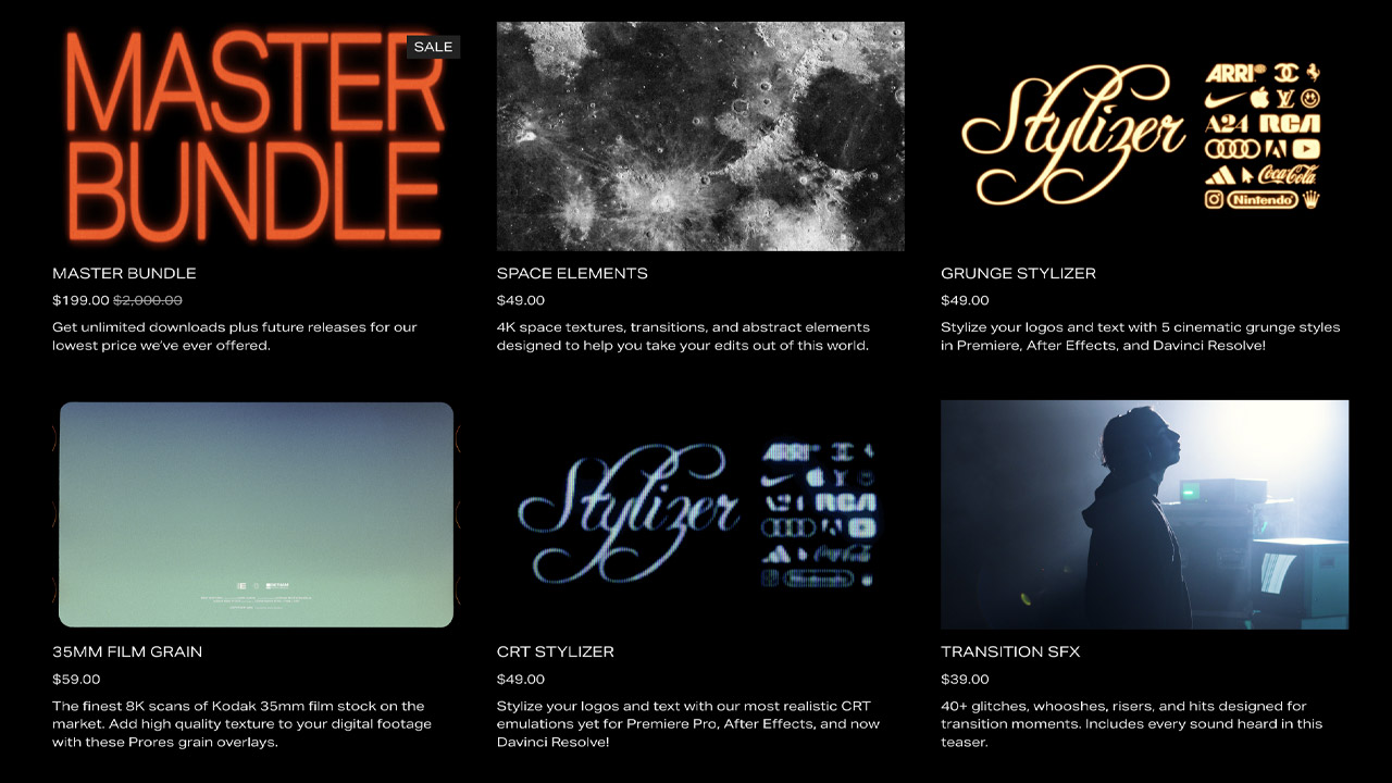
Happy Editing ➔
50% off with code BLACKFRIDAY
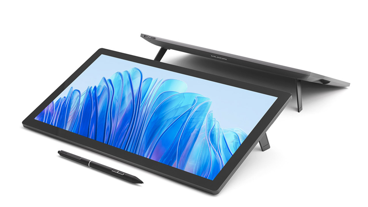
Huion ➔
Up to 50% off affordable, high-quality pen display tablets
Insydium ➔
50% off through 12/4
JangaFX ➔
30% off an indie annual license
Kitbash 3D ➔
$200 off Cargo Pro, their entire library
Knights of the Editing Table ➔
Up to 20% off Premiere Pro Extensions
Maxon ➔
25% off Maxon One, ZBrush, & Redshift - Annual Subscriptions (11/29 - 12/8)
Mode Designs ➔
Deals on premium keyboards and accessories
Motion Array ➔
10% off the Everything plan
Motion Hatch ➔
Perfect Your Pricing Toolkit - 50% off (11/29 - 12/2)

MotionVFX ➔
30% off Design/CineStudio, and PPro Resolve packs with code: BW30
Rocket Lasso ➔
50% off all plug-ins (11/29 - 12/2)
Rokoko ➔
45% off the indie creator bundle with code: RKK_SchoolOfMotion (revenue must be under $100K a year)
Shapefest ➔
80% off a Shapefest Pro annual subscription for life (11/29 - 12/2)

The Pixel Lab ➔
30% off everything
Toolfarm ➔
Various plugins and tools on sale

True Grit Texture ➔
50-70% off (starts Wednesday, runs for about a week)
Vincent Schwenk ➔
50% discount with code RENDERSALE
Wacom ➔
Up to $120 off new tablets + deals on refurbished items
