Learn how to use the graph editor in After Effects.
If you've ever wondered what that "secret sauce" that makes animation look amazing is, this is the place to start. In this tutorial Joey is going to take you through the basics of the graph editor. It may give you a bit of a headache when you first start using it, but once you get the hang of this feature in After Effects you'll see a huge improvement in the way your animations look.
{{lead-magnet}}
-----------------------------------------------------------------------------------------------------------------------------------
Tutorial Full Transcript Below 👇:
Joey Korenman (00:19):
Hey there, Joey here for school of motion. And in this lesson, we're going to take a peak at the graph editor in after effects. I know that the graph editor may seem a bit intimidating at first, but if you hang in there through this lesson, you'll be on your way to having better looking animations right away. We can only cover so much in just this one lesson. So if you really want an in-depth animation training, you're going to want to check out our animation bootcamp program. Not only does it entail several weeks of intense animation training, but you also get access to class only podcasts, PDs, and critiques on your work from our experience teaching assistants. Every moment of that course is designed to give you an edge in everything you create as a motion designer. Also, don't forget to sign up for a free student account so you can grab the project files from this lesson as well as assets from any other lesson on the site.
Joey Korenman (01:09):
And now let's jump in and check out the graph editor. All right, here we are in after effects. Um, so first thing I want to do is explain a little bit about the way after effects uses curves. And, um, it's, it's a little different than, um, some other programs like cinema 4d and nuke and Maya. Um, so what I'm going to do is just create a, I'll just create a new shape. All right. We'll just make a little little rectangle here. We'll square. Right. Um, so if I put a position, key frame on here, option P a and I go forward one second and I move it over here. All right. Let me set my, uh, set my comp, right? So let's preview this. All right. So it moves from point a to point B very boring doesn't doesn't feel that good, you know, it feels kind of stiff.
Joey Korenman (02:06):
So the first trick that everybody learns is to use one of the, uh, the animation helper kind of presets that come with after effects. Um, and so if you select both of these, go up to animation, key frame assistant, you've got easy ease in out and easy ease. And the one most people use is Easy's all right. And now your key frames look a little different. And when we preview this, you'll see that it, it feels better, right? The, um, the box sort of slowly starts moving and then it picks up speed. And then it slowly, decelerates at the end of the move. And this is the way things move in the real world. And this is why, you know, when you see animation, uh, you know, you want it to feel similar to this because it just feels more natural to you. Cause that's what you're to seeing.
Joey Korenman (03:00):
Um, animation is all about tricking you into thinking. Things are moving that are not actually moving. And, uh, it helps, you know, the illusion, if you make things move the way they do in real life. Um, and once you sort of get the hang of that, then you can start breaking the rules and, and doing really cool things. So for now, um, we have easy ease, key frames. Now, what is actually happening? What, like, how has after effects deciding how fast and how slow and when to speed up the, the key, the square and, and, and basically how is it setting the timing of this? So the, the way to understand this is to use this button here, which is that they're calling the graph editor and it looks like something out of, you know, your algebra homework, and maybe that's why people are, are not really using it a lot or not as much as they should.
Joey Korenman (03:51):
Uh, because it's just a little silly, I mean, look at these cute icons and then you have this one and it's just really boring. So, um, what I'm going to do is click this and you'll see, now we have this graph and now if I click on position, it will show me, uh, what my position, um, key frames are doing. All right. Um, I'm going to show you guys a really handy little button. It's this one down here, uh, fit all graphs to view. If you click that, it will scale your view to just fit the graph you're looking at. It's very helpful. So right now you see this green line down here is totally flat. That is the X position, uh, sorry, the Y position. Okay. And if I float my mouse over it, it'll tell you position wipe. Um, and that's flat because this cube is square is not moving up and down at all.
Joey Korenman (04:42):
It's only moving left to, right? So this curve here, this is the X position. And if you, you know, if you try to visualize this as we're moving left to right through time, and at the same time, this curve is going, you know, from low to high and that low to high motion is the same as moving left to right? When you, when you increase the X value, you're moving something to the right. So that's why it's going up. Um, and you can see now that it's got a curve to it and the way that you need to think about this, and it will take a little while, but you'll, you'll start to see it. Um, the steepness of this curve tells you how fast something's going. So if this curve is flat, like it is at the beginning and the end, that means it's moving slowly.
Joey Korenman (05:32):
And if it's totally flat, it's not moving at all. So it's actually starting from a standstill and then it's slowly picking up speed. And it, and in the middle here is where it's the fastest. And you can see that's where that curve is the steepest. Okay. So this is, what's telling after effects start slow right about here. It picks up speed and, and, and it stays fast until about here. And then it slows down again. Now you can change that. And that's the beauty. You can, you can make it, do things differently. Um, now the problem is by default, after effects puts X, Y. And if you're in 3d mode, it puts a Z value all inside of one key frame. And what this means is if I select this, I can't actually manipulate this curve at all. Um, because this key frame actually has two values inside.
Joey Korenman (06:26):
Um, and I'm going to show you guys how to fix that. But, um, in the meantime, I also want to show you the other graph editor that's inside of after effects. And this is the sort of legacy one, the old one that was in older versions of effects, and they still include it just in case you want to use it. And I'm gonna show you how it works. It's a lot less intuitive. If you come down and click this little button next to the eyeball and say, edit speed graph. Now you have a totally different looking graph. Okay. This graph is telling you, and it's kind of hard. It's kind of hard to explain even, but it's basically telling you how fast that layer is moving. All right? And so the speed and the steepness has nothing to do with how fast it's going. The actual value, you know, at this point is how fast it's going.
Joey Korenman (07:18):
So it's starting at zero and it's picking up speed, and then it's hitting its maximum speed here. And then it's slowing back down again. So you actually can edit these curves. If you select a key frame, you get these little handles and you can pull them, right. And that's changing the shape of the curve. And just to show you what that does. If I pull this to the right, okay, what's happening is it's increasing that speed at a slower rate. Right. And if I pull this one, now it's decelerating at a slower rate. So when I, when I play this, you can see what it's doing. It really takes a while to pick up speed. And then when it does it shoots over really quickly, okay. So this is kind of the shortcut. Um, if this is the animation you want, you can use the speed graph and do it most of the time.
Joey Korenman (08:14):
I try not to use it because this doesn't tell me a lot. This is like hard to look at. Um, and I, you know, I don't like it. It offends me. And so I usually use the value graph. This makes a lot more sense. Now you can see visually we're going slow, slow, slow, slow, boom, really fast right there. And then we slow down again. All right. Um, so let me undo all of this. Um, so the way to use the value graph to change the speed of things is to, uh, right. Click or control, click on your key frame for position or for the, for the property. And you'll see this option here, separate dimensions. So we'll click that. And now we have X position and Y position separated out. So the white position, we can actually turn off, cause this is not moving on.
Joey Korenman (09:02):
Why at all? And exposition, now we have a curve and it messed up our easy ease. Um, but that's okay. Cause we're gonna, we're going to change the script. So now, because the exposition is on its own curve, we can change this. All right. So the way animation curves work, you know, I explained that the steepness is how fast it's going. So if I pull this handle down like this, and if you hold shift, it will sort of lock it to, uh, you know, to straight, straight out. Um, if I go like this, what I'm doing is I'm saying to, I'm telling after effects, we're going to go really slow. We're going to accelerate very slowly. Okay. And if I pull this up, this it's the opposite. It's saying immediately start moving quickly and then slow down. All right. And you can bend this curve as well, so you can get completely different animations.
Joey Korenman (09:58):
So what's happening if I do occur like this, okay. Sort of an inverted curve. So this is telling it move very fast, right off the bat and then slow way down. And if you see, you know, imagine here's your starting point, here's your ending point. Imagine cutting that in half. Okay. The first half of the animation, or sorry, the second half of the animation, almost nothing happens. Right? If you imagine a line here from here to here, it's almost flat from here to here. There's a lot going on. Really most of the movement is happening in the first, probably third of the animation. So let's re preview that, all right, you can see it just pops out and then slows way down, which can be kind of cool. Um, you know, if we, um, if this cube at, or sorry, I keep calling it a cube, it's not a cube.
Joey Korenman (10:51):
If this square started off screen and we may need to, uh, I mean, need to stretch that key frame out a little bit now, by the way, the way I just did that, very handy key, uh, hockey is just the plus and minus key, um, on that top number row, the top sort of row of your keyboard, um, minus zooms out, plus zooms in just a nice way to do it. Um, so if you have something like that, you know, you're trying to introduce some, some object into your screen. This is maybe a cool way to do it. You can, you can really fire that thing in there quickly and get a fun, little kind of effect like that. And you can really, really crank this too, if you want to, you know, so that it, it's just, it's almost all the way there, like instantly, like, just like that.
Joey Korenman (11:39):
Um, all right. So now what's a different type of curve. Well, if we do sort of your typical S curve like this, but we're really, we're really pulling these handles out very far. So what's happening is it slowly comes in and then flings over and kinda decelerates all right. Um, and then you could also have, you know, the opposite of the first curve where it slowly picks up speed and that just stops very quickly. Okay. Um, and I don't know, maybe, maybe you want that maybe it's some sort of jerky kind of experimental thing you're doing and that's what you want. But the key is you'll start to just intuitively know how to shape these things. Once you do this a few times. Um, and I know if you've never seen this before, this may look funky to you, but, um, I promise you if you start getting into this graph editor and just think of it as an animation curve editor, don't call it the graph editor.
Joey Korenman (12:35):
Um, but it, it, you know, you'll start to just intuitively know where to pull these things. Um, and you'll get a sense of, you know, having a little bit more control over your animation. You know, now it's kind of really slowly picking up speed. It gets quickly here and then it decelerates but much, much shorter, you know, over a much shorter time than the beginning. Right. So you have a lot of control that way. So now I'm gonna show you guys the other great thing about the, uh, the animation curves. So in the example, video that, uh, that I made for this, um, I just wanted to make something really simple to show you guys. And, and one of the basic things that you would learn in, um, in an animation program, um, is how to make a bouncing animation, because that's sort of a good example, um, of something that really requires, um, you know, using some of the principles of animation to make it look right.
Joey Korenman (13:34):
Um, and, and requires using the animation curves to get it, to feel like a real bounce. Um, so the way that, uh, I started this was I just, you know, basically said, okay, well, this box is going to land here and it's going to drop from off screen. Okay. So how many frames should it take to get from here to here? Well, I don't really know. Um, I had to kind of experiment and play around until it felt right. Um, but let's just say, let's just try this. Let's try 20 frames. All right. That might be too much. So I'm going to put a position key frame here, um, and you can see I've already separated out the, uh, the dimensions on the position. So I have my X and Y separate, and I'm gonna turn X off because I'm not using that right now. All right. So I have the Y position. I'm going to add another key frame at the beginning.
Joey Korenman (14:29):
Okay. So now it's off screen. All right. And if we play that that's really that's way too slow. It's not what we want it. All right. Of course. Um, now think about what happens when something falls, it's accelerating all the way down to the ground. You know, things get faster and faster and faster until they hit something and then the direction reverses, and now they're going up in the air. All right. And so you got to kind of think about how things actually work in real life. Sometimes I'm going to go into the, um, the animation curve editor for this. All right. And you can see right now it's linear, which is not what we want. Um, what I want is I want it to start slow and get faster. So I'm actually sort of drawing the curve I want with my mouse. I don't know if that helps you guys.
Joey Korenman (15:19):
Um, I'm going to, uh, select both key frames and, uh, these little icons over here, these are actually shortcuts to make easy, ease, ease in and ease out key frames. So I'm just going to hit easy ease, and it'll give me this nice S curve. Um, so this, this first key frame, this is actually pretty close to what I want, but I want it to, um, you know, I want this to feel a little bit cartoony, so I'm gonna pull this out a little bit further. Now this is not going to ease into the ground. It's not like there's a parachute on this little orange square. It's going to hit the ground and just come to a dead stop, basically. All right. And that's, that's what happens when things hit the ground. So, um, if we preview this really quickly, okay, let me see. It doesn't quite feel natural yet. Um, it feels a little slow, maybe. So I'm going to, um, I'm going to click and just drag this over and I'm going to have this not accelerate so slowly, I'm just going to kind of mess with this curve a little bit.
Joey Korenman (16:26):
All right. And, and, you know, it's trial and error. I'm not, um, I'm not a super advanced animator by any stretch, but, you know, usually I can play around with it until it starts to feel good. All right. So that's starting to feel pretty good. It kind of lingers and then false. Okay. It's almost like it fell off a table. That's just off screen. All right. So what happens next? Now it's going to bounce up somewhere, um, you know, and a good rule of thumb. If you're, if you're doing something like this is just make it bounce up, half the height it fell from. All right. And then next time it bounces, you know, half that height and then, you know, it'll sort of decay and you can also do that with your key frames. So we're at frame 17. That's how long it took to fall.
Joey Korenman (17:11):
So, you know, let's just for easy math, let's say 16 frames. So how many frames should it go up? Uh, well, half of 16 would be eight frames. Um, so why don't we do eight frames? So from 17, that would be, let's see. Cause we're in 24. So that actually be 1, 2, 3, 4, 5, 6, 7, 8. All right. Um, and I'm going to add a couple of extra frames because I do want it to kind of have a little bit of that cartoony feel to it almost like it sticks to the floor and then flings itself back and hangs a little bit longer than it should. Um, so I want this cube to now come up here, maybe about to there, and you can see that as I did that, it actually added a point on my curve. All right. Now it starts here. It falls and hits when it hits.
Joey Korenman (18:10):
It's not going to bounce immediately back up like that. Okay. But it's also not going to slowly accelerate like this. It's going to be somewhere in the middle. Right. Because, and this also depends if you're trying to make the ball feel like, um, like a rubber ball or like a pool ball, you know, like a billiards ball, um, you know, the material it's made of is going affect that too. So we're pretending this is some really flexible bouncy material. Um, so I do want it to accelerate up and then when it gets to the top, it's going to decelerate and hang there for a second. All right. Um, so what I did was I basically made an S curve, but then I'm going to bend this down just a little bit. Okay. So that when it hits, it bounces up right away, but slower, you know, so let's preview that real quick. Okay. Now that feels way too slow, how it comes out of that. Okay. Um, so I'm actually going to just shorten this and lengthen that. Okay. It's getting better. And the whole thing feels a little slow. So I'm actually just going to compress this a little bit.
Joey Korenman (19:30):
Okay. And you can see, you're probably starting to see the, the benefit of animating this way. This actually in a visual way represents what this square is doing. I almost called it a cube again. Um, all right. So now it's gonna fall down. And when it's falling, it's probably going to take the same amount of frames as when it went up. Okay. So this was from frame 14 to 22, that's eight frames. So go another eight frames and it's going to come back to here. And all I did was select this and hit copy paste. All right. And the motion it's basically going to mirror what's happening here, except it will not ease into the ground. Right. It's just going to slam into it. So if we play this right, so it's starting to feel like a bounce.
Joey Korenman (20:28):
All right. And this curve is telling you what's happening, slams into the ground, eases out, stops, ease is down and then slammed into the ground again. All right. So now we're going to go, uh, four frames. All right. And you can see where this key frame was that we just had the, the square at, and I'm going to halfway to that key frame. Okay. Um, and basically all we have to do now is make the next curve look just like this one, just smaller. All right. So if I look at the angle of that, I can just sort of mimic that, pull this out, go forward, four frames, copy and paste this. And actually, maybe I'll copy and paste. Uh, I will copy I'll copy and paste this one. Um, and you can see it actually, it's sort of maintained the, uh, the angle, um, of this little handle.
Joey Korenman (21:26):
So it's sort of, once you set a curve here, you know, you set your Bezier handles for what the curve is going to do on the, on the incoming and the outgoing side. Um, you can copy and paste those and it'll maintain that for you. All right. So let's see how our balance is doing all right. Feeling pretty good so far. And what I'm going to do is I'm just going to have it bounce a couple more times, and then we're going to tweak the curve overall and show you guys how to do that. All right. So that was four frames. So now why don't we do three frames just because, so it's going to come up about halfway. Um, all right. And then we'll copy this.
Joey Korenman (22:14):
And I'm just trying to make each curve a little miniature version of proceeding curve, you know, and you can kind of see the shape of it. All right. One more bounce to frames, just go halfway. All right. And this last bounce, I mean, it's, it's so quick that I don't need to mess with the curves too much. Okay. So now we've got a decent, it's not amazing, but it's a decent bounce animation, right. And the speed of it feels appropriate. Um, you know, and you could sit here and tweak this for another 10 minutes and probably get a better, but the next thing I want to show you is, you know, how do we make it even more exaggerated, even more cartoony? All right. So we've got this, this nice curve here. Um, and what we can basically do is just, you know, we can scale our key frames so we can make this take a little longer, but then actually, you know, compress the curves so that there's more action sort of in between the, the acceleration and the deceleration.
Joey Korenman (23:28):
So, um, if you guys don't know the way to scale key frames in after effects, you have to select all the key frames you want to scale and you eat and you hold option. Uh, and on a PC, I'm assuming option is, uh, alt maybe or control. Um, so you, you click either the first or last key frame. You can't select any of the ones in the middle. It won't work. So if I hold option and click and drag, you see how it scales them. All right. So I'm going to scale them just a little bit longer. Okay. Just a few frames, go back into my curves. Now, what I want to happen is I want, let's just play this really quickly.
Joey Korenman (24:10):
Okay. I want the square to hang a little bit longer at the top of each bounce and at the top, at the beginning. Okay. Almost like a, like a cartoon, like when, you know, Wiley coyote hangs in mid-air for a little bit longer than, than he should. Um, so what I'm going to do is I'm going to select all of the key frames, which represent the top of the bounce. And then at the same time, I can just pull all of their handles so I can stretch those out and I can stretch them out on both sides. And you can see that when they're all selected, they all respond the same way. All right. So now let's play that.
Joey Korenman (24:53):
Cool. So now it's, it's a lot more cartoony and, and, you know, there's a lot more going on now. Um, you probably noticing this doesn't feel exactly right. And that's also because when you're doing something like this, uh, generally it's good to use, uh, what's called squash and stretch. Um, if you've never heard of that, you can Google it and it will, it will be explained to you. There's a million websites that will explain what that is. Um, and in, after effects, the way that you would do that is you would just animate the scale of this square. Um, I don't want to spend too much time on this tutorial, so I'm not going to do that. Maybe that's one for another day. Um, but I want to show you, um, how you can, you know, you can add to this a little bit, um, by creating those little waves, um, that were in the, in the video, sort of those impact waves that came out because using animation curves, it's not just for position.
Joey Korenman (25:47):
You can use them for anything. Um, so the way that I made and actually let me, let me pull this up and show you guys the way I made these little, um, these little radiating lines that came out, you know, so the way I did that was I made a new comp, I called it wave and, uh, I added a shape layer and I wanted a, I wanted a square so that it would match the shape of the square that's bouncing. Um, so let's just name this a wave, a one. All right. And, um, so right now I need to dive into the contents of the shape layer, go into the rectangle path, and I want to make this path match the size of my square. Um, all right. And then I want to delete the fill. So I only have a stroke, um, and let's just change that stroke to two pixels and let's make it black so we can see it a little better.
Joey Korenman (26:48):
All right. So this is what I had and, um, what I wanted was, as soon as that square hits, um, I want sort of a radiating square to pop out of it, like an impact wave, but I also wanted it to kind of draw and do some cool stuff. So the first thing I wanted was the size to get bigger. So what I did was I put a key frame here and I went forward on second and I made it grow pretty big. All right. And if we ran preview that that's really boring. Of course. Right. So now we know how to make it feel better. Um, we can add, and by the way, the hot key to add easy ease is F nine. Just memorize that. Um, it's just a good place to start before you go into the curve editor. So I always make my key frames easies.
Joey Korenman (27:39):
Then I go into the curve editor, um, and, uh, I'm going to click this button. All right. So now I have this nice S curve. Now, when that square hits the ground, I want those things to shoot out and then slow down. All right. So right now you can see it's slowly accelerating. That's not what we want. We want it to shoot out. So I'm going to invert this curve like this. Okay. And then I want it to really slow down at the ends. Now let's play that. Okay. Now it feels a little bit more like a pop, you know, like a explosion or something. All right. So that's a good start. Um, so then the next thing I wanted to do was have the, a, I didn't want the entire square drawn on. I just wanted a piece of it and I kind of wanted it animating a little bit.
Joey Korenman (28:26):
So I'm gonna show you guys a trick that I like to do. Um, and I've done this in a lot of projects and you can get some cool effects with it. Um, what you do is you add a trim, pats, effector. I'm not sure what these are called, but you add a trim paths to this. Um, and then you open it up. And what trim paths does is it lets you, uh, determine the start and end of the path that's actually going to be drawn. So instead of drawing this entire square, I can set this to, I dunno, let's say 30 and it only draws a little piece of it. All right. And I kind of want more than that. So let's set it, let's set it to 50. All right. So it draws 50% of the square. And then you can use this offset. And I know it's a little tricky to see with the, uh, with the handles on here, but now you can see that, um, you know, I can basically make the little, the snake game that used to show up on, on your Nokia phone. Um, so I'm going to, uh, what I'm going to do is key frame that, and I want, I basically want it to rotate as the Square's growing.
Joey Korenman (29:38):
Um, so I'm going to have it rotate. Let's 90 degrees. Cool. Okay. So now if I play this, you know, the scale feels good, but that move doesn't feel good. I want that move to feel the same as, as the scale. So, um, I'm going to select the key frames. I'm going to hit F nine. I'm going to go into the graph editor and I'm going to make this curve look exactly the same as the other one. And if it doesn't have to be exactly the same, but if you wanted it to be exactly the same, you can actually select multiple properties and see their curves together. So I can kind of visually check and make sure that my curves are actually looking the same. All right. So now you get this kind of interesting effect. Um, and, uh, maybe as a little bonus, I'm gonna, I'm actually gonna make this animate a little differently than the one I showed you guys at the beginning of the video.
Joey Korenman (30:37):
Um, as it offsets, I'm going to have it actually draw off too. Um, so I'm going to, um, by the way, another hockey, if you hit you, you may know it brings up the, um, the properties on that layer that have key frames. If you hit you twice, it brings up anything that has been changed, uh, which is great when you're working with shape layers, because if you've added things or if you've tweaked anything, it'll just show you that. Um, so I want, uh, another option in trim paths, which is the, uh, the start, right? So you can see, I can, I can animate the start and if I animate it to match the end and the shape goes away. So let's put a key frame at the beginning, go forward one second, set the start to 50. So it matches the ending. All right, hit F nine, go to the graph editor, pull this up.
Joey Korenman (31:37):
This is like old hat to you guys by now. All right. So now you get this interesting, this interesting animation, right? This kind of funky looking thing. And by itself, it's not much definitely doesn't look like a, like an impact wave or something. But, um, if I, let me, let me scale this layer up a little bit. All right, let's go up to 200%. That's too big, maybe one 50. All right. If I duplicate this and I scale, it's copied down a hundred, 10% less, and then I'm going to offset it a couple of frames. Um, so I'm going to hold option and I'm gonna hit page down twice and it's going to slide that to two frames. Um, and then I'm also going to rotate it 90 degrees. All right. So now I get this cool kind of cascading thing, and I'm going to do that a few more times. So scale this to one 30, rotate this 180 degrees.
Joey Korenman (32:47):
All right. And what do we have now? Now we have something kind of interesting actually like this a lot better than the, uh, than the one that was on the clip I showed you guys. Um, so yeah, so you get this kind of interesting impact wave thing. Um, and then I just brought that in and I just lined it up, scale this down a little bit. Yeah. And that's basically it. And then I colorized it, you know, I used a fill effect, colorize it. And I had the, you know, I had, um, I had the square change color every time it landed and some other things. Um, but basically that's all I did. So I'm going to duplicate the wave and every time it lands, I'm going to add another one. And here's another key frame for you guys. Um, so I'm, I'm hitting command D to duplicate the layer and then I'm hitting the left bracket. And what that does is it brings whatever layer is selected. It brings the head of it to wherever your play head is this, this red line. Um, right. And then at the end, there's one more.
Joey Korenman (34:06):
All right. So now you can see that, you know, it starts to get a little crazy at the end. So what I did was actually, um, take each wave the whole pre-camp of that wave and rotate it 90 degrees, 180 to 70, and then I'll rotate this first one, negative 90. Um, so now you actually get kind of slightly different waves each time. So when you have multiple ones playing, you know, they don't overlap as much. Um, you know, and now I'm, now I'm starting to do critique this, and I'm thinking that maybe two frames apart, isn't enough. Maybe you need like three or four frames and maybe they should be a little random.
Joey Korenman (34:55):
Now let's play that. Yeah. And he's a little work. What are you going to do anyway? So, um, I hope that now you guys understand the, uh, the animation curve editor a little bit better and after effects. And I really, really want you guys to get in there and use that thing because, you know, I've seen a lot of people, um, do things like this, which makes me crazy where they're animating something and they say, okay, I want a, I want this cube to be here in a second. Um, but I want it to be almost all the way there by 12 frames. So they go to frame and they just do this. And they have, now they have three key frames and why you don't need three key frames. All you need is two. You want to have the least amount of key frames humanly possible when you're doing motion graphics.
Joey Korenman (35:50):
That is, that is a good rule because inevitably when you're doing stuff professionally, it's all gonna change. And if you have two key frames versus four key frames, it will take you half the time. Um, so get in there, use the animation curve editor, make your animations feel good. And you know, and just remember that, you know, when you animate this way, you can actually see your animation. If you're doing a bounce, you can actually see the bounce. And, and after a while, you'll, you'll, you know, in a year, if you guys do this, you could look at this and tell me what's happening without actually seeing the animation. And you'll have a common language when you're talking to other animators. And when you're, you know, if you ever get to a position where you're supervising somebody and you see that their animation doesn't feel right, you can tell them, go to that curve editor and, you know, you know, pull those handles out and make that deceleration a lot longer, you know, and maybe they won't know what you're talking about, but you can show them and impress your friends.
Joey Korenman (36:52):
So I hope this was helpful. Thank you guys, as always for watching school of motion.com. I'll see you guys later. Thank you so much for watching. I hope this lesson gave you some insight into how the graph editor in, after effects can be used to make your animations look better. We only had enough time in this lesson to scratch the surface of what knowing the graph editor can do for your work. If you want to know more about using this incredibly powerful tool, make sure you check out our animation bootcamp program. Anyway. Thanks again. And I'll see you next time.
ENROLL NOW!
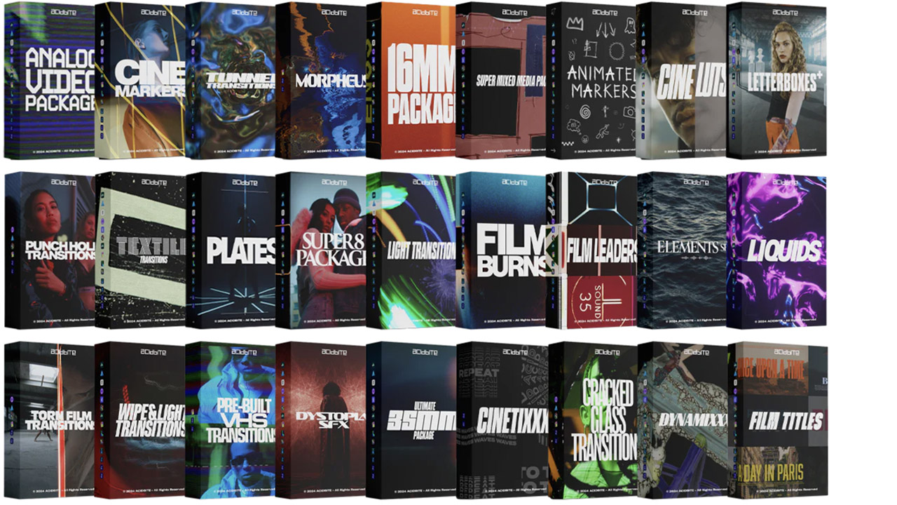
Acidbite ➔
50% off everything
ActionVFX ➔
30% off all plans and credit packs - starts 11/26

Adobe ➔
50% off all apps and plans through 11/29
aescripts ➔
25% off everything through 12/6
Affinity ➔
50% off all products

Battleaxe ➔
30% off from 11/29-12/7
Boom Library ➔
30% off Boom One, their 48,000+ file audio library
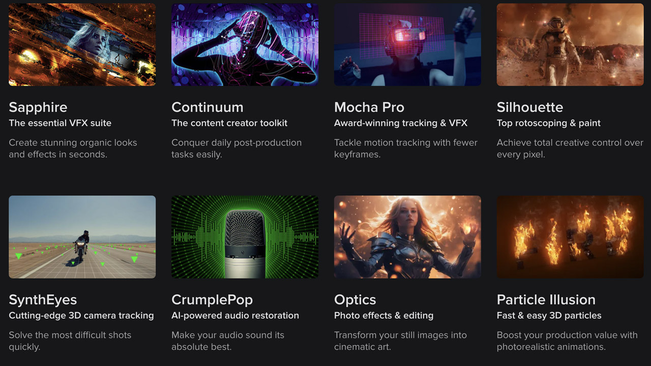
BorisFX ➔
25% off everything, 11/25-12/1
Cavalry ➔
33% off pro subscriptions (11/29 - 12/4)

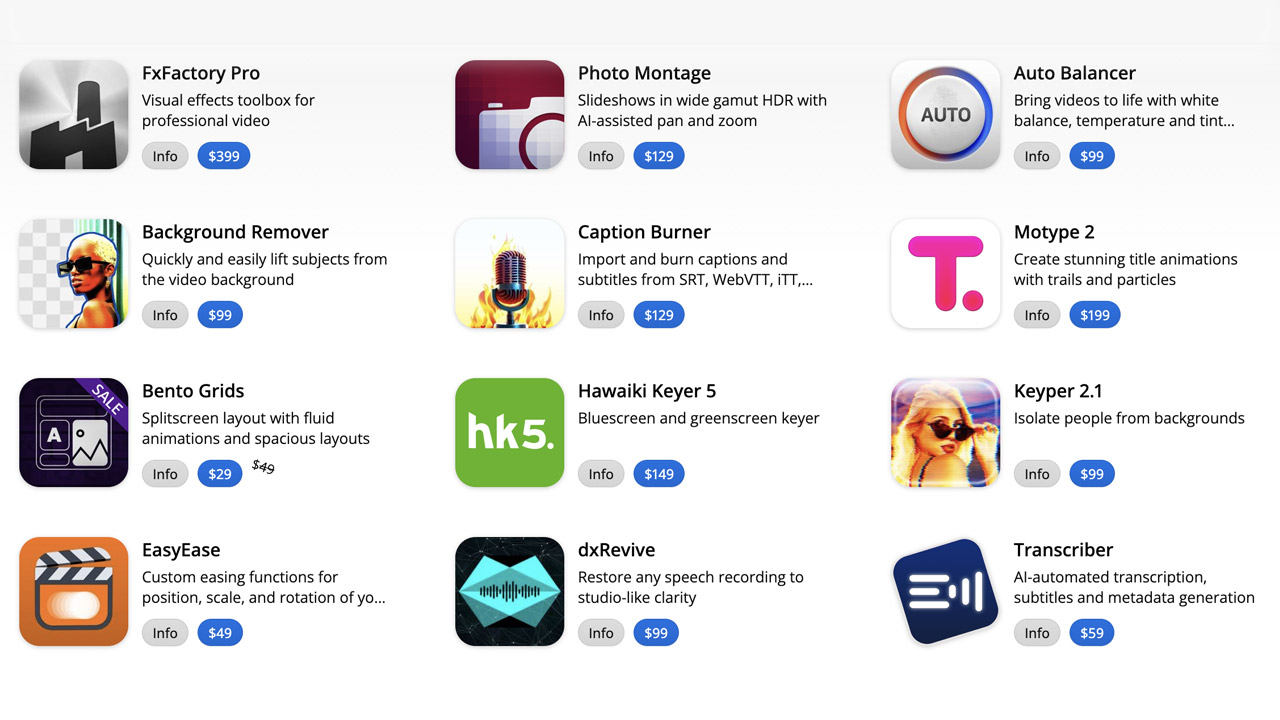
FXFactory ➔
25% off with code BLACKFRIDAY until 12/3
Goodboyninja ➔
20% off everything

Happy Editing ➔
50% off with code BLACKFRIDAY
Huion ➔
Up to 50% off affordable, high-quality pen display tablets

Insydium ➔
50% off through 12/4
JangaFX ➔
30% off an indie annual license
Kitbash 3D ➔
$200 off Cargo Pro, their entire library
Knights of the Editing Table ➔
Up to 20% off Premiere Pro Extensions
Maxon ➔
25% off Maxon One, ZBrush, & Redshift - Annual Subscriptions (11/29 - 12/8)
Mode Designs ➔
Deals on premium keyboards and accessories
Motion Array ➔
10% off the Everything plan
Motion Hatch ➔
Perfect Your Pricing Toolkit - 50% off (11/29 - 12/2)

MotionVFX ➔
30% off Design/CineStudio, and PPro Resolve packs with code: BW30
Rocket Lasso ➔
50% off all plug-ins (11/29 - 12/2)
Rokoko ➔
45% off the indie creator bundle with code: RKK_SchoolOfMotion (revenue must be under $100K a year)
Shapefest ➔
80% off a Shapefest Pro annual subscription for life (11/29 - 12/2)

The Pixel Lab ➔
30% off everything
Toolfarm ➔
Various plugins and tools on sale

True Grit Texture ➔
50-70% off (starts Wednesday, runs for about a week)

Vincent Schwenk ➔
50% discount with code RENDERSALE
Wacom ➔
Up to $120 off new tablets + deals on refurbished items


