Websites that use animation can help brands stand out. Here's a roundup of 10 sites with great animation.
As a professional working in the modern age of information, you need to have a website. Animation and design help guide viewers from item-to-item and page-to-page, which is better for your business, your clients, and you. If you’re stuck searching for inspiration to give your own site a refresh, we gathered some amazing websites with great animation.

In the olden days of Flash, web design was often seen as a difficult and treacherous road, beyond which be monsters. You could start to design a nice, clean, professional site, and then end up with fifty hamsters doing the cabbage patch while your information fought for attention. A LOT of people put pink lettering over green backgrounds. It was awful.
Nowadays, with Webflow and Squarespace making design easier, and programs such as Lottie and Spline offering new tools for animation, there’s no reason you can’t create a truly inspired site. Animation is not just a flashy way of showing off your work; animation can sell your products better than any simple type, and we’ll show you why.
In this article we’ll cover:
- How do web designers create such inspired animation?
- Examples of using Lottie and Spline
- Our favorite 10 sites with great animation
How do web designers create such inspired animation?
Creating any animation requires an artistic eye and an understanding of the tools of the trade. Why, we’ve gone and made an entire school around that idea. For the sites we’re exploring today—and indeed many of the sites you’ll visit over the next year or so—you’ll be seeing Lottie and Spline used quite a bit.
What is Lottie?
Lottie is an iOS, Android, and React Native library that renders After Effects animations in real time, allowing apps to use animations as easily as they use static images. It’s actually a really interesting subject to explore, which is why we interviewed the creators of Lottie not long ago! Many Lottie users often start in Webflow to build their sites, which provides built-in animation tools for the web plus an easy way to use Lottie files.
What is Spline?
There are also up-and-coming tools like Spline which will allow artists to easily embed 3D design & animation on websites. What makes these special is how interactive they are for the user. Spline objects can be clicked and dragged for a variety of fun effects.
What are other ways to add animation?
And some are doing it the old-fashioned way: Cleverly embedding GIFs and video files. While this isn't as interactive as Lottie or Spline, you have to remember to think about the purpose of your animation—and your site as a whole. Once you know what you're trying to accomplish, you can cater your work to that end.
Examples of Lottie and Spline animation embeds
Here's what these technologies actually look like on a site... this site.
Spline 3D Example
This is an example scene from Spline, embedded and playing in realtime!
Lottie Example
This is a free example animation from Lottiefiles, a marketplace for Lottie animations. This animation is playing in real-time from code that was exported from After Effects.
10 Websites with Great Animation
Apple: iPad Pro

It should come as no surprise that Apple, the little tech company that could, has some amazing website design. You can explore any page and find examples of storytelling through animation, but one of our favorites showcases their new iPad. Like many modern sites, the animation is triggered through scrolling, leading the viewer through a journey of discovery. With every new factoid comes an accompanying animation that not only demonstrates the point, but fits into the Apple aesthetic of “cool, elite, modern.”
Apple also uses animation that guides perception and comprehension, such as information fading in and out as it is needed so you’re never overwhelmed with content. Most of what you see is from Lottie, which shows you the versatility of the application.
Stryve

Stryve is an app used for hiring, so the market isn’t necessarily artists or creators. Still, animation is used as a clever tool for delivering information and a curated experience. The viewer is guided down the page by subtle animation cues, or more obviously with a literal thread that draws the eye toward the next bit of info.
What makes this site special is how they use animation in service of the marketing goals of the company. It’s not just art for art’s sake, but art with a specialized purpose. Again, we’re seeing a lot of Lottie.
Better Up: Inclusive Leadership Report

Better Up offers coaching services, which means their main selling point is clarity and engagement. They’ve designed a website that mirrors their product, using animation in subtle ways to remain highly readable while still being entertaining.
You’ll notice that the majority of animation simply assists the typography, using minimalism to express an idea without distracting from the overall message. This is a great technique for those artists that value substance of flash.
Croing Agency

Croing is a creative and digital agency, which means they are competing for attention in a saturated market. Their animation overloads the senses while never falling into pure chaos. There’s always something moving, changing, or directing your attention, and yet you can easily flow from the top to the bottom of the page.
Alongside the smaller touches are “wow moments” that stop the viewer long enough to deliver a key bit of information—usually something that directs you toward a product or service. Each one of these techniques are useful on their own, but together you can’t help but be impressed.
Vibor

Vibor makes a super niche piece of equipment, so you’d never expect them to make anything other than a simple, boring website. Instead, they’ve opted for gorgeous animation that utilizes subtle tricks—such as hover—to improve readability and engagement.
The important thing to note here is that there is no overreliance on flash and spectacle. Vibor understands their audience, and they know to avoid too much of a good thing. With this site, they’ve taken a very dry subject and turned it into a star, without losing the focus that their market requires.
Nolk

Again, we’re taking a dry subject and adding just the right amount of animation to grab the viewer’s attention. Nolk helps growing Business-to-Consumer (B2C) businesses scale up. I know, just that sentence earned a yawn. However, that is a crucial skill that not every business owner has (trust us, we used to be a company of 2 extremely exhausted artists). Nolk decided that they wanted a website that sells their customer-focused and friendly attitude.
The simple typography animation takes the dry content and makes it engaging, and small dancing images delight without distracting. The end result is a speedy navigation down toward their lead generator.
Mama Joyce Peppa Sauce

You just knew we were going to talk about hot sauce at some point. If you’re in the know, you understand that the sauce market is saturated to the brim with boutique shoppes trying to sell you their “hottest condiment on the planet.” How do you stand out in such a crowd? Mama Joyce opted for a delightful chaos. Text rains down the screen while a floating bottle of sauce drifts back and forth, almost like a hypnotist with a stopwatch.
Despite the busy screen, you’re never lost as to the main product. They use color and contrast to keep you focused on the bottle of spicy excellence. The age-old adage for sales is “put the product in the customer’s hand.” In this digital age, these clever techniques work wonders.
Stutpak

Oh, hey, is this someone’s amazing portfolio? Check out Andra Nijman’s work. As artists, our websites are often galleries to showcase our work, but they should be more than just empty rooms with art on the walls. In this case, the artist is actually showcasing what she can do for the client. She’s created simple designs using Lottie in a way that we don’t often see. These subtle movements engage without distracting, and that’s exactly what she’s selling.
It’s a bold choice to put your money where your mouth is, but this is the clearest way you can show new clients exactly what they’ll be paying for. It doesn’t hurt that the textured and handmade look to these animations is slick as an oiled seal.
Museum of Annoying Experiences

Websites aren’t just slideshows to show off information. They can—and should—be digital experiences for your visitors. In this case, the designers have crafted a virtual museum. You navigate around the “rooms” enjoying both 2D and 3D animations. Some of these elements are relatively simple, but the concept of this site is far more complex. It is an example of the whole being far more than just a sum of the parts.
Netrix

Here’s another great example of a portfolio site from the UE team at Netrix. The entire site is designed as though you are flipping through a sketchbook of ideas. Simple animations such as page curls and drawn-on lines and images help the viewer understand the personality of the artists. You almost feel like they are sitting there with you, excitedly sharing their ideas from a personal perspective. And at the end, you land on a professional page that asks for your business.
The best animation keeps you engaged from start to finish, and your website should follow that same principle. From the moment your user logs in to the second they click away, you are responsible for guiding them from one area to another.
Learn the tools to design your own animated websites
Knowing what’s possible is one thing, but actually having the tools and knowledge to build your own animated sites is another. That’s why we’d recommend learning the building blocks of 2D and 3D animation before diving into Lottie and Spline. If you want to explore 2D, we’d recommend starting with After Effects Kickstart!
After Effects Kickstart is the ultimate After Effects intro course for motion designers. In this course, you'll learn the most commonly used tools and best practices for using them while mastering the After Effects interface.
And if you need some 3D to bring your site to life, look no further than Cinema 4D Basecamp.
Learn Cinema 4D, from the ground up, in this intro to Cinema 4D course from Maxon Certified Trainer, EJ Hassenfratz. This course will get you comfortable with the basics of modeling, lighting, animation, and many other important topics for 3D Motion Design. Master basic 3D principles and lay the foundation for more advanced subjects in the future.
ENROLL NOW!
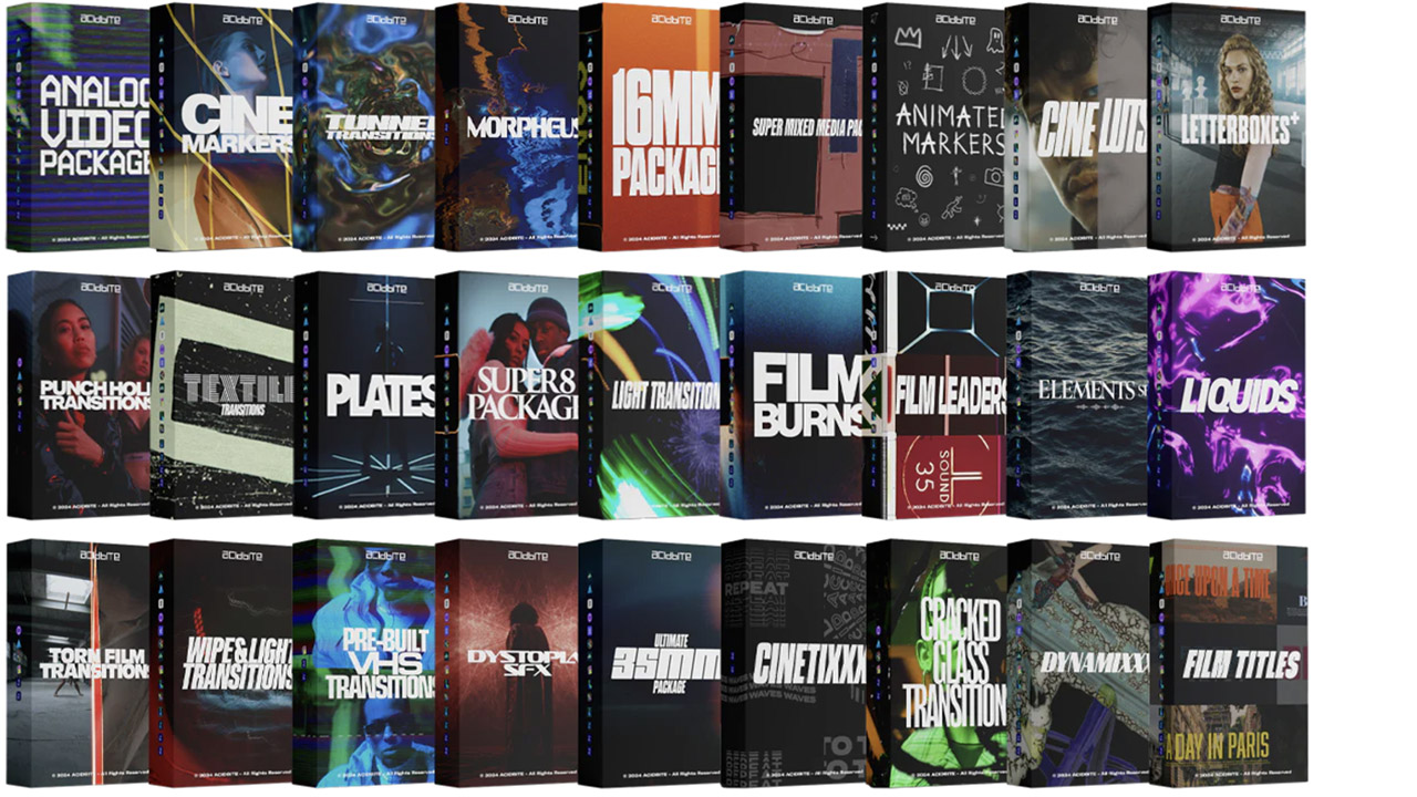
Acidbite ➔
50% off everything
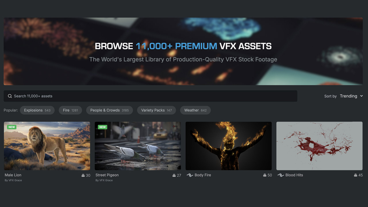
ActionVFX ➔
30% off all plans and credit packs - starts 11/26
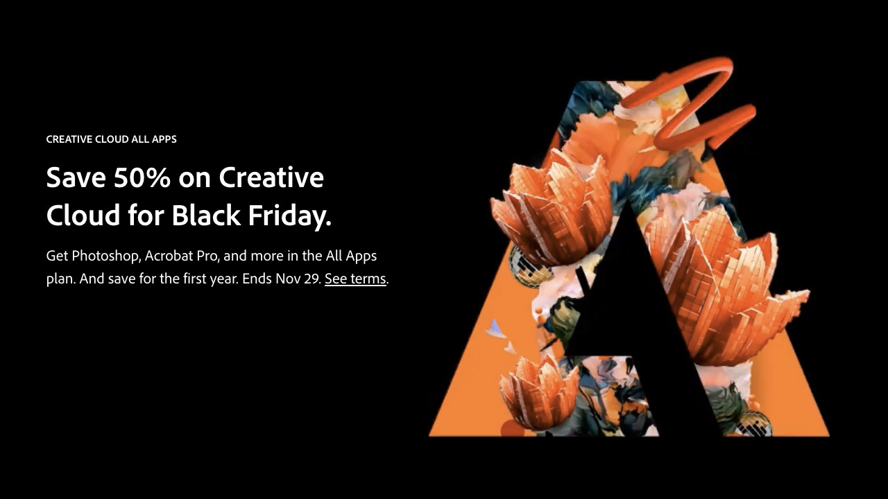
Adobe ➔
50% off all apps and plans through 11/29
aescripts ➔
25% off everything through 12/6
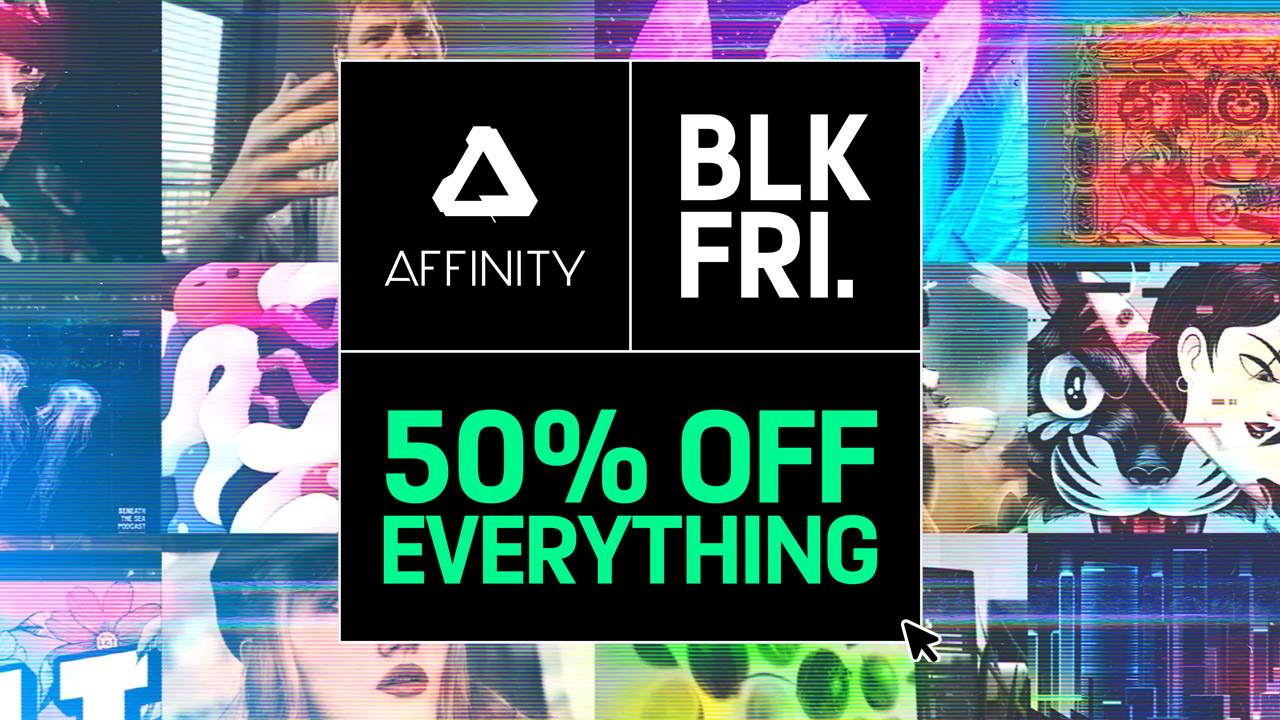
Affinity ➔
50% off all products
Battleaxe ➔
30% off from 11/29-12/7
Boom Library ➔
30% off Boom One, their 48,000+ file audio library
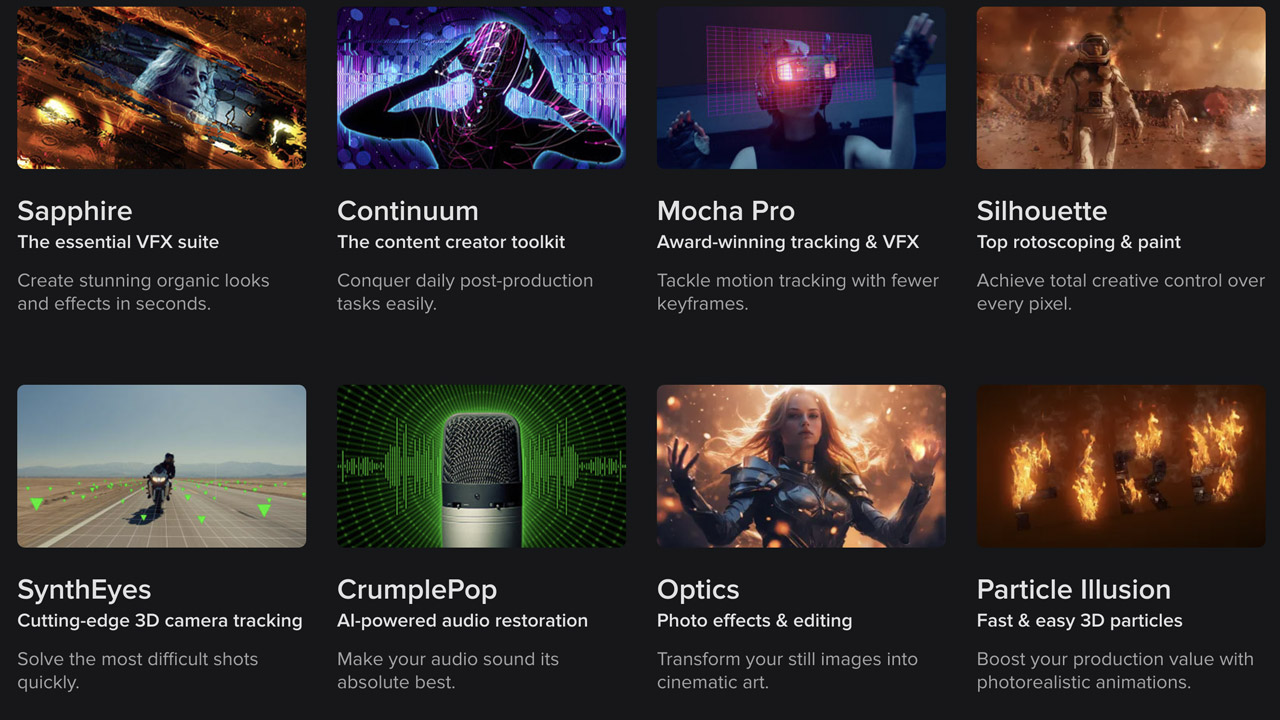
BorisFX ➔
25% off everything, 11/25-12/1
Cavalry ➔
33% off pro subscriptions (11/29 - 12/4)
FXFactory ➔
25% off with code BLACKFRIDAY until 12/3
Goodboyninja ➔
20% off everything
Happy Editing ➔
50% off with code BLACKFRIDAY
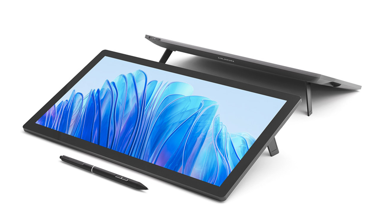
Huion ➔
Up to 50% off affordable, high-quality pen display tablets
Insydium ➔
50% off through 12/4
JangaFX ➔
30% off an indie annual license
Kitbash 3D ➔
$200 off Cargo Pro, their entire library
Knights of the Editing Table ➔
Up to 20% off Premiere Pro Extensions
Maxon ➔
25% off Maxon One, ZBrush, & Redshift - Annual Subscriptions (11/29 - 12/8)
Mode Designs ➔
Deals on premium keyboards and accessories
Motion Array ➔
10% off the Everything plan
Motion Hatch ➔
Perfect Your Pricing Toolkit - 50% off (11/29 - 12/2)
MotionVFX ➔
30% off Design/CineStudio, and PPro Resolve packs with code: BW30
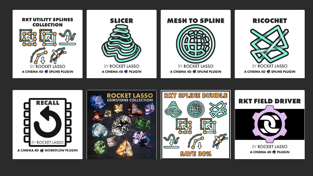
Rocket Lasso ➔
50% off all plug-ins (11/29 - 12/2)
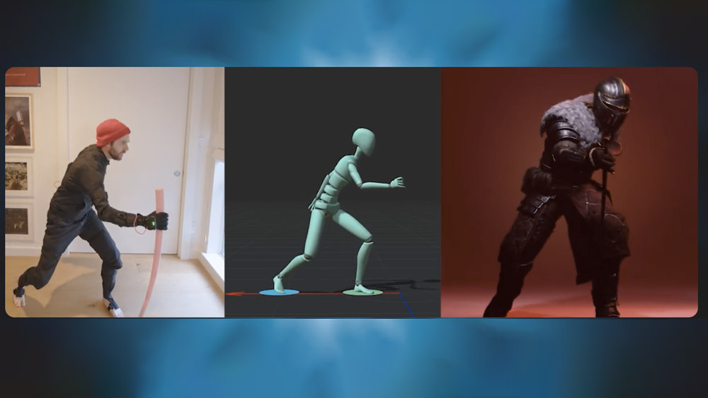
Rokoko ➔
45% off the indie creator bundle with code: RKK_SchoolOfMotion (revenue must be under $100K a year)
Shapefest ➔
80% off a Shapefest Pro annual subscription for life (11/29 - 12/2)
The Pixel Lab ➔
30% off everything
Toolfarm ➔
Various plugins and tools on sale

True Grit Texture ➔
50-70% off (starts Wednesday, runs for about a week)
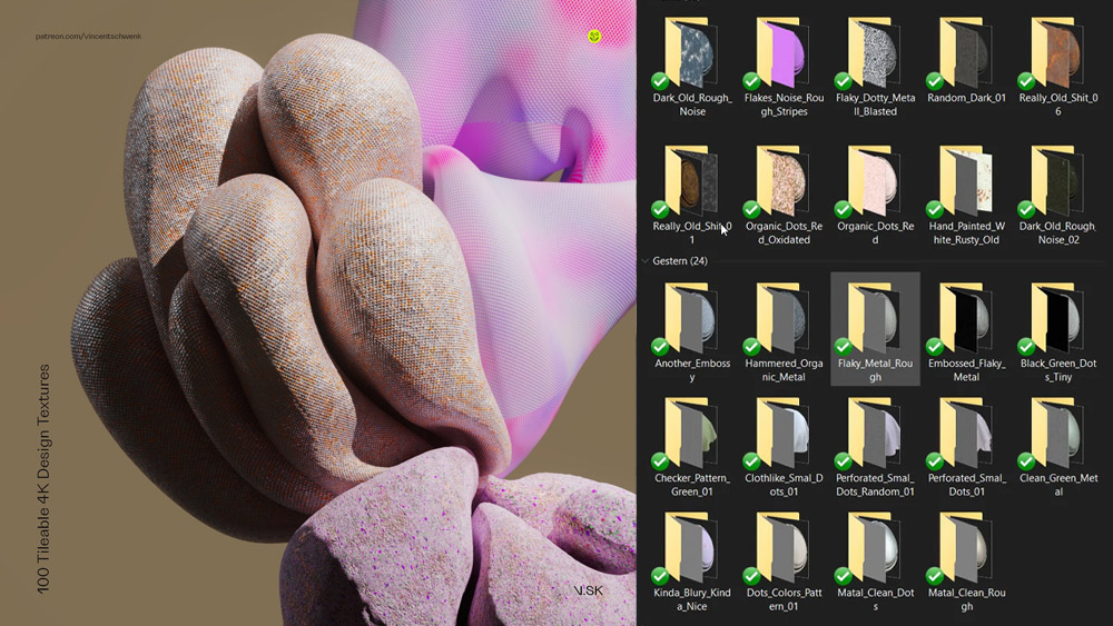
Vincent Schwenk ➔
50% discount with code RENDERSALE
Wacom ➔
Up to $120 off new tablets + deals on refurbished items
