Here's how to work with 3D assets in After Effects.
If you want to be at the top of your MoGraph game you're going to need to know how to work with 3D renders in After Effects. Cineware is great for this some of the time, but it can't do everything for you just yet. You're still going to need to know how to handle 3D renders the old-school way. In this lesson Joey is going to break down all the need-to-know info about using 3D renders in After Effects, like working with Multi-Layer EXR files, using utility passes like Object Buffers and Motion Vector Passes, getting After Effects 3D layers to sync PERFECTLY with your 3D renders, and adding Motion Bur with the ReelSmart Motion Blur Pro Vectors effect.
{{lead-magnet}}
-----------------------------------------------------------------------------------------------------------------------------------
Tutorial Full Transcript Below 👇:
Music (00:00):[intro music]
Joey Korenman (00:17): Joey here at School of Motion and welcome to day 29 of 30 Days of After Effects. Today's video is going to be about compositing animation from after effects with 3d animation, from cinema 40. This is a very common thing you have to do as a motion graphics artists. And we're going to talk about how to really lock those two programs together and get your 2d animation from after effects to sync up 3d animation from cinema 4d, we're going to use pre-rendered elements, but we're also going to use CINAware to pull in information. I'm going to show you a lot of compositing tricks. It's going to be awesome. Don't forget to sign up for a free student account so you can grab the project files from this lesson, as well as from any other lesson on school emotion. Now let's hop into after effects and get started.
Joey Korenman (01:00): So in this video, we are going to cover how to sync up your after effects animation with 3d renders using cinema 4d. And we're going to sort of go over a lot of other compositing things, including using multi-layered EXR files and a lot of really geeky cool stuff. So let's talk about, first of all, what are, what are starting elements are here? So I'm gonna hop into cinema 4d and show you my project. Now I'm not going to get too deep into this, cause this is not a cinema 4d tutorial. I'm using cinema 4d, AR 15. And if you have cinema 4d light, and that's the only version that you have, the free one that comes with after effects, that's okay. You can do this entire tutorial, the exact same way. I'm not using any special features. Really all that's going on is you've got an iPhone model and it spins around and kind of lands in that's it all right.
Joey Korenman (01:52): And, um, what I want to be able to do is composite, whatever I want onto that screen in after effects. And so let me, let me just do a quick render here and show you what this looks like. Um, you know, I've lit this in a specific way, uh, actually just using, um, one of the presets that comes with cinema 4d called the array light. And then I used a couple of, um, of just planes with a white texture on it. And I used that, so that it actually gives me a nice reflection on the phone. And I also rendered with global illumination, which is why it's taking forever to render for you guys. Uh, but here it goes. So this nice diagonal highlight that's going across the phone that you sort of see on a lot of cell phone commercials, that is actually just a reflection.
Joey Korenman (02:44): Um, and I want to make sure that I'm able to keep that when I, um, you know, when I composite something in the screen, so I'm gonna show you how to do that. So the first thing you need to do is you need to make sure that you prepare this cinema four D file a certain way. Okay. And what I mean is, um, you need to make sure that if you want to stick something on this screen, you need to have a reference object in the scene that you can then import into after effects. So if I open up this phone, now this is the Knoll. That's holding all the pieces of the phone and here's the front of the phone. And here's the screen of the phone. And even the screen has multiple pieces is a pretty detailed model. Um, and this cap one object here.
Joey Korenman (03:24): If I, uh, here, let me, let me go forward here and jump into my isometric views here. You can see that that object has its anchor point, right in right smack dab in the center of the phone and right on the surface of the phone. So if I was somehow able to get a Knoll that mimicked exactly what that screen is doing and get that into after effects, then all I'd have to do is parent my animation to that novel. And so that's exactly how you can composite stuff in after effects in cinema 40. The only thing you need to make sure is that on your object that you want to bring into cinema 4d, you need to have this tag, okay. Now I'm not going to go too deep into tags, but you basically right. Click your object or control click. You go to cinema 4d tags, and you put an external compositing tag on it.
Joey Korenman (04:18):
Then when you save your cinema 4d project and you import it into after effects, after effects will ignore every object in the scene except your camera, which it brings in automatically any lights you have and any object that has this tag on it, it will bring in any animation that's on that object position, scale rotation. So now we're good to go. We're all set up. Okay. So let's hop into after effects and I have already rendered out, uh, my, my 3d scene here. Um, you know, you can just import your cinema 4d project and you can have after effects render it. But in most cases that's a terrible idea because it is going to render much slower inside of after effects. And every time you change something you're going to have to, rerender the 3d, which takes forever. So here's what you want to do.
Joey Korenman (05:10):
Uh, you want to render, you know, render an image sequence right out of cinema 40. And specifically what I do a lot of times is I render a specific file format called open EXR, and it's a 32 bit file format, which means it has a ton of color information in there. It's very good for color correction. The other thing it can do is it can hold multiple layers. Um, you know, there's something, there's this technique in 3d rendering called multipass rendering or where you can render out multiple layers of your image. Okay. And so one of the layers I have is an ambient occlusion pass. Um, and I'll show you what all these layers look like inside of after effects. I also have a motion vector pass. This is going to allow me to create motion blur without actually having to render the motion blur inside of cinema 4d.
Joey Korenman (05:59):
And I have an object buffer, which is literally just a mat. Uh, so actually, you know what, let me show you what this looks like. I'm going to turn off aim and occlusion and global lumination and I'm also going to turn off, um, saving so that I don't actually overwrite any of the files I've already saved. So if I just do a quick render here of the current frame, all right, here's what you're going to get. Okay. At a cinema 40, you're going to get your main render, but you're also going to get these layers. Okay. So you're going to get an ambient occlusion pass, which isn't really showing up here because I turned ambient occlusion offs. Let me turn it back on temporarily. So you can see what it does. In addition to ambient occlusion, you're going to get a motion vector pass, which is going to look really, really strange.
Joey Korenman (06:46):
Uh, and then you're also going to get this object buffer. Okay. And you can see with ambient occlusion on the render takes much, much longer, but what it gives you is it gives you these nice dark shadows, wherever objects are close together. It basically creates, um, sort of fake shadowing, wherever objects are just, you know, in close proximity. And it it's very, it just gives things a more realistic look. And so I had this pass render out separately so I could composite it and control it. Here's the motion vector pass. And it looks strange. And basically what it's, what it's doing is it's, uh, it's telling whatever compositing program you're using, how fast each pixel is moving. And it does that by, uh, basically alternating between a red amount in a green amount. And you know, one of those colors, and I'm not sure which one, probably red corresponds to horizontal movement in green horse corresponds to vertical or vice versa.
Joey Korenman (07:40):
And so you can get motion blur by using that. Uh, I've got an alpha channel and then I have an object buffer. The object buffer is the map for just my screen. This is going to be really useful if I want to make sure an image only, only ends up on the screen and the way you get an object buffer, if you don't know, is that same object that has my external compositing tag also has a composite ING tag. They're both in the cinema 4d tags menu. Here's compositing, here's external compositing. And when you add the compositing tag, you can go to the object buffer tab and enable one of these right. Enable buffer one. And then in your render settings, you go to multipass you add all the, you add any passes you want here, and you add an object buffer and make sure that the group ID is set to one.
Joey Korenman (08:28):
And then, you know, this is, this is turning into more of a cinema 40 tutorial than I had hoped. So, um, make sure you have your object buffer set up and all that good stuff. And then the key is I make sure that I have my multipass image set to multi-layer files. So here's what happens. You end up with an EXR sequence. Okay. So let me first, let me reimport this, um, cause I want to show you some little gotchas that can happen here. So I'm gonna make a new folder dump all this stuff in there and then I'll reimport it. Okay. So we're going to navigate to where my renders are. All right. Here it is. All right. So here's my EXR file. So the first thing that happens when you import an image sequence into after effects is it tries to guess a few things.
Joey Korenman (09:18):
It tries to guess the frame rate and it guessed 30. And actually I animated at 24. So I'm going to hit command option G, which brings up the interpret footage dialogue. You can also just control, click and say, interpret footage main and tell after effects that this is actually 24 frames a second. Okay. The other thing you need to make sure you have correct is the alpha channel and you can either have a straight or a pre multiplied alpha channel. That is something that you set inside of cinema 4d right here, alpha channel. And if you want a straight, alpha channel, you can check straight alpha. Okay. Now I didn't check it, which means it's pre multiplied. And if you're don't know what that means, there's actually a tutorial idea. It's a nuke tutorial, but the information still applies to after effects. And I explained the difference between a straight and a pre multiplied alpha channel.
Joey Korenman (10:09):
And I'll link to that in the notes for this tutorial. So now I've got it interpreted correctly, and now I'm going to just drag it into a comp. Okay. And let's just play it. Let's see what we got. Fantastic. All right. So we've got this phone and it's got this nice reflection on it and it's great. Now there's no motion blur on it. And right now the ambient occlusion pass is not being applied to it. Um, and obviously there's no image on it. Okay. So first things first, uh, let me just copy my background right out of this comp and stick it inside of this one and set this back to, I think I had it as kind of like a dark off black kind of cool color. Um, and just in case you guys are curious, this, this background could not be simpler. It's just a bunch of solids sort of layered together with a couple of masks.
Joey Korenman (11:01):
And then I added some, some grain to the whole thing, so I didn't get banding. So there's the background. All right. And so now I've got my phone and, you know, looking at it, uh, you know, there's kind of, it's kind of like a really hard dark edge there that I don't really love. So first thing I'm gonna do is just color, correct a little bit. I'm just going to grab levels. And this is very important. The, this EXR sequence is a 32 bit image sequence. Meaning there is a ton of information in this, in the same sequence. And by default in after effects, you're working in eight bit color mode. So if you look right here, you can see, it says eight BPC. That means you're working in eight bit color and you want to work in 32 bit color if you're using 32 bit image sequences.
Joey Korenman (11:46):
Okay. So the way you do that is you just hold option and you just click this and it'll change to 16 and then 32. And one thing you need to make sure you're aware of is that, you know, look at this levels of fact, look at the numbers it's showing me in eight bit. It goes from zero to 2 55 in 16 bit. It goes from zero to, you know, 32,000 something. And then in 32 bit, it goes from zero to one. And what's really crazy is you can actually in 32 bit mode go past one and past zero. So these are all kind of compositing things that kind of beyond the scope of this tutorial. Um, but working in 32 bit mode, the biggest advantage is you just get a ton of color correction capability. So I'm going to push the whites a little bit.
Joey Korenman (12:28):
And what I, what I really want to do is bring the black level, um, up a little bit. It's like, it feels a little harsh, um, you know, especially sort of in here, like these edges just feel a little harsh. So I'm just going to bring the black level up a little bit and then to compensate for the loss in contrast, I can, I can push this, um, black input down a little bit and maybe play with the gamut a little bit. Okay. So I've just done like a basic color correction to get a little more contrast out of the phone while bringing up this black level. So it's not so dark against, uh, against the white background. All right, next thing I want to do is I want to get that ambient occlusion pass on the phone, but where is it? Right? I rendered out multiple passes, but where are they?
Joey Korenman (13:14):
So they're actually all inside of this image sequence. There are multiple layers to this. Now here's how you see them. I'm going to duplicate this layer and I'm going to rename this one a oh, for Amy and inclusion. I'm going to reset the levels on it. And I'm going to let me solo it for a minute. So we're just looking at this. Now, if you have any XR sequence with multiple channels, you can go to a fact go to the, um, 3d channel group and grab the extract door and you'll see it says E X R. So it gives you a hint. So you do that. And then you click somewhere in this area. It says, click for dialogue. Okay. Now, any layers you have, you can select them. And here CC, I have my AB inclusion layer, motion vector, and my object one buffer right there.
Joey Korenman (13:59):
So I'll grab my ambient occlusion and hit. Okay. And now this layer changes to the ambient occlusion channel and you can see that it looks very flat, um, except there's these nice shadows where stuff is close together. So I'm going to set this to multiply. All right. So I'm now multiplying the ambient occlusion layer over this layer. And so I'm seeing now those shadows, if I turn it off and on, and I do want to, um, I do want to adjust the levels on this. So I'm gonna, I'm gonna push the white output back a little bit. Um, but then I'm going to crush the blacks a little bit, and I'm just trying to find like a nice, happy medium. And really, if you look right here, look in this part of the phone, as I adjust the gamma, you see how you see more and less of that.
Joey Korenman (14:50):
I don't want it to be too heavy because then you get all this weird artifacting there. Um, so I'm going to just probably just leave it right around there. All right. So the levels didn't really do too much. I just brought out a little bit more of that ambient occlusion pass and that's great. Okay. And that's why I rendered it separately. So I had that control. Very nice. All right. So the next thing we're going to need to pull out is we're going to need to pull out a motion vector pass. So let me duplicate this layer again, and I'm going to call this M VEC door and I'll delete the levels. And now just clicking here again, and I'm going to say, now I want the motion vector pass. All right. And so I don't want that in multiply mode. I want that normal mode here it is.
Joey Korenman (15:30):
Okay. So now we have a motion vector pass, and you can see that the color changes depending on how fast it's moving and in what direction it's pixels moving. All right. And I'll show you how to use that. I'm gonna turn that off, throw that down at the bottom. And then there's one more layer, which is the object buffer one. So let me set that to normal, delete the levels, click on this and grab object buffer one. Cool. All right. And so now I can see I've got just a black and white image, white where my mat is in black, where everything else is. Okay. So this will be a nice Luma mat that I can use. Now. You don't have to render everything as a multi-layered image sequence. You can render everything in separate passes. If you want to. The advantage to this is if you come up, you know, if you do a whole bunch of compositing here, and then you render out a new version of this, you only have to replace one thing in your after effects comp and the whole comp will be rebuilt.
Joey Korenman (16:29):
You can have, you know, 25 passes inside of this thing and be doing a lot of really complex compositing. And then if you render out a new version, you only have to render out one set of files. You don't have to render out 25 and then go through after effects, replacing them. So it's a, it's a lot nicer way of working. Um, and if you're not using the latest version of after effects, by the way, CC 2014, this extractor effect, it used to be a lot slower. It works much, much faster in this latest version, um, which is fantastic, like before it was almost unusable and now it's really, really usable. Um, so I would definitely recommend upgrading if you have it. So now let's talk about how we actually get, you know, something on this screen. So first thing we need to do is import our cinema 40 project.
Joey Korenman (17:20):
All right. So let's import here it is iPhone [inaudible] and I am just going to pull this down here into my sequence, and I'm going to turn off everything for a minute. Okay. So you can see by default, it's just rendering the software version. And if I turn on my phone, render it, it should match up pixel perfectly to the CINAware preview. Okay. And you can see that it does, it works out. It's perfectly rendered. It's perfectly in sync. Okay, wonderful. So what I can do now is I can turn off my CINAware layer and just hit the extract button. And what that's going to do is it's going to bring from this cinema 40 file, any lights I have. So there's a light. All right. And I'm gonna delete that because I don't want to use lights inside after effects. Here's my camera, which matches my cinema 4d camera.
Joey Korenman (18:13):
And most importantly here is a no, and that Knoll is named Cappo one, because remember I put the external compositing tag on the capital one object. And if you watch that, no, it mimics what the screen's doing. Pretty cool. Okay. Uh, or so it would seem, there's actually a little twist that you're going to see here. So, um, what I figured I would just do is just take my, uh, school motion intro and put it on the phone. All right. So let's um, so the phone starts out horizontal like this. So let me drag the animation in there and I'm going to pre compose it and leave all the attributes in there. And I'm just going to call this a screen image. Okay. And, and by setting up a pre-camp ahead of time, what this is going to allow me to do is once this is tracked to the phone and composite it, all I have to do is go into this pre-com and replace whatever this is.
Joey Korenman (19:06):
And now I have something new on the phone. So it's like a nice little template. So what I'm going to do is I'm going to make it a 3d layer. Okay. And then I'm going to parent it to cap one, and I'm going to zero out the position, zero out the rotation, and then scale it down. Okay. Now we need to adjust a couple things. First thing is this Knoll inside of cinema. 4d was perfectly right in the middle of the screen. However, now you can see that the anchor point of the Knoll is not in the right spot, it's in the corner. All right. So what I usually do is you just need to know that the center of a novel in after effects is actually not zero, zero it's 50 50. All right. Next thing I need to do is rotate the screen image and I can rotate it 90 degrees, and then I can scale it up.
Joey Korenman (20:03):
Now it just so happens that, uh, you know, this iPhone, this is an iPhone five. So the, uh, the screen is 16 by nine. So using a 1920 by 10 80 comp, like I am means it's going to fit perfectly on the phone, but just to be sure, the next thing I want to do is make it slightly bigger than the screen of the phone. And then I'm going to bring this object one buffer up here, and I'm going to set my screen image to use that as a Luma matte. Okay. And so now it's going to map that out for me. All right. And you can see that it doesn't quite go to the edge of the frame for some reason. And I think that's just the way the model was done in cinema 40. Um, it doesn't go all the way to the edge so we can, uh, I can show you some ways to adjust that.
Joey Korenman (20:51):
Okay. But first I want you to see the big problem here. All right. So here's the big problem. If I just sort of do a random preview of this, what you're going to see is that for the most part, it locks up, but there's like some weird frames where stuff doesn't sync up. Right? Like what's going on there. Right. And then look, look here, what is this? Right? So this, the screen of the phone, it's like almost perfectly locked on there, but not really perfectly locked on there. And why is that? You know? And, uh, I'll tell you why. So when, and actually it's easier to see in here. If I look at, if I hit you on this cap, one note you can see there are key frames on every single frame. Okay. So what happens when you import this, um, the cinema 40 project and after effects is any animation that's on here and I'll show you the animation in cinema 4d, you can see there's not a million key frames, right?
Joey Korenman (21:49):
There's, there's like a dozen. Um, and you can see that, you know, my Z position for example, of the phone, or is these, this nice fluid curve. And in after facts, if I go to my position and look at the animation curves, you can see that the Z is mimicking, what's going on in cinema 4d, but there's some extra junk happening here. What's this Y position stuff. And if you look at the rotation, you know, it, it's close to what's happening in cinema 4d, but, but it's like, there's extra rotation happening here. And, and I'm, I'm really not sure why. So here's the solution for this? What I do is I save a copy of my cinema 4d project. Okay. So just, you know, shift, command, save. And now we wait because I've got an external hard drive attached, but, but what's happening is after effects is baking the key frames in a different way.
Joey Korenman (22:40):
So you can see here, I've already baked at once. So this is going to be bake are two. All right. And what I'm going to do is go to my cinema 40 timeline, right. And make sure you're in key frame mode. If you're not move your mouse over the timeline hit space bar, and then I'm going to select my phone and I'm going to go functions, bake objects. Okay. And what you want to do is make sure you have position and rotation checked. If you, if you're doing this with something where you've animated the scale, you also want the scale checked, uh, PLA and parameter. You don't need to worry about. So it's not important that they're checked and I want to create a copy. Okay. And I'll, I'll tell you why. So when you hit, okay. It bakes the object and what it, what it really does is it puts a key frame on every single frame and it just goes through and it, and it just sort of, it literally bakes the animation on every single frame by letting cinema 4d do it.
Joey Korenman (23:39):
It's going to be much more accurate when we pull it into after effects. And the reason I haven't make a copy is just to, by scrubbing through my animation, that the copy doesn't do something differently, because if it does, it's still not going to line up in after effects, but it lines up perfectly. So now I can delete phone one. Now I don't need that. And I just need the copy and I'll save this project. And now I'll go back to after effects and I'm going to import my baked project now. So now what I'm gonna do is go to the first frame here, and I'm going to delete cap one and the camera. And I sent him a 40 project. And now I'm going to bring in the baked version, turn it off and hit extract. Okay. And now I can actually get rid of the project from there, get rid of the lights.
Joey Korenman (24:27):
And now if I parent my screen image to this cap, one, it should sync up perfectly. And you can see now you don't get any weird key frames or anything. Cool. Piece of cake. All right. So now you see how the, uh, the mat for my phone, if I actually turn it on, you can see that it doesn't actually let me turn it on and set it to screen. You can see that it doesn't quite reach the edges of the, uh, of the screen. And that's probably just, you know, whoever modeled this, made that screen too small and wasn't very precise or something who knows. Uh, and so, you know, I tried a bunch of things to fix it. And what seemed to work best was just blurring the edges just a little bit, just to kind of blend it in with the black screen of the phone.
Joey Korenman (25:23):
Um, and so you just get like a little bit of a soft matte that's happening with the image. Okay. So now we've got the after effects layer completely, perfectly stuck to the phone. So that's fantastic. Um, and we can turn our background back on and, and kind of see what it's looking like. Okay. So now we've got that on there. So now what I also want to do is I want to get the reflection to happen. See if I turn this off, you could see this nice reflection there. Um, and I'd like to keep that now I could have rendered a reflection pass out of cinema 4d. That's one way you can do it, um, is actually even easier way because I have this mat for the screen. Part of the phone, what I can do is duplicate that duplicate the actual foam render, right.
Joey Korenman (26:13):
And then tell the phone render to use the object buffer as it's Ooma mat. Cool. And, uh, this has that blur effect on it. So let me, let me delete that for a minute and you can see all that's done and actually let me color code these. So maybe he's a little bit easier to tell what's what for everybody. All right. So these two purple layers, this is now just the screen of the phone. Composited back on top of this. Now, why would you do that? Well, you do that because now what you can do is you can color, correct. This, let me reset the, the levels and I'm going to color correct this. So it's very dark, but you have this nice highlight on there and I'm going to set the mode to screen. Okay. And I turn this off and on. You can see that now I've composited that reflection back on top and not only the reflection, here's, here's something else that you get to as the screen turns, right?
Joey Korenman (27:08):
When it's facing the camera, it's going to be a little bit more blown out when it's turned away from the camera. You can see that it gets a little darker because of the, for Nella fact. Okay. And also because when it's facing down, there's nothing down there. But once facing up, there's kind of a big, giant light source up there. So you can get that shading back for free by doing this trick, you re composite the 3d render on top of itself. All right. And so now you'll see that you get all this free shading, you get your reflection back in there, and then you can just play with the opacity of it to actually decide how much of that effect you want to keep and how much you want to get rid of. So let's let this Ram preview for a minute and we'll talk about some of the other things we need to do.
Joey Korenman (27:54):
So, one thing I want to do is adjust the timing of this whole thing. So we actually get to watch a little bit of the animation on the screen before the phone, uh, actually moves back and starts rotating. The other thing I want to do is add motion blur to this because the phone is moving so much that, you know, it really should be blurry when it's moving. Um, and so I'm going to show you how to do that too. And then I'm going to show you the little sort of finishing touch that, that I applied, um, you know, just sort of copying the render and having these things pop out at the end. All right. So first let's talk about the timing. So what I want to happen is I want, you know, I, I deliberately set up, so the phone is all the way up against the camera, so we can just sort of play whatever content is on it and then have it swing back.
Joey Korenman (28:44):
Okay. So to start out, let me go into my screen image and let me actually, you know, let's move this back. So the first frame has something on it and then let's go, uh, let's go back to our main composite here. Okay. Now what I need to do is I need to delay the motion of the phone and I, so I need to delay not just this novel, which has key frames on it. I also need to delay every single render, right? Every single piece of this needs to not start moving until I want it to, so let's say I want it to hang for one second. So let's move all this stuff forward. Okay. So now I need to, uh, so the camera's not moving, right, but this, this cap, uh, this, this Knoll here, this is moving. So this actually needs to be moved up to one second, too.
Joey Korenman (29:37):
All right. Now, right now, I can't see my screen because that screen has a matte object that it's using. And the problem is it's a, that mat object, doesn't start for a second. So what I can do is enable time remapping and I can pull this layer backwards. Okay. And so now if I, if I just turn this on and solo it, I'm basically holding on the first frame until one second and then everything starts moving. So this is going to, let me see, let me turn that back off it. Let me see the animation. And then at one second, everything starts happening again. Cool. Now what I want to do is once this thing spins around and starts to come back at us right there, when it spins around, I want it to be on the second shot of the sequence. So I'm going to now hop into my screen image and I'm going to split the clip.
Joey Korenman (30:34):
I'm going to go back a couple of frames and hit shift command D splits it. Okay. And that's just the hot key for split layer, which is right here in the edit menu. And then I'm going to, I'm just going to slip the timing of this. So now we're on the second shot. So now we can hop back here and you can see that flies back. And then as it flips towards us, now we're seeing the second shot. And then when it flips back, the final time, what I want it to do is to be on the ending where we see the school of motion logo. So when we see the screen here, I want it to be the school motion logo. So the other thing I need to do is I need to make this comp longer. So I'm going to make it six seconds.
Joey Korenman (31:14):
So we can then hang on the logo. All right. And you can see that the layers are not, you know, they're not long enough. So what I can do is just extend them all and anything that is a render, right. I can enable time remapping on. So command option, T's the hockey. And I can just extend them all the way to the end. Okay. So that now, and you've got to make sure that I do the matte layer as well. Cool. Okay. So now once the animation stops, it's just going to hold on that last frame, as long as I want it to. So let's go to the part of the animation, where I want to see the school emotion logo. So right in there. So now I'm going to jump back into my screen image comp, I'm going to split the layer one more time and I'm going to slip it so that now we're seeing this part.
Joey Korenman (32:05):
Now here's the other wrinkle at this point, the phone is vertical. All right. So if I want to be able to read this, normally I need to rotate this negative 90 degrees. Cool. But now I've got nothing at the top and the bottom of the screen, which is no good. So I just did my old trick of, uh, using the CC reptile effect. I did this in the kinetic type series two, and I set it to unfold and then expand the down and the up. Now you can see these, uh, these black kind of vertical bands that are happening that obviously should be there. Um, and so probably at the top and bottom of the render, there might've been a one pixel black line because of a compound blur effect or something like that. So an easy fix is you just pre-com this layer. And you can just say, leave all attributes in here and hop into that.
Joey Korenman (33:02):
Pre-com and let's just scale this up by 1% and they hop back in, and now that one pixel BlackLine has gone. Um, cool. And let's look at the phone. I want to make sure that I'm not seeing the, these extra triangles here. So what I'm going to do is just scale this up a little bit more. There we go. Um, cool. So now, if we do a quick Ram preview and I'm gonna hit shift and the zero button on the number pad, so I render every other frame. So it goes a little faster if you guys didn't know that that is a huge time saver, render every other frame when you're Ram previewing. And, um, you can Ram preview twice as fast. So now at the end here, there we go. This phone spins around and we see the explosion and the logo resolve. Beautiful.
Joey Korenman (33:52):
Okay. So now let's talk about how to add motion blur to this. Um, now motion blur in 3d. I mean, there's many different ways to do it. Uh, and I'm going to show you one way that is by far the fastest way to do it. You know, one of the things about motion blur is that the way it's rendered after facts is sort of, you know, if there's 16 samples of motion blur, then between frames one and frame two, it's going to render 16 times and then blend those together to make motion blur, cinema 4d can do that. It can also render motion blur sort of more realistically using something called the physical renderer. But that takes a long time to render too, but rendering out a motion vector pass, like we did can let us do motion blur very quickly. And there are kind of some caveats to it.
Joey Korenman (34:38):
But, um, for the most part, it works pretty well. So here's what, here's what we need to do. First. We need to pre compose the entire comp of our phone. Okay. Whatever our phone looks like, right? Which at this point, it's from this layer all the way down to here. All right, it's our phone, our ambient occlusion, the image on the screen, the map for that image. And then we recomposited the screen back on top of itself to get the reflection and some of that glare. So let's pre comp all of that and call that phone PC pre comp. Okay. Um, now something disappeared. I, and I know why let's hit undo. So the, um, the screen is actually parented to this cap and it's relying on the camera to be seen correctly. So I actually need to pre-camp those as well. So pre-camp phone PC.
Joey Korenman (35:30):
There you go. So now you've got this one layer and that one layer has, uh, everything in it. And now we can use this motion vector layer that has just been waiting and biting its time down there. And here's how it works. Now. Unfortunately you need a third-party plugin to use motion, vector passes inside of after effects. And if you're doing a lot of 3d compositing is well worth the price to get this plugin. And the plugin is called revision, R S M B a sensor, real smart motion blur. And when you buy it, you want to buy the pro version. You don't just want the normal version. Okay. Now R S M B pro vectors. That's the effect you want to use because that looks for a vector pass. So you put the effect on the layer that you want motion blurred, and then you tell it which layer contains the motion vectors.
Joey Korenman (36:26):
So right now the motion vectors are in this layer. So I'm going to say motion vector in that layer now here. So you could see that I were getting motion blur now, right. And if we kind of scrubbed through it, and I apologize for the, uh, the render hit, we're going to take here. You can see that it works pretty well, but it's blurring edge is way too much, right? It's like, it sort of looks right, but doesn't really look right. And in here you're getting some weird stuff like it's not quite working, right? So here's the thing with motion vector passes. You need them to line up pretty darn perfectly pixel for pixel with your render in order to work correctly. And so if I turn on the motion, vector pass, you can see it. And we zoom in here. You'll see that it doesn't quite line up perfectly.
Joey Korenman (37:17):
And so what happens is the edges, some of the edges of the phone overlap with the motion vector pass and some don't. And so that's creating this inconsistency. So the, what you, the workaround is basically to shrink your motion, vector pass just a little bit. Now it's important to know that I, this motion vector pass already has an alpha channel because I use the extractor effect by default, it copied the alpha channel from my render onto this motion vector layer. If you render out separately in a separate pass, it's not going to do that for you. So you're going to have to use an alpha matte or something like that. But now that I've got this, what I can do is I can just put a simple choker on there. So I'm going to go to Matt, simple choker, and I'm just going to choke the mat by one pixel.
Joey Korenman (38:05):
And you can see that it got rid of all those weird fringy edge pixels. And here's the thing now, because I've got that effect on there. My real smart motion blur effect is not going to see the result of the simple choker until I pre compose this whole layer. So now I need to, pre-camp it call it M vector PCF. Pre-camp make sure that you have move all attributes into the new composition and hit, okay. Okay. Now I can transfer back off. And now the motion vector pass should work a heck of a lot better. You can see that now there's still motion blur up here with the phones moving quickly, but on the edges it's, it's not blurred unless it's supposed to be okay. So let's jump forward to a frame where there's a lot of motion. Here we go. Like this frame you can see now in motion, blur is working so much better.
Joey Korenman (38:56):
And, you know, if we go back and find, you know, so here, let me just to show you really like how important it is to do that step. I'm going to turn the simple choker off and let's go forward. Let's find, let's find like a pretty nasty motion blurred frame here. Um, motion blur. By the way, if you go into full Rez mode, you'll get a much better idea of what your motion blur is gonna look like. And look at these disgusting edges here. Look how lumpy and terrible they look. And then if we go back and turn that simple choker back on and hop back out, now there are much, much nicer and cleaner. All right. So, uh, don't ever forget that step is very important. Okay. So now we've got motion blur over the whole thing and actually a lot of motion blur.
Joey Korenman (39:39):
Um, and, and it's amazing how well that works. So, uh, let's do a Ram preview of that. And the last thing I want to do, um, you know, is, uh, actually now that I'm looking at this, see how dark that skin let's go back here, right there. See how dark that is. Oh my goodness. And I just noticed the reflection is not there until right there, so, okay. So let's fix this. Let's go back into our phone pre comp, the reason it's getting so dark. Okay. And this is really one of the things that's interesting about 32 bit compositing this, so this layer here, right? And let me turn off this effect. So you could actually see, this is the layer. Remember we recomposited the screen of the phone back on top of itself, and then we color corrected it and set it to screen mode.
Joey Korenman (40:30):
And, and normally when you, when you put screen mode on something, it, it really can't darken anything. It can only brighten it, right. Well, in 32 bit mode, screen mode can darken things. It's really interesting. And it's because you're black input. You can actually push values darker than black. And so anything that's darker than black is going to subtract from your pixels. And, and, you know, it's really kind of a technical explanation, but just know that in 32 bit mode, the Stratford transfer modes don't act the same way you think they do. So if I want to make sure that I don't ever darken the screen, I only brighten it with the screen mode. I need to make sure I clip my output black. So let me turn that on. Okay. And now let me re color correct this. All right. So now I will never have that problem.
Joey Korenman (41:22):
Now, here's the other thing I need to do. I need to, um, extend this layer back so that the glare actually exists at the beginning of my animation, but I don't really want to see it. So when I think I'm going to do is I'm going to go a few frames before the phone starts to move, and I'm just going to put, uh, an opacity key frame here, and then I'm a jump forward, like 10 frames, put another one, and I'm going to go to this original one and just set to zero. So as the phone starts moving, we'll see that reflection pop up. Right. That's what I want to happen like that. Okay. Much better. And now we don't get that crazy darkening of our image either because we, we turned on clip, output black on, okay. So now we come back here and we can do a quick grand preview.
Joey Korenman (42:10):
So the last step is going to be just to duplicate the phone at the end and, um, and have, you know, have the copies be a little smaller and, and really that's going to be an easy step. We're just going to duplicate this pre-camp and, and scooch the two copies over. Um, and I want to point out also that the animation of this phone, uh, you know, it's really just based on animation principles, you know, whenever you need to just show a phone and there's not like a motivation for what it's doing, it's just show something cool on the screen of this phone and move the phone and interesting way. It's hard to do that. If you, if you're just trying to find a good animation and you're just guessing until you get something you like, um, it's really helpful to understand animation principles. And so I just want to take this opportunity while we're watching a Ram preview happen to harp on that.
Joey Korenman (43:05):
Okay. So now we've got a, this is a pretty good place to, to check it. All right. We've got motion blur on the phone. The screen is composite on there. We've got the reflection composited back over it. Everything's looking great. And now when the phone settles right there, right. When that burst happens, here's what I want. I'm going to duplicate the phone. Let's just call this phone. Oh two and this copy. I want it to be a little bit smaller and I want it to, I'm also going to hit option left bracket. So that layer doesn't start until this frame and I'm gonna hit P separate the dimensions. And I'm going to do an exposition key frame and jump forward, like 10 frames and just scoot this thing over a little bit. Cool. And then I'm going to easy ease those. And I want, I want that to sort of jump out and then really ease into that last key frame like that.
Joey Korenman (44:02):
There we go. Cool. And then I just want the same thing to happen on the other side. So I'm gonna duplicate this and let's go to this frame here and just scoot this one back the opposite way until that's about even, that's great. A double check, my animation curves. There we go. Cool. And the last thing I did was I just put, I did a little bit of compositing to these two phones, just so they look like they were a little further back. Um, what I did was I put a levels effect on each one and, uh, I just sort of brought the contrast down. There's a white background. So if you actually brightened the phone, it'll sort of make it recede back into that white color. Right. Uh, and then I also darkened the white output, just so it wasn't so bright either, you know, almost like the spotlight's really on this phone.
Joey Korenman (44:59):
Um, and then I'll copy that levels to this phone here. And then the last thing I did was I blurred it. So it looked like it was a little bit out of focus. Um, and I want to, I'll take this opportunity to show you guys something cool. So, you know, you can use, I generally use a fast blur. That's sort of the most common blur that I use. Um, and just so you guys know the gosh in blur, this is like an older blur. Uh, this was like the original blur that came with aftereffects fast blur as the updated version of gosh and blue they're identical. The big difference is fast. Blur gives you this repeat edge pixels. So I just use fast blur, don't use gambler, but a fast blur does not look the same as something going out of focus. So you can also use the, um, the camera lens blur.
Joey Korenman (45:48):
And that looks a little bit, you could see it, it just resembles de-focused stuff a little bit more. And this plugins actually, or this effect has gotten pretty good, actually. Um, it used to be really slow. Now it's much, much faster. So this is a perfectly good one to use. The one I really like to use is from a company called fresh lift, and they have two effects that I use a lot depth of field, which uses a depth pass. And there's actually a tutorial on school emotion about this and out of focus, which is sort of just a de-focus effect that gives you some interesting options. For example, if you want, you can sort of have the highlights part, the highlighted parts of your layer glow, which sometimes happens when things go out of focus. I usually turn that off. Um, but it's a really fast and nice looking de-focus effect.
Joey Korenman (46:39):
All right. So I can just copy paste that to both. And there you go. And now you've got, uh, you've got your clones of the phone. Everything's tracked to the screen, perfectly motion blur. Things are color corrected and looking nice. Um, and there you go. So I, uh, I hope the takeaway, cause there's always a takeaway in these videos. That takeaway is that you, you know, if you understand how you can get information accurately out of cinema 4d and bring it into after effects, which by the way you can do with Maya and 3d studio and other programs, cinema 4d is just like so embedded with after effects. That it's just way easier. Um, but once you wrap your head around that, you can do such powerful things because to sync up what's going on with the screen, with the 3d move of the phone, that would be very difficult to do in cinema 4d, but an aftereffects it's really easy to time things out and adjust the way things look and adjust how much of the reflection shows up over the image and all that good stuff.
Joey Korenman (47:40):
So that's why this type of thing is always done in a composite thing program, right? You use 3d for its strengths and you use 2d for its strengths. Cool. So hope you guys learned a lot and thank you guys. I will see you next time on the last day, 30 days of after effects. Thank you so much for watching. I hope you learned a lot. The integration between cinema 4d and after effects is super powerful. Once you wrap your head around it as a motion graphics artist, it's really good to understand the link between those two programs. If you have any questions or thoughts about this lesson, let us know. And we'd love to hear from you if you use this technique on a project. So give us a shout on Twitter at school emotion and show us what you did. And if you learned something valuable from this video, please share it around. It really, really helps us spread the word about school emotion. And we truly, truly appreciate it. Don't forget, sign up for a free student account to access project files from this lesson, plus a whole bunch of other excellence. Thanks again. And I'll see you next time.
Music (48:41):
[outro music].
ENROLL NOW!
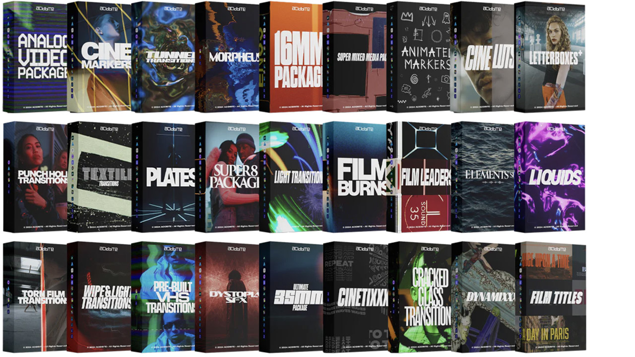
Acidbite ➔
50% off everything
ActionVFX ➔
30% off all plans and credit packs - starts 11/26

Adobe ➔
50% off all apps and plans through 11/29
aescripts ➔
25% off everything through 12/6
Affinity ➔
50% off all products

Battleaxe ➔
30% off from 11/29-12/7
Boom Library ➔
30% off Boom One, their 48,000+ file audio library
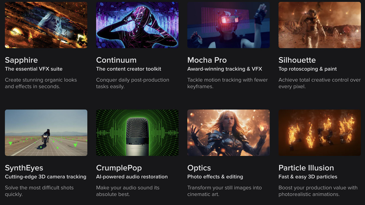
BorisFX ➔
25% off everything, 11/25-12/1
Cavalry ➔
33% off pro subscriptions (11/29 - 12/4)
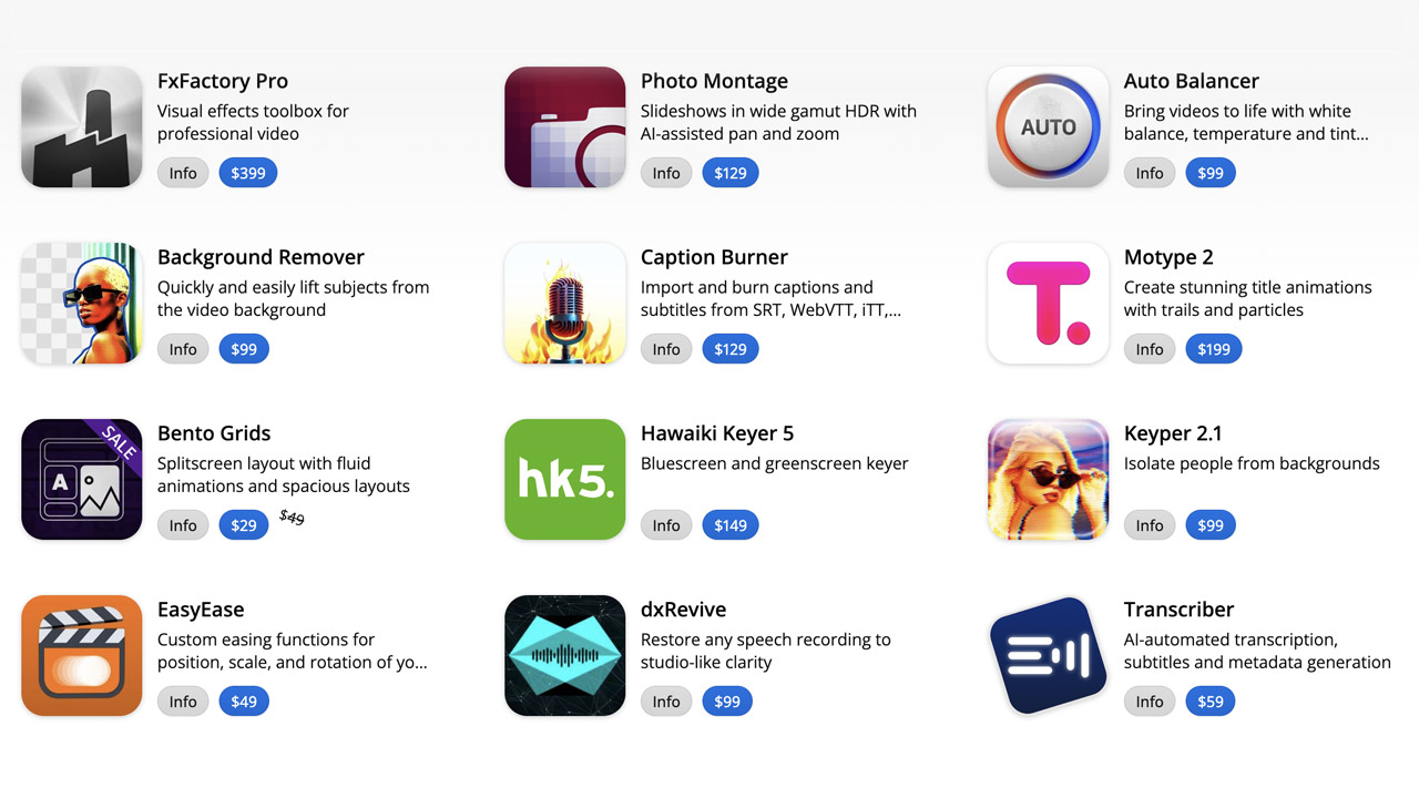
FXFactory ➔
25% off with code BLACKFRIDAY until 12/3
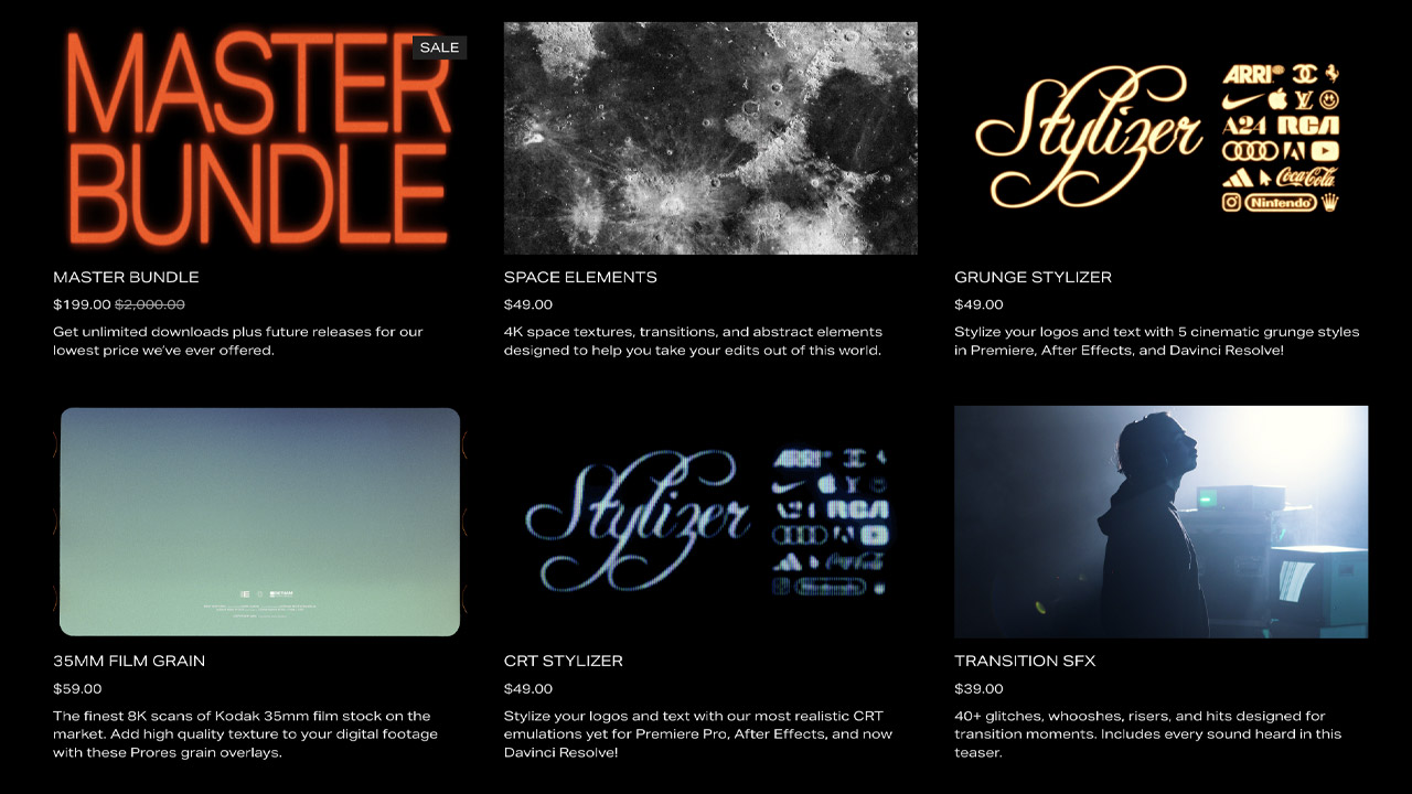
Goodboyninja ➔
20% off everything

Happy Editing ➔
50% off with code BLACKFRIDAY
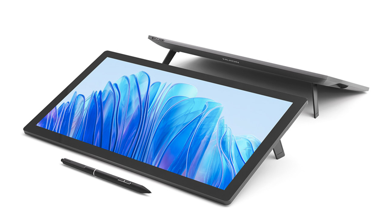
Huion ➔
Up to 50% off affordable, high-quality pen display tablets
Insydium ➔
50% off through 12/4
JangaFX ➔
30% off an indie annual license
Kitbash 3D ➔
$200 off Cargo Pro, their entire library
Knights of the Editing Table ➔
Up to 20% off Premiere Pro Extensions
Maxon ➔
25% off Maxon One, ZBrush, & Redshift - Annual Subscriptions (11/29 - 12/8)
Mode Designs ➔
Deals on premium keyboards and accessories
Motion Array ➔
10% off the Everything plan
Motion Hatch ➔
Perfect Your Pricing Toolkit - 50% off (11/29 - 12/2)

MotionVFX ➔
30% off Design/CineStudio, and PPro Resolve packs with code: BW30
Rocket Lasso ➔
50% off all plug-ins (11/29 - 12/2)
Rokoko ➔
45% off the indie creator bundle with code: RKK_SchoolOfMotion (revenue must be under $100K a year)
Shapefest ➔
80% off a Shapefest Pro annual subscription for life (11/29 - 12/2)

The Pixel Lab ➔
30% off everything
Toolfarm ➔
Various plugins and tools on sale

True Grit Texture ➔
50-70% off (starts Wednesday, runs for about a week)

Vincent Schwenk ➔
50% discount with code RENDERSALE
Wacom ➔
Up to $120 off new tablets + deals on refurbished items
