Great design makes your ideas stand out and have a bigger impact. We've got tips on using contrast and type to help get you started!
Whether you're creating a memo, a movie poster, or an animated film, your ideas live and die with your design. Guiding your audience with contrast and type allows you to make more effective compositions that will—as a benefit—look a lot cooler too.
In this tutorial, I’m going to show you how I use the design principle Contrast to make my type designs have more impact and communicate my ideas more effectively to an audience. Typography and design principles—such as Contrast—are topics we talk about in-depth in the Design Kickstart and Design Bootcamp courses here at School of Motion. If you like what you learn today, be sure to head over and see what we offer.
Also, you can download the project files I’m using in this video to follow along OR practice this after you’re done watching.
Today, we're going to cover:
- Contrast with size and scale
- Contrast with weight
- Contrast with spacing: tracking, leading, and kerning
- Contrast with value: brightness or darkness of an object or word
Grab the project files and follow along. Some of the fonts have been swapped, as we can't share the licenses for Druk (my font of choice today). Feel free to insert your own to practice.
{{lead-magnet}}
What is Contrast?
Contrast simply means that one element in your design is different from another. Contrast is a principle that helps organize your design and establishes hierarchy of important elements. Contrast also helps to show the viewer what’s important in your design and creates EMPHASIS…and emphasis gives your design meaning and impact.
Contrast also tells the viewer where to look first and can help add visual interest to your designs.
But, the most important reason we use contrast...is because we need to control the viewer’s eyes.
Contrast with Size and Scale
The size and scale of your type helps a viewer determine the hierarchy of importance across the image. Think of a movie poster. The title of the movie tends to be the largest part of the image. The tagline is generally the second largest, and then the stars of the movie.
If that same movie poster had everything in equal scale, you might not even know what the film was called.

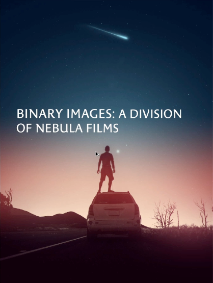
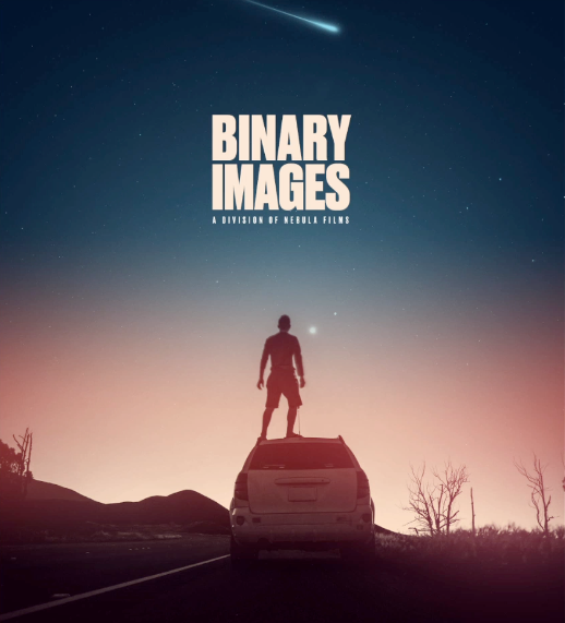
For this exercise, we're going to be working with an imaginary client on a project. Binary Images, a division of Nebulae Films, has a poster for us to design. Let's see what we can do by following the principles of Contrast.
SIZE
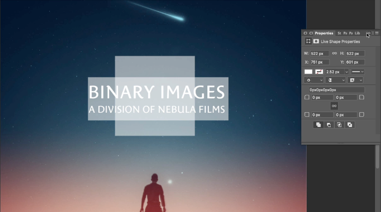
Design is all about how you react to the positive and negative space in the image. By increase the size of the type, it takes up more space and therefore has a larger impact on everything else around it. The end result is a feeling of important.
SCALE
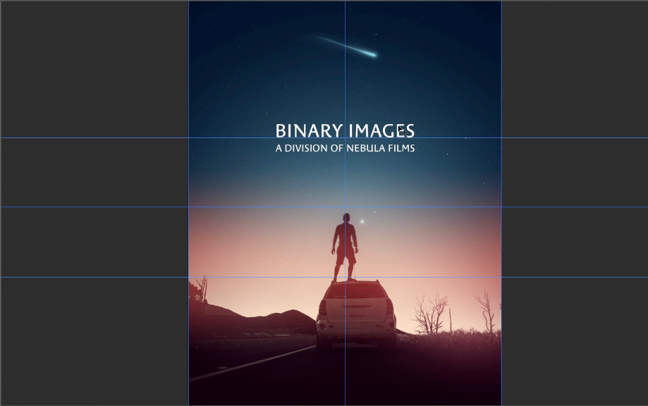
Scale refers to the size of the type in relation to everything else in the design. Is the type bigger than other type? Bigger than images within the type? All of these elements not only inform the viewer with important details of the composition, but they control eye movement across the design.
Since this image is symmetrical, I want the viewer's eye to remain centered and travel in a comfortable path down. I need them to read the type first, so it is larger and dominates more space. Then I trickle out information by leading the viewer down again and again, finally landing them on the image.
Contrast with Weight
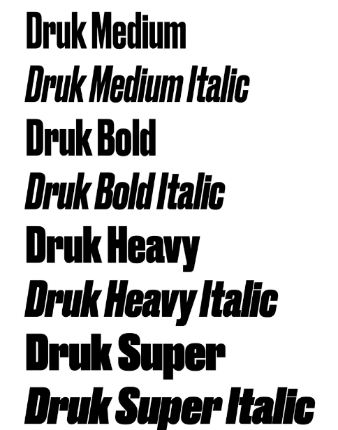
Swapping out the font, and affecting the type, adds weight and emphasis to your design. Bold words stands out and draw the eyes, while italicized words give off a feeling of emphasis and importance. Choosing how and where to employ these designs is a key aspect of Contrast.
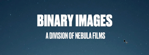
Using multiple weights will help you define which elements of your composition are more important for the viewer.
Contrast with Spacing
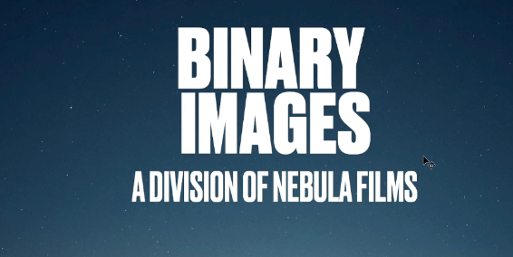
Spacing affects how the reader's eye dances across the image. If type is close together, the words are grouped in importance. If we leave too much space between words, the audience's eyes could get lost. Controlling your spacing not only makes your design more legible, but more visually interesting.
TRACKING
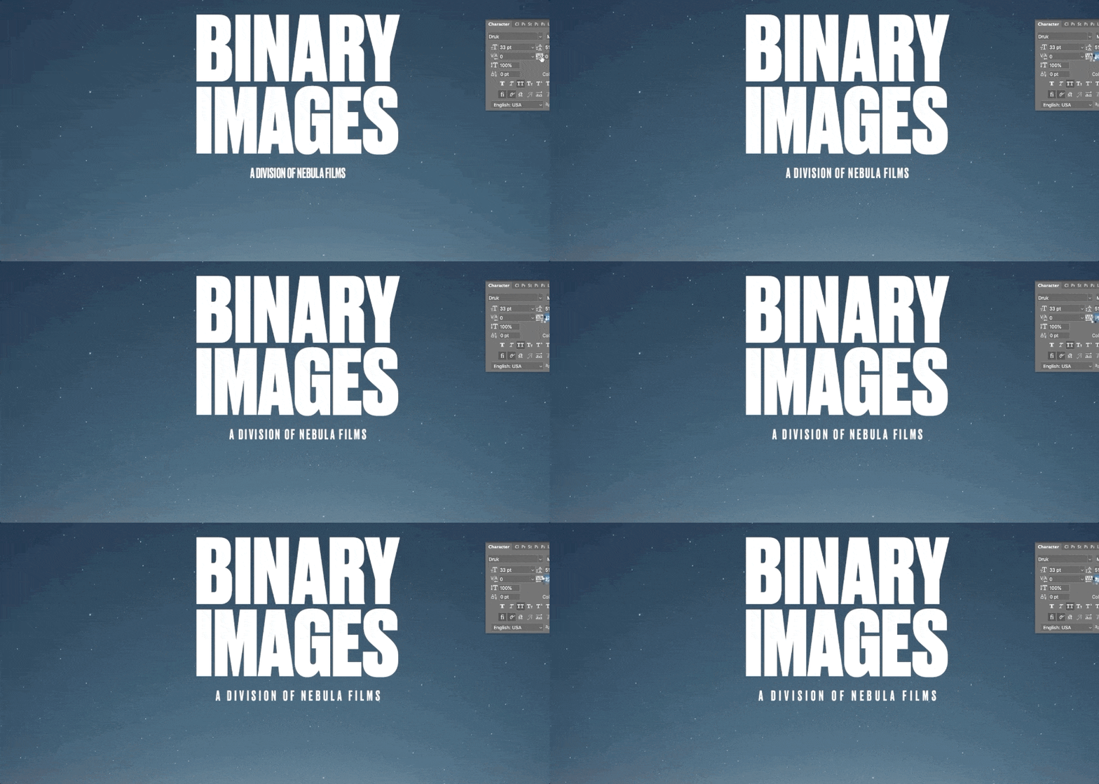
Tracking affects the visual density of a word or series of words. Loose or open tracking is commonly applied to words or lines containing all capital letters. The end result is an open airy feeling.
LEADING
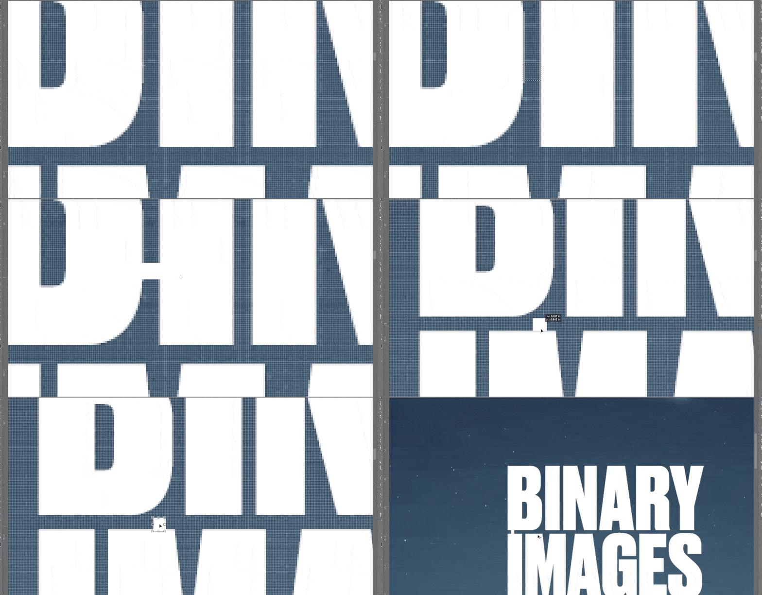
Leading spacing helps to create harmonious layouts between word combinations. Proper leading helps promote readability and creates a sense of proximity between type elements.
Extreme leading can create a desired "artistic aesthetic" in your type design. Leading and tracking both control the amount of white space or negative space desired in your design.
KERNING
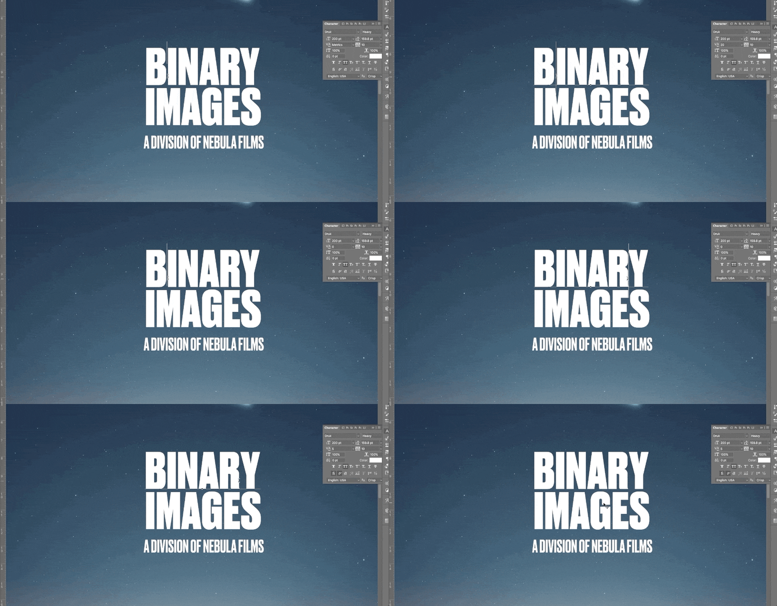
Kerning refers to the spacing between characters. Words should be tight and together, with enough separation so you can easily read the type on the page. If the kerning is too even, T H E W O R D S A R E N ' T L E G I B L E! Proper spacing is all dependent on the font, weight, and your own instincts about what looks right.
Contrast with Value
Value refers to the brightness or darkness of the type in relationship to the background. The simplest version is the text you're reading right now: black type on a white background.
For my design, I need to contrast the dark blue sky. I pick a color from the brighter horizon, push its value brighter, and now it stands out even more than before.

By changing the value of the lower type, I have again controlled its importance in the composition, while at the same time making it a more visually striking image. Now my colors mesh across the entire design.
Look at you now!
That’s it! Pretty simple, uh? Don't forget to practice with the project files above. Soon, you'll be a master contraster! Just remember scale, weight, spacing, and value, and you'll be well on your way to delivering some amazing designs.
If you want to learn more about using the design principle of Contrast and how to design using typography, check out Design Kickstart & Design Bootcamp from School of Motion.
-----------------------------------------------------------------------------------------------------------------------------------
Tutorial Full Transcript Below 👇:
Michael Frederick (00:00): Effectively communicating an idea through design is all about controlling the viewer's eye and guiding them around the design. Well, let me show you how to use the design principle contrast to take your type or graphy to the next
Michael Frederick (00:26): Hello there I'm Michael Frederick. And in this quick video, I'm going to show you how I use contrast to communicate my ideas more effectively to an audience just like you. So today we're going to cover four different areas where contrast can really make a big difference in your type designs. The first thing we'll cover is contrast with size and scale. And in my humble opinion, this is by far the best technique to create dynamic type layouts. The second thing we'll look at is contrast with weight is your type heavy, or is it thin? And the third contrast with spacing now, that's things like letter spacing sometimes called tracking and line spacing, which is letting we'll also talk briefly about contrast with value. That's the brightness of the darkness of like a word or an object. You can download the project files I'm using in this video to follow along with, or practice this. After you're done, watching details are in the description
Michael Frederick (01:36): In the world of design contrast simply means that one element in your design is different from another. Now this is my humble opinion, but I feel that contrast is probably the most important design principle because it helps us organize our designs and it establishes hierarchy of important elements. Contrast also makes our designs look really dynamic and can really help to add that visual interest to our work. And you know, something that's a real big deal contrast also helps to show the viewer what's important in our designs by creating emphasis and as you know, emphasis is that thing that gives our designs meaning and impact. But the most important reason we use contrast is because we need to control the viewers eyes. That's right. Remember we are visual communicators. That's who we are. We control where people look and to better illustrate how we use contrast to control our eyes.
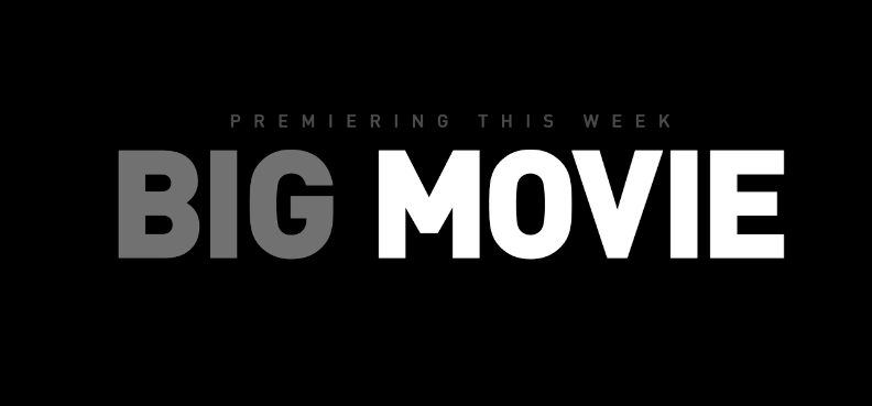
Michael Frederick (02:44): Take a look at these words right here, premiering this week, big movie, it's kind of plain looking. I mean, there's really nothing great about this. It kind of looks boring. So to make this statement have more impact and look more dynamic less, just see what happens if we add contrast with type size first, bam, look at how I just controlled your eye. Now I bet you're looking at big movie first, right? It's large, it's dominant. It's the most important thing on the screen and you know, something, I want you to look at it. So I made it bigger. I added contrast with type size and this one technique is probably the most effective way to make type feel more dynamic and important. Just make one thing bigger in your design. It's sometimes really that simple. Now let's add some contrast with visual weight. Bam, look at that big movie is now heavy and thick.
Michael Frederick (03:46): It has lots of weight and it really attracts your eye, right? So right now I am forcing you to look at big movie first because it takes up more visual space in the frame. It's bold. You're going to look at it. And sometimes we also use contrast with value to help control our eyes. Now value is the brightness or the darkness of an object. So let's go ahead and add some value. Ah, there we go. Right. See how the word movie is now brighter. And this really now pops off the frame. It's brighter. Your eye tends to see those brighter objects first and that's value working for you. So by simply using the design principle of contrast, you can affectively communicate a visual message to the viewer and make your designs look more dynamic and exciting. So are you ready? Cool. Let's design with contrast.
Michael Frederick (04:45): Okay. Now open up that provided file and let's jump into Photoshop in today's lesson. I want to use contrast with type to make this design right here. Look and feel so much more dynamic. So let's do this together. It's me and you. This is going to be fun. Our make believe client today is Nebula films and they are using this piece of key art right here to promote their new photo division called binary images. They'd like to see this title information right here, binary images, a division of Nebula films. Uh, they'd like to see this designed in a way where binary images is the most dominant and important part of the title design. And they want that part of the title to be the hero and a division of Nebula films will need to be secondary visual information. So it's not going to be as important.
Michael Frederick (05:44): So this is really all good stuff to know why. Well, because now I know what needs to be emphasized in my type design. I know what needs to have the most contrast in size and in visual weight. But the problem is is that I really don't like anything about this type layout. I mean, this really looks horrible and I'm not really digging that a typeface at all, either it feels wrong. So I'll be changing that in a few minutes. So let me first duplicate this type folder and go get my type tool. And I just want to move stuff around real quick. So I'll go ahead and break up the title and separate these word groupings based on sort of the hierarchy and the emphasis of the type design and the message.
Michael Frederick (06:39): All right. I think this is going to look awesome. Fingers are crossed. All right. The placement of this type feels kind of weird, right? I mean, this photo is really symmetrical. So I think the type of look best aligned somewhere here in the center. Let me get that right. All right. This is how the viewer needs to see this information. So binary images is on the top and larger because it's important. A division of Nebula films is secondary, so it's not going to be as dominant. It's going to be smaller. So right now I'm going to use contrast with size to really force you to look at binary images because it's important when I'm designing with type. I always like to imagine my type as rectangle or square shapes, so I can quickly see the overall proportion of the layout and how everything kind of fits together because you know, designs it's, it's all about balance and what feels right to your eye based on all the positive and negative space relationships, right?
Michael Frederick (07:56): So I really want to see how this all feels grouped together. That's why I'm making these big shapes. Now, let me turn on my template guide by hitting command semi-colon because this photo design is symmetrical in its composition. I'm gonna position this type block in the center between the dude standing on the car and that blue comment at the top. And I just want to make sure the type has enough breathing room, and it's not jammed into that space between those other elements in the photo. Now, it's always important to me to feel the harmony between the positive and the negative space in any design, right? And when you work with type, think of the type as just another group of shapes to balance in your overall design, okay, it's just another piece of like a larger puzzle. So my second decision to make is to decide what classification of type style do I want to use for this title now, based on this kind of product, I'm kind of thinking a modern, uh, clean sand Serra type phase will work really well.
Michael Frederick (09:18): All right, let me, I'll select sand serif as the filter in my type character panel to narrow my choices. And I want to pick a sand Saraf that has a large type phase family, because I'm only going to use one type phase for this project. So a family with lots of weights and properties will really give me a lot of options to choose from. And that's important when you're using one type phase. So let's see here. And I like the look of this type phase right here. Now drug is one of my go-to typefaces in my toolkit. It's versatile, it's got lots of contrasting weight styles. It's got like medium to super duper heavy, and it has lots of variations. And the cool thing about type styles with variations in the type family. It will allow me to create greater contrast with size and weight.
Michael Frederick (10:21): And that's a good thing, especially when you're only using one type phase in a design plus as a bonus, our eyes do really like seeing those dynamic differences and changes in the visual weight. So I'm going to be using contrast with type size and weight in this design to not only, uh, establish like the hierarchy of this message, but to also control where you look first, I'm really liking this non condensed phase of drug. It feels clean and very bold. And I want to make a bold statement here, and I really do like this heavy weight font for binary images and the thinner medium weight for a division of Nebula films. Now, when you use type a good rule to follow is to skip a few of the weights to create that greater contrast between type elements. I think that's a solid rule and I really want to make sure in this case that the viewer can see binary images first.
Michael Frederick (11:28): So I'll make it really, really heavy in weight. And I want to push that contrast. So remember when you're picking your type phase, just try to select one with lots of weight. So you have those options to make contrast. All right. Uh, I think that's looking pretty good now, should binary images beyond one line or is it stacked in area? Hm. Decisions, decisions always. So I'm thinking stacked because it could be a better fit in this vertical layout. Also, you know, something binary and images. They both have six characters and that could be kind of cool to see these on two lines six over six. So let me break up binary images into two layers so I can have more control over this layout. Okay. Also, I liked that the two words stack create this tight sort of square shape that will attract your eye in the center layout, always trying to control where you're looking.
Michael Frederick (12:45): All right, let me mess with the kerning between the characters. So I'm going to select metric, which is the font built in kerning information and the type panel here and manually Kern the characters that really need it. So I'm pressing the option plus right or left arrows to adjust the kerning between characters. And I want these words to fit tight into this space. So I'm reducing the space between the letter forms right now. Now kerning is not so much about equal spacing between these letter forms. It's more about like how the overall letters sort of fit together as a group. So if the word looks strange to your eye, then the kerning is probably off between specific letter combinations. So just trust your eye because it never lies. Ooh, deep. All right. The kerning is looking okay. All right. So now I need to line up the Y and the S on the right now, this is, this is tricky business.
Michael Frederick (13:59): That piece of the why that's kind of hanging out to the right sort of throws your eye off the vertical line that sort of connects the Y to the S underneath it. Do you see that? I think I'll make a rectangle and try to see the alignment better. Would that straight line of a rectangle? So these are the issues when you're working with type, you get these wonky sorts of form connections that can really look strange. So you've got to look closely all the time at the negative space created by these certain alignments of the type. So just make sure things look right to your eye. Okay, that's looking tight. All right. Now I want to give some space between the words and that's letting and not only paying attention to the space between the words, but I'm also looking at the space between the characters.
Michael Frederick (14:52): You know, I want to make sure that the space between the words and the characters all feel balanced. So if I measured the space right here with a rectangle, then I can use this measurement to create the letting space. And I'm doing this because common space measurements within a type sort of lockup, they can be used to create visual unity, because your eye likes to see these very common spaces sort of put together. So that's very important to keep that in mind, when you were working with type again, these negative spaces, right? And which are the holes between the letter forms, they need to fit together as kind of one unit, your eye needs to flow through those spaces. All right, now I need to deal with the secondary info right here. Hmm. I think I'll make it really small to show contrast between binary images and track out the type to open up the space between the characters.
Michael Frederick (15:53): I'm tracking this out because this open tracking and smaller type size will really help, you know, to push the difference in contrast between this secondary information and binary images. So everything I'm doing, I'm missing with the contrast in spacing, the contrast in size and the contrast and weight, just to create, contrast between what I want you to look at and what I don't want you to look at, or what is secondary. Now, I'm going to align this line of type a division of Nebula films with the I and the S of images. And this will make it a tight lockup. Okay. This is shaping up. It's looking very dynamic now so much better.
Michael Frederick (16:45): The only thing I don't really like right now is the color of the type. Now that white type is very harsh. It looks really nasty. Can't let that be there. All right. I think what I'll do is I want to make this type feel like it belongs in the design, right? I want it to feel like it's part of this overall image. So I'll select the color picker and pick one of those bright colors from the skies horizon. Maybe, maybe tweak it a bit brighter too. I mean, I really want binary and images to pop off this dark blue background, the contrast and value between the background and the words, binary and images needs to be extreme, right? So I want to make them brighter. So you see it first that's value. Now the secondary words, I'm thinking I'll select a, like a medium light color, and this area right here, let's apply this color.
Michael Frederick (17:54): Okay. So these words will be less bright. So they fall back a bit more right into the background. I really want to make sure you focus on the hero words. First value is helping me create that sort of visual hierarchy in my design. All right. Let's take a look at this thing, not the greatest thing ever, but, um, it's not the worst. It's okay. It feels pretty good to my eye. Now let's take a look back at, uh, the type that the client gave me and let's compare, let's compare it with this new revised dynamic type layout. Let's see if there's a big difference. Wow. Right. That's a big difference. I think the new layout is more dynamic and exciting. Now I know where to look and I can definitely see that binary images is the main focus of my type design. Okay. I'm going to put a fork in this design and hopefully my client will lack it.
Michael Frederick (18:57): Very nice, but don't leave yet. Okay. There's more before you go. I just want to show you a few more examples of this same image, but with different type layouts, because contrast with type can be achieved in a lot of different ways. So in the second design, you can see how to contracting typefaces can also create a really dynamic look, right? A basic rule of thumb is to choose a heavy Sarah face and contrast that with a very thin sand Saraf, but make sure you choose two different contrasting styles so they can stand apart from one another. And in the third design, I'm using contrast with type size and letter spacing to create that open feel in this type layout. And also notice how laying out the words on one line creates a completely different look. And the last type design is again, using contrast with weight and size to really draw your eye to the words, binary images.
Michael Frederick (20:14): All right, this has been fun. And I hope that you've learned a few new things. So thanks for hanging in there with me. I know it's a lot to absorb. So if you want to improve your type designs, remember to use the design principle contrast to help you make your designs, look and feel more dynamic. Okay. That's it pretty simple, huh? Hit subscribe. If you want more tips like this one. Now, if you want to learn more about using the design principle of contrast and how to design using type biography, checkout design, kickstart, and design bootcamp from school emotion. Hey, thanks for watching. And I hope to see you in class
ENROLL NOW!
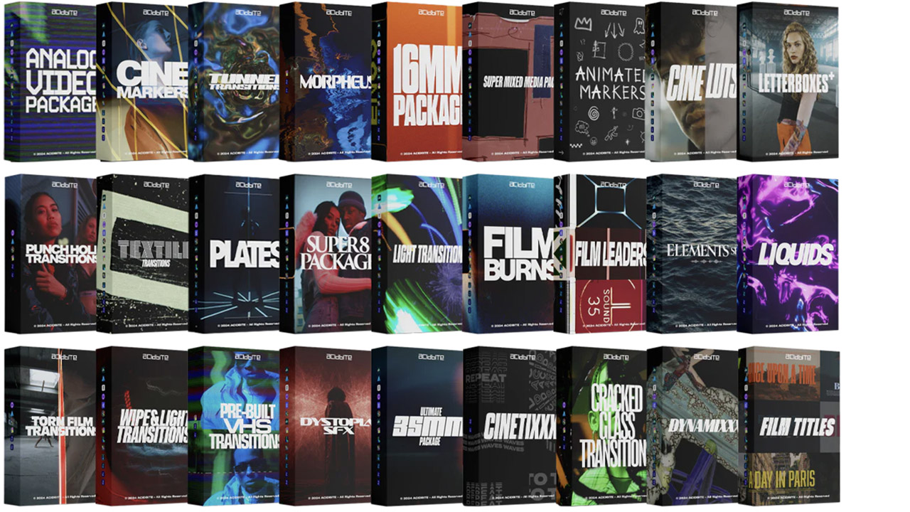
Acidbite ➔
50% off everything
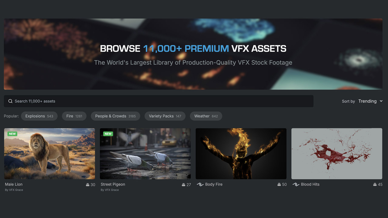
ActionVFX ➔
30% off all plans and credit packs - starts 11/26
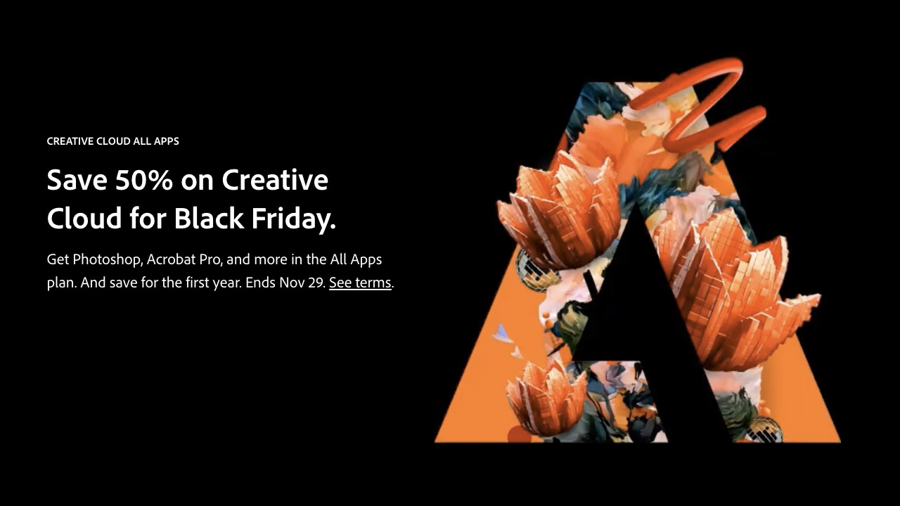
Adobe ➔
50% off all apps and plans through 11/29
aescripts ➔
25% off everything through 12/6
Affinity ➔
50% off all products

Battleaxe ➔
30% off from 11/29-12/7
Boom Library ➔
30% off Boom One, their 48,000+ file audio library
BorisFX ➔
25% off everything, 11/25-12/1
Cavalry ➔
33% off pro subscriptions (11/29 - 12/4)
FXFactory ➔
25% off with code BLACKFRIDAY until 12/3
Goodboyninja ➔
20% off everything
Happy Editing ➔
50% off with code BLACKFRIDAY
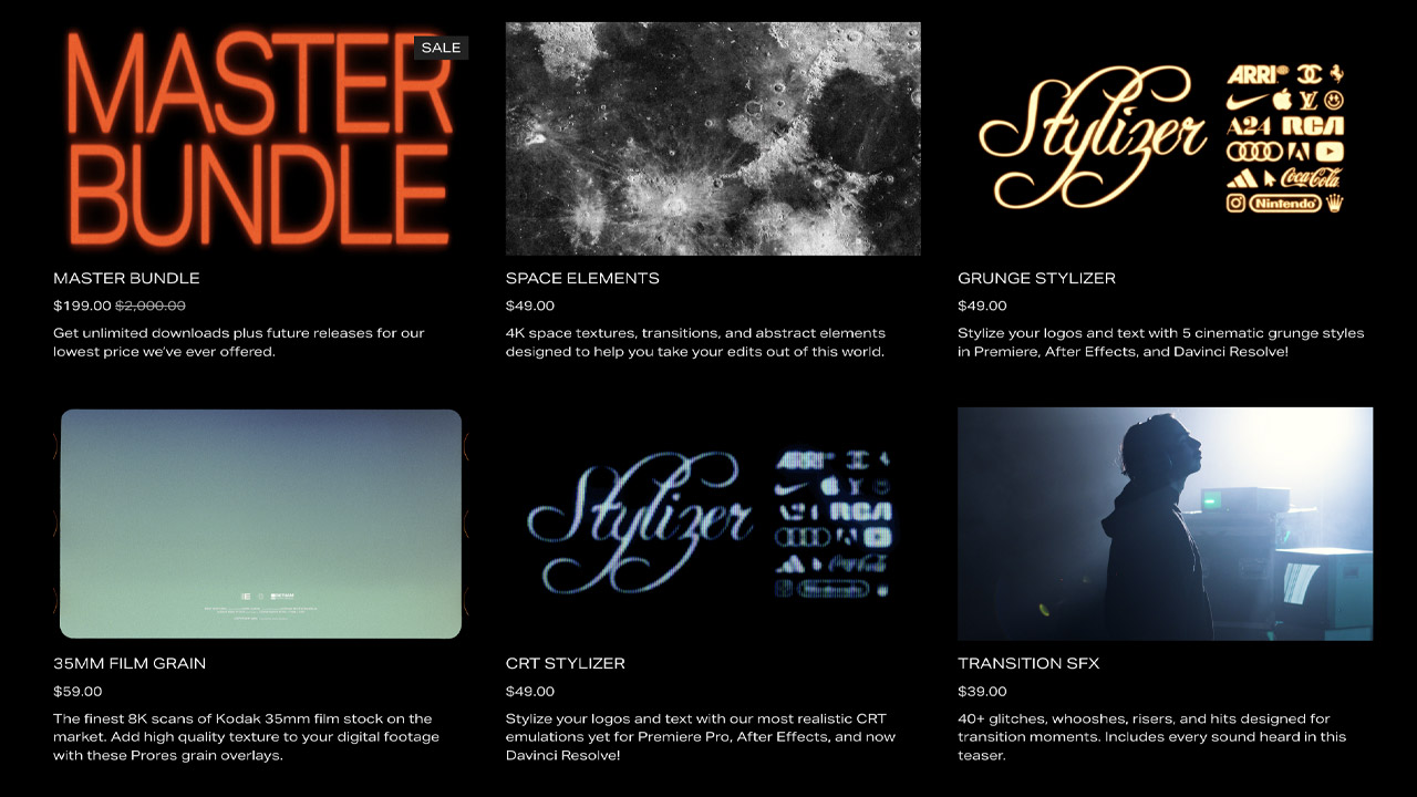
Huion ➔
Up to 50% off affordable, high-quality pen display tablets
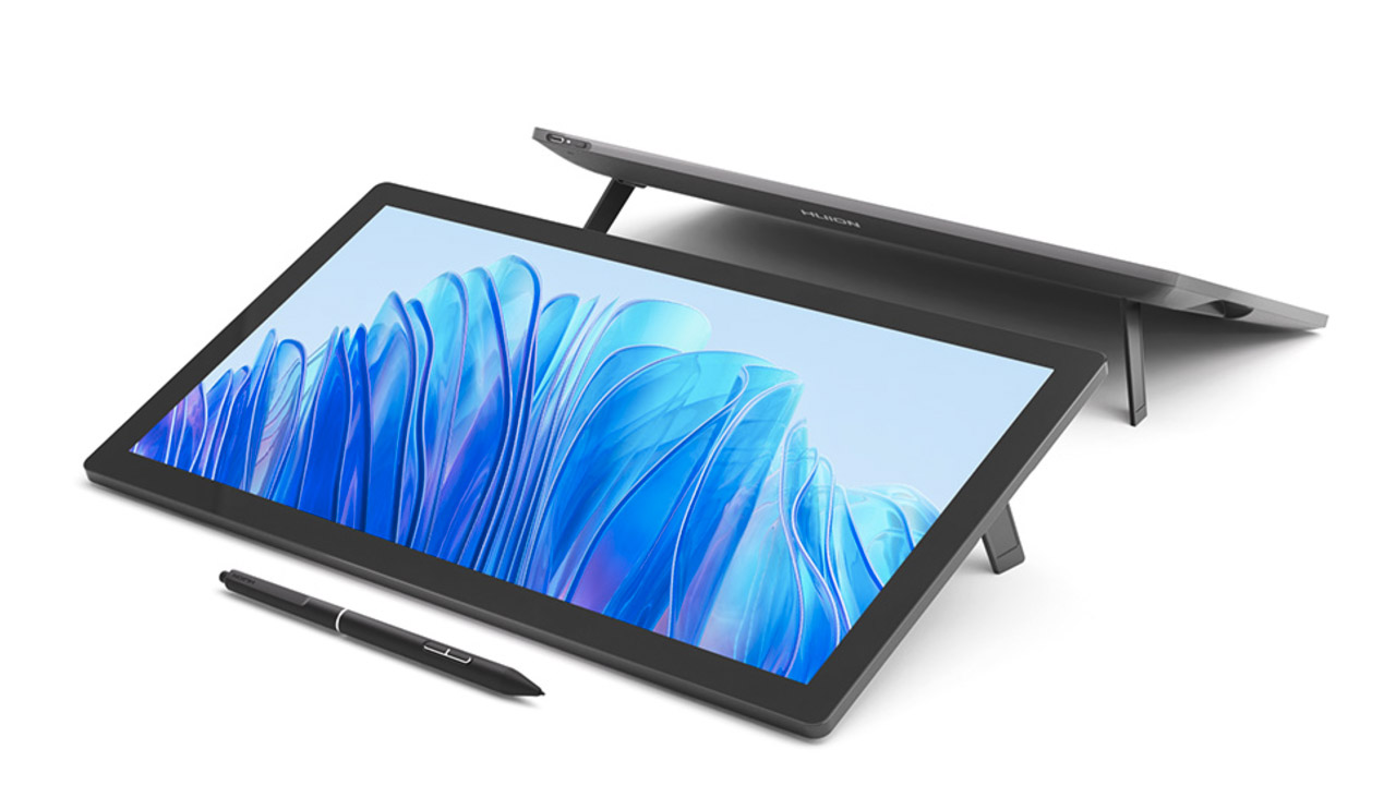
Insydium ➔
50% off through 12/4
JangaFX ➔
30% off an indie annual license
Kitbash 3D ➔
$200 off Cargo Pro, their entire library
Knights of the Editing Table ➔
Up to 20% off Premiere Pro Extensions
Maxon ➔
25% off Maxon One, ZBrush, & Redshift - Annual Subscriptions (11/29 - 12/8)
Mode Designs ➔
Deals on premium keyboards and accessories
Motion Array ➔
10% off the Everything plan
Motion Hatch ➔
Perfect Your Pricing Toolkit - 50% off (11/29 - 12/2)
MotionVFX ➔
30% off Design/CineStudio, and PPro Resolve packs with code: BW30
Rocket Lasso ➔
50% off all plug-ins (11/29 - 12/2)
Rokoko ➔
45% off the indie creator bundle with code: RKK_SchoolOfMotion (revenue must be under $100K a year)
Shapefest ➔
80% off a Shapefest Pro annual subscription for life (11/29 - 12/2)

The Pixel Lab ➔
30% off everything
Toolfarm ➔
Various plugins and tools on sale
True Grit Texture ➔
50-70% off (starts Wednesday, runs for about a week)
Vincent Schwenk ➔
50% discount with code RENDERSALE
Wacom ➔
Up to $120 off new tablets + deals on refurbished items
