Adobe MAX 2020 may be over, but we've got videos from some amazing speakers to keep that inspiration going through the holidays
The first ever virtual, global Adobe MAX is over, and we were fortunate to play a small role in sharing stories and inspiration with the Motion Design Community. Since we're all about sharing the best info for free, we've got a few videos from the conference to drop right here.
To be a better animator, you need to practice and build good habits. It's easy to open up After Effects and just start messing around (and we recommend it), but you owe it to yourself to discover a smooth, efficient workflow. That's why we're all about sharing tips from professionals that you can use today.
In this session aimed at intermediate After Effects users, our Senior Motion Designer Kyle Hamrick will teach you some awesome tricks to up your motion design game! Preproduction & concepting, cross-app Adobe workflow, and pro efficiency tips await!
Grab a bushel of pumpkin pie flavored jelly beans and get ready to level jump your motion game. We're going beyond the basics with Kyle Hamrick.
Beyond the Basics of After Effects
Want to develop more advanced motion skills?
If you’re serious about learning the upper-level skills to reach motion design mastery, check out our courses Advanced Motion Methods.
In Advanced Motion Methods you'll learn how to structure animations according to geometric proportions found in nature, deal with complexity, create cool transitions, and learn tips that only a seasoned After Effects veteran with years of experience can give.
If you want a project-based course that throws you into the deep-end, check out Explainer Camp!
From working with clients to animation in After Effects, this course will teach you how to craft professional explainer videos with the help of Jake Bartlett.
-----------------------------------------------------------------------------------------------------------------------------------
Tutorial Full Transcript Below 👇:
Kyle Hamrick (00:07): Hey there. I'm Kyle Hamrick senior motion designer for school of motion. This session is beyond the basics of Adobe after effects, intermediate skills. I'll be using a piece I created for Adobe last year as a way to showcase various parts of the motion design workflow, and hopefully show you a lot of cool and helpful tips along the way. We'll be talking about several different stages of a good motion design workflow, starting with concepting, and pre-production, I'll be showing you the ways that I use other Adobe apps when I'm creating a piece and how across app workflow can be helpful and efficient, then we'll dive into after effects itself and we'll look at some ways to step your work up to the next level, including tips for finessing, your key frames in the graph editor, navigating complex projects, using advanced features like master properties, ways to artfully transform footage.
Kyle Hamrick (00:54): Uh, and then I'll have a few cool after effects tips for you as well. So when Adobe first reached out regarding this project, I was obviously excited for the opportunity. It sounded like it would be a fun technical challenge as well as a creative one. As the project developed in my brain, it became clear. I was essentially getting to create a love letter to after effects. And I have to say it's one of the cooler opportunities I've ever been given. So Adobe specific request was for a project that could serve as a benchmark in a variety of ways, and would also be aesthetically pleasing, not just a science project and help showcase some of the ways that you can use after effects as part of the benchmarking process. It needed to include a piece of footage, which meant an end-user could also potentially try out different sizes and formats.
Kyle Hamrick (01:40): There was a desire to focus on GPU accelerated effects, as that creates a pretty easy AB for users to see the speed gains that those can bring. And lastly, it was likely this project would be publicly shared. So users who wanted to explore the workflow and structure of such a project could download it and explore it. So let's take a look at what I'm talking about, and then we can dive into some of the process of how this was made. And I'll try to give you, as I said, as many useful tips along the way as I can.
Music (02:22):[intro music]
Kyle Hamrick (02:26): I know you're excited for me to dive straight into after effects and I am too, but let's take a minute and talk about some of the earlier steps in the process. It can be really tempting to just happen to after effects and start doing stuff. And I definitely do that, but there's a time and a place for that animation is a very labor intensive process. So for an actual project, you want to make sure you actually know what you're trying to achieve before you think about animating anything. So let's take a look at my storyboard sketches here, as you can see, I just drew these on paper, which can be a good way to get the ideas down without being too fussy about it. I decided to make this whole thing a little meta, uh, we'll start with a key frame, rolling in a cursor, clicks it, revealing some other kinds of key frames, which all split apart to expose a bunch of this cool internal aftereffects craziness, and that UPenn tool pulls a Bezier path across.
Kyle Hamrick (03:12): And that pulls everything back together for the logo reveal. This idea allow that middle section to be really flexible, which is good since some of those technical specifics were still a little bit of a moving target at this early stage of the project going abstract allowed for the wiggle room to pack in footage and effects and variant versions and whatever, and still have it all make some kind of sense. It also made sense to go ahead and just lay out my storyboard right here in Photoshop. Thanks to the art boards feature. It's really nice to just lay everything out in one place, but still have it all be editable and you can make little tweaks, duplicate elements between frames and so on. I don't usually consider myself as much a designer as an animator, but I'll definitely come in here to create more refined frames for a lot of projects, which you can then send over to after effects is individual layers.
Kyle Hamrick (03:58): It just wasn't the case here from there, I drove into illustrator and dropped in a couple of screen grabs at the aftereffects UI stuff I liked and started creating some of the hero elements I knew I was going to need. My intent was to be converting all of these to shape layers once they're an after-effects so that the final project wouldn't be referencing any external files except for the footage and audio. It's definitely way easier to create this kind of stuff here in illustrator, especially some of the teeny little cursors and stuff, a few of these, like the Bezier handles and other stuff where I realized I'd really just probably be creating them out of parametric shapes. Anyway, I just decided it would be easy enough to build those directly in after effects. So I didn't bother with those here. So it does require a little bit of file prep and there are a few limitations, but you can absolutely send your illustrator files over to after effects and either work with the discrete layers you've created in illustrator, or you can convert some of those elements directly into shape layers in after-effects that gives you full control over just about everything.
Kyle Hamrick (04:57): But it also means you're going to be dealing with a lot more complexity in your after effects project. So you do want to be mindful about whether that conversion is actually necessary or not, because it often isn't even on the best plan projects. You're probably going to have a few elements that you don't realize you need until you're part way through, or maybe you realize that the thing you have isn't quite built in the right way for how it ends up needing to be animated. So it's really good to be comfortable hopping around between these different apps and be comfortable with the workflow of sending things over to after effects in a clean and efficient way to that point. I'll also actually start most of my motion design projects in premiere, especially for projects that are driven by voiceover or music, spending a little effort to get the timing ironed out here where it's really easy and fast to make those edits.
Kyle Hamrick (05:43): And the audio tools are much more robust. It's so much nicer than trying to handle all of that directly in after effects. You can import nice-looking storyboards or even just the super rough sketches and work through the timing here to figure out if you have any gaps or maybe places where you need to cut something, you can even key frame stuff right here in premiere, even if it's just in a basic way to roughly do a couple of the big moves and see how everything flows, the key frames are the same anyway. And so then if you push this timeline into after effects, which you can do in a couple of different ways, you can even just use those or copy paste them to another layer or whatever. If you'd like something that you built in here. Motion design is very much about the process of iterating and refining.
Kyle Hamrick (06:25): And anytime you have an opportunity to catch problems earlier in the process, when they're still relatively easy to fix, that's definitely a win in my book. Premiere is also my app of choice for finishing most of my projects while this benchmarking project is pretty short for anything much longer, it quickly becomes a lot more efficient to be exporting an image sequence or a progress file or something like that out of after effects. And then marrying that to the final audio here in premiere for longer or bigger projects where you might have multiple sections or even multiple artists working on the project, trying to assemble all of that directly in after effects can really be a lot more trouble than it's worth. So again, you want to think about using the right tool for the job. You know, speaking of audio, I did want to take a minute and give a big shout out to west Slover at Sonos Sanctus and Joe BioSil who worked together to create the awesome audio track for this piece after effects has two really noteworthy sounds that every user knows that shine that tells you your renders done and that dreaded sheep noise telling you that your render has failed.
Kyle Hamrick (07:26): I handed these two audio files along with a super rough draft of my animation. And if you loose ideas and let Wes and Joe just work their magic, if you listen closely, you'll actually hear each of these sounds used in several different ways in here. I'll play it again here so that you can listen for those
Music (07:55):[intro music].
Kyle Hamrick (07:59): One last thing before I dive in after effects, I also wanted to take a second and talk about the color palette, which is another of those things that you really want to try to nail down at the beginning. So you aren't later going back and having to change a hundred little individual elements that you've already intimated, right? I went through and pulled colors from the after-effects interface and branding, but of course those UI colors were chosen either to be unobtrusive or specifically to highlight things. And they weren't really designed with a project like this in mind. So I reached out to my friend [inaudible] who has a much better grasp of color than I do. And she helped me dial in a color palette that really made sense here. I did want to point out that I created this project in 2019. So you may notice the older icon color is being more prominent here.
Kyle Hamrick (08:39): I did update the logo at the end to the new color scheme, but since he had that pink and purple for like the last eight years, I felt it was appropriate to keep those in here and let the new logo kind of emerge from those at the end. Okay. So I'm finally over here in after-effects now. And the first thing I want to talk about in terms of really upping your game here is key frame easing. So here's just one element from my project here. I've got that first key frame object that, uh, you know, kind of rotates in and then splits here. Every one of these actual key frames has been touched to some degree to customize it. And if I start showing you some comparisons to ones that haven't been, hopefully you're going to start seeing that difference really quick. So here's one where I just set everything back to totally linear.
Kyle Hamrick (09:22): So all of these key frames are just totally default at this point. Okay. And you see how it just feels stiff and mechanical and pretty clunky, uh, especially this kind of split and push in here. Um, so let's take a look at this easy, easy version to do that. You just highlight your keys and then you can right click on key frame, assistant, easy ease, or you can press F nine, which is what I usually do because I like hotkeys. So all these key frames now have been easy east, so it definitely feels smoother than that. Linear one. And I'll show you a side by side comparison in a minute here, but, uh, this last bit, especially, it's still slow and kind of messy right now that you've had your eyes on those here is that original again with lots of customized easing. Now watch in particular, the rotation here really has like a lot of snap to it at the end.
Kyle Hamrick (10:14): And these little excellent lines have really nice swishes. They go around and the split and push just really kind of wishes into it here. Really nice and snappy. So if you look at them all side by side here, you'll hopefully really be able to see those differences. Um, really just having the eye, developing the eye, to be able to see these differences and, you know, kind of see where something needs to go. This is really the key here because you can tweak on it all day long, but if you don't know where you're going, then, um, you're not going to get real far, right. Uh, there are obviously a lot of animation principles and stuff like that that you, you know, ideally need to learn to really, um, be able to hone this ability properly. But, um, a lot of times too, you're kind of just feeling it like, does the, does your project call for something really crisp and snappy?
Kyle Hamrick (11:05): Um, there are times where these, you know, linear key frames are totally appropriate to, I don't want to make it sound like they're not. Um, but when you start looking at these here, even the easy east one compared to something that's been heavily customized, you can really feel that difference, right. Um, feel the way it just snaps apart there and kind of pushes towards us compared to this slow and boring one, uh, here and here. Right? So let's take a look at some actual key frames that we can play with here. And I'll take a minute to explain the graph editor and how it works. So this top one up here is just linear. I've separated the dimensions which you can do right here by right. Clicking the way the graph editor works with position is a little bit different than some of the other properties.
Kyle Hamrick (11:50): Um, I'll be showing you the value graph, which I think makes the most sense here, and that doesn't really work with the unified position properly property. Uh, but visually I think this is the best way to demonstrate this concept. Okay. So right now this green one hasn't been touched yet, but you're going to see the difference between the linear and the easy east here. Uh, again, I just highlighted that pressed F nine and they're easy eased. So watch the pink versus the blue and you'll see the difference. Pink starts off kind of slow and then it gets fast in the middle and then eases back to a stop, right? Whereas the blue one just starts and it's the same speed all the way across. And right now the green is just linear, uh, because I haven't touched it yet. Uh, but I have clicked this little graph icon here, which is going to mean when I opened the graph editor.
Kyle Hamrick (12:36): This particular property is always going to be shown. You can also highlight individual properties. And then when you open the graph editor, that's dull appear on there. So this little graph button right up here opens up the graph editor. And in this case, it's a representation of the changing value of that exposition of that layer over time. I think the best way to describe a key frame is just a value at a time. Okay. So if you want to change something about that, you either change the value or the time at which it occurs, right? So after effects and other computer animation applications, they also give you the ability to change how that change happens between those key frames. All right. And in this case, we have this one value here. It's 2 0 2 on X. And up to this point, it's just a static value.
Kyle Hamrick (13:28): And then when it hits this point, this key frame here, uh, it starts changing at a constant speed until it gets to its second key frame and then it just stops. And now it's that second static value, right? Just for comparison here. If we also look at the east one, see this nice little S curve that it has, okay, I'm going to click back off that and we'll start changing this one. Now you can actually select these key frames right here, and I can even press F nine in here to go ahead and just easy, ease them. And then what you can also do is start pulling these handles around. These are just, Bezier handles like they're a path or an illustrator object or anything like that. Uh, you can pull these around and if we did this here, so we're going to be easing out of this value slowly, and then we start to speed up because it still has to span the same amount of change during this time.
Kyle Hamrick (14:21): Right. Uh, and then as we come into this other one, we're going to be slowly easing back to a stop. So, uh, right here, we're going to have this really nice snap right around kind of this first, third of the span here. And then there, you can see it just really eases into that stop. Uh, if instead we wanted this to kind of start very suddenly and then have sort of this really slow swoop in the middle. You could kind of reverse this this way. Uh, so if you pull this handle up and then you'll kind of have this static value and then boom, it's just going to launch into this movement. Okay. And then I could pull this one down. You can see here in the middle, it's going to be almost flat, which means it's going to be just kind of creeping here in the middle. Um, but it's also going to kind of slam to an abrupt stop again here at the end.
Kyle Hamrick (15:14): So you'll notice in all these cases, it's still just the same two key frames, but you can make such a world of difference here by the way that they move. So tweaking these manipulating these, you can make it snappy or smooth or, you know, whatever is appropriate for your project. Um, just make it move exactly the way that it needs to for that context. Right? I know this topic isn't quite as exciting and hopefully a lot of you were already doing these, but honestly, simple project organization is really one of the biggest things that you can do to up your game here in after effects. So let's check out this project panel here on the left versus the one on the right or these two examples of timelines. So imagine someone was handing off a project to you, which one would you want? Yeah. Here in your after effects project panel, you can create folders by just clicking this little icon here.
Kyle Hamrick (16:06): If you already have a folder selected, it'll put the new one inside it like this. So let's give this thing a name and I'll drop my video files into it. You can also grab something or multiple somethings and just drag them down to the folder icon and, we have a folder, but this in here, there isn't that nicer in your timeline, taking the time to properly label, trim and color code your layers. It makes a huge difference. You can rename any layer by selecting it and hitting enter. And we'll just give this a new name here, much better since it exits the screen. There's really no need for the layer to keep existing over here so we can trim it by dragging the end like this. Or you can also set your ins and outs with hotkeys by pressing alt or option along with the bracket keys.
Kyle Hamrick (16:51): Uh, now we'll come over here and click on this little color chip. I'll choose yellow just to help it really stand out. Yeah, there we go. So let's take a quick look at the before and after here. Now you're spending your time being creative instead of hunting through your own project. Yes. Since this is an intermediate session, I'm going to assume that most of you know, what a pre composition or pre-con is, but just in case it's any composition, that's nested within another competition. Basically the same thing it's using a smart object and Photoshop or nesting sequences. When you're in premiere, you can take a bunch of complicated stuff in your project and make it function like it's essentially just one object. If you want to do it with some existing elements, you can just select them like this right click, one of them and choose pre compose.
Kyle Hamrick (17:37): And then you're going to give this a meaningful name, right? The only downside is that if you want to make changes inside here, it can mean a lot of back and forth, but after effects has a solution for you, that solution is master properties, which are one of my favorite features and really helps with project organization. There may be a little hard to wrap your head around at first, but once you do, they're so super powerful. So I'm just going to start with a simple example here and the way that these work leverages the essential graphics panel, which you can get by clicking window essential graphics. So I'm going to reveal a property here. I'll just search for color. Yes. You have a search bar right here that reveals stuff, another pro tip. And let's say that I want this base color of the key frame to be something that I might be able to edit somewhere else.
Kyle Hamrick (18:24): So I'll just drag this up here and I might go ahead and rename that base color, just so that I remember exactly what I'm working with. So I'm going to go ahead into this other comp and bring in my build comp that I just created. We'll drop that right in here. Again, this is a, pre-con just like we were using before and just talked about, and you can see that I already have some animation built in here as well. So it brought all that animation in just like, you'd expect a pre-com too. But if I open this up now I have not just my normal transforms, like on any layer, but I also have this thing called master properties and anything that you've dropped into that essential graphics panel within that pre-com is now going to show up here and what that enables is changing this thing without having to go back into the pre-com, which if you've worked in aftereffects much at all, you're going to start seeing how huge this is right away.
Kyle Hamrick (19:15): So I'm just going to change this to a deeper blue, and you'll notice that I didn't need to go back into the pre comp to change that. Uh, the other big thing is that the original composition stays how it was interesting. I'll talk more about that in a minute. So you also have these little push pull buttons right here. Uh, if I want, I could pull from the original and reset it to the original color. You'll notice. Now this goes away because it's back to that default value. Okay. Uh, I'll just undo that I could, if I decided this is what I want to be, the new default, push that value in there. And now within that, pre-camp, that's the new default value. Okay. So let's change that again to something else here. And you can see in here, I also have these position, key frames.
Kyle Hamrick (20:02): Maybe I want to add that property up here as well. Um, I'll get this little warning in this case. Just hit. Okay. And ignore that right now. It's not relevant. And look you there. It just automatically added it. And now those key frames are also visible here in this parent composition. And the big thing here is that I can edit these. So I'm editing the animation. That's inside that pre-com without having to actually dive inside it. And yeah, this is all super cool, but let me show you something even better. I'm just going to size this down. Kind of move it up here and then create a duplicate of this by hitting control or command D so that I have a second one. I'll move this down here. Just that you can see both copies. Um, so you can see that they're doing the same thing, same key frames, but I can make this one be different.
Kyle Hamrick (20:50): I'm going to change the timing on the second one here. And plus I could change the color on this one. Maybe we'll go with that. There we go. Wait a minute. So these are both referencing one pre composition, but I've done two totally different things with them. And neither of them is messing with the original, right? Right. These are iterative. You can actually create iterations of a pre-camp using master properties. So if you can think of a use case where you're going to use the same thing, but in a couple different ways, like say titles or lower thirds or coloring things different ways, uh, or even if you just have one copy of a thing with some internal complexity and you just want to expose a couple of key frames so that you can align that time with other elements in your project, master properties is such a huge step for your workflow.
Kyle Hamrick (21:39): Just keeps you from having to jump back and forth a bunch of times. Have it keeps you from having to make a bunch of useless copies of the same thing, right. It's awesome. Remember that one of the intents of this project is that it user can potentially swap out the video clip to test the performance of different footage formats. That means the included clip needs to be properly licensed. And also that the project still needs to look reasonably similar with other clips in its place. I didn't have anything too specific in mind, but it turned out the small library of footage Adobe provided me with was mostly gardening clips, not exactly what I'd been thinking of, but this project is all about figuring out how to be creative within these boundaries. So I found this clip of a Dolly shot past summer rugala, which turns out to actually have a really nice motion and texture to it.
Kyle Hamrick (22:22): And it's just the right kind of abstract. I added in a few effects to give it a more trippy kaleidoscopic look and ended up using several copies of the footage, but all trimmed and cropped in ways that make it very prominent, but never really the star, which means that it still works pretty well with just about anything you might drop in here. I think this is a great example of taking an asset. You might never have chosen originally and finding a new way of looking at it to turn it into something new and different. One other cool feature in this benchmark project is this control layer that actually has a couple on off switches where you can toggle different color variations or different effects on and off. Now, if you want to know how to do something like that, it's actually probably a lot easier than you think, especially if you're just working with opacity, which is the case here.
Kyle Hamrick (23:07): So I just have one layer here and I've got my opacity revealed. I'm going to right. Click choose effects, expression controls, checkbox control. That'll add that right here. And I could work with that up here in the, uh, effect controls or, uh, open it right here in the timeline as well. So the way I check box control works is just an on-off switch, which means it's actually a binary switch zero or a one in computer speak. Right? And if you remember back to like third grade math, anything times zero is zero and anything, times one is itself. Okay. So if you want to make a nice, flexible on off switch that actually still lets you adjust the property. All you have to do is create a quick expression here. I'm going to alt or option, click the stopwatch to create an expression and I'll type value, which references the original value of the property without the expression.
Kyle Hamrick (24:03): And then I'll say times this little asterisk key here, and then I'm just going to use this little expression, pick whip here, push that right up to the checkbox control. So now it's taking this value, whatever it is, times either zero or one. Okay. So if this is off, it's going to always be zero. If this is on, it's going to always be whatever the value is. So I can actually adjust this to, you know, 50 something here and it still works as an on-off switch, which gives me a lot of flexibility and means I can still easily turn this on and off. Uh, if you copy paste this expression to a bunch of layers, then you could toggle whole chunks of your project from one place, which is really awesome. So wow. Twenty-five minutes goes by really fast doesn't it. But we got a chance to go over some important steps of the motion design creation process. Talk about ways to use different Adobe apps at different stages of your projects, and hopefully learn some new stuff within after effects itself. That'll make your next project that much better. Thank you so much for watching today. Again, my name is Kyle Hamrick. You can find me on Twitter or Instagram and I appear regularly on the school of motion. YouTube page is something this presentation was helpful or inspiring for something you're working on. I'd love it. If you tagged me in a post and let me know so long.
ENROLL NOW!
Acidbite ➔
50% off everything
ActionVFX ➔
30% off all plans and credit packs - starts 11/26
Adobe ➔
50% off all apps and plans through 11/29
aescripts ➔
25% off everything through 12/6
Affinity ➔
50% off all products
Battleaxe ➔
30% off from 11/29-12/7
Boom Library ➔
30% off Boom One, their 48,000+ file audio library
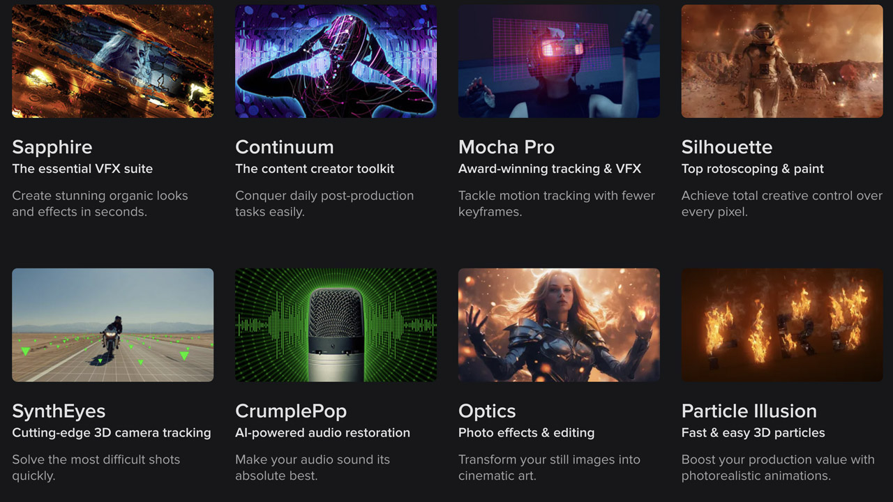
BorisFX ➔
25% off everything, 11/25-12/1
Cavalry ➔
33% off pro subscriptions (11/29 - 12/4)
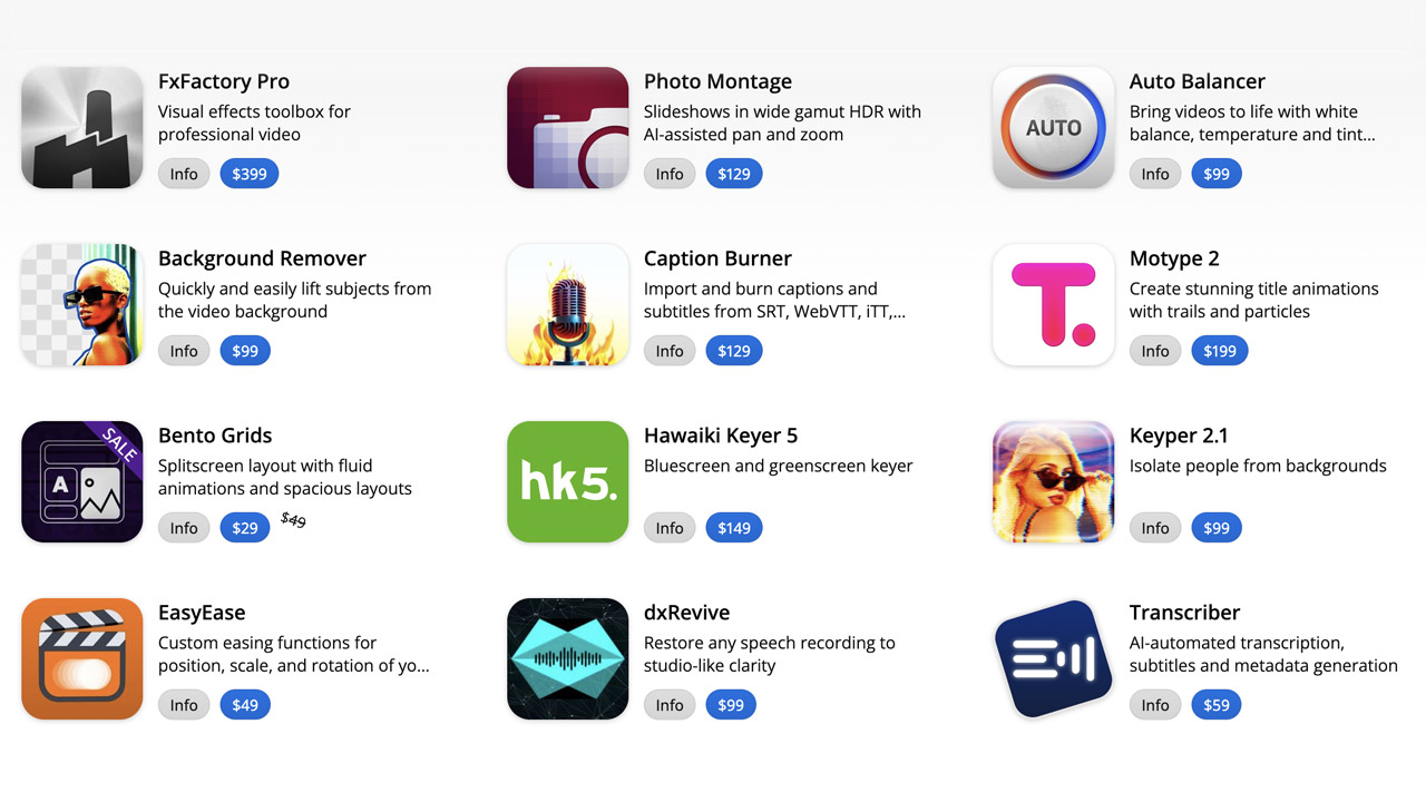
FXFactory ➔
25% off with code BLACKFRIDAY until 12/3
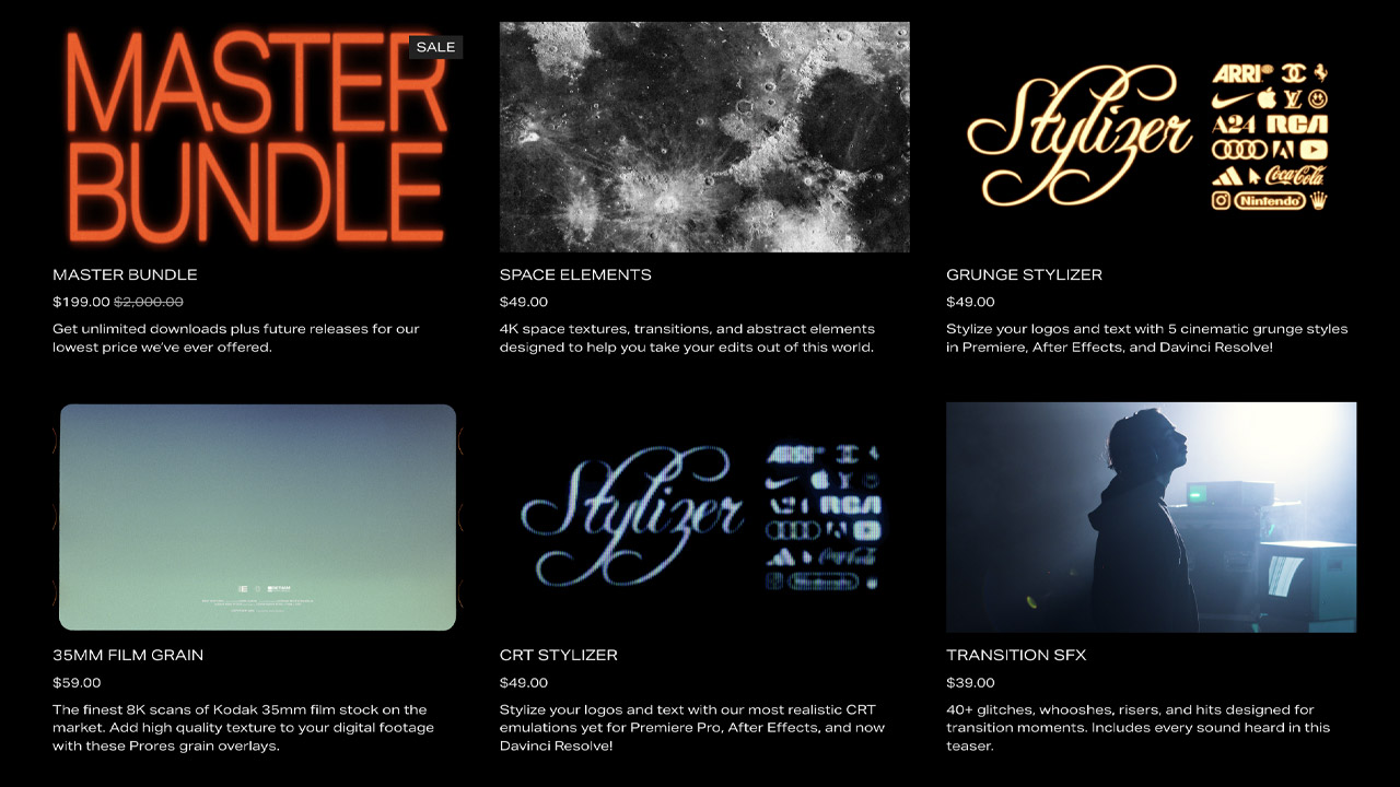
Goodboyninja ➔
20% off everything
Happy Editing ➔
50% off with code BLACKFRIDAY
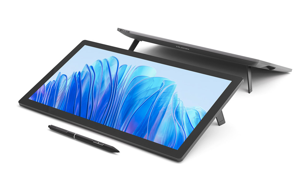
Huion ➔
Up to 50% off affordable, high-quality pen display tablets
Insydium ➔
50% off through 12/4
JangaFX ➔
30% off an indie annual license
Kitbash 3D ➔
$200 off Cargo Pro, their entire library
Knights of the Editing Table ➔
Up to 20% off Premiere Pro Extensions
Maxon ➔
25% off Maxon One, ZBrush, & Redshift - Annual Subscriptions (11/29 - 12/8)
Mode Designs ➔
Deals on premium keyboards and accessories
Motion Array ➔
10% off the Everything plan
Motion Hatch ➔
Perfect Your Pricing Toolkit - 50% off (11/29 - 12/2)

MotionVFX ➔
30% off Design/CineStudio, and PPro Resolve packs with code: BW30
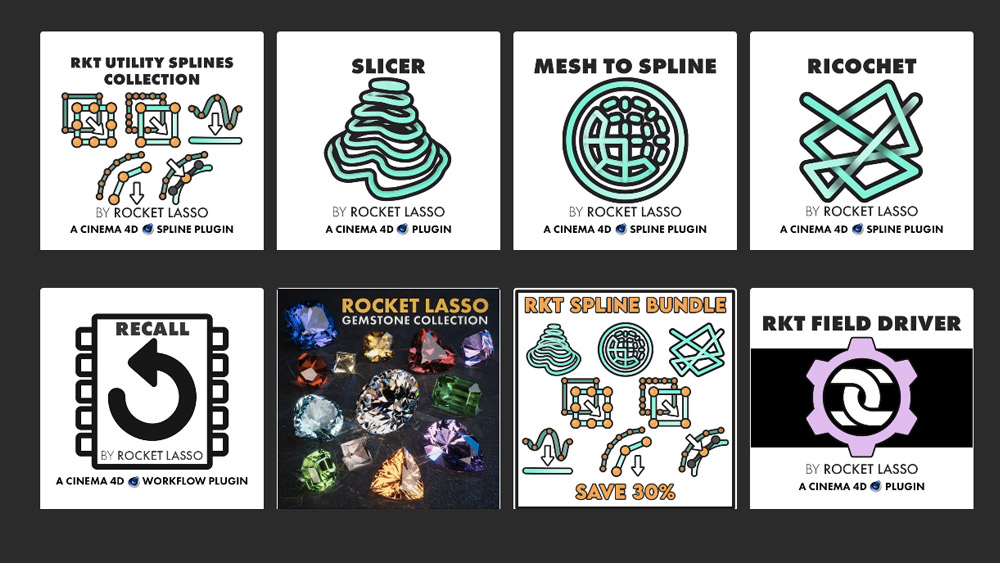
Rocket Lasso ➔
50% off all plug-ins (11/29 - 12/2)
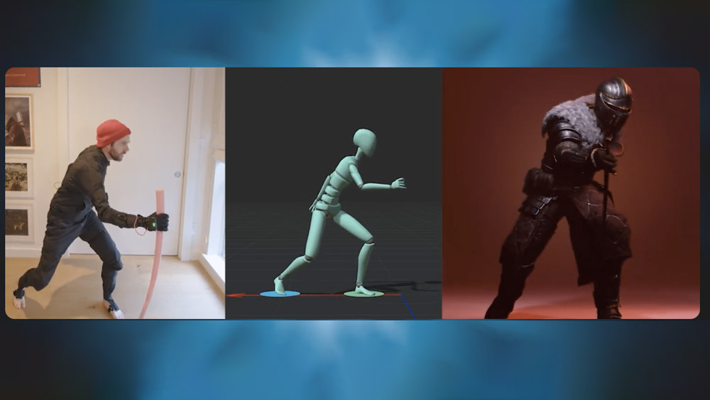
Rokoko ➔
45% off the indie creator bundle with code: RKK_SchoolOfMotion (revenue must be under $100K a year)
Shapefest ➔
80% off a Shapefest Pro annual subscription for life (11/29 - 12/2)
The Pixel Lab ➔
30% off everything
Toolfarm ➔
Various plugins and tools on sale

True Grit Texture ➔
50-70% off (starts Wednesday, runs for about a week)
Vincent Schwenk ➔
50% discount with code RENDERSALE
Wacom ➔
Up to $120 off new tablets + deals on refurbished items
