What are Blending Modes in After Effects?
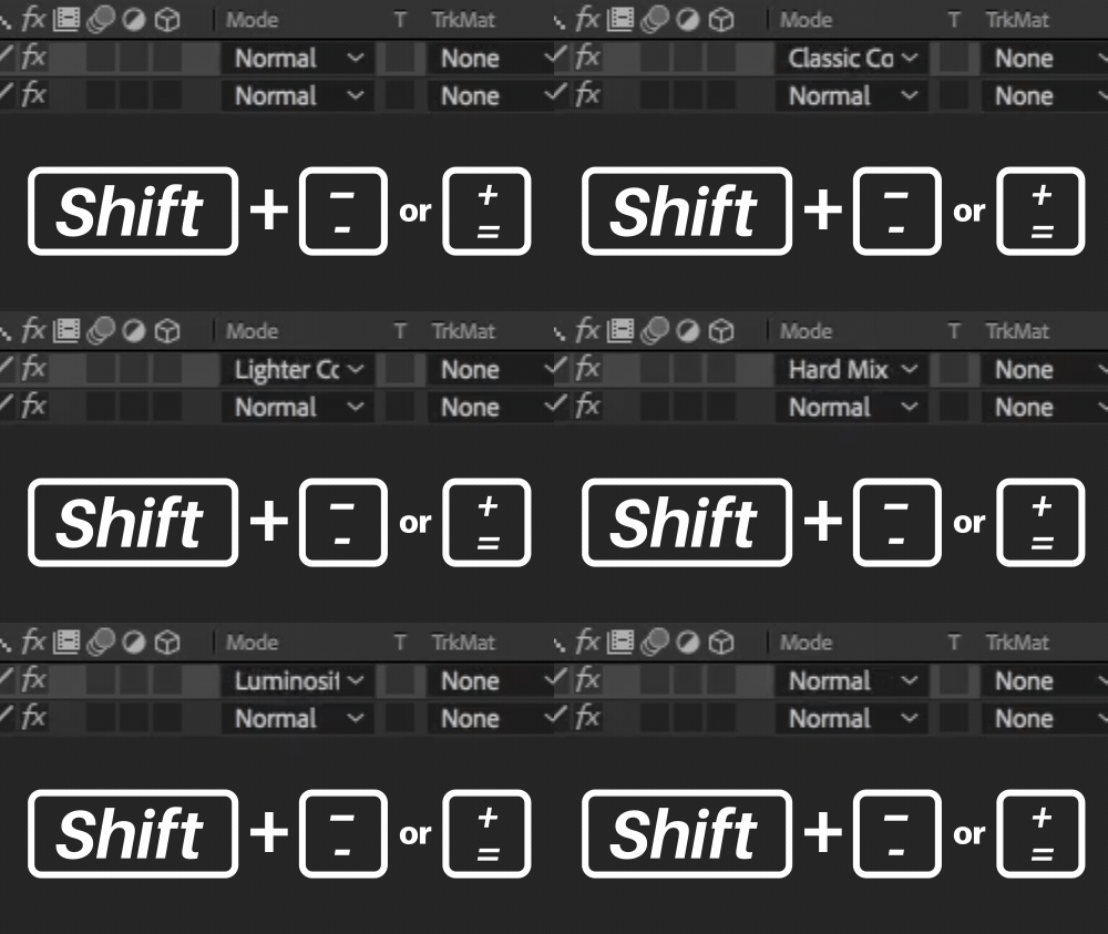
A blending mode is a feature used to combine layers together. If you apply a blending mode to a layer it will affect how it interacts with all of the layers beneath it. If you are familiar with blending modes in Photoshop they work in the exact same way. It's kinda like having a colored filter.
How do Blending Modes Work?
So how does After Effects render blending modes? Glad you asked.
In your timeline After Effects will look at the bottom layer first. And when I say “look at” I mean it will calculate the masks, effects and transformations of that layer. Software doesn't have eyeballs you silly goose...
Then it will look at the next layer up in the timeline and do the same. At this point it will combine the top layer with all layers below it based on the chosen blending mode for that layer. By default it’s set to “normal” meaning it will simply display the color information of the top layer.
THE MATH BEHIND IT ALL
In chapter 9 of the book Creating Motion Graphics with After Effects Trish and Chris Meyer talk about “The Math Behind the Modes”. They do a wonderful job explaining what After Effects is doing and I’ll try my best to paraphrase it...
They break down some of the ways that modes can work. When a mode adds to the color values of the layer underneath, the numeric value for every color channel (red, green and blue) is added to the corresponding values of each color channel underneath. So if a pixel has 35% blue on the top layer and 25% blue on the bottom layer and a mode adds them together it will output 65% blue (a brighter blue). But if it subtracts the same values then it will result in 10% blue making that pixel darker. Multiply also does just what you might expect. .35 x .25 will equal .0875 or 8.75% strength.
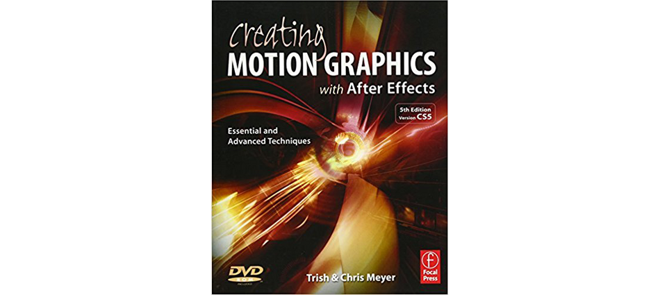
It's worth noting there is a more updated book by the Meyer’s on After Effects and Johnathan mentions it in this article on 10 Great Books for After Effects Artists.
Breakdown of each Type of Blending Modes

In order to illustrate the different blending modes in After Effects I will be using two layers. The top layer (source layer) will be a vertical blue gradient which I’ll apply the different modes to. The bottom layer (underlying layer) will be a horizontal red gradient for most and for others it will be a photograph of a palm tree. Why a palm tree? Because palm trees are neat.
Normal Modes
The first section of modes include the default, Normal. If the layer is set to 100%, these modes make it so you only see the top layer.
NORMAL
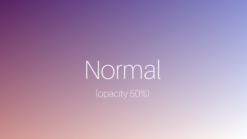
This is the default setting. It just means that the source layer will be the only color visible. If you set the opacity of the source layer to anything less than 100% then you will start to see the underlying layer. This is sometimes all you need to achieve the result you want.
DISSOLVE & DANCING DISSOLVE
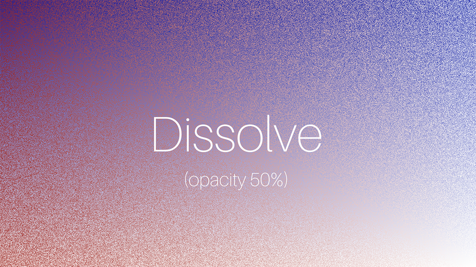
With Dissolve & Dancing Dissolve each pixel will be either the source or the underlying color, depending on the opacity of the source layer. This mode actually doesn’t blend any of the pixels. It simply creates a dither pattern based on the opacity of the layer. So if you have the opacity set to 50% then half of the pixels will be from the source and half will be from the underlying layer.
This is a neat effect because it’s similar to blending them with normal and a lower opacity, but instead of blending, it randomly selects the top or bottom layer on a pixel by pixel basis.
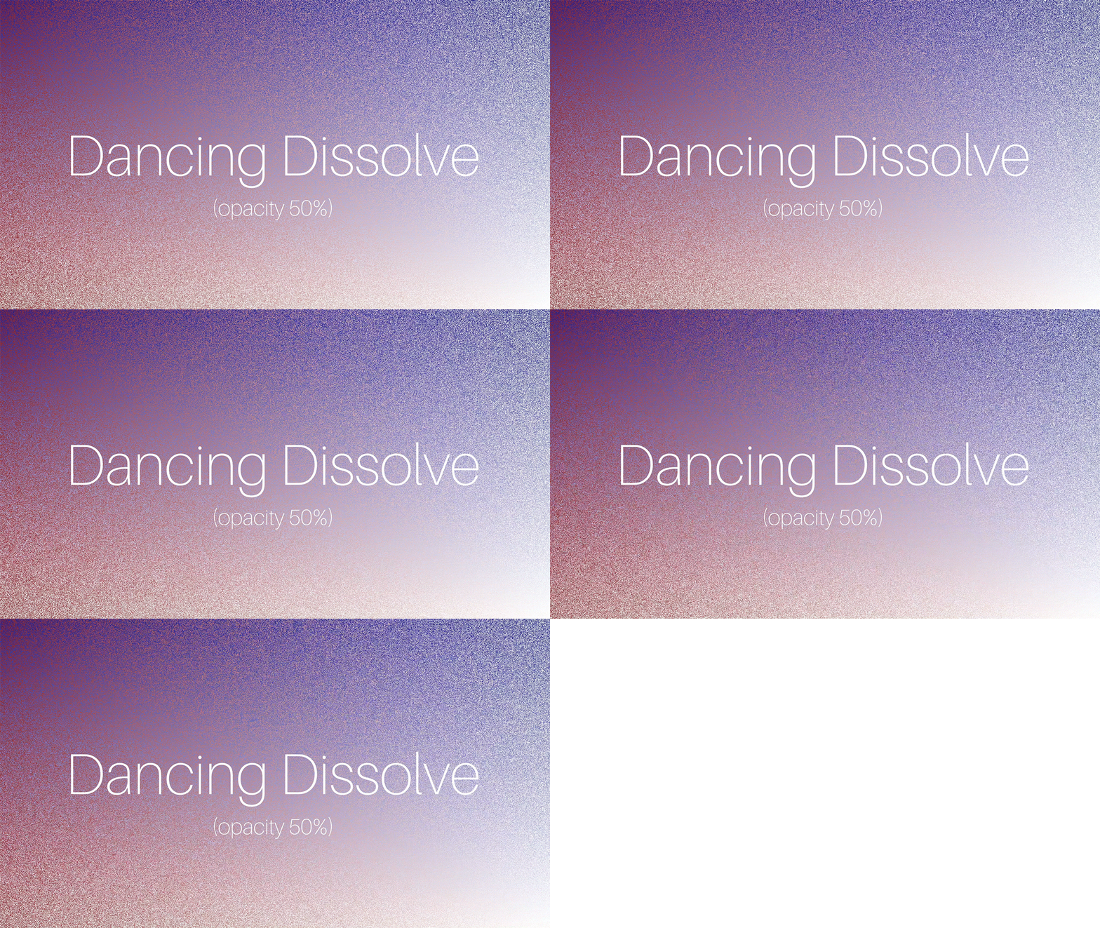
Dancing Dissolve does the same thing, but it processes it for each frame differently which creates a self animating “dancing” effect.
Subtractive Modes
All of the subtractive modes darken the resulting image. If a pixel on either layer is black then the result will be black. But if one of them is white it will have no effect.
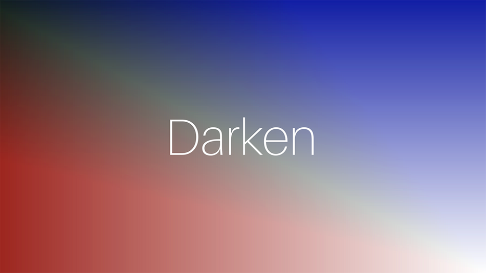
DARKEN
This mode looks at both layers and choses the darker of the corresponding color channel values (red green and blue). So no matter which layer is in front, it will pick the lower value for each channel on each pixel.
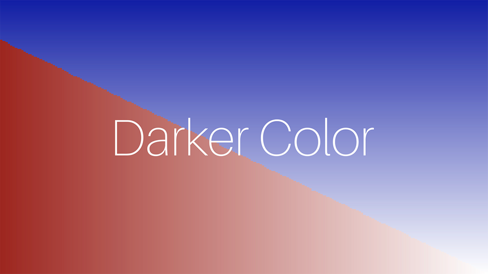
DARKER COLOR
This functions much like Darken except instead of choosing the darker of the 3 channel values it chooses the darker resulting color.
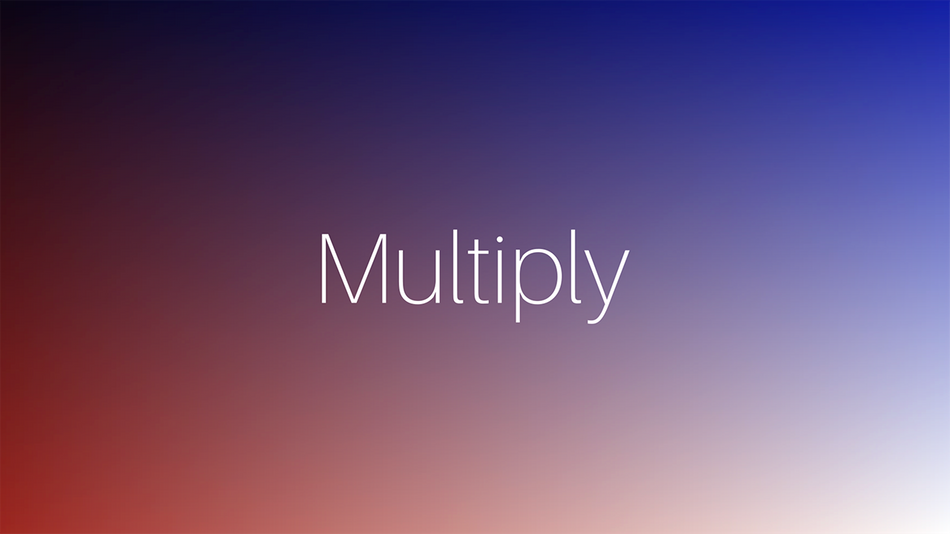
MULTIPLY
With multiply, the color is scaled down by the darker of the two color values. So this is different from Darken because it isn’t looking as deep as the channels (RGB), but rather just at the color value they create. This mode sort of resembles placing multiple gels in front of a light.
Pro Tip: Multiply is one of my most commonly used modes.
LINEAR BURN
This uses the top layer’s color information to lower the brightness of the bottom layer. It will result in something darker than Multiply and it will also have more saturation in the colors.

COLOR BURN & CLASSIC COLOR BURN
This increases the contrast of the underlying layer via the color information of the source layer. If the top layer (source layer) is white then it will not change anything. They say this will give you a result that is in between Multiply and Linear Burn. The order you stack does matter with these because the bottom layer usually comes through more.
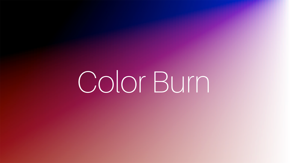
Classic Color Burn is from After Effects 5.0 and earlier. It has some limitations so it's usually preferable to use regular Color Burn.
Additive Modes
A lot of these modes are the exact opposite of the Subtractive modes. They make the image brighter. If a pixel on either layer is white then the result will be white. But if one of them is black it will have no effect.
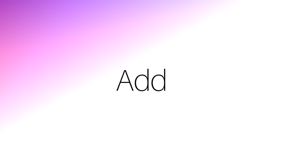
ADD
This mode is just what it sounds like. The color values of each RGB channel are added together. This always results in a brighter image. It’s also one of the most useful modes. If you have an asset that was shot on a black background (like fire) this is often a great way to composite it over another image.
LIGHTEN
This is the opposite of Darken. It looks at both layers and choses the lighter of the corresponding color channel values (red green and blue).

LIGHTER COLOR
The opposite of Darker Color. It it chooses the lighter overall color.

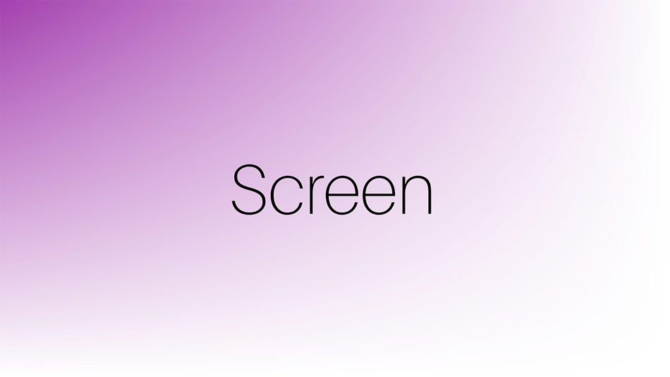
SCREEN
Screen is the opposite of Multiply. It essentially replicates projecting multiple photos onto a single screen. Just like Multiply, I use this one a lot. If I have a layer with a lot of white and I want to overlay the image and let all the white drop out I'll try Screen.
LINEAR DODGE
This mode will look the same as Add at 100% opacity. But if you lower the opacity down it will start to look a bit less saturated than Add.


COLOR DODGE & CLASSIC COLOR DODGE
This decreases the contrast of the underlying layer via the color information of the source layer. It’s much like Color Burn, but the opposite, resulting in a brighter image. The bottom layer will be the one that comes through more so the stacking order is important.

Complex Modes
These modes work based on luminance. So they will do one thing to areas that are brighter than 50% gray and another to the areas that are lighter than 50% gray.
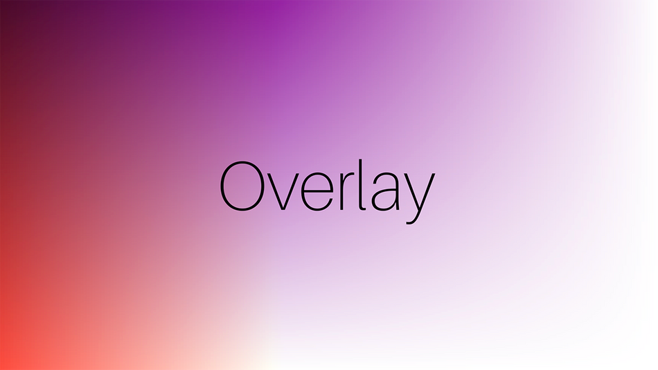
OVERLAY
Overlay is definitely one of the most useful modes. It applies Multiply to the darker parts and Screen to the lighter parts of the top image. This results in something that’s very close to the name. It feels like it overlays the top image onto the bottom one. The stacking order is important here because the bottom layer will come through more.
SOFT LIGHT
This is a bit like overlay but it feels more subtle. Any spots brighter than 50% gray on the top layer will dodge the bottom layer. And anything darker will be burned. So it’s sort of a mix of dodging and burning which is why it’s more subtle than Overlay.

HARD LIGHT
This does the same thing as Overlay but it’s much more intense. The top layer will show through more than the bottom layer.

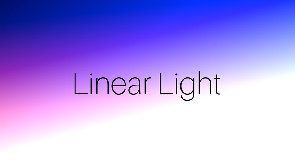
LINEAR LIGHT
This is another step into the extreme, even more than Hard Light. The math for Linear Light is the same as Soft Light, but more intense. So it also does the dodging and burning based on the gray levels. The top layer for this will also show through more than the bottom one.
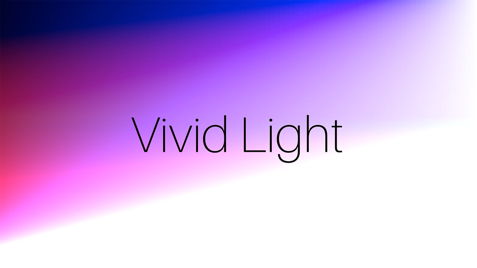
VIVID LIGHT
Vivid Light is yet again more intense than Linear Light. This one actually adjusts the contrast of the bottom layer. It results in a very high contrast image.
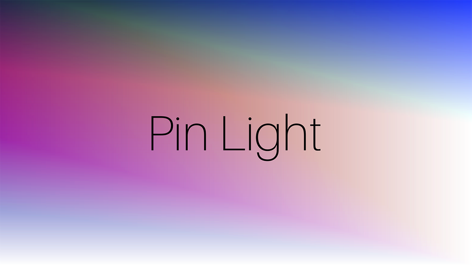
PIN LIGHT
Pin Light will choose between either the top or the bottom pixel based on brightness. So it’s a mix of Darken and Lighten based on that 50% gray level for each pixel.
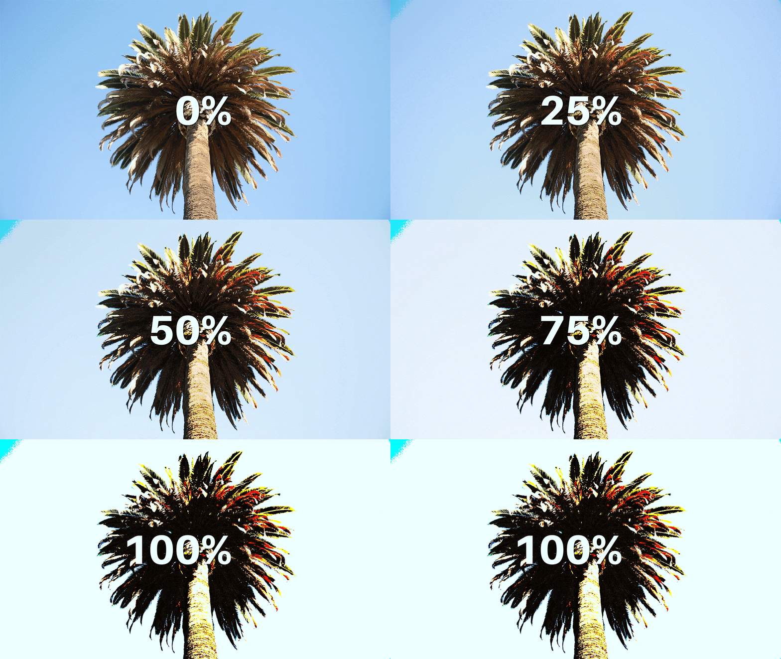
HARD MIX
This is a very extreme and strange mode. It will only output one of the 8 basic colors: red, green, blue, cyan, magenta, yellow, black and white. This mode doesn’t really feel too useful on it’s own but you can use it to achieve some different compositing goals.

One example is to duplicate a layer and then apply Hard Mix to the top layer. Now by changing the opacity of that Hard Mix layer you can adjust the contrast of the bottom layer.
Difference Modes
These modes result in some seriously strange and seemingly useless results. But they can be used for utility and that’s probably why they exist.
DIFFERENCE & CLASSIC DIFFERENCE
This subtracts the color values of the two layers and tends to create crazy trippy colors because a lot of colors become inverted.
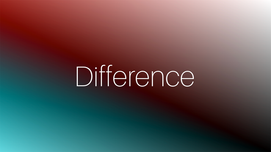
If you duplicate a layer and apply Difference it will just result in a black image. This can be useful for compositing if you have two shots that are very similar and you are trying to find the difference in them.

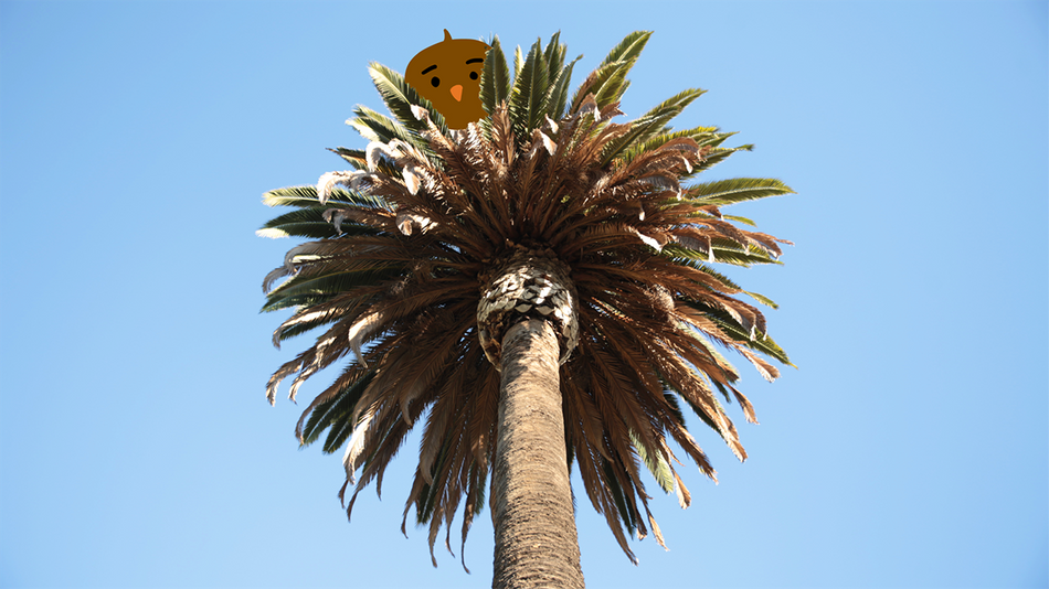
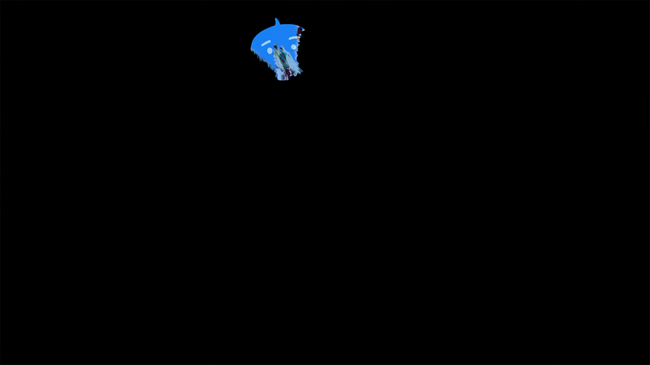
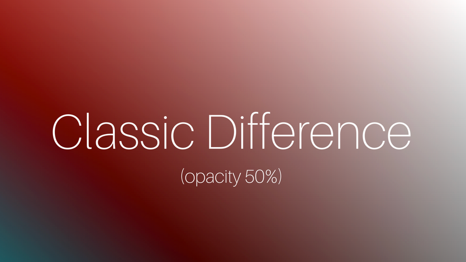
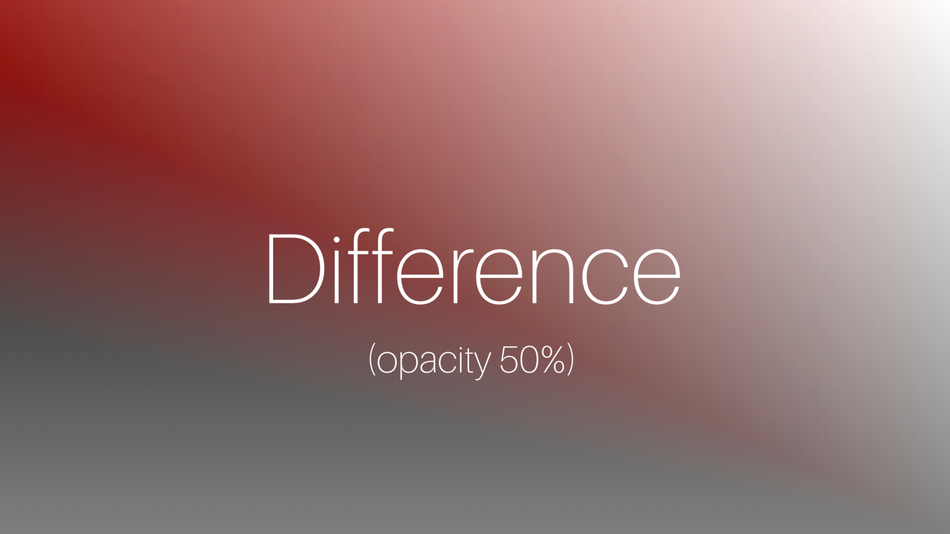
Classic Difference is only noticeably different when the layer is less than 100% opacity. Classic has more colors in the transition tones than Difference and therefore makes for more saturated colors in those transition areas.
EXCLUSION
This is a lot like Difference except that it results in less contrast and a bit less saturated colors. When one of the layers is at 50% gray it will result in gray instead of creating huge color shifts. So essentially it’s a bit “less trippy” than Difference.

SUBTRACT
This will subtract the top layers color values from the bottom layer. This means that if the top layer is bright (larger numbers) it will make the result darker and visa versa. So it’s kind of backwards. If the layer you are applying it to is bright then it will make the result darker.

DIVIDE
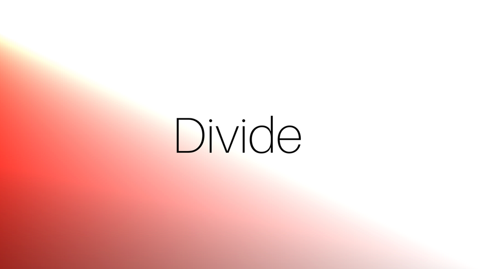
This one is a bit strange too. It will divide the color values and since the values for black and white are 0.0 and 1.0 respectively, the calculation will be dividing numbers that are less than 1. Ok, time for some math… when we divide by a fraction it results in a larger number. So 1 divided by .5 is the same as multiplying it by 2, aka doubling it. Long story short, the dark areas of Divide will make the image brighter.
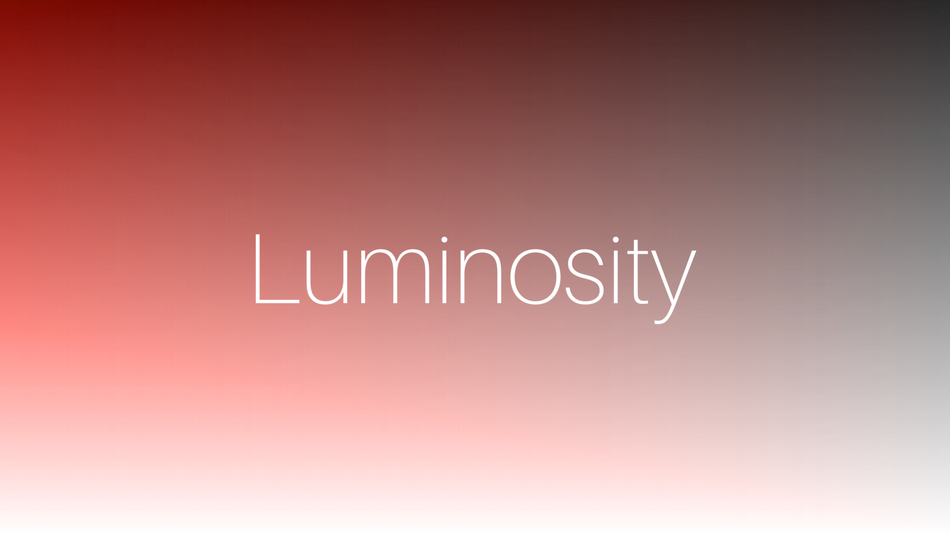
HSL Modes
WTF does HSL mean? Hue, Saturation and Luminance, That’s what!
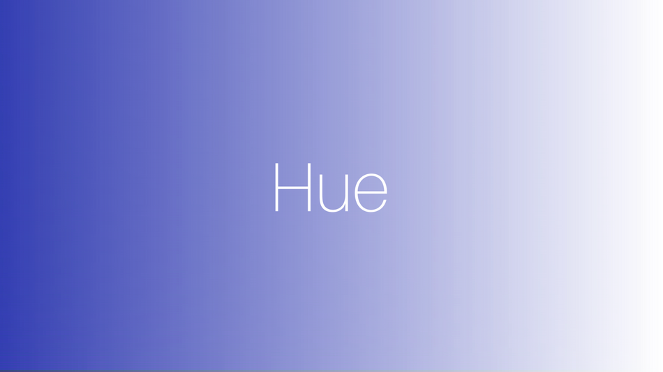
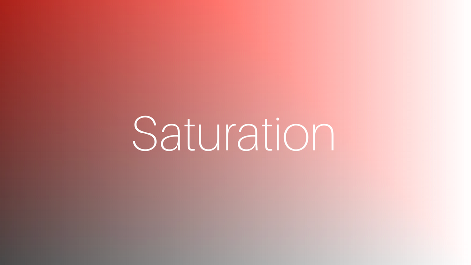
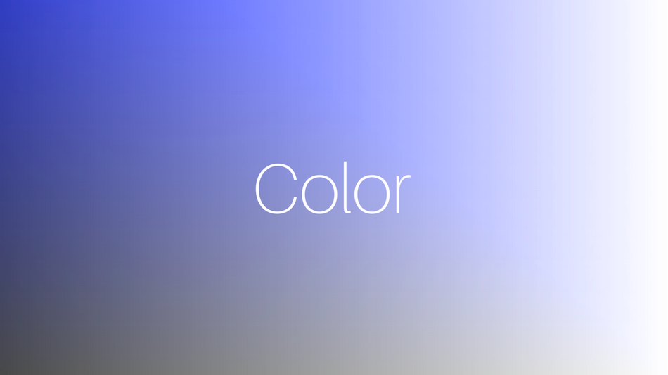
These are simple. The name of the mode determines what is kept by the top layer. So if you apply Hue to the top layer then it’ll lock that in and use the saturation and luminance from the bottom layer.
Matte Modes and Utility Modes
All of the modes discussed so far (with the exception of dissolve) have an affect on color values. The rest of the modes all have an effect on transparency instead. These all function quite differently and have a much different purpose than most of the other modes.
MATTE MODES
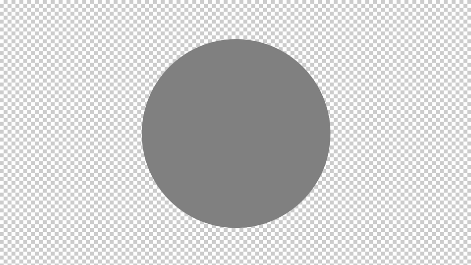
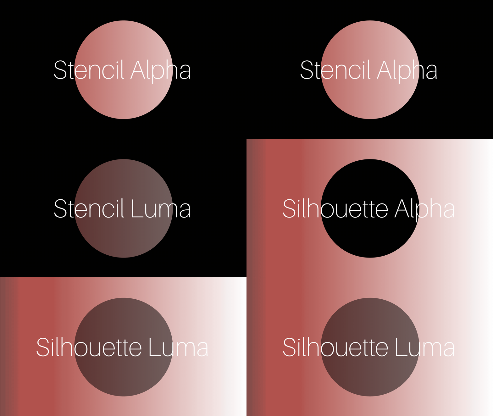
The four Matte modes use the source layer as a matte, much like the Track Matte function. It takes either the Alpha (transparency) or the Luma (brightness) values to create the matte. This is useful because it can function as a matte for all layers below instead of just the one immediately below it as with track mattes.
ALPHA ADD
This is a very specific utility mode, and it’s much less about combining overlaying images as it is about fixing a problem. If you have ever used a mask to cut something in half and then reversed the matte on a second layer you may have noticed that you often get a seam along the edge where the layers meet. You probably want the object to appear solid and not have that semi transparent seam.
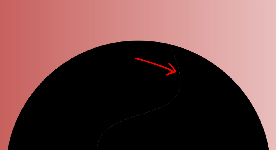
The solution to this is the Alpha Add mode. Long story short, it will change the way that After Effects does the math for the anti aliasing on the edge of the layers and it should result in a seamless edge.
LUMINESCENT PREMUL
This mode is also about solving a specific problem. Sometimes when you bring a source into After Effects that has premultiplied alpha channels the edges of the alpha channel can be too bright. If this is the case try bringing in the footage as Straight Alpha instead of Premultiplied and then composite it with this mode. If you want to read more about the difference between straight and premultiplied alpha channels there is some information on this page about it.
More Blending Mode Resources
The Adobe website is a perfect resource for all things After Effects.Be sure to check out some of these great books. Particularly After Effects Apprentice and After Effects Visual Effects and Compositing. This is a great video tutorial that walks through all of the blending modes in Photoshop. It’s not about After Effects, but most of the modes also apply.
ENROLL NOW!
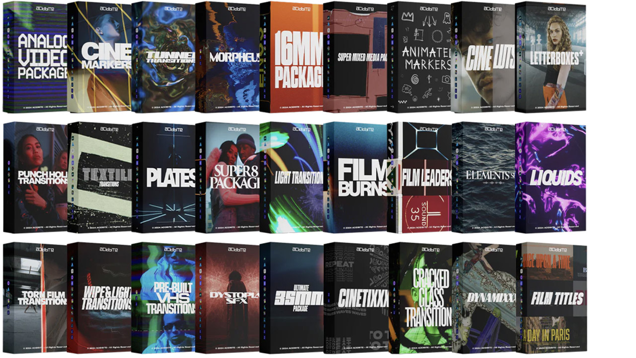
Acidbite ➔
50% off everything
ActionVFX ➔
30% off all plans and credit packs - starts 11/26

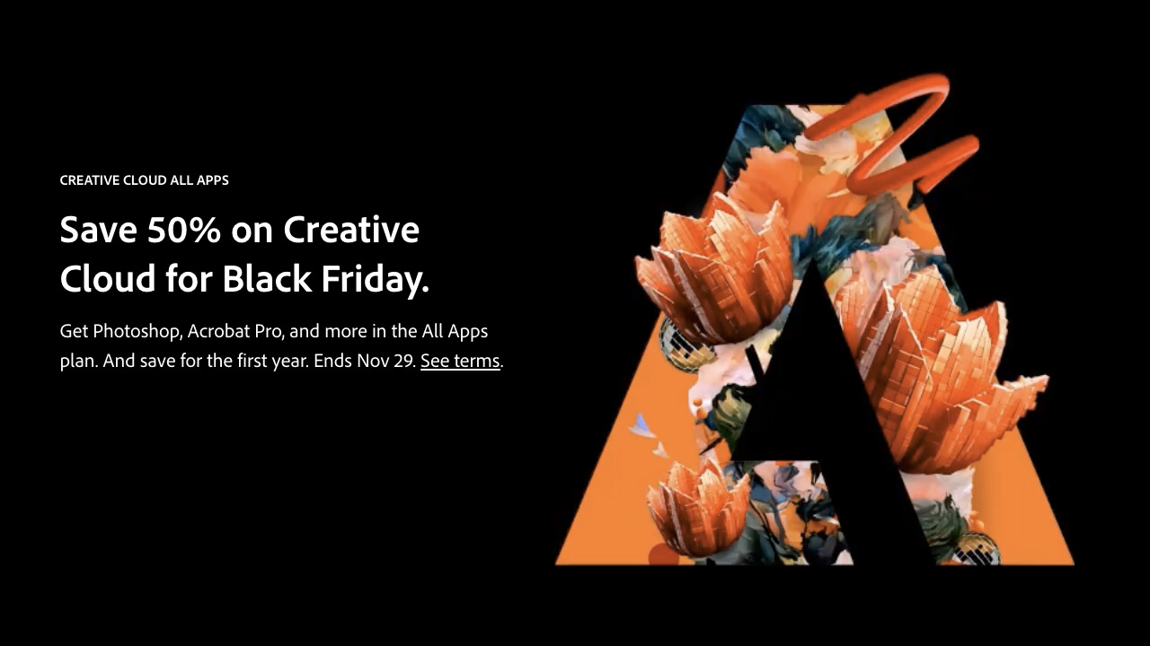
Adobe ➔
50% off all apps and plans through 11/29
aescripts ➔
25% off everything through 12/6
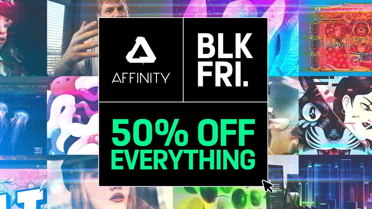
Affinity ➔
50% off all products
Battleaxe ➔
30% off from 11/29-12/7
Boom Library ➔
30% off Boom One, their 48,000+ file audio library
BorisFX ➔
25% off everything, 11/25-12/1
Cavalry ➔
33% off pro subscriptions (11/29 - 12/4)
FXFactory ➔
25% off with code BLACKFRIDAY until 12/3
Goodboyninja ➔
20% off everything
Happy Editing ➔
50% off with code BLACKFRIDAY
Huion ➔
Up to 50% off affordable, high-quality pen display tablets

Insydium ➔
50% off through 12/4
JangaFX ➔
30% off an indie annual license
Kitbash 3D ➔
$200 off Cargo Pro, their entire library
Knights of the Editing Table ➔
Up to 20% off Premiere Pro Extensions
Maxon ➔
25% off Maxon One, ZBrush, & Redshift - Annual Subscriptions (11/29 - 12/8)
Mode Designs ➔
Deals on premium keyboards and accessories
Motion Array ➔
10% off the Everything plan
Motion Hatch ➔
Perfect Your Pricing Toolkit - 50% off (11/29 - 12/2)

MotionVFX ➔
30% off Design/CineStudio, and PPro Resolve packs with code: BW30
Rocket Lasso ➔
50% off all plug-ins (11/29 - 12/2)
Rokoko ➔
45% off the indie creator bundle with code: RKK_SchoolOfMotion (revenue must be under $100K a year)
Shapefest ➔
80% off a Shapefest Pro annual subscription for life (11/29 - 12/2)
The Pixel Lab ➔
30% off everything
Toolfarm ➔
Various plugins and tools on sale
True Grit Texture ➔
50-70% off (starts Wednesday, runs for about a week)
Vincent Schwenk ➔
50% discount with code RENDERSALE
Wacom ➔
Up to $120 off new tablets + deals on refurbished items
