All-Access Pass
Unlimited access to 50+ courses, unlimited critique, live events, and 24/7 community. Join School of Motion All-Access today.

Learn how to choose colors more intelligently by understanding the concept of Value in color theory.
The hardest thing about being a Motion Designer is often the design part. And, one of the most common questions we get is, "How do you choose the right colors for your designs?" Unfortunately, there isn't a silver bullet answer to that question, but today we'll be teaching you something that's pretty close.
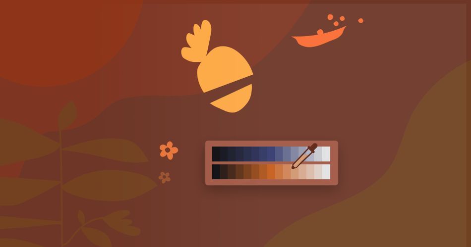
In this tutorial, Design Bootcamp instructor (and Emmy award winner) Mike Frederick will give you the skinny on Value, a component of color theory that will instantly upgrade your work once you understand it. There are also plenty of Photoshop tips in this one.
Put on your fancy design cap.
Design 101: Using Value Structure
{{lead-magnet}}
What are you going to learn in this tutorial?
Design is an endlessly deep well, but in this lesson you'll start to get a handle on some basic color theory. You'll learn how to apply Value to your work in a very practical way. You'll learn some theory, but you'll also see that theory put to use in Photoshop.
WHAT IS VALUE?
Boring word, awesome concept. Value is the brightness of a color, and it's probably the most important component when it comes to creating contrast in your work.

HOW DOES COLOR RELATE TO VALUE?
Value is just one piece of the color pie. How does it relate to things like warm and cool hues?
WHY IS VALUE STRUCTURE SO IMPORTANT?
Value structure is a game changing idea once you grasp it. Mike's set up some great visuals to help the concept really lang.
HOW DO YOU USE VALUE IN PHOTOSHOP?
Enough theory, let's get to it! Mike walks through a simple but very illustrative example of how designers use Value in motion design.

Design the foundation of great work. We'll help you learn it.
Motion Designers often ignore the design part of the equation, focusing more on software techniques and tricks. This is not wise. Design is the foundation of every great piece of work you've ever watched and, more importantly, it can be learned. Check out Design Bootcamp our 12-week interactive learning experience that will teach you the principles of design in a real-world setting.
Our team is standing by to answer any questions you have about this course or any other class in our curriculum. Please let us know if we can help you in any way!
-----------------------------------------------------------------------------------------------------------------------------------
Tutorial Full Transcript Below 👇:
Michael Frederick (00:00): Hello there I'm Michael Frederick. And in this quick video, I'm going to teach you a very handy trick about using value to get your colors, to work better in your composition Now value and color theory or topics we talk about in depth in the design bootcamp course at school. What motion? So make sure to check that out. If you like what you learned today, also you can download the project files I'm using in this video to follow along. Details are in the description.
Michael Frederick (00:40): Value is defined as the relative lightness or darkness of a color or hue. The greater, the difference in value of two objects, the greater the contrast. Now, if you search for the meaning of value, you will likely find this value scale chart right here. This scale represents the darkest values we see, which is on the far left side of the scale. And the lightest values a hundred percent white is on the right side. Now, most designs we create contain the values, which fall somewhere in the middle range of this scale. The most important thing to remember about this value scale is to pair values that have enough contrast between them. That's the trick. So what happens if we don't use enough contrast with value? If we decide to choose two values, side-by-side on this scale, we get a design outcome that looks like this muddy, yuck, not a good look.
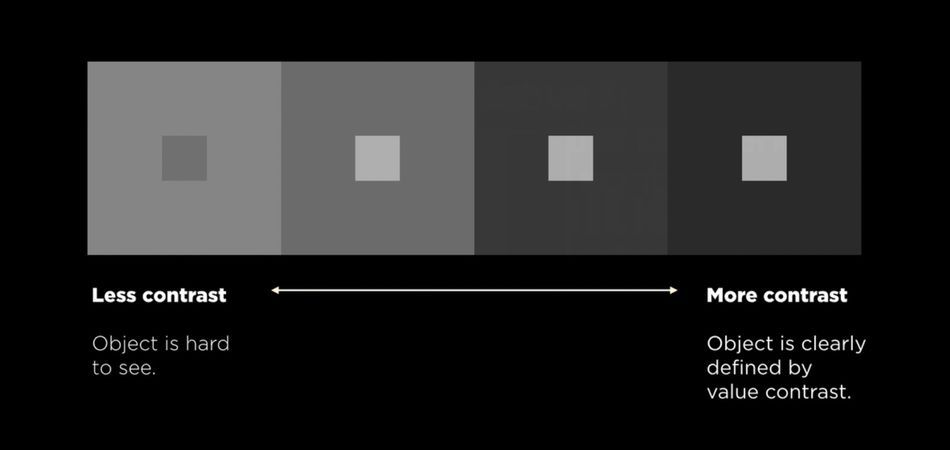
Michael Frederick (01:36): You can see in this design, the shapes are really hard to see now, why do you think that is if you squinted this frame, you'll begin to notice that the shapes blend into the background, the shapes in the background share values that are really too close together. They almost blend as one value. So to fix this problem, choose two values that have more contrast. If we squint at this frame, you can clearly see that the lighter shapes pop off the darker background. This design tells the viewer where to look. This frame illustrates good emphasis hierarchy. And contrast contrast is probably one of the most important principles in design. And to reinforce the idea of contrast this chart right here, clearly shows how more contrast in value helps your eye. See what's important in your design. Now, what if we add a cool color or a hue to the value scale?
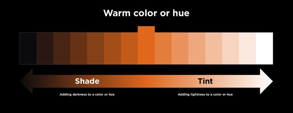
Michael Frederick (02:34): Well, we get a range of blue values that go from a dark blue to a lighter blue. And two terms that are commonly associated with value is tent and shade. Tent is what you get when you add lightness to a color or a hue and a shade is when you add darkness to a color or a hue. And on the flip side, if we add a warm color to the value scale, it looks like this. So what would happen if we picked two contrasting colors from these two color scales and combine them using color proportion into a single awesome design, what would happen? Well, here's a great example of what can happen when a skilled designer combines two contrasting color values to create hierarchy and emphasis in this design, the fire is a brighter color that pops off the darker blue background. As a viewer.
Michael Frederick (03:29): I know exactly where to look because she is directing my eye through the use of lightness and darkness. My eye tends to see the light warmer colors. First, they pop off the cool background. And one way to see value clearer in a design is to add a mosaic effect over the frame. This process helps to simplify complex value ranges and shows you the dominant elements that attract your eye. This process of seeing value changes is incredibly important. This is the way we direct our eyes through a design. So speaking of design, let's change gears a bit and jump into Photoshop and do some value. Designing here. We have two style frames that contain really poor value structures. I think it's pretty obvious everything is blending together and there's no contrast. And seeing that I'm the designer of these frames. I have the power to control your eye.
Michael Frederick (04:28): Yes, I do. And to tell you as the viewer, where to look and in these designs, I'd like for you to see these vegetables right here first, because they lead your eye through the open negative space and frame one, and then two, the cooking studio logo and frame two. But because these frames have very low contrast value structures, you really can't see what's important. And that's a really big problem. So to put it very simply the handy trick I talked about earlier in this video is this, when you want to create levels of hierarchy in your design, working with lots and lots of contrast between the values in the background and the foreground can really help you see what's important in your designs value, create hierarchy. And in design bootcamp, we talk a lot about hierarchy and how to control our eyes through the lightness and darkness of objects.
Michael Frederick (05:31): So in frame one, I want to make these veggies brighter and values so we can see them. I like to keep these on the warm side of the color wheel, just because this is an overall warm frame, but I just want to make them brighter. When I make colors in Photoshop, I use these three sliders right here. The top one here is hue and color and that's temperature. That is the color, the temperature, the feeling of what I'm making. And the second one is saturation. That's the intensity of the color. And the third slider, this is brightness. This is the darkness and the brightness of a color. This is the value slider right here for my first color choice. I'm thinking this vegetable right here, I need to really make this thing pop. So I'm going to really crank up my brightness. So on the value slider, I'm going to crank up the value to like a hundred, because I really want it to pop off this background and saturation, not really sure, maybe somewhere up in here, I want it to have some sort of pop and intensity, but not too much. And I think I want the actual temperature of the color, the hue and the color to be. I don't know, somewhere in this sort of golden yellow range right in here somewhere. I like that color right there. It's kind of right between the red orange and sort of the lighter yellow. So it's kind of gold and the intensity. Let's crank that up a little bit. Let's do another 10 to 75 and uh, let me just select it.
Michael Frederick (07:12): And there's my veggie too. And I'm going to hit option delete so I can fill it with that beautiful golden color. Now look at the difference between this color. The value is so bright compared to the background. Now I can see it. It's awesome. So I think what I'll do now is I'll fill veggie one and three, which are these two objects with more colors that are bright in value and are on the warm side. So let me do that right now. That looks good too. Again, it's on the warm side of the color palette, which is nice and veggie one, let me fill that with something that is also in the warm family and also very bright. I'm going to probably keep the brightness up to a hundred percent because I really want this to pop. Okay, this looks pretty good. Frame one. I'm liking it so far.
Michael Frederick (08:07): Now here's another trick that I need to tell you about when I'm working with value. I always create an adjustment layer. I do a black and white adjustment layer, and I put it on top of both frames. And what I do is I use this as a way to look at the value. So if you squinted this frame, you can now start to see that these three vegetables pop off this very dark background, and you can see how close these values are in the background of these shapes. They blend as one unit, which is really nice, but it's nice to also see that the color variation is very slight between this shape, this shape, this shape, this shape, but this shape right now, this is distracting my eye. I want to be focused on these vegetables as they're kind of moving through this negative space, but this thing right here is stopping my eyes. So I'm thinking I'm just going to quickly select this color here.
Michael Frederick (09:11): And I'm going to put in the background, I'm going to fill it with that color. Now that makes a big difference. So from this color to that color, I think this is so much better because now if I checked my values, when my black and white adjustment layer, I want to see these pop off the background and be dominant. These are the most important things in my design, and that's what I want to focus on. That's what I want you to see as well. All right, so that looks good. I like that frame. Now I'm going to move on to frame two and do the same thing. But look at this, the background and frame two is bright and the objects, the veggies and the logo probably are going to be dark almost like this thing right here, which I'm not really sure why that's dark.
Michael Frederick (10:06): I may need to change that, but these shapes and this logo need to be dark so they can pop off the background and be dominant. I want to see this because my eye is going to move from here to here. So I'm going to go ahead and make these darker, cool colors, because this is a cool frame versus the warm frame and frame one. So I'm going to select veggie three close frame one, and I'm going to go up here and again, use my HSB sliders. And I'm going to yank this all the way into a cool place. What if I go almost into a kind of like a purple, like a really cool purple let's get the saturation up and let's definitely take the brightness now is not going to be a hundred percent. It's going to be down here because it needs to be dark because it needs to have contrast against the background. Because again, we're dealing with value. We're dealing with contrast, contrast, and black or darkness and lightness. Let's see, let's do something like that. There we go. A lot of contrast between that color and this background. I really like that. Let me make this a color. And also the cooking studio logo, a darker color and a, that will almost do it for frame to maybe a bluish purple possibly. And for the cooking studio logo is going to color overlay and the blend mode is normal. So I'll mess with my sliders.
Michael Frederick (11:48): It looks like a good color. I may adjusted a little bit all, and I'll just apply that to my color overlay and hit, okay. That looks really good. Now in the first frame, this thing here is really dark. And again, my eye wants to move from frame one, followed the negative space, and then they follow through the negative space to the cooking studio logo. And this thing here is a bit harsh to my eye. And I keep looking at this and not that look at it in gray scale. And this thing is just not really going to work. So I'm going to, again, select an object in the background like this blue object, and I'm going to fill shape number two with that. And that looks really good squint at it. Let's look at both frames.
Michael Frederick (12:48): And if I squinted this, my eye follows these three bright objects in frame one, and it goes into the two or the three dark objects in frame two. And I think these frames look really good and I'm going to put a fork in it and hit save here is where we started. The values were not working so well. Everything looked kind of muddy. The hierarchy wasn't working for me. I couldn't see the important things on the frame. And then just by slightly altering the values of certain objects, I was able to control the value and make your eye, see the objects I wanted you to see in the composition. And this is how value can work for you to help you see hierarchy and your own designs. Okay. My work here is done. Hit subscribe. If you want more tips like this one and make sure to check the description so you can download the project files from this video. If you want to go deep into the principles of design and practice using them on real-world projects with the help of industry pros, then please check out design bootcamp from school of motion.
ENROLL NOW!
Acidbite ➔
50% off everything
ActionVFX ➔
30% off all plans and credit packs - starts 11/26

Adobe ➔
50% off all apps and plans through 11/29

aescripts ➔
25% off everything through 12/6
Affinity ➔
50% off all products

Battleaxe ➔
30% off from 11/29-12/7
Boom Library ➔
30% off Boom One, their 48,000+ file audio library
BorisFX ➔
25% off everything, 11/25-12/1
Cavalry ➔
33% off pro subscriptions (11/29 - 12/4)
FXFactory ➔
25% off with code BLACKFRIDAY until 12/3
Goodboyninja ➔
20% off everything

Happy Editing ➔
50% off with code BLACKFRIDAY
Huion ➔
Up to 50% off affordable, high-quality pen display tablets

Insydium ➔
50% off through 12/4
JangaFX ➔
30% off an indie annual license
Kitbash 3D ➔
$200 off Cargo Pro, their entire library
Knights of the Editing Table ➔
Up to 20% off Premiere Pro Extensions
Maxon ➔
25% off Maxon One, ZBrush, & Redshift - Annual Subscriptions (11/29 - 12/8)
Mode Designs ➔
Deals on premium keyboards and accessories
Motion Array ➔
10% off the Everything plan
Motion Hatch ➔
Perfect Your Pricing Toolkit - 50% off (11/29 - 12/2)

MotionVFX ➔
30% off Design/CineStudio, and PPro Resolve packs with code: BW30

Rocket Lasso ➔
50% off all plug-ins (11/29 - 12/2)
Rokoko ➔
45% off the indie creator bundle with code: RKK_SchoolOfMotion (revenue must be under $100K a year)
Shapefest ➔
80% off a Shapefest Pro annual subscription for life (11/29 - 12/2)

The Pixel Lab ➔
30% off everything
Toolfarm ➔
Various plugins and tools on sale

True Grit Texture ➔
50-70% off (starts Wednesday, runs for about a week)

Vincent Schwenk ➔
50% discount with code RENDERSALE
Wacom ➔
Up to $120 off new tablets + deals on refurbished items



All-Access Pass

Unlimited access to 50+ courses, unlimited critique, live events, and 24/7 community. Join School of Motion All-Access today.
