Start Your 3D Journey in Cinema 4D
Master the essentials of 3D modeling, lighting, and animation in C4D. Enroll in All-Access to unlock C4D Basecamp and 50+ other courses.

Tendril taps Cinema 4D to refresh Microsoft emojis.
Emotion, story and fun characterize Microsoft’s recently reimagined family of emojis. Working closely with the team at Microsoft Design, Tendril conceptualized, designed, and executed a complete refresh of over 1800 smileys, people, animals, objects and symbols. Using Cinema 4D and Redshift, the 20-strong team modernized the emojis by bringing 3D and animation to many fan favorites.

A huge undertaking spanning seven months, we asked Cofounder and Creative Director Alexander “Xande” Torres, Creative Director Leo Mateus and Lead Modeler Flavio Diniz to tell us about the challenges and rewards of this complex project.
Please tell us a bit about Tendril.
Torres: Tendril was founded by me, Chris Bahry, Kate Bate, and Patrick Coffey in 2010 as an animation, VFX, and digital innovation studio. We have growing offices in Toronto, Canada and Sao Paulo, Brazil, with about 50 artists, designers, producers and directors. We create design-driven and art-centered brand films, graphic packages, teasers, short films and immersive experiences for brand, technology and entertainment companies, including Nike, Hublot, Vizio, ESPN, FX and more.
How did you land this project and what was your brief?
Torres: We helped the team at Microsoft Design explore playful new expressions for avatars. They were happy with our work and rewarded us with a real challenge: to reimagine their complete set of over 1,800 emojis. Microsoft wanted to ensure that inclusivity and human expression were at the core of this redesign and that it aligned with their product vision going forward.

What references were you given and how did you tackle such a huge project?
Mateus: We were asked to work within the rules and parameters set by Unicode’s square (32x32 pixels) framework and to align with Microsoft’s Fluent Design System. A holistic approach to product development, it sets out design principles for all Microsoft’s products, and the Emoji Fluent System is a continuation of this.
Knowing Microsoft’s vision for how emojis should be applied across its products in the future helped us to establish design foundations for each category of emoji. Smileys were the jumping-off point, and soon after we started investigating objects and places, then vehicles and the list went on. This ensured that our team had a well-structured methodology to keep progressing until the very last emoji.
Creatively, what’s the difference between the old and new emojis?
Torres: The new emojis are more expressive, playful and add a lot more personality. The smileys are based on a shape we call the “imperfect circle,” and we made the human emojis more inclusive, avoiding any stereotypes or conventional labeling that traditionally exists when illustrating human expression.

What do 3D and animation bring to emojis and how did Cinema 4D help?
Mateus: 3D and animation helped us depict inclusivity, expressing that there is more than what meets the eye, adding dimensionality and a more humanistic approach to the emojis. We deployed various techniques to create an orthographic look while manipulating assets in 3D space, and some emojis had to be rebuilt to be animated.

Diniz: Cinema 4D was our main tool and it helped us with everything: modeling, texturing, animation, lighting and rendering with Redshift. For the smileys’ “imperfect circle,” volume modeling was perfect for the look we aimed for: rounded models, soft curves and bevels.
Being able to customize the interface, organize everything in layers and the ability to make custom menus with the user data made the project very organized. Cinema 4D’s Take System was key for managing the amount of files, especially in cases where emojis had skin tone variation.
And for most animated emojis, we didn't need to create complicated rigs with joints; we just needed to use some combination of deformers and animate the parameters.
Is the project finished, or will you continue working on the emoji family?
Mateus: It is very much an organic design system that will keep evolving. Since the new emojis foundation was put in place, we have already completed two new mini sets: The WFH (Working from Home) emojis and a small update following the latest addition from Unicode.

What’s been most rewarding about the project?
Torres: We like projects that encourage the world to see things differently, and this one was about positive change. It gave us a lot of pride knowing that we were improving something that millions of people use daily.
Helena Swahn is a writer in London, UK.
ENROLL NOW!
Acidbite ➔
50% off everything
ActionVFX ➔
30% off all plans and credit packs - starts 11/26
Adobe ➔
50% off all apps and plans through 11/29
aescripts ➔
25% off everything through 12/6
Affinity ➔
50% off all products
Battleaxe ➔
30% off from 11/29-12/7
Boom Library ➔
30% off Boom One, their 48,000+ file audio library
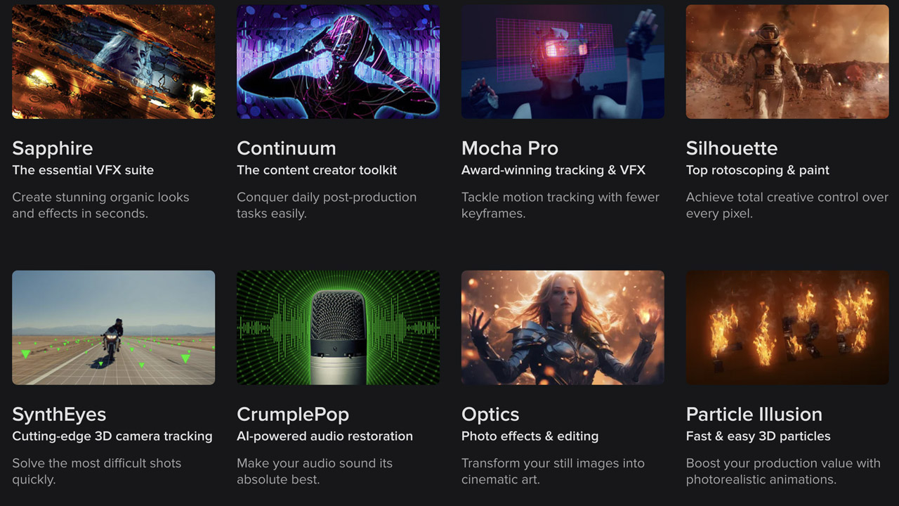
BorisFX ➔
25% off everything, 11/25-12/1
Cavalry ➔
33% off pro subscriptions (11/29 - 12/4)
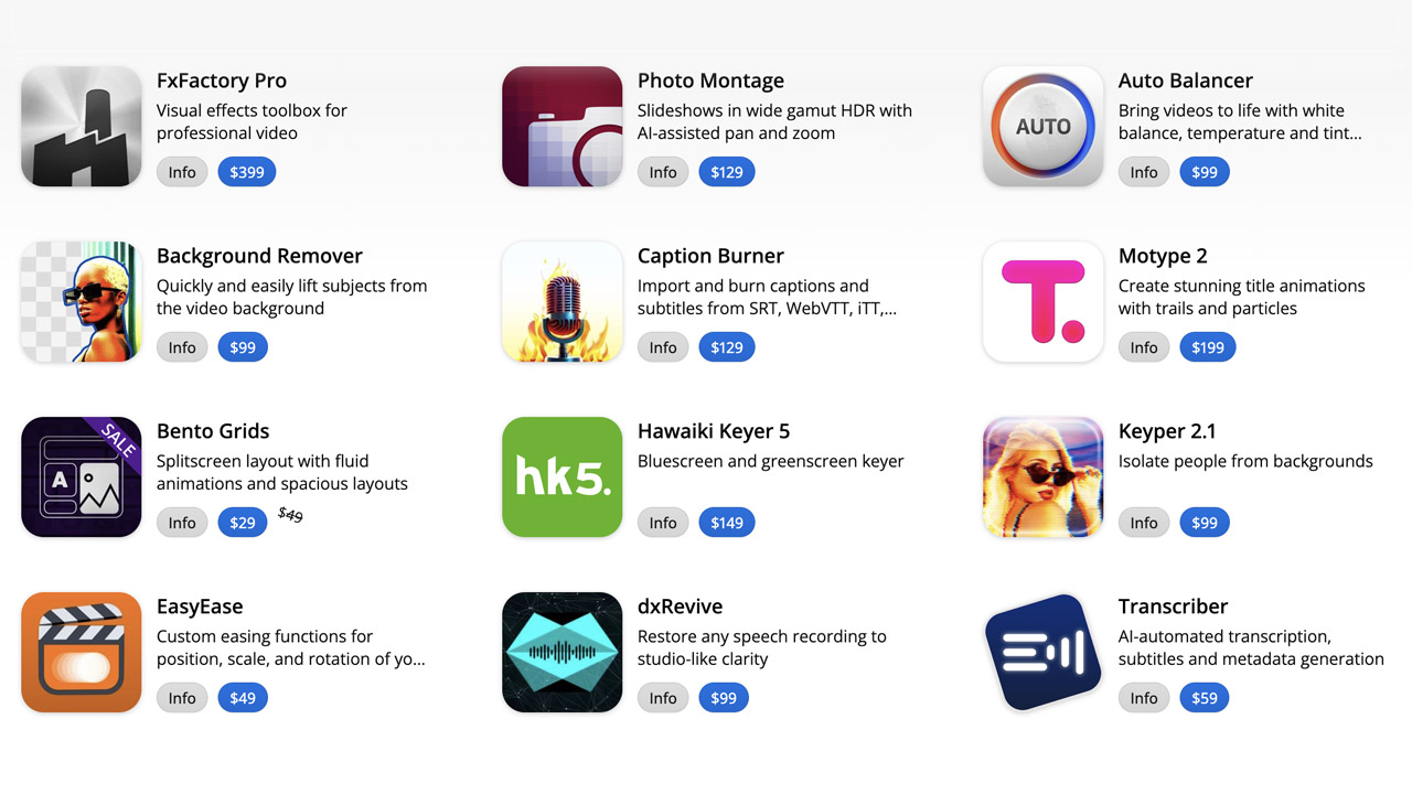
FXFactory ➔
25% off with code BLACKFRIDAY until 12/3
Goodboyninja ➔
20% off everything
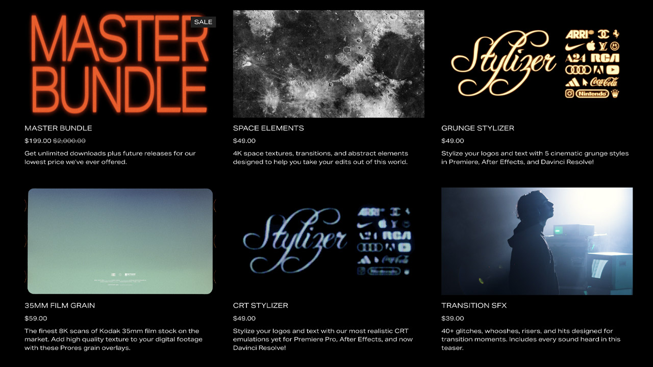
Happy Editing ➔
50% off with code BLACKFRIDAY
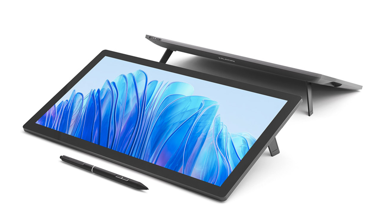
Huion ➔
Up to 50% off affordable, high-quality pen display tablets
Insydium ➔
50% off through 12/4
JangaFX ➔
30% off an indie annual license
Kitbash 3D ➔
$200 off Cargo Pro, their entire library
Knights of the Editing Table ➔
Up to 20% off Premiere Pro Extensions
Maxon ➔
25% off Maxon One, ZBrush, & Redshift - Annual Subscriptions (11/29 - 12/8)
Mode Designs ➔
Deals on premium keyboards and accessories
Motion Array ➔
10% off the Everything plan
Motion Hatch ➔
Perfect Your Pricing Toolkit - 50% off (11/29 - 12/2)
MotionVFX ➔
30% off Design/CineStudio, and PPro Resolve packs with code: BW30
Rocket Lasso ➔
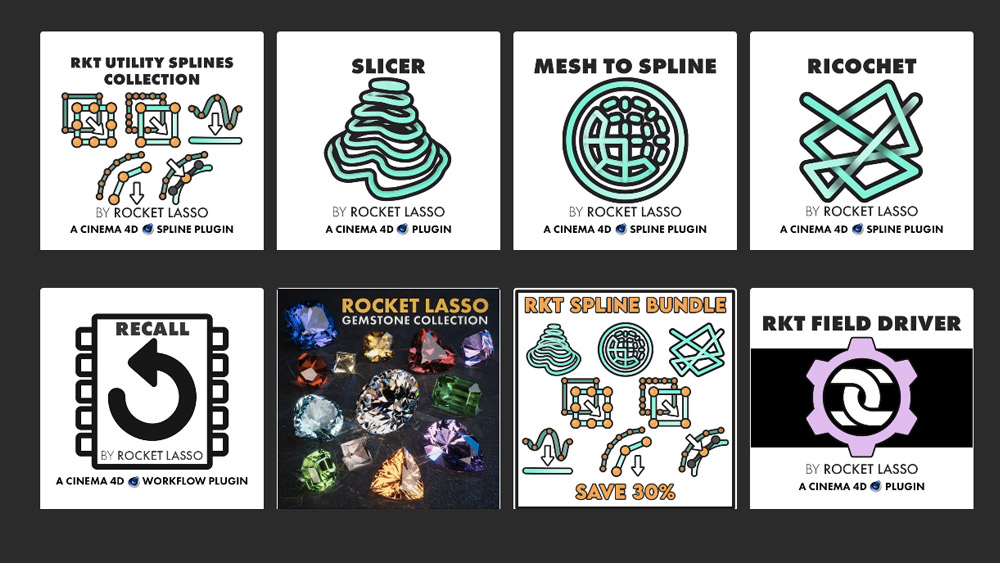
50% off all plug-ins (11/29 - 12/2)
Rokoko ➔
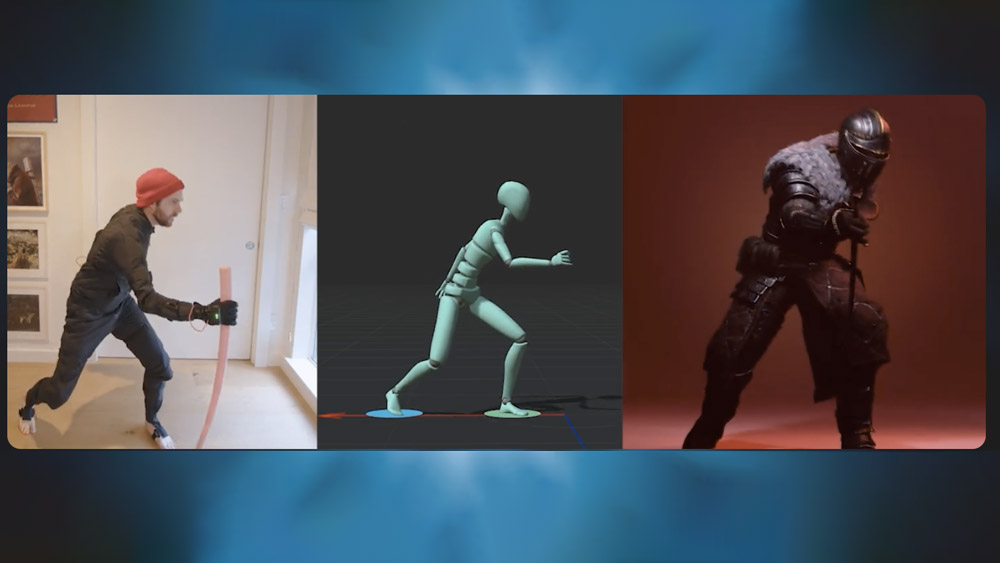
45% off the indie creator bundle with code: RKK_SchoolOfMotion (revenue must be under $100K a year)
Shapefest ➔
80% off a Shapefest Pro annual subscription for life (11/29 - 12/2)
The Pixel Lab ➔
30% off everything
Toolfarm ➔
Various plugins and tools on sale
True Grit Texture ➔
50-70% off (starts Wednesday, runs for about a week)
Vincent Schwenk ➔
50% discount with code RENDERSALE
Wacom ➔
Up to $120 off new tablets + deals on refurbished items

Start Your 3D Journey in Cinema 4D

Master the essentials of 3D modeling, lighting, and animation in C4D. Enroll in All-Access to unlock C4D Basecamp and 50+ other courses.


