All-Access Pass
Unlimited access to 50+ courses, unlimited critique, live events, and 24/7 community. Join School of Motion All-Access today.

Learn how to combine masks, built-in brushes and imagery to add texture and form to your designs in Photoshop.
Learning to illustrate is possibly one of the best ways you can improve your work and career as a motion designer. It's an incredibly valuable skill, but also one that strikes fear into the hearts of digital artists everywhere. We get it... drawing is hard! It's also very learnable, and in this video you'll get to dip your toe into the world of illustration by seeing how a high-caliber artist approaches texturing inside of Photoshop.
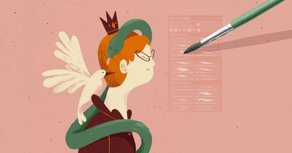
In this tutorial, Sarah Beth Morgan who teaches Illustration for Motion will show you a texturing technique that she uses all the time on client work and personal projects. It doesn't require any third-party tools, just plain ol' Photoshop. By the end of this lesson, you'll feel a heck of a lot more comfortable adding texture to your designs.
Grab your stylus, we're going in.
How to Add Texture to Your Designs in Photoshop
Download the project files below
ENROLL NOW!
Acidbite ➔
50% off everything
ActionVFX ➔
30% off all plans and credit packs - starts 11/26

Adobe ➔
50% off all apps and plans through 11/29
aescripts ➔
25% off everything through 12/6
Affinity ➔
50% off all products

Battleaxe ➔
30% off from 11/29-12/7
Boom Library ➔
30% off Boom One, their 48,000+ file audio library
BorisFX ➔
25% off everything, 11/25-12/1
Cavalry ➔
33% off pro subscriptions (11/29 - 12/4)
FXFactory ➔
25% off with code BLACKFRIDAY until 12/3
Goodboyninja ➔
20% off everything

Happy Editing ➔
50% off with code BLACKFRIDAY
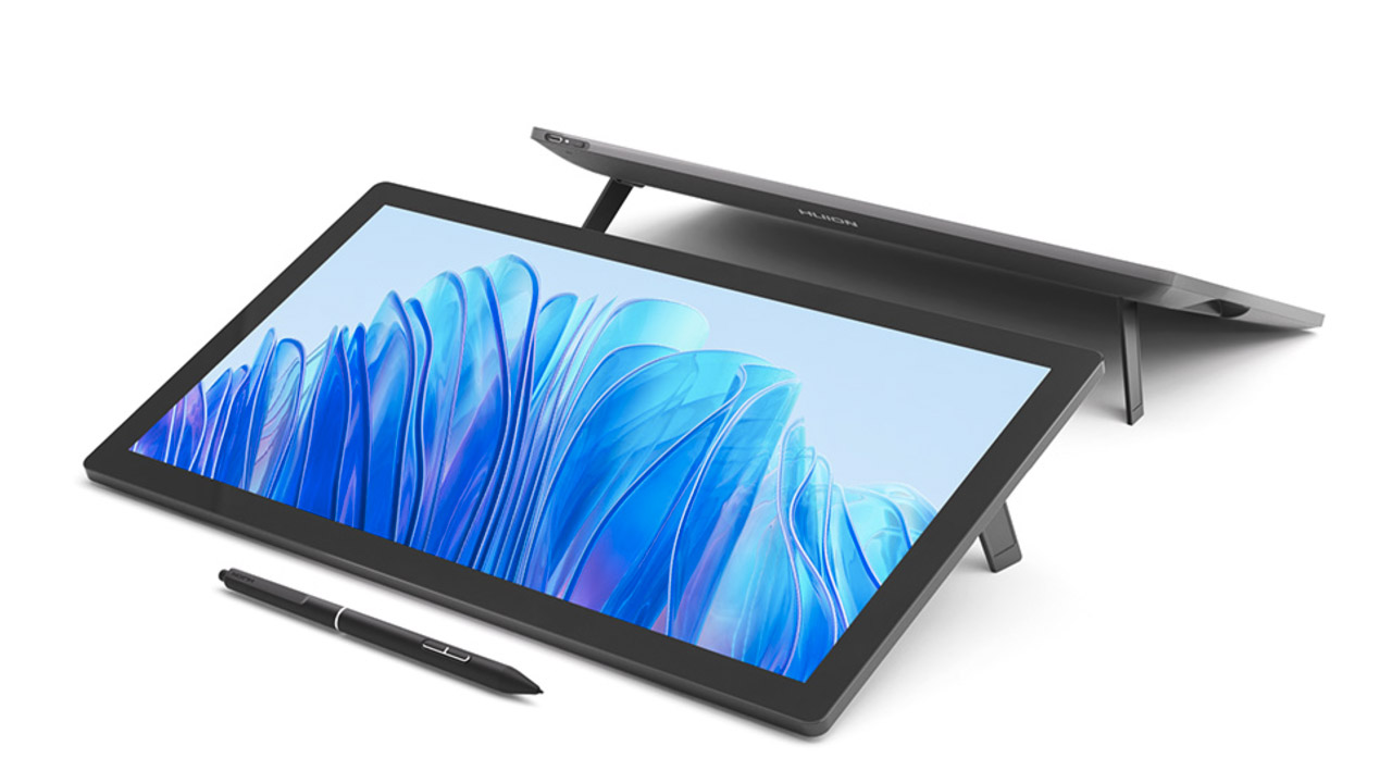
Huion ➔
Up to 50% off affordable, high-quality pen display tablets
Insydium ➔
50% off through 12/4
JangaFX ➔
30% off an indie annual license
Kitbash 3D ➔
$200 off Cargo Pro, their entire library
Knights of the Editing Table ➔
Up to 20% off Premiere Pro Extensions
Maxon ➔
25% off Maxon One, ZBrush, & Redshift - Annual Subscriptions (11/29 - 12/8)
Mode Designs ➔
Deals on premium keyboards and accessories
Motion Array ➔
10% off the Everything plan
Motion Hatch ➔
Perfect Your Pricing Toolkit - 50% off (11/29 - 12/2)

MotionVFX ➔
30% off Design/CineStudio, and PPro Resolve packs with code: BW30
Rocket Lasso ➔
50% off all plug-ins (11/29 - 12/2)
Rokoko ➔
45% off the indie creator bundle with code: RKK_SchoolOfMotion (revenue must be under $100K a year)
Shapefest ➔
80% off a Shapefest Pro annual subscription for life (11/29 - 12/2)

The Pixel Lab ➔
30% off everything
Toolfarm ➔
Various plugins and tools on sale

True Grit Texture ➔
50-70% off (starts Wednesday, runs for about a week)
Vincent Schwenk ➔
50% discount with code RENDERSALE
Wacom ➔
Up to $120 off new tablets + deals on refurbished items

Follow along with this FREE Photoshop file!
What are you going to learn in this tutorial?
In this lesson, you'll learn about the various uses of texture in designs and illustrations. You'll also find out exactly where Sarah Beth gets her texture brushes from and how she uses them in Photoshop to add visual interest and form to her work.
HOW IS TEXTURE USED?
Sure, you can slap a texture over your whole design in Multiply mode, but is that all there is to it? Uhm... no. You'll learn how to really control your texturing in Photoshop.
WHERE DO YOU GET GOOD TEXTURE ASSETS?
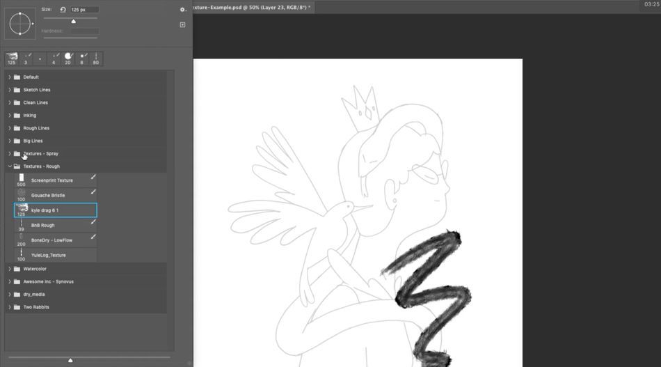
Sarah shows you exactly where you gets the textures she uses 90% of the time. Spoiler alert: They come for free with Photoshop.
HOW DO YOU APPLY TEXTURES IN PHOTOSHOP?
You'll need to be familiar with a few masking techniques to really gain full control of your textures. You'll learn several in this lesson.
HOW DO PROFESSIONAL ILLUSTRATORS WORK?
There is no substitute for watching a professional do her thing. By observing Sarah Beth as she works, you'll gain a better intuition for how professional illustration works in practice.
Don't Fear Drawing. Learn to Illustrate for Motion.
If you're a motion designer, you should learn some illustration skills. We can't overstate how helpful they can be for your work and your career. If you're ready to take the plunge and want to learn from one of the best artists in the field with the guidance and critique of industry pros, check out Illustration for Motion. This 12-week interactive course has been one of our most popular classes since it launched, and for good reason: It works.
Our team is standing by to answer any questions you have about this course or any other class in our curriculum. Please let us know if we can help you in any way!
-----------------------------------------------------------------------------------------------------------------------------------
Tutorial Full Transcript Below 👇:
Sarah Beth Morgan (00:00): Hey, I'm Sarah Beth Morgan. And in this short video, I'm going to teach you a few ways. You can add texture to your artwork in Photoshop. I use these tricks all of the time on client work, and now you can take The texture is just one technique that can adept inform to your artwork. If you're looking for a chance to really level up as an illustrator, check out illustration for motion, where you'll learn the principles and techniques of illustration from the ground up through the lens of someone working in motion design. Also, you can download the project files I'm using in this video to follow along or practice with. After you're done, watching details are in the description.
Sarah Beth Morgan (00:44): Texture is just one of the many ways that you can add a lot of visual interest and extra depth in layers to your illustrations and designs. I especially love it just because it makes my illustrations a little bit more unique. And when you bring it into motion, it adds like a little layer of secondary movement that the animator can play with. Texture can really take a flat image and help give it form and more visual interest. It can add variety to color and help separate elements more clearly. I'm just going to walk through a couple of things I really love. Um, and there's lots of different ways that you can use texture in your work. As we can see through these examples, especially this first one, you can really take something that was created in illustrator, like a vector piece of art, and really give it a lot more life by adding textures afterwards in Photoshop.
Sarah Beth Morgan (01:29): So this piece by Giacomo bag Nara, forgive me if I'm pronouncing his name wrong, but I really love that he added a little bit of grading texture to the apple, which makes it feel a little bit more realistic. We've got some almost like paper, like splatter textures on the rest of the items, but you can see that really differs from this piece by Karolis Strautniekas. I'm not even, I'm not sure if I'm pronouncing that right either, but I just love how it's monochrome, but because there's a lot of texture, it really still adds a lot of feeling of variation and contrast. You can also actually create your textures by hand and scan them in. Like, I'm pretty sure Maggie Chang made this all by hand with watercolor and then probably perfected it and Photoshop. And we can just use it always. It really brings a lot of extra life to motion.
Sarah Beth Morgan (02:18): Like in this piece, by Ariel Costa or boot my brain, he really brings to life these more graphic shapes by adding noise textures and handmade gradient textures, or you can use texture selectively like Gunnar did here, where the character is just flat. And then the background has lot more depth and personality to it, which kind of makes the character stand out and makes you look at them more carefully. Or you could literally create textures by hand on paper like they did here. I'm not even sure if it was on paper, but they use a lot of like realistic type textures, Kranz and animated frame by frame using different pastels and everything in that really adds a lot more tactile and organic quality to the word possibilities are endless.
Sarah Beth Morgan (03:09): So how does one texture, a static illustration? That's what I'll be going over here to start if I'm illustrating a Photoshop. I really like to make sure I'm using a textured brush to create all of my shapes that way the edges of my illustration have a bit of personality and tactileness to them. I've organized all of my brushes into categories, using groups so that it's easy for me to pick brushes for line work and rough textures, et cetera. I also like to play with this flow feature in the brush tool to adjust how much of the brush is appearing when I apply pressure. So I think for this illustration, I'm going to go with a running anchor brush that I've renamed from Kyle Webster's kit. And of course, if you're going to create a cleaner illustration style like that Giacomo bag, Nura vector style that we were just looking at, you can start in illustrator or you shape layers in Photoshop and then apply textures over those, as well as I'm working.
Sarah Beth Morgan (04:02): I'm making sure to keep all of my layers separate, which is really important for the masking texture technique that I like to use. It's also really important if you plan on animating your illustration later. Okay. So now I've got my illustration colored in fully, but I haven't really added any texture detail, just a little bit of line work. And now that I have an illustration that's flat shaded and broken into layers, I'm basically all ready to go. And here's an example of the type of work I do all the time. It looks pretty good as is, but I think texture could really help it in a lot of ways. So first off, how do I add more texture besides like those textured edges? There are many ways, but the one I use the most is Photoshop brushes, which I was just kind of going over, but I really love the organic quality that these brushes have rather than the brushes that you use in illustrator, which are vector.
Sarah Beth Morgan (04:52): And they're just a lot heavier and tougher to work with. Photoshop has tons of awesome brushes. And Kyle Webster actually created hundreds of useful ones that come with the creative cloud app. And here's how you get them and use them go to Photoshop and open your brush panel and click, get more brushes. And from there, this gives you access to all of Kyle's brushes and some of the Photoshop default brushes as well. There's tons of awesome ones. As you can see here, and all you really need to do is just click download, and then it'll immediately start downloading this whole brush pack, which has lots of brushes in it. And once it's done downloading all you need to do to get it to work is drag it into Photoshop. And then if you go to your brush panel, you'll see it's already there at the bottom as a group.
Sarah Beth Morgan (05:36): So I'll go over three textures. I really like that could be really fun for you to try out as well. I really liked this big spray texture I got from, um, actually just like a friend. So I'm not really sure if it's a Kyle texture, but something you can do that will be really similar is say, you want a texture, a shape like, and you want to use something to emulate the spray texture. I guess what I would do is I would take a big default soft round brush, maybe soft round pressure size, and then I would change the blending mode to dissolve. And then that adds the same quality, just a little bit more digitized. You can play around with the settings on that. And it, it works in a really similar manner. I also really like his dry media brushes, like the ones I just downloaded.
Sarah Beth Morgan (06:24): And I have some of those in my rough textures. He has this Kyle drag brush, which is really nice to give like a watercolor effect, which feels more organic and hand drawn. So that's a good option. And then there's also this like screen printing texture that he has, which I love as well. It kind of gives things more of like a paper quality rather than like a shading. Like you can't really use it for shading as much to create form. Um, but it, it gives everything a little bit more roughness. And another one that's really fun is this bone dry, low flow. I think this comes from either his dry media or his painting textures, but that one's really fun. And you can play a lot with like reducing the flow and this pressure opacity tool there's a lot you can do with his brushes. And they're really fun and easy to play with.
Sarah Beth Morgan (07:18): All right. So let's actually text her this artwork. I'll be using the bone dry, low flow brush that I just showed you. Um, I think mainly because this, this kind of feels like it has a little bit of like a storybook quality to it. I could definitely use that spray texture because that's kind of trendy and that's in right now, but I don't know something about this just feels like it's painterly, which kind of feels like a children's book and just kind of look, I'm going for here. So we've got this texture, but I'm going to be playing around with the flow of it as I go. And like, we're going to be masking it out. So it's going to look quite different when we're done with it. I'm going to try to remain within my palette for textures. And a lot of times I will be using a multiply mode or screen mode or overlay mode, and I'll adjust the opacity of each texture layer to get a more desired look, uh, because I have a dark color here and I have a light color and I've got like kind of a mid-tone color with this orange.
Sarah Beth Morgan (08:14): I think that's kind of all I need to get started with my colors. Of course, if I wanted to go and use like some analogous colors or complimentary colors, like if I wanted to use like a bluish color to, to offset this orange, um, give it more of like a shadowy feel for the hair I could, but I, I personally just really love using the colors that I already have in my palette to create the shadows the best way to do this is create a new layer for your textures. Say, I want to texture the woman's hair right here. A lot of times I will control, click the layer. And then that will let me select which layer I'm actually using. And then I'll find the hair layer from there. I just usually this add layer on the bottom, right. But you can also do a command shift N and that will create a new layer as well.
Sarah Beth Morgan (09:03): Uh, but I just, I usually press it because I am using my Santiq here. You can use a tablet or anything like that, but being able to apply different pressure and have that pressure sensitivity is really going to improve your textures a lot. Uh, so yeah, I've got this texture layer I just opened here and I'm going to rename that to like hair shadow. And then from there, this part's really important. I'm going to create a clipping mask that way the texture is only wrapping around my particular layers. So say I want to use this darker, like maroon color to create a shadow for the hair. And I want to keep it within the hair shape, option, click between these two layers between the hair shadow layer and the hair layer. And then the shadow layer will clip to the hair layer below it, but I'm just going to delete what I did there.
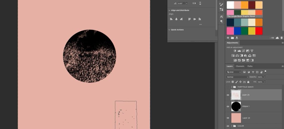
Sarah Beth Morgan (09:51): And I already have this clipped layer. Um, so I'm just going to begin kind of texturing in here. I'm going to reduce the flow a bit. So it has a little bit more separation between the brush strokes and I'm going to just kind of like slap it on there. And this is the technique I use the most for texturing. So I've, I've got this texture on here and it looks really heavy. Like if I zoom out, it's like, that's a little too dark. I don't want that. The next most important part of this technique is to actually turn this clipping mask also into a layer mask. So the way you do that is just press this little layer mask button. And then that creates this like black and white mask for your layer, which is how we're going to reduce the texture and make it feel more precise.
Sarah Beth Morgan (10:39): So using that same texture brush, make sure you've got your color selected as the black. So it will be using black and white to mask your texture here. And then that kind of starts like erasing, essentially the information that's there. But if you want to turn this layer mask off, like say I disable it. The texture is still there. All the information is still there. And that was actually really helpful for animation because if the animator still has all that layer information, they may or may not use it. And they may not like using the layer mask, but at least it's still there and I didn't completely erase everything. Um, you can kind of use X to switch back and forth between the colors on the left here, the black and white using black and white, you can mask out your texture as much, or as little as you please, this kind of adds like a fun painterly texture and, and it might still be like a little dark for me.
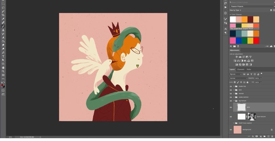
Sarah Beth Morgan (11:31): So I'm going to just take the overall whole layer, the hair shadow layer and reduce the opacity to like 50. So now we've got this textured look here and it adds a bit of volume to, or hair and a little bit of shadow, but also just adds more of a hand-drawn look, which is kind of what I'm going for here. And it might look kind of rough, but that's what I like. I kind of like those imperfections, but yeah, there's kind of like your basic texturing technique and that's kind of what I do throughout my whole project is I just apply these textures with masks and layer masks and clipping masks throughout that just gives me a lot more control because if this was like flattened the animator or me, wouldn't be able to go back and adjust these textures myself. And, you know, there's a lot of ways to do this. Some people like to use maps, some people like to, uh, create groups for their textures and then clipping mask that out. Like there's a lot of things you can do, but this is my favorite method. It's really nice to kind of apply this. Like if you, if you keep all your layers separate, say I have this wing, that's behind everything I could easily, um, go in and like create some shadow separation here. It's a really handy technique.
Sarah Beth Morgan (12:47): Obviously you're going to be using texture, just add a little bit more tactile quality and, and bring a little bit more life to your illustrations. But I mean, there's other reasons for texture too. I can use texture to help suggest the form or three-dimensional shape of an object. I mean, this takes practice and you kind of have to study a bit about, you know, where the highlight should be and maybe where the ground shadow should be, or like what actually realistically would happen with lighting. So this takes practice, but essentially I'm imagining where shadows would fall and painting them in, especially like with a snake, it's going to be curving around here. So there would be a little bit of shadow inside where it's being hid hidden from the light. Uh, and then for this one, I just kind of color pick the color of the snake.
Sarah Beth Morgan (13:33): And then I actually put the layer in multiply mode, but it adds a bit more depth there. And then obviously any time that something is being hidden behind something else, there's going to be a shadows like on the tail here. Um, you would add a shadow on the back of the snake because it's behind our character. The snake is, is turning around here. There's going to be kind of like a fold in the snake. So that's where you would put the shadow there. And then obviously here as well, when it's wrapping around behind the woman, it would be shadowed too. And you know, I'm not always like doing this maybe anatomically correct or anything, but, uh, usually I just kind of go off how it visually feels like, does this feel right? And then, I mean, you can do the same thing with highlights instead of putting your layer on multiply mode, I'll color, pick the color of the layer, I'm texturing, and then put it on screen mode or overlay mode.
Sarah Beth Morgan (14:31): And then that will get a lighter version of the color of the snake there. So I can mask that out as well, and then maybe even reduce the opacity of that. Having the highlight and the shadow really helps suggest that form. And then I can kind of, you know, apply that on this, uh, birds wings here. I actually want to like show some separation. The feathers on the wing. One thing I'll do is I'll create this new layer. And then sometimes if I'm just being really rough with it, I will use the lasso tool, which you press, press L to get that lasso tool up. And then just select the part that I want to start shading and then texture within that shaded part. So there's like kind of a hard edge on my, my texture right there. So it just adds a bit more, uh, dimension to this bird's wings.
Sarah Beth Morgan (15:17): And, you know, there might be parts of your illustration that you actually want to leave on texture, or I could kind of create like a pattern texture. So like say take the shirt, create the clipping mask. Um, and then maybe I use the same inking brush, put that on multiply mode with the same color of the t-shirt or the shirt, and then kind of add like a loopy texture in there. But then if I put that on really, really low capacity, like maybe 15, you know, that kind of adds a bit more depth to my piece. And then finally, you know, it's, it's kinda nice to add a little bit of background texture. I'm going to do that by taking some real world textures and applying them to the background. A lot of times, honestly, I'll go to Google images and then I'll type in dust texture and I'll go to images and then I'll choose something like, like this, like, this is really nice.
Sarah Beth Morgan (16:17): I don't really know what it is, but I'll copy it. And then when I get to my background texture, I'll just paste it in there and like instantly she's in our space, but since it's a black and white texture, I can do screen mode, which will give me like a white background texture, or I can go to that layer and press command, I, which will invert it. And then that will give me something I can put on multiply mode. And then I will kind of like turn down my opacity on that layer. So it's more subtle. And then I can even take spray texture that I have and then mask it out from there. So it's even less prominent. It's just adds a little bit of like background visual interest to everything. And if I want, like sometimes I'll even go in and I want to add a little bit more, uh, uniqueness to this texture.
Sarah Beth Morgan (17:04): Sometimes I'll even go in and I'll draw dots with my line brush or something. So it's just really nice to take some real world texture and apply it selectively and parts of my image. In this case, the background to make it feel more hand drawn or imperfect, or you could even take a picture of something at home, or like here, where we saw in Ariel Costa's piece, you could take a picture of marble on your kitchen, counter or something, and then use a clipping mask to apply that texture to your shape. I could obviously go on for days and days about texture, but I hope that this tutorial taught you something useful. Try out these techniques the next time you're working on a design or illustration, make sure to hit subscribe. If you want more tips like this one and check the description so you can download the project files from this video. If you want to learn to illustrate from the ground up with the help of industry pros and fun real-world projects, check out my class illustration for motion. Thanks so much for watching.
All-Access Pass

Unlimited access to 50+ courses, unlimited critique, live events, and 24/7 community. Join School of Motion All-Access today.
