All-Access Pass
Unlimited access to 50+ courses, unlimited critique, live events, and 24/7 community. Join School of Motion All-Access today.
Learn how to draw low-detail, stylized character faces that are simple and easy to animate
Do you ever feel like every other animator just draws better than you? That their drawings look so slick and effortless? What is the X factor missing from your character design arsenal? I’d like to share with you the process I learned along the way to producing better illustrations for character profiles.

No one style fits everyone, but there are some simple techniques you can learn to make drawing for animation a lot easier. I picked a number of great tricks when I went though Illustration for Motion, and they've stuck with me ever since. In this article, we'll cover:
- Starting with good reference photographs
- Defining Your Style
- Tracing and playing with shapes
- Matching skin tone and complementary colors
- Bringing your work into Photoshop and Illustrator
- And more!
Using Photo Reference

There are a lot of unique features that define a person. So, to capture their personality and uniqueness, you’ll want to work from reference material.
Since most people aren’t able to get an in-person model, you are going to need photo reference to help guide you. I’d suggest finding at least 3 or more photos of the person you are drawing.
I find a single photo rarely captures a person’s essence in a single snap. Factors such as face angle, accessories covering the hair/face, and lighting would usually require more reference.
Illustration style reference

Having reference material is just the first step in creating caricatures! Next you’ll want to define the style you’ll be working in.
Have a look at your favorite artists on dribbble, Pinterest, Instagram, Behance, or—dare I say it—step outside your house and go to the bookstore or library. Collect 3-5 style references. You could create a moodboard or just include them in your Photoshop document along with your photo references.
Tracing

Let’s be clear: This step is not cheating and should be treated more like research and development.
Create an extra layer in Photoshop/Illustrator and trace over the 3 photographs. Drag the traced layer outlines off the photos and keep them side by side. This helps you become more familiar with the person’s face, and also gives you a more basic outline reference of the features you may have not noticed.
Caricaturing/pushing the shapes

Get your beret on! It’s time to draw some tourists. You're going to draw a caricature. Caricaturing is drawing a picture or imitation of a person in which the striking characteristics are exaggerated.
First, understanding the art of caricaturing will help condense which features of a person are their most important. The basic art is to take the most definable features of a person and accentuate them. If their nose is big, make it bigger. If it’s small, make it smaller.
The same is true for colors: Cold? make it bluer; hot, make it redder.
One major caveat to consider: Caricatures can sometimes offend the subject. They surface features that don’t want to be found. Lucky for you, we all have more than one definable feature. Navigated correctly, the end product can also be flattering whilst maintaining likeness.
Face shape

We come in all shapes and sizes.
Face types can be narrowed down to 3-4 simple shapes. Round face (child or fat). Square face (military or strong jaw). Acorn face (normalish face) . Long face (skinny face). Naturally there are variations, but this is a good starting point.
If the person’s face is fat, naturally you would make the face rounder. But you could also make the ears, eyes, and mouth smaller to make the face look larger. If the person’s face is super skinny, not only can you make their face long, but you could enlarge the accessories they’re wearing, or draw the nose and ears larger.
Big hair, tiny face. There is no set formula. Just give it a try with these guides in mind and see if it works for the face you’re drawing.
Eyes

Blink and you’ll miss this tip!
The safest option for eyes is to just draw simple circles. They're easy to put a mask/matte on when animating blinking. You can add extra detail behind the eyes, such as socket shadows, or above, such as lashes.Adding tiny subtle details can dramatically enhance or change the face.
Ears

Ears are EAR-itating to draw! Let’s make them simpler.
The ear is a complex shape...but it doesn’t have to be. The key is breaking it down to a simpler shape.Here are some examples of common shapes
- backwards C with another tiny C inside that
- 3 where the top half can be larger
- Graffiti ears are backwards C with a plus sign inside.
- Mat Groening Homer style ear
- Square ears
- Spock/elf ears
- ...and so many more
Use this as a starting point. If you’re struggling, just search cartoon ears on Pinterest.Discover your own unique ear and you could start a whole new style.
Skin tone

Skin tone matters. Here’s how you can do your part.
This can be a tricky topic, as some people are very sensitive about their skin color and don't approve of exaggeration. There is also an unfortunate history of people using caricatures to denigrate people of color. Most of us have a natural bias to our reflection in the mirror, so it's important to be aware of that as you start to draw.
Be sure to pick colors that match the person whom you are drawing, especially when you are drawing a set of avatars. Don’t restrict your color palette just to fit the brand guidelines. One lighter tone and one darker tone and one olive tone does not match all. If you're uncertain, or worried that your choice might come across as offensive, ask for a few opinions from people you trust. If the brand guidelines have no limits for realism, be creative with your color choice to ensure inclusiveness. A great example is the old-school Nickelodeon show Doug. His best friend Skeeter was blue and other characters were green and purple.
Simple mouths

Say Aaaahhh.
With a mouth, less is more. Keep the design of mouths simple in style. If you must show teeth, keep them clean without shading and using grey tones. Same goes for drawing each tooth or the line detail between teeth. The final product either looks too teethy or too dirty. Highlights are great to draw attention to feminine lips. That could be great for, say, a toothpaste ad. FIY: You don’t have to draw full lips; you can just use simple single curved lines. If you’re concerned that character doesn’t look feminine enough, accentuate other features (large eyes or lashes, hair and/or accessories).
Hair

Hair today, goatee tomorrow. If you got it, flaunt it.
Next to face shape, the hair (or lack of hair) is arguably the most definable feature on a face. Ask me, Joey Korenman, or Ryan Summers. This can be quite difficult when all bald men tend to look the same*. So we have to lean harder on finding other features and accessories that define that person. I.e. Beard, glasses, weight, face shape, their hobby or job, etc.
But for those with hair, accentuate the defining aspect of that hair. If it’s spiky, make their hair spikier; curly, curlier; straight, straighter; afro, afro—ier ....you get the picture. Once again less is more. Try to condense them into simple shapes that define, not just look like the photo. Remember, in the end you will have to animate this.
*Incredibly handsome
Nose

I can’t lie, the list of noses keeps getting longer!
Once again, with the nose less is more.
- Two circles
- triangle. (Betty & Veronica from Archie comics)
- upside down question mark.
- U
- L
- Or if it’s not the style or the nose is tiny, we can have no nose at all.
You could use these simple shapes. Unless of course the nose is the most definable feature, you can go paint the town and add much more detail.
Accessories

You are what you wear.
Sometimes, people are recognizable by the accessories they wear on their head, eyes, ears, or what they chew/smoke in their mouth.
- Elton John's Shades
- Arnold Schwarzenegger’s & Clint Eastwood’s cigar
- Tupac's Bandana
- Pharell's Topper
- Samuel L. Jackson's Kangol Hat
- Chris Do’s “God is a designer” baseball cap.
These are great ways to make your characters recognizable by name or theme.Another perfect reason to have more multiple reference photos should you miss them wearing their accessories.
Making Refinements

Less is more.
The difference between caricature art and illustrating for motion is that you have to further refine and simplify your drawing to its most basic ingredients. You'll never know the skill of the artist you’re handing the job over to, or what deadline they are working toward. Will it be cel-animated or rigged? Should the artist ask for something even simpler, think circles, triangles, squares, and rectangles. Reduce to the most simple of shapes you can, without losing the essence.
Working with a colour palette

Restriction rejuvenates your artwork.
The art of creating a limited/reduced color palette is a skill of its own. I’d suggest choosing 2-3 colors for the face, and then adding an extra 1-2 colors if it’s a full body shot. Limited color palettes really make your work pop.
Here some fantastic color palette generators/pickers online:
https://color.adobe.com/https://coolors.co/https://mycolor.space/http://colormind.io/
For shadows and outlines, set your layer to “multiply,” adjust the opacity to around 40%-100%. For highlights, set the layer to “screen” and adjust the opacity for 40%-60%. I love integers of 10. It makes my brain happier.
Program tips and tops
Shortcuts and Photoshop & Illustrator trick galore! You’re welcome!
You’re going to find yourself duplicating, flipping assets, and needing to use symmetry a lot.Here are some Photoshop & Illustrator tips that should make the process a whole lot smoother.
PHOTOSHOP

Symmetry ToolTo draw in symmetry, click the icon that looks like a butterfly.It’s visible in the top-middle navigation, and only visible with brush tool (B) selected.A blue line will appear defining the middle point between the drawn and symmetry-draw shape.
Making your own symmetry hotkeyIf you end up using symmetry a lot, it's worth your time to make a custom hotkey.
- Draw a shape
- Open your actions panel.
- Click + button (new action) and label it “Flip Horizontal”
- Set “function key” to a hotkey of your choice. (I chose F3).
- Click record
- Go to Image/Image Rotation/Flip Canvas Horizontal
- Click stop
Now you can use F3 to flip horizontal whenever.
Duplicate in placeCtrl + J. Some specific selections use Marquee Tool (M) to select a section and Ctrl + Shift + J.Drawing straight linesHold shift and draw.To draw lines at any angle. Tap a dot where you want your line to start, hold shift and tap the 2nd dot where you want your dot to end. To keep the line stroke one thickness, go to brush settings and set size jitter/control from “pen pressure” to “off”
ILLUSTRATOR
There are two ways to draw a face with symmetry:

First way - PathfinderDraw half the face, duplicate it (shift+ctrl+ V). Click the draw shape. Right-click on the selection, select transform/reflect/vertical and click ok. Move the flipped shape, then select both sides of the face and open your “pathfinder” panel and click the “unite” icon.Drawing perfect corners can sometimes be challenging. Rather draw sharp angled corners and round them out by selecting your corners with the direct selection tool (A). On each corner a blue circle will appear. Click and drag these circles round the sharp corners.

Second way - Width ToolDraw a vertical line with the pencil tool (P).Select the line and set the stroke really thick to say 200pt.Go to the strokes panel and set the caps to rounded capsSelect the width tool (Shift+W) , it looks like a bow and arrow.Click and drag to the left or right and you will add a taper to the line.You can add as many tapers as you like.
And That’s a Wrap!
I hope you feel a little more comfortable with drawing simple faces for motion design. Remember, practice makes perfect. The more you draw, the more you train that muscle.
Illustration for Motion
Want to know more? I suggest you try out Sarah Beth Morgan’s course - Illustration for Motion.
In Illustration for Motion you'll learn the foundations of modern illustration from Sarah Beth Morgan. By the end of the course, you'll be equipped to create incredible illustrated works of art that you can use in your animation projects right away.
Attributes:
PHOTO REFERENCE:
ILLUSTRATION STYLE REFERENCE
ENROLL NOW!
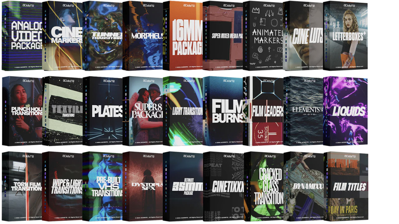
Acidbite ➔
50% off everything
ActionVFX ➔
30% off all plans and credit packs - starts 11/26

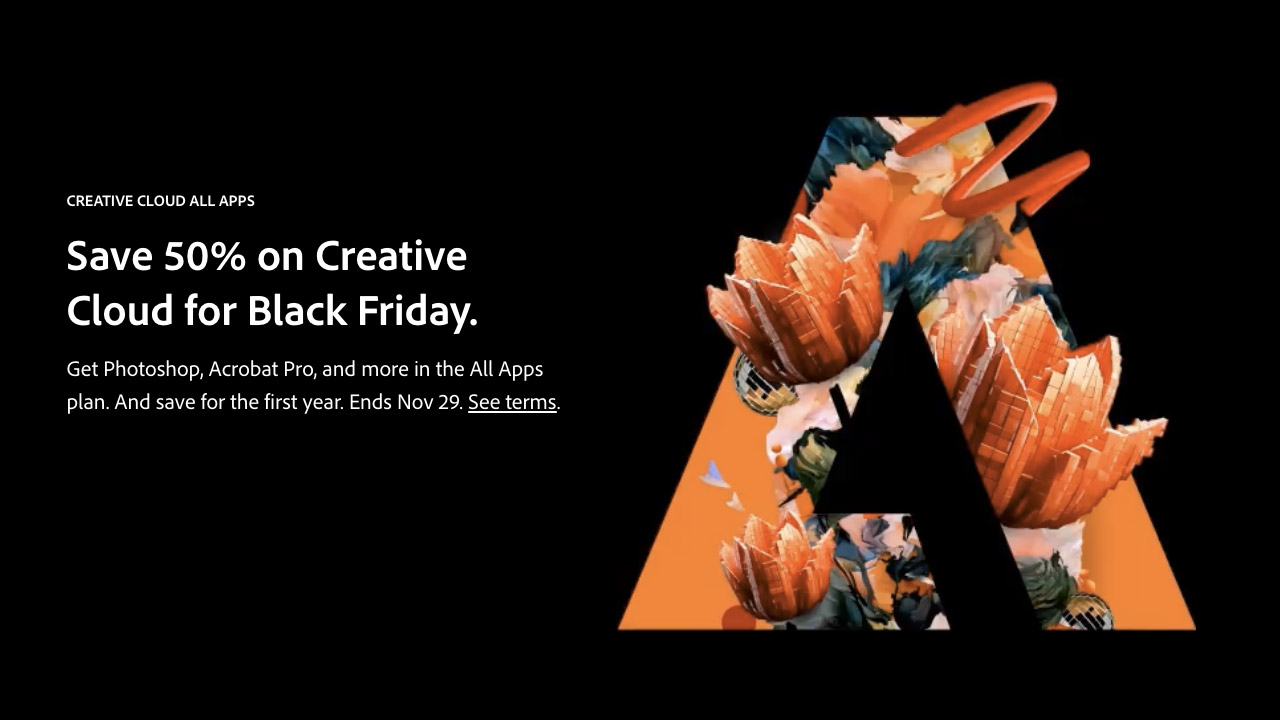
Adobe ➔
50% off all apps and plans through 11/29
aescripts ➔
25% off everything through 12/6
Affinity ➔
50% off all products

Battleaxe ➔
30% off from 11/29-12/7
Boom Library ➔
30% off Boom One, their 48,000+ file audio library
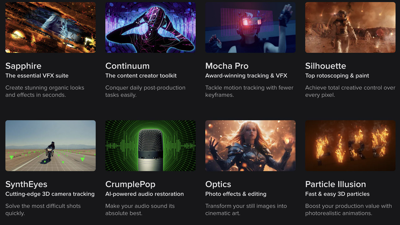
BorisFX ➔
25% off everything, 11/25-12/1
Cavalry ➔
33% off pro subscriptions (11/29 - 12/4)
FXFactory ➔
25% off with code BLACKFRIDAY until 12/3
Goodboyninja ➔
20% off everything

Happy Editing ➔
50% off with code BLACKFRIDAY
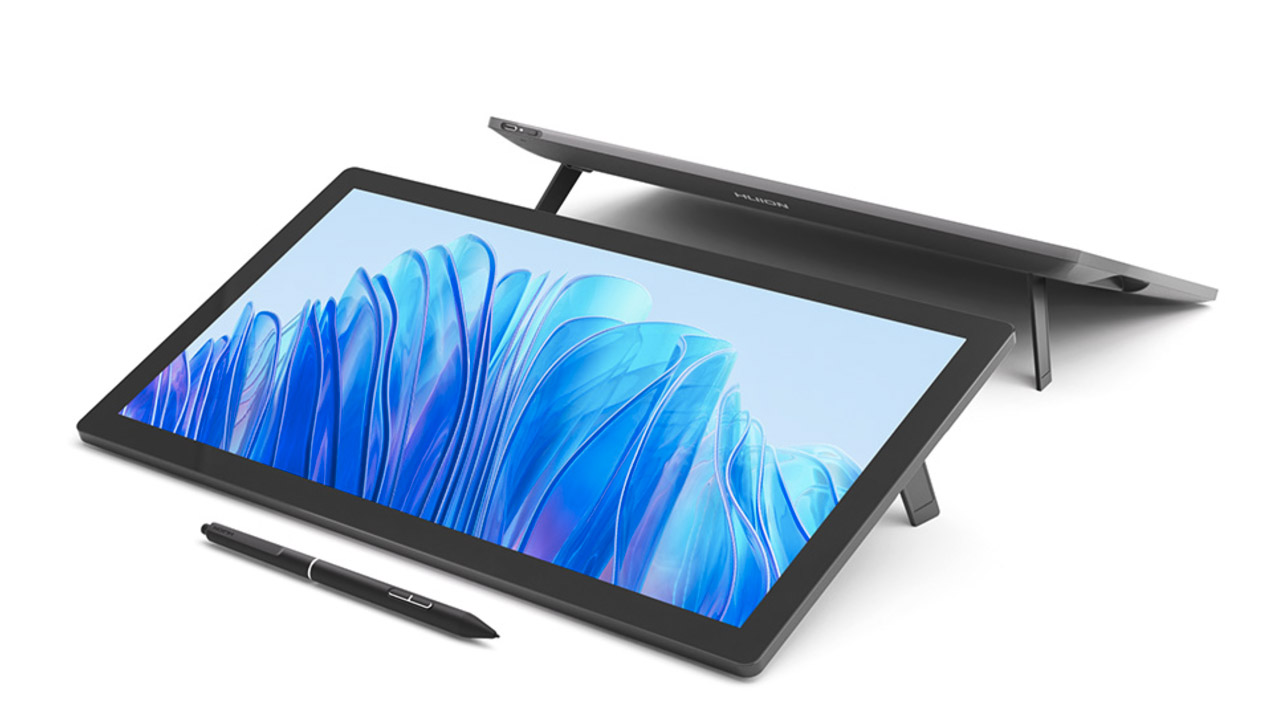
Huion ➔
Up to 50% off affordable, high-quality pen display tablets
Insydium ➔
50% off through 12/4
JangaFX ➔
30% off an indie annual license
Kitbash 3D ➔
$200 off Cargo Pro, their entire library
Knights of the Editing Table ➔
Up to 20% off Premiere Pro Extensions
Maxon ➔
25% off Maxon One, ZBrush, & Redshift - Annual Subscriptions (11/29 - 12/8)
Mode Designs ➔
Deals on premium keyboards and accessories
Motion Array ➔
10% off the Everything plan
Motion Hatch ➔
Perfect Your Pricing Toolkit - 50% off (11/29 - 12/2)

MotionVFX ➔
30% off Design/CineStudio, and PPro Resolve packs with code: BW30
Rocket Lasso ➔
50% off all plug-ins (11/29 - 12/2)
Rokoko ➔
45% off the indie creator bundle with code: RKK_SchoolOfMotion (revenue must be under $100K a year)
Shapefest ➔
80% off a Shapefest Pro annual subscription for life (11/29 - 12/2)
The Pixel Lab ➔
30% off everything
Toolfarm ➔
Various plugins and tools on sale
True Grit Texture ➔
50-70% off (starts Wednesday, runs for about a week)
Vincent Schwenk ➔
50% discount with code RENDERSALE
Wacom ➔
Up to $120 off new tablets + deals on refurbished items

All-Access Pass

Unlimited access to 50+ courses, unlimited critique, live events, and 24/7 community. Join School of Motion All-Access today.
