Learn After Effects the Right Way
Master the After Effects interface and build a real animation skillset. Enroll in All-Access to unlock AE Kickstart and 50+ other courses.
Prepare your Photoshop files for After Effects and watch them come to life
Photoshop is a great place to create designs for animation, and the process is smoother if you prepare your files for After Effects before sending them over. Today we’ll look at how (and why!) to prep your files in Photoshop before sending them to After Effects, and how to think about structuring your designs when you’re creating for animation. Let’s get started!
Today we will
- Work through restructuring an existing design
- Identify potential issues you might run into
- Learn some helpful tips for keeping this process as smooth as possible.
The techniques we’ll be covering should work with pretty much anything you can create in the recent versions of Photoshop and After Effects, but if you’d like to follow along, you can download my example files for free!
{{lead-magnet}}
Restructuring a Photoshop Design for After Effects

Whether you’re working with someone else’s artwork or your own, designing pieces that move (or will move) is a bit different than designing pieces that don’t. Even the coolest-looking project with the tidiest Photoshop organization will probably need some restructuring before it goes to After Effects, because it’s just a different way of thinking about the pieces with which you are working.
In our recent tutorial covering the different ways you can import a Photoshop file into After Effects, we used a file that was pretty ideally set up—but getting to that point means understanding what you’re aiming for, and why.
Save a new version of your file
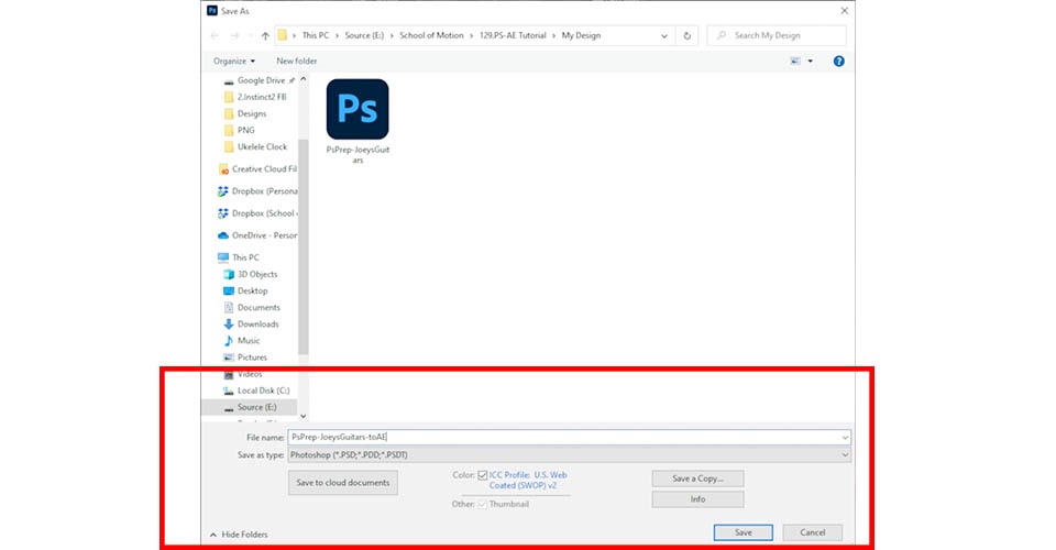
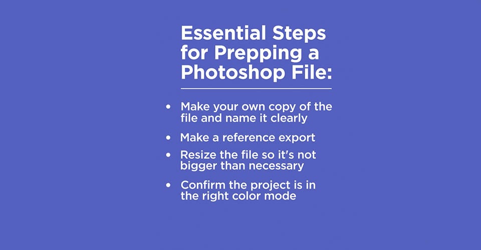
First, save a new version of your file with something like “-toAE” added on to the name. This will make it easier to distinguish versions in your folder, and you’ll still have the older copy if things go horribly wrong.
Adjust the dimensions of your file
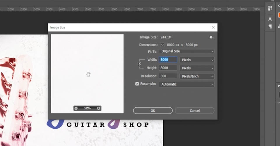
Next up, check out the current dimensions of this design. 8000x8000? That’s WAY bigger than we need it to be, and this much resolution is meaningless for what we’re doing. Let’s go up to Image > Image Size. First thing is the Resolution—higher resolutions make sense for print work, but anything above 72 ppi is totally unnecessary for screens, so let’s change that to 72. Our client said this should be a 1200x1200 animation, so let’s go ahead and size down the image dimensions as well. You may occasionally want to save your image larger than your final frame size—more on that in a minute!
Export a reference image of your file
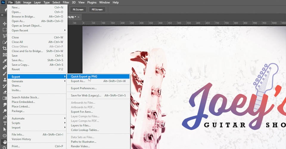
Time for another really important step: let’s export a reference image before we start messing with anything else! You can use whatever method you like, such as a Quick Export as PNG. Sometimes restructuring will change the appearance of some layers, so it’ll be good to have this reference when you bring the design into After Effects later.
Change from CMYK to RGB
This file is still in CMYK, which you’ll see a lot with designs that were built for print. If you’re unfamiliar with the term, RGB (red, green, blue) uses white as a combination of all primary colors and black as the absence of light—these are generally better for digital images and designs meant for screens. CMYK (cyan, magenta, yellow, black) uses white as the natural color and black as a combination of all colors—these are better for designs that will be printed out.
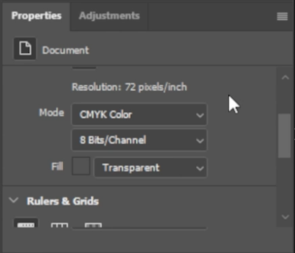
After Effects—and any other video creation app—only works with RGB, so we’ll need to change that, too. You can do that in the Properties panel or under Image > Mode.
Photoshop is going to warn you to Merge and Rasterize stuff, but we prefer to keep everything editable when possible. There are times where this may change the appearance of some layers slightly, so that’s why we exported that reference BEFORE doing this. Double-checking the color mode is very important, because After Effects will not import a CMYK file properly, or often at all.
Resizing your Photoshop file for use in After Effects
Let’s revisit that resizing we just did. All the images in this file are Smart Objects, which means we still have access to the original images at full size, regardless of how big this specific Photoshop file is.
If your design contains rasterized, or flattened layers, though, you may want to keep this bigger than the final animation frame size, to give yourself more flexibility. Just like Photoshop, After Effects works with pixels, and if you scale something above 100%, it’s going to start looking bad.

If there’s even a possibility that you’ll want to scale up any of the elements in your design, you may want to keep your entire file bigger. How much bigger? That’s…kind of up to you, and what your project requires. Of course, this means the file size will also be bigger, and After Effects may have to work a little harder when you’re animating. It’s all about finding balance.
While you have to be mindful about scaling—depending on how you import—you can potentially give yourself access to the full, untrimmed layers, even if they extend outside the Photoshop canvas. If you need some help with this step, we have a whole tutorial on how you can import this Photoshop file into After Effects!
You might have picked up on something here: To a certain degree, you have to think about how you want to animate this design before you’re even in After Effects. That can seem like a lot if you’re still new to this, but don’t panic! Even if you’ve been animating for a long time, you’re still going to change your mind, or get partway through and realize you should have built an element in a slightly different way. That’s okay, and with experience you’ll get a feel for what works best. That’s also why we kept our original file, why we made a reference export, and why you should try to keep your Photoshop files flexible and non-destructive whenever possible.
How to group your Photoshop layers for After Effects
When your layers get imported into After Effects, they’ll maintain the same structure and layer order…however, groups in Photoshop become pre-compositions in After Effects. They’re similar, but in some ways, precomps are almost more like Smart Objects: They aren’t really immediately accessible without actually diving into them, in a way that leaves you unable to see the other parts of your project structure.

While it might make sense to have top-level groups such as “Text” and “Art” in Photoshop, you’ll probably want to eliminate these extra levels before sending this to After Effects. AE also gives you options you just don’t have in Photoshop—such as easily linking layers so they’ll move together, various mask and matte options, and more, meaning you don’t always need to group things out of necessity, like you might in Photoshop.
Generally speaking, if you have a group of layers that you know can really just function as one thing in your animation, those are probably fine to leave in a group. When in doubt, fewer groups are better. Also, make sure to properly name EVERYTHING!. You don’t want half of your workday spent clicking through “Layer 1” through “Layer 1000.”
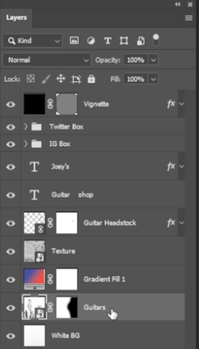
Assessing your images
The images included in your design can be another big decision point. Let’s check out the guitars in our example. There’s a mask applied, so let’s double click to open up the original and see what we’ve got.

Aha! There are more guitars we can potentially work with. In animation, you’re not just thinking about the single image you were given, but sometimes how you might get TO that image. Maybe it’d be cool to scroll past a few other guitars before we land on the featured ones? Would you want to be able to move these as three separate groups? They’re on white, so it’d be easy to slice this up into the pieces we need.
Looking at the three guitars in our approved image, is there any reason to separate those? Would we want the ability to move them, even subtly, as three separate objects? If so, we’d need to cut each of them out individually, and carefully cut around the tuner, and clone in the portion of the fretboard behind it. Would we need to paint in the little pieces of this shadow, then?
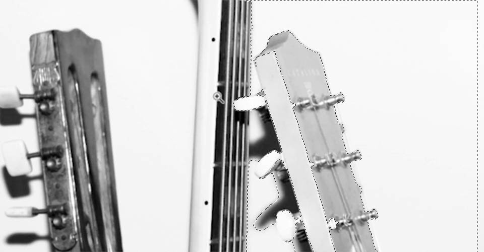
This is why it’s important to have some kind of plan. This could be a lot of work, or very little, depending on what you need to do with it! So unless you just LOVE doing cutout and cloning work, you might try to start simple, and then you can come back in here and tackle that stuff later on.
And if you need a little help cutting images out of your assets, we just so happen to have the ultimate guide to cutting out images in Photoshop!
Notice that we did almost ALL of this using Layer Masks, so we can come back and keep editing these if we need to—and we haven’t destroyed or lost anything in the process.

Artboards
Working with Artboards is very useful when you’re designing for multiple aspect ratios, or laying out a set of storyboards. Unfortunately, After Effects doesn’t really recognize artboards, so you’ll have to separate these out into individual files…after you’ve properly named them and made reference exports, of course.
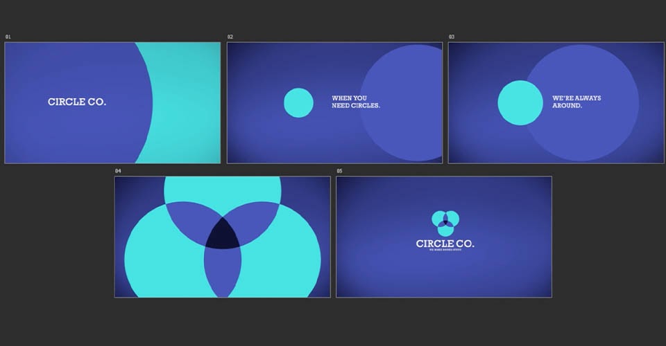
With storyboards, it may be common to have multiple frames that are important for design approval, but may be essentially the same from an animator’s perspective—like the second and third frames above. Look for opportunities where you might be able to combine frames that use most of the same elements, just to save yourself a little bit of importing and setup later.
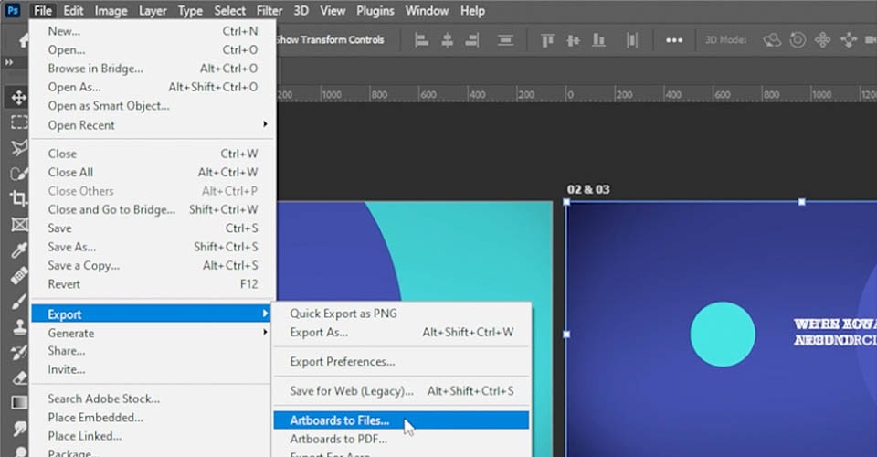
Once you’re happy with everything, come up to File > Export > Artboards to Files. You’ll get a few options, and then Photoshop will save each of these out as its own layered PSD, ready to be imported to After Effects.
Linked Files and Smart Objects
Linked files and Smart Objects are a great way to keep things editable when working in Photoshop, but you’ll have times you’ll need access to the original element.
In this example, we have a linked Illustrator file inside our Photoshop design.
Importing this into After Effects gives us the layer, but only as flattened pixels. In this case, we’d want to open up the original Illustrator file by double-clicking it in our Photoshop layer panel, make sure it’s saved as its own separate Illustrator file, and then Import that element separately into After Effects, giving access to the full size or layers that you may need for your animation.
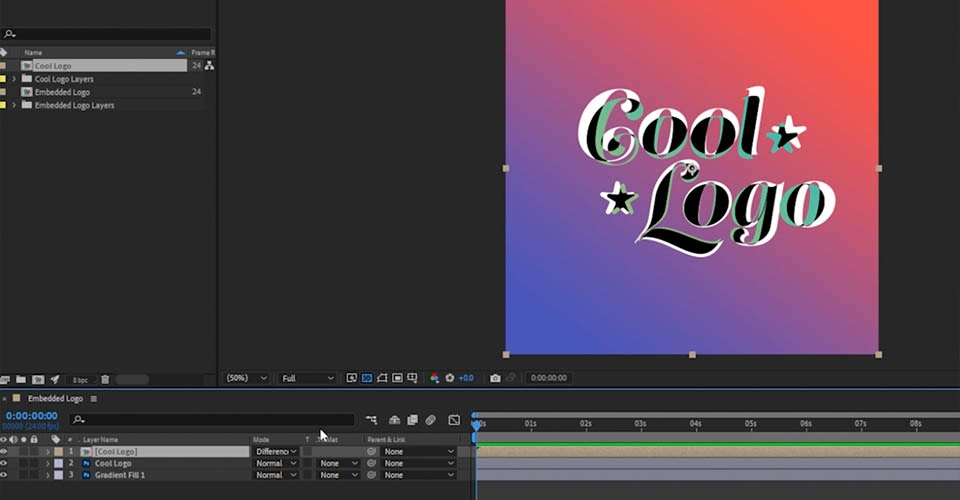
Often, you may need to match the exact size & positioning you used in Photoshop. The Difference Blending Mode is really helpful here. Make sure the Modes column is visible—if you see Switches instead, you can hit the F4 key to toggle between these - and then if I set this layer’s Blending Mode to Difference, it gives you this great utility view where anything that’s exactly the same is pure black, and anything different is shown as white.
Now I can adjust this until it’s juuuust perfect … set this layer back to Normal, and delete that flattened copy, because I don’t need it anymore.
Creating and Importing Textures
Using texture in your designs is a great way to help you think about many of the lessons above. Here we’ve created a simple circle with some brushed-on texture.
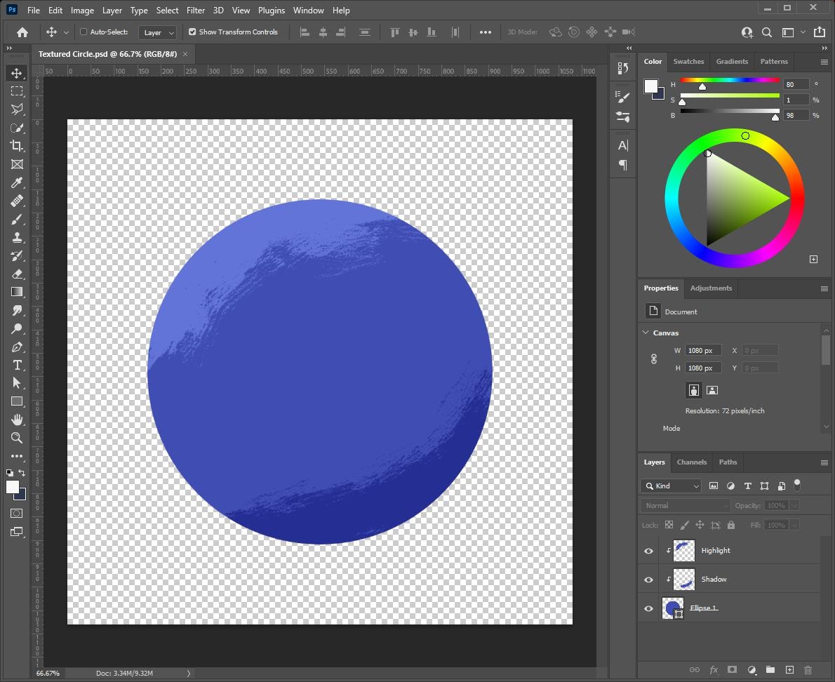
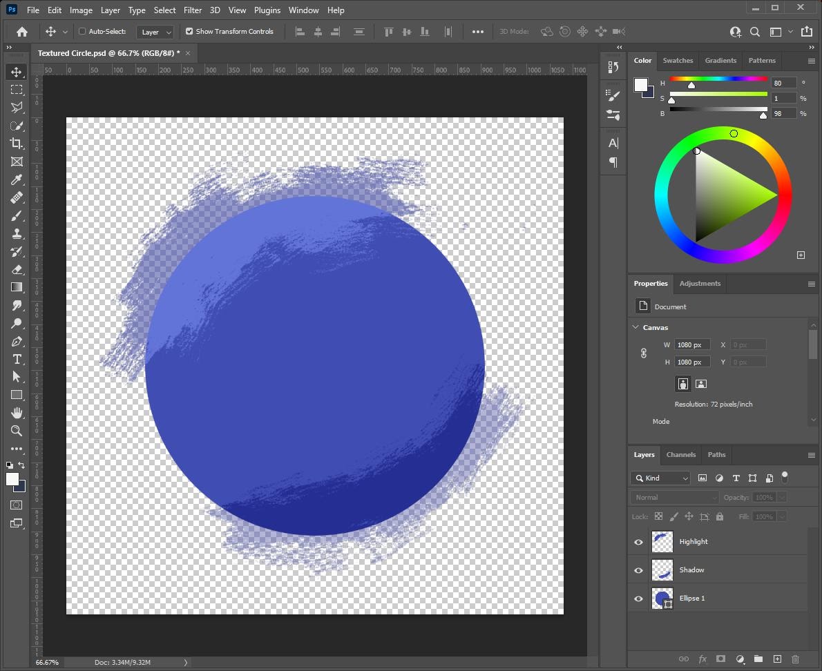
If we release the Clipping Masks, though, you’ll see we actually won’t have much in the way of options once we get into animation.
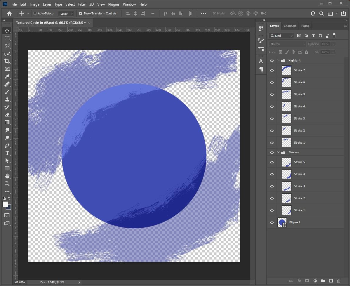
Here’s an alternate approach to the same look, where we actually put every brush stroke on its own separate layer. In After Effects, we’ll still be able to trim all the strokes to the circle—giving us the same look as above¨but we’ll be able to animate every stroke individually if we want, giving us tons of options!
Preparing your Photoshop Files for After Effects
Photoshop and After Effects share a lot of functionality. Some features, such as Text, Layer Styles and Adjustment Layers, transfer over perfectly or at least … pretty well, with just a few exceptions.
If you ever run into trouble importing something that just doesn’t look right, remember that if you don’t NEED the editability or flexibility for a particular layer or group, don’t overcomplicate it! Remember that in Photoshop, you can always rasterize a layer, Merge layers together, or pack something away as a Smart Object, as long as you keep an editable copy of the layers or the whole file. Sometimes, that may just be the only way to get it to import perfectly—and if it’s just going to function as a single piece in After Effects anyway, it’ll just make your file that much simpler.
Remember our circle example above? It’s not uncommon for the prepped version of your Photoshop file to look different than the original design, because you know that you’re just making sure you have the right pieces so you can structure this properly when you get to After Effects.
Hopefully these tips help you build your files in a more animation-friendly way, and you can spend less time struggling with importing, and more time making cool designs and even cooler animations!
Kickstart your After Effects journey
If you’re planning to animate your Photoshop designs in After Effects, the way you build your file might be pretty different than if you’re working on something that doesn’t move. Once you understand the fundamentals, you’ll be able to bring your work to life in amazing ways. If you’re looking for a place to start on your animation journey, head on over to After Effects Kickstart!
After Effects Kickstart is the ultimate After Effects intro course for motion designers. In this course, you'll learn the most commonly used tools and best practices for using them while mastering the After Effects interface.
ENROLL NOW!
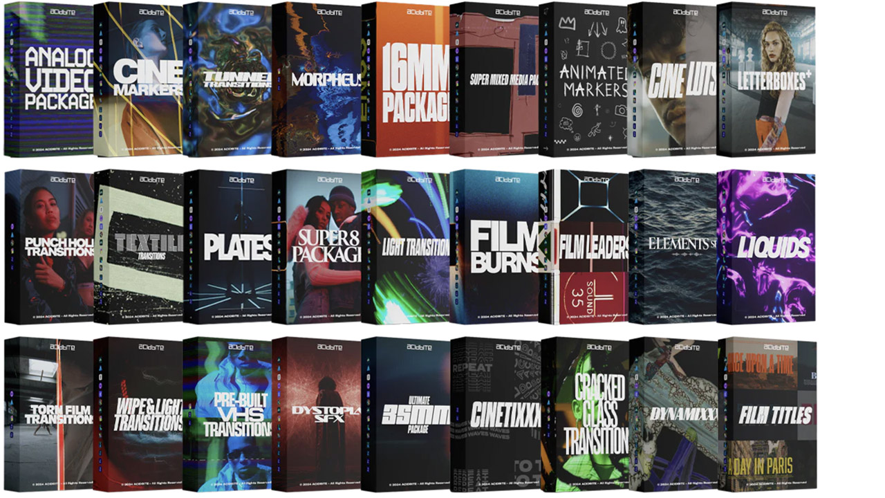
Acidbite ➔
50% off everything
ActionVFX ➔
30% off all plans and credit packs - starts 11/26

Adobe ➔
50% off all apps and plans through 11/29
aescripts ➔
25% off everything through 12/6
Affinity ➔
50% off all products

Battleaxe ➔
30% off from 11/29-12/7
Boom Library ➔
30% off Boom One, their 48,000+ file audio library
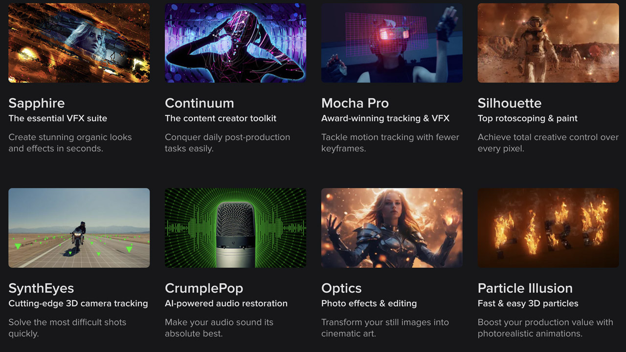
BorisFX ➔
25% off everything, 11/25-12/1
Cavalry ➔
33% off pro subscriptions (11/29 - 12/4)
FXFactory ➔
25% off with code BLACKFRIDAY until 12/3
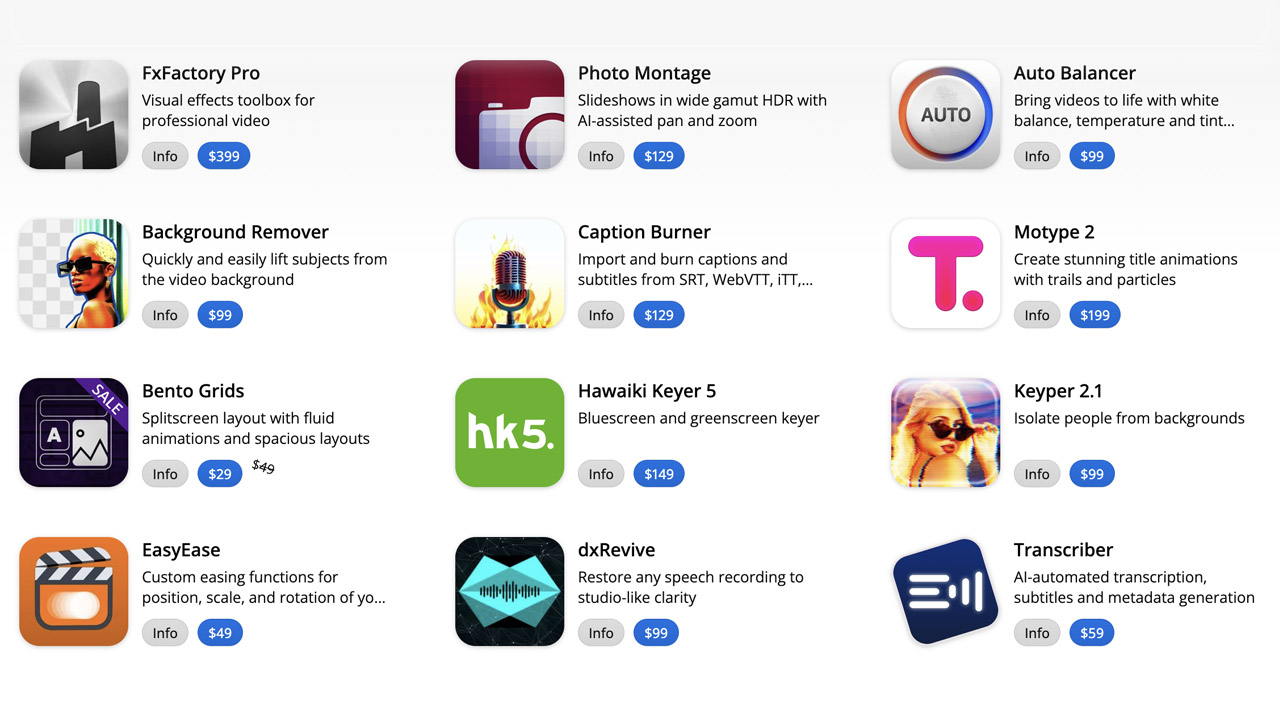
Goodboyninja ➔
20% off everything

Happy Editing ➔
50% off with code BLACKFRIDAY
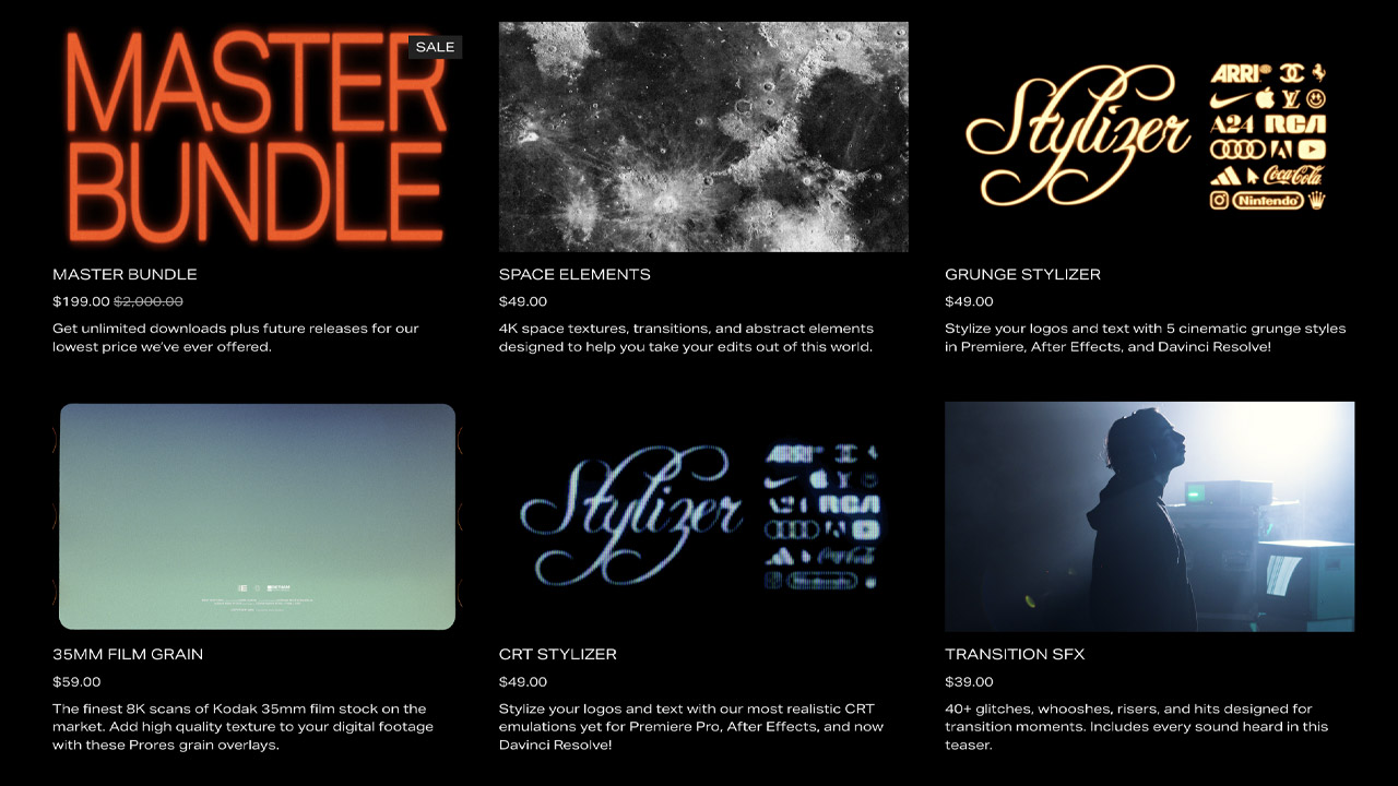
Huion ➔
Up to 50% off affordable, high-quality pen display tablets
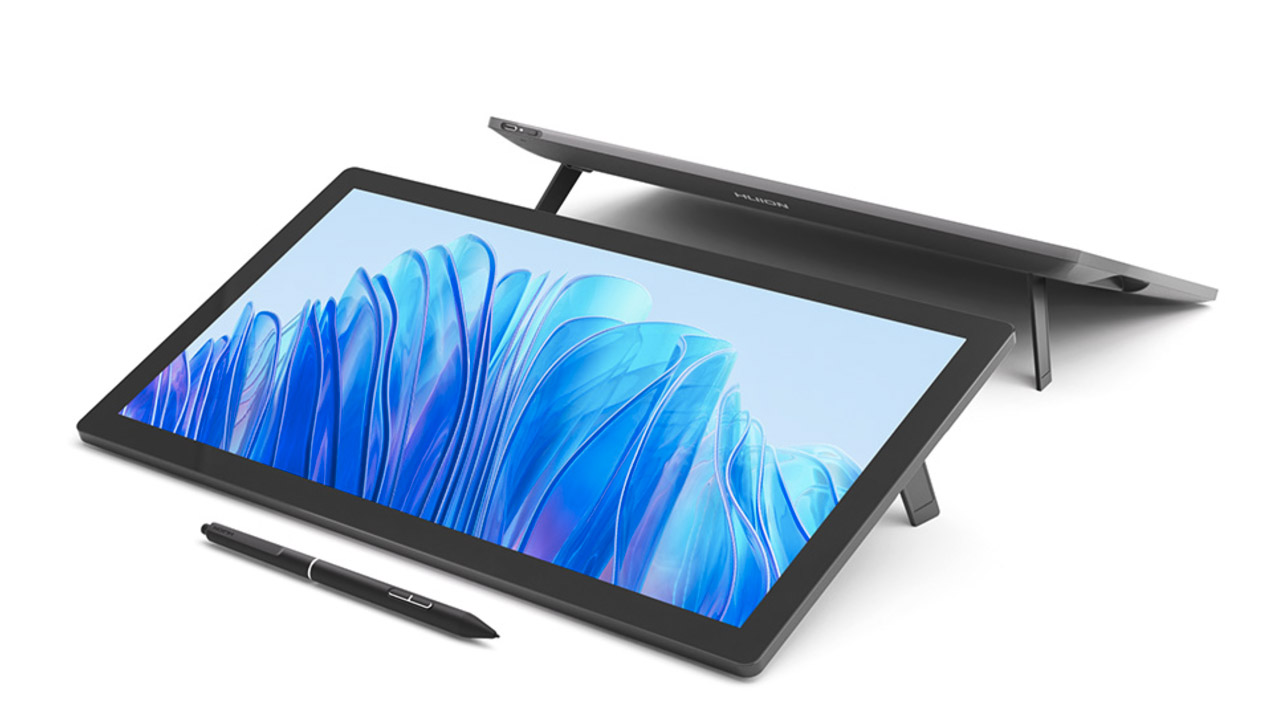
Insydium ➔
50% off through 12/4
JangaFX ➔
30% off an indie annual license
Kitbash 3D ➔
$200 off Cargo Pro, their entire library
Knights of the Editing Table ➔
Up to 20% off Premiere Pro Extensions
Maxon ➔
25% off Maxon One, ZBrush, & Redshift - Annual Subscriptions (11/29 - 12/8)
Mode Designs ➔
Deals on premium keyboards and accessories
Motion Array ➔
10% off the Everything plan
Motion Hatch ➔
Perfect Your Pricing Toolkit - 50% off (11/29 - 12/2)

MotionVFX ➔
30% off Design/CineStudio, and PPro Resolve packs with code: BW30
Rocket Lasso ➔
50% off all plug-ins (11/29 - 12/2)
Rokoko ➔
45% off the indie creator bundle with code: RKK_SchoolOfMotion (revenue must be under $100K a year)
Shapefest ➔
80% off a Shapefest Pro annual subscription for life (11/29 - 12/2)
The Pixel Lab ➔
30% off everything
Toolfarm ➔
Various plugins and tools on sale

True Grit Texture ➔
50-70% off (starts Wednesday, runs for about a week)
Vincent Schwenk ➔
50% discount with code RENDERSALE
Wacom ➔
Up to $120 off new tablets + deals on refurbished items


Learn After Effects the Right Way

Master the After Effects interface and build a real animation skillset. Enroll in All-Access to unlock AE Kickstart and 50+ other courses.


