Unlock Your Motion Design Potential
Get unlimited access to 50+ courses, workshops, and resources from the best instructors in motion design. Join School of Motion All-Access today.

Master Motion Designer and SOM Alum Jacob Richardson Breaks Down the Dos and Don'ts of Designing with Value and Contrast
Many motion designers are quite keen on complexity. Rightfully so, since tricky designs can be great attention grabbers. They can't, however, mask or compensate for weak fundamentals.
When it comes to the basics, there's probably nothing more important than understanding contrasting values.
School of Motion alum Jacob Richardson, a Birmingham-based freelanced 2D animator and director, has developed a Quick Tip Tutorial video on value-based design.
If you've yet to master using lightness and darkness to design effective compositions, this brief tutorial is for you.
{{lead-magnet}}
What is Value-Based Design?
Simply, value-based design refers to creating forms and signifying space or distance, or creating forms or the illusion of volume or mass within a shape or space, by adjusting relative lightness or darkness; or, how much tint (addition of white) or shade (addition of black) there is in a color.
The difference in contrasting values helps the eye separate elements of an image and understand the design being presented.
Images with high values express lightness, airiness, or openness; images with lower values express darkness, weight, or gloom.
In the illustrations below, Jacob demonstrates what happens when you adjust values (right), and when you don't (left). The fishbowl on the left is designed with different colors; however, since the values of all the colors are so similar, the illustration is difficult to decipher. On the right, that same fishbowl displays distinctly, with adjustments to the color values.

THE IMPORTANCE OF CONTRASTING VALUES
If the above illustration hasn't sold you, think about this.
What happens when you hit the street for a run at night, dressed in dark colors, without your reflective gear? You risk getting run over by a moving vehicle. Why? You blend in with your surroundings — no contrast! Now, imagine that same run at that same hour, outfitted with bright white sneakers, a neon jacket, arm bands, and a headlamp. You've significantly improved your chances of returning home in one piece. How? With your safety attire, you've leveraged contrasting values to increase your visibility, against your surroundings — exactly what artfully contrasted values achieve in dynamic design.
Below is a real-world design example. With its Samsung Galaxy Note 10 ad, Verizon achieves the desired effect with its stark, heavy, bold black text and phone shadow against the bright white background.

For more on "making dynamic compositions" with contrasting values, watch this Design Theory video from The Futur, starring Matthew Encina:
OTHER KEY MOTION DESIGN TERMS
Value and contrast are two of the many terms you'll need to know to excel as a motion designer.
Learning the lingo makes it easier to successfully complete continued education courses, collaborate with other designers and search online for tips. That's why we created The Essential Motion Design Dictionary, featuring 140 of the most important terms and concepts in the field.
Download it free today:

READY TO EXPAND YOUR SKILL SET?
While our free online tutorials can make a major difference in your motion design career (try this one, for example), to truly take advantage of what SOM has to offer, you'll want to enroll in one of our courses, taught by the top motion designers in the world.
We know this isn't a decision to be made lightly. Our classes aren't easy, and they're not free. They're interactive and intensive, and that's why they're effective.
In fact, 99.7% of our alumni recommend School of Motion as a great way to learn motion design. (Makes sense: many of them go on to work for the biggest brands and best studios on earth!)
Want to make moves in the motion design industry?
Pick the course that's right for you:

You'll gain access to our private student groups; receive personalized, comprehensive critiques from professional artists; and grow faster than you ever thought possible.
ENROLL NOW!
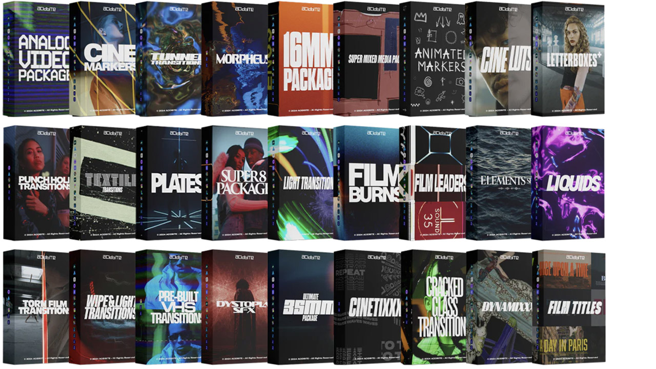
Acidbite ➔
50% off everything
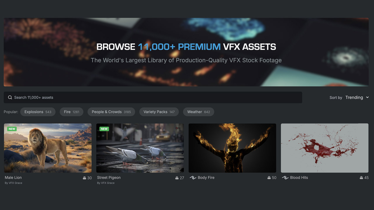
ActionVFX ➔
30% off all plans and credit packs - starts 11/26
Adobe ➔
50% off all apps and plans through 11/29
aescripts ➔
25% off everything through 12/6
Affinity ➔
50% off all products
Battleaxe ➔
30% off from 11/29-12/7
Boom Library ➔
30% off Boom One, their 48,000+ file audio library
BorisFX ➔
25% off everything, 11/25-12/1
Cavalry ➔
33% off pro subscriptions (11/29 - 12/4)
FXFactory ➔
25% off with code BLACKFRIDAY until 12/3
Goodboyninja ➔
20% off everything
Happy Editing ➔
50% off with code BLACKFRIDAY
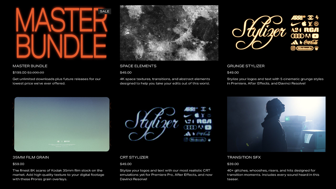
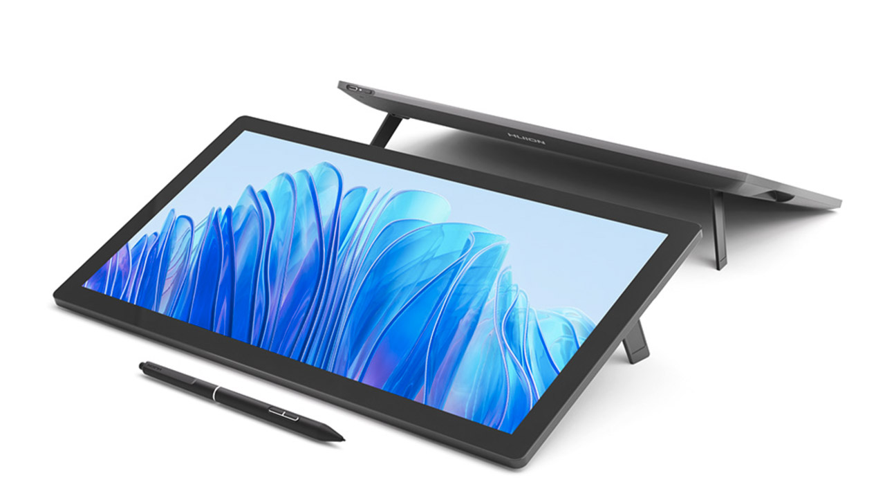
Huion ➔
Up to 50% off affordable, high-quality pen display tablets
Insydium ➔
50% off through 12/4
JangaFX ➔
30% off an indie annual license
Kitbash 3D ➔
$200 off Cargo Pro, their entire library
Knights of the Editing Table ➔
Up to 20% off Premiere Pro Extensions
Maxon ➔
25% off Maxon One, ZBrush, & Redshift - Annual Subscriptions (11/29 - 12/8)
Mode Designs ➔
Deals on premium keyboards and accessories
Motion Array ➔
10% off the Everything plan
Motion Hatch ➔
Perfect Your Pricing Toolkit - 50% off (11/29 - 12/2)
MotionVFX ➔
30% off Design/CineStudio, and PPro Resolve packs with code: BW30
Rocket Lasso ➔
50% off all plug-ins (11/29 - 12/2)
Rokoko ➔
45% off the indie creator bundle with code: RKK_SchoolOfMotion (revenue must be under $100K a year)
Shapefest ➔
80% off a Shapefest Pro annual subscription for life (11/29 - 12/2)

The Pixel Lab ➔
30% off everything
Toolfarm ➔
Various plugins and tools on sale
True Grit Texture ➔
50-70% off (starts Wednesday, runs for about a week)
Vincent Schwenk ➔
50% discount with code RENDERSALE
Wacom ➔
Up to $120 off new tablets + deals on refurbished items


Unlock Your Motion Design Potential

Get unlimited access to 50+ courses, workshops, and resources from the best instructors in motion design. Join School of Motion All-Access today.
