Learn After Effects the Right Way
Master the After Effects interface and build a real animation skillset. Enroll in All-Access to unlock AE Kickstart and 50+ other courses.
But wait, there’s more!?!
That’s right, just when you thought there couldn’t possibly be any more information about bringing a file from Illustrator into After Effects; we bring you part two.
This time we’ll be going though a more complicated Illustrator file than in lesson one and how we can set it up in Illustrator to be animation ready. Along the way we’ll go over some neat little tips and tricks that might make your life easier some day.
Warning: This is not you’re average vector file, it’s full of little traps and things that you didn’t know would break when need to convert to an After Effects shape layer. We’ll tackle blend modes, dashed lines, raster effects, and so much more.
If you liked this series please share it! Thanks for watching!
{{lead-magnet}}
-----------------------------------------------------------------------------------------------------------------------------------
Tutorial Full Transcript Below 👇:
Amy Sundin (00:08):
Hey guys, this is Amy from school of motion with part two of our bringing your illustrator files and after effects series. This is the final part in the series, and we're going to go over a bunch of other things that you can encounter when you're bringing those illustrator files into aftereffects that we just didn't have time to get to. In part one, don't forget to sign up to be a VIP member at the bottom of this page. We're actually going to give you all the project files that we use this time in this lesson. Thanks for watching. Let's get started. All right, guys, let's get started on part two of bringing your illustrator files into after effects. So you might notice that our original files up right now, and this is not the file we'll be working with. This is actually because we got a little bit of feedback from one of the animation bootcamp students, Renee.
Amy Sundin (00:55):
He pointed out this wonderful feature that I did not notice before in after facts when you go to the save as dialogue. So we save as we can actually save each art board to a separate file. Hooray. So this will cut down on some time you just hit okay there and I'll actually show you what it did. So what it did was it re-saved our original scene in this folder that I named art boards. You're probably going to want to make a new folder for that reason. So you don't confuse yourself. And then actually, if we open up these other files, you will see, seem to is now isolated, seeing one only thing there and art board, three only thing. They're so perfect. Obviously you might want to rename these to something that makes more sense to you, but that cuts down on just all that time having to hit file save as, and also on you accidentally screwing up and overriding a file.
Amy Sundin (02:00):
So really cool. Thank you, Renee. Awesome. Tip. All right. Now this is the file that we're actually going to be working with. So this one right here is the one that would be handed off to you that you're going to have to prep for after effects to be animated. This is the intermediate file of what we're going to be setting up today to get this stuff to function right in after effects. Now it looks a little overkill, but it's actually not for what we're going to be doing with it. Lots of layers. And this is our actual final result in after effects. So I'm going to go through and Ram preview this for you guys.
Amy Sundin (02:53):
Now, as you can see here, while it's Ram previewing, we have all kinds of little moving parts pieces going on. We have some trim path effects going on on this type here on the a and the, oh, we've got these, a wavy lines going on in the background that are actually kind of clipping this grainy stuff as a mat. We've also got all of these circles moving independently, all animated. We've got these dash lines shooting out from the center point. And if you look down here, there's a little bit of like a flickering kind of effect going on on these lighter areas here. And there's actually some, there's some light paths going across. So there's a bunch of different stuff that needs to be addressed in this file.
Amy Sundin (03:47):
All right. And this is what it kind of looks like when we're done. So you'll see, we have a mix of things that need to be converted into shape layers, bunch of pre comps, and then stuff that actually we are going to leave alone as an illustrator layer. So let's jump back into illustrator and start prepping this file. All right. So here's our original file. Now, the first thing is we don't need all this color palette stuff. That's just stopped from the designer that they left over. Same thing with this mask. This is just used so that they can see with that, like what the final product is going to look like. Cut.
Amy Sundin (04:33):
So that can go away now. So this is what we are left with here. So we have this upper tone, that's kind of tinting project. And also you're going to want to have your appearance and your transparency pallets up and ready when you're looking through a file with these kinds of raster effects, because this is where you're going to see what is going on with those. So if we hit this little target circle here, you're going to see this has an opacity of 15% with a soft light and a grain effect on it. Now that's actually very important because if we need to take this into after effects, I will actually show you what's going to happen. We're going to import that original file. We don't, well, we didn't save it, but that's okay. We'll just pick any one of these
Amy Sundin (05:36):
And see how this is breaking that's because there are transparencies and blending modes and other effects layered on these. This one will break. See there's some more transparency breaking. And this one, these gray spots that's from the effects breaking in from illustrator in after facts. So no good. Can't use it. Let's fix it. Delete these really quick. All right. So what we want to do with this one is I actually just made a note for myself up top. This is like the oper tone. So like an, almost like an adjustment layer and I'd have a 15% opacity on it with soft light and grain. So all I'm going to do is rename this actually, I'm going to cheat my copy of the name, but I'm going to rename this with my notes. So I know what's going on with this layer when I get into after effects and I'm going to remove those effects from here, because they're just going to break.
Amy Sundin (07:03):
So delete the effect. And then we're going to move this back to a normal layer with 100% opacity on it. And then we're just going to shut it off. So this is now ready to bring into after effects. You could also probably rebuild this in after effects, if you wanted to using just a solid, as long as you know, what those things were that you used previously, but I want to leave it in here. So the next thing that I want to address is going to be down here, actually. So this was a neat thing that I was talking about last lesson with the blend mode or not blend mode, blend shape. There we go, the blend shape. So here's this kind of cool little trick that you can do. Blend shapes actually stay editable until you expand their appearance. So if you want to quickly get this kind of scaled stepped effect with a nice even gradient between two colors, you can go in and use the specified steps in the blend shape.
Amy Sundin (08:12):
And we can still change this too. So if we don't want four anymore, we can say 10 and there's 10, or we can go back to four and hit, okay, now we could convert this in after effects, but we're trying to do as much planning ahead of time instead of bringing something in and then having to do all that work in another program. So what we're going to do to convert these blend shapes so that they can be animatable guess that's a word it is today, so that we can get this nice kind of staggered effect that's going on, where they're pushing out all those have to separate.
Amy Sundin (08:58):
Come on now. All right. We're going to go up to object and expand and hit. Okay. And there you go. Those are ready for us. Now, check that out and we'll do the same thing here. Object, expand and hit. Okay. So those are actually ready now and let's move them onto their own layers. Well, they're mostly ready actually. I'm kind of a liar about that. So let's move these actually onto upper layers. As we discussed last time where, oh, holy crap. We'll be right back. All right. So don't forget to save that's. The lesson is why we save our files because you never know when the program's just going to be like I'm done right now. So we're back. I move these onto their own layer and really quickly, we're actually going to break these out into their own paths ahead of time. Instead of using explode shape layer later on in after effects.
Amy Sundin (10:16):
So this was another piece of feedback. Somebody finally explained to me what I was doing wrong with my life. When it comes to getting this option, the release to layer sequence to work. I didn't think about this, but there's two different ways. You can select things in illustrator. There's actually selecting like the subgroups using the target little circley guy, or there's actually selecting the layer name. So what you need to do is select the layer name, and that's going to bring back release to layer sequence. So you don't actually have to add that second layer. That's just some way that I tricked myself into thinking that it was working. So thank you very much to Shawn Kimber on Vimeo and Sam from animation bootcamp for helping me figure that one out. Awesome work guys. All right. So we want to actually click on the layer and release to layers sequence and oh, they're grouped, they're grouped, ungrouped, these things. We don't want them grouped. We just want our layer released to layers sequence. There goes, don't leave things in groups if you're using release to layers, because it will just kind of group the layer. It does that.
Amy Sundin (11:44):
And there we go. You don't even have to pull them out one by one easy peasy. Now I'm going to actually go in and rename these properly.
Amy Sundin (11:58):
All right? So those are all renamed and broken out onto their own layers now and ready to bring in after effects. So the next thing we're going to address is actually the stuff that's kind of left over in this sun layer right now. So these things back here, let's take a closer look at them. Actually, we need to bring them up above where they belong. Again, mind your layer order. So if we look at these, we can see that there's this like wavy line going on here, but we're actually highlighting this. They're all circles. Now you might be wondering why this is happening. And there's an easy explanation for this. If you look under appearance and we actually select one of these, we will take you. What's happening is there's a warp effect put onto it. So if we turn off that warp and actually we'll turn it off on all of these, you can see they're snapping back to what they were before circles.
Amy Sundin (13:12):
They were just rings that were done in illustrator, and then an effect was put on them to get them to bend in that certain way. So if we actually bring these into after effects, they will completely break. And that's where you're getting that gray box. It's because after effects does not like these types of old fashioned raster facts or any of the raster effects actually from illustrator will not come over. So the way that I dealt with this to be able to animate, give her a second, she's got to think about things to be able to get that movement. We're going to go to quarter Rez. There we go. You can see those lines back. They're moving. Now. What I actually had to do was go in and rebuild those paths so that I could use them later on in after effects to turn them into mats like this. So there it is moving along, but we need a path to be able to move first. So let's go back into illustrator and we'll set that up really quick. We're just going to use ye oldie pen tool and draw these out. Now I am going to put a stroke on these. Well, we have lost our path going back here.
Amy Sundin (15:07):
Okay. Areas we are in the sun layer. Good, good. Here's our path. I am going to kind of bump the stroke up so I can see it. So I know that it's there and I'm going to touch it up a little bit too, because this is slightly off. And then we do the same thing for all three of those paths now, because of the way that this is going to be animated, we don't have to be super, super precise or anything. We just have to get the general shape down and actually follow a long things. All right. And with a couple last touch ups here and there, I'm gonna knock these strokes back a few points
Amy Sundin (15:58):
Because they're all pretty big 1, 2, 3, and we'll just knock them back to like a two points stroke right now. So that works. All right. So now we have those paths and we are going to bring those three out onto their own layers. And we're actually going to do this just real quick, this way instead of using release. Okay. So the next thing that we need is we actually need that grainy kind of look so that we can cut that as a mat in, after effects or using an alpha. So if you're curious as to exactly how I built it in after effects, I'm not going to get too much into that. The project file is included with this, all the illustrator assets and that after effects project. So you can dig more into that on your own, but I just know that I need this grainy stuff as a flat layer now, and I'm going to leave it as a flat layer as an illustrator layer.
Amy Sundin (17:11):
And I'm not going to turn that into a shape layer ever when it's an after effects, it's just going to stay the same. So what I wanted to do with this is I need to go in and I need to find just this warp effect and delete that off of there. And now I should have just a circle with that effect in it. Now I don't really want this to actually be a circle. I want this to cover my whole art board, just in case this thing gets a little bit crazy and comes all the way out to like the other edges. So I don't want this to just be limited within a certain range. So what I'm going to do is actually make a new box and I don't actually need this.
Amy Sundin (18:08):
All right. So we have our box. What I'm going to do is I'm just going to grab this right here that says, click, click to target, drag, to move appearance if we hover over it. So we are just going to grab this, come on, oopsies, didn't go. According to plan, did it all right, we want this one, grab it and move it. You can see it kind of popping there up to our rectangle. And now our rectangle has inherited all of the appearance properties. You can kind of see this edge over the top here. That's the appearance properties of that circle that is now just an orange circle. And we can delete that. And now we're going to want to do the same thing for our other warp paths to get those prepped.
Amy Sundin (19:03):
All right. So now all of those are ready to be used as mats for this particular effect that we had going on. So now let's just do that release to layers sequence and bring these out. And if I renamed them when they were in there just to save myself the trouble. So I know, okay, this is the outer mat. Instead of scratching my head later going, what was that supposed to be? All right. And then let's just get these in some sort of order so that they're hanging out next to each other. So we want our path above each one and have them just be kind of buddies right now. So there you go. That portion is ready to go into after effects. Now, the next thing that we're going to address is the white sun and the white sun has these transparencies on them. Now we don't have to worry about that too much. We just want to actually get these onto their own layers to be animated. So if you look into our prepped file, here's our white sun. And I actually did notate the transparencies on there just in case I need that information later. It's always better to be a little bit overly prepared than under prepared. So we're going to go through, break those out and rename them.
Amy Sundin (20:47):
And this is where you're going to find your opacity is down here in that appearance tab. Again, actually what I'm going to do. I'm going to bring these out these light dash lines. Those are going to go onto their own layer while I deal with these. Now I've kind of developed my own shorthand with renaming things over time. Um, it's not always the most consistent thing. It makes sense to me. It may not make the most sense to other people. So just do what works for you. And remember that you may be handled handing this file off to somebody later on. So try and be courteous to when you're doing these things. All right. So that's taken care of now. The next thing that I want to mention is actually this layer 26 with the dashed lines. So what I'm going to do is I'm going to jump back into after effects really quickly so I can demonstrate something and then we'll come back to this layer. So back here and after a fact, if we actually go down to you, see those dash lines layer here, let's just, precap this really quick come into here.
Amy Sundin (22:08):
There, there. Okay. So here's our dash lines. Now you would think that you could just hit this button up here and have these strokes be preserved because that's actually what these are, are strokes from illustrator. Well, when we hit this button, you can see it's thinking just a little bit too hard for comfort right now. So we'll let it go for a couple more seconds for demonstration sake. And then we're going to hit skip, and we're going to check out what it did and look at that. See that, see that little, this little guy, watch him move slowly up. The chain what's happening is after facts. Instead of reading this in as, oh, that's a stroke, it's just making a path out of every or a new shape out of every single dash is what's happening. So this is clearly terrible news. We don't want to do that.
Amy Sundin (23:13):
It's completely unmanageable. So this is something where you're going to want to either expand the appearance, depending on what you're going to be animating. You can expand the appearance over an illustrator. You can leave them all on their own layer, or if you're doing this kind of effect that I was doing, or you just have them shooting out. I just rebuilt these strokes inside of after effects as a new stroke with a dashed line. So just do a rebuild on it. If you're doing something like this, otherwise plan ahead and know that those will not come in nicely into after effects.
Amy Sundin (23:57):
So what I did was I actually just left this layer alone due to the fact that they don't play nicely. And then I rebuilt them because of, as I stated before, that effect that I was using. So this is just now a template layer, and we're going to leave it here. All right. So we've made a fair amount of progress in breaking this file down already. So the next part of this that we want to deal with is actually these main shapes here. And there's a lot going on inside of these groups. There's all kinds of dash lines here. We have all these different paths. Here's more groups, kind of a little bit messy in here, but it's not too bad. It's manageable. We can, we can work through this. So to get it, to look like this, where that kind of flash happens. And then each one of these just kind of drops in transparency on its own. We need all these shapes separated out into their own layers, which is what I did. So you can see this light left here. And this has all of those as a mat. And actually if we go into here, we can see it all broken out.
Amy Sundin (25:28):
So we're going to go in to illustrator and take care of that stuff so that we can use these paths. Now, if we actually tried to do that with this layer in after effects right now, as is, where are you? Well, you know what, let's save our file and try it. So radio example, composition, retained layer styles, retain like your sizes, something like that retain the layers radio example. And we're actually going to take this purple base believe is the layer. You can already see how things have kind of broken in here. Now see none of our blend modes came over. So if we actually try and divide up at this one, yup. Those two. So we'll just take the purple screen and we'll convert it, Everything broke. And there's just a ton of paths here to deal with. This is not the most efficient way to work with things. So we don't want to do this. Now we'll go forward in time and break all these up. And as I said before, make sure you watch out down here. Cause there's hidden opacities in here.
Amy Sundin (27:11):
All right, we have a road light layer. So the first thing we're going to do is get organized. We're going to find all of these light layers and we're just going to drop them into one spot. So there's another light layer and we're going to drop that in and here's, this is just one shape that's kind of underneath. You can see what it's doing. It's creating that highlight again on this side and this side. So those are going to stay on their own. The base is going to be on its own. Now let's think about this. We want our darks together.
Amy Sundin (27:53):
And then this is actually a copy of the base and it's got a 60% overlay with some grain on it. So this is using kind of, this is kind of another adjustment layer. So we want to put that on its own layer, our dash lines again, we're going to keep those guys on a layer. Alright. Where do you belong? Yep. You were that and you were that. Okay. So here's another thing that I noticed about this, this path here. It's not separate. So we have to do a little bit of illustrator work because we want to keep flexibility in our file and we need to cut this guy really quick. So to do that, we need to find our path and we can actually literally go in and cut it. All right. So I want to cut this path apart. So I'm going to isolate it, which I turned to double-click to isolate back on. If I can never grab the path, I will isolate it. Double click. So you can see this path kind of screwy. And I don't want to deal with that. So I'm just going to come in and fix it one way or another ye oh, there we go.
Amy Sundin (29:21):
All right. So those are tool worked. It looks like did it work? Oh, it did work. Look at that beautiful. Two bads, no longer one path. That's why I was yelling at me. It just worked before I could notice it did work. Cool. So those are now separate. So we don't ever have to worry about that again. So now we're going to actually take our darks out and put them into left and right. And then rename them. This is a whole lot of renaming, but I cannot stress how important good organization is. If you don't organize and think ahead, you'll end up having to go back and redo a lot of stuff and it can become a big headache and nobody likes to redo work or after reopened files,
Amy Sundin (30:18):
When you're working in illustrator, especially it helps to kind of lock off layers that you're not using. So that way you can actually grab things a lot easier like this purple screen layer keeps getting in my way. So I'm just going to lock that off. I'm going to group those grouping is a great way to use, like use it as a temporary container almost. So I'm just grabbing all of my little components and hopefully not moving them in the process. Wake on pens a bit sensitive. There we go. So now I have all my temporary containers. So now I know, okay, this is going to my right, and this one's going to my left. And same thing here. This one's on my right and this one's on my left. And now when I actually go in, and sometimes it's just easier to just kind of make your own layers here temporarily and just keep breaking them out like that, to where you're staying organized at the same time, because otherwise you're going to have 30, some odd layers. If you ungroup all of these at the same time and then do a, a release Slayer sequence. And then you're gonna have like layer 1, 2, 3, 4, 5, 6, and so on through like whatever it might be. And then just turns into a big headache.
Amy Sundin (31:46):
Some of you may be wondering why I use so many underscores and my naming conventions. And that's because I was actually originally trained to use Maya and my does not accept spaces. So it was just kind of an old holdover habit. You don't actually have to do that. That's just something that I do. I've just gotten used to it. And if you watch, while I'm working on this, I'm actually sorting them kind of in numerical order from like top to bottom. Cause I found that was easiest for me to remember. And it's that sort of just little organizational things that are going to make everything that much easier at the end of the day. I mean, I know this is moving in quite fast motion, but you can probably see a little bit of what I'm doing. All right. So all of those little pieces are now on their own individual layers, which definitely did happen in this final project here. You can see them all. There it is. Hello, hello, to so on and so forth, hanging out, just waiting. And some of these, as I said, did get pre comps. So that's why you want them separated.
Amy Sundin (33:19):
All right. So back to this layer here, now we have two bases. And when I did this, the first time I did separate those out, we have our top overlay. Our dash lines did go onto their own layer and our base ended up on its own layer. And that's again, so that we have that flexibility that we might need later on down the line. So we're going to rename this one to top and it has a 60% overlay on it. 60% overlay for our blend mode. And we are just going to hopefully drag this out. Nope, needs to be on its own layer.
Amy Sundin (34:06):
Okay. So this overlay is just that it's an overlay. Now we want to try and keep everything in order as much as possible. So that's just going to get bumped right up to the top right now. And our dash lines are going to come up to the top also cause those belong above those paths, these belong below. So we're just going to grab those out. Now this purple base actually did have a opacity of 85%. So, and that's uniformly over the whole thing here. Now, when I rebuilt this file, depending on what I had to move over, I adjusted the transparency. Earl passes it. However you want to say it as needed. So this sucker is almost done. Finally at long last we are almost finished separating this file out and then we can actually go in after effects and start having fun with it instead of just all this tedious setup work.
Amy Sundin (35:13):
All right? So now we've got some type to address and we already know from our previous lesson, that type just completely blows up. As soon as we try to bring it into after facts from illustrator, the two just don't like each other. So we are going to outline all of this type. These two were already outlined conveniently, and they're broken out into their own individual pads. It's just this one up here. That's the stroke, that's a trap. So you're going to want to control shift O and that will outline your type for you. And then again, make note of these appearances so that when stuff breaks on the other side, we can bring it back. So this is one 75% And I'm actually going to leave these grouped together On their own layers liar right now, undo what I did. I only need one layer. All right, red type orange type. These ones are actually going to leave together just because they're pretty easy to break apart. Like I don't have to worry about something blowing up in my face when I get into after facts, if I do need to separate this type out. So I'm actually going to just leave these together and then use explode, shape layers. If I need them, let's say as hard light on it. And this one has something I thought, yes, it does 52% overlay.
Amy Sundin (37:09):
All right. So that's that we have a file completely prepped and ready for after effects now. And we shouldn't run into any issues with rebuilding this once we get into that program. So I'm going to quickly take you into after effects. Now with that file that we just built, we're going to import this guy back in composition, retained layer sizes import wait a moment. And there it is ready to go. It takes a second to Ram preview, but wait, I believe there is something I forgot to tell you guys about this file. So because we're using raster effects, I actually doubled the size of the file as a safety. Instead of going with that minimum resolution of, we'll say the client wanted 1200 by 1200, I believe see what our art board says. Yes, 1200 by 1200. So that was the dimension that the client specified because that's what actually needs to be delivered, but because he's raster effects just do not hold up inside of after effects. I like to make the file bigger than the bare minimum, just in case I need to zoom in on something or have something, you know, get closer to the camera or the screen or scale, because that will mess a bunch of stuff up. So what we can do is make our art board twice as big. So it's 2,400.
Amy Sundin (39:00):
I forgot that that does that easy enough. Okay. So that's taken care of select it all and you can hit Ault to scale from the center of an object. So Alden shift and that'll constrain it so we can easily just drag it out to its new dimensions. And it's going to think about everything because it's got to go through and redo all these raster effects. And if you notice we have something that got left behind. So we're going to go back really quick and control Z that all right. So let's go find that guy that got left behind now, a good way to do this is that when you select everything, go up to object and hit unlock all. So this means something did get left behind. It was locked up. So you hit unlocked all and there's the offending circle right there. So that's unlocked now, grab it all, all shift, click and drag, and this'll get us pretty dang close and then wait for everything to move along again. We can re-center it back up again. Look at that. Perfect. Wonderful. So save that. So now that it's at double its previous size, so we don't have to worry about any of those raster effects, getting all messed up. If we do have to make it bigger in after effects later on or zoom into something.
Amy Sundin (40:47):
Cool. So let's import this again. That's the example composition retains. So layer sizes, I don't know, import it and here's everything as planned. So now you can get in there and actually start animating your project. Very exciting. Congratulations. You've survived, but wait, there's still some stuff that's not quite right. And I'm actually going to walk you through that on the finished file here. So in this finished file, I'm going to actually bring up our switches here. Do you notice I to rebuild these blend modes here? So let's actually bring this up to full. Give it a second to think. All right. So what is going to do is it's going to bring everything in as normal because none of that stuff's going to read over. So this is why we made those notes. And you're just going to end up going through and looking for what gets you the closest rebuilt to this?
Amy Sundin (41:59):
Cause some of these aren't going to be an exact 100% match, but they're going to be pretty darn close. And I know some of them, I actually ended up changing a little bit just because I thought they looked a little bit better in the end. So if you kind of go through, Hey, don't want to click like that. So you can see on like a normal, and then I changed the opacity here where there's a darken or whatever you happen to want to use. There's add, believe I said this was a hard light originally. Okay. So I just kind of want to elaborate on something really quickly about how after effects is going to be handling these files. Now, when I say stuff breaks, I'm typically talking about that it breaks when you convert it to a shape layer to be used in after effects.
Amy Sundin (42:52):
So if you needed to do something like a trim path, or I don't know, there's probably other examples out there. I just can't think of any right now, but there's numerous reasons why you would convert something to a shape layer instead of you leaving it as your illustrator artwork, that's, what's actually breaking all the transparencies and stuff. So you'll see it did a really good job preserving all of these things. But if you look the opacities reading at 100%, even though we know an illustrator, some of the stuff was set up with different transparencies on it. So it's just treating these kinds of as solids, like solid shapes. Now I actually ran into an instance with this where I use the fact that it was, or after effects will break these things to my advantage. And that was when I was actually setting up that kind of flickering effect that we're getting here.
Amy Sundin (43:52):
That shouldn't be on fall at all. It should be on auto. Here we go. Look at how much quicker that works. All right. So that kind of flickering effect there with the light coming up on these light colored squares here, that was actually because when I converted them to shape layers, they went back up to a complete solid like that at 100%. So it was actually able to go in and key all of these values so that I could get that nice, bright white without having to go and rebuild a whole shape or something. So that was kind of a neat instance where it wasn't actually infuriating that after effects doesn't respect these transparencies and pull them over. No, it would be nice if it did do that, when you converted it to a shape layer and it could pull all that data. That would be awesome too, because I'm sure I could just crank it back up to 100 and everything would be fine. But I guess for once I was like, oh, that's, that's a little bit cool that it did that. So that's my story about how we got that flickering effect by using the braking. All right. Now I want to mention one more thing. I'm going to actually bring this up full screen one more time. So you see this, this little cut here. That was my bad. I completely forgot to convert these or to make them shape layers so that these wouldn't get cut when I was working with them.
Amy Sundin (45:32):
So that was my fault. Now, if I can find my pre-camp really quick, there it is the sun you're going into the sun and we'll go into the outer sun. So this is where I screwed up. You can see that clipping up there from the edge of the layer we, where it is. It's getting cut off. That looks silly. So this is kind of a cool little bonus thing about the way that aftereffects handles things. You would think that I'd be screwed because I already keyed this stuff, but I'm actually not. So if we select all of our layers and we bring up our buddy explode, shape layers, I would fix that window size. And we convert them. Note that all of these guys are now turned off and these guys are turned on. So I'm actually going to drop them down to the bottom, bottom, not top, okay. They've been dropped to the bottom. So those guys are all shut off and everything is still moving. So after effects actually preserved my keys, thankfully. So it wasn't a huge nightmare to fix this. Now it's still cut and that's because we need to just hit this remove art board button again, which we went through last time.
Amy Sundin (47:07):
There we go. So now our board is removed and our circles are nice and continuous. We don't get that cut anymore. Everything is good. Now there's one more thing that I almost completely forgot to mention. And that was, you know, how we set those paths up back there so that we could cut mat out. I actually wanted to kind of show you that really quick. I was using this path or some of the other paths. And what you do is when you convert them to a shape layer, all of those points that we did that we like drew out in illustrator, those came over. So this is fully editable and this is exactly what we wanted from illustrator. Now, if we had brought in that raster effect would have just gotten that big, ugly gray thing. So that's why we rebuilt this well so that we could retain this full editable movement here that we need to actually build that effect that I did over here with our fancy mats, where our fancy mats, here we go.
Amy Sundin (48:23):
So there's all kinds of stuff going on with those. We actually go into one of them. There you go. And not be a negative time. So you can see that kind of moving independently there and cutting stuff out. So that's super important that we needed that editable capability there and after effects, we'll read paths in that way, when you convert it to a shape layer. That is the last thing that I want to mention this time. Thank you so much for watching. Hey guys, thanks so much for watching this series. I hope you learned a ton of new tips and tricks about bringing your illustrator files in the after facts as always, please leave us your feedback. And if you like this series, share with everybody on Facebook, Twitter, wherever it is that you hang out on the internet. Thanks so much for watching. See you next time.
ENROLL NOW!
Acidbite ➔
50% off everything
ActionVFX ➔
30% off all plans and credit packs - starts 11/26

Adobe ➔
50% off all apps and plans through 11/29
aescripts ➔
25% off everything through 12/6
Affinity ➔
50% off all products

Battleaxe ➔
30% off from 11/29-12/7
Boom Library ➔
30% off Boom One, their 48,000+ file audio library
BorisFX ➔
25% off everything, 11/25-12/1
Cavalry ➔
33% off pro subscriptions (11/29 - 12/4)
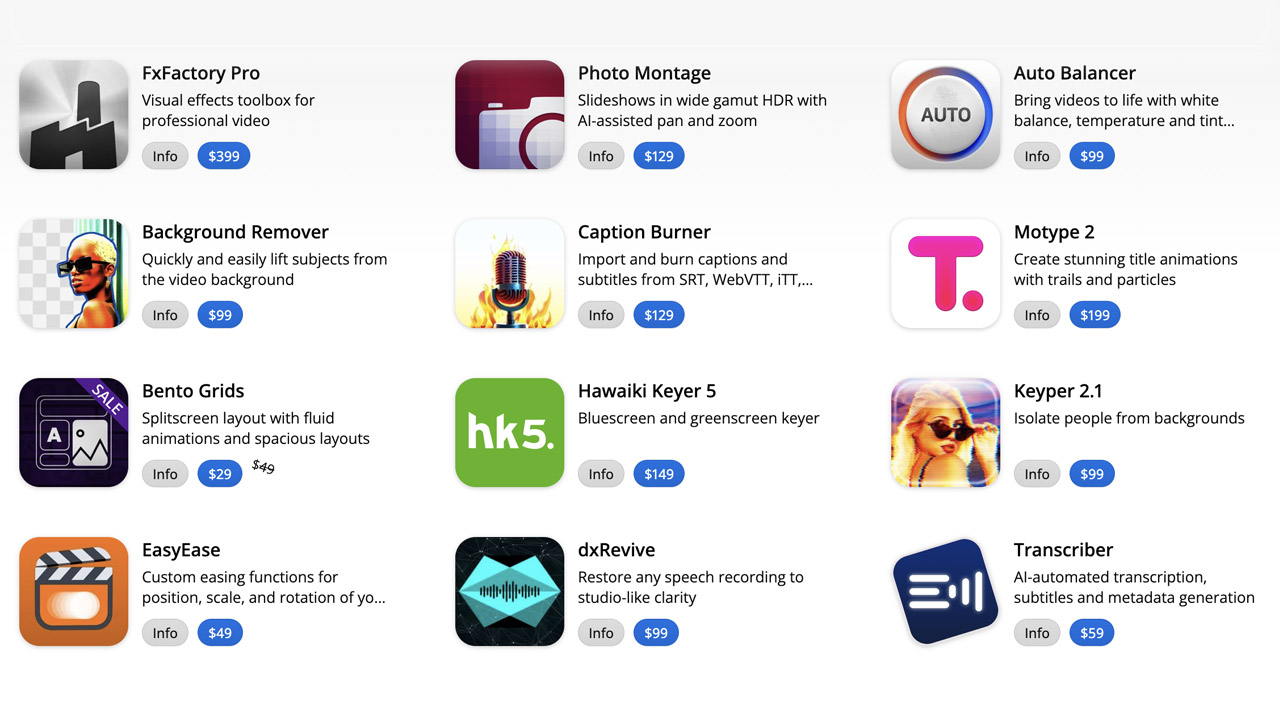
FXFactory ➔
25% off with code BLACKFRIDAY until 12/3
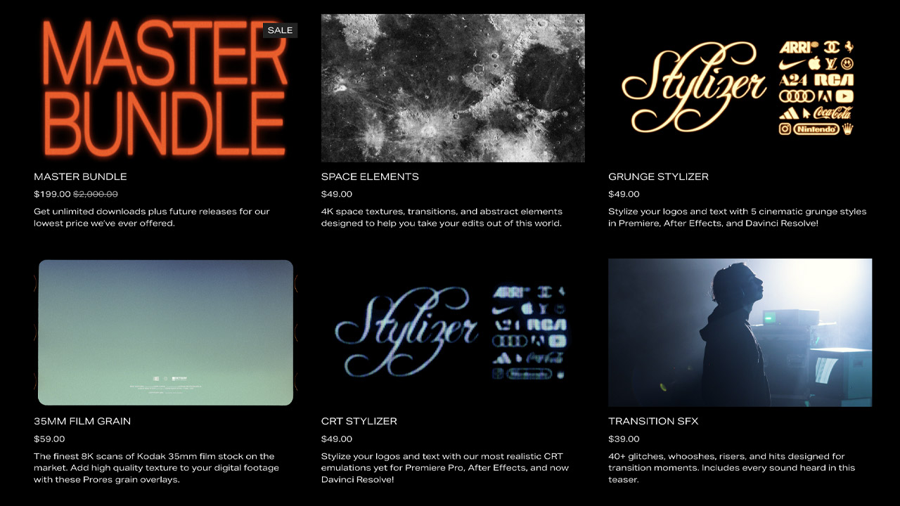
Goodboyninja ➔
20% off everything

Happy Editing ➔
50% off with code BLACKFRIDAY
Huion ➔
Up to 50% off affordable, high-quality pen display tablets

Insydium ➔
50% off through 12/4
JangaFX ➔
30% off an indie annual license
Kitbash 3D ➔
$200 off Cargo Pro, their entire library
Knights of the Editing Table ➔
Up to 20% off Premiere Pro Extensions
Maxon ➔
25% off Maxon One, ZBrush, & Redshift - Annual Subscriptions (11/29 - 12/8)
Mode Designs ➔
Deals on premium keyboards and accessories
Motion Array ➔
10% off the Everything plan
Motion Hatch ➔
Perfect Your Pricing Toolkit - 50% off (11/29 - 12/2)

MotionVFX ➔
30% off Design/CineStudio, and PPro Resolve packs with code: BW30

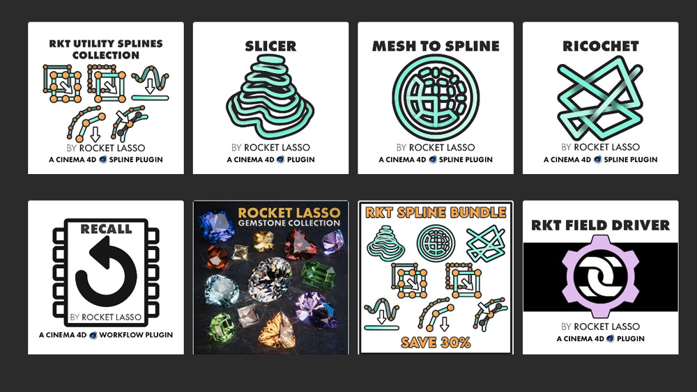
Rocket Lasso ➔
50% off all plug-ins (11/29 - 12/2)
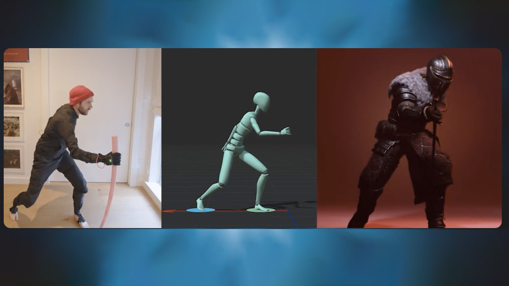
Rokoko ➔
45% off the indie creator bundle with code: RKK_SchoolOfMotion (revenue must be under $100K a year)
Shapefest ➔
80% off a Shapefest Pro annual subscription for life (11/29 - 12/2)

The Pixel Lab ➔
30% off everything
Toolfarm ➔
Various plugins and tools on sale

True Grit Texture ➔
50-70% off (starts Wednesday, runs for about a week)

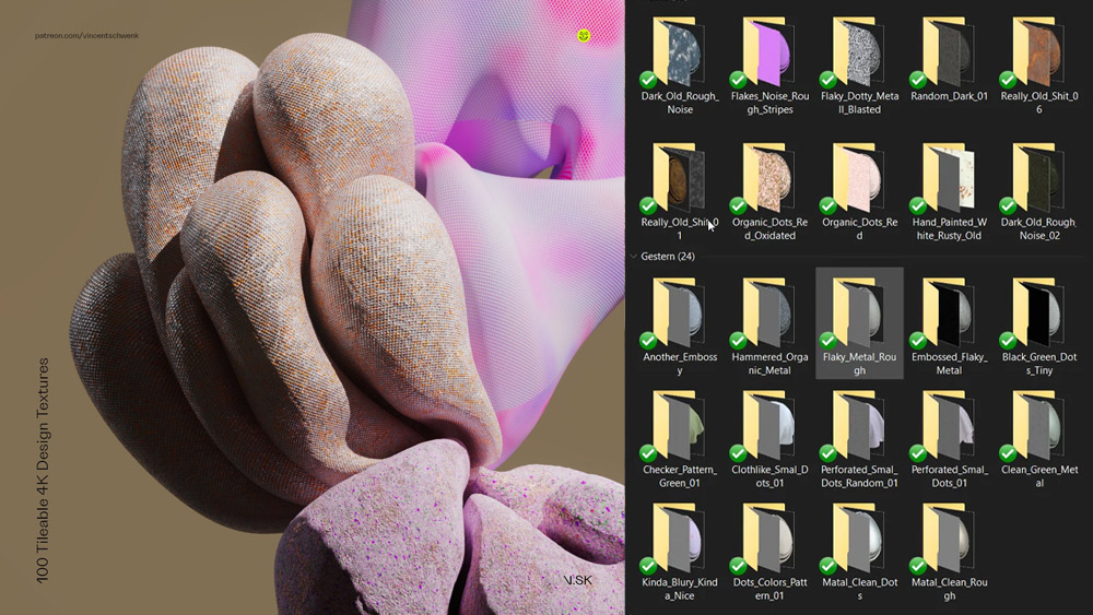
Vincent Schwenk ➔
50% discount with code RENDERSALE
Wacom ➔
Up to $120 off new tablets + deals on refurbished items

Learn After Effects the Right Way

Master the After Effects interface and build a real animation skillset. Enroll in All-Access to unlock AE Kickstart and 50+ other courses.
