All-Access Pass
Unlimited access to 50+ courses, unlimited critique, live events, and 24/7 community. Join School of Motion All-Access today.
Looking to showcase your Motion Design work on Instagram? Here’s how to share your work.
So… What does the world’s largest catalog of selfies have to do with being a Motion Designer? Believe it or not, in the past few years, a vibrant community of Motion Designers have flocked to Instagram to post daily renders, works in progress, and all out jaw-dropping personal projects. If you haven’t yet hopped on that train, we think it’s about time.
Instagram is simply one of the best ways to expose your work these days, people are being headhunted and hired off Instagram left and right. It’s too great of an opportunity to ignore for budding and seasoned motion designers alike.
Step 1: Dedicate Your Account
Whether you have an existing Instagram account or not, it’s time to think about how you want to be recognized as a Motion Designer. Pictures of your dog or the amazing dinner you ate last night are probably not the type of things that are going to help you build a following, or at least the following that you want.
For you, this may mean creating a new “clean” account that is purely for your artistic outlets. For others, it might be as simple as deciding to shift the majority of your Instagram posts toward more motion design related content. Oh, and in order for the world to see your stuff, you’ll want to make sure your profile is public. duh...
Step 2: Get inspired
Instagram and Pinterest are my favorite places to go looking for Motion Design inspiration. A great way to get a feel for the type of work you’ll want to create and post on Instagram is to start following artists whose followers you would like to have someday.
Here is a list of some of my favorites:
- Wannerstedt
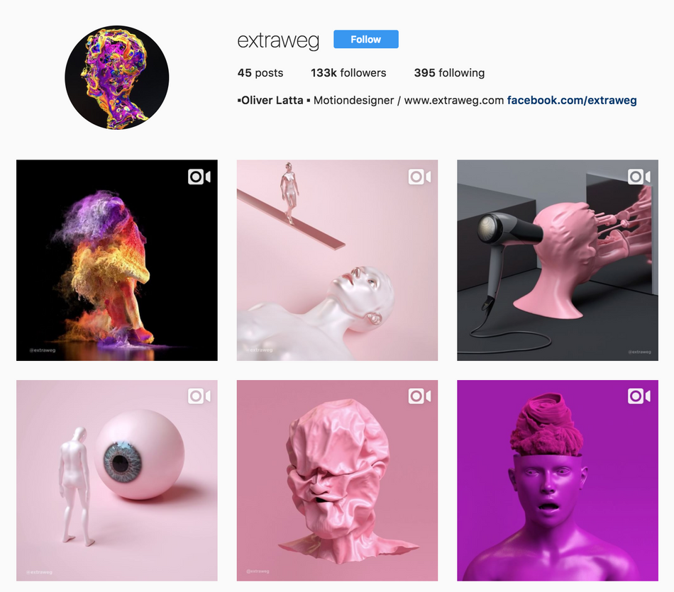
- Extraweg
- Fergemanden
- And last but not least: Beeple
In addition to artists, there is also an amazing handful of motion design curators on Instagram. More on them later. For now, these accounts are must-follows:
Step 3: Curate Yourself
Now it’s time to really focus on posting high-quality images and animations to your account. Starting off, you may not have that much stuff in your portfolio, and that’s totally okay. For now, it’s all about posting your BEST work. You are building your brand and representing yourself. Think about the fans you want to have and the clients you want to land. What do they like? Design and animate with your future collaborators in mind!
To everyday or not to everyday … That is the question...
So... let's talk.
Remember that Beeple guy I mentioned earlier? He is what we all consider to be the official ambassador of the everyday. He’s been posting an image a day for over 10 years and he’s constantly getting better. He’s more or less at the center of movement for artists doing daily renders and posting them to Instagram.
Now, the logic of whether or not you should do daily renders is an entire article in itself.
In short, dailies can be really great if you are trying to get better at a certain style or technique. But, if you have trouble with context switching (like me), everydays can hold you back from progressing into more in-depth, longer form projects. I’ve never even tried to everyday, but if you’re really good and want to give it a try, go for it - your Instagram account will thank you!
In reality, you really just want to put out good content as often as you can. Whether you have a library of content you can’t wait to publish or you’re just cranking out one or two designs a month, try to post regularly if you can without sacrificing quality.
Step 4: Format Your Video
This is where things start to seem tricky, but they’re really not so bad once you begin to accept these two hard facts that there is no way of getting around:
- Instagram video quality is not as good as what you’re used to.
- Uploading is a convoluted process.
We’ll cover uploading later, but for now, let’s talk video. Here’s what Instagram is doing to your animations, and why:
Instagram is downrezzing your videos to to an absolute maximum dimension of 640 x 800 and then re-encoding it at an excessively low bit rate.
Why are they doing this? For starters, Instagram is not primarily a video platform. It’s original intention was for the mobile sharing of photos. Because it’s a mobile app designed to be able to efficiently run on cellular data networks, it needs to keep file sizes small for faster load times, lower network strain, and less data overages to the end user.
Because there is no way to get around this at the moment, we need to play within Instagram’s rules, so let’s dive in.
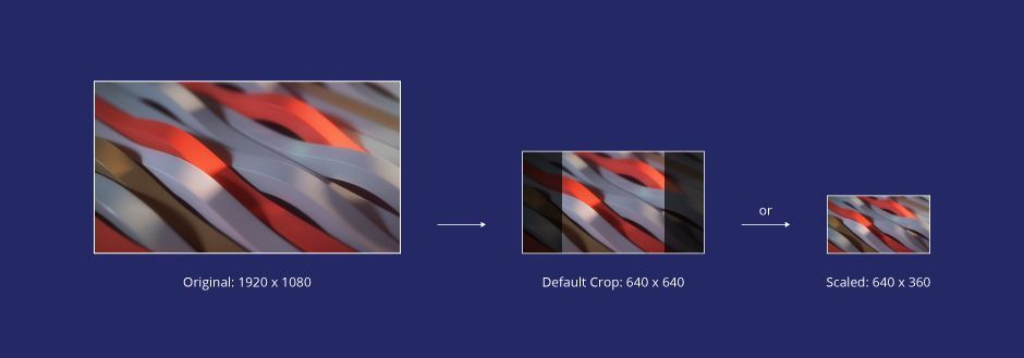
The maximum width any video can be is 640 pixels wide.
For standard 16:9 full HD video, you have two options that the Instagram app will handle for you:
- You can either have the video scaled vertically to fit to a height of 640px and crop off the sides.
- You can have the video scaled horizontally to fit a width of 640px, thus resulting in a resolution of 640 x 360.
Most Instagram video content is square 640 x 640. This is the default crop for uploading video and probably the most popular aspect for motion designers.

The maximum dimension of 640 x 800 can only be achieved by inputting a portrait video that is taller than it is wide. Then, a similar scaling/cropping scenario happens.
For example: The default square crop occurs when selecting a vertical video shot at 720 x 1280 - It’s width scaled to 640 and the top and bottom cropped off at 640 as well.

But if you hit the little crop button in the lower left hand corner, your video will continue to be scaled to 640 wide, but you’ll get an extra 160 vertical pixels. Neat!
Pictures follow the same rules outlined above except the standard square resolution is 1080 x 1080 and the maximum dimension is 1080 x 1350.
SO WHAT FORMAT SHOULD YOU BE EXPORTING?
Some theories out there claim that compressing your videos to sizes under 20Mb will help you avoid recompression on Instagram. This is false. All videos are recompressed on Instagram.
Other theories claim that you should format your video to the exact pixel resolutions described above. This is also false. We’ve found that supplying higher quality, full resolution videos to Instagram actually (slightly) helps create a cleaner re-compression of your video.
Our recommendation: Output H.264 Vimeo preset to the aspect ratio of your choice in either square 1:1 or portrait 4:5 to maximize the screen real estate taken up by your video.
For more information on codecs, see here.
Step 5: Upload Your Video
So now you’ve made a motion design masterpiece, exported it and you go to instagram.com aaand…. Where’s the upload button?
This really puzzled me at first, but it all goes back to the previous discussion about Instagram being a “Mobile” app. Basically, they want you to use the App for everything. At this time there is no officially supported way to upload pictures or videos from your desktop.
The preferred way of uploading is actually a pretty simple, albeit annoying process: All you have to do is transfer the video or picture to your phone and upload it using the Instagram app.
There are a number of ways to transfer content to your phone, but the most universal way to do this would be to use your favorite file sharing app, like Dropbox or Google Drive.
Now, if this method of uploading drives you absolutely insane, we don’t blame you. There are several techniques you can use to enable uploading from your computer if you like. I’m only going to briefly cover them here so you know that they exist:
- User Agent Spoofing - You can use browser extensions like User-Agent Switcher for Chrome to trick your computer’s browser into thinking that you’re using a mobile web browser. This only works for photos and doesn’t support filters.
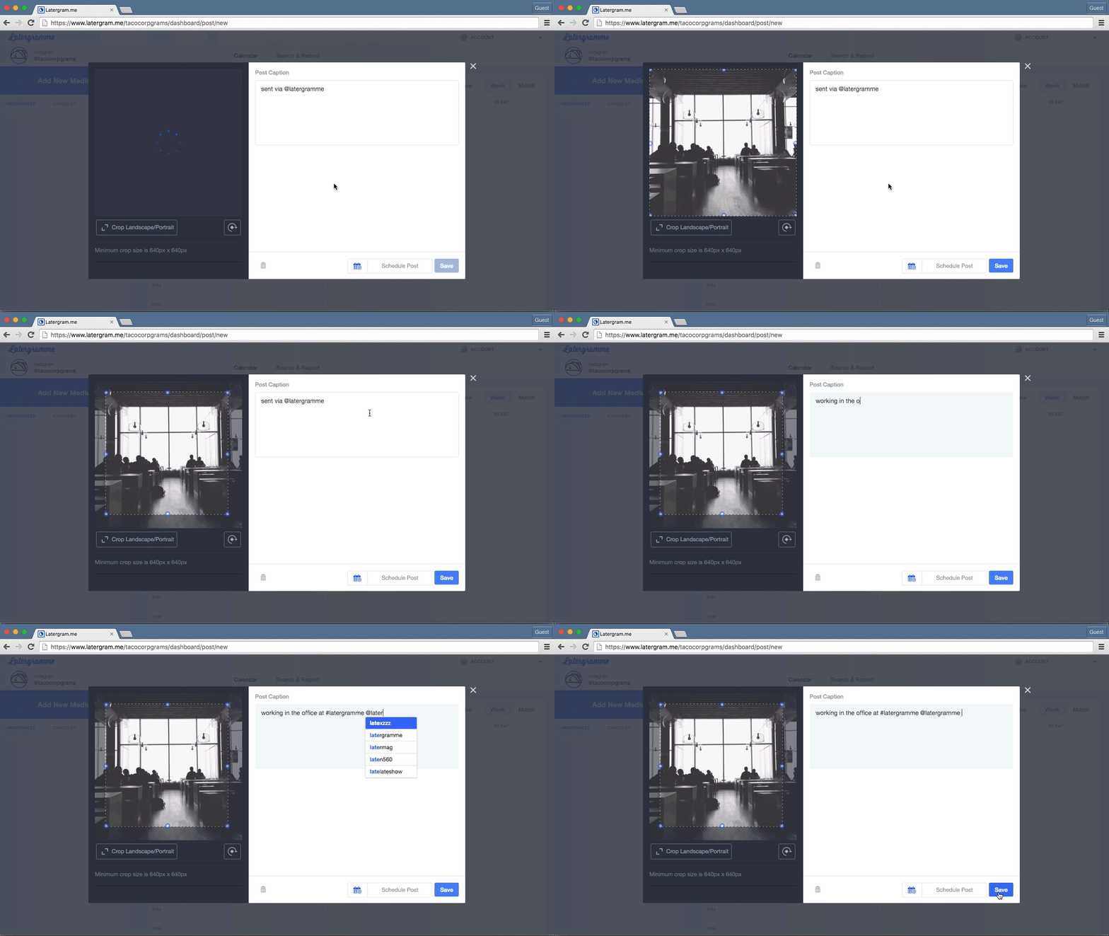
- Later - Subscription-based Instagram post scheduling software. Packages range from $0 - $50 a month. At the $9.99 tier you can upload video.
- Other workarounds - Hootsuite, and Bluestacks (an Android emulator).
Feel free to explore these other options at your own leisure!
Step 6: When to Post
The Huffington Post recently published an article about what times of the day and week will optimize your exposure on Instagram. In short, they found that posts on Wednesdays get the most likes. They also found that posting at 2 AM and 5 PM (EST) were the best times to get likes, whereas 9 AM and 6 PM were the worst. That being said, we’re motion designers - We pull odd hours and it probably doesn’t really matter that much, but … The more you know!
Step 7: Use Those #Hashtags
Hashtags and a reasonable description or title for your work are the things that are going to get the right eyes on your work and maximize your exposure. As of the time of this writing, you can use up to 30 hashtags but somewhere between 5 and 12 should do the trick.
I like to use these curators’ tags for starters:
- #mdcommunity
- #lucidscreen
- #xuxoe
- #mgcollective
While you might not get featured (you might!), these tags are great exposure because people generally like to browse and search them from time to time. I happened to discover these hashtags by studying the hashtags used by other artists I like, and I suggest you do as well from time to time! The only thing that’s important here is to keep your hashtags relevant to the content you are creating, otherwise you risk venturing into spam territory and nobody wants that, especially not you.
FIND OUT HASHTAG POPULARITY
There's also a great tool called Display Purposes that will allow you to see how the popularity of certain hashtags. It's magical.

Step 8: Hit the “Share” Button
…And that’s it! Just a couple final thoughts before you become the next Insta-art legend:
This is a great opportunity to practice finishing projects and letting them go. You will get faster, and better over time. Don't worry about how many or how few likes you’re getting. Don't read into anything too much. None of it really matters, and that’s the beauty of it! This is your opportunity to, put yourself out there in front of millions of people, so go on and have yourself a total blast! You are now Instagram’s latest motion designer.
ENROLL NOW!
Acidbite ➔
50% off everything
ActionVFX ➔
30% off all plans and credit packs - starts 11/26
Adobe ➔
50% off all apps and plans through 11/29
aescripts ➔
25% off everything through 12/6
Affinity ➔
50% off all products
Battleaxe ➔
30% off from 11/29-12/7
Boom Library ➔
30% off Boom One, their 48,000+ file audio library
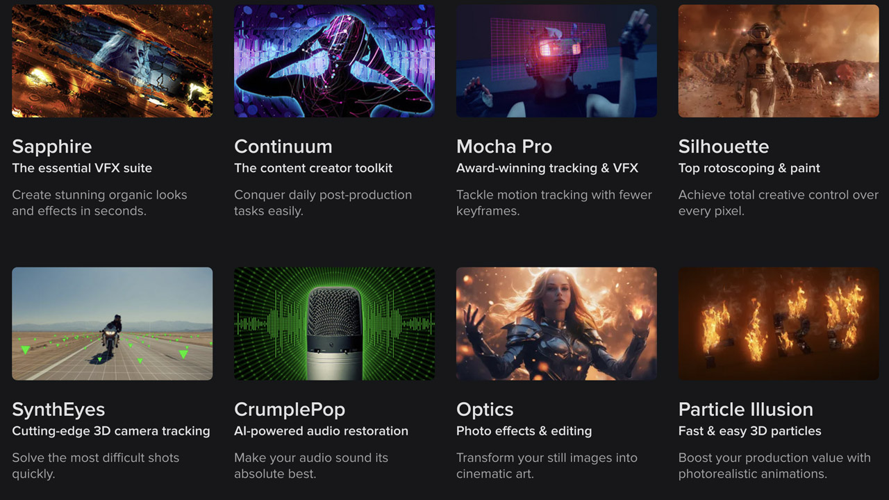
BorisFX ➔
25% off everything, 11/25-12/1
Cavalry ➔
33% off pro subscriptions (11/29 - 12/4)
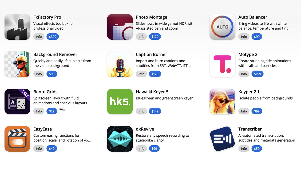
FXFactory ➔
25% off with code BLACKFRIDAY until 12/3
Goodboyninja ➔
20% off everything
Happy Editing ➔
50% off with code BLACKFRIDAY
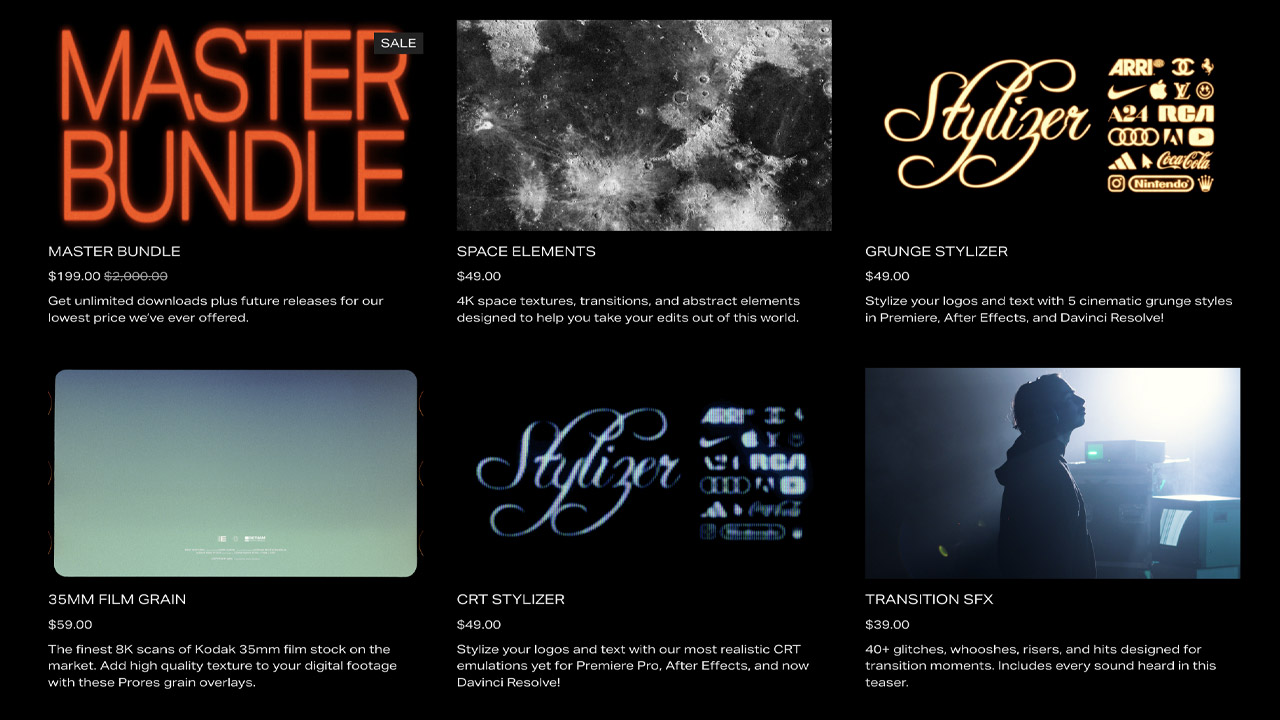
Huion ➔
Up to 50% off affordable, high-quality pen display tablets
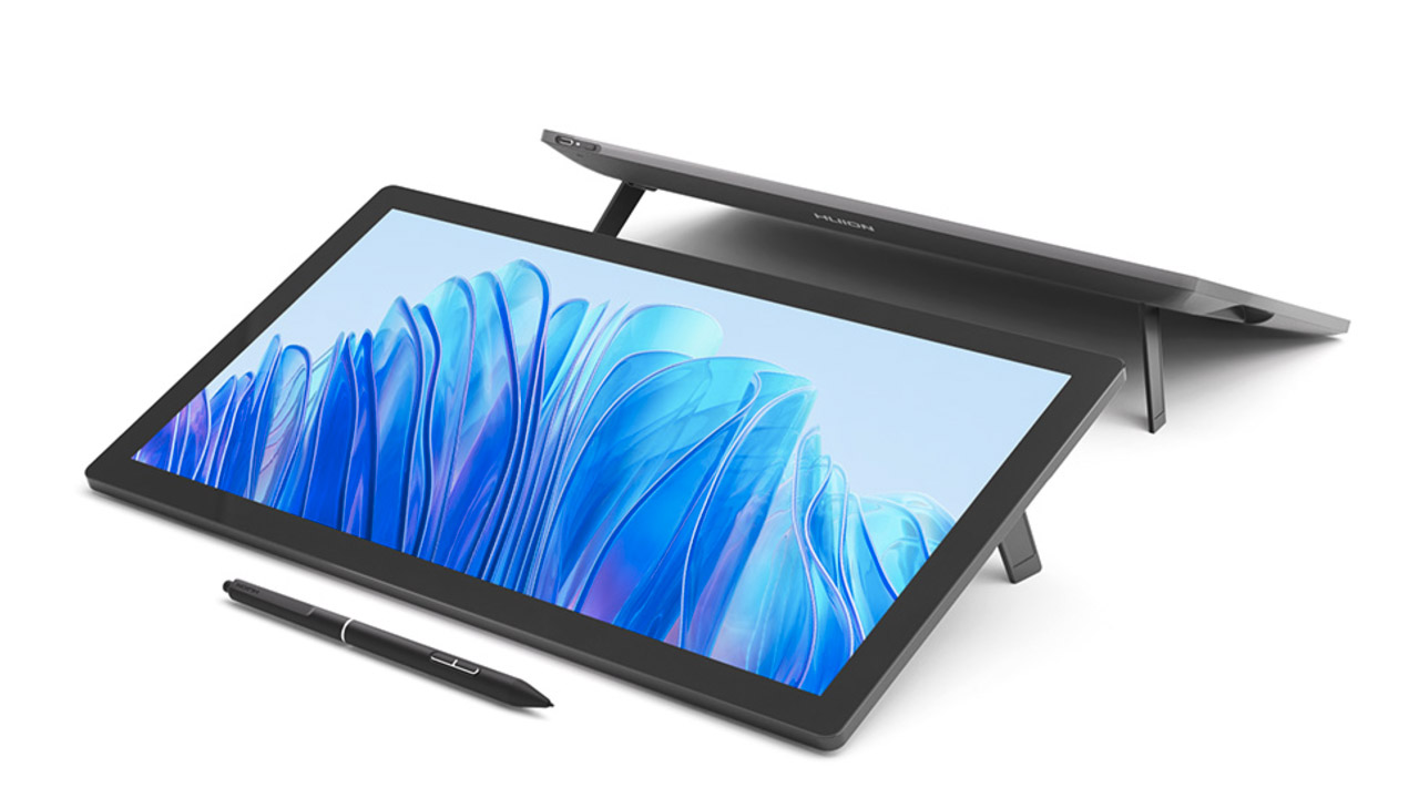
Insydium ➔
50% off through 12/4
JangaFX ➔
30% off an indie annual license
Kitbash 3D ➔
$200 off Cargo Pro, their entire library
Knights of the Editing Table ➔
Up to 20% off Premiere Pro Extensions
Maxon ➔
25% off Maxon One, ZBrush, & Redshift - Annual Subscriptions (11/29 - 12/8)
Mode Designs ➔
Deals on premium keyboards and accessories
Motion Array ➔
10% off the Everything plan
Motion Hatch ➔
Perfect Your Pricing Toolkit - 50% off (11/29 - 12/2)
MotionVFX ➔
30% off Design/CineStudio, and PPro Resolve packs with code: BW30
Rocket Lasso ➔
50% off all plug-ins (11/29 - 12/2)
Rokoko ➔
45% off the indie creator bundle with code: RKK_SchoolOfMotion (revenue must be under $100K a year)
Shapefest ➔
80% off a Shapefest Pro annual subscription for life (11/29 - 12/2)

The Pixel Lab ➔
30% off everything
Toolfarm ➔
Various plugins and tools on sale

True Grit Texture ➔
50-70% off (starts Wednesday, runs for about a week)
Vincent Schwenk ➔
50% discount with code RENDERSALE
Wacom ➔
Up to $120 off new tablets + deals on refurbished items


All-Access Pass

Unlimited access to 50+ courses, unlimited critique, live events, and 24/7 community. Join School of Motion All-Access today.
