Start Your 3D Journey in Cinema 4D
Master the essentials of 3D modeling, lighting, and animation in C4D. Enroll in All-Access to unlock C4D Basecamp and 50+ other courses.

How to Light a Scene with HDRIs and Area Lights
In this tutorial, we're going to explore lighting, and why you shouldn't light with just HDRIs.
In this article, you'll learn:
- What is an HDRI?
- Why you shouldn't light with only HDRIs
- How to properly light an outdoor shot
- How to use artificial light sources
- When can you get away with using just HDRIs?
- Why you should avoid front lighting
In addition to the video, we've created a custom PDF with these tips so you never have to search for answers. Download the free file below so you can follow along, and for your future reference.
{{lead-magnet}}
HDRI is short for High Dynamic Range Image. It's a panoramic photograph that covers the entire field of vision that contains a large amount of data which can be used to emit light into a CG scene. While lower range images calculate their light value between 0.0 and 1.0, HDRI lighting can reach a value of 100.0.
Because the HDRI catches a higher range of lightning information, it can be used to in your scene with a few key benefits.
- Illumination of the scene
- Realistic reflections/refractions
- Soft shadows

So here’s maybe a controversial statement. If you’re lighting with HDRIs alone, you’re doing it wrong. HDRIs are baked lighting solutions, meaning two things: First off, you can only rotate them, and that limits your flexibility.
Second, all the light from an HDRI is from an infinite distance away, meaning that you can never go in and light specific objects in your scenes or pull lights closer or further away from those objects.

Sure, they can be great if you just need to show off the modeling job you did—like this example of a metallic object lit with only an HDRI—but this won't be enough when your scenes start getting more complex. HDRIs tend to create softer shadows, which might not be a realistic look for your composition.

Let’s take a look at this scene from a fun project I did recently as part of my upcoming SOM class on digital cinematography. Here’s what the scene looks like with just the HDRI as the light source. Very flat no matter which direction I turn it. Then here’s what it looks like when we add in the sun.

Now we get nice direct light and way more contrast, with strong shadows. This is pretty good but the barn doesn’t feel all that inviting in shadow, so here’s what it looks like when I add in an area light to fill in the shadows here and add a strong highlight to the barn on the side here.

In this instance because the area lights are warm like the sun they feel motivated and you don’t notice that they’re artificial sources. Especially this light on the side of the barn just feels like an extension of the sun.
With outdoor scenes, the daylight rig can work great alone, but if you combine with an HDRI using the mix sky texture button, you can add in more detail in the sky and the reflections as well.
Often I do all my lighting with area lights though. Here’s a breakdown of the lighting on this tunnel. I started with just the starmap lighting the scene, then added in the practical lights—and by that I mean lights in the shot that we can see. Then I added some overhead lighting in a few spots down the tunnel, invisible to camera, and then a few more on the sides. Finally, I added in a sunlight.
Now here’s a breakdown of the lighting from my cyberpunk scene here. Again, starting with an HDRI, doesn’t do much. Now we add all the neon. Then I add in a purple sun, and now some area lights between the buildings to bring out some of the details in the alleyways and add in some more color.
I’m enhancing the balconies a bit with some warm lighting, but not too bright or it’ll be distracting and pull the eye too much.
As with our naturally lit outdoor scene, layering together multiple lighting sources achieves the most engaging result.

Now sometimes you can actually get away with lighting with only HDRIs. For example, my Deadmau5 Kart project was lit with what I’d call stylistic HDRIs, such as Nick Scarcella’s Manhattan Nights HDRIs, which are free here on Gumroad. There are also some extremely cool looking fractal HDRIs that can be awesome for abstract shots, or blending in with star maps as backgrounds, as well as creating unique and cool reflections.
As a final takeaway, I would say avoid front lighting your shot. That creates a look like an onboard flash on your camera would, and flattens all the detail. It looks amateurish and can wreck your shots, especially if the light is placed close to the same angle as the camera.

Front lights from above or slightly to the side look somewhat better, and front lights as fill can be very nice but when it’s the key light it typically doesn’t look great.
HDRIs are a powerful tool for 3D designers, and they can help you achieve more realistic and professional-looking renders. That said, you need to get comfortable placing addition layers of lighting to place with shadows, draw focus, and bring your creations to life. Experiment, and I'm sure you'll find what works best for you.
Want more?
If you're ready to step into the next level of 3D design, we've got a course that's just right for you. Introducing Lights, Camera, Render, an in-depth advanced Cinema 4D course from David Ariew.
This course will teach you all of the invaluable skills that make up the core of cinematography, helping to propel your career to the next level. You’ll not only learn how to create a high-end professional render every time by mastering cinematic concepts, but you’ll be introduced to valuable assets, tools, and best practices that are critical to creating stunning work that will wow your clients!
-----------------------------------------------------------------------------------------------------------------------------------
Tutorial Full Transcript Below 👇:
David Ariew (00:00): HD arise can be very useful, but also limiting. So I'm going to show you how to precisely let your scenes with area lights.
David Ariew (00:14): Hey, what's up, I'm David Ariew and I'm a 3d motion designer and educator, and I'm going to help you make your renders better. In this video, you'll learn how to use specific light sources to enhance your renders and draw the eye. Enhance exterior lighting with a combination of HD arise, daylight and motivated area lights, cell scale with smaller pools of light use light linking to only aluminate specific objects and avoid front lighting or shots. If you want more ideas to improve your renders, make sure to grab our PDF of 10 tips in the description. Now let's get started. So this might be a controversial statement. If you're lighting with HDRs alone, you're doing it wrong. You need to stop lighting with HD rise. Only HD your eyes are baked lighting solutions, meaning two things. First off, you can only rotate them. And that limits your flexibility. And second, all the light from an HTRI is from an infinite distance away, meaning that you can never go in and light specific objects in your scenes or pull lights closer or further away from those objects.
David Ariew (01:12): Sure. They can be great. If you just need to show off the modeling job you did like this example of a metallic object lit only with an HTRI, but when you're seeing start getting more complex, you'll find that even with H dries with a very direct looking sun, your shadows will be super soft and overall you'll get a pretty flat look. That's not to say that this couldn't be what you're going for. Like, you might want a flat look for example, this beautiful render by Marius Becker. But my point is that you're limiting yourself. If this is the only lighting tool that you use, let's take a look at this team from a fun project. I did recently as part of my upcoming school of motion class on digital cinematography. Here's what the scene looks like with just the HDI as the main light source.
David Ariew (01:48): It's very flat, no matter which direction I turn it, then here's what it looks like. When we add in the sun. Now we get some nice direct light and way more contrast with strong shadows. This is pretty good, but the barn doesn't feel all that inviting in shadow. So here's what it looks like when I added an area light to fill in the shadows a bit. And then I add a strong highlight to the barn on the side here with another area light in this instance, because the area lights are a very similar color temperature to the sun. They feel motivated. And you don't notice that they're artificial sources, especially this light on the side of the barn just feels like an extension of the sun, our eyes aren't that great at immediately determining light direction unless they're insanely well-trained. So there's a lot of flexibility here.
David Ariew (02:26): When you're lighting without door scenes, the daylight rig can work great alone. But if you combine with an HTRI using this mixed sky texture button, you can add in more detail in the sky and the reflections as well. Often I do all my lighting with area lights, though. Here's a breakdown on the lighting on this tunnel. Here's what it looks like with just the star map, lighting the scene, then adding in the practical lights. And by that, I mean the neon lights in the shot that we can see. And then here's a few area lights there, overhead lighting, a few spots down the tunnel, which are invisible to camera. Then here's a few more area lights on the sides to really fill it out. Finally, here's adding in a sunlight, which is another cool look, but not necessary. Now here's a breakdown of the lighting from my cyber punk scene.
David Ariew (03:04): Again, starting with an H dry doesn't do much. Even if we crank the power, it's just flat. Here's what it looks like. Once we add in all the neon signs, then I add in a purple sun, which gives some nice shafts of directional light. And now here's adding in some area lights between the buildings to bring out some of the details in the alleyways and add in some more color. Here's a few additional lights to hit the metal awnings of some of the stores. And now here's some lights to boost the background volume metrics. Then we've got some lights to bring out the interiors of several of the shops. And here I'm enhancing the balconies a bit with some warm lighting, but not too bright, or it'll be distracting and pull the eye too much to the foreground. And finally, here's some additional warm, cold and pink highlights on the walls and awnings lighting with area lights can make all the difference in selling the scale of a scene to, for instance, here in the shot from Coco, we buy that this is a huge environment because of the literal tens of thousands of lights going on.
David Ariew (03:52): When an area is huge, the lights have to be massive to, to let everything from a single source. So it's much more natural to see little pools of light here and there with a big scene. For example, here's another scene of mine from the excision concert visuals I did recently. Here's what happens if we light with just an HTRI or with a couple of huge area lights and it just looks flat, but it looks so much more convincing when we light with a bunch of smaller lights, light linking can also help improve your renders. And by that, I mean, targeting specific lights to specific objects here. For instance, these strong lights are meant to focus our attention on the chip in the shot, but they're blasting the floor and it's super distracting in octane. I can set my lights to only target this object by creating octane object tags for the floor and telling it to ignore lights from ID two.
David Ariew (04:35): For instance, then I set the area lights tidy too, and this is what we get light linking saved me on this project. For sure. Now, like I've said before, there really are no rules. And to contradict myself, sometimes you actually can get away with lighting with only your eyes. For example, my dead mouse cart project here was lit with what I'd call stylistic, aged your eyes. And in this case I used my buddy, Nick Scarcella's Manhattan nights, HDR eyes, which are free here on Gumroad. These were taken at night in times square and other areas in New York city. So they're mostly dark with neon lights and therefore create a ton of interesting reflections in the car and wet pavement. Another pack that I love is this one by the French monkey called fractal dome volume one. And these are some extremely cool looking fractal, aged your eyes.
David Ariew (05:18): That can be awesome for abstract shots or blending in with star maps, his backgrounds, as well as creating unique and cool reflections. As a final takeaway, I would say avoid front lighting or shot that creates a look like an onboard flash on your camera, wood and flattens all the detail. It looks amateurish and can wreck your shots. Especially if the light is placed close to the same angle as the camera front lights from above or slightly to the side looks somewhat better in front lights is Phil can be very nice, but when it's a key light, it typically doesn't look great. I'm going to keep contradicting myself though, because here again, I can think of one instance where I've seen this work really well. These renders by SEM Tez can are amazing to me because they look like photos pulled from old albums from the eighties. He intentionally tried to recreate flash photography lighting, and that gives it this authentic quality. I'm not saying that the lighting looks good, but it looks convincingly retro. And that dramatically increases the photo realism of these renders because of how it tricks our brain. By keeping these tips in mind, you'll be well on your way to consistently creating awesome renders. If you want to learn more ways to improve your renders, make sure to subscribe to this channel and hit the bell icon. So you'll be notified when we drop the next tip.
ENROLL NOW!
Acidbite ➔
50% off everything
ActionVFX ➔
30% off all plans and credit packs - starts 11/26
Adobe ➔
50% off all apps and plans through 11/29
aescripts ➔
25% off everything through 12/6
Affinity ➔
50% off all products
Battleaxe ➔
30% off from 11/29-12/7
Boom Library ➔
30% off Boom One, their 48,000+ file audio library
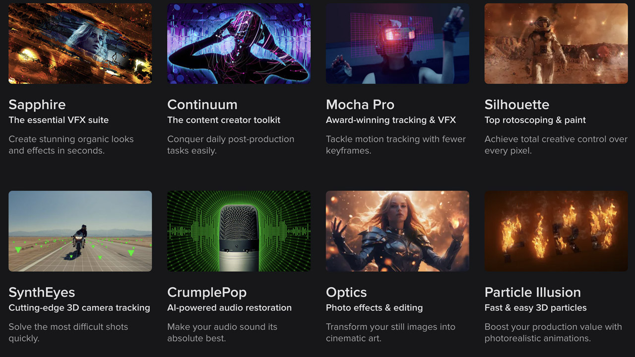
BorisFX ➔
25% off everything, 11/25-12/1
Cavalry ➔
33% off pro subscriptions (11/29 - 12/4)
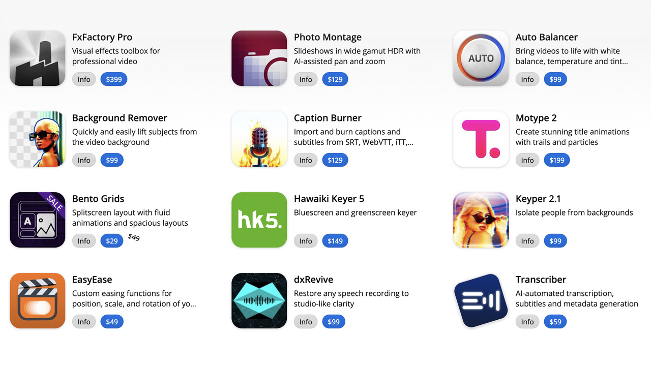
FXFactory ➔
25% off with code BLACKFRIDAY until 12/3
Goodboyninja ➔
20% off everything
Happy Editing ➔
50% off with code BLACKFRIDAY
Huion ➔
Up to 50% off affordable, high-quality pen display tablets
Insydium ➔
50% off through 12/4
JangaFX ➔
30% off an indie annual license
Kitbash 3D ➔
$200 off Cargo Pro, their entire library
Knights of the Editing Table ➔
Up to 20% off Premiere Pro Extensions
Maxon ➔
25% off Maxon One, ZBrush, & Redshift - Annual Subscriptions (11/29 - 12/8)
Mode Designs ➔
Deals on premium keyboards and accessories
Motion Array ➔
10% off the Everything plan
Motion Hatch ➔
Perfect Your Pricing Toolkit - 50% off (11/29 - 12/2)

MotionVFX ➔
30% off Design/CineStudio, and PPro Resolve packs with code: BW30
Rocket Lasso ➔
50% off all plug-ins (11/29 - 12/2)
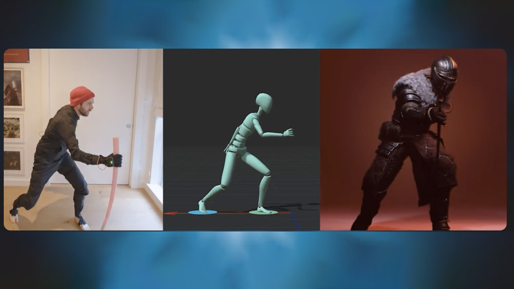
Rokoko ➔
45% off the indie creator bundle with code: RKK_SchoolOfMotion (revenue must be under $100K a year)
Shapefest ➔
80% off a Shapefest Pro annual subscription for life (11/29 - 12/2)

The Pixel Lab ➔
30% off everything
Toolfarm ➔
Various plugins and tools on sale

True Grit Texture ➔
50-70% off (starts Wednesday, runs for about a week)

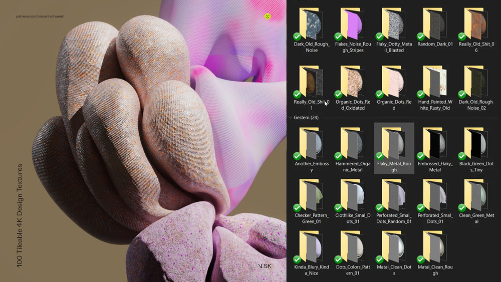
Vincent Schwenk ➔
50% discount with code RENDERSALE
Wacom ➔
Up to $120 off new tablets + deals on refurbished items

Start Your 3D Journey in Cinema 4D

Master the essentials of 3D modeling, lighting, and animation in C4D. Enroll in All-Access to unlock C4D Basecamp and 50+ other courses.


