All-Access Pass
Unlimited access to 50+ courses, unlimited critique, live events, and 24/7 community. Join School of Motion All-Access today.
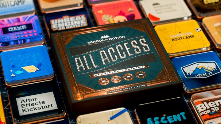
Get comfy. This is gonna take a while.
We are going to create an entire short film / MoGraph piece from scratch, and document every darn step in the process. This entire making-of series spans about 10 hours, and will show you the whole shebang from start to finish.In this first video, we go over the process of coming up with a half-formed vague idea, and then fleshing out through style research, sketching, music searches, and Googling stuff. By the end we have something that kinda looks like a story, and a script even!
{{lead-magnet}}
-----------------------------------------------------------------------------------------------------------------------------------
Tutorial Full Transcript Below 👇:
Music (00:02):
[intro music]
Joey Korenman (00:11):
Howdy, Joey here at School of Motion. And I want to welcome you to part one of this video series, where we're going to be going through every single step of the process in the making of a short motion design-y film. We're going to go through coming up with the idea of gathering, reference materials, doing thumbnail sketches, cutting an animatic modeling, texturing rigging, animating compositing, and sound design. It's going to be a very long series and hopefully you're going to learn a ton. One of the things we're trying to do at school emotion is push past the limitations of a single tutorial mindset where you kind of learned maybe a trick or two, and maybe that's helpful. Maybe it's not. Maybe you're just watching that tutorial because it's kind of entertaining. This is going to be a serious learning endeavor, and hopefully you get a lot out of it. And please let us know if you do, don't forget to sign up for a free student account. So you can grab the project files from this series. And there are a lot of them you can follow along. You can mess around with the project files and see exactly what we're doing in these videos. So thank you. Hopefully this goes well, fingers crossed. And uh, here we go.
Joey Korenman (01:17):
So where do you start with a project like this? It's just so big. It's massive because you can make absolutely anything you want. There's no client and there's only a deadline because you say there is, and the thing is done when you say it's done well. In very broad terms, there are basically two ways to approach something like this. Let's call them top-down and bottom-up so bottom up is the way most things get made. You start with a concept and then you move on to a script, maybe some style frames and mood boards, stuff like that. And then you storyboard the whole thing out. You cut an animatic and maybe you find some music you like for attempt track, and then you animate and then you composite and you sound design and you finish the thing. So you start very broad and you end up refining and sharpening the piece along the way.
Joey Korenman (02:11):
But the start of the process is the initial concept, a different, but no less valid way of doing this is to start at the top. Albert Omoss talks about this a bit in episode 69 of the collective podcast, which is awesome by the way, uh, sometimes you have a vision in your head of some cool half-baked thing and you just need to get that vision out. But, you know, it's, half-baked, it's totally without context. So you make up a context for it. Like maybe there's some cool artwork that inspired you or a new tool you want to try out. So in a way you can start with the execution and then back into a concept that makes sense. This is what I did for giants.
Joey Korenman (02:58):
I've recently inspired by low poly artwork. I follow Timothy J. Reynolds of turn his left home.com w has such a hard URL to say, I follow Tim on Twitter. Uh, and I've become a big fan of his work and of his style. Low poly is pretty popular these days, and it really has some huge advantages. If you decide to use it as a style, you can get away with a bit less modeling and texturing because you're really just going after the basic form of something and with the right lighting and rendering and compositing, it can still be very, very beautiful. So I wanted to try creating a piece that told a bit of a story and had some emotion to it is so much of the work we do as motion designers. These days is clever and well executed, but sort of emotionally dead inside. I mean, I love a good explainer video, just as much as the next person, but I thought it would be a great creative challenge to try and make the viewer feel a little something if I could pull it off.
Joey Korenman (04:02):
And finally, I wanted to try out X particles for Cinema 4d, which I know seems very shallow just to try and shoe horn, some emotional concept into an execution based around a desire to play with a new toy. But there it is. I really wanted to learn X particles. I started to have this vague vision in my head of a cool desert scene with like a low poly plant or a flower standing in the shadow of this enormous obstacle. And then growing up the side of it to overcome this gigantic thing and it's path. So step one, for me in these kinds of situations is just to saturate my brain with reference. I find that it helps me generate ideas when I can sift through a bunch of cool artwork and I might get ideas about color palette or composition, or I might get derailed and ended up with a new idea entirely.
Joey Korenman (04:58):
Um, but here is my basic process. So my goal is to basically just flood my brain with images and stuff like that, and try to come up with, um, you know, basically something that resembles a mood board, something I can reference back to as I'm working on this and, and really, uh, you know, in this initial stage, I also just want to start generating more ideas. So let's hop into a Google Chrome here, my browser of choice. And you can see today my goal record inspiration video. So we're going to go right to Pinterest. Now I love Pinterest for this, and I'm going to show you why. All right. So Pinterest, a account is free if you don't have one, um, you can just sign up for free. And if I click on my account here, um, you can see I've already got some boards set up.
Joey Korenman (05:49):
Okay. And the way Pinterest works is you create a board and then you add references to that board. So let's create a new board here and why don't we just call this, um, you know, giant reference, giant references demo. Okay, cool. And, uh, that's all I needed. I don't need to fill out any of this of the junk. I'm going to hit create board. All right. Now here's what I love about Pinterest. It's basically like a stream of consciousness, kind of a kind of thing for design and photography and stuff like that. So, you know, all I know at this point is that I've got this vague thing in my head. There's a desert. All right. So let me just type in desert and just see what comes up. Right. And, and not desserts. Um, just, just desert. All right. And we'll see what, what pops up and, you know, all right.
Joey Korenman (06:37):
So apparently Pinterest doesn't know the two S rule. Um, so it's showing me pictures of desserts and deserts, but that's fine. So what, uh, what I want to do is kinda go down here and just like, look, just let my eye just see stuff. Right. Let's just catch some things. So first thing actually that jumped out at me was this photo. I, you know, I don't even know what it is. I guess it's like, you're inside a desert. You're looking up through these rock walls. It's beautiful. What's amazing about it is the color. Um, you know, I don't know anything about this photo, but I never would have thought to make the desert this color, but now that I've seen this photo, I think that might be cool. So I'm just gonna hit Pinot and I'm gonna make sure that I, uh, I use the correct the correct pin board here.
Joey Korenman (07:24):
So I have a giant reference board that I've already kind of started. Um, but I'm going to show you guys how to start one from scratch. So giant references demo is when we just made, I'm gonna hit Pinot. Excellent. Okay. So there you go. Now that one is, is in our board, right. And let's just keep going down and let's see what else jumps out at us. Okay. So this is another cool one, cause I kinda liked the texture of the ground. You've got these nice cracks and I also liked the way, um, you know, you've basically got like a rainbow here. I mean, you've got yellow transitioning to orange, to red, to purple, you know, almost a blue. So I'm going to pin that as well. Um, and you know, not everything has to look like the final product. This is just sort of color reference.
Joey Korenman (08:07):
Right. So I know that I do want to try and do something in this low poly style. So let me go ahead and just type in low poly and see what, what pops up here. Um, and there's a lot of stuff. I mean, this, you know, this just goes on basically to infinity, right? I can just keep scrolling down and see an endless supply of low poly stuff. And since there's so much of it, I kind of need to be a little bit careful about what I pick. Like this is beautiful, but it doesn't really speak to me. It doesn't, it doesn't, um, it doesn't resonate with what the image in my head looks like, you know? And so that's kind of what I'm trying to reconcile here. I've got this movie in my head that only I can see. Um, and I want to find images that can kind of help me pull that movie out of my brain.
Joey Korenman (08:55):
All right. So, you know, something like this, this is very simple, but I like the contrast between the ground and these kinds of mountains. Um, and the sky, I like the value contrast there. So I'm gonna pin that as well. All right. And then we'll do Lee. We'll do a couple more, um, just kind of see what else we can find here. Like I love stuff like this, you know, these really detailed, I mean, low poly, it's kind of a, it's, it's an interesting style because it can actually be extremely detailed. It's just kind of a neat look like something like this. There's a lot of detail going on there. Right. And you can see, this is one of the things that's cool about Pinterest. If you click on that image, I should have known Nick Campbell influencing, even, even when I'm trying not to look at grayscale grill, I'm looking at grayscale gorilla.
Joey Korenman (09:45):
So, uh, so, you know, if I w if I like this image though, I can just pin it, but if I click it, it's actually going to take me to a, it's going to take me to the site where this image lives. All right. So, um, so you can see, so now, if I want to look at my pins, my board, I can actually go up to my account and I can find my, um, my new board I made, which is over here, giant references demo, and I can just click on it. And sometimes you have to refresh them to refresh my browser and there it is. Okay. So now these are the references that I have pulled so far. Cool. Um, and now, just to show you, uh, let me go back and actually look at the giant reference, the giants reference board that I started before I started recording this tutorial, because what's awesome about Pinterest to me is that it basically makes a mood board for you.
Joey Korenman (10:37):
And if you don't know what a mood board is, it's basically just a collection of images that you've swiped off of the internet usually. Uh, and it lets you just kind of gaze at them and get just a rough idea of what your piece might look like. It's sort of a vague way of describing something visually, um, without having to create a whole bunch of artwork, you just go find something that looks like what you're seeing in your head. And so I want to call out like, you know, I didn't just look at low poly stuff. I also found, you know, stuff like this, just really interesting architecture, you know, I mean, I know that there's going to be something in the desert. Um, you know, maybe it's a mountain like this that's, that's kind of the, the foe. And then the hero is going to be like a small little plant like this.
Joey Korenman (11:22):
And that's why I liked this reference photo here, because you've got these tiny little camels, you've got this really imposing, beautiful mountain and the, you know, the, like the lighting and all of that stuff. It's just gorgeous. Right? These are pyramids by the way. I know what they are. I know I just said mountain, but I want everyone to know. I know these are pyramids. All right. So this is one way of using Pinterest. You can just search within Pinterest. Now, another cool thing you can do is you can install this little Chrome extension. Okay. This is the Pinot to Chrome extension. Um, and if you Google Pinot Chrome extension, right there, it is pin it button Chrome web store. If you're using the Chrome browser, I highly recommend you install this because it lets you do stuff like this. So I'm going to go to another site that I love getting inspired by, which is from up north.
Joey Korenman (12:12):
Um, and basically from up north, just curates really great stuff from all over the web and they kind of have themes. So you've got topography one day architecture, the next, you know, beautiful signage. That's awesome. Um, and so, you know, you can kind of go through here and, you know, there's actually categories. And so let me take a look at maybe, um, you know, like what would be, what would be helpful, maybe photography, right? Because I want this to feel very cinematic, you know? And so like just being inspired by awesome compositions. Like this can be very helpful, right? So I like this photo. And once you install this extension, you actually get a little button on every photo you mouse over and you can just click Pinot. All right. This little pop-up happens. And then I can just tell it, put that in my giants reference board done.
Joey Korenman (13:03):
And that's it. Okay. And so now when I go back to Pinterest, this image is going to be there waiting for me. All right. So let me go down and see what else we got here. Yeah. I don't know. See, that is cool. I love that. Aw. See, this is what I mean, like, so I have a very half-baked idea in my head. Okay. The, the picture I just clicked and this picture don't have a lot in common other than there is a sky in them, but this there's something about the graphicness of this, right? Like this is so imposing, you're looking up at it and it's very hard and in angular. Um, and I really like it, it just looks evil. And so, you know, I know I'm going to need whatever is opposing this plant sort of flower thingy. That's going to need to look evil too.
Joey Korenman (13:51):
So I'm going to want something like this and who knows. Maybe, maybe it ends up being a building and it's, and it's something like this, right. So I'm just going to kind of go down like this and try and find, you know, a couple more things. So here's the big version of that image that I pulled. Um, what else, you know, like I also know, um, that I'm going to need something probably. Um, I dunno, like, like plant ish, right? So what, so actually we can use Google for this too. We can just take it in low poly plant, right. And just go to Google images. This is another way you can use Pinterest. Once you've installed this plugin, you can just use the Google image search like this. Just kind of scroll down and see if anything jumps out now, low poly plants. I'm sure a lot of this stuff is designed for video games.
Joey Korenman (14:39):
It's not going to really work that well for my purposes, but you never know. You might see something really interesting that jumps out at you like this. Like, that's really interesting. What is that? It's, I mean, it's a low poly tree. Um, you know, and to me, a low poly tree in my head, it has a lot less detail. This is actually sort of sculpted and it looks like a tree, so it's cool. I'm going to pin that. All right. So you can pin literally anything once you've got this, uh, extension set up. It's really great. Let's see if there's anything else.
Joey Korenman (15:12):
I mean, you know, there's stuff like that. That's kind of interesting. I like this texture. That's really beautiful. You know, it's, this is, what's cool. Like when you take low poly stuff, but you apply good textures, good lighting. And you know, you can tell there's like some ambient occlusion in here. Um, it can still look really just visually very interesting. I'm going to pin this as well. Cause that's kind of a neat texture maybe for like the way the ground could look or something like that. Cool. All right. So I am going to do a lot more pinning, but I wanted to show you guys how I use Pinterest in this way. Um, and there's a million websites out there where you can find, uh, you know, really interesting, um, you know, really interesting reference. I mean, Vimeo is another great one. You can go to Vimeo and just check your feed and, and get inspired that way and pin videos right off of Vimeo.
Joey Korenman (16:05):
So, um, in this initial phase, I'm just trying to get inspired and I'm going to go here and just check out my, uh, my board one more time here. So this is the giants reference board. Once Pinterest actually shows it to me. Come on, buddy. Here we go. All right. And I'm going to refresh it just to make sure everything shows up and you can see I've got 14 pins in here and I've just got this beautiful mood board basically already starting to inspire me. And I'll tell you like some of the things that are, I'm thinking in my brain right now, one of the things that's jumping out at me is in my head when I was envisioning this, I was really seeing a color palette, something like this. Now that I've pulled all this reference, I really like having a more reddish kind of color to the ground.
Joey Korenman (16:51):
It's really just pretty. Um, and I like, I dunno, I like this too. I like, I like this low poly look, but I also like this kind of shiny metallic texture. I wonder if there's a way to combine the two. So there's going to be a whole look development phase in this project as well, but this is just the reference gathering phase. So, uh, so now I'm going to end up, uh, probably spending another hour or two, just scouring the internet and trying to solidify stuff in my brain sack. Another thing that really inspires me and helps me come up with ideas is music. We're very fortunate at school of motion to have an amazing relationship with premium beat, and I love their music library. So I often just start there and listen to a ton of music at this point. I'm not sure what direction I want this to go in. Should it be really somber and moody Or techie like a Scrillex song? Maybe it should be kind of indie, you know, like the soundtrack from Juneau or something. I actually like this track it's sparse and I think it would work well with some voiceover
Music (18:09):
[piano]
Joey Korenman (18:14):
Voiceover. Yeah. So you remember at this point, all I've got is this vague movie starting to form in my brain. And I'm the only one that can see this movie at the moment. Um, and as I looked through all this reference and listen to different music tracks, my mind starts to fill in the gaps kind of all by itself. And, and what I'm hearing is a voice, uh, and not my voice, my voice sounds too young and goofy. I want a deeper, more serious voice. And I want that voice to be saying something really profound about, you know, I don't know something, I'll figure that out later at this point, sometimes I like to start sketching. Uh, now I am not a very good illustrator, but it doesn't really matter because these drawings are just another method that I like to use to jog my creativity.
Joey Korenman (19:04):
Uh, sometimes I just draw in Photoshop using a Wacom tablet. So the way that I want to use Photoshop right now, um, you know, it is basically as a drawing tool. Um, and it's basically because I'm not a great illustrator and you can hit undo when you're in Photoshop. So I just want to use this to kind of get my brain flowing a little bit. So what I'm going to do is I'm actually going to grab this built-in pencil brush. Um, and I'm just going to use normal black color. And the reason I'm using something like this, uh, which by the way, I'm using a Wacom tablet. So I actually have pressure sensitivity, um, which makes it a little bit easier to get more natural kind of thick and thin lines. And, you know, if you, um, if you can draw then, um, you know, you have a big leg up on people like me who can't draw as well, but, you know, I I'm, I'm not gonna concern myself so much with the quality of the drawings.
Joey Korenman (19:56):
It's really more about trying to find some interesting angles, try to develop a little bit more of what this main character sort of plant thing is going to look like in my head. Um, and so, you know, typically if I'm doing something like this, I like to give myself a rule of thirds guides. And so you can do that really easily. If you go up to view and say new guide layout, you can, uh, you can just leave it on one of the presets. And so you've got a preset called thirds and, um, and you basically just have three columns and three rows here. Okay. And you get guides. So now, you know, where on the screen, uh, you know, that those sort of focal points are right when you're designing stuff. This is sort of design 1 0 1, but it's always a good place to start with the rule of thirds.
Joey Korenman (20:39):
You know, don't put stuff right in the middle, um, put it like on the third and even better if you put it like in the bottom third and the left third, and, you know, it's kind of a more interesting place for things to be on screen. So now I've got these guides set up and I just, I want to start to get some of these images out of my head and onto Photoshop. So I'm going to just quickly, I'm going to rename this layer. Oh one, uh, you know, cause I know I'm going to be drawing multiple frames here and so let's just start out. Okay, I'm going to draw just a horizon line and why not put it right on that third? A cool little trick is if you're drawing and Photoshop and you hold shift, you can draw a straight line really easily.
Joey Korenman (21:14):
Okay. So now we've got a horizon line right on the third. That's fantastic. And let's just see what we like is see if we like that. So, you know, there's going to be some sort of main character plant thing. And I kind of picture it like over here and I don't know how big it is. I'm not sure what it looks like yet. I'm just going to kind of start doodling. This is more like gesture drawing a little bit. Um, and there's going to be some sort of head to it, some kind of flower on the, on the top, but I don't really know what that looks like yet. So I'm just going to kind of draw like a really rough kind of plant here, kind of coming up out of the ground and its opponent is this big imposing something, right? It's a mountain.
Joey Korenman (21:54):
Uh, you know, for some reason I like the idea that it's, you know, whatever, this is like a nice organic thing. And so whatever is kind of creating tension for it, creating the conflict in the short film is not organic looking. It's very straight. So maybe, you know, maybe it's almost like a big tall, like building or something, right. You've just got this big imposing building. Um, by the way, you can see it's very hard to draw good straight lines using a tablet. Um, I'm hoping to get us antique one of these days because that would make stuff like this a lot easier. And so, you know, uh, I'm starting to already kind of see where this is going. I actually liked the way this building kind of from a low angle looks, um, you know, and it'd be cool if there was maybe like some, some terrain in the background, like some mountains that were almost, you know, leading your eye up towards that building.
Joey Korenman (22:48):
Right. So I'm gonna sort of just, just roughly sketch those out as well. Um, and again, I'm thinking this whole thing is going to be kind of done in this low poly. This is the undo by the way, um, in this low poly style, right? And I want these to be a little taller. So that just naturally leads your eye up into the, into this part of the frame where the building is. And you know, now I need to figure out where, what this flower thing is going to kind of look like. And I know I want low poly and you know, I don't, I don't know. I don't want like a Daisy kind of looking thing like this. That's going to be kind of silly. I want something a little bit more interesting, um, that, that maybe won't look so childlike and goofy. Um, and so I'm just gonna open up a Google, you know, and Google can be your best friend when you're doing stuff like this good afternoon, Joey.
Joey Korenman (23:35):
Uh, and I'm going to search for low poly flower, right? I mean, who the heck knows it's Google and I'm just going to open up Google images and I'm just going to let my eyes scan this stuff. And you know, this is, this is how I like to work with reference. Sometimes I just, I like to have Google just curate a whole bunch of junk and I'll just kind of, you know, go down the page and just look for stuff that's interesting to me and see if something jumps out and, you know, sometimes like, I'll see something like this. I'm like, that is beautiful. I love that it has no place in this short film, but it is very cool. Um, and you know, but I'm looking for a flower now, this is interesting because this is flower ish, but it's not a flower. That's kind of cool.
Joey Korenman (24:19):
I like that this kind of just polygons that are roughly like the inside of a flower. And then there's this too. I don't know what this is. Let me click on this guy. So, all right. This is really interesting. And you can see that this is the geometry, and then this is maybe like the painted version of it. Maybe this is like for a video game or something, but I love, I just like the way this looks, this low poly kind of tube shaped flower. So maybe, maybe that's, what's going to go on here. So maybe like, you know, the actual shape of this thing, maybe there's going to be kind of like these curved pedals, like kind of coming out and, and overlapping, you know, in summer kind of like bigger than others and, and in the middle me, maybe you get this cool, like spiky kind of thing like this, right.
Joey Korenman (25:06):
And you've got just kind of curved stuff. And then, and then there's kind of this like, tube that it all kind of comes out of. And maybe that's the shape of the flower. That's kind of interesting. All right. So I'm going to, um, I'm just gonna erase that very quickly. Um, I'm going to put a layer back here of just white so that I can easily erase stuff from a walk that all right. So I'm going to race stuff and not have to worry too much about, um, seeing through, all right. So if that's the way it's going to look, then you've got kind of this like tube thing here, and I kind of want it. I kind of want this to feel a little bit like a character. So I want it kind of leaning a little bit. Right. And then out from there, you're going to have these little pedals coming out and, and, you know, and again, I'm not worried about how crappy this drawing is.
Joey Korenman (25:53):
Um, I'm more concerned with like, is this gonna work right? And, and, you know, you'd like the posture of this thing doesn't feel right to me now. I want it to be a little bit more hunched over like this like that, and have like a little, maybe a leaf coming out, kind of where an arm would be. Right. It starts to feel a little bit more like a character. Cool. And then another thing I like to do at this point, um, you know, I'm kind of working, like I said, I'm working backwards. So I might jump all over the place. Just, whatever's going to kickstart my creativity here. I'm going to grab, I'm just going to grab like a big normal, soft brush, and I'm going to call this value here. And what I'm going to do is set the opacity, this brush down to like 20.
Joey Korenman (26:32):
And I'm just going to lightly start to play with the value of this frame, just to see, because the, you know, value, if you're an unfamiliar with that term, it's basically the brightness and the darkness of stuff. Right. And, um, you know, I've got like some mountains that are kind of in the background and those are, those are kind of in the middle. This building's going to be dark and then the sky is going to be bright. Um, and then the flower is going to be dark and maybe it would be cool if this here, let me go back to my pencil tool. So maybe it'd be cool if there was like a shadow being cast by this building that was like blocking out the sun for this flower. Right. And maybe, I don't know, maybe that's the, maybe that's the struggle, you know, maybe that's actually what's causing the problem for this flower.
Joey Korenman (27:23):
It's like the, the sun's over here and it can't, you know, it can't get it. That's kind of interesting. Okay. So now I've got this frame and it's kind of exciting to me because I like the, I like the angle of the building. I like the composition here. Um, and I can sort of see this story a little bit more clearly. Now this flower is being blocked by, you know, the sun's being blocked by this building and the flower wants it. So, you know, the next thing I want to do, let me, let me make a group for this. Okay. Because I'm going to reuse this little set up. I basically got my value. Right. And then I've got my artwork here. And so I'm going to duplicate this. Let's make another frame. All right. Oh two. And I'm just going to, uh, I'm going to delete everything on this value and I'm going to make this totally white again.
Joey Korenman (28:11):
Now the next shot that I want to kind of play with is the opposite of this. So this is low angle looking up at the building. Now I'd like a high angle looking down at the flower. And so this is where knowing a little bit about the language of film can help you. Um, because there are some rules that you need to follow in order to make this work as an edit, right? If we're cutting from this shot to another shot, I need to maintain the screen direction basically. Okay. And so what that means is the flowers on the left, looking to the right, the buildings on the right, looking to the left. I need to maintain that. Another thing that's really important from an editorial standpoint is something called iTrace. So your eye is going to basically be alternating between the building and the flower.
Joey Korenman (28:56):
Okay. Those are the two areas of contrast. And th that, those are obviously the subjects of the shot. That's what we're going to be looking at. So I need to make sure that I don't ask your eye to jump somewhere completely different. So what I mean by that is if I want this next shot to have the flower, but we're really far away from it and we're looking down at it. Well, I don't want to put the flower like over here, you know, really like far away, let me up the opacity on this brush back up. I don't want the flower, like over here. Okay. Like we're really far away from the flower looking down at it. I don't want that. Okay. Because watch the flowers here now it's here. That's going to jar us. Okay. So I don't want that. So what I'm gonna do is I'm going to make this, this layer 50%.
Joey Korenman (29:44):
Um, let me delete this value. Here we go. I made this layer here. I made this 50% opacity. And the way I did that, by the way, uh, there's a great shortcut. If you have this, uh, arrow tool selected, which is the V key, and then on your number pad on your keyboard, you can just hit those numbers. Zeros a hundred, go over here. Five is 51 is 10. And so you can just quickly play with the opacity, that layer. And what I want to do is set it to 50%. So now I can see exactly where that flower is going to be. All right, the flowers over here, which means when I'm looking down at it, you know, maybe it wants to be up here kind of relatively in the same spot on screen. It doesn't have to be in exactly the same spot, but you know, if we're looking, if we're looking down at it, you know, it's going to be something like this.
Joey Korenman (30:31):
Right. Okay. So there's our flower. Then I can set the opacity of this back to a hundred. There we go. And then I can draw the building in. All right. And so the building, again, the buildings on the right side, it's going to be on the right side. And maybe what we do is we're kind of like over the top of it. And we're at an angle where the, you know, the contours of that building are actually kind of pointing to that flower. Right. That'd be kind of a nice thing. And it'd be cool to, if there was like a little bit more detailed to this building, if it wasn't just such a, such a boring shape, you know, so we'll definitely like have like a little bit more going on, you know, maybe there's like different levels to it. Um, you know, like once we get to the top, you can kind of see all that stuff.
Joey Korenman (31:14):
Right. And then, you know, what else is happening? So you've got the, you're going to have the shadow, which is going to be sort of like coming off the building like this, and it's going to kind of be like, you know, being cast like that. And you can, you can tell here's where my, my limited illustration abilities comes into play, but basically here's the shadow okay. Of the building and maybe something like that. And then, you know, often the distance, you know, I don't really want to see a bunch of mountains and stuff here. Like maybe, you know, if you think about the angle, we're looking at this who probably won't see the horizon, we might, if there's a really wide angle lens on our camera. Um, so maybe the horizon would be like over here. So maybe up here, you're starting to see some mountains and stuff, but really most of the frame is empty and we're really trying to get the audience to look at the building.
Joey Korenman (32:05):
So let me grab my big fat brush again, go to my value layer here. And let's just, um, let's set the opacity to 20, right. And let's just start to figure out the values a little bit. So the shadow is going to be kind of dark like that. The plant's darker so we can see it. And then the side of this building could be really dark like this. Right. And really the whole building, like we could sort of have like dark kind of sections of it like this. Right. And, and then the desert floor could be sort of a medium kind of thing like this. And maybe, maybe these mountains are a little darker up here. Okay. And let's just see, we can kind of practice cutting, like cut from this to this. And you can see now that it actually works. This is what's great too, about doing it in Photoshop.
Joey Korenman (32:50):
You can really easily kind of preview your edits here. Now, looking at this, it occurs to me that I I'm in the desert. I've got these wide vistas. Um, and yet I'm working in a 16 by nine frame, uh, which that's standard for television, but movies and cinematic things are generally not 16 by nine. So I'm going to go back over to the internet here and I'm going to type in, um, let's type in anamorphic ratio. I'll look there it is first thing, anamorphic format, right? So typically when you go see a movie, look at this dark night, so you go see a movie they're shot at anamorphic scope. Okay. Uh, sometimes called cinema scope. This is 16 by nine, and it's showing you what happens. This is actually a create little image. Uh, I'm going to have to share this. So when you, when you see this, it makes it very clear when you have a wider frame like this, you have your subject, but then you get to see a lot more of the background, which is really great for vertically oriented subjects like people or plants or buildings.
Joey Korenman (33:54):
So 2.35 to one, that's the ratio that I need. So what does that actually translate into? Let me pull up my little calculator here. Um, so I can take a 1920 and divide it by 2.35. And that is the vertical size that I need this comp to be. So I'm going to just go up and change my canvas size. Let me select pixels here and we'll do 19, 19 20, and I'm just going to round it to eight 20 to make it easier. Okay. Okay, cool. So now I need to scale all this stuff down a little bit, cause I didn't really like frame it for this, but, but I like this, this is nifty. Right. Um, and, and here, let me just, let me just stretch out the values here. Just so we've got something to look at, but you can kind of see, yeah, this is, this is going to, this is going to be a little bit more cinematic and cool.
Joey Korenman (34:46):
Um, let me, let me up the opacity here and I can kind of draw, draw this stuff back in a little bit more. Yeah. I like this because this lets us see. And this also makes me realize I want the building to be a little thinner. I think too. I want it to be a little bit more delicate. Right. But we'll, we'll mess with that and cinema four D but I like this framing so much more, it's so much more cinematic it, you get to see the environment more, which makes this look smaller and it makes this look, look bigger. All right. And then this shot too, even works a lot better, um, with this kind of aspect. And let me just kind of nudge these things down a little bit and play with the framing. Yeah, this is great. Okay, cool. All right. So as I'm doing this, I might end up using these for the animatic.
Joey Korenman (35:29):
I probably won't, I'm probably going to do a 3d animatic, but this is giving me just more fuel. It's making this whole abstract thing more clear in my head. All right. So let's, let's do another frame. So, um, let me just duplicate this little set up here and we'll move it up to the top. We'll call it oh three and I'm going to make this white and delete all this. And I'm going to go to the white layer, grab my pencil, make sure I'm at a hundred percent. So one of the things that, um, you know, would be cool would be to have kind of like a nice slope push in into that flour. Okay. So, you know, we're going to have like the spiky kind of polygon S you know, center of this thing. Right. And I'm not sure what that looks like yet, but I found that cool reference.
Joey Korenman (36:14):
And then we're going to have these cool kind of curled, um, you know, kind of pedals coming up out of the thing. And, you know, maybe some of them are really thin and some of them are really fat and we'll kind of arrange those in a nice way. And then once you, once that's done now, you've got this cool kind of tube, this kind of cool tube shape that kind of comes off of the flower. And maybe you can kind of see like, you know, leaf down here or something like that. Right. But you're looking at this, this is the face of this thing. And then behind it, so let's figure out where do we want that horizon to be? We want to pretty much be level with this flower for a shot like this, a good buddy of mine runs. Zeitler amazing instructor at rangeland college of art and design.
Joey Korenman (36:55):
He likes to say that camera distance equals emotional distance. So we are very close to this flower right now. So that means we're kind of asking the audience to relate to it a little bit. And what we're also doing is we're going to put the camera pretty much it, I level with it. If we're looking down at something, then psychologically that kind of places us above that thing. And we're omnipotent almost looking down at it. And if we're looking up at something psychologically does something different, right. And so this is the language of cinema. So if you're at eye level with something, you're now on the same level, and if you're close to it now, emotionally, you're connecting with it. Okay. Um, and so if this thing was at eye level, um, you know, we can kind of cheat it a little bit, but I mean, the Horizon's not going to be too far from the center of the frame.
Joey Korenman (37:44):
And so maybe we'll just kind of just kind of stick it here, like this, and often the distance I want this flower to feel. I want it to feel like it's being imposed upon, like, it's this little, you know, antihero. Right. So, um, so what I want to do is kind of like make some, I don't know, almost like some cliffs back here or mountains or some kind of low poly thing. And again, I'm kind of structuring them deliberately so that they angle up like this. It's bringing your eye into the middle of the frame and maybe these are too tall, but, um, but that's okay. That's another thing that it'd be easy to play around with, in cinema to really nail that framing. And I also don't want things to be too soon, too symmetrical ever. So I'm going to, you know, I'm going to have this side be a little different than this side.
Joey Korenman (38:30):
Cool. And then I'm going to just do a little bit of a value exploration here too. Um, and again, you don't have to do any of these steps. Um, I like to do the value exploration because it, you know, it helps me figure out if this shot is going to be too busy before I actually like do it. Um, and I'm not even sure like what the story of this thing is yet. So, um, you know, being a little bit premature here with everything, but all right. And I want, I know I want the flower to be dark and the flowers in the shadow of the building. So wouldn't it be cool. Maybe on this shot, we see the flower and it's lit up, but then the shadow of the building falls across it. So maybe I see, I love this. This is how doing this.
Joey Korenman (39:13):
It's like brainstorming with a pencil. Like maybe what we see is that the shadow of the building and only comes to here, but like the sun is dipping in the horizon, so it's getting longer and longer. And then we cut and we're pushing in as the shadow falls over this and covers it up. And then we cut back to this and this thing's totally dark and we're looking up at it and then what, then what's going to happen. Right. And so anyway, so there's a lot of kind of story to figure out here. Um, but this is already really helping me make this more real in my head. I kinda know how I want the flower to look a little bit now. Um, you know, I mean, this is kind of a good little style reference, even though it's very undeveloped and I definitely want this to be a building.
Joey Korenman (39:59):
I now know that that this makes sense if this is a big, you know, manmade looking structure with angles and stuff like that, then it's going to contrast really nicely with this kind of more delicate flower. Awesome. This was, this worked out well. So as you saw, like, you know, going into Photoshop really helped me figure out a lot of things about this piece. It's becoming clearer and clearer. Each time I jog my brain a little bit. Now I know that there's going to be this big building and this plant, and we sort of started to figure out what those things are gonna look like, but, you know, uh, I need to know more specifically now, what is that building going to look like? Well, I'm not an architect, so I need to go and find some reference of tall imposing buildings. Uh, so I look in all the usual places and there's some great stuff out there.
Joey Korenman (40:51):
And what I like to do sometimes is just type weird stuff into Google and see what comes out like how many people have ever typed in the search phrase, imposing building. So this image popped up and I love it. It's really tall and it's creepy and this sort of Gothic way. So this is my building or something close. So let's recap. There's going to be a desert, a plant slash flower, a tall, evil building, cool music and voiceover. And it's going to look low poly, be very cinematic, have some sort of emotional connection. And, you know, man, a script sure would be helpful at this point. So I don't really want to write my words for this. Uh, you know, I'm not, I'm not a writer by trade and since this is going to be a short little piece, I'd rather tie it into something that already resonates with people.
Joey Korenman (41:43):
So I decided to try and find a quote to use. Uh, but first I needed some kind of theme to go on. So thinking about the imaginary movie, playing in my head, it struck me that this is sort of like a David and Goliath story, right? You know, the tiny little plant can use its advantages to overcome a much larger phone and maybe the plant needs the sun and it's being blocked by the building. And you know, there's like motivation for it. And so, so now let's go back to Google and try to find a quote.
Joey Korenman (42:16):
So in my searching, I found a couple of quotes from a book called wait for it, David and Goliath. Uh, it was written by Malcolm Gladwell who, uh, I am a big fan of his. He is brilliant and has written a couple of books that I really loved. And the quotes go like this giants are not what we think they are the same qualities that appear to give them strength are often the sources of great weakness. The powerful are not as powerful as they seem nor the weak as weak. Now you got to imagine that in a much deeper James Earl Jones asked voice, which that's another thing I have to figure out by the way. But when I read this, everything clicked, we see a tiny little plant in the desert and its sun is getting blocked by this big mean looking building. And we naturally think the giant building is the strong one in this scenario, but really that's not true buildings. Can't move and plants can move and they can grow and adapt. And maybe this plant completely overwhelms the building in the end and purchased on top of it. Victoriously in this quote, ties the whole thing together with brilliant music. Awesome. So now what
Music (43:39):
[outro music].
ENROLL NOW!
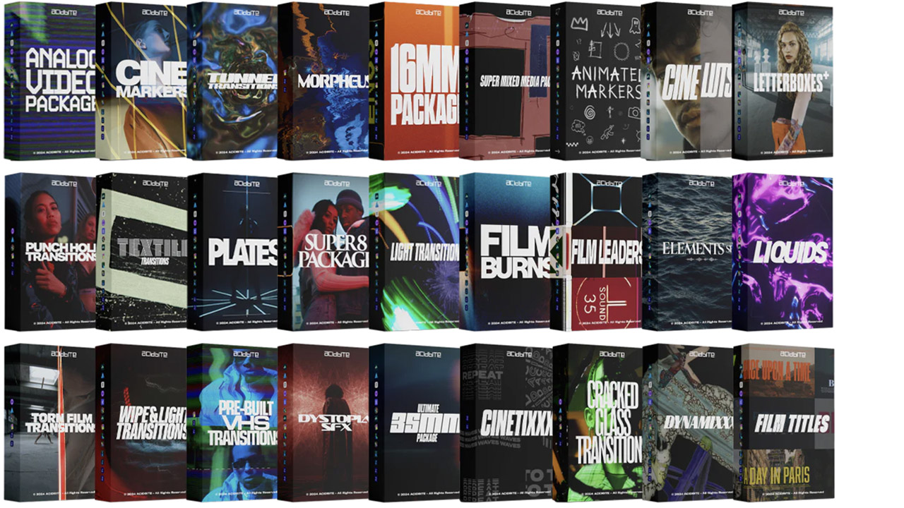
Acidbite ➔
50% off everything
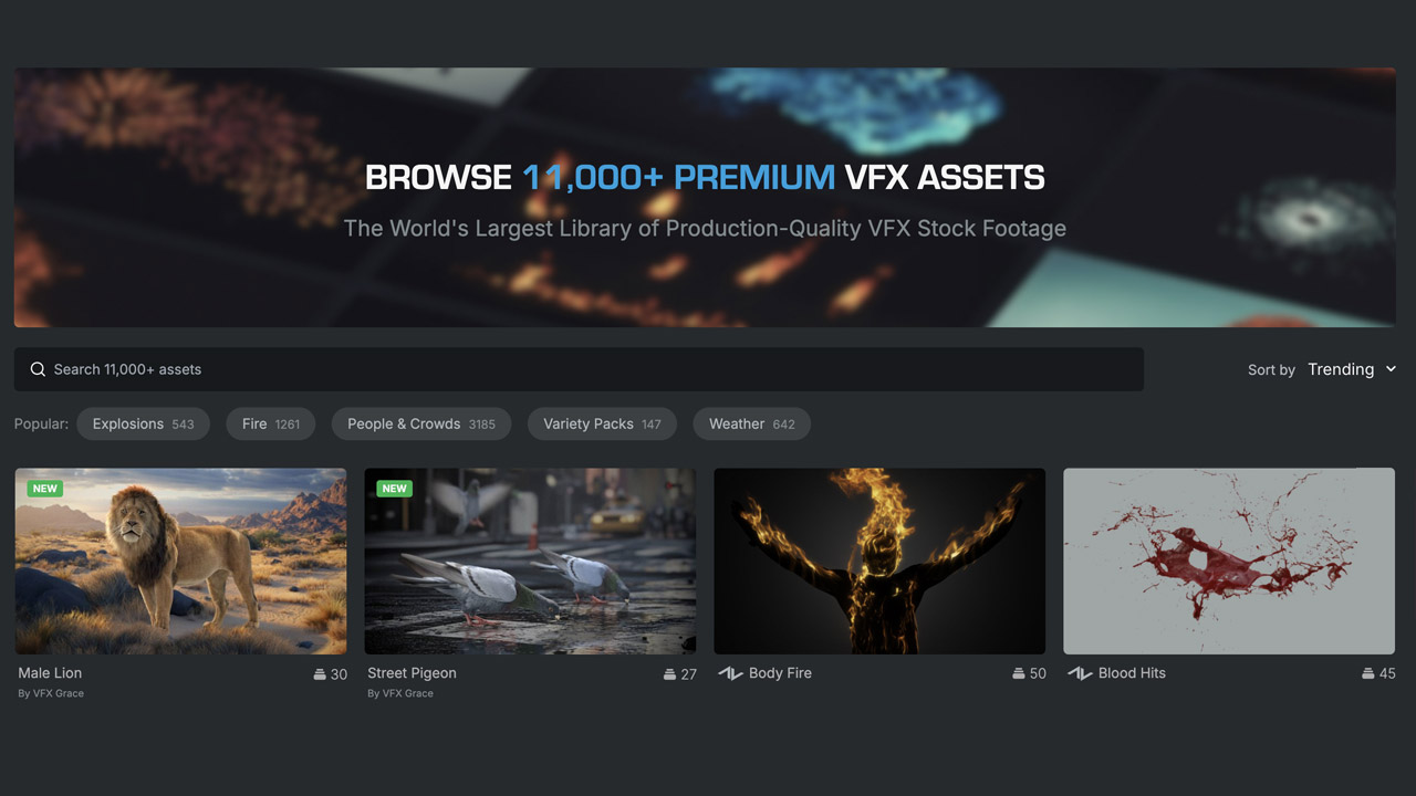
ActionVFX ➔
30% off all plans and credit packs - starts 11/26
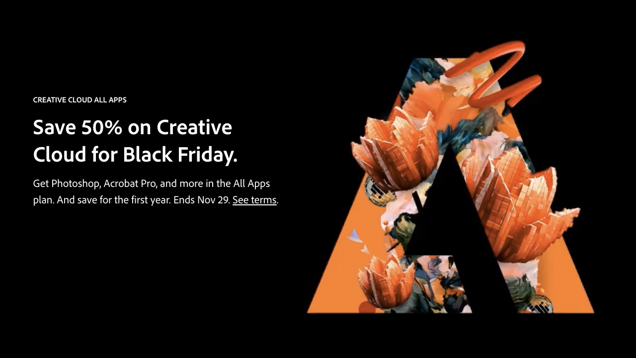
Adobe ➔
50% off all apps and plans through 11/29
aescripts ➔
25% off everything through 12/6
Affinity ➔
50% off all products

Battleaxe ➔
30% off from 11/29-12/7
Boom Library ➔
30% off Boom One, their 48,000+ file audio library
BorisFX ➔
25% off everything, 11/25-12/1
Cavalry ➔
33% off pro subscriptions (11/29 - 12/4)
FXFactory ➔
25% off with code BLACKFRIDAY until 12/3
Goodboyninja ➔
20% off everything
Happy Editing ➔
50% off with code BLACKFRIDAY
Huion ➔
Up to 50% off affordable, high-quality pen display tablets

Insydium ➔
50% off through 12/4
JangaFX ➔
30% off an indie annual license
Kitbash 3D ➔
$200 off Cargo Pro, their entire library
Knights of the Editing Table ➔
Up to 20% off Premiere Pro Extensions
Maxon ➔
25% off Maxon One, ZBrush, & Redshift - Annual Subscriptions (11/29 - 12/8)
Mode Designs ➔
Deals on premium keyboards and accessories
Motion Array ➔
10% off the Everything plan
Motion Hatch ➔
Perfect Your Pricing Toolkit - 50% off (11/29 - 12/2)

MotionVFX ➔
30% off Design/CineStudio, and PPro Resolve packs with code: BW30
Rocket Lasso ➔
50% off all plug-ins (11/29 - 12/2)
Rokoko ➔
45% off the indie creator bundle with code: RKK_SchoolOfMotion (revenue must be under $100K a year)
Shapefest ➔
80% off a Shapefest Pro annual subscription for life (11/29 - 12/2)

The Pixel Lab ➔
30% off everything
Toolfarm ➔
Various plugins and tools on sale

True Grit Texture ➔
50-70% off (starts Wednesday, runs for about a week)
Vincent Schwenk ➔
50% discount with code RENDERSALE
Wacom ➔
Up to $120 off new tablets + deals on refurbished items



All-Access Pass

Unlimited access to 50+ courses, unlimited critique, live events, and 24/7 community. Join School of Motion All-Access today.
