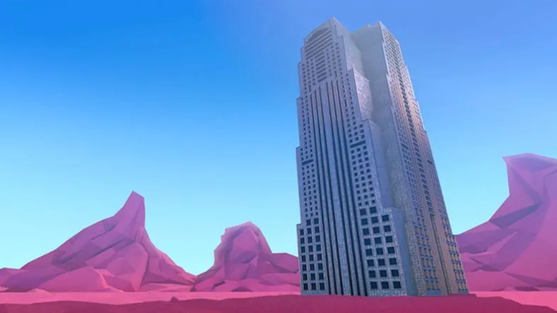
Now that we've got over a thousand rendered frames...
What the heck do we do with 'em? We can't just throw them into the cut and call it a day can we?
Nearly every 3D render you do will go through a compositing step to get that final polish.We rendered out all kinds of passes. Shadow, Ambient Occlusion, Reflection, Specular... and now we're going to take those passes into Nuke to beautify the crap out of our images.
Nuke is amazing at stuff like this and now you can get a FREE copy of Nuke Non-Commercial to play around with! If you're a School of Motion VIP member, you can download the EXR sequences from Giants to play around with or follow along.
At the end of this episode, you'll even get to see a 95% picture-locked version of the film. Holy crap, we've come a long way.
Every episode of Making Giants comes with the most up-to-date projects and assets so you can follow along or break apart anything that isn't covered in the videos.
Note: The EXR sequences are MASSIVE. Once you download this episode's package of files, you can then open a text file with links to download individual shots' EXR sequences separately. There are nearly 100 gigs of files in total, so this time I'll let you download just what you want.
{{lead-magnet}}
-----------------------------------------------------------------------------------------------------------------------------------
Tutorial Full Transcript Below 👇:
Music (00:00:02):
[intro music]
Joey Korenman (00:00:11):
Holy crap. We have rendered frames and a lot of them actually, uh, so I rendered shots one through five on Rebus farm, and it's pretty mind blowing how fast that was done. So I submitted those five shots, about 570 frames, total average render time of about five minutes per frame. That's about two days of rendering and it was done in about an hour and the cost about $56. So yeah, a little bit cheaper than buying my own render farm. Now the last three shots I went ahead and rendered locally because I had X particle caches that were one and a half gigs each and I was just more comfortable letting those crank while I went to NAB in Las Vegas. So those three shots, about 530 frames total rendered on my iMac in just over three days. Big difference. So now we need to take those frames and make them pretty.
Joey Korenman (00:01:09):
And to do that, we're going to start in my favorite compositing app nuke. Now I want to also point out that the Foundry recently released a free noncommercial version of nuke, which opens the app up to a whole new generation of artists. And it was a brilliant idea on their part. So if you want to follow along, go to the Foundry, download it. And for now we're going to hop into nuke and comp a shot. So I've imported my multipass EXR file here. And, um, you know, if we kind of let it Ram preview a little bit inside a nuke, um, you'll be able to see some of the movements, right? And you can see the buy-ins kind of creeping up the side of the building and it's going to look really nice, but visually there's a lot of things that aren't working right now.
Joey Korenman (00:01:53):
The shadows, the ambient occlusion is just way too heavy here and it's getting just too dark. You can't really see what's going on. And you're kind of losing a lot of the detail and the vines. Um, overall the shot feels a little dark. It's not quite saturated enough. So there's a lot of things that we need to fix in compositing. And luckily we set up all those passes, right? So if I look up here, I'm in this channels menu, I can actually see all of the different passes that I rendered out and, you know, there's a lot of them. Um, and, and all of them can be useful in different ways. Here's the ambient occlusion pass, for example, um, you know, here's the global lumination pass. So this is one of the things I love about nuke is that this little node, right, this is just a, an image sequence.
Joey Korenman (00:02:40):
It contains all of this information. Now over here, I've brought in some of the reference images, um, that I have on Pinterest. And then these are some stills from the Sherwin Williams campaign that, uh, buck did. And this is one of my favorite looking spots of all times. I think it's just beautiful. It's composited beautifully. And so a lot of times when I'm doing compositing on something that kind of looks 3d, you know, like this, uh, I like to pull in frames from spots that I think have a similar art direction, a similar vibe. And that way I can just kind of go back and forth between them and, and try to figure out, you know, okay, why doesn't mind feel as good as this? Well, obviously this one's a lot brighter. There's more contrast. And it gives me hints as to, you know, where I need to push and pull colors and brightness values and things like that.
Joey Korenman (00:03:32):
All right. So here's my reference. So the first thing that we need to do is split out all of these different channels into their own little nodes. And that way we can mix them together and start to do some of the complex interesting things that nuke lets you do. So the way you do that in nuke is with a shuffle node. All right. Uh, it's just, you know, silly name for, for something that basically splits out different channels. All right. Um, and I'm going to try and not make this too much of a, how to use nuke tutorial. It's more of a composite tutorial. Um, but you take your shuffle node. Um, I like to turn on the postage stamp option, which then gives you a like a little thumbnail and then in the options for this node, um, all I need to do is set this to whatever channel I want.
Joey Korenman (00:04:14):
So, uh, let's start with diffuse and then I'm going to rename this diffuse. All right. So now this note is just the diffuse pass from cinema 4d. Um, right. So I could then just copy this and I can add another little.here and these little dots, is there just kind of a nice way of keeping your, um, your nuke script organized? So there's not like noodles, these are called noodles by the way. Um, so there's not noodles going everywhere every which way. So after diffuse, uh, maybe we'll grab the specular. So here's our specular pass. All right. And you can imagine we can color correct this. Um, we could make the building really shiny. We could make the ground less shiny. We have all these options now and I just need to rename this specular. Okay. So what I'm going to do now is I'm going to pause this and then I'm going to go ahead.
Joey Korenman (00:05:02):
I'm going to set up all the shuffle nodes and get all of my passes set up. So now we've got all of the passes separated out. Um, and what's cool is, you know, you can kind of see just by the thumbnails, what each pass kind of is, right. So even at this tiny little resolution, you can tell, this is the object buffer for the plant. This is for the building, these are the vines. Um, so now you've got like this little deck of cards and you can kind of mix and match and shuffle stuff, right? So here's the original render, right, right out of cinema 4d. And what I'm going to do is now use all of these passes to rebuild something pretty close to this, and you'll never get it exact, but that's the whole point. You don't want it exact, you want to, you want to push it.
Joey Korenman (00:05:43):
You want to make it even better. So what I usually do is I start by putting the, the, um, the diffuse pass on the bottom. And then I start adding kind of in this order, specular, then reflection, then I'll do, um, you know, I might actually need to switch these, this is the ambient light pass, um, which is sort of like the luminance, uh, you know, of, of these layers. So I can brighten specific things if I want to. Um, and then I've got my GI pass, which is, you know, the effect of the light kind of bouncing around and bouncing off of all the objects and mixing together beautifully. Um, so what I'm going to do, I like to put my shadow passes kind of together, um, because you treat those a little bit differently. So let me get these kind of lined up like this.
Joey Korenman (00:06:26):
Here we go. All right. So we're going to start with diffuse and I'm going to use a merge node right. In a merge node in nuke, basically. Uh, it's like putting one layer over another and aftereffects. It's pretty much how it works. Um, and we're just going to set it up like this. And so, uh, a, the, a input goes over B alright, and nuke. That's how it works a over B. And if you look at this now, you'll see that now you get, you get those specular highlights pretty much added, right on top. I'm not going to go too deep into the way compositing works, uh, in nuke. But if you're curious, there's a tutorial on school of motion called pre multiplication demystified, which gets into the way nuke actually composites it's a little bit different than after effects. Um, I guess technically it's kinda the same, but you have to do some things differently.
Joey Korenman (00:07:14):
Um, and I don't want to, I don't want to geek out too much in bore everybody. All right. So now we've got diffuse and we've got specular. All right. So let's, let's just start there. And, um, you know, now that now that I've got the specular separately, uh, separate from the diffuse, you can do things like add a grade node, which is essentially like the levels node in after effects. Um, right. And so I could grab, let's say the gain and push that, and the gain is sort of the brightest parts of the image and push that to get even more of a specular kind of feel. Right. And so you can really easily dial that in if I wanted to, um, I could even go in and add, let's say like a little more blue to the specular channel and add a little bit of a bluish cast to this.
Joey Korenman (00:07:58):
I could really amp that up if I wanted to. All right. So I'm going to leave this just at white for now. All right. But just to kind of show you a lot of the things you can do, so there's the specular, and then I'm going to copy and paste this merge note and a over B. Right. And I'm, and you're going to notice, I'm going to kind of make this into a stair-step kind of a thing. Right. And then now I've added the reflections on top. All right. And the reflections really, the way I used them was to get some of that blue sky reflecting into, uh, the mountains a little bit. Um, and when we're closer to the building, you'll see some reflection on the building as well. So again, I could come into this reflection pass and grade that as well. All right.
Joey Korenman (00:08:37):
So what I'm going to do is I'm going to set all of this stuff up, um, you know, and it's basically going to work just like this. I'm gonna merge the ambient Passover, this I'm to merge the GI, Passover it, I'm going to then multiply the shadow and the AB and inclusion. And then all of this stuff over here, these are like utility passes. I may or may not use them. That's why I put a little gap there. So let me get this set up. I'm going to pause it. And then when we come back, I'll show you how we're going to start really tweaking the look of this thing. So now I've got all the merge nodes set up and we've sort of rebuilt, uh, our, our image a little bit. So this is the original image. And then if I look through this node here, you can see, this is the rebuilt image.
Joey Korenman (00:09:16):
Doesn't look the same as this. Okay. But that's okay because we're going to actually have a lot more control now. And we are going to go and start tweaking this thing to death. Before I do that, um, I do want to pull up one of these reference images, like maybe this fish and I want to keep it on screen so I can constantly glance at it and use it as reference. So what I need to do is that a new comp viewer, um, which is going to give me, um, basically another set of another window that I can open up. Right? So here's viewer two and viewer two, I want to be looking at, um, I want to be looking at this image. All right. So viewer one should be looking here if you were to, should be looking at the fish and then I'm going to split my workspace in drag viewer to actually let me drag viewer one over here.
Joey Korenman (00:10:08):
There we go. All right. So now I can keep this open, right? And it doesn't matter what I'm doing over here. This will always stay there. And I can just kind of look at it and notice like the contrasts and the values that I'm getting, the level of saturation it's going to help me maintain this kind of a feel with my own piece. So let's start, let's go to the diffuse channel. All right. And it's really, really dark. Now I could color correct it to make it a little bit brighter, but I have this pass here. And I think what I'm going to do is in the end, I'm going to mix some of this in, and that's going to automatically bring some of the, some of the shadow levels up, but give them color. So it's gonna, it's going to basically help act almost like a fill light.
Joey Korenman (00:10:49):
All right. So we've got our diffuse pass and we've got our specular pass. We did a little bit of a grade to the specular pass and we merged that over. This is what we get. Okay. Um, so then the next thing we have is the reflection channel, the reflection pass. When we add that over, and this is what's called and kind of step through here's before here's, after all it's doing really on this shot is adding a little bit of that blue back into the mountains, which is cool. Um, but it's kind of de saturated them. So let's look at our reflection pass, and maybe I could add a, say a saturation node to it and just pump up the saturation a little bit. Right. And so now if I hit, if I select this node and I hit the D key, it'll disable it.
Joey Korenman (00:11:30):
So you can see that that saturation note is just pushing a little more blue into the mountains, which is cool. All right. I like that. Um, you know, and I kinda like that. Um, you know, if I, if I, for example, if I come over to viewer two, um, I could load this, this image in as well. Right. I can kind of switch between which image is being loaded in. And I kinda like this color. This is kind of where I started. And now looking at this, I feel like maybe there's a little too much blue in there. And maybe, maybe what I need to do is push the color of these mountains a little bit more red. All right. So first let's get our comp set up and then we'll start dealing with that. So here's where we're at. And then we've got our ambient pass, um, which I think is very similar to the material luminance pass.
Joey Korenman (00:12:16):
It's almost identical. Um, so what I'm going to do is I'm just going to merge that over and see what that does. Okay. So here's before and here's after, and that makes a big difference. Right? You can see that it, it brings up the level, uh, you know, on the flower, it brings up the levels on the vines. If I fade this in and out like this, you can see what it does. Right. And I do want a little bit of shadow, so I'm not going to mix it in a hundred percent. Maybe somewhere around 70% works a little bit better. Then we've got our GI pass. And I love using the GI pass because what it does is it mixes all the colors together. And you're bouncing some of the blue sky off of the red, uh, the red scenery. Um, and you're getting some of that yellow light coming out of the, you know, there's a luminance channel, um, on the face of the flower and that yellow is mixing with the purple pedals.
Joey Korenman (00:13:08):
So when we merge that over, right here's before here's, after it brightens everything up, it fills in some of the, some of the darker spots. And it might be cool. Let me copy this saturation note and paste it on the GI. Um, because you know, the GI is gonna let you really push your colors and it's going to mix them together in this beautiful way. Look at the blue tint that this building is taking on. So here's before the GI pass here's after, and that blue sky is casting blue light onto the building. All right. So let's look at our original render. This is the original render, and here's where we're at. Now. We're already pushing past what we were able to do with just this shot. Right. We could color correct this, but now that we have all this control over all these passes, we're able to really push colors and stuff like that.
Joey Korenman (00:13:57):
Okay. So the next thing we're going to look at is the shadow pass. So here's the shadow pass. It's not very pretty, but really the most important thing about the shadow pass is this shadow here. That's being cast on the ground. Okay. Now this shadow looks pretty heavy. So what I want to do is pull back the mix. I'm going to double click on this merge note here. I'm going to pull back the mix. So we're not getting as crazy of a shadow. Okay. Another thing that would be cool is to color, correct this a little bit. So let me add a grade node to this. Right. And let's look through that grade node. So, you know, what I could do is I could push the black point like this, right. So I can have more contrast and just get a little bit more, um, you know, a little bit more play, I guess, out of the shadow pass.
Joey Korenman (00:14:45):
Um, and then, you know, I may need to mix this, mix this down a little bit less, but then another thing I can do is I can actually come into this grade node, um, and I can push the color tone of that shadow a little bit. So for example, if I go into the gamma and I open up, you know, the four color channels, red, green, blue, alpha, if I push that blue, I'm pushing a little bit of blue into the shadows, right. And if I really cranked that, you'll see that you can really affect the cast of that shadow and making it a lot more blue. And I don't need it to be too much more blue, just a little bit. Okay. Um, and then we've got the ambient occlusion pass and this, this we're going to need to do something about, okay. So what I'm going to do is just multiply that ambient occlusion pass.
Joey Korenman (00:15:31):
And this is where we're, this is where we're at currently. Okay. Um, now the shadow pass, I feel like it's affecting certain things a little more than I'd like, I really only care about that shadow pass on the ground. And actually now that I think now that I'm looking at it, I think the ambient occlusion pass is probably what's doing it. So I'm looking over here and I'm thinking, man, that is getting pretty dark, that flower's getting a really dark from this pass to this pass. So what I want to do is I want to lighten the ambient occlusion pass over here and in after effects, um, you know, you could do it, you'd have to pre-camp it and make some masks and, and then use that pre comp. And what that's going to do is it's going to create issues when you then bring in another shot, you're going to have to kind of reverse engineer what you did in nuke.
Joey Korenman (00:16:20):
I can set up some kind of elaborate system of nodes and then literally just replace this. And the whole thing gets updated. So here's what I'm gonna do. I'm gonna add a grade node. I'm going to put it here and I'm gonna rename it grade dot flour, okay. Or grade flour, because I can't add a dock. Apparently. Now, one of the cool things about nuke. If I look through this node up here, I still have access to all of these channels. Okay. Even though I've split them out like this, this is really just for convenience. So it's easier for me as a human being to see what I'm working with, but nuke actually doesn't need that. You can still access every single channel from every single node. And the reason that that is really useful is for stuff like this. Cause what I could do is I could tell this grade node to be masked by object buffer one, which is the plant.
Joey Korenman (00:17:14):
Okay. And what this is now going to do is it's going to only affect the plant. Okay. So I can look at it in context and I can just adjust maybe the gamma and just take down the ambient occlusion, just on the flower and leave everything else alone. It's a very, very powerful tool. Um, the other part of the ambient occlusion pass that's too dark is right here. Okay. And really what I need to do is just overall just brighten this area and you know, I could maybe use this building pass, but the vine pass kind of overlaps it. So in this case, what would be better is to take a grade node like this and we'll rename it grade vines. So we know what it is later. And instead of trying to use one of these channels, I could just make a quick mask.
Joey Korenman (00:18:06):
Okay. So I'm going to add, what's called a roto node and all it does is it lets you draw shape. It's just like a mask in after effects. Okay. And so I'm gonna draw the shape like this. Um, and actually before I do that, I need to make sure that I'm on the first frame. Um, nuke automatically key frame stuff. Okay. By default it's automatically gonna set key frames every time you change what frame you're on. So I wanna make sure I'm on the right frame. So I'm going to go to my roto node and I'm just going to draw a little shape around this. All right. And one of the things I love about nuke is you, you can just hold command. Um, so I can like move this and then hold command and just push these edges out. And what I'm doing is I'm creating a feathered mask really, really quickly. Okay. And a little bit of a feather down there.
Joey Korenman (00:18:56):
There we go. And I just want, I want that mask to kind of feather out. So there's not like a hard edge, um, to this color correction that I'm about to do. All right. If I look through this roto node and look at the alpha channel, this is what it looks like. Um, oh, here's another thing that I've completely forgotten to do. So in nuke, um, it's very important that before you do anything like this, you set up your script so that the resolutions, correct. So I'm gonna hit the S key and set my full-size format, which is basically like your comp size. I'm going to set it to, um, 1920 by eight 20, which is the, you know, this, the size of our, of our render basically. And so now anytime I create a roto node or anything like that, um, it's going to be the correct size.
Joey Korenman (00:19:41):
So if I look through the alpha channel of this roto node, you can see that now I've got this nice little feathered alpha channel like this. And so what I can now do is come over to my grade and I can grab this little arrow, which is the mask arrow, which a lot of notes have, and I can pipe in that Rodo. And so now if I look through this, I can just affect that part of the ambient occlusion channel. And I can go to the last frame and I can just grab these points right. And move them up and just really quickly kind of key frame that shadow. Okay. And I can adjust this and make this a little bit, a little bit smoother, a little more feathered, and it's really quick. Um, and then just kind of step through and check. Right. And make sure that we're getting, we're getting that good result.
Joey Korenman (00:20:34):
So now if I look through this, right, and I come in here, it's still pretty dark. We're going to color correct this, but now look, what happens if I take that grade note off, right. We're now bringing back so much in the building. Okay. And this is really important. All right. So now what I want to do is I want to add in this material color node, and I want to see what, what that's going to do for me. Cause I think what it's going to do is it's going to help me, um, even more fill out this scene a little bit. All right. And I'm probably gonna mix it very low. Um, so let me kind of scoot these things over a little bit and add a new merge node. All right. And I'm going to merge a over B and let's just take a look at this.
Joey Korenman (00:21:19):
All right. So that has a very profound effect on my render, but I can really, I can mix it all the way to zero and then just push it up just a little bit. Okay. And it's just filling in a little bit of the shadows, a little bit of the darker parts. Okay. All right. So now let's start to get really specific. So the vines are way too dark. I want them to be brighter. Now I've got this material luminance channel. Um, but it's, I've already got this ambient channel. It's kind of doing the same thing. So I don't think I actually need this material luminance channel. I'm just going to delete it. And what I'm going to do is I'm going to start now working down like this. Okay. So now I'm going to start effecting the entire comp. So I'm going to add a grade node, right? This is one of the most common nodes. I use it all the time and I'm going to call this grade vines Brighton.
Joey Korenman (00:22:10):
All right. And what I can do is I can say a mask by, and I can find the vines object buffer, which is 1, 2, 3, that's going to be object buffer three. Now I have two options. One, I could grab that little arrow on the side here. Right. And remember I talked about this little arrow. I could grab that and bring it all the way up and pipe it right to this. Right, right. To this little note. All right. So how about for this? Why don't we do that? Cause this gives you a good visual cue of what's going on. And so now if I push the gamma there, I'm just brightening the vines. Okay. Um, and gamma kind of affects the mid, the mid range of the color gain affects kind of the higher, the higher brighter parts of the color. So if I push the gain, I can get a little more contrast while still keeping some of those shadows in there.
Joey Korenman (00:22:59):
Um, and then maybe I'll take the offset and lower it a little bit. Right. And play with multiply, which is kind of an overall adjustment and really just brighten those up. Okay. So now look at that. And that's brightening the little leaves that are popping up as well. Okay. So this is 100% scale right now. And I want you to look at this and then look at this, look at the difference that we're able to pull out of that render just by having a few extra passes. Okay. And as we move through the scene, you're able to see that now you get a much better look at those vines. Okay, cool. So now, um, you know, why don't we, why don't we, you know, take a look at some of our, uh, some of our buck reference images. Okay. So one of the, that obviously there's a vignette, obviously.
Joey Korenman (00:23:47):
There's um, let me, let me set this up correctly so I can actually go to viewer two. All right. And then I'll go to viewer one and I'll look at this. Okay. So one of the things that I'm noticing is that there's just not nearly as much contrast, right? Like over here, you've got some parts of that image that are almost totally black and here you don't, 'cause, I've, I've sort of brought back so much of that, that light. So now I could just do kind of an overall grade. All right. So I'm gonna call this grade dot overall. And, and I keep saying dots, even though you can't put a dot there, um, all right. And I'm going to push the gain right. To get brighter pixels, and then I'm going to push the offset right. To darken it a little bit. Okay. Um, and you know, like you can also mess with the black point in the white point, which are really kind of heavy handed ways of color correcting.
Joey Korenman (00:24:42):
Um, and I, I generally kind of stick around here. Um, another thing I might try actually, so the grade note is great, but there's another node called the color, correct. Node gives you a little bit more fine control. So I could actually come to like the mid-tones and just affect the gain there. Let me look through this. And that is really just gonna affect bright parts highlights. Um, if I affect the gain on the highlights, it almost won't do anything because the highlights on the color, correct node, uh, they really only affect the bright, bright, bright, bright, bright parts, which I guess we don't really have anything bright enough yet. So I've got the gamma and then, um, on the shadows, I could affect the gamma and push that down, get a little more contrast. Okay. So let's take a look at what that node did right now.
Joey Korenman (00:25:25):
We're getting closer to this, right. It's bringing back some of that nice contrast. Now, looking at this, I feel like, Hmm. Maybe that, uh, maybe that ambient occlusion pass is just getting a little heavy, so maybe I'll go to the merge node for it and just bring down the mix a little bit. Right. Just a little bit like that. Um, and you know, I kind of want to step through my comp and see all the steps, see what I'm doing here. Cool. I feel like I'm pushing the shadows a little bit far. Okay, cool. All right. So I'm starting to dig this. All right. So, um, another thing that I want to look at is the colors. Okay. So I wanna look at the color of the ground. So what I want to do is I want to actually pull up in viewer to this.
Joey Korenman (00:26:13):
Okay. So I can look at the colors. Like, I really like this kind of red where it's, it's very red with a little bit of blue in it. This is a little bit too blue. So now what I'm going to do. All right. Let me first rename this color. Correct. Overall. And what I'm going to do is after this color, correct. I'm going to add, what's called a Hugh correct node. Okay. And I'm going to pipe this in now. This note is really cool. So the way it works, all right. And let me, let me make sure that still have my reference up. I keep hitting the wrong buttons here. Okay. All right. So the Hugh correct node, as I mouse over parts of my image, it will show me where on this huge chart, that color falls. Okay. And then I can affect different curves for that specific color.
Joey Korenman (00:27:01):
So for example, I want to pull some of the blue out of this color overall across my whole scene. So what I'm going to do is I'm going to go to the blue curve and you can see here's my blue curve. It's flat right now, and I'm going to mouse over. And I'm just noting where that yellow bar is falling. Right. And it's falling around here. So I'm going to hold command and option and create a point here. And I'm going to drag the blue down and you'll see what it's doing. All right. It's pulling blue out of that color. If I pull too much blue out, it starts to look kind of yellow like that. If I can add more blue, it looks really purple. So I'm, I'm pulling it down. I'm kind of glancing over here and looking, I may also want to add a little bit of red there.
Joey Korenman (00:27:41):
Okay. All right. So that Hugh correct node, it lets you do really specific color corrections. Um, and I also really like the richness and the contrast in this picture. And we've got a lot of contrast in the plant. We've got a lot of contrast in the building. The landscape is feeling a little flat. All right. So let me call this you correct ground, right. So I know what it is. And then I also want to color correct up. And I pulled this way up too high. Here we go. Um, I want to color correct the ground a little bit more just to get a little bit more shadow out of it. Get a little more contrast. Now, one thing you need to know about nuke, which is great is I'm doing all these color corrections and you know, the color correct that I did back here is being affected by this one.
Joey Korenman (00:28:27):
Then this one, then this one, um, and you don't lose any quality. Nuke is smart enough to sort of look at everything you've done. And then basically it only touches your image once or twice. It doesn't actually touch it. Then touch it again, then touch it again. You're not losing anything by doing by stacking hundreds of color correction nodes. It's totally cool to do that. Um, okay. And looking at this now, I feel like, uh, I may need to add a little bit of that blue back cause it's starting to look a little bit yellow. Okay. So then what I'm going to do is I'm going to add a, a grade node. Um, and I'm going to pipe that in and I'm going to set this to be grade ground, and I'm going to just do this the easy way I'm going to say mask.
Joey Korenman (00:29:09):
And I want to use object buffer. And let me double check. I want to use this object buffer here, object buffer scene, right? If you're a member, we combined the mountains and the ground into one object buffer in case, just, just in case we wanted to do this exact thing. So that is object buffer six right there. And I'm going to come in here and I'm actually going to push the black point a little bit. Okay. I'm gonna push the black point and I'm gonna pull the white point a little bit and get even more contrast out of there. Now, when I push the black point, it's saturating the blacks a little bit too much. Um, so I may also want to de saturate the ground a little bit. Um, so maybe, maybe what I'll do is I'll add another saturation, right? And I'll call this saturation or I can actually rename it de saturate ground.
Joey Korenman (00:30:04):
And another thing you can do a new, by the way, as you can come in here and give this thing a label, you can add little notes. Um, I'm not really going to that much trouble because I'm trying to do this as efficiently and quickly as possible. But now I can say mask by object buffer six and just desaturation just a little bit. Okay. Just so it's not getting really crazy. Okay. All right. So, you know, somewhere in there I'm be saturating at like 10%. Not very much so let's step through. So we started here, right? Brightened the vines didn't overall correction corrected the hue of the ground, brighten the ground to give him more contrast than de-saturated a little bit. So we're here. Right. And we started with this out of cinema 4d, so we're getting a much different look already. Okay. Um, cool.
Joey Korenman (00:30:54):
And now looking at this, the brightness of the vines is probably getting a little crazy. So let's, you know, let's, let's dial those back a little bit, um, and, and try to keep a little bit of that contrast in there. Okay, cool. Um, and then if we look at it at 100%, you can see that it, you know, there's a ton of detail in there. We still can see some ambient occlusion in there. It's still looks really nice. So another thing that, um, I thought might be interesting to try is to give the sky a little bit more variation. So this sky just has a gradient texture to it really simple. Um, but because we've got a mat for it, it'd be really easy to actually tweak the colors a little bit. So, you know, the sky is, is generally, um, you know, if the sun's going up, then, you know, the, the sky is going to be a little brighter on the bottom than on the top, but why don't we push that a little bit?
Joey Korenman (00:31:45):
So what I could do is add another grade node and you can see how powerful, like, just color correcting is. I haven't done any real fancy compositing yet. This is all just color correction at this point. Um, I could call this grade sky and let me, let me start organizing this a little bit too, because I think this is going to start to get confusing. So what I might do is add like, um, let me think here, let me add like some organizational stuff, right? So in this little group here, you've got all these nice little, um, these little things that can kind of help you organize. So for example, a backdrop node, this is a great node. Um, and let me, let me see, did I actually add one? I did here it is. Here's the backdrop node. What this does is it lets you add literally it just like a little, a little backdrop to a group of nodes and now you can select them all at the same time just by clicking this.
Joey Korenman (00:32:40):
And I could rename this thing, um, because these are all, you know, ground sort of corrections. So I could just name it ground. I could even give it a label ground. Okay. Um, and make that, I don't know, bigger fonts and I can change the color of this, you know, and, and, and maybe try to make it the color of the ground or something so that I it's very clear at a glance that this is all color corrections related to the ground. Okay. Um, and so I'll probably go back after I set up this for shot and organize this so that when you guys download this new script, it'll make a little more sense to you. All right. So we've got the grade for the sky and what I want to do, uh, this is going to be a little more interesting. So what I want to do is just affect the color of the sky, but not the whole Skype.
Joey Korenman (00:33:25):
So, you know, I could come in here and say mask by, um, you know, object buffer seven, which is the sky. And then I can just affect the sky. Right. Which is great. And even that is already looking a little bit better, just, just affecting the gamut of it and pushing the contrast of the sky a little bit more, um, like here's before here's after it just gives it a little more something. If I push the gain, it's going to brighten up the bottom part there. It's getting a little too saturated, but let's say that I wanted to do this. Um, you know, but, but not across the whole sky, maybe really just affect the center part of the frame a little bit and leave the edges alone. So in this case, let me turn off this mask goodbye. And so here's what I'm gonna, what I'm going to want to do.
Joey Korenman (00:34:09):
I'm going to want to make one of those Rodo nodes, the hotkeys, oh, if you're following along and I'm going to just draw roughly like, you know, a shape like this for the sky. Okay. And then I'm going to come in and feather this. So it's only affecting, you know, the parts that I want and giving me like a nice kind of, you know, almost like a vignetting effect to this. Cool. All right. Let me smooth these alphabet. And so what I need to do is take this alpha channel and I need to use it to crop out the sky's alpha channel. So the way I'm going to do that is I'm going to take this, uh, not this, sorry, this I'm going to take my sky mat, my object buffer, and I'm going to pipe it into my Rodo node. Okay. So if I look through my Rodo node, I see this, and then I see this alpha channel.
Joey Korenman (00:35:09):
And so what I want to do is look at the alpha channel and I want to take this shape, right. That I just made, and I want to invert it and I want to make the color black. And so what that's doing is it's taking this black and white alpha channel, right? Like that, that already exists. And it's painting parts of it, black. This is one of the things about Newfie. It took me a while to get the hang of, to really think about an alpha channel, an image that you can manipulate, right? So we start with this and then we have, you know, this, this roto shape that we've made and I'm inverting it, turning it black, and basically painting black around the south channel. So what this is going to do for me now is it's going to let me use that as a mask.
Joey Korenman (00:35:57):
Okay. And so now if I look through this grade node and I really crank it, you can see it's really only affecting that one part of the sky. Okay. Which is cool. So what I would probably want to do, because I actually really liked the way the gamma looked. So I'm going to actually, for now, I'm just going to set this one to mask by object buffer seven. Um, and I'm going to push that gamma and the game, because that I was liking the way that was looking, but then I'm going to add another grade node like this, and that's going to use this as a mask. Okay. So this is going to be grade sky too. And so now I have like another set of controls where I can push, let me look through this node so I can see what it's doing, um, and make sure that I've got my alpha channel.
Joey Korenman (00:36:44):
Correct. Here we go. Um, mask, there we go. And now I can use this extra set of controls to push the center even a little bit more and get almost a little bit of a halo out of it if I wanted, and then I can come in and say, okay, well I really need to, I really need to like constrain this a lot more than I have. Okay. There we go. Um, and one thing you gotta be aware of is that it's very easy to accidentally set key frames. So I'm making sure that there's only one key frame on this roto node. Cool. All right. So now we started here. We did some color correction to the sky. Now we're here. Okay. Um, cool. So now let's, you know, take a, look, this, this now even feels darker, um, than our image I want to now I'm going to go to viewer two for a minute and pull up, let me pull up like this shot, all right.
Joey Korenman (00:37:39):
This shot has a lot of richness to it. I really liked the shadows. I like, you know, what's going on. Um, and this mine is almost feeling too bright, but since it's a, you know, it's a totally different color palette and it's, it's, you know, a brighter scene, I think that's okay. And once we've been yet it, and do do some other things, it's going to dull it back a little bit, which, which will be nice. Okay. Um, here's the fish shot, which, uh, I really dig too. And you know, our colors are way more saturated. So at the end I might actually de saturate the whole thing just a little bit. Um, this is actually another reference image that I thought was really great. I liked how there was a warmth to the whites. Um, so what I'm going to do is come over here, grab viewer one, look through this again.
Joey Korenman (00:38:25):
And I'm going to do a little bit more to the overall color, correct. So I can come over here to this overall color, correct. Um, I can come into my mid-tones and let's go to gain and open up our colors. And let's just add a little bit of red to this and see what that does just a little, all right. Um, I could also go to the highlights and if I push these highlights, you could see it doesn't really do that much right now. You get a little bit, you can see it's affecting pretty much just the brightest parts of the image, right? Not, not really doing too much. So what might be an interesting way to push a little bit of warmth into it is to go to this specular pass, which we've graded and in the grade for the specular pass, add a little bit of red.
Joey Korenman (00:39:11):
All right. You could add a lot of red, but we don't want to add too much. We're just going to add a little bit of red. Okay. And then let's come back here and let's look at their end result as we do this. Right. So it, when it was at 2.05 in the red channel, it looks like this. If I pop it up to 3.05, you can see, it just adds a little bit of a warmth to the specular hits. And it doesn't really affect the mountains too much. Now, of course, if I wanted to, I could put a separate grade and I could just grade the building. So I'm going to, I'm going to pump this up to about 2.65. All right. Let's look at this a hundred percent. I like the warmth that that's adding to it. Cool. Okay. So now once again, I like to do this, so let's look at where we're at, where we started two very different looking shots so far.
Joey Korenman (00:40:00):
Okay. All right. So now one huge thing that we do not have yet is any sort of depth fog to this, right? You're, you know, when you're in a, any kind of environment, the atmosphere is going to sort of fade colors out as you get farther away. And this is supposed to be really, really far away from this flower. So we need to have the flower in the ground. That's close to the flower, be a little more saturated. Um, and you know, in general, so w one way I could have done this was by creating a depth pass. Uh, there would be a problem with that in that the, this scene has so much depth, the depth pass wouldn't really have enough resolution for that to work. Um, I mean, it could work, but it wouldn't work all that well. So I'm just going to do this by hand.
Joey Korenman (00:40:46):
So what I'm going to do is I'm basically, oops, disconnected. This. What I'm going to do is I'm going to create, um, a blue kind of color cast across the whole scene. And I'm going to fade it basically from top to bottom like this. Um, and then it's only going to, it's not going to affect the flower. It's only going to affect the ground, the mountains, the building, so everything, but the flower basically. And, and, and the sky, the sky won't be affected either. So here's what I need to do. I need to first create a map for all of those things. Okay. So let's come up here to our little toolbox and do that. Okay. So what I'm going to use is this matte and this mat, I need to combine them. Okay. So what I'm going to do is, uh, just use a merge node, and I'm just going to merge this and let me kind of do this over here.
Joey Korenman (00:41:40):
So I'll merge this and Ulmer. I can do it here, I guess. And I'll merge the plant. All right. And it's going to start, we're going to start to get some little crisscrosses and stuff like that, but that's okay. All right. So this is what we get, and this was the problem I was talking about. Um, when you try to just take two mats and combine them, uh, this is, this is what happens. You'll get this little fringe. And so I need to take this and I need to do an erode, and I'm gonna use the filter road, and I'm just going to erode it.
Joey Korenman (00:42:12):
Let me go back to one like this and look through this. Uh, let's see here. All right. So we're eroding the alpha channel, so I need to look at the alpha channel. All right. So I kind of wrote it. There we go. I need to wrote it down about three pixels. Okay, cool. All right. And then what I can do is duplicate this. So if I turn, if I disable this, what this erode did, was it got rid of this fringe here, which is great for me, that's what I needed. But it also, uh, it added a whole bunch of, um, you know, it added a whole bunch. It took away some detail basically. So what I can then do is copy and paste that erode and just do it again, uh, except set it to three. Okay. Um, except now it's actually bringing that back.
Joey Korenman (00:43:00):
So, you know what, let's just see how this works before I go too crazy. Let's do negative three. There we go. Copy paste. See if I can bring that back without Nope. That's not going work. All right. Nevermind. So we're going to start with, uh, we're going to start here. Oh, I know what's going on. I didn't double click this. There we go. All right. So you can see now it's, it's still bringing back a little bit of that, which means I probably need to erode it more before we do this. Right. So maybe minus four and then four. Okay. So this my work, this might actually be a decent mat for us. So what I'm going to do, uh, let me pull, okay. Let me add a, let's think about this. What's the best way to do this. What I'm going to do is, um, I'm going to grab a gradients node, which is called a ramp in, uh, in nuke.
Joey Korenman (00:43:58):
And for the two colors, I'm going to look through this node and I want the colors, um, uh, well, actually an easier way to do this would be to just combine a ramp with a color. So let's do this. So let me, I'm gonna use, what's called a constant note. A constant note is just a flat color, and I'm going to click on this little guy and then I'm gonna hold command and click that color. So now this constant is that color, and I'm going to do a copy node. All right. And what the copy node does is it takes, um, it takes one image and it makes it, and this is just by default, what it does. It makes it into the alpha channel of another image. So this ramp is now the alpha channel of this blue color. And now what I can do with this is I can, I can actually control this ramp.
Joey Korenman (00:44:49):
So I'm going to look through this, but I'm looking at the controls of my ramp. And once I merge this all together, I'll be able to use this to kind of set up my distance fog. Cool. All right. So here's our distance fog, and this would be a good, a good time to make a new backdrop node and go like this and rename this D fog or something, right. Distance fog. So I know what it is and we can make it different color, you know, maybe make it kind of something in the, in the bluish zone. Cool. I can brighten it up a little bit. So we've got our distance fog. And so what I need to do is take a, this alpha channel, which is being generated by the ramp, and I need to multiply it by this alpha channel, this one. Um, and so what I'm gonna do is grab a merge node and let's put a cause I want to multiply by that one, over this to say, look, we look through the merge node and I need to set it to the operation, to multiply, look through it, look at the alpha channel.
Joey Korenman (00:45:54):
So this is the alpha channel right now. Um, and so what's going on is I need to do one more step. So here's, here's the alpha channel coming out of this erode set up here. Okay. And if I multiply it, what it's going to do is it's going to take the black pixels and knock out black pixels against this. Okay. But what I actually want is to knock out the sky and knock out the plan. I want the opposite of this. So I need to add an invert node and stick it here. Boom. There we go. So now if I look through here, if it looks the merge node, here's the alpha channel we're getting what's cool is I can use this ramp and kind of interactively like create just the perfect amount of depth fog, right? Just like that. So now I've got this set up, which is going to give me a great alpha channel.
Joey Korenman (00:46:44):
And if I don't look through the off channel, you've see I've got this blue color and you'll notice that the alpha channel is not being applied, right. It should be black down here and there should be really nothing over here. Um, but that's not how it's working. And so that's because in nuke, there's a step that doesn't happen automatically the way it happens and after effects called pre multiplying. So I'm gonna pre malt and now I get this. Now what I can do is just take a standard merge node and merge this whole thing over everything else. And because of this, uh, this filter erode, I'm getting, you know, some issues. Um, so I'm actually going to turn that off and see if I can get away with not using it because you can see it. Um, you know, it fixes like some fringing issues that we'd have around the flower, but it screws up stuff around the building in the mountains.
Joey Korenman (00:47:35):
So it seemed like a good idea at the time clearly wasn't and now I've got this depth fog that I can grab the ramp and literally interactively just control it, just like this. All right. So this is kind of a cool setup. Um, so now if I don't want, as much of that depth fog, it can just come to the merge node and mix it down a little bit. So I don't need a ton. I just want a little bit, right. Kind of like, you know, just a little bit like that. So here's before here's after, so that may have seemed like a lot of work to do something like that. But you know, the point is you have so much control when you do this. Right. If I want the top of the building to be re to seem like it's really far away, I can do that.
Joey Korenman (00:48:18):
Okay. Cool. All right. So now another thing, um, that I want to do is I wanna, I want to break up the lighting on the ground a little bit and you know, there's no clouds in the sky or anything, but it's just so flat right now. Right. So what I'm going to do is let's go up here. Cause now we've got a bunch of color correction stuff happening up here. All right, let me move this down here like this. So this is like our little ground spot. So what I'm going to do is I'm going to add a color corrector. That's only going to effect part of the ground and I'm just going to do this manually. Um, so what I'm going to do is I'm going to add a, a roto node over here, and I'm just going to grab, like, you know, just like a little piece of the ground here and maybe a little piece over here.
Joey Korenman (00:49:07):
I'm just going to add a couple of shapes, just like this, right. Just kind of randomly, and then maybe, I don't know, maybe even like, like off, you know, on the side of the mountain, just, just, just making a little, little things that are going to be almost like little gobos, um, you know, like when you're a gobo, by the way, um, that's when you make a cutout, um, and you put it on a light when you're shooting and it can sort of add more interest and more variation. So I've got these little shapes. If I look through this, this is what I just created an alpha channel that looks like that I'm going to add a blur node and just blur those bloom. Really good. Right. And then I'm going to pipe that into the color, correct node. So now on this color, correct node, I could push the gain a little bit and am just trying to just get some, a little more variation in the shot.
Joey Korenman (00:49:55):
That's really all I'm doing. Go to the shadows and, and, and maybe, you know, push the gain up there a little bit. Oh, the show when it's not giving us anything, the shadows, uh, on the color corrector, no, they really only affect the darkest, darkest parts of the image, which by the way, now that I'm looking at this, I, that kind of, I was kind of digging what that was doing. I was, um, I was hitting the gamma in the shadows and I was getting a little bit more, more saturation out of and a little bit more richness. Cool. Okay. Um, so now with everything kind of done in context, it looks like this. Okay. And all that little thing did it just broke up the frame just a tiny bit. Cool. All right. So now let's, let's get down to kind of a, the end game here.
Joey Korenman (00:50:44):
So next I want to start doing some of the things that are going to make this feel a little bit, um, I don't know what the word is. I'm thinking of just a little bit more shot, you know, instead of rendered. So what I'm going to do is start with, um, lens distortion. All right. Any lens you shoot with is going to have a little bit of lens distortion, and this is a pretty wide angle lens. So the lens distortion is going to actually go this way. If I really exaggerate it. And basically like here's a fish islands and then here's, you know, a wide angle lens. And all it does is it, it basically gets rid of any super straight lines in your shot because lenses are not, you know, they, they, they curve things. And especially at the edges of the frame, um, you're going to have a little bit more movement than in the center because of the way a lens is shaped. So that was really simple. The next thing I'm going to do is add a vignette, um, and I almost typed in vignette, but the way, the way I do it is with a grade node. And I'm just going to say grade vignette.
Joey Korenman (00:51:46):
Okay. Um, and I'm going to add a Rodo note and I'm just going to grab an ellipse tool and just straight up vignette, just like that. That's going to create this shape, which I can then blur and just really just blur the, what are the heck out of it. Right. I can even push this up past that. Cool. And, um, and then what I need to do is come into this shape and I need to invert it. So that way my color correction only affects the edges of my frame. And then I can pipe that in as my mask and use that grade, just push the gamut down a little bit. Okay. So now I just did a little bit of a vignette on the edges of the frame. Okay. Now I mentioned that the saturation is getting a little out of control here. So I'm gonna grab a saturation node and just knock this down, just, just a L just a hit, right.
Joey Korenman (00:52:39):
So maybe go to 0.9. Okay. And let's disable that and see what that's doing. It's just bringing it back a little bit for me. Um, and then I'm to want to add, uh, some film grain. So I'm going to add a grain node, right. Come in here. And, um, when you add grain, you need to be looking at it at a hundred percent to really get a sense of how much grain that there is and how big it is. This feels like a ton of grain to me. Um, so I'm just going to kind of look through these different presets and see if there's any that have smaller grain that maybe would be a good starting point like that. Sorry, I don't need a ton of grain, just a little. Um, even that might be a little much, I'm gonna hit the space bar and just look at this full frame for a minute.
Joey Korenman (00:53:19):
Um, and with grain, it's really important that you actually watch it, um, when you're playing your animation so that you can actually see what it looks like when it's moving, because green changes from frame to frame. And a lot of times you won't be able to tell if you have too much grain until you're actually playing the animation. All right. So if I play this that's too much green, all right. I can notice the grain way too much. It's just too heavy. So I'm going to come into the intensity and I'm just going to divide each of these by two. And I'm literally just typing in divide by two. This is a cool thing you can do in nuke. Just do simple math. Um, cool. And so now I've, I have the same size of grain. It's just way less intense. All right. Um, and so now looking at this, cause we're getting pretty close, right?
Joey Korenman (00:54:08):
Let's, let's go back to the, let's go back to the beginning where we started. That's where we started. Here's where we are now. Very, very different. Um, let me pull up, you know, my, um, my color kind of reference here. All right. Um, so there's a couple of things I still want to tweak. All right. So here's what we're going to do. We're going to come up here. I do want to make that plant a little bit brighter. So I'm going to, uh, I'm going to add a color corrector up here. Um, and I'm going to actually use the color, correct? Not color transfer. I'm gonna use the color, correct node to do that. I just want to bring back some of the shadows cause especially with the vignette, um, it's getting a little, a little dark, so color, correct plant. Um, because I'm definitely just affecting the plants.
Joey Korenman (00:54:56):
I'm going to, um, I'm just going to come down. Let's see here. Let's see if I can actually do this on this note. Here we go. Mask by, uh, object buffer one, which is the plant. And then I'm just going to go into the mid-tones. I'm going to push the GAM a little bit. Okay. And you can see I'm just effecting the plant and I'm bringing back some of that, some of that detail that was getting lost in the shadows. Okay. So that's before that's after. Cool. And that's all I wanted to do. So one last thing I want to try and we're going to see how this works out. I want a little bit of a light wrap on maybe the mountains, maybe the building, maybe even part of the plant. This is something I really like to do. So what I need is an alpha channel, um, for each of these things and I could do them all separately.
Joey Korenman (00:55:43):
Um, it might make sense to kind of do them all, um, do them all separately, just so I have the control. So here's what I'm going to do. Um, so this is kind of my color correction, part of my comp right here. And then I've got my distance fog, which comes in right here. And so then after that, uh, down here before all of this stuff, this is where I'm going to do my light wrap. So I'm actually going to use the light wrap node. And with the light brat, the light rap needs is two things. It needs a, um, an alpha channel, which, which can go into the eight input. And so let's just do the plant for now. Okay. So what I'm gonna do is I'm gonna, I'm going to come way up here and I'm going to grab that plant alpha channel.
Joey Korenman (00:56:26):
Um, and I'm just going to kind of grab this pipe and kind of aim it down this way. So I'll be able to visually tell what I'm, what I'm doing. All right. And then in the B input, you need basically, whatever the, whatever the color of the light is, that's going to wrap around and I kind of want a nice warm, tinted color. So when he's a constant and I'm going to grab that, I'm going to grab the color picker and I'm gonna grab like one of these colors up in here. Right. And I don't want a blue color. I kind of want one of these warmer, like orange colors. So I'm gonna just pick around until I can grab something, something like that. Okay. So I'm going to pipe that into the B input of the light Rapp. And I'm gonna look through the light wrap and I'm going to tell the light rap.
Joey Korenman (00:57:09):
I only want the rap and I'm going to turn the intensity way up and take a look. All right. And you can see that what this is doing is it's literally just creating a little edge wrap around just the plant. Cause that's what I have for my office channel. Now I, um, you know, I don't want the entire plant to be wrapped around. So here let me merge the silver seat and see what it's doing. All right. So let me merge a over B and what it's doing is it's creating, if I disable this, right, it's creating that little glow around it. And I could set this from over to say, plus, um, I could maybe try, um, color Dodge, right. Which my brain is a little more, I always get these confused. Yeah. It's colored Dodge. Um, but really over seemed to do the job.
Joey Korenman (00:58:00):
And if you come in here and you go to intensity, you can really boost that up and get like a nice, you know, and you can play with the diffuse Snus, um, and all of these things. Right. And so I don't want all of this. I just want a little piece of the top to have a little bit of that light wrap on it. So I'm going to do the same trick I did with my, um, you know, basically with the distance fog. So this is, this is basically the alpha channel that, that I'm feeding it. Right. I'm feeding it, the flour. So what I could do is add a roto node, insert it into the pipe here, and then come up here and just draw a little shape around just that part of the flour that I want to have that light wrap, I can invert the shape like this.
Joey Korenman (00:58:47):
Okay. Um, and then I can just feather it just like this. Right. And make sure that I'm only getting the part of the flour that I want and I want that color to be black. All right. So I'm, I'm basically taking the alpha channel that's there and I'm painting parts of it, black using this roto node. There we go. And so now, if I look through the merge node, only that part of the flower is actually getting the light wrap. Okay. So I can, you know, now I can just kind of dial this in, let me see. This is actually coming out. Right. I think I'm doing something wrong. Here's my alpha channel. All right. And okay, so I know what's going on. So what I need to do is remove this roto node, come down here to the light wrap. I know what's going on.
Joey Korenman (00:59:37):
I need the roto node to actually happen after the light wrap. And let me show you why, let me move all this stuff up. All right. So if I look through this and here's my Rodo, um, right now, this merge node is taking this color information. So this is actually the color channel. This is not the alpha channel. Okay. It's taking the color channel and it's compositing that over, over the image. And so what I actually need to tell this roto node to do is to output on the RGB channel. So every channel, okay, now it will actually dark in that part. And now I can actually control the light rap. All right. Um, I've been using new for years and I still get confused by it sometimes, but you know, you can see hopefully the power of doing stuff like this. Um, cool. So now I can use these light wrap settings and I can crank the intensity up if I want.
Joey Korenman (01:00:30):
Um, I can add more diffuse newness, you know, um, to kind of spread that light out more. Um, I could come into my constant and I could totally change the color of it. So if I want, um, you know, more saturation or more intensity or anything like that, um, you know, and I can, I can hold them. What's cool is you can hold command and it will just kind of constrain it to just the hue. So if I want to push it more red or more orange or more yellow, you can do that. Um, and then you can, you can, um, just, you know, make it brighter, make it darker. Right. But I want it, I just want it to be a subtle thing. Okay. And you can see how subtle of a difference it makes. It's not a huge, it's not a huge thing now because this shot tracks, um, it moves, I'm going to have to animate this Rodo.
Joey Korenman (01:01:18):
So I'm just going to, you know, and I'm just going to do this really quickly with like a couple of key frames starts here and then I'll go to the middle and make sure that it's kind of still in the right spot. And there you go. So that quickly, I've now got this cool little light wrap here. So let's do the same thing, um, for the building and for the mountains. So, um, what I could do is I could just copy, um, this whole setup and why don't we do the building and the mountains, uh, as one layer. So what I need is a combined mat with the building in the mountains. So let's come up here to our little toolkits. All right. And I'm going to grab a merge node and I'm going to merge the building and the mountains. And I only need the mountains that don't need the ground.
Joey Korenman (01:02:07):
Okay. So you get this. And so this is going to be our mat for that. Let me kind of make this a little bit neater looking and, you know, you may start to think like, oh my God, look confusing. This thing is, what's amazing is when I do the next shot, I literally will just replace this. And then I'll go through and I'll tweak some of these roto nodes. All of the color correction should work pretty much right out of the box. Now you'll, you'll tweak it because different shots need different things. But, um, this whole crazy compositing setup we've got going here, everything will reconnect for every single shot automatically. That's the beauty. So here's our alpha channel and I need to pipe this down into this light wrap node. All right. And I'm going to scoot this over so that I can scoot all this stuff over.
Joey Korenman (01:02:57):
So it's not, uh, I getting in the way. All right. So here is the second light wrap and I might add backdrop nodes to explain which light rap is, which so we can kind of keep track of that. All right. And so here's what that, that light wrap has given me. And really all I would want is the top of the building and maybe the top of these mountains. Okay. So I could then, um, do the same thing. I could just add a roto node down here and I could just grab, you know, like that, um, I could grab, you know, like the sun's kind of back here somewhere. Um, you know, so I could, I could just grab maybe, maybe the top of this mountain up here. Um, and maybe, maybe a little bit of this one and a little bit of this one.
Joey Korenman (01:03:43):
Right. Um, and I can grab all of, I can actually just grab all of these shapes, um, like this come into shape. Um, let me see here, let's go into Rhoda and I can feather them all at same time like this. Okay. And let's do a smooth fall off on the feather. Um, and the reason this is happening is I need to cusp these. I need to basically round out those shapes. So now I've got these, this nice feathered Rodo and I can grab all those shapes, say invert, set the color to black and have that roto node set to output on RGBA. Um, and let's see. So there's this, there's this. And I think, oh, I know what's going on. It's probably because I have too many shapes. Let me turn, let me turn these off. So if I just have one at a time, um, that's going to work a little better.
Joey Korenman (01:04:40):
Okay. So I'm going to have to do this one a little bit differently. So what I actually need to do is take this, I need to take this, the output of this roto node. Let me just look through this, right. So if I look through this and turn all of these on, here we go look through this, um, and make this, make all of these white like that. Okay. Um, and don't invert them. So now I can take this invert it, and then I can multiply it times the light wrap. Okay. So I'm going to add a merge and I'm going to need to multiply this times, the light wrap. So now I look at the light wrap and not the off channel, but the actual RGBA. Um, and did I need that invert? Maybe I didn't. There we go. I didn't need the invert.
Joey Korenman (01:05:33):
That was a problem. Okay. Now that seems like a silly setup, right? To have to do all that work. The beauty of it is now I can click this roto note and literally interactively just shape these things and even better. Let me copy that merge node and merge this on top of this. And so now before, after I've added a little bit of a light wrap to all of these things really, really quickly and easily. And I can in context to grab my Rodo note and say, okay, well, it'd be cool if there was a little bit more on this edge. Okay. And I can really dial it in while I'm looking at my comp and say, Hey, what if it came down a little further? That's kind of neat. Right? Um, what if it came out more to the edge of the frame? That's great.
Joey Korenman (01:06:23):
And then I'm going to have to go to my first frame and just make sure that I'm, you know, that the masks still work and make sense. Um, and what I'm seeing is that I'm getting a little bit of an issue because the flower in that mountain are intersecting. So maybe what I'll do is I'll actually just animate this a little differently. Okay. And then I can come into my light wrap, uh, my light wrap settings, and I can up the intensity. Right. And see what that, see what that's given me. Maybe they're a little more diffused, a little more intense. Cool. All right. So it just adds that extra little coolness to it. Now, the one on the building that's a little bit, um, I don't know that one's a little bit, uh, bright. That one's a little much, so what I'm going to do is I'm going to go to my Rodo and I'm just going to select that shape and go to shape and bring the color down on just that one.
Joey Korenman (01:07:19):
All right. So it doesn't affect the other ones and we just get a little hit of it there. Cool. All right. So now, if I look through all these layers and you've got the vignette and the, you know, the lens distortion and the grain, and we take a look at this, I can, I can probably close this viewer down. Now I don't need this. Now let me close this pain. And this is what we've got. And this is, you know, this is looking pretty good to me. I may want to do a little bit more color correction. I may want to push a little bit more blue into, into the plan or maybe into the vines. I may play with this a little bit more before I send it off to render, but hopefully, uh, you, you can kind of see the process of, of doing something like this in nuke.
Joey Korenman (01:08:05):
So you start with this, you ended up with this. It's a very different looking thing. And it's because we have all these passes and we have all this control and, and you know, what I really love is that at any point you can really just come in and I could just, while I'm looking at the end result, crank up the specular pass and see what that's going to give me, um, you know, and do a lot of, you know, I can try a lot of extra things if I want more specular, I can, I can see it really quickly in context. Um, you know, the GI, what if I push the saturation on the GI even more, right. It's not really doing too much now. What if I de saturate the GI? Oh, I don't really like that as much. So, um, so here we go.
Joey Korenman (01:08:47):
This is more or less the final look that we're going to go go for. Um, I'm probably going to turn down the light wraps a little bit. Now that I'm staring at them for a long time, I feel like they're probably getting a little out of hand. Um, especially the ones on the, uh, the building in the mountains. I'm going to knock those down by half, but here we go. So I'm going to now go through and do this for every single shot, render these out and see what happens. Comping might be my favorite part of this whole process, because you can just spend hours tweaking, little details to make your frame look a little nicer, to draw the eye a little better and just Polish things. And it's a really powerful way to get that Polish. You know, that we're all after as artists. So once I had all the shots comped, I rendered them out. I put them back in the cut and took a look at where we stood.
Music (01:09:44):
Giants
Joey Korenman (01:09:46):
Are not what we think they are The same qualities that peer to give them.
Music (01:09:54):
Strength are often
Joey Korenman (01:09:58):
The sources of
Music (01:10:01):
Weakness.
Joey Korenman (01:10:06):
Powerful are not as powerful as they
Music (01:10:08):
See as weak.
Joey Korenman (01:10:26):
Whoa, I really cannot believe that it looks like this after staring at hardware renders for so long. It's so amazing to see something that looks real. It looks polished. Now. The sound is still very rough, terrible if I'm being honest. Um, but I'm pretty proud of the visuals, although we're not done yet. I want to do something to this shot to give it a little bit more impact. And then at the end, we need to make this type look a little nicer and do some animation on it. So onward.
ENROLL NOW!
Acidbite ➔
50% off everything
ActionVFX ➔
30% off all plans and credit packs - starts 11/26
Adobe ➔
50% off all apps and plans through 11/29
aescripts ➔
25% off everything through 12/6
Affinity ➔
50% off all products

Battleaxe ➔
30% off from 11/29-12/7
Boom Library ➔
30% off Boom One, their 48,000+ file audio library
BorisFX ➔
25% off everything, 11/25-12/1
Cavalry ➔
33% off pro subscriptions (11/29 - 12/4)
FXFactory ➔
25% off with code BLACKFRIDAY until 12/3
Goodboyninja ➔
20% off everything
Happy Editing ➔
50% off with code BLACKFRIDAY
Huion ➔
Up to 50% off affordable, high-quality pen display tablets

Insydium ➔
50% off through 12/4
JangaFX ➔
30% off an indie annual license
Kitbash 3D ➔
$200 off Cargo Pro, their entire library
Knights of the Editing Table ➔
Up to 20% off Premiere Pro Extensions
Maxon ➔
25% off Maxon One, ZBrush, & Redshift - Annual Subscriptions (11/29 - 12/8)
Mode Designs ➔
Deals on premium keyboards and accessories
Motion Array ➔
10% off the Everything plan
Motion Hatch ➔
Perfect Your Pricing Toolkit - 50% off (11/29 - 12/2)

MotionVFX ➔
30% off Design/CineStudio, and PPro Resolve packs with code: BW30
Rocket Lasso ➔
50% off all plug-ins (11/29 - 12/2)
Rokoko ➔
45% off the indie creator bundle with code: RKK_SchoolOfMotion (revenue must be under $100K a year)
Shapefest ➔
80% off a Shapefest Pro annual subscription for life (11/29 - 12/2)

The Pixel Lab ➔
30% off everything
Toolfarm ➔
Various plugins and tools on sale

True Grit Texture ➔
50-70% off (starts Wednesday, runs for about a week)
Vincent Schwenk ➔
50% discount with code RENDERSALE
Wacom ➔
Up to $120 off new tablets + deals on refurbished items
