All-Access Pass
Unlimited access to 50+ courses, unlimited critique, live events, and 24/7 community. Join School of Motion All-Access today.

Let's finish this!
It's time to wrap this animation up. In this lesson we'll start out by going over a few little loose ends that we didn't cover before; like importing footage into Photoshop and rotoscoping that footage. The kind of rotoscoping we'll be doing here is not quite the same as what you do in After Effects, but it's close, and as tedious as it may be it can save you A LOT of time.
I'll also take a bit of time to go over how I approached doing the animation over the footage that Rich Nosworthy made for us.
After that we'll render everything out of Photoshop and take some time to give it some finishing touches in After Effects to really bring everything together.
If you don't know who Rich Nosworthy is by now, it's time to fix that. Check out his work here: http://www.generatormotion.com/
In all of the lessons in this series I use an extension called AnimDessin. It's a game changer if you're into doing traditional animation in Photoshop. If you want to check out more info on AnimDessin you can find that here: https://vimeo.com/96689934
And the creator of AnimDessin, Stephane Baril, has a whole blog dedicated to people who do Photoshop Animation that you can find here: http://sbaril.tumblr.com/
Once again a huge thank you to Wacom for being amazing supporters of School of Motion.
Have fun!
Having trouble installing AnimDessin? Check out this video: https://vimeo.com/193246288
{{lead-magnet}}
-----------------------------------------------------------------------------------------------------------------------------------
Tutorial Full Transcript Below 👇:
Amy Sundin (00:11):
Hello, everyone. Amy here at school of motion. Welcome to the final lesson in our cell animation and Photoshop series. This time we'll be working with the animation that Rich Nosworthy and he made for us. We'll actually be learning the ancient art of roto scoping to get those octopus legs moving. I will be the first to admit that roto scoping is not the most fun thing on earth to do, but it can save you from a ton of trial and error, animating complex movement by hand, like waving tentacles. We'll also get into some finishing and compositing details and after effects to really bring this animation together, make sure you sign up for a free student account. If you want to grab the footage that Rich made for us to use in this lesson, one last shout out to walk them for their support and for making this antique, you can do cell animation without it, but it's so much nicer with one.
Amy Sundin (01:02):
We've got a lot of work to do so let's get started. Welcome to lesson five, everyone. First, we're going to cover something that we didn't get to in the last lesson importing footage to animate over in Photoshop. Some of you may have figured this out on your own, but we'll take a quick moment now to formally go over it. So we're going to go up here. We have the timeline panel already opened. We're going to click new documents seam, and that's going to create a new 1920 by 10 80 comp brings up our timeline frame rate, which will set to 24 frames per second and hit, okay. Now the next thing we want to do is we're going to delete this initial layer that it made for us. And we're going to come up here to this little film strip, and this is where we're going to import our footage.
Amy Sundin (01:46):
So we're going to go to ad media and navigate to where our footage is. All right, so now we have our proxy footage imported into Photoshop and you see that it plays back just fine. We're at our full 24 frames per second. Now, the reason that we have to bring this in at a full 1920 by 10 80 is because if you try and transform this, uh, there's a chance that Photoshop will crash. You're going to want to repeat this process to bring in your clean plate, which is the footage that doesn't have the proxy on it. The clean plate is going to be used to give us a good idea of what our final animation will look like. Let's take one more quick. Look at that animation that I did over this footage that Rich Nosworthy gave us. You see, we've got that splash going out in front of those tentacles.
Amy Sundin (02:31):
The way that I approached this animation was I did all of the line work for the splash and got that looking good first. And then I came in and did some roto scoping on those tentacles. So what is roto scoping? The short answer is that it's tracing over footage and as much work and TDM as it can be. It's also a major time saver. So let's check out high approach the roto scoping process in this animation. So let's get started with that roto scoping now. Okay. So now that we're ready to add our color layers, first thing we need to do is figure out which leg that is because back and our style frame, you notice that this leg is slightly darker. So I'm actually going to color, pick that color really quick and I'll come over here. And if you'd look that back leg is the first one that gets revealed.
Amy Sundin (03:18):
So we are going to start off with that darker color. The other thing we want to do is we want to figure out exactly where that water starts to come in. So the water starts coming in on this frame. So this is where we're going to want to start our actual animation of this technical coming in. Now there's no untenable revealed yet, so we can go forward two frames. And this is the frame we're going to start on. So let's add our new video group and extend that by one frame here, we're going to be tracing over each of these Octo legs here on two frame exposures. And we're just going to stay on twos the whole time. Now, the other thing I want to mention really quick before we start drawing, is that, see where this water overlaps really what I want to draw on.
Amy Sundin (04:03):
This is just going to be this portion that's below this water line. I don't even need to worry about working with any of this stuff that's covered up by the water. So just focus on these parts that are exposed as you're drawing. All right? So all we're doing here is we're adding a two frame exposure. We're tracing around the edge of the tentacle, where it's exposed beyond that waterline. And then we're going to use the magic wand, which is the w key to select that inside area. And then just use that expand fill action that we made in an earlier lesson and using that to fill in the solid color. And all we're going to do is repeat that process over and over again, every two frames like this until we get to the very end of this animation. Another thing that I want to mention is that I am taking into account exactly where those suckers are placed.
Amy Sundin (04:57):
And I am drawing just those little bumps there for the suckers because later on, I'll be filling in those details and we want those suckers to be on the octopus tentacles to make them look more like an octopus. Otherwise you do get to just get these like flat stringy noodley things. So I'm adding those suckers in and I'm trying to keep them as close as possible to where the actual proxy suckers are. There are going to be a few places again, where I'm going to have to just kind of interpret them. But for the most part, they're in a close enough spot to where I can just follow this proxy guide for them.
Amy Sundin (05:34):
Now, if you'll get this frame, something clearly went wrong with the model. So we're just going to kind of work around that and not worry about it too much. And just fill this in and make it look correct. Don't forget to stop and save your work. Every once in awhile, before those sneaky computer gremlins caused Photoshop to crash, you can very easily lose a lot of work that way. So if you remember me talking about using artistic interpretation here, you can see that one frame where I didn't really like the curve of the tentacle. So I actually adapted that a bit more to my liking and just gave it a little more of a curve to it instead of it being quite as straight.
Amy Sundin (06:29):
So we've got one leg done and now we need to do the other four. I'm going to keep each leg in its own video group. And that's to make putting the outline on the much easier once we're done also like adding shadows and highlights easier and give us the ability to isolate and easily change any of the legs. If we need to, like, if we wanted to add a mid-tone to those base colors of the legs. So right here, you can see me starting to change up this technical just a little bit. I'm giving it a bit more curved because I didn't like how flat it was getting. So again, you can stray away from that proxy and I'm using still a lot of this to help me along with it, but I did make some changes here so that I got more of a curved feel and it felt a little bit more natural and the way that I wanted it to all right, and just like that, about six hours later, we have our tentacles moving.
Amy Sundin (07:58):
So it doesn't matter that this stuff to add the bottoms jumping around like this, we can take care of that later on and after effects using a mat, or we can even do it in Photoshop. So this I wouldn't be too concerned about right now. It's just making these tentacles up top look good. So this was a whole lot easier than trying to go in and actually draw them all by hand ourselves. So the next thing that I did was colorize that splash. Since I know that you watched the earlier lessons on how to do that using the expand fell action, we'll just forge ahead here and go straight to adding those outlines on the tentacles. I use that expand fill action on the outside of the legs to give them this nice dark outline that you're seeing. All you have to do is select the base coloring of the leg and run that action.
Amy Sundin (08:42):
The reason that I added the outline is because it helps to separate the legs from one another. So they don't look just like one giant pink blob. I also went in and drew in some of the line work where the tentacles curl at the ends that didn't automatically get an outline from running that action. I then gave those suckers some accent Dean to give them a bit more dimension. And then I moved on to adding shadows and highlights. Let's take a quick look at how to approach adding those in. So we're going to take a really quick look here at how to add a highlight and a shadow layer to our octopus legs. So what we're going to do is we're going to come in and we're going to make a new layer really quick, and this is where we're going to make a palette.
Amy Sundin (09:22):
So we're just going to color, pick our base color. And then we're just going to come in and just get that base color drawn out over here. And now I want to make this shadow color that I have going around the leg or for these little accents here. So what you can do is you can come in and just turn the brightness down a bit on this until you get the color that you want. So that's actually really close to where we were at with that. So we'll stick with it. And the other thing we're going to need is a highlight color now, and for the highlight color, we'll go back to this base color here. So I'm going to open up the actual little color palette window here, and I can see a little bit better when I'm dragging stuff around in here. Exactly where on this value scale and falls.
Amy Sundin (10:07):
So what I'm going to do is I'm going to pick a color that's kind of representative to like the light that's going on in the scene. So in this case, we have a lot of orange in that background and it's somewhere in this value level. So I'm going to go back to my orange, come here. And then you just kind of bring it across into more of like a wider space there. So that we're a little bit more towards this bright side. You can just kind of tweak it. I know it's a little more orangy from the background, so we'll take that for our highlight color. And then we can just put that right up here.
Amy Sundin (10:49):
And now what we're going to do is actually add those layers in. So we need to make a new layer obviously, and we need to figure out where a light source is coming from. So let's just say that our light source is coming down from this direction here, right? So what we're going to do is we'll start with that shadow really quick. And for the shadow, you're going to figure out which side of the leg is going to be, you know, on the dark side of this light. So what we're going to do now is we're actually going to make it so that we can only draw on the actual octopus leg. So now what I'm going to do is I'm going to use the magic wand tool. I'm going to select this pink base color here, which is on the Slayer. And we're just going to go back and make a new layer for our shadow and we'll come in and select our color and then select our brush and just kind of start drawing where you think that this would be the dark side of the tentacle.
Amy Sundin (12:04):
So this takes actually quite a bit of practice to just figure out where the shadow is going to fall and where it's going to kind of start thinning out at the top here and stuff. And then, you know, if we want to bring it back in a little bit on the inside, like, do we want to put it there? So this is just like a bunch of practice and then trial and error, and you'll eventually kind of get a flow and a feel for exactly where things need to be. So now we're going to repeat the same type of setup for our highlight and the highlight. You really don't need to make it quite as broad as you did with the shadow. Like the shadows pretty thick, the highlights, just an accent. So really you just kind of come in and give it a few little pieces. You don't need to make it quite as bold.
Amy Sundin (13:05):
So this is my workflow for adding highlights and shadows to something. And this is something that normally takes years to master. And it's not something that you're going to get right away, but at least now you have an idea of how to get started with this kind of workflow. So now you can give it a try. So now that we've done all this hard work animating, let's actually get all this footage out of Photoshop and bring it into after effects finished, compositing it. So to do that, what we need to do is decide on what we want to render out. Now, I'm not going to get into too much detail here with all of this, like highlights and shadows and all these sub layers like this. I'm just going to take out these main chunks. I'm going to do the legs, this water first, the water second, and the little snap accent here.
Amy Sundin (13:52):
Now, when you actually render something out of Photoshop, you need to turn off everything that you don't want to render. So I'm getting rid of this background, the clean plate, and then we'll start with the legs. So we're going to turn off our water first, our water second, and our snap. This is actually a mat. So I'm leaving that turned on right now. So if we scrub through, we can see right away that we only have our legs on, and that's exactly what we want to render out. So now let's actually render these out. We're going to go up to this little menu here. We're going to hit render video, and I'm going to navigate to where I want to save this to. So I made a new folder for lesson five output, and I'm going to name my file and I'll just name it legs.
Amy Sundin (14:40):
And we're going to throw an underscore on it. And I'm also going to create a new sub folder called legs. And this is because I'm going to be doing a Photoshop image sequence, and I'm going to be doing a PNG sequence because PNGs carry alpha and things like JPEGs don't. So use any preferred format that you have that has an alpha channel to render the stuff out. And then it will automatically number everything after that underscore now. And we want to keep our documents size, our frame rate the same, and we're just going to go up to our work area. We want an alpha channel of straight unmalted and that's all we need to do. And all you have to do now is hit render. And when this comes up, you want to do the smallest file size and the interlacing is left to none.
Amy Sundin (15:39):
And when that's done, you will have one nice tidy legs folder here with all of your images in it. So now we're just going to repeat that same process for our water. Second, our water first and our snap. Now I am rendering out the same amount of frames every time, even though a bunch of them will end up as black, because that will just make it much easier to line things up in after facts, once we're importing our footage. All right. So now that we've got all that stuff out of Photoshop, let's bring it into after effects and start compositing. So the first thing you're going to want to do is you're going to want to bring in that clean plate. So let's import our file and we will just drop that into a new comp like this. So now we will import all of our other layers, make sure P and G sequence is checked off and it's important as footage and you just hit import.
Amy Sundin (16:39):
Now you're going to want to right click on this guy and go to interpret footage and then main. And what you want to do here is you want to make sure that after effects is assuming the proper frame rate, typically it won't do that by default. So you're going to have to come in and just change this to 24 frames per second and hit, okay. And now this footage, when we drop it in here will actually be the proper length that we want. Now, the reason you're seeing a little bit of tail here is because we actually didn't animate the full length of the footage that Rich gave us. So this is correct.
Amy Sundin (17:21):
And let's just put this in order and you can see here, those other pieces of footage that I didn't interpret yet, they're much shorter. And the hot key to get to interpret footage is going to be control all G and let's just play this back really quick and make sure that everything is in order. All right. So now that we've got everything in order and placed in here, what we're going to do is we'll add a first in this bottom part of the water. So to do that, we need to make a duplicate of our legs. So control D and then you can just bump those up a couple layers, and you're going to want to make a copy of this water. Second here again, control D. And we're going to want the water second above the legs. And what you want to do here is we'll go up to a frame that's a little further along, and we're going to negative scale this so that we can get it on the ground here.
Amy Sundin (18:20):
So what you want to do is you want to uncheck the constraint here, and you want to just flip this to a negative value. So it's negative 100 in the Y and then we will bring up our position and bring this down. So it lines up nicely like that. Now, if you scrub through here, obviously there's no reflection yet, and you have all this pink stuff kind of poking up above here. So what we want to do is we want to alpha matte the legs to this second splash that we just duplicated. So let's turn that into an alpha mat. And now that we've done that this looks a little bit better. Like it's only showing up where we need it to on this end part here. Obviously this doesn't quite look like a reflection yet, so we have a little bit more work to do with it.
Amy Sundin (19:13):
So let's add some effects to this to make it look a bit better. The first thing we'll do is we'll do the obvious and drop the opacity of it. So let's just turn that down quite a bit. And that helps a little. So now it's not quite as bold anymore, but it still needs a little something else. So let's come in and add a little bit of a blur to this. So we're going to use our fast blur and just drop that on there and just give it a little bit of a blur. We don't meet a whole lot here just to touch. So the next thing that we're going to want to do is we'll add a little bit of a turbulent displace on this, and that will give it a nice texture. So let's drop our turbulent display sign. And again, we don't need a whole heck of a lot here. So let's just kind of play around with the amount and the size here to get it to where we want it to be right now. The size is really, really big. So let's turn it down. So it's just a little bit Ripley, nothing too crazy, somewhere, probably around like a nine, nine and a half. And then we'll just give it a little bit more to the amount here.
Amy Sundin (20:45):
So now this will have kind of a nice watery effect. One of the legs are just kind of swimming around in there. And the last thing we're going to do is we'll give it a little bit of a tint and that will help integrate this into this footage a little bit better now for the tint, we can leave the black to black, but you're going to want to grab this map white too, and select this color here. And now you can see it's got a completely different look to it. I think I will actually bump this a little bit more.
Amy Sundin (21:23):
All right. So now we have this nice reflection going on in the water down here, and we can actually change the transparency on this too, just to kind of, you know, be able to see the floor a little bit through there and some of these legs going on. So that integrates it even a bit more into the footage. I'm actually, I'm going to turn this down. Just a touch more. There we go. Now, because we got rid of some of that transparency to this, the colors are not quite as vibrant as we want. So we're going to add a hue saturation effect here, and all we're going to do with this hue saturation is we're just going to bump the saturation up again just a little bit. So it looks more like our original color that we had. So if we go back now, you can see that looks a lot better than that kind of washed out color that we had. So that's how it was before. And now that is much nicer in those richer blues that we had before.
Amy Sundin (22:36):
All right. So now that we got this nice reflection going down here in the water, let's move on and actually add a shadow kind of over here from these legs to make them just a little bit more integrated into our scene. So to make that shadow, what we're going to do is we're going to come in and we're going to grab these legs and we're going to duplicate them. Now, obviously a shadow is not going to be the same color as the legs. So what you're gonna want to do is go over to your facts and grab a fill effect, and we can just drop that fill right on top there. And then you're going to want to pick a color from one of these darker regions, probably off of the robot or someplace like that, so that you still get a nice tint to the shadow so that it matches the coloring in the scene.
Amy Sundin (23:27):
So now that we've got that done, we need to get the shadow to lay on the ground. So we're actually going to use an effect called CC slant. And what we're going to do with the CC slant is we're going to actually just kind of tilt this over a little bit till we get it to roughly where we would want it to be on the ground. And then you're going to grab this height and you're going to smush this guy down kind of somewhere down here, and obviously that's way out of place. So we're going to grab this floor and we're going to move it up in the wide direction until we get this so that it's laying on the ground where we want it to be. And we can kind of mess around with these values to get them to look right, you know, and just tweak things a bit. And that's looking pretty close
Speaker 2 (24:28):
[inaudible].
Amy Sundin (24:28):
So probably right around there is where we want this to be, so that it looks like it's on the floor. And now that we've got that on the floor, obviously, shadows, aren't really sharp like this, right? So we're going to go in and we're going to grab a fast blur and we'll drop our fast blur on there. And all we have to do is just crank this up a little bit. We don't want it super blurry just enough so that it softens that edge there. That's looking much more shadow light, and we can actually turn down the opacity a little bit on this. There we go. So that's looking like a nice shadow, but we have all this kind of weird crawly stuff over here. So what we need to do is create a mat to knock this stuff out. So what we're going to do is make a new solid command.
Amy Sundin (25:27):
Y and I always leave my solid some obnoxious color when I'm doing a mat and I'm just going to drop my opacity down so I can see what I'm doing. I'm going to grab my pen tool, which is G and after facts. And then we will just draw a mask onto our mat here and there we go, but we need to invert our mask because what's going to happen when we use an alpha mat is it's going to show up wherever the solid is. So let's invert that really quick. And then we're also going to add a feather to this just as soft in the edge. Cause otherwise we're going to get this hard line where it transitions between where this mask is and is not. So let's just feather this really quick. So now you can see we've got a nice soft edge along that border, and we can crank our opacity up.
Amy Sundin (26:26):
And that soft edge is really obvious now. And then we just grab our legs that are for our shadow and we will alpha Mathis. So now we have all that stuff that was kind of over here is pretty much gone. There's just a tiny bit there, but it's not bothersome and this is looking pretty good. So the next thing that we're going to do is we're just going to add a nice, simple light wrap on here to give this a bit of a glow and get it to really integrate into the scene. So what we're going to do is we're actually going to duplicate this background because this is what we need to pull our color from. And I'm just gonna kind of pop it up here in the middle. So you guys can really see what's going on here. And what we want to do with this is we're going to use something called a set mat to do this.
Amy Sundin (27:20):
Now, if you want to know more about the set mat effect, you can check out our 30 days of after effects, tutorial called tracking and keying part two, where Joey gets a little bit more in depth to the mechanics of what's going on here with the set mat effect. But I'm just going to show you really quickly how to do this. So we're going to type in set mat and we're going to grab that effect and we are going to drop it onto our duplicated footage. Now, what we want to do is we're going to pick one of the layers with the legs on it. In this case, I will pick my shadow layer. Now you can see there's just a little bit of an outline going on here. And this is correct, even though we put those effects, like the CC slant and the blur onto that layer set mat ignores all transforms and any effects that you've put onto a layer that you're pulling the alpha data from.
Amy Sundin (28:18):
So what you're seeing here is completely correct. Now, what we're going to do is actually invert this map because right now we need these legs to be showing up. So the next thing we'll do is we're going to grab our fast blur again, and we're going to drop that right here into the stack. And we're just going to blur this. And if you notice this background is getting blurry too, and that's okay, but you can see if we zoom in here, we're getting this nice glow on the edge of the legs. There, there it is without it. And there's that glow on the edge. So this nice light wrap effect. So what we're going to do now to cut out this background again, is we're going to grab another set mat. We can actually just duplicate our original and then drop it to the bottom of the stack. And then we're just going to uncheck this invert mat button. And right there, our background is right where we need it to be again, but we have this nice light wrap effect and this nice glow to the legs. And it really just pulls those legs into the footage even more. All right. And there you have it. We've done some really quick stuff that was very easy to achieve in after effects to really just add those finishing touches to this animation.
Amy Sundin (29:40):
That's it. You made it to the end of our cell animation and Photoshop series. I hope you enjoyed the series and learn a bunch of stuff to get you started with traditional animation. I also hope that you had a lot of fun doing these lessons. I know I did. If you like the series, please spread the word and share it with people. Thanks to walk them Rich Nosworthy, and thanks again to you for watching. I'll see you next time.
ENROLL NOW!
Acidbite ➔
50% off everything
ActionVFX ➔
30% off all plans and credit packs - starts 11/26

Adobe ➔
50% off all apps and plans through 11/29
aescripts ➔
25% off everything through 12/6
Affinity ➔
50% off all products

Battleaxe ➔
30% off from 11/29-12/7
Boom Library ➔
30% off Boom One, their 48,000+ file audio library
BorisFX ➔
25% off everything, 11/25-12/1
Cavalry ➔
33% off pro subscriptions (11/29 - 12/4)
FXFactory ➔
25% off with code BLACKFRIDAY until 12/3
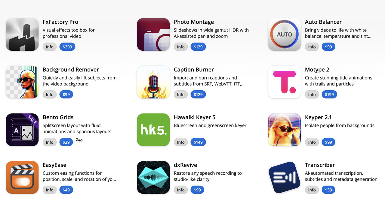
Goodboyninja ➔
20% off everything

Happy Editing ➔
50% off with code BLACKFRIDAY
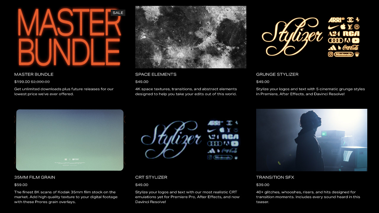
Huion ➔
Up to 50% off affordable, high-quality pen display tablets
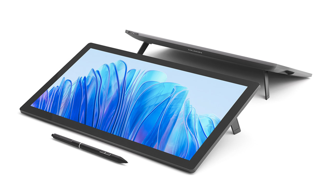
Insydium ➔
50% off through 12/4
JangaFX ➔
30% off an indie annual license
Kitbash 3D ➔
$200 off Cargo Pro, their entire library
Knights of the Editing Table ➔
Up to 20% off Premiere Pro Extensions
Maxon ➔
25% off Maxon One, ZBrush, & Redshift - Annual Subscriptions (11/29 - 12/8)
Mode Designs ➔
Deals on premium keyboards and accessories
Motion Array ➔
10% off the Everything plan
Motion Hatch ➔
Perfect Your Pricing Toolkit - 50% off (11/29 - 12/2)

MotionVFX ➔
30% off Design/CineStudio, and PPro Resolve packs with code: BW30
Rocket Lasso ➔
50% off all plug-ins (11/29 - 12/2)
Rokoko ➔
45% off the indie creator bundle with code: RKK_SchoolOfMotion (revenue must be under $100K a year)
Shapefest ➔
80% off a Shapefest Pro annual subscription for life (11/29 - 12/2)

The Pixel Lab ➔
30% off everything
Toolfarm ➔
Various plugins and tools on sale

True Grit Texture ➔
50-70% off (starts Wednesday, runs for about a week)
Vincent Schwenk ➔
50% discount with code RENDERSALE
Wacom ➔
Up to $120 off new tablets + deals on refurbished items


All-Access Pass

Unlimited access to 50+ courses, unlimited critique, live events, and 24/7 community. Join School of Motion All-Access today.