Create Stunning Visual Effects in AE
Learn compositing, tracking, keying, and rotoscoping in After Effects. Enroll in All-Access to unlock VFX for Motion and 50+ other courses.
Here's how to use Polar Coordinates in After Effects.
GMunk is the man. He creates some incredible work, and in this After Effects lesson we're going to re-create some of the effects from one of his pieces, Ora Prophecy. Check out the resources tab to take a peek at that before you get started. You'll learn how to use the lesser known Polar Coordinates effect, which has a bit of a strange sounding name, but once you see what this effect does you'll see why it's perfect for what we're building in this lesson. You'll also be doing a bunch of animating, use a couple of expressions, and start to think like a compositor to break down exactly what's going on in the original GMunk piece. By the end of this lesson you'll have a ton of new tricks in your bag.
{{lead-magnet}}
-----------------------------------------------------------------------------------------------------------------------------------
Tutorial Full Transcript Below 👇:
Music (00:00):
[intro music]
Joey Korenman (00:21):
What's up Joey here at school of motion and welcome today to have 30 days of after effects today. What I want to talk about is an effect that a lot of people don't really understand and it's called polar coordinates. It's this really geeky sounding effect, but with a little creativity and some know-how, it can do some incredible stuff. Now, this tutorial was inspired by a sick piece done by my favorite motion designer, Jima. I tried to recreate a little bit of it and I show you how I do it, and don't forget, sign up for a free student account. So you can grab the project files from this lesson. Now let's hop into after effects and get started. So like I said, the purpose of this video is going to be to introduce you guys to the polar coordinates effect. Um, and if you look at the final render that I put together, um, I kinda went a little bit overboard, um, and I obviously did a lot more than just, um, you know, put together a simple little demo here.
Joey Korenman (01:12):
And, uh, I'm not going to be able to show you how I did every little piece of this. Uh, if that's something you're interested in, please let me know in the comments. Um, because you know, all of this stuff you're looking at, there's free information out there about how to use, you know, the sound effector in cinema 4d and how to create things that react with audio. What I want to show you in this tutorial is how to make this tunnel, this kind of rotating, 3d, infinite tunnel. Um, and it's actually a lot easier than you think. Uh, I want to show you guys the G monk piece, and I know it wasn't just G monk. Um, he probably worked with a lot of people on this, but he, he made this piece recently. And if you look at this part right here, this tunnel, and there's a lot of really neat stuff going on here, and there's some really fancy particle stuff, but this, this tunnel, this cool techie, Tron looking tunnel is what I wanted to try and recreate.
Joey Korenman (02:11):
And I thought it would be a good way of using, um, the polar coordinates. In fact, in the end to show you guys how to use it. So let's happen after facts. Uh, and first, let me try to show you what this effect does. Um, just on a very simple level. So I'm gonna make a new comp we'll just call it test. All right. So what this effect does at its simplest level, okay, I'm just going to make a big horizontal line across the entire comp and I'm going to add an adjustment layer, and then I'm going to add the polar coordinates effect to it. Okay. So polar coordinates and only has two options, the type of conversion, and then the interpret, the interrelation is basically the strength of the effect. So if we, uh, if we set this to rectangular to polar, and then we up the strength here, all right, you can see what it does.
Joey Korenman (03:06):
It basically takes that linear thing and it basically bends it into a circle. Okay. So that's what the effect does. Um, and you might be wondering why is that useful? Well, like if, if you want to turn the tutorial off after this, this might explain everything for you. Okay. If I, uh, if I take this line, put it up here, actually, I got a better idea. Let's put it way up here. Let's actually move it out of the frame. All right. And let's put a key frame on Y position and go forward one second and move it down here. That's it. Okay. Now, when we play that, that's the animation, that's happening. Very simple. If we, uh, turn the polar coordinates strength all the way up to a hundred, and then we play it, well, now look what it's doing. All right. It's taking that vertical motion in our layer and it's turning it into radial motion.
Joey Korenman (04:03):
So that's really why this effect is so cool. Um, so I'll show you guys how I made the tunnel, but before I do that, I want to, I just want you to understand a little bit better. Some other ways that this effect can be used. Of course, we're just scratching the surface here. Um, and there's actually some, some other really cool things you can do. So let me first turn my adjustment layer off. Let me delete the shape layer. Um, and I'll show you guys this example, um, that hopefully will, will start giving you some ideas of your own some cool experiments. You could run with this effect and see what you can come up with. So here we've got a star and what I'm going to do is I'm going to turn the conversion instead of rectangular to polar. I'm going to say polar to rectangular.
Joey Korenman (04:47):
All right. And what this is going to do is it's going to take something that's radial, right? Like a circle or a star, and it's going to sort of undistort it and create an unwrapped linear version of it. Right? So if I turn this, uh, this, this adjustment layer back on, right, I'll, I'll scrub the, the strength here. She can see what it does. It does this weird warp, and we end up with this, okay. Now, why is that useful? Well, it can be useful if you have something, a piece of artwork that's circular or something, you know, anything that kind of has this radial, uh, shape radial symmetry to it. You can use polar coordinates to now create a unwrapped kind of rectangular version of it. Then you can do other stuff to it. So, for example, what if I just took a simple effect, like Venetian blinds it's, uh, you know, sometimes it useful effect and all it does, if you've never used it, it just basically makes a lot of little cuts in your footage and you can control the angle of the cuts and, and you basically use it to, you know, white things on and off.
Joey Korenman (05:54):
Um, and what's interesting is that, you know, this effect right now, it doesn't really look like anything special. The trick is you basically use polar coordinates to unwrap something. You then affect it. Then you use polar coordinates again and go back to your original polar look, right? So we first went polar to rectangular. Then we affected it and now we're going rectangular to polar. And this doesn't look really all that interesting. Now you've got lines radiating from the star, let me zoom in and go for rest. We can really see this, but now you can start to get some interesting looks, right? If I start messing with the direction, now we're getting kind of a spiral wipe, which, you know, would actually be pretty tricky to do. Um, and let me up the width of these things. So they're a little bit bigger, and then I can adjust the direction till we get a nice kind of seamless looking thing.
Joey Korenman (06:50):
And now what you have is a wipe that actually works in a spiral fashion. Okay. So this is something that would be pretty tricky to do actually. Um, if you, you know, if you wanted to create this type of wipe, um, but here's a quick little trick to do it, um, and it can also be used for maybe more useful things. Um, let me turn this off for a minute if, uh, if you wanted to distort that star, but have it be distorted in a radial way. Um, you could use maybe turbulent displace, um, and maybe set it to vertical displacement, um, and let's bring the size down, bring the amount up, right. And then use that same track. Right. So now, and then, you know, if you change the, the, the evolution of this, um, you know, you can start to see, you're going to get, you're going to get noise and distortion that moves in and out from the center of this object.
Joey Korenman (07:51):
Um, and so you could use this, you know, here's, here's a really quick cool example of how that might be useful. And I actually got this idea recently from watching Andrew Kramer's tutorial on how to make, um, this really cool explosion and he uses polar coordinates. Um, and I promise you, uh, Andrew, if you're watching, I did not steal the idea for this tutorial from you. You just happened to do it at the same time I was doing this one. Um, so yeah, what I want to do is just turn off the fill and just turn the stroke up a little bit. All right. And so this is interesting, right? Because let me, let me turn these effects off for a minute. So we've got a circle and then I'm going to use the polar coordinates affected, turn it back into a line. Now why in the world would I want to do that?
Joey Korenman (08:36):
That seems kind of ridiculous because now I can use this turbulent displace, right. And let me turn it to something else, maybe twist, right. And if I animate the evolution, you're going to get something like this. Right. Um, and even better, if you all set the turbulence, you can have something that looks like moving through the shape, right. And this effect, it doesn't work in a radial way. It works in a linear way. So if I use this trick of, you know, sort of sandwiching and effect between polar coordinates, what I can get, if I offset the turbulence on why is I can kind of get this radiating, you know, it almost looks like, like a star or something like the Corona of a star. So let me just put a quick key frame here, uh, on the offset turbulence, I'll go forward one second and I'll move it outward a little bit.
Joey Korenman (09:27):
And then we'll just ran preview that. And you can see, I mean, it's a, it's pretty nifty little, little trick, and you could definitely, you know, you'd obviously want to put some more facts on it and layer it and do other things to it. Um, but hopefully this starts to show you the power of using the polar coordinates. It lets you do things in a linear way, but then turn them into this radio thing. So hopefully that gave you a hint about how I actually pulled off, um, copying this amazing G monk piece. So let's take another look at this. Um, you know, I didn't copy it exactly. There were so many layers. I mean, there's so many things going on and again, I want to stress that what makes this piece amazing is not the fact that maybe they used this trick to create it.
Joey Korenman (10:08):
Um, it's obviously the, the design and the sound design, especially in the vibe that this piece gives you. And none of that has to do with, uh, actually, you know, what effect they used it has to do with the, the thinking and the art direction behind it. Um, so I just want to stress that, um, cause that's kind of a big thing for me is never forgetting that that's the important thing. But look at the design of this, you've just got a bunch of, you know, sort of lines that just move at right angles. Okay. They sort of randomly like, you know, they'll come out a little bit, then take a turn, then turn back, then turn this way. And every once in a while there's kind of like a little, a little area here that kind of gets enclosed. Um, and as the piece goes on too, you kind of see this come back.
Joey Korenman (10:52):
Um, and you even get to see it from a side angle and you'll kind of see that sometimes these little shapes get filled in. Sometimes they look a little bit less, uh, transparent. This part's really cool too. I'll just let you watch it because it's awesome. All right. So what I wanted to do is see if I could just make that in after effects without having to resort to illustrator or something like that. Um, so let me delete this stuff. We're going to, we're going to create all of this stuff in after effects. So if we, um, if we want to have things radiating out from the center of our comp, then the way we need to do it is to have them start at the top of our frame and move down. That's how you get outward motion using the pole, the polar coordinates effect.
Joey Korenman (11:38):
So the first thing we need to do is create our artwork. Um, and I'm gonna make this comp a lot longer, a lot taller than it is because if I'm going to be moving these shapes down and I want to have a lot of them, I'm going to have enough room. If I only have this small little comp. So let me make this instead of 1920 by 10 80, I'll make it 1920 by let's do like 6,000. All right. So now you get this nice tall comp, all right. So let's come down here to the bottom. Um, and I want to be able to make these shapes really easily. So I'm gonna do two things. One is I'm going to turn on the grid in after effects. Um, so you can go to view show grid. I usually use the hotkeys. Uh, so it's command apostrophe, we'll show you the grid.
Joey Korenman (12:25):
And then the second thing you need to do is make sure that you have snapped to grid turned on. If you don't the grid, won't actually help you create these things. All right. So now I'm a new, I'm going to switch to my pen tool and I'm going to hit the Tilda key here. All right. And if you don't know what the Tilda key is, it's the little key next to the one on the top row of your keyboard with all the numbers and that little squiggle is called the Tilda and whatever window your mouse is over, when you hit Tilda will get maximized. All right. So if I want to zoom in here and work on these shapes, this makes it a lot easier. Um, all right. So the next thing I'm going to do is I'm going to set up my shape settings.
Joey Korenman (13:05):
I want no fill, right? So you can click the word fill, make sure that this, this, uh, none icon is clicked for the stroke. White is fine for the color. All right. I'll just make it white. And then for the thickness, um, I'm not exactly sure what I want yet, but why don't we just set it to five for now? All right. So first let's just try drawing one of these shapes. All right. And let's just keep this open so we can reference it. All right. It's find a good frame. Like that's a good frame. Okay. So really all I need are a bunch of, you know, like a vertical line. Um, and every once in a while it kind of takes a right or left turn. So let's hop in after facts. We'll start down here and I'm just gonna, I'm going to put a point there and because I have snap to grid turned on, I can actually do this pretty quick.
Joey Korenman (13:52):
Right? Have this come back up here, come over here, pop up like this. And you can see, um, that this actually doesn't take that much time. All right. So now I want to draw a different line. So what I'm going to do is I'm going to hit the V key switch back to my arrow, and then I can just click somewhere else outside of this to de-select it. Right. Um, or a faster way would, would be to de-select everything. Um, so if you hit shift, command a that deselects everything. So command a is select all shift command day is de-select all. So now, if I hit my pen tool again, which is the G key and keyboard, you guys should learn these hot keys. They really make you so much faster. Um, so now I can create another shape. All right. So maybe this one starts here.
Joey Korenman (14:43):
Now I'm going to show you this. I just screwed up a little bit. When I clicked, I clicked and dragged a little bit, and you can see that the Bezier handles of this point were pulled out a little bit. And that's a problem because now if I pull this point over like this, it's actually bending a little bit. There's a little curve to it, which I don't want. So I'm just going to hit undo. Um, so that's one thing you have to be careful of, make sure that when you click your point, you just click and you don't click and drag so that you don't get any curves. Okay. So now I'll click here, click over here, maybe come down like this. And you know, I'm not really following any rules here. I'm just trying to, I'm just trying to make something that resembles the spirit of G monks. All right, Sonoma, de-select all. And let me make one more shape. All right. And then we'll move on here. I'll make this one, like a little bit fatter.
Joey Korenman (15:38):
Cool. All right. So then the next thing we want to do is, uh, I want to take some of these, uh, I forgot to de-select all. There we go. All right. So the next thing I want to do is I want to create a few little caps for these things. All right. So I'll create one de-select all right. And then maybe I'll create a little area like this, just fill in that shape like that. All right. Do you select all and then I'll do maybe a thicker one here. Okay. And then maybe this one. Okay. And then maybe I'll put a line here and a line here and we'll call it a day. Okay. De-select all. And then do one maybe up here. Cool. Okay. Now I'm going to hit, uh, command apostrophe and you can see our design here. Beautiful. Um, and so then the next thing I want to do is just sort of duplicated a bunch of times. So I don't have to actually create this really complicated set up here. Um, so an easy way to do that is to just select all of these pre composed them and we'll call this shape. Oh one.
Joey Korenman (17:01):
All right. And so let me scoot this guy over like this, and then I'm going to duplicate it and I'm going to come over here and I'm going to try to line up these lines right here as best I can. And then scoot this one down a little bit. And the reason I'm doing this is so that we can sort of hide the fact that we're just going to clone this thing a bunch of times, I want to try and mix up, you know, and then maybe for this one, I could scale it negative 100, right. Horizontally. So that it's actually a mirror image. And so it actually looks even a little different. I can scoot this one up like this. Okay, cool. So now I've got this kind of building block that I can start to use. Um, so maybe I'll duplicate this more time scooted over here.
Joey Korenman (17:53):
All right. And I'm just kinda nudging these things with the keyboard and zooming in, and it's not going to be perfect. Um, unless you take the time to make it perfect, which I'm not very good at. I'm kind of impatient. So now I want to take this whole setup pre comp, that we'll call that shape two and I can duplicate it and bring it up like this. All right. And you can see that there's like a little hole here that we need to fill. So what I'll probably do is just duplicate it again and I'll just bring this over like this, and I'll just sort of position it so that it fills in that hole. And we're getting a little bit too much overlap down here. So what I might do is then mask that section off and set that mass to subtract, and then I can just adjust that mask.
Joey Korenman (18:49):
So it only shows up where I want it to. All right. All right. And maybe move it up a little bit, grab those points. Cool. And hopefully you're seeing how quickly you can do this too. I mean, this, you know, if you're, if you're actually doing this for a paying client yeah. You probably want to take the time to make it perfect. Um, but if you're just playing around or if you're just trying to, you know, do something for your real, just to make something cool looking, um, no, one's going to notice these little inconsistencies when this is moving. Cool. All right. And then why don't we duplicate this whole thing one more time?
Joey Korenman (19:34):
Let me, pre-com this whole thing shape. So three duplicate, bring it up here and just to make life easier. I mean, mask off this little, top piece here, subtract it and then duplicate it. And so now we can move this up. There we go. Cool. And then we just need one more copy and we're pretty good to go. Cool. All right. So we've got this really interesting looking setup here. Um, the next thing I did was I actually filled in some of these shapes, right? So, um, maybe you just want to pre comp this and just call these lines so you don't have to think about it anymore, and then you can lock it so you don't accidentally move it. And then let's hit that Tilda key again and zoom in. And this time, what I want to do is I'm going to select my rectangle, a tool.
Joey Korenman (20:33):
I'm going to set the fill to a fulfill, um, and set the stroke to zero. Uh, and so now what I can do zoom in, we can turn the grid back on. Um, although that may not actually help us at this point, because since we sort of hand position those lines, you can see that a bunch of them don't actually line up to the grid anymore. So let's not even bother with that. And that's, let's turn off snap to grid, which it's great out because the grid is not showing. So we're good to go. So then I just take the rectangle tool and I just sort of quickly go through and I try to be somewhat arbitrary about it and not have too many big areas of filled in, um, color. But sometimes, you know, sometimes I want that section. Sometimes I want that section.
Joey Korenman (21:26):
Um, and I'll just try to do this a bunch of times. Um, and I think when I met, when I did this for the tutorial, I probably spent, I don't know, 15, 20 minutes making this design and, and filling this in. I'm trying to do a little quicker, cause I know how boring it is for you guys to watch. Um, but one of the things I'm hoping, let me undo that. One of the things I'm hoping that you're getting from this in addition to learning a new trick, uh, is, you know, seeing how quickly you can get things done and after effects and not having to overthink the production of your elements. Sometimes I know, um, I've, I've done jobs where you have a big team. And so you sort of, you sort of end up trying to find ways to include everyone in the work.
Joey Korenman (22:18):
And so you might have a designer actually create this stuff in illustrator, but then you got to take that illustrator file into after effects and then you may need to tweak it. And so then you have to do a bunch of work. And, and so, you know, when you're doing something like this, don't be afraid to just say like, Hey, I can just do it in after effects and we don't need another person and we don't need to make work for somebody. Um, a lot of this type of stuff you can just do very quickly. Alright. So that's pretty cool. And, uh, let's just leave that for now and what we may actually be able to get away with. All right. Um, and one thing you should, you should notice too, because I didn't, de-select all, when I was making those shapes, it put all of those shapes on one shape layer, which is okay for this, this isn't going to bother me.
Joey Korenman (23:05):
Um, so I'm renaming this solid and what I'm gonna do is just duplicate it and see if I can get away with just lining it back up, which seems to work. Okay. Um, so that way I don't have to, you know, literally go through this entire, this entire layer here, I'm making these. Okay, cool. So we've got some filled in areas. We've got some lines, we did that fairly quickly. All right. So this is now our design. Let me rename this comp, this is going to be tunnel flat. Okay, cool. So let's, uh, let me make a new here because I'm super in our attentive. There we go. All right. So here's our tunnel flat layer. So the next thing you want to do is make a new comp and this is going to be our polar comp. Okay. Now what I'm going to do here, I'm going to start by making it 1920 by 10 80.
Joey Korenman (24:03):
And I want to show you what happens if I do this. So let's drag our tunnel flat comp into this. Alright. And let's, uh, flip it upside down. And the reason we need to flip it upside down is because it's, this needs to be negative 100. Um, it needs to be upside down because in order for the polar coordinates effect to work correctly and make, make this look like a tunnel coming towards us, this layer is going to have to move down. And since I designed it from the bottom up, uh, then I actually just need to reverse it when I, when I move it this way. All right. So let's start by just opening up the position property here. So hit P um, I always separate dimensions. I almost never leave them connected for position. Uh, we'll put a key frame on Y we'll move this thing out of the frame and then we'll go forward.
Joey Korenman (24:57):
Our comp is 10 seconds long and let's just move this thing all the way down like that. And let's see how fast that ends up moving. Right. That might be too fast, but we'll see. Okay, cool. So, uh, so there we have it. And now the last thing we do is we add the adjustment layer and we add the polar coordinates effect. So distort polar coordinates, switch this by default, it's polar to rectangular. You have to switch it rectangular to polar and then turn the interpolation up. Okay. And now if we ran preview this, this is what you get. Okay. So you get this infinite kind of, you know, I mean, it, there it is, right. It looks just like G monks, same thing done. Uh, all right. So obviously there's some problems. One is the effect. It only creates a circle that is as tall as your comp.
Joey Korenman (25:57):
Okay. Um, so what I, what I did for the video I made for the tutorial was I actually just set the width and the height to 1920. Okay. Um, and then make sure that your adjustment layer is the same size as the comp. So I just opened up the settings for that, by the way, the hot key, if you don't know a shift command, Y opens up the settings for a solid, and then you can just hit make comp size and it'll scale it to the comp size. So now we get a tunnel that actually is the full size of the comp. Now I'll show you what's going to happen. Um, so what we're gonna do is we're going to take polar comp, we're going to make a new comp, and this will be our, you, our final tunnel comp here. Um, and this comp is going to be 1920 by 10 80.
Joey Korenman (26:50):
So this is going to be, you know, our, our normal comp we're going to render from, and we're going to take our, uh, our polar comp put it in there. Right. And you can see that it's almost big enough, but it's not quite big enough. And that's okay because I knew going in, right. If you look at the final here, there's so many effects and layers of things happening here that I knew that I could just kind of cover that up if I wanted to. And what I actually ended up doing was putting an adjustment layer above this whole thing. And I do that a lot. I use adjustment layers to kind of affect my whole comp that way it's easy to turn it on and off. Um, but I used another distort effect called optics compensation. And what that does is it sort of simulates either a fish islands, if you just sort of leave it on and you turn the field of view up, it kind of makes your, it, it basically simulates a very wide angle lens.
Joey Korenman (27:45):
Um, or you can do a reverse lens distortion, right. And it'll actually, it'll suck out the edges of your comp a little bit and give you a little bit of lens distortion. Um, and so that's what I wanted to do. So why don't we pull the start time of polar comp to there okay. Or better yet? Why don't we go into polar comp and we'll have, uh, we'll have the Y position start where it's already far enough out that it's reaching the edge of our tunnel. Okay. So now, if we look at tunnel final, we're in half Raz, I'm just gonna do a quick Ram preview, um, just to get a sense of the speed of this thing. Cool. All right. So, uh, the next thing is you can see the beginning of this and it kind of goes off into infinity, which could be cool.
Joey Korenman (28:35):
And if you look at the G monk piece, it goes pretty far back, but there is a definite hole there. Okay. Um, so I don't know if they used polar coordinates to, to actually create this piece, but to fake that, um, there's an easy trick. All you have to do is go to go to your polar comp here. Um, let's turn off this adjustment layer for a minute. So the way the polar coordinates effect works right, is the top of your frame is the center of the circle. Okay. And the edge of the circle and by the center of the circle, I mean, the, the top of this frame correlates to the center of, of the circular version of, of your, your layer. Um, now this outer part actually falls in the middle of your comp. Okay. So the polar coordinates effect it doesn't use this bottom part of your frame.
Joey Korenman (29:32):
Okay. So what I want to do is mask out the correct part of this, so that I get a whole in the middle. All right. So since the middle core corresponds to the top of my frame, I need to mask this part out. So I'm going to make a, uh, I'm going to make a matte layer here. All right. Just to a new solid, um, and I usually make my mats some really bright color on my timeline so I can differentiate them. Um, and then I'm going to take my mask tool and I'm going to mask out this part and I'm going to feather that mask and then invert the mask. Sorry I did that wrong.
Joey Korenman (30:12):
Oh, all right. Um, so yes, so I do that. Nope. I was right inverted. And now tell this layer to use this as an alphabet. There we go. Okay. So here's my, my matte layer that I'm using as an alpha matte. And so now we don't see this part of it. Okay. If I turn on the transparency grid, you can kind of see it's a little tough, but you can see that there is no information there now. So when I turn the polar coordinates adjustment back on, now we have a tunnel emanating from there, and I can adjust that by feathering the mask more. And if I want, I can even adjust how far down this comes and that's going to affect where the tunnel actually starts. Okay. So now let's go to our final. Cool. So we're starting to get somewhere now. Okay. Now I moved the mass too far, so you're starting to see a little bit of the center there.
Joey Korenman (31:10):
Um, and so this is why it's helpful to have polar coordinates on an adjustment layer because you can just turn it on and off really quickly. If you see that you mess something up, like I just did. So I need to adjust this mask, this, and this needs to come out more. There we go. Now, turn it back on, come here now. We're good to go. Cool. All right. So, um, the next part of this is I wanted to make it look like the tunnel was a little bit more 3d, right? We're getting that sense that we're moving through a tunnel, but it doesn't feel very 3d. It feels very flat, which could be cool. Um, but if you want it to feel like, you know, it has a little bit more depth to it. Um, what you kind of need is a little bit of parallax.
Joey Korenman (31:58):
Okay. And you can kind of see that parts of the tunnel moved slower parts of the tunnel move faster. So what I did, I just kind of did it the easy way. So let's turn off our adjustment layer for a minute. Oh, sorry. Wrong comp, turn off our adjustment layer. Excuse me. And what I did. Um, first, let me change the setup a little bit to make this easier. So I'm going to turn off this layer is now no longer using this layer as a mat. What I'm going to do is turn this layer back on and I'm going to, uh, I'm going to set the mode to stensul alpha. And so what that's going to do is it's going to use this layer as the alpha channel for every layer that's underneath it. Okay. And the reason I want to do that is because I'm going to duplicate this layer. Okay. I'm going to duplicate it and I'm actually going to make it a 3d layer, and then I'm going to push it backwards and Z, so let's push it backwards, like a thousand. Okay. And now, since I did that, I need to adjust the initial Y position.
Joey Korenman (33:09):
All right. But you can see that it moves slower than the layer in front of it because it's further back in space, just a very quick and dirty little way to do this. And I'm going to make the opacity like 50%. Okay. Um, I'm also going to scoot this thing over, right. And I'm gonna make it a different color so I can differentiate, and then I'm going to duplicate it and scoot this over. So now it'll fill the entire frame. Okay. So now we've got one layer of parallax just by doing that. And if we look up, I need to turn my adjustment layer back on, pop over here. And just by doing that, you can see that it's given the tunnel a lot more of a 3d look.
Joey Korenman (33:58):
Cool. Um, another thing that really, really helped with the, uh, with the tunnel kind of field, this, um, was having, having it rotate a little bit, um, which that was, that was really easy to do. Uh, you know, you could actually just rotate this comp, um, the way I did it was I actually used another effect on my adjustment layer. Um, I used distort transform, and then I put an expression on the rotation to just keep it rotating. Um, so that's, that's a very common expression I use all the time. Uh, what you do is you hold the option key and you click the stopwatch for rotation. You can see it turns red. So now I can type in an expression and the expression is just time times, and then whatever number I want. So let's try time times 50, right. And I'll do a quick Ram preview.
Joey Korenman (34:51):
And that feels way too fast. So why don't we do time times 15 and that's better. Okay. So now if we go to the final, we have this nice kind of, you know, we're, we're drifting towards the tunnel and it's coming at us and it's really neat looking. Everything's cool. All right. Um, and then, you know, just to make it a little bit neat, or why don't we turn this off and why don't we do one more layer of parallax? So let's duplicate this, make it a different color. Um, let's push this one back to 2000. All right. And pop over here, push this over and let's see how fast that's moving and make the opacity different to let's make this 20%.
Joey Korenman (35:43):
All right. And then change the Y position a little bit. So moves a lot slower. There we go. Cool. All right. So then I'll just duplicate that, push this over, like, so you can see I'm being very, very imprecise with this, but because it's so busy now we've got so much going on. It actually works. Okay, cool. So we've got that. And if we turn our adjustment layer back on and go back to the final comp, now you're getting something with a ton of complexity, um, and you know, a few layers of parallax and you're really getting that 3d tunnel feel to it. Okay. So now looking at this, right. Uh, one of the things that jumps out at me is that everything feels really, really chunky, and that's not what I was going for. I, one of the things I love about G monk stuff is that he is not afraid to make stuff very thin.
Joey Korenman (36:48):
Okay. So let's try to do that. The great thing about this as the way we have it set up, it's all done in after effects. So if we just jump back into our comps, let's jump in here. Um, all we need to do is go back into our lines comp and find our original shapes buried in there. There we go. That whole thing is built out of this little setup. I'm just going to select all these and change that stroke to two. All right. And now I'm going to jump to my, uh, my final comp here, and that's a lot better. Okay. Now this is half Rez. So you're getting a little bit of degradation, but I love how much thinner everything looks. All right. Um, and then the next thing that, uh, that I had done, so here let's pram preview this a little bit.
Joey Korenman (37:34):
I want it to get a little bit more randomness in how bright these panels are, um, because they just felt too uniform to me. Right. All right. So this is already feeling pretty cool, and this could be useful, um, on its own, but it just doesn't feel as glitchy and analog and crazy as I wanted it to. So I'll just show you a few more things I did. Um, so if we go back into our tunnel comp and you can see that all of these solid pieces here, uh, they're actually, you know, they're just made from these three shape layers. So what I'm gonna do is I'm going to pre-camp these, and I'm gonna call the, this is the solid shape layer. All right, I'm going to make a new solid that is this gigantic, you know, 1920 by 6,000 size. And I'm going to use a fractal noise effect.
Joey Korenman (38:28):
All right. And if you're not familiar with fractal noise, you should be. And, uh, there is a tutorial, um, coming on the 30 days of after effects of bow fractal noise, there might even be two of them. So, um, so you will learn more about this. Uh, but fractal noise is great at generating random shapes and noise and stuff. And it's got this really cool setting. Um, if you change the noise type two block, okay. And maybe it's hard to see, but let me zoom in here a little bit. It starts to resemble pixels, and there's still like a lot of noise and kind of static looking stuff in there. Um, and all of that stuff is actually the kind of sub noise. There's kind of two levels of noise happening with fractal noise, the main level, and then the sub level, and that sub level, if you take the influence of it down here in the sub settings, turn that down to zero.
Joey Korenman (39:20):
Okay. And you'll see, now you just get this pixely pattern, which is cool. Um, and I am going to close that down. I'm going to scale this way up like this and what this effect can now do. If I animate the evolution of this, right. I can get this cool kind of pixely pattern. Right. Um, I can even move this noise through these pixels. So I'm going to do two things. One, I'm going to put that same expression on this evolution that I did on the rotation. So I'm going to say option, click that and type in time times let's try 100. All right. And so it just gives it a little bit of change over time. All right. Nothing too crazy. The next thing I'm going to do is I'm going to offset the turbulence and I'm going to have it offset like this. It's going to offset vertically. Okay. So what I'm going to do is I'm just going to put a key frame here. I'm going to hop to the end and I'm going to animate this up like this, and then let's take a quick look and see what kind of speed we're getting. All right. I may want that to actually happen a little bit faster. Um, so let me crank that value a little bit too quick Ram preview. All right. Maybe a little bit faster.
Joey Korenman (40:45):
Cool. And so now what I want to do with this is I want to use this cool animated pattern I made using fractal noise. I want to use that as a Luma matte for my solid shapes layer. Right. So here's the solid shapes, right, right here. And I'm going to tell that layer solid shape to use my cool fractal noise as a Luma matte. And so now if we watch this, you're going to get this cool kind of pattern moving through it. Okay. And it's going to animate continuously throughout the comp. Okay. And it's going to be kind of cool. Um, you know, and if you want it to, I mean, there's a lot of ways you can make it even more random. It might be cool. You know, maybe what I could also do is, uh, put an expression on the transparency of these shapes.
Joey Korenman (41:35):
So, you know, maybe I could have them flicker a little bit too. So why don't we turn the opacity maybe to like 70% and I'm going to put a quick expression on there called wiggle. Uh, if you're not familiar with expressions, by the way, you should watch the introduction to expressions video it's on the site. And I will link to it in this video, in the con in the, um, description. So you can watch that. Um, but there's a new in ways to use expressions to really speed up your ability to do this stuff. So what I'm going to say is why don't we have this thing wiggle, um, 10 times per second by up to 20. All right. And if we ran preview that you could see just gives it a little bit of like a flicker. Cool. And if I wanted it to, to actually flicker more, I could change that.
Joey Korenman (42:21):
The amount, that second number is sort of the strength of the wiggle. Okay, cool. And one thing that now looking at this that I wish I had done, I wish I had had all of those shapes on their own layers so that I could have them all flicker separately, but you know, what live and learn. All right. So now we've got that and we can turn our lines back on, right. So now this is what you're getting, and now this is what's feeding all the way through your chain, into your final tunnel comp. Okay. And so now you're starting to get a lot of that cool, you know, complexity and that richness. And there's just a lot going on. And, and frankly, now that I look at it, I think I want those lines to be even thinner. I think I might just set this to one pixel, right.
Joey Korenman (43:09):
And come down here right now in half. Whereas it's going to make it look a little bit chunkier, but I don't want to, I don't want the render times to be ridiculous for this. Um, cool. So, I mean, this is essentially how I built the tunnel, and then of course I did some compositing and I couldn't just let the center be, you know, have nothing in it. So I had to make this crazy thing and cinema 4d, um, watching the G monk thing a million times, I noticed that there are these cool pulses, um, kind of timed out with music and it kind of looked like a, you know, like one of those rainbow rings you get with, um, uh, with the lens flare. So I used that and just, you know, but it really it's, you know, chromatic aberration, um, and some vignetting, I did some fake depth of field using the lens blur with a gradient.
Joey Korenman (44:01):
Um, and if there's anything that you see in this, that you are really curious how I did it, please ask me in the comments because, uh, I'm always on the lookout for, for new tutorials and new things to teach you guys. Um, and I don't want to throw too much into one tutorial. So this I'm just kind of focusing on the tunnel part. Um, but the rest of it is, uh, is fair game for future tutorials. So that is, uh, I guess that brings me to the end here. I hope that this was useful and I hope you, you kind of have like a new appreciation for this effect that has a weird name, and it's only got two settings and it seems like how could that possibly be useful? But look at this crazy thing that we just made, you know, in, in like 20, 30 minutes together, all inside of after effects with absolutely no illustrator, nothing like that, there's no third-party plugins or anything.
Joey Korenman (44:56):
Um, and it's great. And, you know, you can use this to make really interesting radio waves and really, you know, I, I showed you a bunch of ways you can stack a polar coordinates with effects inside and then undistort it using another polar coordinates and get some really interesting things. Um, so anyway, I hope that was useful. Thank you guys so much, uh, stay tuned for the next episode of 30 days of after effects. I'll talk to you guys later. Thank you so much for watching. I hope that was cool. And I hope you learned something new about using the little known polar coordinates effect. Now we'd love to hear from you if you use this technique on a project. So please give us a shout on Twitter at school of motion and show us what you did. Thank you so much. And I will see you on the next one.
ENROLL NOW!
Acidbite ➔
50% off everything
ActionVFX ➔
30% off all plans and credit packs - starts 11/26

Adobe ➔
50% off all apps and plans through 11/29
aescripts ➔
25% off everything through 12/6
Affinity ➔
50% off all products

Battleaxe ➔
30% off from 11/29-12/7
Boom Library ➔
30% off Boom One, their 48,000+ file audio library
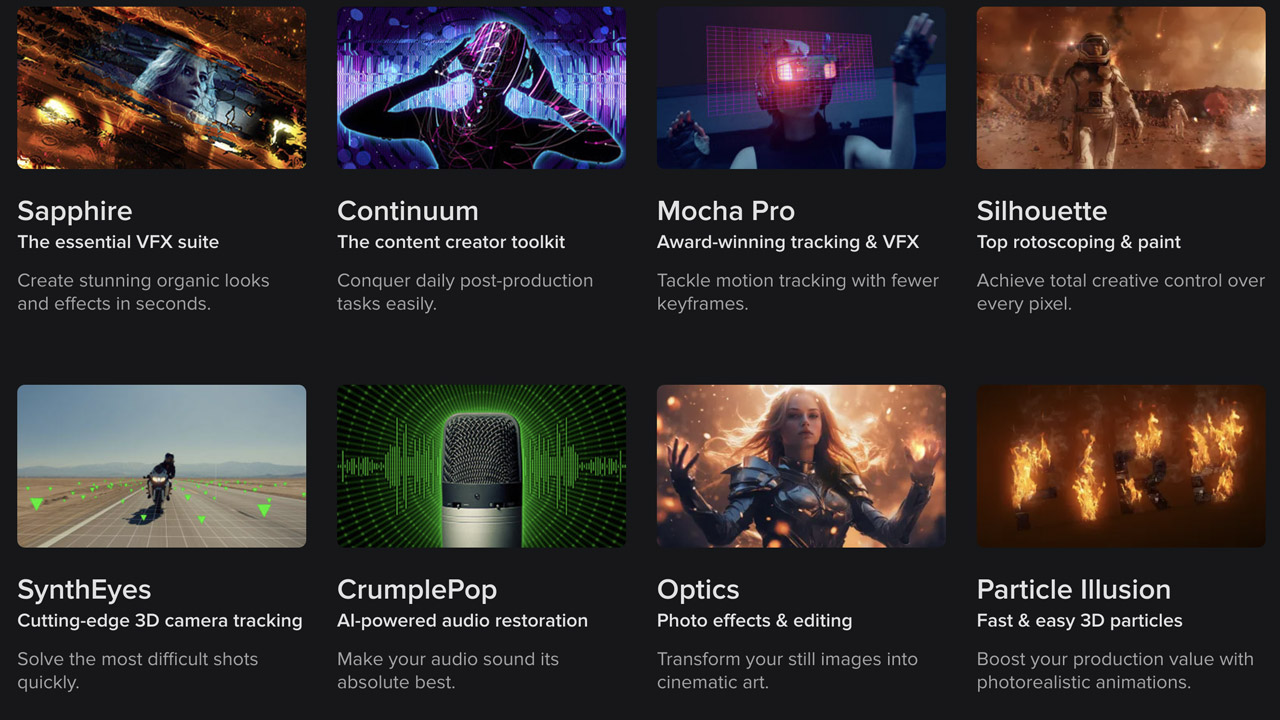
BorisFX ➔
25% off everything, 11/25-12/1
Cavalry ➔
33% off pro subscriptions (11/29 - 12/4)
FXFactory ➔
25% off with code BLACKFRIDAY until 12/3
Goodboyninja ➔
20% off everything
Happy Editing ➔
50% off with code BLACKFRIDAY
Huion ➔
Up to 50% off affordable, high-quality pen display tablets

Insydium ➔
50% off through 12/4
JangaFX ➔
30% off an indie annual license
Kitbash 3D ➔
$200 off Cargo Pro, their entire library
Knights of the Editing Table ➔
Up to 20% off Premiere Pro Extensions
Maxon ➔
25% off Maxon One, ZBrush, & Redshift - Annual Subscriptions (11/29 - 12/8)
Mode Designs ➔
Deals on premium keyboards and accessories
Motion Array ➔
10% off the Everything plan
Motion Hatch ➔
Perfect Your Pricing Toolkit - 50% off (11/29 - 12/2)

MotionVFX ➔
30% off Design/CineStudio, and PPro Resolve packs with code: BW30
Rocket Lasso ➔
50% off all plug-ins (11/29 - 12/2)
Rokoko ➔
45% off the indie creator bundle with code: RKK_SchoolOfMotion (revenue must be under $100K a year)
Shapefest ➔
80% off a Shapefest Pro annual subscription for life (11/29 - 12/2)

The Pixel Lab ➔
30% off everything
Toolfarm ➔
Various plugins and tools on sale

True Grit Texture ➔
50-70% off (starts Wednesday, runs for about a week)
Vincent Schwenk ➔
50% discount with code RENDERSALE
Wacom ➔
Up to $120 off new tablets + deals on refurbished items

Create Stunning Visual Effects in AE

Learn compositing, tracking, keying, and rotoscoping in After Effects. Enroll in All-Access to unlock VFX for Motion and 50+ other courses.
