Learn how to fully utilize precomps in your work.
Precomposing is the most powerful tool in After Effects, and yet a lot of artists don’t use precomps to their full potential. Joey based this video off of a lecture that he gave when he was teaching at Ringling College of Art and Design where he showed just how quickly and easily you can use precomps to build very complex-looking animations that are, in reality, very simple. This technique is really fun to play around with, and can be used in conjunction with other tricks to do some incredibly cool work. Even if you are an advanced After Effects-er you'll probably pick up a new trick or two in this video.
{{lead-magnet}}
-----------------------------------------------------------------------------------------------------------------------------------
Tutorial Full Transcript Below 👇:
Joey Korenman (00:17):
What's up Joey here at School of Motion, bringing you day 15 of the 30 days of after effects. Today, I'm going to talk about pre comps. Now, if you've used after effects for more than a week, you probably know about pre composing, but in this lesson, I want to reinforce the power of pre comps. And a good way of doing that I found is to show just how quickly you can build very, very complex animations. That really don't take that much work. And don't have very many key frames, but actually look really cool and complicated. I'm hoping that along the way, you're going to pick up some tricks about working with pre comps. Now don't forget to sign up for a free student account, so you can grab the project files from this lesson, as well as assets from any other lesson on school emotion. Now let's hop in and make something cool.
Joey Korenman (01:03):
So let's talk about pre comps. Um, and one thing I wanted to say about pre comps is that when I was starting out with after effects, they sort of freaked me out because you know, you do all this work and then you, you pre-com it. And all of a sudden you can't see your work anymore. And it feels like you're hiding key frames from yourself. And God forbid, you want to go in and tweak something. Now it's kind of hidden and it's, it's kind of, it makes it trickier. Um, and you have to manage it. Um, this is actually something after effects artists have been complaining about for years is the fact that you can't sort of see your key frames while they're in a pre-camp, um, very easily anyway. So, um, what I want to show you is some of the really, really, really cool things you can do with pre comps.
Joey Korenman (01:41):
Um, this is a little bit more of a beginner tutorial, but, uh, I'm just going to keep pushing and pushing and pushing the pre comps until you get something that looks really, really complicated like this. Um, and hopefully what I'll show you guys is that this is actually really easy to make. Um, it it's, it's shockingly easy. So, uh, all right, so let's just hop in and get started and let's talk about pre-com. So I'm going to make a comp a 1920 by 10 80. All right. And I'm just going to call this square. Okay. Um, all right. So first thing I want to do is just animate something really simple. All right. I'm going to turn on my guides here by hitting the apostrophe so I can kind of make sure I have things in the center where they need to be, and I'm just going to make a square.
Joey Korenman (02:24):
So a, an easy way to make a square and make sure it's in the middle of your comp is go to, uh, go to your shape layer tool here, grab a rectangle tool and just double click that button. And what that'll do is it'll make a shape layer that's right in the middle of your comp. Um, and then you can come into the shape layer settings here and Turrell open the rectangle and the rectangle path, and then you can unlock this size property. So the width and the height aren't linked anymore, and just make the width and the height the same. And then you can scale that down. And now you have a perfect square, right in the middle of your comp. You can do the same thing with a circle too. It's pretty useful. Make sure that, um, you know, if you rotate this thing, are you doing anything to it?
Joey Korenman (03:02):
It's right in the middle. Um, and what I want to do, let me rename this square and I don't want to fill on it. Uh, I do want a stroke. So what I'm going to do is maybe it had like a, a two pixel stroke. And I think I had some nice kind of pink color in there. So, so let's get rid of the fill a quick way to do that. As you can click on the word fill, if you have this selected, uh, it brings up this little box and then you can just hit this guy and now it gets rid of the fill. It's kind of a neat little shortcut. Okay. So now we have our square and let's just do a simple little animation with it. Okay. So, um, you know, here's a simple thing. We'll have it start scaled at zero and then we'll go forward, you know, a second and we'll have it go up to 100.
Joey Korenman (03:50):
Okay. And of course we can't just leave it like that. We have to easy ease the key frames, go into the curves editor and kind of give it some character. Um, and, and what I did in the demo, um, this is something that, um, I'm not sure I've shown you guys before, but it's a pretty cool key framing technique. You know, if I really want this thing to shoot up and then slow down at the end, this is the shape of the curve you want to create. But if I really want that to be accentuated, um, then what you can do is kind of go to the halfway mark, hold the command button on a Mac on a, on a PC. It's going to be controller alt. I'm used to PC in a long time. So I'm sorry. I don't actually know what button you push.
Joey Korenman (04:30):
Um, but you push that button, whatever it is. And you click here on the curve and now you have an extra key frame and you can not do that. You can just kind of pull it up like this. Okay. And you still want it to be, you know, below this key frame, but what you're doing is you're really giving yourself an extra handle on that curve to bend the crap out of it. Um, and a, a cool little shortcut, as you can ask, select that key frame, and you can click this button right here, which is an, it basically makes this Bezier curve automatically try to smooth itself out. So if I click that smooth it out a little bit, um, and then I can just sort of grab this handle and pull it, you know, to shape it, how I want. So you could see now I've got this really hard bend and then it really takes a long time to flatten out.
Joey Korenman (05:15):
Um, and so this is what that looks like. Okay. Um, and then if I want to, I could even play with the timing of that and have, you know, have it shoot up. And then it's kind of nice. And maybe we'll just pull this down a little bit. Cool. So you get this nice burst and then a long ease, which is cool. Um, on top of that, why don't we have it rotate a little bit? So I'm going to put a re a rotation key frame here. Here's a cool trick. If, uh, I want to see where my scale key frames are, but I want to work on my rotation curve. So I'm just going to click this little button just to the left of the scale property. It looks like a little graph. If you click that, it'll keep that scale property on the graph for you.
Joey Korenman (05:52):
And so now I can see the rotation in the scale at the same time, so it can line up key frames if I want. So I want the, I want that square to end zero degrees, but maybe here, I want it to be rotated 90 degrees backwards that way. Okay. Um, and then, you know, I, I normally don't like to just kind of do linear moves like this. I always like to add a little, um, you know, a little character to it. So I'm just gonna easy ease these key frames real quick, and I'm going to go backwards. Let's go backwards, three frames, put a rotation, key frame there. And so that way now it can sort of anticipate a little bit, okay, that's what it's doing when it kinda dips this way. First it's anticipating that it's going to go up this way. And of course, when it lands, I'm going to add another key frame here.
Joey Korenman (06:37):
I'm holding command clicking, and I'm just going to have it overshoot a little bit. All right. And, you know, hopefully if you guys watch enough tutorials, this shape is starting to become very familiar to you. Cause I do it all the time. Cool. So now I've got this cool little scaling up square and you know, the animation is kind of nice. And maybe, maybe just so it's not, um, you know, it's a little bit more random. Why don't I speed up the rotation a little bit. So I'm gonna hold option to scale those key frames a little bit. Uh, remember you got a hold option, grabbed the last key frame, and then I'm going to offset it a few frames just so it's not happening so much in sync. All right. So that's kind of cool. And that anticipation move is bugging me. It's a little bit stiff.
Joey Korenman (07:24):
So I'm just gonna adjust that a little bit. That's better subtleties people. They make a difference. So that's cool. Let's say we love that. Okay. Um, so now, you know, what can we do with this, uh, that maybe is a little tricky? Well, what's cool is since I animated it in the middle, if I pre composed it, I can do a lot of cool stuff with it. So let's, uh, let's, pre-com this, so shift, command C and I'm going to start numbering knees, uh, and this is going to come in handy in a little bit. Okay. So I'm going to call this oh one square PC, and I'm gonna make sure it doesn't give me an option in this case, but sometimes depending on what you're doing, this option will be available to you and for what we're about to do, you need to make sure you're moving all the attributes of your animated object into the new comp.
Joey Korenman (08:15):
So now what I want to do is I want to actually mask out this layer. Um, but I want it to be massed out perfectly, uh, sort of like, I want to mask it out. So I basically have a quadrant of it, right. Like a quarter of it. So what I'm going to do is I'm going to put a guide right in the middle here, like this vertically, and I'm going to zoom in so I can make sure that it's as close to perfect as possible. Okay. And then I'm going to do the same thing on the horizontal. I'm gonna grab one of these guides. If you guys don't see the ruler, uh, command R it turns that on and off, and then you can grab a guide right out of there. Cool. So now we've got two guides there. And if I go to my view menu, you'll see, I have snapped to guides turned on.
Joey Korenman (08:58):
Um, let me turn off my, uh, my title safe here. Uh, apostrophe key turns that off. And what I'm going to do is select this layer. I'm going to grab my mask tool, and I'm just going to start up here and you'll see that when I get close to these guides, it doesn't snap. And why is it not snapping? Cause I don't have Snapchat guides turned on. I thought I didn't it didn't but now I have it turned on and it snaps. See that snaps right on there. So now that mask is perfectly lined up right in the middle of that layer. So now I can turn the guides off and the hockey for that is command. Semi-colon I know it's a weird one or you can just go view and, and hit this show guides turns it on enough now, why did I just do that?
Joey Korenman (09:41):
Um, so if you look at this, let me scale this a little bit. If you look at this now I've got just a quarter of the animation I just did and what's cool is, um, what I can do is I can take, I can take this layer here and I can duplicate it. I'm gonna hit S to open the scale and I'm going to flip it negative 100, just like that. Okay. And so now you can see that it, it does a much more interesting thing that actually would not be very easy to create in a different way. It's like a little mini kaleidoscope effect. Okay. Um, cool. And so now I'm going to take these, I'm going to pre comp them and I'm going to say, oh, two squares half. Um, now a quick note, the reason I'm starting to number these is because, you know, I think when I did the demo, I ended up with 12 layers of these things.
Joey Korenman (10:36):
And, and you know, when you, once you've got a built out, what's fun is going back into like the earlier layers and tweaking things. And, and if you don't label these things in a way where it's easy to figure out what order things were created in, um, it's gonna be very hard to know where to dive into. All right. So now that I've duplicated that or sorry, pre comp, that I'm going to duplicate it hit S and now I'm going to do negative 100 scale on the horizontal. So now I get this. Okay. Um, so what's awesome is I've got this really neat looking kind of animation here. Right. And what's cool is because I've got this nested setup. I could just go back into, um, this very first pre-camp here. And let's say, I just wanted to duplicate that square. Right. So just grab it, duplicate it.
Joey Korenman (11:25):
There we go. Um, and maybe scale this one down a little bit. So I, I don't want to use the scale property cause I've got key frames on that. So what I'm going to do is hit you twice, double tap you, and that will bring up all the properties I've changed. And so now I can just actually shrink the rectangle down, the benefit of doing it this way is it doesn't shrink the stroke. The stroke is still the same thickness and maybe we make the stroke a different color. Maybe we kind of make it like a teal color. Cool. And let's offset that a couple of frames before four frames. Okay. So now you get something like this. And then if we look at the, um, oh, that's my final. If we look at, if we look at the, uh, you know, sort of the end result of what we've made, now, you get something like this, all right.
Joey Korenman (12:10):
And it's starting to get kind of cool. Now, what happens if I take these and I pre comp them, right? So now this is oh three squares and you don't really have to be too creative as long as you have a number on there, you know, squares again. Um, as long as you have a number on there and you, you know, you can sort of look here and say, oh, I know this is the first one. Then that's all that's important. So now I could duplicate this and what if I rotated this 45 degrees? Right. So now you get like this kind of crazy bouncy, sacred geometry looking thing. Right. And now I'm thinking, you know what, the middle of this looks a little bit empty. So maybe what I do is we go back into the initial, you know, square here and we need to just fill in this middle section a little bit.
Joey Korenman (12:56):
Okay. Now what are some cool ways we could do that? Um, what if we did this? All right. So what if we take a square? Right. Um, let me just, let me just double tap this real quick, just so I can make sure. And I'm going to name this little square, double, tap it to make sure that I get a shape layer with the anchor point right in the middle. Um, I don't want to stroke on this one, so I'm gonna set the stroke to zero, but I do want to fill, so I'm gonna click the fill button and click this solid color. And I don't want that color. Maybe I want like a, kind of a grayish color. Um, I'm going to double tap you to bring up the, uh, the rectangle path properties and make that into perfect square.
Joey Korenman (13:38):
And then on a scale that square weight like this, there we go. Okay. All right. Um, and I'm going to try and do this a little differently than the demo for you guys, just so it's not exactly the same to make a little square here and what I'm going to do. Um, so, so here's what I want to point out to you guys before I go any further. So, um, what I want to do is I want to kind of remind myself which piece of this comp that I'm working in actually gets used. Okay. So a cool little keyboard thing you can do. Um, if you're in a pre comp and you know that this comp is used somewhere else, but you can't remember which comp you can hit the tab key. Um, and it's tab key in, uh, creative cloud, uh, 13 and 14.
Joey Korenman (14:25):
Um, it's a different key. I forget which key, I think it's the shift key if you're an Adobe CS six. So they actually changed that key, but in Adobe CC it's tab, it shows you the current comp square PC, and then it shows you the next comp that this is being used in. And if it's being used in more than one comp, it'll show you more than one option here. So now I can just click this and it will take me there. And what I can do is I can, I can, uh, click one of these and I can see it's using the top right. Kind of portion of that comp. So what I could do is I could take that little square and maybe let me just nudge it up five. And over five, I was holding shift and using the arrow keys there.
Joey Korenman (15:08):
Um, let me do like three more. Okay. So it's kind of in the corner of the cube like that. And what I'm going to do is, uh, I'm going to put a position, key frame here, and then I'm going to jump back 10 frames and I'm going to move this. So it actually moves back through the origin like this. Okay. And the reason I'm doing that, um, is because if you remember the pre-com this, this comp here, we're only actually gonna end up seeing the top right piece of it. Cause we massed it. So when this cube is here, it's actually going to be hidden in the final result. And what it's going to do is it's going to look like it kind of comes out of the middle. Okay. Um, and let me just add a little bit of overshoot to this too. Um, so what I need to do first to make this easier is control, click on position in separate dimensions.
Joey Korenman (15:56):
Um, and then let me go forward. Maybe three frames, put key frames here, go back here. And then this is going to be a little bit trickier because this is a diagonal move. Um, but I'm just moving. I'm sort of moving it past its end point. And then we will just grab, these will go into a graph editor. Um, I'm still seeing my scale key frames here. So I need to, I need to make sure I turn off that little graph button on the scale of these two. So I don't see it anymore. And now I can select both of these properties, select all the key frames, hit F nine, easy, ease them. I'm going to hit the plus key to zoom in here. Um, the plus and minus key on your, on the top row or your keyboard, the number pad that zooms in and out on your animation curve editor.
Joey Korenman (16:44):
And so now I can, I can do what I always like to do and just sort of stretch out the curves here, make this a little bit funkier right. There we go. Okay. And that is awful. That should be moving a lot faster. And the title, like the timing, I hate this, you guys, I hate it. So these things rotate up and maybe right about there. That's where this thing starts to shoot out and I want it to happen fast. So maybe like five frames. Yeah. Let's see what that feels like. There we go. Cool. All right. So now if I hit that tab key and we go up to Square's half, then I hit tab again, I go up to this one. I hit tab again. I can, you see, I can keep following it sort of down the line to the end, right?
Joey Korenman (17:29):
And now this is what we have. Okay. And what would be cool too, is if I offset maybe this top copy, right? So it's like a little bit, you know, there's like a little bit of a springiness to it. Right. And what's amazing. And I'm going to keep harping on this because this is why I think pre comps are so cool and so useful and fun to play with. And you shouldn't be afraid of them is looked as not a lot going on here. That's really it, those are our key frames. Right. But if you look at the end result, let me close this. So I quit opening an accident. If you look at that, look how complicated that looks. It didn't really take that much. All right. So now let's just keep going. Okay. So now I'm going to pre comp that oh four, and this is going to be called sacred geo because sacred geometry is so hot right now. So let's duplicate that and let's shrink a copy of it down like that. Um, and maybe, I dunno, maybe rotate that copy 45 degrees and let's see what that looks like. That's pretty interesting. And we're going to of course, offset that inner copy, few frames. So you get this crazy looking thing like that.
Joey Korenman (18:35):
That is pretty neat. Okay, cool. Um, and then why don't we, why don't we go back to the very first pre comp here and why don't we actually allow this inner square to get filled in, um, by the end of this animation? So what I did to do that on the demo is, um, so here's my inner square, me rename this inner square. And what I'm gonna do is let's see right about there. I want it to sort of start flashing and filling in. So what I'm gonna do is I'm going to duplicate the inner square, but I'm going to call this dash fill inner square dash fill. Um, and, uh, oops, oops. Dashville, I'm going to hit you. I'm going to get rid of all the key frames on it and I'm just going to parent it to this one. In case I change this one, this one will still move with it.
Joey Korenman (19:22):
And what I'm going to do is go up here, set the stroke to zero, turn the, uh, turn the fill onto a solid color. And let's pick, let's pick like, kind of in that teal zone, but then we'll make it not a hundred percent. Okay. We'll make it maybe 20%. Okay. And what we'll do is we'll figure out where do we want that to start showing up maybe here. Cool. And I'm going to put a key frame on the opacity. I'm going to hold option and command and click the key frames. Now it's a whole key frame, go forward, a couple of frames and set that to zero. And so then what I'll do is I'll just sort of go forward a couple of frames, copied both of these, and then I'll just sort of randomly spread them out like this. And this, what I'm doing is, you know, by kind of randomizing the time of these, I'm kind of creating a little flicker.
Joey Korenman (20:12):
And then at the end, I want to make sure that it does go back to 20%. So now if we play that, so you get like a little kind of flashing flicker, and maybe that could start a little bit sooner and maybe these don't need to be so far apart and you can sort of play with the timing of that. Cool. Okay. And now let's go to our end result and see what we got and look how much more complicated that made it look. And there's like this crazy flickering and flashing going on. And, and there's really nothing to it. It was pretty easy. Um, another trick I like to do, uh, because I've got these comp this way. Um, so this top copy here, and I'm not doing a good job of, of naming these things, but this is the inner copy. Right. Um, and that is on the top.
Joey Korenman (20:57):
And so we're going to kind of see that over this one, which is going to be helpful because what I want to do is go to color correction effects, add a human saturation effect that I can just, just kind of roll the Hugh around if I want, I could just make it 180 degrees and now it's sort of the complete opposite, but you can see, like now I've got all this color variation happening too, which is cool. Awesome. All right. Well, why don't we just, uh, why don't we just keep going? So let's, pre-com these as you do. So now we're at oh five, uh, we'll call this crazy geo. And now what I want to do is I want to scale this down a little bit. Um, and I want to have some copies of it. So what I'm going to do, let's think about this for a minute.
Joey Korenman (21:43):
Let's um, let's turn on our guides. So I'm going to hit apostrophe and I'm going to duplicate, and I'm just going to move one over. Duplicate, move one over, maybe one more. Okay. So we got three copies on this side, and then I'm going to, um, I'm just gonna go back to this middle one here, and I'm going to duplicate it again, duplicate it again. You can see I'm being very imprecise here, but that's okay. So then what I want to do is I want to look at these two, this, this copy in this copy. Uh, let me zoom in here and what I want to do by the way, period, and comma zoom in and out of your comp, very handy. I'm going to line up this, uh, this little point here with title safe. Okay. Then I'm going to go over to this side and I'm going to grab this one.
Joey Korenman (22:31):
And I'm going to line that point up with, with, uh, and sorry. That's action safe. That's not title safe. If you guys don't know about action, safe and title safe, that maybe that's another topic for another day, but all I'm doing is I'm using, uh, this outer line, which is action safe just as a guide to make sure that the beginning and the end of this chain are sort of in exactly the same spot on screen, just on the opposite side. The reason I'm doing that is so now I can select them all. I can go. I have my align menu open here. If you don't see that, I go up to window and pick a line and I'm going to distribute the layers with their vertical access like this. And so now I've got everything, uh, I've got, you know, I still have a perfectly centered composition, but these are all distributed evenly.
Joey Korenman (23:17):
Right. Um, and so if I play this, you now get this crazy thing like this and what I like to do whenever I have things that look the same, but they're all in a row like this is, I like to offset them. Um, now I kind of did this a silly way. And so it's not going to be as easy. Um, it would be easier if I knew that the leftmost layer was the top one and the right most layer was this one, but I didn't set it up that way. So what I'm going to do is I'm going to click this layer. I know that this is the leftmost layer. Okay. So that's going to be, um, let's think about this. Why don't we have the middle one open up and then it will expand outwards. Okay. So where's the middle one, if I'm not sure what I'm gonna do is just select any layer.
Joey Korenman (23:54):
I'm going to hold command and use the up and down arrow keys. And you can see that it selects the layer above and below whichever one I have selected. And so all I got to do is find the middle one, right? Let's see. There it is. There's the middle one. So that's going to be the first, uh, that's going to be the first one to animate on. Now, let's go forward two frames. Actually, let's go to the end here so it can actually see these things. Um, what I want to do is offset each of these two frames. So now I need to figure out which layers this one and this one. All right. So there's one. So I'm going to move that forward to frames, which is option page down twice. See each is nudges that layer two frames forward. And then I can find on the other side, it's that one it's nudge that two frames forward.
Joey Korenman (24:38):
Okay. Now I need the next one in line. So let's find that one, there it is on the right side that one's going to be four frames for it. So 1, 2, 3, 4, and then on this side, there it is 1, 2, 3, 4. And then the last one's in line, right? Once you 3, 4, 5, 6, and let's find that last one on the right side. There it is 1, 2, 3, 4 by six. So now if we play this right, you see how it's sort of like this nice kind of bursting open thing. Um, and now I could even, I could even sort of, you know, line these up like this so that it's a little bit easier to see which ones go together. Um, cause I feel like the offsets nice, but it's not really as much as I'd like, so I'm gonna offset it another two frames each. So I'm gonna grab these two and go two frames forward, four frames forward, six frames forward.
Joey Korenman (25:34):
Cool. And now you get this crazy. Look at that. It's great. What are we going to do with this? We're going to pre comp this that's pre-conference so now look, we're up to oh six already. So this is oh six. We'll call it geo cascade. Sure. Why not? Um, cool. So now why don't we, uh, why don't we have this whole thing move, right? So it animates on and then why don't we have the whole thing rotate. So I'm going to have it anticipate and then let's go 10 frames forward shift page down jumps, four tens frame and let's have it rotate. And what am I do is I'm gonna have it rotate to 45 degrees. So I'm gonna have an overshoot a little bit and then four frames fall back to 45 degrees. Cool. Easy, ease those hop into the graph editor. Do a quick little quick little Yankee here.
Joey Korenman (26:30):
Just yank it a Yankee, but that doesn't sound right. Don't use that term. Don't use that term everybody. Cool. All right. And I like the way that's working, but I want that rotation to happen a little faster in, I want it to start earlier too. Right? So it's sort of like, as this thing's about to finish opening, it's starting to rotate. There we go. Cool. All right. And now what do you think we're going to do? We are going to grab this and we're going to pre-camp it. And this is going to be oh seven geo rotate. All right. And you know, then you can just duplicate it and on this copy, just rotate it 45 degrees or sorry, 90 degrees or 45 degrees wherever you want. Right. But maybe this one is offset a couple of frames. So you get a little bit of that, that lag to it.
Joey Korenman (27:27):
That's pretty cool. I like that. All right. Now you're seeing, you're getting a little bit of a cutoff edge here if you see that. Um, and so let's think about how we might be able to fix that. Let's see what we could do. What if, well, first I'm going to grab both of these. I'm going to pre-com them. So this will be oh eight, we'll call this geo cross. Um, and let me fit this. And so maybe what I'll do is I'll just scoot this whole thing over like this. Okay. And then I'll duplicate it and I'll scoot this whole thing over. And what I'm going to try to do is line these up with each other like this. Um, now I want this to be kind of in the middle, cause it's really just kind of in this weird spot right now, I'm going to grab both of these.
Joey Korenman (28:17):
And what I'm going to do is I'm going to hit command semi-colon if you remember this square comp that we've been in, we've been in this comp the whole time. So our guides are still there. Let me turn off the title safe. And so what I can do is with those guides on, I can kind of zoom in here and grab both of these and I can make sure that I line up the center point with the guide, turn those guides off. And let's see if that looks like now. Okay. So it looks cool except like where it overlaps in the middle there. Um, and so let me see if I can sort of maybe help that a little bit, cause I don't really like the overlap as much, but it is kind of interesting what it's doing. Look at that. And then it ends up lining up with itself, which is cool.
Joey Korenman (29:05):
Ah, you know what, actually, it doesn't, it doesn't bother me too much. There's so much going on that it's just sort of, I am I'm okay. Kind of letting it go. All right. So now we've got this crazy, crazy looking thing. And so far, I don't know, we may be, have a dozen key frames. Um, in total it's there's just not a lot going on, but with pre comping look how quickly it gets crazy. Let's pre comp. This let's call this a oh nine, uh, geo merge. I don't know. I'm just making stuff up now and let's try this too. There's a, there's a neat little trick that sometimes it works, sometimes it doesn't, but let's, let's try it. Um, I'm not sure how well it's going to work in this case, but I'm gonna scale this down and actually I'm not going to scale down.
Joey Korenman (29:46):
I'm gonna make it a 3d layer and I'm going to just push it back in Z space like this. Okay. And then I'm going to put an effect on it. Stylize, it's called a, a tile, uh, CC reptile. There it is. This comes with after effects. And what it does is it basically repeats your image for you, but there's a lot of different ways you can do it by default. It repeats. Um, so it literally just sort of like, it takes the left side of this and it starts over, you can switch the tiling to unfold. And then what it does is it actually mirrors, uh, the image on the right side. And then I can also do it on the top and on the left and on and on the bottom. And, you know, depending on what you have, look at that that's nuts depending on what you have, you can, uh, you know, you can get away with kind of just cloning, essentially your comp and making it bigger really easily.
Joey Korenman (30:45):
Um, so that's cool. So the reason I push that back and Z space was so that I could duplicate it and have a closer copy of it. All right. So we got this cool. Um, let's hit the transparency down a little bit and then we'll duplicate it. It turn the transparency all the way back up and let's lose the reptile. Now we don't need it. And let's, uh, let's leave it as a 3d layer, but put the Z value back at zero. Okay. And let's have the background, which is, remember, this is the background there. I'm actually gonna layer for my S I'm going to name it for myself. This background layer let's have this start, maybe 10 frames before the foreground does. Okay. Um, and we can update the cause. It's pretty hard to see. There we go.
Joey Korenman (31:36):
Cool. That's pretty interesting. All right. And now I feel like the middle of this is just screaming for something, right. So what would be cool is if one of these cool, sacred geometry things can be really big right there in the middle. Um, so why don't we do this? What I can do is I can just double-click these pre comps and kind of keep dive in lower and lower and lower into it until I find oh, five crazy geo is the comp that has that in it. Okay. So now I can hop back here and I can just grab oh, five crazy geo look at that. All right. And we can offset that. So maybe we'll, we'll just sort of offset these layers a little bit. Maybe that could start a little bit later. There we go. Cool.
Joey Korenman (32:24):
All right. So let's, let's run preview this. And I think as far as making crazy repetitive layers goes, I think we've, I think I've shown you guys enough, you know, we're, uh, if you look here, we've got nine pre-camp layer, so we're layers deep of just sort of tweaking and, and, you know, just offsetting things, um, and scaling and copying layers and really everything remember is based on this, this little thing, when you go through the, you know, you go through the trouble to pre comp everything and just tweak a few things. Now you get this insane looking kaleidoscope thing. Um, and because, you know, these are, I mean, this whole thing is now just three layers in this, you know, in this kind of main comp, um, it's really easy to add, you know, add the hue saturation effect, um, you know, offset the saturation of this one, or, sorry, offset the hue of this one a little bit, maybe like a warmer color like that.
Joey Korenman (33:22):
So now, you know, you can sort of start working on your, on your comp a little bit. Um, and then, you know, sort of the next, the next layer of craziness as you, pre-camp all this, and now we're up to 10 and we're going to call this a, I don't know, that was geo merge. Why don't we call this composite? Cause now we'll actually start compositing it. And what you could do is you could duplicate it. You could add fast blur to it. This is kind of my go-to thing at a fast blur, set this to add mode, right. Play with the opacity a little bit. Right. And now you've got a nice, you got a nice glow on it. Right. But now, because this is all pre comp, you know, you can sort of decide like, okay, what else, what kind of, what other things do I want here?
Joey Korenman (34:10):
Right. Um, and in the demo, one of the things I did was I went into, you know, I'm sort of just kind of walking through these here, look at that. Okay. That's cool. So what if in this pre comp here, I add like a little glitch, right? And the way I did that, um, let me make a new layer here. I'm going to make it the comp size. I'm going to make it an adjustment layer and we'll just call this glitch. There are a million ways to make glitches and after effects, I'm just going to do this kind of, uh, kind of a quirky way that I like to do it. I'm gonna use the distort magnify effect. And what you can do is, um, you can crank the size of the magnification effect up like this. Okay. So now you can actually see the whole layer.
Joey Korenman (34:55):
And if I move this point around, you can kind of see that it acts almost like a magnifying glass kind of shifts things around. Um, and this edge it's making like a round edge, which I don't want. So I'm gonna change the shape to square and I'll change the, uh, change the blending mode to add. And, um, maybe the opacity I'll turn down a little bit like this. And so now what I'm gonna do, I'm gonna make this, uh, I'm gonna make this adjustment layer start right here. A good, hot key for that, uh, the left and right bracket. They actually moved the end point and the outpoint or sorry. They actually moved the layer. So that the end point is where your play head is or the outpoint depending on which bracket you hit. And what I'm going to do is I'm going to put a key frame on this center property.
Joey Korenman (35:38):
So let's hit you to bring that up. I'm gonna make that a whole key frame. So command option, click it, go forward two frames, and then I'm just going to move it right somewhere else. I'm gonna go forward two frames. I'm going to move it somewhere else. Maybe like glue there. Okay. Then I'm going to go forward one frame and I'm going to hit option right. Bracket. And all that's going to do is gonna trim that layer for me. And so now we get this little thing like that, and what's cool is because it's an adjustment layer. I can just move it wherever I want it. Right. And then maybe have it happen again. I'll just duplicate the layer and have it start here. And so now you get, you know, two little kind of glitches happening and it's really easy to move them around wherever you want.
Joey Korenman (36:26):
Cool. All right, let's scoot this one back a little bit to maybe there. Cool. That was easy. And then let's go all the way to our final comp and let's see what the effect of that was. And you can see it just kind of, it adds like a little, just, just crazy jittery computer thing to it. Now there's a lot of, uh, you know, there's some issues with the composition here, um, in terms of, you know, where my eye is going and stuff like that. Um, and the good thing is that's all pretty easy to fix now because I have set this up, um, with pre comps, right? I don't have 50 layers I have to deal with at the same time. I only have three. Um, you know, one, one problem I'm having is that this layer here, if I solo it, right, this layer, it's drawing attention away from, from this big middle one.
Joey Korenman (37:14):
Um, so what I might do is just, I'm gonna grab my ellipse tool and I'm just gonna put a mask on it like this, and I'm going to feather that mass. So you do see the edges. Um, and then I'll just turn the opacity down a little bit too. And actually I'm not going to turn the opacity down, what I'm gonna do. Um, I have this hue saturation effect on there, and I'm just gonna turn the lightness down a little bit, just like that. And then this background one, um, I'm actually going to a oopsie Daisy, let's go back here on the background. I'm gonna turn the opacity down a little bit more. There we go. And then we'll go to the end here. Now we can see area that's a little bit better, a little bit easier to look at. Cool. Um, the other thing, you know, I did some other stuff in the demo.
Joey Korenman (38:00):
I added like a little camera move to it. Um, you know, that's why I pushed to the background back in Z space. So I could actually add a camera. Right. And a, and let's just do a simple little move here. Um, put a key for a Mount position, picky frame on zero rotation. We'll go to the end here. And we'll just, we'll kind of zoom in a little bit. Um, and you can see that one problem is this main piece here is not a 3d layer. So let's fix that. And then we'll also have this rotate a little bit. Cool. Um, and why don't we, you know, since this is now three layer, why don't we actually bring this forward, closer to the camera, but then shrink it down. So it's the right size. All right. And so now you've got this cool kind of 3d feel to it. And if we go back to the final comp, you've got, you know, your glow and all this stuff, um, and we haven't even color corrected it yet. Um, you know, of course, of course, uh, you know, another thing that I kind of just do a lot, probably I overdo it is I'll add an adjustment layer like this.
Joey Korenman (39:09):
And I like, I love actually the optics compensation effect, reverse lens distortion. Just crank that up a little bit. And it just gives you a little bit of that, you know, the edges kind of warping a little bit, it kind of helps it feel a little bit more 3d, which is kinda nice. Um, I mean, gosh, I haven't even put a vignette on this thing yet, but you know, the point I was trying to make this tutorial is look at the final comp it's, it's three layers. Um, and you know, it looks like there's just a ton of stuff going on, but key frame wise, there's not, there's really not that many key frames to this thing. And it's just all pre comping and duplicating layers and creating these neat, unique patterns. So, um, I hope that, you know, I hope you guys liked this tutorial and I, and I hope that, uh, you know, if you're a beginner, I hope maybe, you know, some of the things you learned here will, will help you navigate pre comps a little bit better, um, you know, using the tab key and kind of naming your pre.
Joey Korenman (40:05):
So it's, you know, it's easy to find out where you came from and for those of you that are a little bit more advanced, you know, I mean, it's not that often in a paying job that you actually get asked to do something like this. Um, and so I don't know. I find that that a lot of artists actually haven't done something like this before. So if you haven't just do it, just try it. I mean, it's pretty amazing this, you know, this looks super busy. It's crazy how busy this looks with such a little, you know, such a tiny little seed we planted to make all that stuff. So anyway, I hope that, uh, I hope this was helpful. Hope you guys dug it and thank you guys so much. I really appreciate it. And I'll see you guys next time. Thank you so much for hanging around and watching this video. I hope you learned something new about how powerful pre comps can be. And we would love to hear from you if you use this technique on a project. So give us a shout on Twitter at school emotion and show us your work. Also, if you learn something valuable from this video, please share it around. It really helps us spread the word about school emotion, and we really appreciate it. So thank you for taking the time to hang out and I will see you on day 16.
ENROLL NOW!
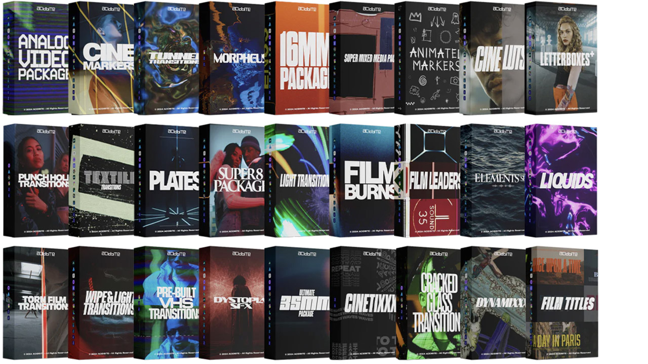
Acidbite ➔
50% off everything
ActionVFX ➔
30% off all plans and credit packs - starts 11/26

Adobe ➔
50% off all apps and plans through 11/29
aescripts ➔
25% off everything through 12/6
Affinity ➔
50% off all products

Battleaxe ➔
30% off from 11/29-12/7
Boom Library ➔
30% off Boom One, their 48,000+ file audio library
BorisFX ➔
25% off everything, 11/25-12/1
Cavalry ➔
33% off pro subscriptions (11/29 - 12/4)
FXFactory ➔
25% off with code BLACKFRIDAY until 12/3
Goodboyninja ➔
20% off everything
Happy Editing ➔
50% off with code BLACKFRIDAY
Huion ➔
Up to 50% off affordable, high-quality pen display tablets
Insydium ➔
50% off through 12/4
JangaFX ➔
30% off an indie annual license
Kitbash 3D ➔
$200 off Cargo Pro, their entire library
Knights of the Editing Table ➔
Up to 20% off Premiere Pro Extensions
Maxon ➔
25% off Maxon One, ZBrush, & Redshift - Annual Subscriptions (11/29 - 12/8)
Mode Designs ➔
Deals on premium keyboards and accessories
Motion Array ➔
10% off the Everything plan
Motion Hatch ➔
Perfect Your Pricing Toolkit - 50% off (11/29 - 12/2)

MotionVFX ➔
30% off Design/CineStudio, and PPro Resolve packs with code: BW30
Rocket Lasso ➔
50% off all plug-ins (11/29 - 12/2)
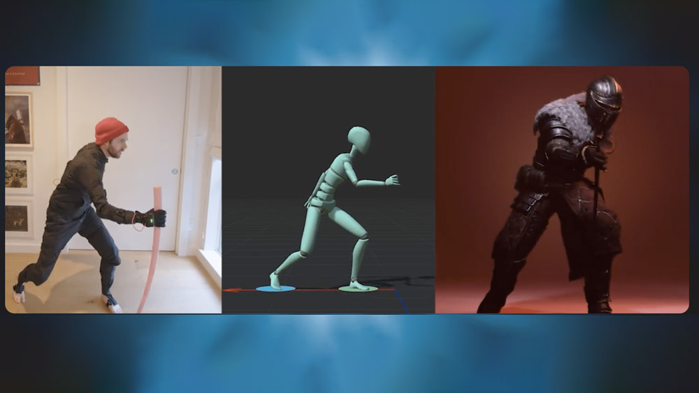
Rokoko ➔
45% off the indie creator bundle with code: RKK_SchoolOfMotion (revenue must be under $100K a year)
Shapefest ➔
80% off a Shapefest Pro annual subscription for life (11/29 - 12/2)

The Pixel Lab ➔
30% off everything
Toolfarm ➔
Various plugins and tools on sale

True Grit Texture ➔
50-70% off (starts Wednesday, runs for about a week)
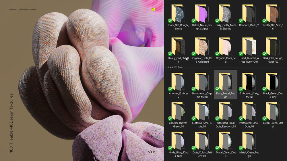
Vincent Schwenk ➔
50% discount with code RENDERSALE
Wacom ➔
Up to $120 off new tablets + deals on refurbished items
