How to Improve Your Design with Shadow.
In this tutorial, we're going to explore designing with shadows.
In this article, you'll learn:
- How shadows affect a 3D design
- What is a Gobo, and how you use it
- How shadow quality affects the render
- Using volumes to create shadows
- Using the motion of shadows to improve animation
In addition to the video, we've created a custom PDF with these tips so you never have to search for answers. Download the free file below so you can follow along, and for your future reference.
{{lead-magnet}}

As much as we need to think about lighting with area lights to improve our renders, we also need to think about crafting our shadows and acting like a DP. By flagging lights and creating interesting shadow patterns, we can guide the eye or just add detail and make it feel like there’s a larger world off camera.

Here in this recent ice scene I built, I felt that the foreground was distracting and everything had too much light, so I threw the foreground into shadow to lead the eye more naturally into the shot.

Here’s an outdoor scene with some nice strong sunlight, but just by adding an off-camera tree, we can bring in some shadows to add patterns and detail.
One of the easiest ways to create shadows is to just make a plane that’s invisible to camera with a black diffuse texture on it. In Hollywood terms, it's a Gobo.
A gobo is an object placed inside or in front of a light source to control the shape of the emitted light and its shadow.

We can also do this same kind of thing by putting an alpha channel into a plane, or if we want a light with some nice shadows then we can place a texture into the texture slot. As we scale the light down smaller and smaller, the shadows will sharpen up. Just search for gobo pattern on Google and you’ll get a ton of great results.
.gif)
We also want to pay attention to the quality of our shadows. Soft shadows happen with large sources and hard shadows are created with small sources. The sun acts like a small source because it’s so far away and takes up a very small area of the sky, but is bright enough for the light to reach us. So if you want to mimic a sunlight without using an actual sun, then you need a pretty small but very bright source.

We can also create shadows with fog volumes or VDBs, which will mimic what clouds do. Or if you can’t access those, then just some spheres high up in the scene could work as well to create patches of light and shadow.

Here’s a final example of some concert visuals I created for the Kpop group Big Bang, and all I’m doing is animating a box in front of the key light to create sweeping shadows. This brings so much visual interest to the shot.
.gif)
Shadows aren't just a byproduct of solid lighting. They can enhance your storytelling, build out your virtual world, and really improve your render. Make sure you experiment with using different lighting sizes and intensifies, gobos, and movement of shadows across your objects.
Want more?
If you're ready to step into the next level of 3D design, we've got a course that's just right for you. Introducing Lights, Camera, Render, an in-depth advanced Cinema 4D course from David Ariew.
This course will teach you all of the invaluable skills that make up the core of cinematography, helping to propel your career to the next level. You’ll not only learn how to create a high-end professional render every time by mastering cinematic concepts, but you’ll be introduced to valuable assets, tools, and best practices that are critical to creating stunning work that will wow your clients!
-----------------------------------------------------------------------------------------------------------------------------------
Tutorial Full Transcript Below 👇:
David Ariew (00:00): We're talking about lighting, no one ever focuses on the impact shadows can have on the design of your shot.
David Ariew (00:13): Hey, what's up, I'm David Ariew and I'm a 3d motion designer and educator, and I'm going to help you make your renders better. In this video, you'll learn how to use invisible planes to flag off lights and create areas of shadow. Use props to create shadows from off camera, add gobo patterns to lights, alter the quality of shadows by either choosing hard or soft shadows and create shadows with fog volumes, MPD bees. If you want more ideas to improve your vendors, make sure to grab our PDF of 10 tips in the description. Now let's get started as much as we need to think about lighting with area lights, to improve our renders. We also need to think about crafting our shadows and acting like a DP would onset by flagging lights and creating interesting shadow patterns to guide the eye or just add detail and make it feel like there's a larger world off camera. Here's one of the easiest ways to create shadows. Just make a plane. That's invisible to camera with a black texture on it.
David Ariew (01:04): Now, as you move it around, it acts like a flag to the light. So you can design your shadows more intentionally here in this recent IC nine belt, I felt that the foreground was distracting and everything had too much light. So I threw the foreground as a shadow to lead the eye more naturally into the shot. Here's an outdoor scene with some nice strong sunlight, but just by adding an off-camera tree, we can bring in some shadows to add patterns in detail and create that dappled sunlight. Look, we can also do the same kind of thing by putting an alpha channel into a plane, or if we want to add in some shadows that track with the light itself, then we can place a texture into it here in the distribution slot. And as we scale the light down smaller and smaller with surface brightness off so that the light doesn't get darker as we scale it down, we'll see the shadows sharpen up, just search for gobo pattern on Google and you'll get a ton of great results.
David Ariew (01:54): Here's a subtle example from an amazing video called memories of Australia, which was actually created an unreal engine. Notice how much life this slight shadow animation adds to the shot. We also want to pay attention to the quality of our shadows. Soft shadows happen with large sources and hard shadows are created with small sources. The sun actually acts like a small source because it's so far away and takes up a very small area of the sky, but it's bright enough for the light to reach us. So if you want to mimic a sunlight without using an actual sun, then you need a pretty small, but very bright source and an HTRI to fill the shadows more naturally here with blue bounce light, and it helps to push the light way back. So the shadows get more parallel just like the sun, or you could take a large light source and just push it very far away and make it very bright as well.
David Ariew (02:40): You can see here if we have the area like closer, we've got soft shadows, but as we move it further back and brighten it up, the shadows get much more sharp with characters like Bumble mouse here, soft shadows often look much nicer than hard ones do. We can also create shadows with fog volumes or VDBS, which will mimic what clouds do naturally, or if you don't have access to those, then just some spheres high up in the scene could work as well to create patches of light and shadow. For example, here's a fog volume I created for this mega scans macro scene. Here's the ground before and after without the patchy fog and just pure Hayes. Instead we flattened out all the light and the whole scene is in shadow. We could push the volume back to get the foreground into sunlight, but that creates too harsh of a transition.
David Ariew (03:22): But here, when we've added the patchiness to the fog, we get that dappled sunlight effect where there areas of light and shadow throughout the scene. And it's much more interesting to see God raised there. Actually another form of shadow they're just light broken up into a volume like here in this environment, I designed for a dead mouse music video. Recently I put a bunch of spheres off camera animating with a random effector, and that caused the light to break up. And these God raised to shine down onto the environment. Here's a final example of some concert visuals I created for the K-pop group, big bang. And literally all I'm doing is animating a box in front of the key light to create some sweeping shadows. This brings so much more visual interest to the shots. And here you can see the setup where it's literally just a cube. That's rotating back here to cast shadows. It's crazy. Just how putting objects in front of a light can make such a huge difference. Like keeping these tips in mind, you'll be well on your way to consistently creating awesome renders. If you want to learn more ways to improve your renders, make sure to subscribe to this channel, hit the bell icon. So you'll be notified when we drop the next tip.
ENROLL NOW!
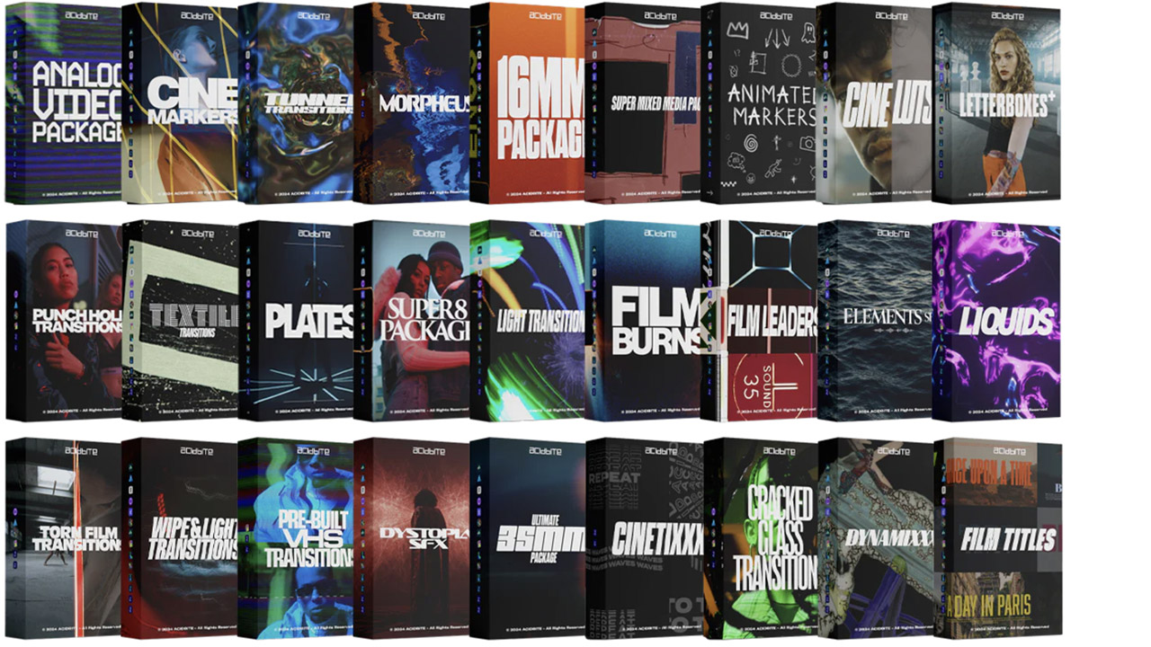
Acidbite ➔
50% off everything
ActionVFX ➔
30% off all plans and credit packs - starts 11/26

Adobe ➔
50% off all apps and plans through 11/29
aescripts ➔
25% off everything through 12/6
Affinity ➔
50% off all products

Battleaxe ➔
30% off from 11/29-12/7
Boom Library ➔
30% off Boom One, their 48,000+ file audio library
BorisFX ➔
25% off everything, 11/25-12/1
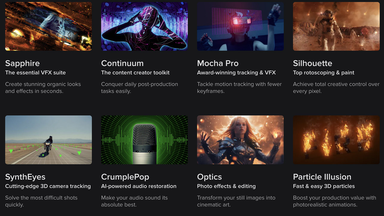
Cavalry ➔
33% off pro subscriptions (11/29 - 12/4)

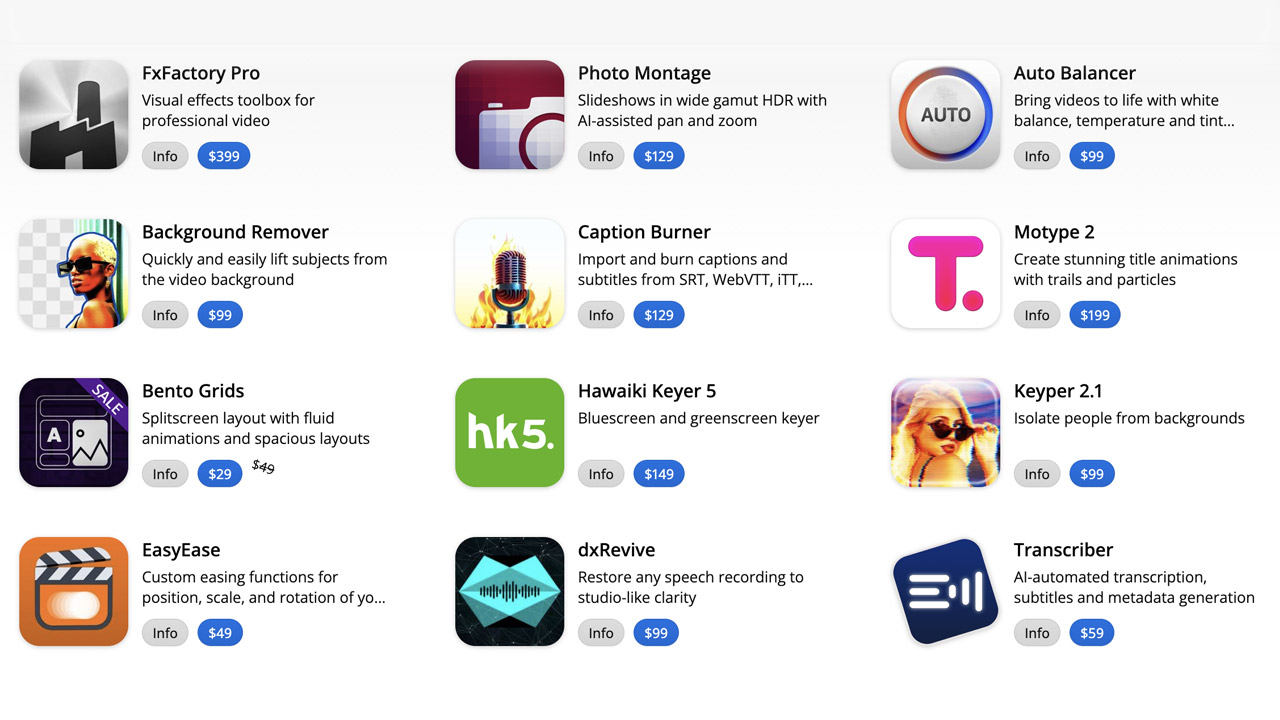
FXFactory ➔
25% off with code BLACKFRIDAY until 12/3
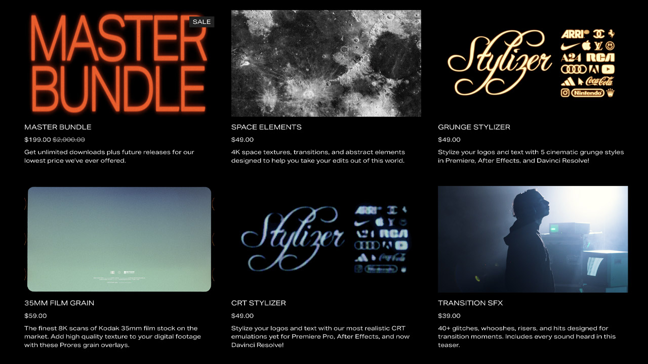
Goodboyninja ➔
20% off everything

Happy Editing ➔
50% off with code BLACKFRIDAY
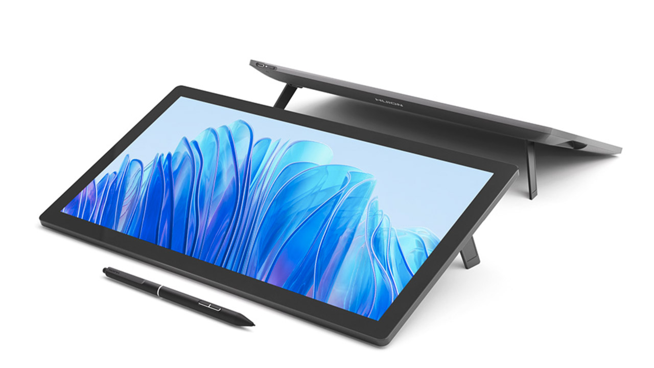
Huion ➔
Up to 50% off affordable, high-quality pen display tablets
Insydium ➔
50% off through 12/4
JangaFX ➔
30% off an indie annual license
Kitbash 3D ➔
$200 off Cargo Pro, their entire library
Knights of the Editing Table ➔
Up to 20% off Premiere Pro Extensions
Maxon ➔
25% off Maxon One, ZBrush, & Redshift - Annual Subscriptions (11/29 - 12/8)
Mode Designs ➔
Deals on premium keyboards and accessories
Motion Array ➔
10% off the Everything plan
Motion Hatch ➔
Perfect Your Pricing Toolkit - 50% off (11/29 - 12/2)

MotionVFX ➔
30% off Design/CineStudio, and PPro Resolve packs with code: BW30
Rocket Lasso ➔
50% off all plug-ins (11/29 - 12/2)
Rokoko ➔
45% off the indie creator bundle with code: RKK_SchoolOfMotion (revenue must be under $100K a year)
Shapefest ➔
80% off a Shapefest Pro annual subscription for life (11/29 - 12/2)

The Pixel Lab ➔
30% off everything
Toolfarm ➔
Various plugins and tools on sale

True Grit Texture ➔
50-70% off (starts Wednesday, runs for about a week)
Vincent Schwenk ➔
50% discount with code RENDERSALE
Wacom ➔
Up to $120 off new tablets + deals on refurbished items
