All-Access Pass
Unlimited access to 50+ courses, unlimited critique, live events, and 24/7 community. Join School of Motion All-Access today.
Is It Time To Get The BRAND Back Together?
As an animator or designer, do you have a logo? Do you have a logline? A set of colors that you use on your site, your social media handle, on – gasp – your business card? You might think all these things add up to something special, something we like to think of as a “brand,” but you wouldn’t be entirely correct. They are components of your brand, but not the sum total of that oft-misquoted and misunderstood word.

Your brand is actually your reputation, and—for better or worse—we all have one. But what happens when your rep has outrun all those aforementioned elements? Is it time to upgrade, to rebuild, to—dare we say it—REBRAND?
A good brand is a summation of who you are as a professional. It can be a single word or phrase that describes you to the world. Snickers satisfies. Nike tells us to Just Do It. Arbys has the meats. In a world full of competition, you are the only YOU out there, so how do you let everyone know?
Your brand!
We've got a HECK of a lot to talk about, and we cover most of it in this chat with the incredible team at Newfangled. You can either listen first and then read the rest, or grab a little more knowledge before plugging these geniuses into your brain holes. Either way, grab an extra large Slushy, because we're about to light your mind on fire.
Ready, Set, Refresh - Newfangled Studios
Why is your brand so important?
When you’re starting, your brand is aspirational, theoretical, almost an experiment to see if you can reach your goals. But when you’ve been at this for awhile and you know who you are, the rubber has met the road through years of trials and tribulations. Hard jobs and long nights, big victories...and perhaps a few little defeats. Teams have grown, changed, and that all-so-important reputation has found its way into your (and your clients) day-to-day lives.

And the old logo and colors you started out with? Maybe you’ve actually outgrown them. No matter how prescient you may have been at the beginning, it’s nearly impossible to see that far into your own future. When you get to that moment in your career, it can be nerve-wracking. Fortunately, we know someone that recently went through this exact thing.
The question of rebranding was recently brought up by Macaela VanderMost and the team at Newfangled Studios – one of School of Motion’s favorite studios that’s enjoying a highly successful run of late. That’s right – we said SUCCESSFUL. If you take a look a the newest work on display from Newfangled, you’ll see a hit list of the best of the best: Google, Bank of America, Disney – yes, that’s BABY YODA, and so many more.
Why would you want or need to rebrand?
But if you’re collaborating with the best and busy as heck, why exactly would you want to change your branding? The answer goes back to the idea that your Brand is your reputation. As brand expert Marty Neumeier explains:
Your Brand isn’t all the individual components we usually think of when we hear that word; your brand is a RESULT. It isn’t what YOU say it is, it’s what everyone else says.
Newfangled's output said one thing while their original brand said another. Their logo didn't feel timeless, it didn't play well in modern social media formats, and the studio's focus on diversity as a woman and LGBTQ+ owned business wasn't expressed. It was a classic brand disconnect.
Now this is where we need to dispel a few myths about rebranding; it typically signals that something isn’t working. Whether it’s an air of desperation, a timidness to turn with the times, or a wholesale change in direction—the splashiest of rebrands are often an attempt to redirect energy into something new or fresh about a company.
What's the difference between a rebrand and a refresh?
That might be why the Newfangled team prefers to call this a refresh rather than a complete rebranding. The spirit of the studio—with its focus and commitment to diversity, its wide-ranging approach to creative solutions, and its creative capability to stand in many different styles—is the same today under the new logo and website that has just launched. But there is something new...
CONFIDENCE.

Everything surrounding the launch of this new logo and site and branding has an air of cool confidence; a swagger without an air of cockiness. The kind of team that inspires a client because they know they will get a solution with classic, assured vibe.
Newfangled's IG Rollout
If you want to learn more about how the team approached this oh-so-important task—including the involvement of the prolific studio brand expert Stephen Kelleher (mastermind behind Gunner and Hobbes brand design!)—take a listen to our podcast now.
Show Notes
ARTISTS
STUDIOS
Transcript
Ryan Summers:
Motioneers, how do you know when your logo has gotten a little too old? When do you know that you need a rebrand?
Ryan Summers:
Now, that's a very loaded word. And a lot of us haven't really been through this process before, whether you're a freelancer, you work for a studio, or you on your own studio, figuring out how to present yourself to the world, to your clients, to your peers, to potential hires. It's one of the toughest questions we can face as motion designers.
Ryan Summers:
And I always find it kind of funny because we're asked to solve that problem for our clients every single day. But we have to do it for ourselves, it can be really difficult.
Ryan Summers:
That's why today Motioneers, I'm bringing in Macaela VanderMost and Stephen Kelleher to talk about how they teamed up to figure out how to, let's call it, refresh, Newfangled Studios, logo and brand to the world. We're in for a treat. So, sit tight, buckle up. Let's learn a little bit about branding.
Ignacio:
I want to give a great, great thank you to all people that are working in School of Motion. I feel much more secure, stronger in my designs, and I know how to do what I want to do and how to make it happen. Thank you, all you guys. Thank you to my TA, DJ Summit. Yeah, my name is Ignacio, and I'm a School of Motion alumni.
Ryan Summers:
Macaela, I just want to start this off by talking about where Newfangled came from and how you approach this idea of needing a new logo and a refresh. Because the studio itself is not in a typical kind of scenario that you find a student looking for a rebrand or refresh. And normally, it's a studio in trouble or it's a studio that's in a huge change, probably like personnel have changed or an owner has left.
Ryan Summers:
So, Macaela, I have to ask, why is now the time to refresh your branding for the entire studio when you're very successful?
Macaela VanderMost:
So, a lot of people are asking, why are you doing this? Because we're definitely the busiest and most successful that we've ever been. And so, why take the time and spend the money and the effort to refresh our look?
Macaela VanderMost:
And I think the short answer is that the old brand wasn't reflecting the quality of work and the confidence that we have now. But the longer answer is that at our core, we're still Newfangled. Our name is still Newfangled. We'll still stand behind the meaning of that word, which is going about things in a uniquely different way. That's what I set out to do 12 years ago, that's what we're still doing today.
Macaela VanderMost:
But we know who we are now much more than we used to. And so, we really believe in the power of design. And we want it to go through a very deliberate process to communicate what we stand for, crystallize who we are, and really make it clear what we bring to the table as a diverse company.
Macaela VanderMost:
And so, we're just more confident now than we ever have been before. And so, I feel like it's that moment for us where we're very confident, we can kind of raise our glass and make a toast and say this is who we are. And we want our logo, color palette and overall brand to really reflect that confidence that we're feeling in this moment.
Ryan Summers:
Can you tell me a little bit because I've always really liked the Newfangled logo. Can you tell me how that was created before we go into creating this new kind of rebrand, refresh?
Macaela VanderMost:
So, the old logo, we came up with the name, Newfangled. Newfangled basically means distinctly different or a different way of going about things. A lot of people use it as a negative connotation, like all Newfangled technology, but we sort of liked taking ownership of that word and saying "No, we want to do things in a new and different way." And so, the company was built on that and that remains. We're still Newfangled. We still stand behind the meaning of that word today.
Macaela VanderMost:
But when we originally branded, I wanted to go more of like a nostalgic route. And so, it kind of has that baseball old school lettering to it. And it was supposed to kind of be a throw to the negative connotation of that word, like almost a little sarcasm.
Macaela VanderMost:
And at the time, the studio was it was me and my wife, we started together. It was just us. I worked with a designer, Matt Naboshek, a long time ago. And at the time, that was a really cool fresh logo that had meaning to me to the extent of what I knew Newfangled was at the time, which is just a cool studio that was going to do things in a new and different way, and just kind of blaze our own trail. And that was the extent of the logo.
Macaela VanderMost:
It also had a little hat and a mustache, that was really cool back then. And the hat really symbolized one person taking on multiple things. Because one time, I was just kind of me and my wife, and some interns. And that left our brand identity quite some time ago because it just didn't really feel applicable anymore. And we dropped that and just the Newfangled piece. So, we're just not that same company anymore.
Ryan Summers:
But that's pretty amazing to have an identity and just a design that's supposed to signify a studio. Like you said that you didn't even fully understand exactly where the studio was going to go over the course of 10 years. But for it to last that long is a pretty impressive kind of mark of just the work that was done then.
Ryan Summers:
Was there a specific moment or a specific incident that triggered you into wanting to kind of take a look at this or was it just kind of like a slow gradation over time where you look at your business card, or you look at your website, and it eventually was like, okay, now's the time?
Macaela VanderMost:
There were some very technical things. The logo was built at a time where the world was not digital first. It was a broadcast world we were living in. And the logo was long and skinny and fits beautifully in a 16 by 9 frame. It doesn't fit in a square. It doesn't fit in a 9 by 16.
Macaela VanderMost:
So, there are just some very sort of technical when you scale it down really small, it doesn't read as well. And all of that was because it was built at a time where things went on to a TV, where you looked at things large and you looked at things 16 by 9. So, those are some of the technical reasons.
Macaela VanderMost:
But then there were the emotional reasons to do with the pride that we have in our studio. And that when the studio was built, it was myself and Jenna. And it grew to be much larger than me. And I brought on people who are so much more talented than I could ever hope to be. And they weren't feeling the pride in that logo.
Macaela VanderMost:
And so, there was two years ago, Cory, who's head of design at Newfangled brought me a whole deck. He made a whole deck on the reasons that the logo didn't work. And I took it as a personal attack. And so, then it just became a running joke of the time that Cory made a PowerPoint about how much he hates me.
Macaela VanderMost:
Because it's your company mark just feels so personal. It feels like your clothing or your own personal style. It feels like your haircut. And so, I think I was blinded for a long time that it wasn't working anymore. And I needed to have outside players who I trusted tell me that this isn't working Macaela. And then it took me a very long time, like years to come around to it.
Ryan Summers:
I was going to ask if it was hard for the team to consider moving away from the old brand.
Macaela VanderMost:
No.
Ryan Summers:
But it sounds like it was harder for you.
Macaela VanderMost:
It was me. It was me and Jenna. I mean, it's our baby.
Ryan Summers:
Exactly. Yeah, no, you can't change your first kid's first name after he's been born.
Macaela VanderMost:
Yeah.
Ryan Summers:
So, you make this decision. It sounds like you have your team's full approval and kind of momentum behind this. But then making the decisions one thing, but then deciding how to approach it's a whole other thing.
Ryan Summers:
And I would assume the first instinct is you have a team full of wonderful designers that you know and trust, and then also probably intimately know the brand as good as anyone else could. How do you make the decision to once again reach out and find a new designer rather than working with someone internally? And then how did you find Stephen?
Macaela VanderMost:
Well, first of all, part of it was practical. I mean, we're slammed. We are the busiest we have ever been. We never have any downtime at all. So, our brand is the first thing to get neglected, which isn't cool. We shouldn't neglect our own brand. Part of it was just I wasn't willing to give up my internal resources, who I needed working a client work to do our brand.
Macaela VanderMost:
And then the other part of it is just to have respect for the craft. I do have designers and illustrators on staff, but we make motion graphics or we make ads for digital platforms. We're not a branding studio. And I have a tremendous amount of respect for what Stephen does. It is his specialty.
Macaela VanderMost:
So, I think it was a combination of not having the time and resources to do it ourselves, wanting that expertise and also wanting that outside opinion because I think I needed someone who didn't have an emotional attachment and baggage with the brand to come at it fresh and say like, "I'm an expert. This is what I do. This is what I think."
Macaela VanderMost:
And there couldn't have been a better fit than Stephen. He redesigns studios. I mean that is what he does. He designs and redesigns studios. So, it's not just that he's a branding guy and he does soda and cars and also maybe a studio like no, that's what he does. I have followed him on Instagram for a long time. I have no idea where I found him. I've just always kind of known of him. He's someone in the industry that people know who he is.
Macaela VanderMost:
And if I were going to hand over the keys to my brand and also pay a decent amount of money to get it done, I wanted to make sure that I was working with somebody who I really had a tremendous amount of respect for. And so, when it came time, when I said, "All right, fine, I'll do it," I didn't talk to any other designers. I knew I wanted Stephen to do my brand.
Ryan Summers:
So, Stephen, once you got this call, how did you feel about Newfangled? Looking at their work, looking at their brand, looking at their logo mark, what did you feel was working or maybe not even working about what you were going to start looking at improving?
Stephen Kelleher:
Well, I mean, Macaela reached out and straight off the bat kind of outlined clearly what she felt wasn't working. When I had a look at their website, I could straightaway see why she had those concerns, some of them technical, but also it did seem a bit dated. It seemed a bit not on a par with where their work was. So, she said as much. I readily agreed that that was visibly the case. And we kind of took it from there.
Ryan Summers:
So, when you're about to move forward now, though, you reach out to Stephen, what's the first conversation like? Did you put together a brief? Did you just have a nice long phone call? Did you send them the all the files you had of the old brand? How did you approach that first kind of engagement with someone like this?
Macaela VanderMost:
Well, it's funny because I came to it like I was going to have this whole process. And it was like I was going to walk him through the process. [inaudible 00:11:47] that's how I usually come to the table at these kind of engagements. That's my role in it. And he very nicely in his cool way put me in my place and said, "This is the process."
Macaela VanderMost:
So, yes, my team had Shawn Peters, who's creative director, and he primarily focus on copy. He had put together an entire deck. We had a committee to really define what we love about our brands, what we feel needs to change, who we are, what words we would use to describe our perfect logo. We have this whole rich PowerPoint deck that we put a lot of time in. And we even had a poll go out to the whole company with different questions, like which words would you associate with this, so that we're really getting the diverse perspective of the whole team.
Macaela VanderMost:
And we felt like we came to the table pretty prepared. But Stephen kicked it back to us and said, "This is what I need from you. I need you to fill out this questionnaire." And the questionnaire is apparently his standard questionnaire. And it's a lot of things like if you were to pick three and only three adjectives to describe your logo mark, what would it be? Like practical things, we're going to use this logo, how you're going to use it? If you were to pick an emotion behind it, what's the emotion behind it?
Macaela VanderMost:
So, a lot of it we kind of hearkens back to those original materials that we had done with our team and sort of reframed it. And then, what we found ourselves doing a lot of times to see, but he'd say pick two adjectives. And I would say, "Fine, here's your two adjectives." But I also have to say, "Here's 10 things that it's not."
Ryan Summers:
Right, right.
Macaela VanderMost:
So, there was a moment in there where it was like, we're confident, but we're not egotistical or cocky. We're creative, but we're not goofy or silly. We're friendly and welcoming and inclusive. But we're not kind of like dorky and overly friendly in a dorky way. Because we wanted to make sure that we were really clear in what we were trying to define.
Macaela VanderMost:
So, I think that process that we went through as a team with our, I call them my rebrand rider dyes. And it was like my lead producer, two creative directors, Jenna, who's been there from the beginning and just a smaller group of people who intimately know the brand and also whose decisions like design decisions I really trust was on the committee.
Macaela VanderMost:
And then we, like I said, when I brought it out to the larger group and told them what we were thinking and asked a lot of questions to make sure that with a smaller group was thinking was also sort of aligned with what the larger group was thinking, and it was spot on.
Ryan Summers:
That's amazing. He's finally the perfect client, Macaela. I can't tell you how many times I've asked clients like, tell me what this isn't going to be because that normally is the easier question.
Macaela VanderMost:
He didn't want to hear that. Stephen didn't want to hear what ... He's like "No, I need you to tell me what it is." But it isn't this.
Ryan Summers:
That's great. So, when you approach something like this, there's a lot of different factors to consider. And I think a lot of times, most motion designers just think, "Oh, I need to rebrand, that means I need a new logo." And I think it's so much more than that.
Ryan Summers:
But from your perspective, as somebody who's kind of specialized that looking at a studio and seeing where their strengths are, and maybe what their weaknesses, and where the spirit of the studio isn't matching up, what does a refresh or rebrand look like from your perspective, from a designer's perspective?
Stephen Kelleher:
Yeah, I think broadly, you can kind of categorize these refreshes or rebrand into, yeah, there's two categories, really. It's either like an evolutionary thing or a revolutionary thing.
Stephen Kelleher:
And evolutionary would be if things are functioning, but they need to be improved tactically. Broadly, that's how you might classify that. And that would be an attempt to try and keep as much equity of their identity as possible and updated-ish or modify-ish, so that you don't lose that equity, but you're also giving it a newness. And then the revolutionary way of rebranding or refreshing would be to literally start fresh.
Stephen Kelleher:
So, broadly speaking, when you look at a company that wants to refresh, you kind of try and categorize which of those two buckets you're going to be in. And from there, my studio has a definite process that we go through in order to kind of maximize the value for money and in the time we have allotted.
Stephen Kelleher:
So, we kind of worked through that, talk through it, agree to it, work through it. And it's a pretty refined, well-honed process at the moment. So, there's stages to it. There's sign offs to it. And most importantly, it's important that the client, we're walking through things and agreeing to things and every step of the way that we're building upward and forward, and we don't regress.
Stephen Kelleher:
So, I'm sure, Macaela will attest to this. It's very much a partnership. And I think that there's a mutual trust and established from the outset is crucial just for the work to get done, and especially if you're trying to create something very good and exceptional.
Ryan Summers:
I'd love to ask you, Macaela. What was it like being on the other side of the desk, so to speak? You probably have your own set of instincts and procedures, like Stephen was talking about when you're working for a client. But in this situation, you're essentially the client. What was that like being on the other side where also you're a designer? Where does that relationship with Stephen start off, and then, how does it grow throughout that process?
Macaela VanderMost:
I think one thing that I've learned from working with a lot of clients is a lot of times work can get watered down because sometimes clients don't have the confidence to write a brief, stick to the brief and not backpedal when things start to get a little bit more bold than they thought.
Macaela VanderMost:
And that's not all clients, some clients. But I went into this with the very firm intention that I was not going to do that. I find Stephen to be an exceptionally talented designer. I loved his work and that's why I hired him.
Macaela VanderMost:
So, I even wrote a little affirmation about letting the experts do their job. I worked very hard on a brief and made sure that I came to a consensus with my team of what we're looking to do. And then I stuck to it. And if I started going off brief, which I'm human, I did a few times, Stephen would remind me of the brief, and I'd say, "You're right, you're right."
Macaela VanderMost:
So, I think you just need to remember that you hired an expert, so that you could get expert advice. And if you end up just making all the calls yourself, you may as well just have hired somebody who knows Photoshop.
Macaela VanderMost:
So, that's basically what it comes down to. As I know when my clients hire me for a reason, I want them to listen to me and have that be a mutual partnership. And I treated Stephen with that same respect, or I think I did, Stephen, I tried to anyway.
Ryan Summers:
Did she, Stephen?
Stephen Kelleher:
100%. And I think this was a particularly great example of the best possible outcome. I mean, I've worked with quite a few design studios or animation studios, and I'm always very cognizant that you're dealing with people who are a bare minimum visually sophisticated and very often have teams of very talented people, designers working with them, too.
Stephen Kelleher:
And so, it's kind of a double-edged sword because you know that they have their own visual opinions on things that can also be very helpful. It can be a hindrance. But like I say, the main thing is that there's a mutual trust happening.
Stephen Kelleher:
And when there is and you have a client who's a visually astute person, it actually is the best outcome because it will bring you to places that you wouldn't have done yourself. And it's a collaborative process that actually ends up greater than the sum of its parts.
Stephen Kelleher:
That's definitely in my opinion had this turned out and a large part of that was due to Macaela being respectful of my opinions, but also not being shy with her own ideas. And yeah, it was very fruitful and ideal in my mind how it turned out. Yeah.
Ryan Summers:
Let's get into kind of the nuts and bolts of this because there's so much I'm really interested in. Especially because we're talking about a study that was successful, when you looked at the existing brand and the existing website and the logo, and then kind of stared at the brief that Macaela carefully put together, what were the hallmarks of the things that you were trying to protect or ensure that they still existed in all of your new work? And was there anything that you knew right off the bat after having looked at all this and evaluated that you saw as a place that you could elevate or push or refine?
Stephen Kelleher:
Well, I think Macaela was very clear from the outset. Although I did explore some things that I tried to retain some of the equity that had been there before, certain iterations, there was one iteration that had like a bowler hat. And I definitely tried to advocate for trying to retain some link with the past, but Macaela was very clear about her wanting to push into the future and have very much of a fresh take on their studio.
Stephen Kelleher:
I think that was because unlike a lot of companies who maybe feel like an identity, a rebrand, refresh will kind of boost their business. First of all, that's not really the case. An identity, that's exactly what it is. It's purely a logo, it's purely identification.
Stephen Kelleher:
But I think, Macaela, the concept behind this was that they're a very successful business. And it was simply that their current identity wasn't reflective of who they were, their standard of work, where they'd grown to. And therefore, that was the justification for kind of leaving the past behind and kind of putting a new flag in the ground and starting fresh.
Stephen Kelleher:
I think it's very often the case where a business will be fine with kind of a not so great identity let's say, because the business very often doesn't rely heavily on that. Businesses that do heavily rely on that might be businesses that are very shelf aware. They need to compete visually on a shelf to be successful, in terms of their branding.
Stephen Kelleher:
But Newfangled was a very viable business busy. And in fact, it was almost a testament to how busy and successful they were at that it took X amount of years to actually look at their identity and go, "You know what, maybe we have time to look around and tweak this."
Stephen Kelleher:
So, from my point of view, it's very understandable why they were, where they were, and also why they wanted to kind of pivot into a totally new feeling and direction.
Ryan Summers:
Macaela, describe the logo to me because it has a lot of different interesting elements that add up to something that's very unique for our industry. But I have a feeling that there's a lot more under the surface that means a lot to the people of Newfangled.
Macaela VanderMost:
So, okay, so this is the podcast. I want everybody to close your eyes. Picture a lowercase N that's really kind of stretched out in the cadence of a rainbow. And then in the middle of it, there's a sparkle. And so, it sort of looks like an eye with the sparkle as the pupil. Okay, so that's the overall mark.
Macaela VanderMost:
Now, what that means to someone who is outside of Newfangled, like a client or just somebody looking at the mark, it really is supposed to say newness. Obviously, it's the letter N for Newfangled. There's a sparkle in the eye. It's about being a member of that audience and bringing in sort of that wow factor, like you look at our work, and there's a wow factor, there's a sparkle there.
Macaela VanderMost:
But then under the logo itself is really something that embodies our values and sort of who we are internally. So, the N is also sort of in the shape of a rainbow, which we have a lot of values as it pertains to diversity and inclusion. And then the star itself, each point of the star represents a different point of our moral compass.
Macaela VanderMost:
And then we decided to make it a lowercase N, sort of very intentionally because we are very confident, it's a wide set lowercase N. You couldn't knock it over. But we want to own that. We're a boutique agency. We're small. We're focused. And we don't have a big ego, but we stand very strong and unwavering in our commitment to embodying the principles reflected in that north star.
Macaela VanderMost:
So, there's definitely two sides to the coin, where it's if I were to just take a glance at it kind of looks like an eye with sparkly pupil, which is like, yeah, that's newness. But then under the ... It's an onion of a logo because there's so much nuance to what it actually means to us and who we are as a company.
Macaela VanderMost:
And then when you blow it out into the palette, we really wanted to use color and font choices to make the brand feel friendly, inclusive. And so, our palette is blue and pink, and black and white, which feel like the furthest ends of the spectrum for both race and gender identity.
Macaela VanderMost:
And so, pulling back on that and just sort of a less is more and just showing either extreme of the palette really sort of helped solidify that we're very inclusive shop and how much that means to us.
Ryan Summers:
I love that. I mean, I think it's so rare for a logo to be anything more than just cool. And I feel like even when you're out in the world talking about your studio, talking about your new work, having those layers sometimes can come in so handy. When you're just sitting in the room waiting for a meeting to start, somebody asks something about like, "Well, why is the logo an N? Or why is it that eye-"
Macaela VanderMost:
Do you have an hour? Do you have two hours? I'll explain it to you.
Ryan Summers:
I feel like it's one of those great little tools that you can always rely on like you just mentioned that there's confidence now in the studio. Having that is just a little bit of confidence that can give you that little edge when you're talking, you're just kind of waiting for the meeting to begin, or you're somebody flipping through a book and another person's looking at the logo. I just love that there's so many tools within what looks like a fairly innocent innocuous logo.
Macaela VanderMost:
Yeah. And the fact that I was able to cram all that into a logo, because I had such an exceptional designer working on it, I think it's going to give everybody else false hope that you can get so much meaning into a mark because I can't tell you how many times Stephen said to me, "This is a mark. It is to identify your company. It is not to write the history books of everything you ever felt about your company." But you know what? It kind of did. And that's the amazing thing about it.
Ryan Summers:
I have to ask you the hard question, Stephen, because I think this is something that a lot of designers struggle with. But when I looked at it, I was really impressed by how it felt classic and it felt timeless. But it didn't feel nostalgic. I could see hints and pieces of maybe references, but it felt way more than the sum of its parts it.
Ryan Summers:
Do you have any methodology towards making something feel that way, like feel something that it's not that hard to make something feel classic and be able to know where it came from? And it's just kind of pulling something out from the graveyard and resurrecting it and sticking on someone's product or studio and hoping it gels.
Ryan Summers:
But this does something so much more than that. I mean, we have a lot of unique parts, right? You have the lowercase N, you have the star. There are all those different elements. But altogether, it just has this really fresh feeling that it doesn't feel safe, it doesn't feel rounded off, it doesn't feel like I said nostalgic or old. How did you accomplish that? Because I think that's something a lot of designers want to achieve. But there's no good way, no process to start in that kind of quest for that look.
Stephen Kelleher:
Well, that's very flattering. I appreciate you saying that. I'm a fan of modernism. And I think the reason why I have an approach, which is based around modernist principles is that it's been shown to work and shown to last.
Stephen Kelleher:
And when creating an identity not only for the client in the immediate present with their needs, but you want to make something that's done once and done right, and that can last forever. So, I always feel like the modernist principles of reduction and simplicity are something to abide by and try and embody in the work that I make.
Stephen Kelleher:
So, I think this is a good example of that. There's nothing extraneous from the design. And in terms of my process, and how to get here, I mean, I have a whole library have reference books of some of the best work that's ever been made that I always look at in a cautious way, hopefully not to be influenced, but also to try and elevate the work that I'm making to that standard. But also, to ensure that I'm not doing something that hasn't been done before.
Stephen Kelleher:
And that's one of the biggest tasks that I personally face when trying to create a mark that's very simple, but ownable. It's very hard to find something that with simple geometry hasn't been done before or isn't reminiscent of something that somebody else has seen before.
Stephen Kelleher:
And certainly, when I present work, when I presented this work with Macaela, there was a bunch of iterations where the reaction immediately is like, "Oh, that reminds me of this. This reminds me of that." With this particular one, I think Macaela noted it reminded of an element of a certain football team. And I think that it's my job to articulate maybe why that isn't a worry and that isn't concerning. And that in fact, there's no link between these two things.
Stephen Kelleher:
So, all of that is to say I do have a pretty rigorous process and it is all aimed towards the client's benefit. Again, it's like you just hope that the client trusts that you're doing due diligence in all these areas.
Ryan Summers:
One of the things that I'm most impressed by Newfangled since I ran into them, even doing my demo reel dash course, Newfangled is one of the first studios I want to talk about.
Ryan Summers:
The diversity that Newfangled expresses in their styles, the diversity in clients, and type of work you take on, but really more than anything, the focus diversity just in the world in terms of what this industry means going forward, both on the client side and from the artist side, that is a hallmark of focus of I'm assuming Macaela's kind of emotional direction in this industry.
Ryan Summers:
But how do you take all those things and actually also integrate it into the brand and to the logo that I'm assuming you want to have it stand for a long time, how do you feel even something like that into the brand itself?
Stephen Kelleher:
That speaks I think to a little bit later in the process after we have a mark that's saying primarily what it needs to say for the business.
Stephen Kelleher:
I always try and really clearly differentiate, let's say, what a logo can do and what branding could do. Like I say, a logo is simply identification. The branding can speak to all of the things that you want to impart and the kind of empathy and relationship you want to build up with its viewers or your clients and stuff like that.
Stephen Kelleher:
So, when talking to Macaela, yeah, it was very clear that diversity and that the identity of the origins of the studio and their interest as a studio, and the people who make up the studio was reflected in some way.
Stephen Kelleher:
And in this particular case, we looked to coloring to reflect that. It was actually a little bit later in the process when we got to different kind of color palettes, and we tried a bunch of things. And what made logical sense to reflect their studio's diversity was to use a combination of colors.
Stephen Kelleher:
And in this case, it was black and white, which are opposites and include the whole spectrum of shades, and then blue and pink, which historically have connotation towards gender. And so, it was a balance of those four colors that seem most appropriate to the studio itself and their ethos and their identity.
Ryan Summers:
I think that's great. It's such a unique choice of colors because it says so much about the diversity kind of focus without having to shout it.
Ryan Summers:
At the same time, I feel right now, we're in an industry where, Macaela, I don't know, if you feel this way, but it's very white male, 40 something dominated. And there are a lot of studios scrambling to appear diverse. It feels like those studios are shouting it and it feels like it's temporary. It feels ephemeral. It doesn't feel very authentic.
Ryan Summers:
So, I really appreciate the fact that it's integrated at the core. But it's not something that's the first thing when you walk in the door, it's screaming to you out loud. Do you have any opinions on how Stephen was able to integrate that into the brand so naturally?
Macaela VanderMost:
I will say that there was one piece of that that was sort of a really beautiful, I don't want to say mistake, but it was just something that was uncovered in the process, which was when I saw that logo, when I got to tell you, there was four million logos and Google Slides presentation. And I said that stopped me in my tracks.
Macaela VanderMost:
And part of the reason was that lowercase N looks like a rainbow to me. And that's not necessarily something we briefed in. I didn't say I want it to make it the gay pride flag or something, but that it reflected the rainbow in its shape, but also reflected back that it's the audience and the newness in their eye made me really feel like it aligned with the diversity of audiences that we serve, and then the diversity within our team.
Macaela VanderMost:
And me being a member of the gay community, obviously, rainbow has a certain connotation to me. But a rainbow just means all different types of things coming together, all different types of people coming together. So, that was something that sort of was like just that little magical moment that was unintended. And when it happened, it was like, "Oh, yeah, let's lean into that."
Macaela VanderMost:
And the color piece was part of it. I feel he was really nice. And whenever I had an idea, even if it was bad, he would just show me that it was bad, instead of telling me it was bad. We might make a little face, but then he would show me it was bad.
Macaela VanderMost:
And one of the ideas that I had is I wanted the palette to feel like different skin tones. I was like, "Oh, what if we had like this a pale pink. And then we had a really dark brown. And we had all these different skin tones. And it could feel like it's so inclusive."
Macaela VanderMost:
And he showed it to me and I thought, wow, that looks like I'm trying too hard in being inauthentic. And we're not a minority-owned company. We're an LGBT and women-owned company. And I want to be inclusive, but also be authentic to who I am.
Macaela VanderMost:
And so, in more discussion actually, what Stephen helped me to understand that I didn't come to the table with myself is that showing restraint with what you're selecting can sometimes say more than trying to throw the entire rainbow at it. So, I kind of came at it with like, "No, we have to include everyone and to feel like everyone needs to see themselves in it."
Macaela VanderMost:
And Stephen, in his very quiet way, helped me understand as well as I got to give credit to Cory, one of my creative directors that he really understood the value of restraint, and selecting those things that had an opposite nature to them, and letting our audience kind of fill in the blanks felt more powerful than trying to throw everything at it. And the palette is very limited and that's really intentional.
Ryan Summers:
I think it looks beautiful. I love the experience of as soon as you get put in the client seat, especially as a creative, you almost always because you're the one who's trying to express restraint or express kind of approaching things in a safe way but a directed way that your initial instinct was like more, let's get more in there, let's put ... It's so funny that it's such a great reminder to anyone out there that sometimes putting on the client hat actually really helps you empathize going forward, having that experience is a good reminder.
Ryan Summers:
You mentioned the millions of iterations, and I've seen a sneak peek at some of the work that you've done, Stephen. But just as a designer, as someone who's thinking through this, how do you manage that wide range of iterations? There were so many variations. And when someone points out a really great idea, like, "Oh, that N looks like a rainbow." Do you take credit for it? Do you smile and sit back? Like, oh, I meant it to be a rainbow or do you just take the compliment move forward?
Stephen Kelleher:
That is a great example of a fortunate kind of happenstance. Because the rainbow, although I clearly can see it, was not the intent behind it. But in terms of creating the wide variety of options, I mean, even just in the sketch phase, that's why the first week of an identity project, I kind of go dark because there's so much work that needs to be done. And it's mostly in just getting things on paper and seeing that you've tried everything in your mind that's super crucial.
Stephen Kelleher:
And then, maybe you've done hundreds of little doodles and sketches or ideas, and then you're going to pick out maybe the best five out of them. So, it's just a matter of due diligence that you're always you just need to constantly draw for days and days and make sure that you're not leaving any rock unturned.
Stephen Kelleher:
And then at least at that point, you can go with some degree of confidence to the client and say, "Okay, look, I've tried everything I can think of, and this is the best solutions that I could recommend at this point in the process."
Stephen Kelleher:
And you got to make sure you're doing that so that they can feel confident in you and that you can feel confident that you have tried things that you really have explored what needs to be explored.
Stephen Kelleher:
And sometimes it's the case that the first thing you draw will be the best idea. Sometimes it's the case that after three or four days when you're exhausted and you can't think of anything else, you'll wake up that night with the one.
Stephen Kelleher:
So, it's like there's no rhyme or reason to it. It's everyone who's involved in the creative profession can attest to just the mystery of where ideas come from. But there's no doubt that you got to put in the work to get there.
Stephen Kelleher:
So, you just got to keep drawing and keep drawing. And I certainly didn't show Macaela and her team all of these sketches at all. And like I say, I would just present the ones that I thought were successful. But I guess, yeah, in hindsight, you look back and go, "That's a lot of Ns. It's lot of letter Ns," but needs to be done. Yeah.
Ryan Summers:
Yeah, I feel like, there's definitely a time when I was directing multiple jobs at the same time that I wish I had an independent observer that could just track the development of anything and see where everybody agreed on something and how that kind of spiderweb to the next revelation and the next revelation, all in the hopes of trying to make those processes more efficient.
Ryan Summers:
But no matter what, like you said, if you got it right at the beginning, you wouldn't have known that until you did a bunch and then looked back. And if you didn't get right at the beginning, you've had to do all those, the magic bullet always ends up being you just have to do the work. At some point, there's no physically smaller unit of energy that you can consume. You just have to put the time in and get the buy in from the client at the same time.
Stephen Kelleher:
Truly. And that's why I think it's super crucial that the work that you do do is something that you actually really enjoy because it will require your time and your life force. So, I love doing this work. And it can be frustrating at times, but a lot less frustrating than any other job I've ever had. So, it's a pleasure really.
Ryan Summers:
Well, and when it's done right, probably one of the truly more frustrating aspects of working in this industry in motion design is how ephemeral most of our work is that it can take three times longer to make something than it actually lives. There's not much work in our industry that people stand back and be like 10 years later say, "Oh, that was the defining thing of that type of work." But the work you do, if done well and if it's done in accordance with the studio and the client's needs, it's probably one of the more permanent types of work you could do in our industry.
Stephen Kelleher:
Yeah. It's actually a reason why I kind of pivoted into this area. I was in motion design for maybe 15 years. So, I definitely could see exactly what you're talking about. And the other side of that though with motion work is you have a lot more freedom I think to explore and express and try new things and fun things. And that's why I got into motion design back in 2003, when I did.
Stephen Kelleher:
So, there's pros and cons to both things. But I definitely do want to think that I'd like to think that somebody saw the work, let's say, that I created for Newfangled as a mark on a piece of paper or on a screen in 50 years' time that it would be hard to place time wise or that it would still look maybe fresh as it does now. So, that's the goal.
Ryan Summers:
I got a sneak peek at some of the materials. And I've seen some of the amazing, the extensive kind of work process that Stephen went through. And I saw a couple times of mentions of the just the Newfangled northstar as a concept, which in the end if you look at the blog post and see the examples, that is very well evoked in the final kind of brand, but can you just talk a little bit about what the Newfangled north star is to you and your company?
Macaela VanderMost:
Sure. So, the north star, if you think about the coin with two sides, so one side is sort of what we bring to the clients into our audience. And then the other side is more like inward facing, and it's about the morals and values of our team and what it means to be a Newfangled talent on the Newfangled team. And there's four points to the star. One point is respectful partnerships. And then the other point that's opposite that is growth potential.
Macaela VanderMost:
So, the idea of the points being opposite each other is that there's sort of like a push-pull in any relationship. And you want to have respectful partnerships, not only with the people within your team, respecting their boundaries, their expertise, their work-life balance, but then also having seat at the table partnerships with your client, where it really feels like you're an extension of their teams. That's what respectful partnerships about.
Macaela VanderMost:
And then on the sort of the opposite side of that is the growth potential. So, we want to grow as a company both in how we can impact our client's brands and how we can just do cool stuff like grow as artists. And I don't mean that in the literal sense of the word. I'm not trying to be some big studio. I like being a boutique studio.
Macaela VanderMost:
But growth and that we're always making for progress, and that could be a push-pull. You want to push the envelope. You want to always be doing the next cool thing, but you also want to be respectful to your clients and go the extra mile for them. So, that's that push-pull.
Macaela VanderMost:
And then, the other one is the top and the bottom of the star, our business results and engaging creative. Engaging creative is the very top of the star. We want to produce jaw dropping creative that's best in class, inspiring, and I just want to watch and engage with, but foundationally at the bottom of the star is business results. So, it seems simple, but this can get lost.
Macaela VanderMost:
So, among a lot of creatives is that we don't want to just produce simply the most visually impressive work. We want to keep business results at the foundation of all of the work that we're doing because ultimately, that's why our clients are coming to us.
Macaela VanderMost:
And so, on the client side of the coin, it's making sure that we hit their business goals and that we're producing something for them that's going to do something for their business. But then for us, too, it's also business results because that's what sets us apart from other creative shops. And that creates more and more business results for us.
Macaela VanderMost:
So, there's basically the four points at the star, they have push-pull, and each one of them has a dual meaning whether you're on the team or whether your client.
Ryan Summers:
Man, I almost feel like I could stand up and give you a standing ovation having been at multiple studios, big name studios, high profile studios that struggled, having been with them both when they've gone through rebranding, rebuilding websites, relaunching themselves out into the world. They don't have that clear of an idea of who they are, their reason for being, their goals for the future. And it certainly is not evoked in their actual logo or in their brand or in their website at the end.
Ryan Summers:
Was that something that you developed over time from the moment you opened, when it was just you and your wife? How long did it take for you to kind of like develop this idea of the north star? Because I think that it's probably something that was incredibly powerful for Stephen to consider visually, but I just feel like as a business, that's so rare to run to someone that understands that much about their day-to-day work and their future.
Macaela VanderMost:
Well, that's kind of the beauty of overhauling your brand when you're 12 years old and having a great deal of success and momentum is you know who you are at that point. Whereas at the beginning of my journey, I didn't really know who we were yet. I had an idea, but we had to figure it out.
Macaela VanderMost:
So, how long did the north star take to develop? It's probably over the last year that we've really cemented what it was. I worked with a coach. I find outside perspective to be really valuable. And I'm also cognizant that I'm the boss, and maybe not everyone's going to tell me their full opinion all the time.
Macaela VanderMost:
And so, I work with a diversity and inclusion coach. And she really helps me define things. Actually, someone hung up on my wall in front of me that says fear, empowering and intuitive, those are three pillars of how I want to be a leader. So, she helped me to find that and she helped me define the pillars of the company. And those things were always there, but she helped me put words to it. And it's like anything else. It's just like what Stephen did, it's just putting in the work and putting in the time.
Macaela VanderMost:
It's making time every week to meet with a coach and carving out an hour or two every week to do a little bit of introspection and think about who you want to be as a company, who you are, what's important to you, what's important to your clients. And then over time, it just starts to gel.
Ryan Summers:
Man, I almost feel like we could do another podcast with you on just running your own business beyond just creating a refresher rebrand, because those are so refreshing to hear. Because I think there's probably a lot of creatives that look to a studio like Newfangled. And to you, Macaela, as an example of where they want to go and where they want to be. What I'm really excited about is that all this stuff comes back into the actual representation of the refresh.
Ryan Summers:
But now that you have this done and you're getting ready to launch, right, this is here, you've done all the hard work, you have the north star that really helps you kind of know where you are now and where you want to go, how does this affect your day-to-day operations? How do you see this? And once this website is out there and it's in there in the world, what changes from the day before when it's the old brand and the old logo to the next day? How do you carry yourself differently in the world?
Macaela VanderMost:
I think we're the same company. But outwardly, I think people can understand more the quality and thought that goes into our work because they don't see all that behind the scenes. That's not changing about Newfangled and I would never want that to change. It's really just about reflecting where we're at today.
Macaela VanderMost:
So, I'm not sure that anything changes. In terms of defining the north star, one of my goals, personally as a leader is to be more empowering to my staff. So, as we grow, it used to be that I could be involved in every single little decision. And over time, I'd start to let go of that. But also, I had to let my team know that it's okay to make decisions without me.
Macaela VanderMost:
And so, part of the north star being developed was an exercise in empowering others to know that this is the moral compass of the company. So, whenever you need to make a decision, look to these four points of the star, find the balance in that decision.
Macaela VanderMost:
And this could be a very day-to-day thing. It's 8:00 at night and the client is giving us notes, what do I do? And it's like, "All right, well, let's look at the north star." Engaging creative, business results, growth, potential respectful partnerships.
Macaela VanderMost:
We want to have respectful partnerships with the employees. We want to have respectful partnerships with the client. So, let's talk to everybody and find the middle piece in there. Let's find the boundaries and approach it in a respectful way.
Macaela VanderMost:
And I think that whenever you have little problems throughout your day, like well, should this be an overage or man, this doesn't look as cool when you make the logo bigger, but it's a direct response ad. And we probably should, what should we do?
Macaela VanderMost:
I think there's a lot of questions that come to me throughout the day that I can start to sort of rationalize using the north star, like here's decisions that I might make and here's why. And it puts that there as a tool for the employees to make decisions and empower them to do things on their own without needing always being directed by me. And that's just crucial for us to grow.
Ryan Summers:
I love that. It really feels like the north star is the operating manual for everyone internally about how they should think and consider decisions inside Newfangled. And then the new brand, the refresh is essentially the reflection to the outside world for how they should react and respond to Newfangled. And they feel really well joined in a way that I think is extremely rare in our industry.
Macaela VanderMost:
Yeah, I mean, a lot of that goes to my team for taking the time to think about it and do all that introspection. And then, Stephen is just a tremendous designer. I mean, everything he put forward is like that's the one, that's the one, that's the one, that's the one. I love them all. And then when I saw this one, it literally floored me. I stopped. So, that was cool. That was a cool moment.
Ryan Summers:
I wanted to ask you in closing, you mentioned Stephen asked a ton of questions. He had this great questionnaire and he's obviously has this reserved confidence that I think is something that's rare to run into someone as a business leader or an owner to have that interaction with someone when they're trying to help you. You mentioned in there that he said, name me only one, but one emotion that you want an audience or a viewer to invoke when they see the logo. Do you remember what that emotion was that you said back to him?
Macaela VanderMost:
Confidence.
Ryan Summers:
Confidence. That's great. That's very good.
Macaela VanderMost:
We know who we are. We're very confident now. And when our clients hire us, they can trust us because we know what we're talking about. But like I said, not egotistical. Not [crosstalk 00:50:28].
Ryan Summers:
It's a sliding scale. Exactly, exactly.
Ryan Summers:
Quiet confidence, it came up a couple times in today's discussion, didn't it, Motioners? Well, whether it's talking about Stephen's working philosophy or the mantra for all of Newfangled Studios. It's really interesting to see how you have to learn who you are and what your business is becoming for you can really even think about refreshing or rebranding your studio, or your efforts.
Ryan Summers:
And I think this goes for a shop, as well as really going for an individual artist, whether you're a freelancer or you're working in a studio. You have to know where you want to go and who you are right now to really know how to tell someone to remember you by.
Ryan Summers:
So, I really want to say thanks to Macaela and Stephen. This is the kind of conversation you don't get an insight into very often in the world of motion design. That's it.
Ryan Summers:
As always Motioneers, we're here to inspire you, expose things that you would never find before and just find more voices out there in the world of motion design. Until next time, peace.
ENROLL NOW!
Acidbite ➔
50% off everything
ActionVFX ➔
30% off all plans and credit packs - starts 11/26
Adobe ➔
50% off all apps and plans through 11/29
aescripts ➔
25% off everything through 12/6
Affinity ➔
50% off all products
Battleaxe ➔
30% off from 11/29-12/7
Boom Library ➔
30% off Boom One, their 48,000+ file audio library
BorisFX ➔
25% off everything, 11/25-12/1
Cavalry ➔
33% off pro subscriptions (11/29 - 12/4)
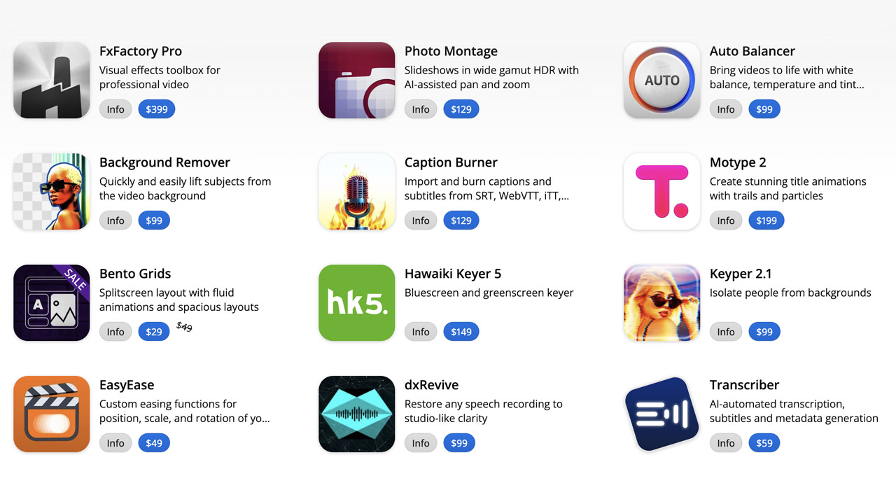
FXFactory ➔
25% off with code BLACKFRIDAY until 12/3
Goodboyninja ➔
20% off everything
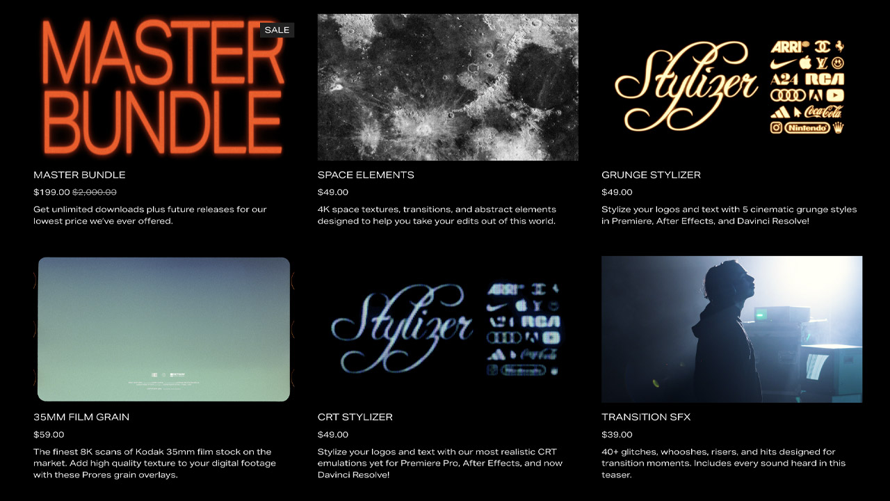
Happy Editing ➔
50% off with code BLACKFRIDAY
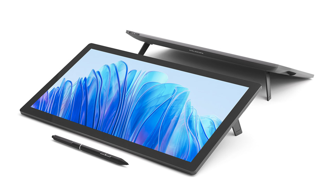
Huion ➔
Up to 50% off affordable, high-quality pen display tablets
Insydium ➔
50% off through 12/4
JangaFX ➔
30% off an indie annual license
Kitbash 3D ➔
$200 off Cargo Pro, their entire library
Knights of the Editing Table ➔
Up to 20% off Premiere Pro Extensions
Maxon ➔
25% off Maxon One, ZBrush, & Redshift - Annual Subscriptions (11/29 - 12/8)
Mode Designs ➔
Deals on premium keyboards and accessories
Motion Array ➔
10% off the Everything plan
Motion Hatch ➔
Perfect Your Pricing Toolkit - 50% off (11/29 - 12/2)
MotionVFX ➔
30% off Design/CineStudio, and PPro Resolve packs with code: BW30
Rocket Lasso ➔
50% off all plug-ins (11/29 - 12/2)
Rokoko ➔
45% off the indie creator bundle with code: RKK_SchoolOfMotion (revenue must be under $100K a year)
Shapefest ➔
80% off a Shapefest Pro annual subscription for life (11/29 - 12/2)

The Pixel Lab ➔
30% off everything
Toolfarm ➔
Various plugins and tools on sale
True Grit Texture ➔
50-70% off (starts Wednesday, runs for about a week)
Vincent Schwenk ➔
50% discount with code RENDERSALE
Wacom ➔
Up to $120 off new tablets + deals on refurbished items


All-Access Pass

Unlimited access to 50+ courses, unlimited critique, live events, and 24/7 community. Join School of Motion All-Access today.
