All-Access Pass
Unlimited access to 50+ courses, unlimited critique, live events, and 24/7 community. Join School of Motion All-Access today.
Adobe MAX 2020 may be over, but we've got videos from some amazing speakers to keep that inspiration going through the holidays
The first ever virtual, global Adobe MAX is over, and we were fortunate to play a small role in sharing stories and inspiration with the Motion Design Community. Since we're all about sharing the best info for free, we've got a few videos from the conference to drop right here.

Are you looking to animate your own designs? It may seem daunting at first, but the process can be very simple if broken down into digestible steps. Two of our fabulous School of Motion course instructors teamed up for an awesome 4-part lab aimed at introducing designers to Motion Design in After Effects! In part 3, designer/director Nol Honig introduces you to the After Effects interface and workflow, getting you ready to create your first animation. In part 4, Nol animates Sarah Beth Morgan’s design from Parts 1&2, teaching you the essential steps to put your own design into motion. Grab a hearty snack and strap in tight, it's time to take those designs and bring them to life.
So You Want to Animate - Part 3
So You Want to Animate - Part 4
Do you want to learn the fundamentals of motion design?
If you want to add motion to your toolkit, you need to have the right tools for the job. Enter After Effects, the premiere software for motion designers. But how can you learn such a deceptively complex program? Sounds like you need After Effects Kickstart!
After Effects Kickstart is the ultimate After Effects intro course for motion designers. In this course, you'll learn the most commonly used tools and best practices for using them while mastering the After Effects interface.
And if you want to take your After Effects game to a whole other level, it's time you mastered expressions...in Expression Session!
Expression Session will teach you how to approach, write, and implement expressions in After Effects. Over the course of 12 weeks, you'll go from rookie to seasoned coder.
-----------------------------------------------------------------------------------------------------------
Tutorial Full Transcript Below 👇:
So You Want to Animate - Part 3
Nol Honig (00:07): Hey everybody. My name is Nol Honig and I'm a director and a designer and an animator. And I live in New York city. I'm also a teacher. I teach the classes after effects, kickstart and expression session at school of motion. This is part three of the, so you want to animate lab series in which Sarah Beth Morgan. And I show you how you can bring your designs to the next level using subtle animation. First of all, I just want to say how awesome Sarah Beth Morgan is. I hope you were really inspired to work with her. One thing that you should know about me is that I've been teaching motion design for about 20 years, and I know that it can be intimidating to approach after effects, but I got you covered, okay. In this session, I know that I can cover the fundamentals in a way that will be both educational and fun.
Nol Honig (00:58): All right. So what I'm going to do is I'm going to work first with a really simple example, and I'm going to show you the whole after effects workflow in one go. Okay. And then in the next session in part four, I'm going to animate Sarah Beth Morgan's illustration. Okay. But first I just want to break down the process for you and demystify it. So you can see it from beginning to end, because pretty much anytime you're ever going to animate anything and after effects, you're going to take these same steps. I just want to say right away that people who learn design first and then motion actually had some pretty big advantages. So let's go over those real quick. For one, if you already know Photoshop and or illustrator, I think you have a big leg up when it comes to learning after effects.
Nol Honig (01:43): Basically knowing some Adobe software means that it's much easier to learn new Adobe software. And in this case, I think Adobe has done a really good job of building some good workflow connections between after effects, illustrator, and Photoshop. Definitely a lot of the keyboard shortcuts are the same as well as some of the tools in the tool bar being either exactly the same or very similar. So I think they've done a really good job of integrating the software and I think you'll be able to approach after effects intuitively because of that. All right. So that's the first thing. And your second big advantage is one that people don't talk about as much, but I think it's really important. Okay. And what I mean is that good design is often much more important than good animation. All right. Basically good design will elevate mediocre animation, but amazing animation will never save bad design.
Nol Honig (02:40): And often when people judge your animation, what they're actually judging is the design a lot of times. Okay. Because if the design lacks appeal, let's just say, nobody's going to stick around to watch the animation, to see if it's awesome. And by the way, this is why it was so smart of Sarah Beth Morgan, to emphasize the kind of level one animation that we're doing here. Um, I want to double down on this and just say that since you're already great at design, you should keep your animation subtle and let the design be the star of the show. Learning the basics of after effects is not actually that hard. I kind of think about it like learning to play the guitar. It's not that difficult to learn a few simple guitar chords and bash out a song, right? Learning the guitar. Isn't the hard part, getting good at playing the guitar is hard.
Nol Honig (03:33): And that just requires a lot of practice. And basically after effects is the same way that said, I am now going to teach you after effects. But before I do that, we actually need to start in Photoshop. So I made this really simple drawing and Photoshop here with a circle and a square, and this kind of freehand blobby shape that I've named William. If you'd like to follow along with me in this lab, you can always design your own simple drawing like this. All right. So the important thing here is that each layer has its own name and anything that I'm thinking I want to animate separately, which is everything I've put on its own layer. Okay? So in order to get our artwork from Photoshop into after effects, what we need to do is import it into our aftereffects project. And by the way, I'm just using Photoshop for this because that's what Sarah Beth uses the same exact thing would work in the same way with illustrator art as well.
Nol Honig (04:32): So when you first launch after effects, you're going to see this home window right here. So go ahead and just press this new project button. Okay. So now here's the after effects interface and yours might look a little bit different from mine because it's kind of customizable, but don't sweat that what we want to do now is import our layered artwork. So I'm going to press command. I, or you could go to file import file command. I I'm on a Mac. All right. So when we do that, we can navigate to where we have our artwork, which is right here. Okay. And now this is actually really important. If you don't see these options here, you need to press this button down here, which is a little bit hidden, this options button. So if you're just looks kind of blank, like this, press that, and now you can see the import options.
Nol Honig (05:18): And those options are basically twofold. One is you can import as footage, which means that it's basically one layer, like a piece of video or a photo or one layer from a Photoshop document, right. Or you can import as a composition. Okay. And that means, and that's actually what we want to do in this case. What that means is it imports layered artwork and preserves all the layers. Okay. In this case, I'm going to choose, retain layer sizes. Don't worry about that for now. All right. So let me hit open boop. And you'll see. Oh, yes. It's like, are you sure you want to do this? And I'm just going to hit, okay. I'm not going to keep the layer styles editable. Great. So now up here in my project window, you can see that I've got a folder here now with the name of my Photoshop doc.
Nol Honig (06:02): And here are all the layers that I made in Photoshop. Okay. My circle, my square and William, right? Additionally, it has this composition icon here and this composition layer. And you're kind of wondering what's the composition because that's not something that you ever, that's not a term you use in Photoshop or illustrator. As far as I know, a composition is where you do your work in after effects. Let me double click this and I'll show you if I double click this. Now you can see that I've got my composition window up here with all these same objects that I hadn't Photoshop. And down here, I have my timeline. And those two things make up my composition, okay. Between those two windows, the timeline and this canvas here, that's what I'm going to do all my work in after effects. All right. So that's what it's called.
Nol Honig (06:48): It's called the composition. Now the cool thing about this, as you can see is that it's preserved all the layers in the order in which I've made them in Photoshop, right. And even kept all of the same names for everything. So that's really awesome. And I'm hoping that means that you see that this isn't too scary right away. And speaking of very scary look who decided to join us today. My cat named Sebastian Sebastian say hi to everybody. So now that we have the artwork imported, we're pretty much ready to move into the animation phase, except that I need to just explain a few things to you. First, let's dig into one of our layers here. So I'm going to turn off my square and William by William. And let's just focus on the circle. If I twirl this down here, you can see that there are these five basic properties of pretty much any layer in after effects.
Nol Honig (07:43): Okay? These are always the most basic ways that you can change this layer. Right? So position is like where it is on screen scale is how big or small it is. Rotation is how rotated it is. And then there's opacity, which is kind of the opposite of transparency. So if something's a hundred percent opaque, then it's 0% transparent, kind of like a wall. But if something is 0% opaque, if it has zero opacity, then it's fully transparent, like a window or something. Okay. All right. And something that's really important to note about all of these properties is that they have these values associated with them. So for example, position, these two numbers here are the X and Y coordinates for where the circle is on screen. If I move the circle, you could see that those values are changing. And if I move it over here, you could see that there are different from where it started, which was here.
Nol Honig (08:37): Okay. So those are the values and all properties of any layer have values. Okay. For scale, the values are the scale of it. Right now it's 185, right? I hope that makes sense values. Now, the other thing is anchor point, which I didn't talk at all about and anchor points a little bit different from the other basic transforms. Okay. But it's super important. And in fact, in some way it's sort of like the most important one because scale and rotation and to some degree or other position, but we're not going to talk about that now are dependent on anchor point. So let me get in a little closer here. So you can see that as I scale this circle up and down, it's scaling in and out of that anchor point. And similarly, when I rotate this, it's rotating around the anchor point, okay. This is like a really, really important thing to understand about after effects.
Nol Honig (09:29): Anchor point is very, very important. And you kind of always want to think about the anchor point really honestly, before you animate anything. And speaking of animating the way that we animate anything and after effects always is by setting key frames, key frames are actually really important. And if you've never used any time-based software, you might not understand them. So I need to explain this in a little bit more detail, right? So this is a little bit abstract, but bear with me here for one second. All right. So to animate a property really means that you're changing those values over time, right? Without change, there's no animation. So for example, if I set a key frame for scale at a hundred percent, and then I move in time and I said another key frame for scale at a hundred percent, there's no change. It's not really animating.
Nol Honig (10:20): Okay. These key frames, basically mark points in time where you're specifying a specific value on a property, like position or scale or whatever. Okay. So for example, in plain English, if it's position we're talking about here, you'd say like the circle layer at the start of the composition is right here. Okay. And then to create a change in a property over time, you need at least two key frames with different values. So first the circles here, and then later in time, the circles here, there's a change over time. Okay. So I know that didn't make total sense just yet, but I want it to get that technical mumbo jumbo out of the way first. All right. So let me explain it to you here and after effects and it'll make a lot more sense. All right. So for my circle layer, for example, if I just want to animate position, all right, the way that I make the first key frame, and this goes for any property ever in after effects, the way that you make the first key frame for any property is you press this stopwatch button here.
Nol Honig (11:24): Oop. Okay. And you'll see, now that it has made a key frame and it has made a key frame where my current time indicator is, that's this sort of bar here. Okay. So right at the beginning of the composition where I press this button here, it made a key frame and that's this diamond shape here. Additionally, I can kind of see that it's like lit this stopwatch up in blue and put the little, like time indicator in there. Okay. That means that like a key fam has been made on this. Right. But that still doesn't mean that animation has been made as I just went over because we only have one key frame at one point in time. Right. So basically if I grab my current time indicator and I moved, just say to like one second here or something, now, if I change these values, I will have made an animation.
Nol Honig (12:10): Okay. And I can do that in a couple different ways. I can change the values just by clicking and dragging this. Okay. Or let's see even better is I could just grab this here. Okay. And you can see now that it's making this motion path and that, what that means is that after effects, interpolate, which is just a fancy word for saying that it animates between the key frames states for you. Okay. This is how it works. You kind of define this state and then that state, and then after effects moves in this case, the object between those two states. Right? So that's how key framing works. Something else that's actually really important to know about key frames is that they can very easily be edited down here on the timeline. For example, the easiest way to edit key frames in a certain way is that you can push them in time.
Nol Honig (12:58): You can make these two key frames closer together or farther apart. And when I make them closer together, the animation happens faster because the animation is happening over fewer frames. It's happening over a shorter period of time. Right. Also if I take the animation and I widen it out, it's now happening slower because I'm taking the same two key frames and I'm just spacing them out in time differently. Okay. That's another really important thing to remember about key frames and after effects. Finally, I also want to point out that you weren't limited to just two key frames for any property or even just one animated property per layer. Okay. You can animate everything about every layer at the same time, if you want. Okay. You can make tons and tons of key frames. Uh, generally I do. All right. So let's make a little animation here for this circle.
Nol Honig (13:47): I'm going to take the final key frame for position, and I'm just going to move this to the end of the composition. Right. Which means that it's just going to be moving the whole time that it's on screen. Okay. And I'm going to go back to the beginning. And what I want to do is now add like an opacity animation onto this. So let me go ahead. And actually, I want this to fade opacity wise from zero to a hundred percent. So actually I'm going to go to, like, I don't know, somewhere over here for 14 frames or whatever, and now I'm going to make the opacity key frame at 100%. Okay. And then roll back to the beginning. And now I will change this to zero. Okay. I can click in here and just type zero for example, or I can click and roll that down, but now you can see that the circle has disappeared from the screen.
Nol Honig (14:34): And if I were to play this back, which I haven't explained yet, um, you would see that this is moving and fading on at the same time. Okay. So let me actually explain playback real quick. Cause it's a little bit different in after effects than it would be in like, uh, in premiere or in like an online music player or something like that after effects works by, it basically puts each frame into the Ram of your computer and that's how it displays it. Um, so what that means is you can see right here that these, this sort of thin bar here, there's some green in there and some spaces where there's no green, basically where it's green, those frames have been added into the Ram already. So this is more technical mumbo jumbo. But basically when I go to play this first, it has to put all those frames into the Ram and then it'll start playing it at real time and a loop.
Nol Honig (15:22): Okay. And by the way, the way that you press play is by pressing the space bar, for example. So I'm going to do that now. And it's going to kind of go a little slower and now it's going to start playing it real time in a loop. And it's a little bit hard to see, cause it's the yellow one page. I apologize for that. But you can see that it's just playing this loop of the circle fading in and moving. All right. And another thing to remember is that Adam animators in after effects are always watching stuff in loops. We're just constantly watching loops. Okay. So let's now work the rest of these layers. I'm going to go ahead and twirl this down to collapse that I guess, and turn on my square. Okay. So let's see for my square, I'm going to, let's see, let's roll this open and I did position and opacity.
Nol Honig (16:08): So let me work on scale. Okay. So let me have this scale up to a hundred and then scale down. So it's like starts at zero. It goes up to a hundred and then goes back down to zero at the end of the comp. Right? So the way I would do that is press the stopwatch button. That's right. To make the first key frame always. And I'm going to set this to zero now scale just by the way is listed also with X and Y and you could Unchained this and so you could animate or adjust just the X of the scale or just the Y in this case, I'm going to keep it chained. All right. And then kind of go to the middle and the composition somewhere around one 15, and now I'm going to set this to 100, right. And then I'm going to go to the end and I'm going to take my 0% scale, key frame. I'm going to copy it and paste it there. Okay. So now that's gone back into its own center. And if we preview that, it looks like this.
Nol Honig (17:02): Hey, it's amazing. Okay. And now for the heck of it, what I want to do is add some rotation to this as well. All right. So I'm going to that's right. Press the stop watch button to make my first rotation key frame here at the beginning. Let me get a go to the end. I just want this to be continuously rotating. All right. So now rotation is listed in a kind of funny way, whole rotations, which is the ax and then degree rotations with the degree sign. Okay. So if you wanted something to rotate three whole times, you'd type three in there. And the first one right here, if you just want it to rotate 15 degrees, you do that in the degree part. Okay. In this case, I think I just want it to rotate one whole degree. So I'm going to do that there. Or I could have typed 316 degrees, same exact thing. Right. So let's preview this.
Nol Honig (17:51): All right. So that's looking really good. And what I'm going to do is now just turn on William. And I think for William, I'm just going to animate the kitchen sink. All right. So I'm going to go back to the beginning of the composition and let me twirl this down. And, uh, I'm basically going to make a key frame now for position scale rotation and opacity. Check this out. I can go boop, and just kind of twirl down on all those or press down on them all at once. All right. Now I'm going to go to the end of the comp and, uh, let me go ahead and I'll move him over a little bit and I'll scale him down. And why don't I go ahead and rotate him a little bit and fade him down to zero. Okay. Let's check out all of that.
Nol Honig (18:42): Wow. Okay. So this is amazing and I love it and I can't wait to send it to my client and I'm pretty sure I'm going to win some sort of award for this animation. It's that good? Okay. But right now it only exists in the Ram of after effects. So how do I go ahead and take this and turn it into something tangible that I could send to my client or post on Instagram or whatever? Well, the answer is rendering rendering is the final stage of the motion graphics workflow. Basically, when you're done with your work, like I just said, you want to turn it into something tangible, you need to render it. Okay. And there's basically two ways to do this. You can render through after effects, which is kind of an old school way of doing it. Or more recently, like in the last 10 years, Adobe has built a different piece of software called Adobe media encoder that you can use to render from after effects.
Nol Honig (19:36): And it's really powerful and it's definitely my preferred way to render. So I'd like to walk you through that now. So once your animation is finished, what you want to do is go up here to composition and add to Adobe media encoder cue, or option command M on a Mac. Okay. And when you do this, what it's basically going to do is going to take a second and it's going to launch media encoder, and it's going to, after effects is going to tell a media encoder, we want to work on this composition. Okay. Simple animation. Here you go. So it's basically taking all the information from after effects and now moved it into Adobe media encoder. All right. Now it will automatically drop on the sort of compression that you last put on there for you. If you've never used it before, I'm not actually sure what it'll put on there, but what we want to do here is no matter what it says is drag down this, okay.
Nol Honig (20:27): In this case, we want to make an animated GIF. Right. And that's what we're going to do with Sarah Beth's illustration as well. So let me just walk you through this. So pull this down to where it says animated GIF, okay. Is obviously quite a lot of other things in here that you can turn it into, but we're turning into an animated GIF and then this is kind of important. All right. So you want to press this button here or this link, and it's going to take a sec to do this, to open this dynamic link connection. Um, I think it's now like really checking back and forth with after effects to make sure, uh, I'm not really sure what I was doing there, but whatever. Um, so the technical and then here. Okay. So I designed the art and I believe Sarah Beth designed her illustration the same way, bigger than necessary.
Nol Honig (21:09): It's just what you do. Okay. So I made a 2000 by 2000, but if I want to make this an Instagram, for example, I want it to be 10 80 by 10 80 square. That's optimal for Instagram. So I would change this. I would uncheck this, okay. Leave this chain because in this case it's a square and I would just set this to 10 80. Okay. And now the other thing is this quality tab, you can play around with this on your own, but a hundred percent quality makes rather big of loops. And, uh, I think you probably want to lower this down to somewhere, halfway down just to lower the quality. Okay. So that's fine. I'm going to hit, okay, here and now here, you just want to basically click on this and give it like a good name and put it in a good folder somewhere like here, for example, and I'll just call this simple animation GIF and I'll hit save, and then I can go ahead and press this green play like button here. And it's rendering. You can see a little bar. And what we're waiting for is the render chime at the end, which is the happiest, the happiest noise in the world, because that means that your work's done. All right. So now what I want to do is click on this little link here that it's given you, it'll open the file. And now here you go.
Nol Honig (22:25): It is now a tangible thing, which we could post to Instagram or send to the Emmy's so that they can give us an award. Right. And that's it really, these are the steps that I always take every time I animate anything and after effects and pretty much anytime anybody animates anything and after effects, including you, I hope from now on, right. Let's actually review these steps just to go over them again, because they're important. Right? So first of all, generally what you're starting out with is by importing art into, after effects. Now, sometimes you're making art in after effects, but oftentimes really it's a combination of things for me, I'm importing Photoshop, art, I'm importing illustrator art. I might be working with an audio track that I pull in or a cut from premiere. And then I might be creating art also in after effects at the same time.
Nol Honig (23:10): Right. So, yeah, but importing is a really big step, generally the first one, right. Second, you're really working on the animation and you're just really animating each layer until it feels right. Which is obviously the bulk of the work and where a lot of the finesse comes in. Okay. But once you're done with that, then you move on to the rendering stage, which we just showed you. And basically, you know, we didn't really talk about this, but you can work in a lot of different formats and sizes and things in after effects. And you just want to make sure when you render that you're rendering the correct way for what you worked on. And also a lot of times, especially nowadays, clients will need you to render one way and another way, because they might be using the final product for different formats or whatever.
Nol Honig (23:54): So, um, renderings are really important. Step two and something you might actually have to do more than once on any project. Right? And the final step that's really important is that once everything's all done, you get to drink martinis on a yacht while counting your money. And that's the basic workflow of any animation project. Yes. This is the exciting, exciting life of a motion designer. Thank you very much. I hope you liked this and you got something out of it in part four. I'm definitely going to be kind of doing the same thing, but I'm going to be using the illustration that Sarah Beth made of the clementines, which is actually going to be adding quite a lot of complexity into this. So I'm going to be bringing in quite a lot of new after effects tips in part four. So definitely go ahead and check that out when you're ready. Thank you so much. And I will see you in the next video.
-----------------------------------------------------------------------------------------------------------
So You Want to Animate - Part 4
Nol Honig (00:06): Hello, and welcome to part four of the, so you want to animate lab series in which Sarah Beth Morgan, and I show you how you can bring your designs to life with some simple animation. Thanks for joining us in case you miss part three, let me just reintroduce myself really quickly. My name is Nol Honig and I'm a director and a designer and an animator and a teacher. And I live in New York city. I teach the after effects, kickstart class at school of motion. And if you think today's lesson is helpful for you, you might want to check that out in part four of today's lesson. What I'm going to do is go over how I would bring the awesome illustration by Sarah Beth to life in after effects and create a looping GIF that we could post to Instagram or something. I think this is going to be really fun.
Nol Honig (00:56): And I'm going to show you some really useful after effects tips along the way. So let's jump right in as a reminder, here's what the illustration looks like that Sarah Beth gave us, uh, basically the way she laid this out in Photoshop, all of the layers are either in these groups, which are like folders, or they are in clipping masks like this. Okay. The only layer that isn't is this top stem. And I assume you're pretty familiar with how Photoshop works. I just want to show you that so that when we import it into, after effects, you can see the difference. So let's import this drawing into after effects. I'm going to hit command. I okay. And then find the illustration. And then just as a reminder from part three, I went over this, but we do not want this as footage, which would collapse it down to one layer.
Nol Honig (01:42): We want it as a composition so we could preserve the layers and I'm also going to retain the layer sizes. Okay. I'm going to hit open. Great. And I want editable layer style. So I'll hit. Okay. Now, just like before, in part three, it has put our artwork up here in the project window. Uh, but unlike part three, if I open this folder, there is a lot of layers in here and some of them even have different icons. Let's look at this. Am I going to open my composition? Double-clicking on this. All right. And now in here we can kind of see that anything that was a group or in that folder structure, or was it clipping mask in Photoshop has now become this other thing here in after effects. And these are known as pre comps or pre compositions. And that basically just means that they are nested compositions within our main composition, which I know sounds a little scary and confusing at first, but actually it's really cool.
Nol Honig (02:37): So look, I'll double click on the type pre-com okay. And that will open up this other composition. This other timeline that, as I said, is nested within the main one. And just to show that if I turn off the word clementines here and I go back to my main comp, you can see that the word clementines is now gone there. Okay. So anything that happens, including anything that's animated, which is kind of the point in the pre comps will update automatically into the main composition. So that's how this is going to work. But other than that, we're going to treat these pre comps mostly as flat layers. So it's kind of going to be the same, but with differences. Now, there are two things that I just want to go over before we start animating. So the first thing I just want to mention is pre visualizing your animation, which generally speaking is a really good step.
Nol Honig (03:24): And in case it doesn't make sense to you. It's just a fancy way of saying, think about ahead of time, how you want it to move. All right. Uh, and as I say here, mouth noises in hand gestures are surprisingly useful for this. So in this case, I'm kind of imagining something like that. Right. And it's also good to look at the client brief just before you start animating and actually even look at the illustration again and just kind of like, think about it, how you want it to go. All right. So the client brief is pretty brief. In this case, it doesn't offer us that many clues, but it does say subtle and looping animation. So those are important things that we want to keep in mind. Second of all, when I look at the drawing, again, it's not just the clementines in the branch that need to move.
Nol Honig (04:10): I'm also going to animate the type and the grit in the background. So in my mind, I'm thinking of ways that I can do that right now. And this is all super helpful and will allow your animation to go faster. Now there's one more stage that we have to go through before we can really start animating rather than animating each one of the layers in the drawing separately. What I want to do is create a skeletal system so that I can kind of animate them all together as one. This is going to take a few extra minutes to set up, but it's definitely going to save us time in the animation. Now, motion designers generally refer to this process as rigging and rigging could be super complicated, or it could be relatively simple. And we're going to stick on the simpler side today. We're going to basically just use anchor point, which I talked about briefly in part three and a new function that I'm going to teach you now called parenting.
Nol Honig (05:05): All right, we are ready to get rigging. So what I'm going to do first is I'm going to turn off this type layer and lock that cause I don't need that right away. And I think I'm also gonna lock my background layer. So I don't just like click on it by accident and move it. All right. So I'm going to turn actually off all the other layers, except for this top stem for one second. And I'm going to twirl down this tab and the transforms, I can show you these five basic transforms. Now what we're going to do is we're going to animate the rotation of this layer. So if I were to like rotate this, now you can see that because the anchor point is in the center, right? Let me move it on this. This is the anchor point right here, by the way, it's rotating around its own anchor point.
Nol Honig (05:49): As we talked about in part three, and this is not how we want this to move. We want this to rotate from its own end point. All right. So I have to the anchor point from here over to here, but if I try to do that with my regular V arrow, I will move the whole layer and not the anchor point itself, which is not what I want. Okay. So how do I do that? Well, I need a new tool. That's really only in after effects and it's called the pan behind tool for some reason. And the shortcut for that is why here it is up here. It's a kind of icon that we really don't have anywhere else, but if you press that, okay. And now I go over to my anchor point. I can take this and move this over here to where I want it and it doesn't move the whole layer.
Nol Honig (06:34): Yay. So the pan behind tool is your friend, just to show you what this looks like. Now, this will rotate like this, which is what we want. Okay. So cool. I'm going to pull back just a little bit and let me now turn on my bottom stem. Okay. This is one of those pre comps, but we're just going to work with this as a flattened layer. And let me turn off the top stem for one sec, I still have my pan behind tool selected. You could tell by the kind of cursor thing. So I'm going to grab the anchor point and move it up here to where I want this to swing from. And I'm going to get in really close and just make sure I'm kind of getting this in the right place. Cool. So now I'm going to turn the top stem back on right now.
Nol Honig (07:13): If I rotate this bottom stem, I just pressed our, by the way, to reveal only the rotation property of that. I can rotate this now this way, and that's great. And I can rotate this this way, but it's really not what I want. What I want is when the top stem rotates for the bottom stem to move along with it as though they're connected right at the anchor point of the bottom step. Okay. So how do I do that? Well, that is the function that I was just talking about called parenting. Now, when two people are in love, no, no, wait a second. The way that you parent and after effects is like this. All right. So if I want my bottom stem to be connected to my top stem, which I do in this case, let me actually collapse these both down for one sec.
Nol Honig (07:58): The easiest way to do this right, is to grab this little pick whip right here. Now, actually, before I start in case you're not seeing parent and link this little tab right here, it could be closed like this. All right. So just in case you're like, wait, no, I'm not seeing that go in here and right. Click to columns and go to parent and link. Then you'll see this too. Okay. Great parenting. It's awesome. So check this out. If I take this little pick whip from bottom Stan and I pull this over to top stem boop, right now you could see that in this little pull-down tab, this now says two layer to top stem. And by the way, you could parent this way as well. Not with the pick-me-up. I just think the pick whips fun. So anyway, so now if I press R and rotate my top stem, yes.
Nol Honig (08:44): Both stems are rotating together, which is what we want. We're on our way to creating the skeletal structure, the rig. All right. So let's just do this now for everything else. I'm going to undo that. And I'm going to turn on this leaf here. Okay. And I'm going to go ahead. Oh, I still have my pan behind tool selected shortcut Y and I'm going to move up here and I'm actually going to solo this just for a sec. So this button, by the way, is the solo button and it'll solo any layer that you want. I'm just going to move this here. And sometimes that's really useful when you just want to see that one layer. Okay. Now this leaf, I want parented to the top stem as well. So I'm going to take that boop. All right. The right leaf. I'm still have my pan behind tools selected.
Nol Honig (09:30): So let me find where the anchor point is. It's over here. I'm just gonna move this up here somewhere. Okay. And I can solo that real quick and just get in there and make sure I'm putting this in the right place. Details are important. All right. And so this also gets parented to that top stem. Okay. So I'm going to pull this over top stem, Oop, and now the leaf bottom. Okay. So this one, I'm going to move the anchor point up here. All right. Okay. So this one, though, this is important. This leaf is parented to the bottom stem. All right. So let me just show this also that I can not rotate the top stem and everything rotates with it. I can rotate the bottom stem and that leaf rotates with it, and I can also rotate the leaf itself. All right. You see where this is going now?
Nol Honig (10:22): Cool. Let's move on to this Clementine here in front. Choose my pan behind tool. Why shortcut move that anchor point over here in this little hole there. Okay. And then I'm going to turn on the other Clementine. Oops. I forgot to parent the first one. So let me parent this too. That's right. The bottom stem. You guessed it. And now this one here, turn that on pan behind tool. Move the anchor point into the little hole here. Okay. And let me parent this now to my top stem Oop. Great. Now you see again, everything moves, moves with that, which is awesome. Okay. So we're done with the rigging now and we are ready to move on to the animation phase, which is the fun, fun part that you've all been looking forward to. I'm sure. The thing that I want to keep in mind right away is that this is animating as a loop.
Nol Honig (11:17): So it has to begin and end the same way. It that's to look the same at the beginning and end. Otherwise there'll be an obvious cut in the loop. Right? So what I'm going to do is I'm going to select all my layers. And I know in my head, because of my pre-visualization process, that I just want rotation. That's the only thing that's going to animate on any of these, uh, main layers of the stems and leaves and stuff and the oranges. So I'm going to press R with all of these selected to reveal the rotation property. And I'm going to, I want to make key frames for all of these here at zero degree rotation. Right? Cause you remember in order to make the first key frame, I have to press this stopwatch. And then after that I just moved the values. Right. So what I'm going to do is just go burger up and press the stop, watch for the rotation for all of these layers at the beginning of the composition.
Nol Honig (12:11): So that they're all set to zero. All right, good enough. Now I'm also going to go to the end and I want zero degree rotation, key frames for all these layers at the end to cause the loop. Right? So you'd think that I could just select all these key frames and copy paste. But what happens is you can see here is that I paste every layer again. So you can't really do that, which is irritating. So, oops, well, you'd have to do is like go through here and select these and copy paste them individually from each layer. But there's actually an easier way, which is this little button over here, which just means if you press this button, you're going to add a key frame at whatever value this says already for that layer at whatever moment in time you're at. Okay. So in this case, that's exactly what I want.
Nol Honig (12:55): I want zero rotation, key frames at the end. So I could just drag up and press that button. Okay. So as you remember from part one, I have two key frames, but I have no animation right now because the key frame values are both the same. So as I scrubbed through this, there is no change. Right? Let's do something about that. Now I'm going to go to the middle of the cops somewhere. It doesn't really matter exactly where, but sort of in the middle and now I want to start rotating all these things. All right. And I'm going to start with the top stem cause that's the driver of the action here. And when I rotate it this way, it rotates in a positive numbers. And when I rotate this way, it rotates down into negative numbers, right. So I actually think it looks nicer going in this direction.
Nol Honig (13:39): So I'm going to work with negative numbers for this, uh, layer. All right. So now I want subtle animation. I know we've said this over and over again. It's very tempting. Once you start animating to really make things move around a lot, but it doesn't, it's not gonna look good. So I want to keep this really subtle. Like I'm going to make this negative 1.5 in terms of rotation. All right. And if we preview that, here's what it looks like. It's really subtle. Okay. But that's what we want. So with that done, I'm going to just stay in this area where I've got this key frame set and I'm going to set rotation, key frames now in the middle for all of these other layers. And, uh, mostly I'm just going to set them all to negative 1.5. Okay. Uh, and I just want a very subtle animation.
Nol Honig (14:25): Let me preview what that looks like just with those two layers. So you can start to see now it's bringing some life into this because there they have separate motion and you can really feel that. Right. All right. So let's go ahead and just do this for everything. So for this leaf here, I'm just going to make this negative one. All right. Subtle, subtle animation for this leaf here. Okay. I think this one, I was kinda thinking about this. I think it can rotate in the opposite direction. That's just one that I think can rotating the opposite direction. So I'm going to say 1.5 positive 1.5 on that. All right. And we'll see what it looks like. Maybe I'll change my mind later. All right. For this leaf again, just negative 1.5, I think would be good. And um, and I can change this all later.
Nol Honig (15:06): Once I preview it for the Clementine, this has a little bit more weight to it than the leaf. So I'm going to say negative two. And for this one, I'll say negative 1.5. Again, I don't know. I'm just kind of making this up as I go, but let's just look at what this looks like right now. Okay. So it's definitely swinging in the loop and it's subtle. So we've kind of achieved something right now. Uh, one thing that bothers me is that this leaf doesn't move. It sort of feels very much connected in lockstep to this orange because it's rotating. I think the same amount. Let me go to the middle here and see what my value is. Yeah. So let me change this or let me, Hm. Yeah, let me change this leaf. Okay. Let me just make this like negative 0.5 and see what that looks like.
Nol Honig (16:00): Yeah. I think that's good. It's just a little subtler now what I'll say right away. When I look at this animation is that it's kind of got all the right pieces, but it, it feels robotic. It feels wrong. And the reason why is because all of these key frames right now are linear they're, what's known as linear key frames in after effects. And what this means is that in between key frame, a and key frame B, it moves the object at a constant rate, okay. In between the second key frame and the third came key frame, it's always moving things at constant rates between the key frames and nothing in real life moves that way in real life. If I were to move my hand from here to here first, it would sort of ease out of that. And then it would kind of ease into the final position.
Nol Honig (16:44): That's just how things move organically. They don't just start moving on a dime and move at their ultimate speed and then just stop on a dime. They ease out and they ease in. Okay. So after effects has a built-in function to help us with this, I'm going to select these key frames here and then these key frames here. Okay. And then I'm going to right. Click on a key frame and go to key frame assistant. And here you go, easy ease or the beloved shortcut F nine. I'm going to press that now. All right. And now you see the diamond shape. Key frames have turned into these hourglass shaped key frames, and let's just preview that. See what the differences. Yeah. And I think you can see right away, the action feels much better. It just feels more organic. It's just the way it's just much closer to how things would swing in real life.
Nol Honig (17:31): All right. So easy. Ease is really going to be your friend for these subtle animations. So now it's time for me to move on to the last two elements, the type and the background. And I have to go kind of quickly here because I'm running out of time. So let me jump into my type. All right. And let me explain. That's really awesome. If you have live type from Photoshop that was live in Photoshop and after effects, it's no longer like a live type layer, but you can convert it really easily by right. Clicking and go to create and then convert to editable text. And now it's like editable text that I could type something else in there. So that's really useful, especially because of this next step. What I want to do is put an effect, preset, uh, like a pre animated element on this type.
Nol Honig (18:17): There's, um, some really awesome effects and presets in this window effects and presets. You could also go to window effects and presets and open it there. Okay. It gives you this little search bar and then I'm going to type type writer in there or start to type typewriter. And then you can see there's an animation preset named typewriter. And if I grab this and drag this down on top of my type layer right now it's disappeared. And if I press you, you can see, oh, and by the way, you, the shortcut you is the universal keyboard shortcut to reveal all animated properties. All right. So that's really useful. So here I have an end state of the animation and the beginning, uh, sorry, the beginning state of the animation and an end state. So if I move these two closer together and then preview this for you, you can see that the word clementines just kind of types itself on there.
Nol Honig (19:01): And that's really useful, really great tip for social media posts, the typewriter preset. Anyway, I'm also going to go to the end here and I'm going to copy this and paste it there and then copy the first key frame and paste it there. So it like types itself back off at the end. Okay. Move in rather quickly. What I also want to do is fade the word, figure one on. So I'm going to animate the opacity. So I'm going to press T to reveal the opacity property. I'm going to make a 100% opacity key fan by pressing the stopwatch. You remember that? Now I can go back to the beginning and just dial this down to zero. I'm going to do the same thing at the end, as I did on the clementines where I just kind of copied this 100% key frame here, and then just dial this back down to zero at the end, so that now fades up and fades out pretty simple animation.
Nol Honig (19:50): And then finally, I want to talk about this line here. I want to draw this on or have it look like this is drawing itself on, and I want to use a mask, which is not something I've talked about yet. So let me quickly go into this. If I go up here to my tool bar, I've got a rectangle tool. That's pretty similar to the one in Photoshop and illustrator. The keyboard shortcut is Q but forget about that. If I choose this, okay. And I have my line selected. If I Mark Key over this, now you can see I'm just drawing it on screen. So basically if I set the mask over here with it off, okay. And then after effects automatically opens the mask property. So otherwise you can press M to reveal that. And what I want to do is I want to animate the mask path.
Nol Honig (20:31): So I'm going to press this here, okay. To make a mask path, key frame where it's kind of off, I'm going to move toward these other key frames are in a press V to get my VRO. And now I'm going to kind of carefully select just the end two points of the mask and drag this over until it gets to the end, which is right there actually. So now I've created a mask animation that just draws that line on like that. That's pretty cool. And just like the other pieces, and I'm going to copy this here and go to the end and paste the off mask state at the end as well. All right. So now let me go back to my main comp and let's watch this altogether.
Nol Honig (21:10): Yeah. And you could see right away that that's like really fun. Okay. So moving on. Cause I am running out of time here. I'm going to animate the grit in the background really quickly. All right. Basically for these scatter dots for this texture here, I want this kind of like gritty old movie projector, kind of staccato animation, where it's like, okay. And there's actually a kind of key frame in after effects that will do this is called a hold key frame. Let me demo this for you. I'm going to press P to reveal my position. I'm going to make a position key frame here. I'm going to move forward 10 frames by hitting shift and page down. Okay. So I'm at frame 10. Now what I want is for this to have like, shifted over, just say like here, but as you remember in after effects, it will put the animation between those two key frames state.
Nol Honig (21:54): So we don't want that. We want it to hold one state until it reaches the next state. And then we want it to just switch all at once and hold that state. Okay. And after effects, those are called hold key frames. So check it out right now. It's animating between them. But if I select both of these key frames, both of them and I right click here, I can go to toggle, hold key frame toggle just means turn on and off like a light switch. Right. So basically we've just turned these on to become, hold key frames. So now it holds this value until it gets here and then it switches. Right. And that's just what we want. So I'm going to move another 10 frames and I'm just going to move this over here. I'm gonna move another 10 frames and put it over there. Another 10 frames here, another 10 frames here. And basically I just want to get to right here, which is 10 frames, I think before the end of the comp. Yep. So now it'll create a nice loop. Okay. So now, uh, I can just look at this back in my main comp preview this.
Nol Honig (22:49): Yeah. And I think this looks totally charming and awesome. The one final note I would say is that now that we have motion on the background, grit, it's more present than I think Sarah Beth wanted it to be, or that's how it feels to me. It steals a little bit of attention from the type. So I'm going to get into my background. I'm just going to press T to reveal the opacity of this. I'm just going to not animate this. I'm just gonna set this down to like 50%. Okay. So it's a little bit lighter on screen. And then let's look at that.
Nol Honig (23:18): Yeah. I think that looks really charming. And so it's just a little less present, right? I just noticed one thing, which I think can make this animation a little bit stronger. I'm going to, um, display the rotation of all these layers. Okay. And right now all of these key frames in the middle are in the same exact moment in time. And in real life, nothing would ever move. So that it's like exactly locked into everything else like that. If we want to give this a more organic feeling in the animation, all I'd have to do is kind of redistribute these key frames a little bit in the middle here. And it would create a kind of looser feeling to the animation. All right. So check this out. I'm just going to move this back a couple of frames and then this just want to make sure that like all these things happen, you know, just at slightly different points.
Nol Honig (24:05): I mean, when it turns, when it changes direction. Okay. It's a small thing, but check out the difference now. Yeah. I think this just goes a long way to giving it that extra little bit of organic flare. And now I feel like this is really done. As you remember from part three, once the animation is done, now it's time to render, which basically just means to take what's in after effects and turn it into a tangible thing, like a QuickTime movie or an animated GIF that you could post on Instagram. So as you remember from part three, I'm just going to go up to composition, add to Adobe media encoder queue or option command M is the shortcut. Okay. So this is the correct animation fruits of the trade. And like I explained earlier in part three, it's basically going to give whatever the last render settings that you had on there automatically.
Nol Honig (24:52): So in this case, it's given it an animated gift setting just in cases, it wasn't clear or you miss part three, all you have to do is pull this down and find animated GIF. And that should be okay. In this case, we don't need to press this button because we want it 1500 by 1500, which is exactly the way the source is. So we just want to keep everything the way that it was. And then finally, I'm just going to click in here and give it a name and find a good place to put this like here, okay, I'm not going to hit save. And then I'm going to go ahead and press the button to start rendering. And basically at this point, you know, we're all done and we're just waiting for that special render chime noise, which means we're done.
Nol Honig (25:35): And there it is. Now I'm going to just go ahead and click on this little link here and let's preview the animation. Yeah. I love this. I think this looks really fun and really subtle and has a lot of life to it. So awesome. And with that, we are really, really done. I just want to thank Sarah Beth Morgan again and say that I think we did a really great job in this lab. In these last two hours, we basically walked you from design concept thing all the way through design and illustration and into technical rigging and animation and all the way through how to render for social media. I think we covered a lot and I'm really hoping this is going to be really useful to getting you started on bringing some life to your animation. Thank you so much for joining us. Thanks to all the Adobe people for making this possible. And this was really great. So thank you again.
ENROLL NOW!
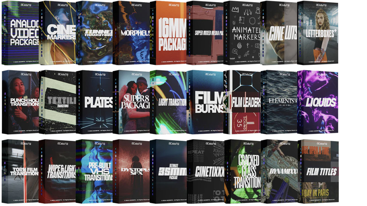
Acidbite ➔
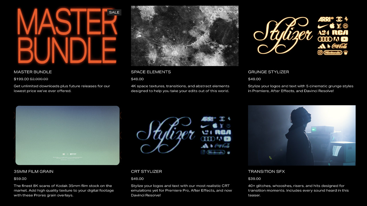
50% off everything
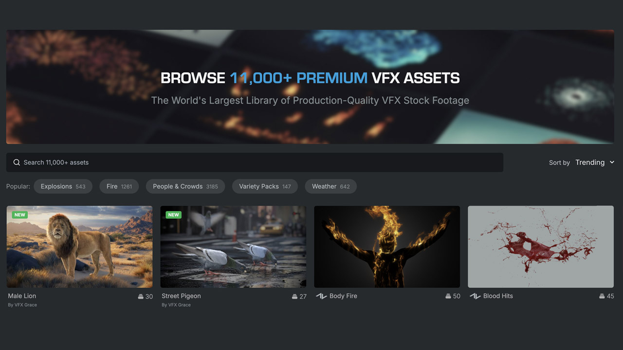
ActionVFX ➔
30% off all plans and credit packs - starts 11/26
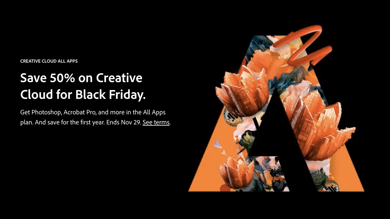
Adobe ➔
50% off all apps and plans through 11/29
aescripts ➔
25% off everything through 12/6
Affinity ➔
50% off all products
Battleaxe ➔
30% off from 11/29-12/7
Boom Library ➔
30% off Boom One, their 48,000+ file audio library
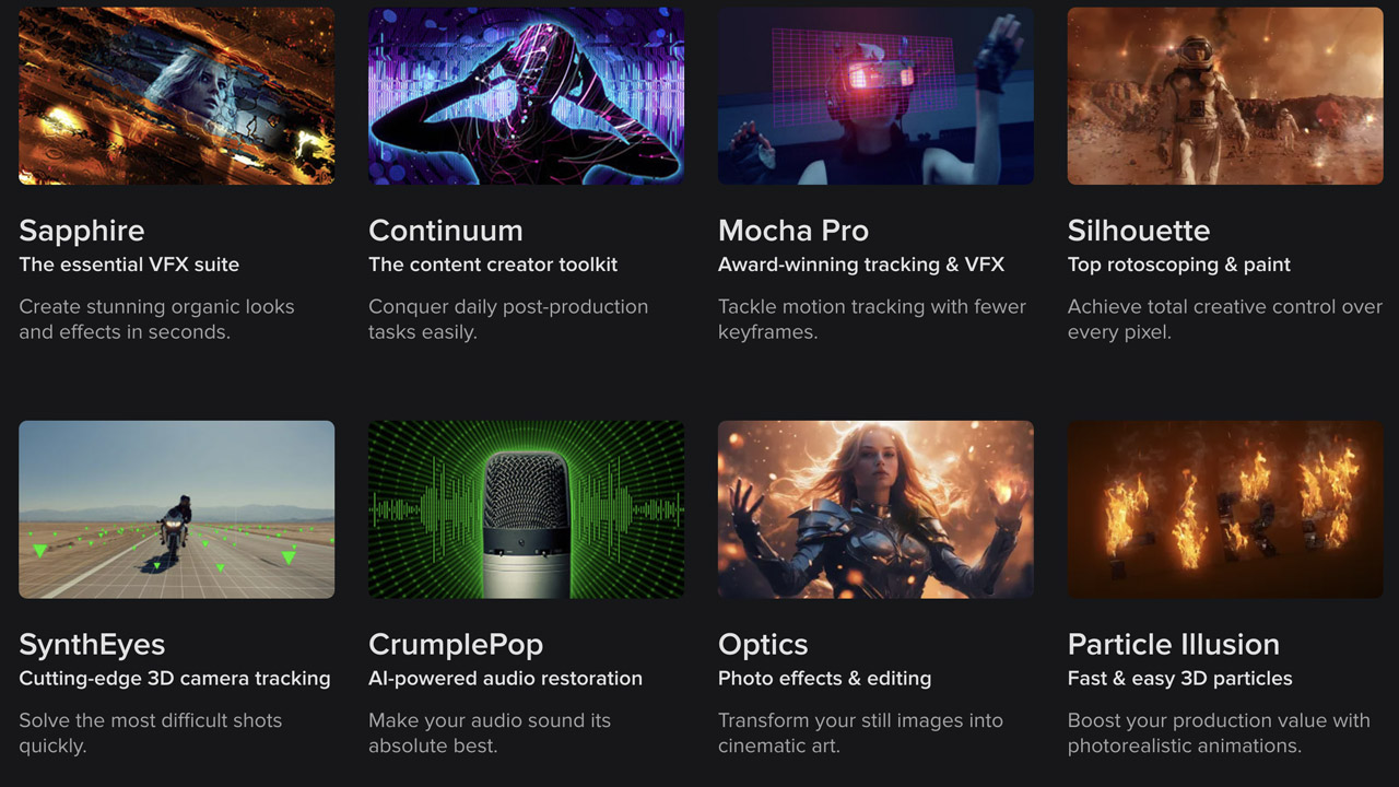
BorisFX ➔
25% off everything, 11/25-12/1
Cavalry ➔
33% off pro subscriptions (11/29 - 12/4)
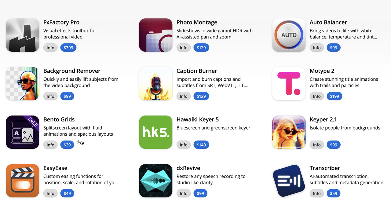
FXFactory ➔
25% off with code BLACKFRIDAY until 12/3
Goodboyninja ➔
20% off everything

Happy Editing ➔
50% off with code BLACKFRIDAY
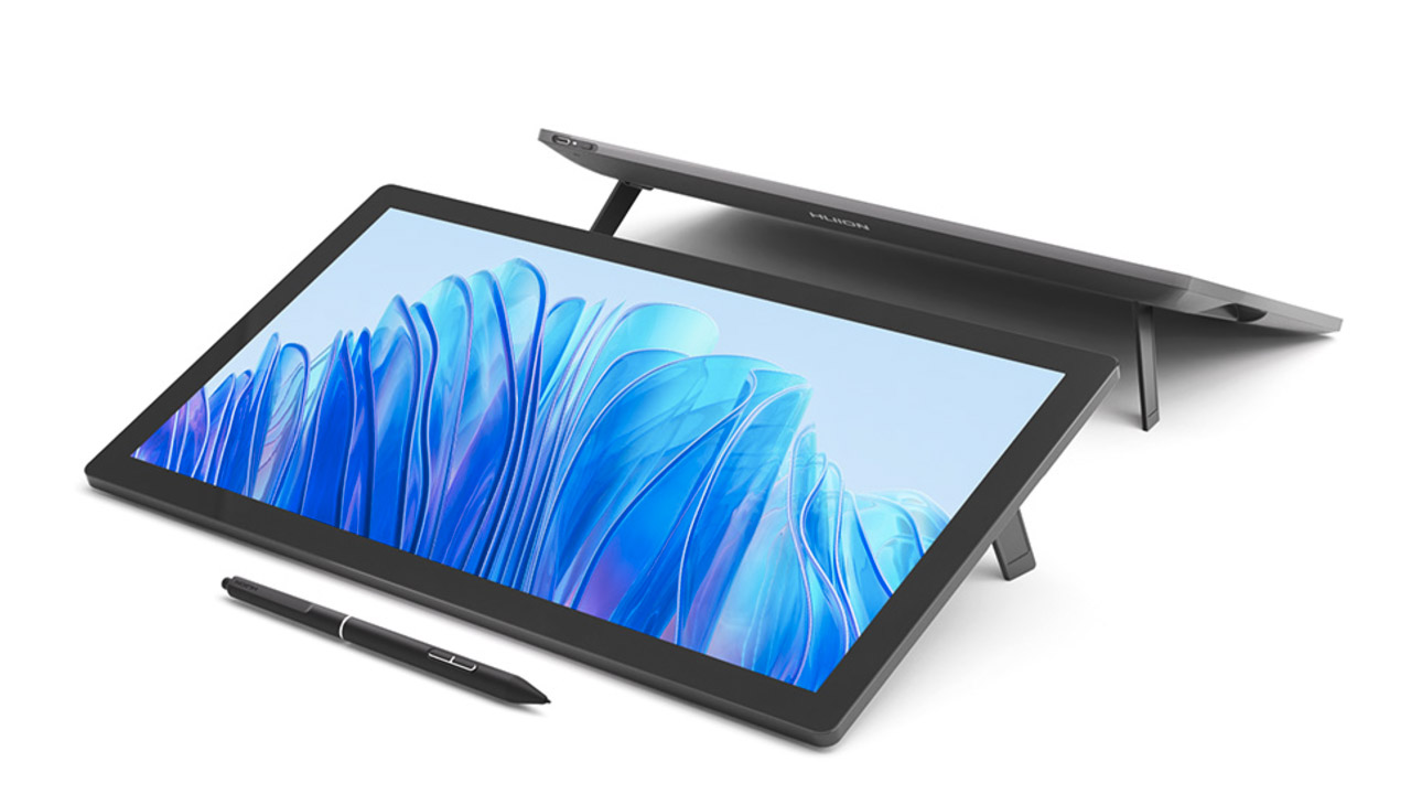
Huion ➔
Up to 50% off affordable, high-quality pen display tablets
Insydium ➔
50% off through 12/4
JangaFX ➔
30% off an indie annual license
Kitbash 3D ➔
$200 off Cargo Pro, their entire library
Knights of the Editing Table ➔
Up to 20% off Premiere Pro Extensions
Maxon ➔
25% off Maxon One, ZBrush, & Redshift - Annual Subscriptions (11/29 - 12/8)
Mode Designs ➔
Deals on premium keyboards and accessories
Motion Array ➔
10% off the Everything plan
Motion Hatch ➔
Perfect Your Pricing Toolkit - 50% off (11/29 - 12/2)

MotionVFX ➔
30% off Design/CineStudio, and PPro Resolve packs with code: BW30
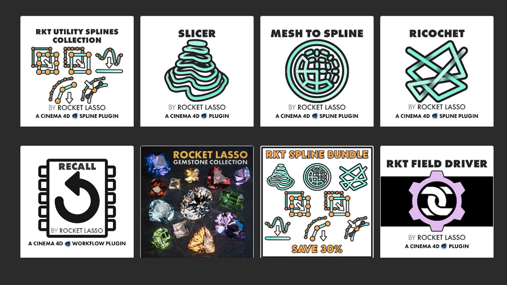
Rocket Lasso ➔
50% off all plug-ins (11/29 - 12/2)
Rokoko ➔
45% off the indie creator bundle with code: RKK_SchoolOfMotion (revenue must be under $100K a year)
Shapefest ➔
80% off a Shapefest Pro annual subscription for life (11/29 - 12/2)

The Pixel Lab ➔
30% off everything
Toolfarm ➔
Various plugins and tools on sale

True Grit Texture ➔
50-70% off (starts Wednesday, runs for about a week)
Vincent Schwenk ➔
50% discount with code RENDERSALE
Wacom ➔
Up to $120 off new tablets + deals on refurbished items


All-Access Pass

Unlimited access to 50+ courses, unlimited critique, live events, and 24/7 community. Join School of Motion All-Access today.
