A Beginners Guide to Sports Graphics
If you're reading this sentence, there's a good chance that you didn't play professional sports. Just remember that no matter what your dad thinks, motion design is an industry that requires just as much skill and practice as sports.
The team at School of Motion is super stoked to bring you a brand new series designed to get you acquainted with motion design graphics for sports. After reading the series, you will have a taste for what makes up a basic sports graphics package. Including lower thirds, headshots, and more critical elements of motion graphics in sports. I can't wait to kick this series off and share some of the things I learned during my time in the world of live sports production.
So if you're ready to learn some interesting stuff, run a lap and keep reading... Let's kick-off (pun-intended) the series with headshots.
What are Headshots?
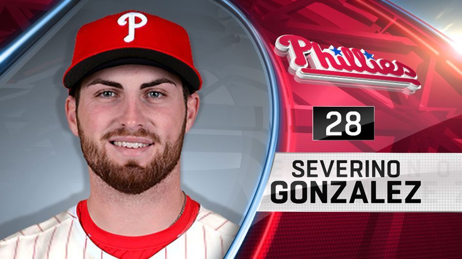
Headshots are used to identify players in sporting venues and on TV. They typically consist of a static image or moving video of the player, as well as some basic information like name, position, number, favorite Ninja Turtle, etc.
Headshots can either be displayed via broadcast or live at the sporting venue and they are (almost) always created before game day.
Headshots require a lot of organization and a good project template. But how are you to create a sports headshot?! Well my friend we have a step-by-step guide for you...
How to Create Sports Headshots
So you're ready to create some motion design headshots? Well with that eagerness you'll be a starter in no-time. First, download this project file to follow along.
{{lead-magnet}}
Since you'll be using a template for your graphics, it’s easy to either go through all of the players yourself or team up and split the work with a friend. Be sure to use a good naming convention in your project and when rendering. In this case I chose SOM_##_LastName-HEADSHOT. SOM designates the sport, like SOM for School of Motion or FB for football, then come numbers, and last is the player’s name – all with no spaces. One quick note – this workflow could obviously be put on steroids (wink, wink) if you implement an automatic workflow like Joey describes in his render-bot tutorial.
Now that you know the game-plan it's time to hit the field.
1. Have a Game Plan (Stay Organized)
Consider this: The average American college football team will have over 100 players on its roster. Clearly a lot all of those guys are just on the practice squad, but they’ll all require a headshot in the event that they do make it into a real game. That’s a ton of work however you precomp it.
When creating a mass of graphics like this, it’s best to jump in with a plan rather than winging it. That means deciding on a clear workflow, naming convention, and templatizing (that's a word right?) everything before doing the brunt of the work.
2. Design the Graphics
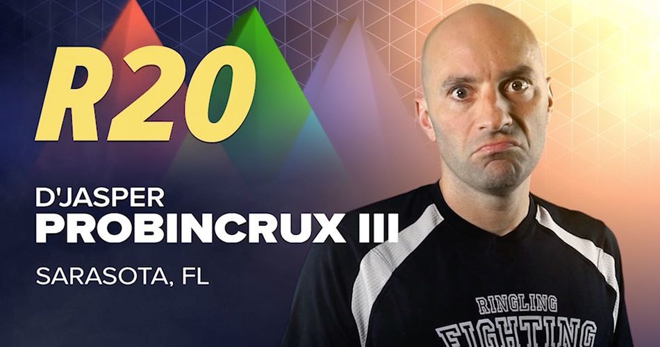
Time to start churning and burning. Before the geniuses at Adobe introduced essential graphics and master properties, building After Effects templates for headshots relied exclusively on a lot of careful precomping. Now life is a little bit easier (though there’s still some precomping). Check out the headshot below and note everything it has going on.
Woo-wee that's a defensive lineman you don't want to mess with!
Along with some pretty colors, the above graphics have a moving headshot of a “player”, name, number, and home town. You could also include position, stats, or taco preference - depending on what you’re going for. These are all the attributes that are unique for each player and thus will need to be easily changed.
3. Setup the Proper Composition Layout
Each graphic will consist of two precomps, one unique precomp for the player’s video and another precomp with master properties for the player information. These are grouped into individual folders within the After Effects project.
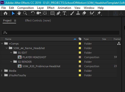
Using master properties, the text information can be updated within the main headshot comp without digging into its precomp. Note that you’ll need to pay close attention to how the text is justified and where its anchor points are located. If done incorrectly the names won’t align properly when creating each headshot.
If you want to learn more about Master Properties, check out our tutorial here on the site.
Master properties are the bomb.com
Now for our all-star athlete above, His footage was shot in front of a green screen and then keyed for the headshot. If you’re also shooting these headshots, take time to get the shoot right. The secret to a good green screen key is knocking the production out of the park. In addition to these green screen tips, it can also help to have music playing for the athletes to help keep them relaxed and having fun during the shoot.
4. Batch the Graphics
Back in After Effects, if green screen shots are consistent, you can simply replace each player’s footage in the precomp without having to adjust the key from player to player. That saves a TON of time if you’re doing 100+ players. A good key can be pulled using After Effects’ Keylight effect, but for tougher keys - or to key things that shouldn’t be keyable - try Composite Brush from AE Scripts. It’s basically voodoo.
5. Make it Loop
The last thing I want you to notice is how the headshot graphic loops above, starting with a wipe. This is because this headshot is intended to be used in a live situation, in stadium or broadcast/stream. Starting with a wipe will allow you to run player headshots back to back and still look clean, rather than jump cutting from player to player.
Well that's all for now. In our next article we'll take a look at how to create replay wipes for live broadcasts.
Have you ever created graphics for sports? Let us know by reaching out to us on our Twitter and Instagram (@schoolofmotion). We're always looking to share incredible sports graphics.
I'll leave you with the funniest example of sports headshots I've ever seen.
Want to Take Your Design Up a Notch?
That’s it! Pretty simple, huh? A great sports headshot is all about following the principles of design and creating simple, clean animation. If you want to know more, check out Design Kickstart!
In this 8-week course, you’ll take on industry-inspired projects while learning key design concepts that will elevate your design work right away. By the end, you’ll have all of the foundational design knowledge necessary to start crafting storyboards that are motion ready.
ENROLL NOW!
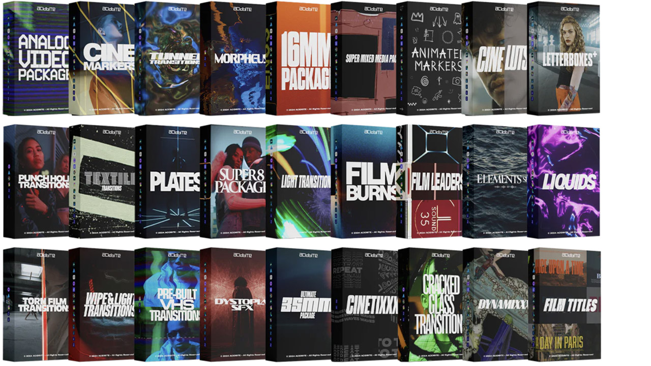
Acidbite ➔
50% off everything
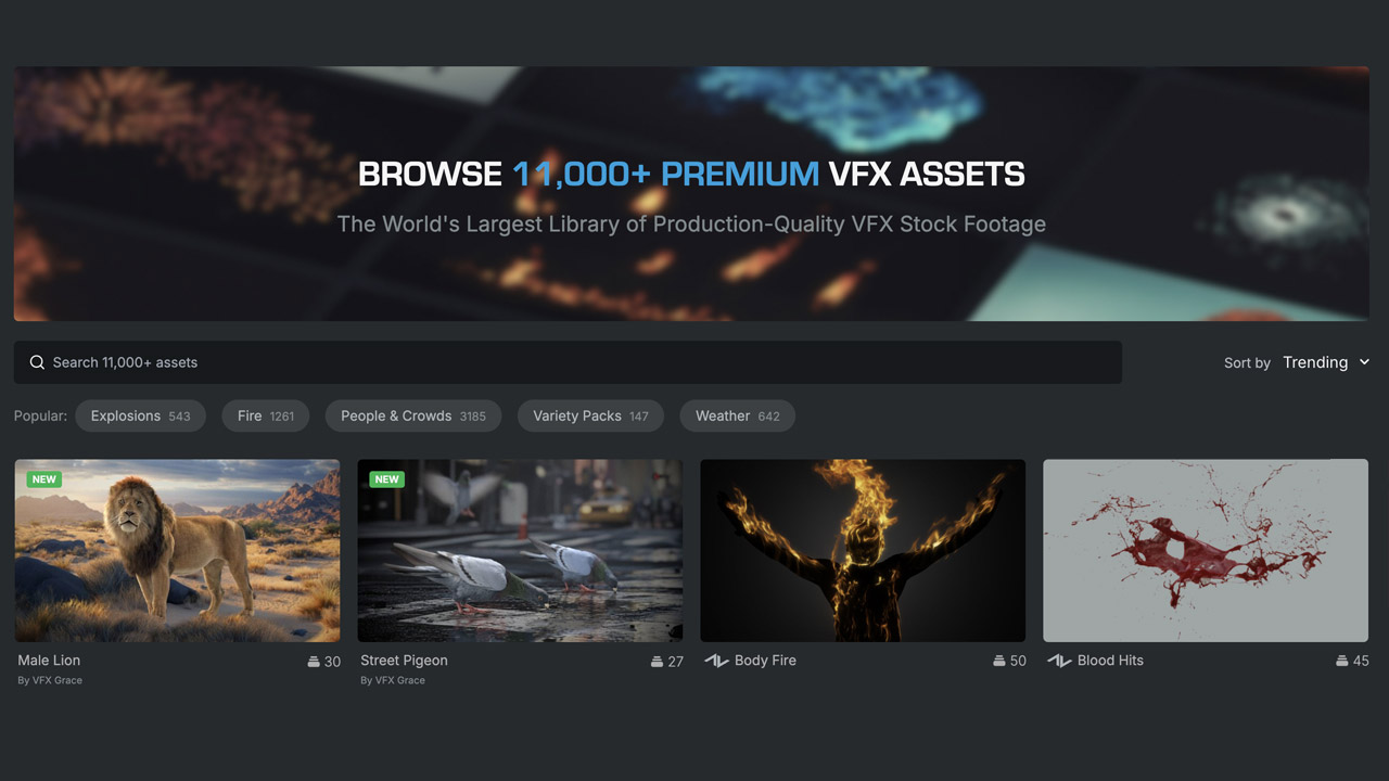
ActionVFX ➔
30% off all plans and credit packs - starts 11/26
Adobe ➔
50% off all apps and plans through 11/29
aescripts ➔
25% off everything through 12/6
Affinity ➔
50% off all products

Battleaxe ➔
30% off from 11/29-12/7
Boom Library ➔
30% off Boom One, their 48,000+ file audio library
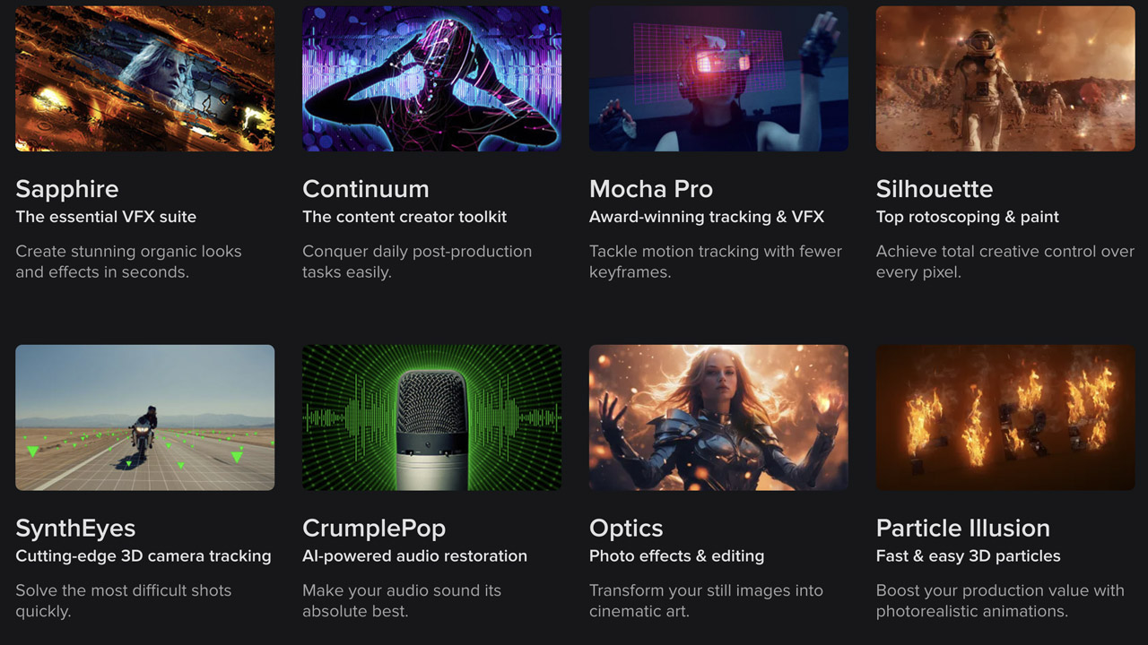
BorisFX ➔
25% off everything, 11/25-12/1
Cavalry ➔
33% off pro subscriptions (11/29 - 12/4)
FXFactory ➔
25% off with code BLACKFRIDAY until 12/3
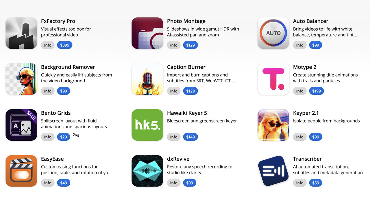
Goodboyninja ➔
20% off everything
Happy Editing ➔
50% off with code BLACKFRIDAY
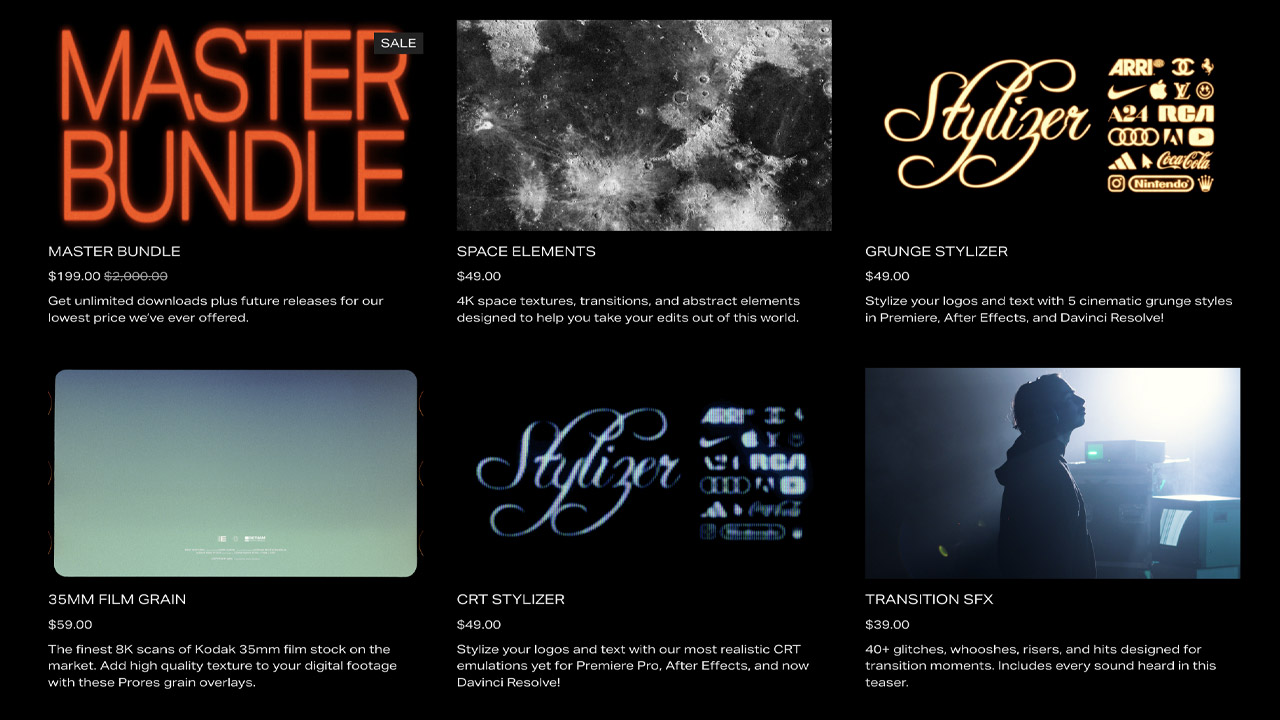
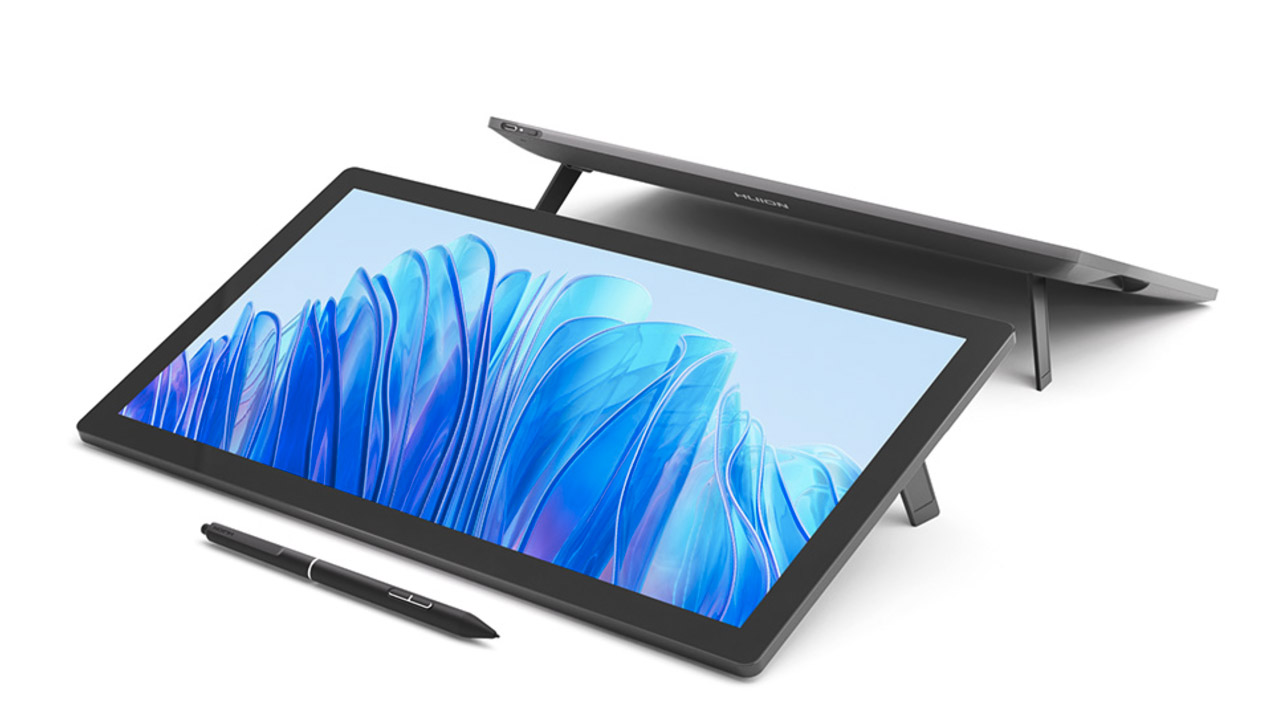
Huion ➔
Up to 50% off affordable, high-quality pen display tablets
Insydium ➔
50% off through 12/4
JangaFX ➔
30% off an indie annual license
Kitbash 3D ➔
$200 off Cargo Pro, their entire library
Knights of the Editing Table ➔
Up to 20% off Premiere Pro Extensions
Maxon ➔
25% off Maxon One, ZBrush, & Redshift - Annual Subscriptions (11/29 - 12/8)
Mode Designs ➔
Deals on premium keyboards and accessories
Motion Array ➔
10% off the Everything plan
Motion Hatch ➔
Perfect Your Pricing Toolkit - 50% off (11/29 - 12/2)

MotionVFX ➔
30% off Design/CineStudio, and PPro Resolve packs with code: BW30
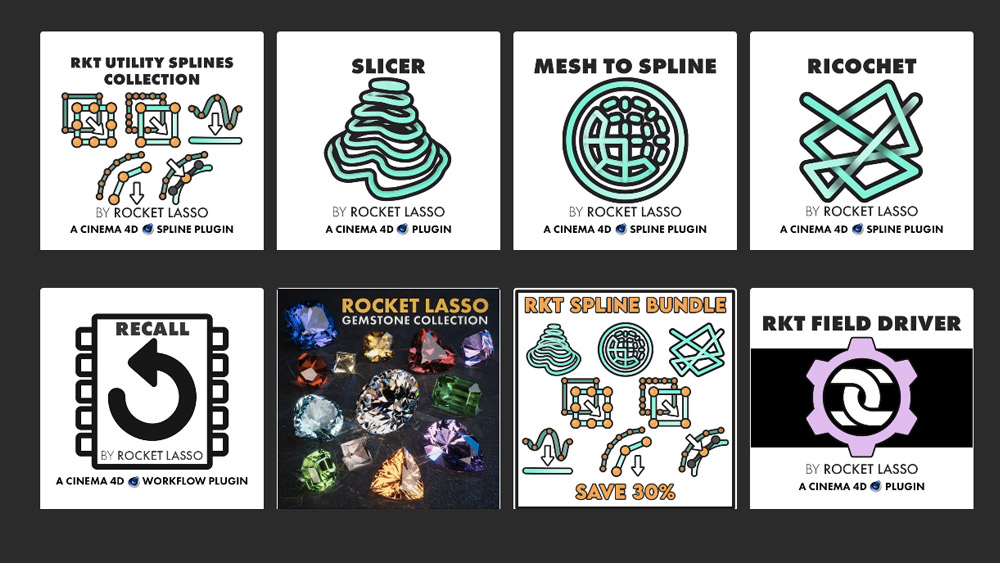
Rocket Lasso ➔
50% off all plug-ins (11/29 - 12/2)
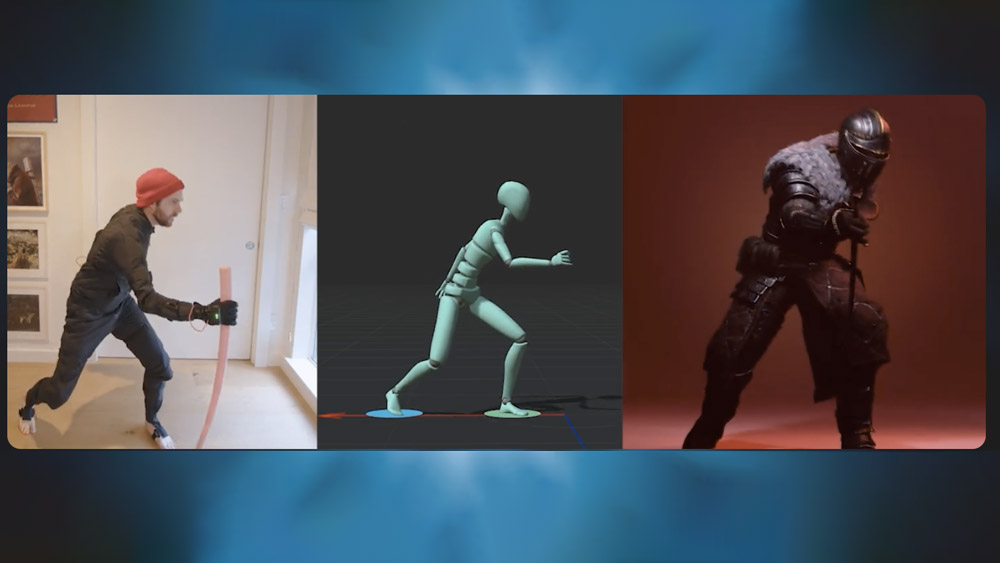
Rokoko ➔
45% off the indie creator bundle with code: RKK_SchoolOfMotion (revenue must be under $100K a year)
Shapefest ➔
80% off a Shapefest Pro annual subscription for life (11/29 - 12/2)

The Pixel Lab ➔
30% off everything
Toolfarm ➔
Various plugins and tools on sale

True Grit Texture ➔
50-70% off (starts Wednesday, runs for about a week)
Vincent Schwenk ➔
50% discount with code RENDERSALE
Wacom ➔
Up to $120 off new tablets + deals on refurbished items
