Learn After Effects the Right Way
Master the After Effects interface and build a real animation skillset. Enroll in All-Access to unlock AE Kickstart and 50+ other courses.
Need a quick primer on the basics of Squash and Stretch?
Check out this helpful After Effects lesson.
If you've taken Animation Bootcamp you know how important Squash and Stretch is to making your animations come to life. It’s the great multi-tasker, doing things like mimicking motion blur and adding a sense of flexibility and volume to what you’re animating.
The easiest way get squashing and stretching in After Effects is by using the scale property which can give you uniform, clean looking squash and stretch. That’s good for some things, but it can get boring after a while.
In this lesson you’re going to learn how to build a sweet squash and stretch rig that will warp and bend your characters in a more interesting way that the scale property alone can't. You’ll be pairing up effects with simple expressions to build a rig that keeps you in control without adding a ton of extra keyframes.
BONUS: Because it’s built with effects and expressions you can save it as an animation preset for easy re-use!If you want to grab the finished rig you can log in and download it.
{{lead-magnet}}
-----------------------------------------------------------------------------------------------------------------------------------
Tutorial Full Transcript Below 👇:
Music (00:00):
[elevator music]
Jake Bartlett (00:19):
Hey, this is Jake Bartlett for school of motion. And in this lesson, I'm going to be teaching you about an advanced squash and stretch method. Now, if you're not familiar with the squash and stretch animation principle, you should definitely go back and watch Joey's lesson on what it is, why it's important and how to do it. That'll get you up to speed. Then you can come back to this lesson and learn how to apply it in a more advanced way. Squash and stretch can add a whole lot of life to your animations. And it's really great for making things look cartoony. And what we're going to do in this lesson is streamline the entire process of applying squash and stretch to anything you want to animate simple shapes, text characters, anything at all. And on top of that, we're going to be adding an extra level of detail that will create unique deformations with your squash and stretch.
Jake Bartlett (01:03):
We're going to be using a few expressions, but none of them are too complicated. So don't worry if you're not too savvy with them. And don't forget to sign up for a free school of motion student account so that you can have access to my project files for this lesson, as well as all the other lessons on school of motion. Plus, you'll be added to our weekly newsletter, which keeps you up to date on this industry and everything that's happening over here at school of emotion. Now, squash and stretch is a super helpful technique for giving life to your animations, but sometimes just using the scale property, makes it all look a little too uniform and can start to look a little plain. Let me show you what I mean by that. I've set up this little demo to explain what squash and stretch is, and then what we'll be doing.
Jake Bartlett (01:40):
So on the left side, you see there's no warping at all. This little chicklet guy is just jumping up, falling down. There's no squash and stretch in the middle here. I'm using the scale property to drive the squash and stretch. So the character anticipates his jump squishes down, hops up in the air and then deforms to make a much more cartoony, bouncy, squishy looking animation that gets the job done. And a lot of times it can look just fine. But what we're about to do is add another level of detail that you can see over on this third character where we're not only scaling the layer, but we're also deforming the shape. So right in here, you can see that the character is bending in a way that just animating the scale property. Wouldn't allow us to do that. Little extra detail can add a lot of life to your animations.
Jake Bartlett (02:26):
So let's jump in and see how we can make this happen. I'm going to make a new comp 1920 by 10 80, 24 frames per second, and I'll make the background white. So it's easy to see and I'll start by making a new solid, and I'll just make it 200 by 200 pixels and pick a nice orange color hit. Okay. And then I'm going to add the warp effect. So I will find the warp and apply it. So let's take a look at what this effect is doing. You may be familiar with it already, but it just allows you to bend in historic whatever it's applied to in some preset. So by default, it's set to the arc warp style and I have this bend control, which allows me to control how much it bends and in what direction I can also choose which axis to warp it on so we can go vertical or horizontal.
Jake Bartlett (03:17):
And if you go through the warp styles, there are all different kinds of warps that you can apply to your layers. So you can take some time to look through all of these. We're going to be using the bolds warp style for this. And as you can see this warps the top and bottom, when it's set to horizontal, and if I change it to vertical, it'll kind of push the edges out or bring them in. This is how we're going to be using it. So make sure the warp style is set to bulge and your warp axis is set to vertical. Some other controls. We have our horizontal distortion and vertical distortion, and these are also going to come into play. If I adjust this, you can see that it kind of skews the layer left and right, or up and down. Now, one important thing to take note of is that right now, this warp effect is basing the warp on the size of the layer.
Jake Bartlett (04:04):
But if I were to make a shape layer and I'll make the square the same size as our solid, and I'll just push it over to the side so we can see it. And then I apply the warp effect that you can see, this is not working the same way. If I move my shape layer around, it doesn't really seem to make sense at all. What's actually happening. Is that because this is a vector layer and not a Rasta layer, like the solid, the effect is being based on the bounding box of the comp rather than the bounding box of the layer. And that's how it's going to work for any layer that's vector or continuously rasterized. So shape layers, text layers, and continuously rasterized comps. The workaround for these types of layers is to comp the artwork before you apply the effect. So if you're going to be using shape layers or text anything, the warp isn't based around the bounding box of the layer, make sure that it's pre composed.
Jake Bartlett (04:58):
So if I remove the effects and pre compose this layer, name it box, this pre-camp is still the same size as my main comp. So I need to go into it and change the size to be 200 by 200. Now I could leave a little bit of room around the outside edges if I wanted. And that would be just fine. So let's say two 50, and I might give you a little bit more room to customize this. If you were turning it into a character, like my example, but then we come back out to our main comp I'll copy this effect onto the box. Now it works exactly how it needs to.
Jake Bartlett (05:33):
All right, I'm going to delete that layer and we can move on. The first thing I want to do is link this vertical distortion to the bend amount. So that those two numbers are always the same and I only have to animate one of them to get the result of both of them. So I'm just going to open up the effect and then I'll add an expression on the vertical distortion by holding option and clicking on the stopwatch and then pick whipping the bend value that will automatically generate the expression code that it needs to reference. That effect I'll click off of it. And now, whatever this value is set to the vertical distortion value will update with it. So already we're simplifying our process by cutting out one of the properties that we would have had to key frame by hand, I'm going to set this to zero for now, and we could drive the squash and stretch part of this effect using the scale property.
Jake Bartlett (06:21):
So I could open up the scale on linked them, set this one to 50 and this one to one 50, but that squash and stretch is based on the anchor point. And I would want it to be at the base of the layer. So if I move that down to the base, that could work, but now my anchor point is at the base of the layer. So things like the rotation are going to be based on that as well. So instead of using the scale property, we're going to use an effect. That's going to make the squash and stretch completely separate from the transformed controls of the layer. So we'll come over to the effects and presets and type in transform and apply the transform effect. Now, if you've never used this effect before, it basically just gives you all the transformed properties that any layer already has, as well as some additional controls that are going to help us out with this rig.
Jake Bartlett (07:06):
So here I've got a scale I can reposition the layer and you'll notice that the actual layer itself is not moving. It's just the contents within it. So this added level of control is really going to help making animation a lot more controlled and fine tuned. So let me recenter that. The first thing I want to do is be able to change the anchor point. So if I grab the anchor point and adjust it, you see that shifting my layer around to fix that, I need the position to go where the anchor point is. And then the layer will scale off of that point. But I want that to automatically happen wherever I put the anchor point, the position to go with it. So we're going to add another expression on press E to bring my effects, Throwdown transform. And I just want to link position to the anchor point, the same way that we linked vertical distortion to the band.
Jake Bartlett (07:59):
So I'll hold down option, click on the stopwatch for position, and then use the expression, pick whip to select the anchor point. Let go click off. And now wherever I put this anchor point, the position moves with it. Now my layer still moving because I changed the scale. So let me put that back at a hundred, but here we go. Now I can move this anchor point around and the layer stays where it should. So I will just drop this down to the bottom center. And then I want to unlink my scale within height. So I will uncheck this uniform scale. So now I can independently adjust the height and the width net will allow me to animate my squash and stretch. Now these are two separate properties, but I don't want to have to key frame both of them to drive my squash and stretch.
Jake Bartlett (08:43):
So if you remember from Joey's lesson, you want your layer to pretty much maintain the same volume at all times. So if you were to scale the height down to 50, you would want the width to scale up to one. And the way you can always check this math is just add up these two values and make sure they always equal 200. So if this is 1 25, then this should be 75. That equals 200. The volume is maintained, but when you're animating, you don't want to have to think about all that math and frankly, you shouldn't have to. So we're going to solve this with expressions so that after effects does the math for us, and these two values always equal 200 to do that. I'm just going to option, click on the scale with property and I'm gonna type in 200 minus, and then I will pick whip the scale height.
Jake Bartlett (09:34):
So this value should be 200 minus whatever this is set to. If I click off of that, that simple little equation is now calculating my squash and stretch for me. So all I have to do is animate the scale height and the volume of that layer will always be contained. So very simple little equation, but it completely simplifies the process of animating squash and stretch. And just to reiterate what this anchor point is doing. If I clicked and dragged it to the top of the layer instead, now my squash and stretch is based on the top. So I will just put that back down to the base and we can move on. Let me set this back to 100. And the next thing I need to do is get the bend to work with that scale height. So all we have to do is animate a single property and all of our warping and squash and stretch is happening automatically.
Jake Bartlett (10:27):
Now this next expression is a little bit more complex, but pretty straightforward once you understand it. So I'm going to add an expression to the Ben property, give myself a little bit of room and we're going to start by defining a variable. Now, a variable is just a way for you to write your own shorthand within expressions. So I'm going to start by typing VA R for variable space, and then we have to name the variable. So I'm going to type S for scale height, and I'm gonna make that H capital. Now that capital age, isn't extremely important. That's just kind of the common way of writing code. Every new word is capitalized, and it can just make your code a little bit easier to read, and then I'll put another space equals space, and then we need to tell this variable what it contains.
Jake Bartlett (11:13):
So I will grab the whip and come down to the scale height and let go and finish this line of code with a semi-colon so that after effects knows that's the end of the variable. So now anytime that I type as height after effects will interpret it as this line of code, that references the scale height, I'm going to drop down two lines and we're going to write a linear expression. Now a linear expression is just a way to interpret one range of values into another range of values. So let's just write the expression and then I'll explain how it works. So we're gonna start by typing linear, open parentheses, and then S height. And again, that will reference this line of code and I'll put a comma zero comma, 200 comma, 50 comma, negative 50, then a closed parentheses and a semi-colon to finish off that line.
Jake Bartlett (12:15):
So what is this saying? The linear expression is first looking for a property. So we told after effects to look at the scale height property right here. Then it needs four values, a minimum and maximum input range and a minimum and maximum output range. So it's going to look at that scale height property when it's between a value of zero and 200. And I chose those two numbers because I'm never going to set my scale height lower than zero, and I'm never going to set it higher than 200. So that is the minimum and the maximum input range. Then it needs to know what do you want to remap that range to be? So when the scale height is set to zero, I want the bend property to be set to 50. And when the scale height is set to 200, I want the bend to be set to negative 50.
Jake Bartlett (13:10):
Now, if I click off and adjust the scale height, you can see what's happening. The bend property is automatically changing based on the scale height. And because we linked the vertical distortion to the bend that is also being adjusted. So with these two effects in a few simple expressions, we created a squash and stretch rig that warps and deforms in interesting and unique ways, and automatically calculates our squash and stretch all based on a single property. So if I just set a key frame and press a you to bring up that key frame, I could literally animate this entire squash and stretch rig with a single property. Something that would've taken me a lot more time. If I was having a key frame, each one of those properties individually, I'm going to get rid of these key frames, set it back down to 100, and there's actually another feature of the transform effect.
Jake Bartlett (14:03):
That's going to come in handy when you're animating things that you squash and stretch. And it's the skew part of this effect. If I adjust the skew, you can see that it warps our layer in another interesting way. And in this instance, I would want my skew axis to be set to 90 degrees. And as I adjust the skew, now you can see that as based on where the anchor point is. So the skew property allows me to lean my layer in one direction or the other this in combination with the squash and stretch can make things like bounces and jumping, much easier to control. And another benefit of using the transform effect is, again, that all the squash and stretch the skewing, everything is contained within that effect. So I can resize this layer, reposition it, rotate it. And none of that transform of the layer will mess with the transform effect.
Jake Bartlett (14:54):
So your squash and stretch the skew, the warp is all independent of those transformed controls. So that's very handy when moving around and animating your layers. Let me get this scale back to 100 and the skew back to zero. So the way that we set this up is really for the character to be based on the ground. So when I do this squash and stretch, you see that it's based on where we put our anchor point down on the imaginary floor, but what if I wanted this character to start at the ground, jump up and hit the ceiling and then squash and stretch off of that. Well, then we need to move the anchor point to the top. We need to key frame it from the base for when it jumps off the ground. So we can add the squash and stretch there, but the way that we've set this up really doesn't work for things like hitting into the ceiling. We want the fat part to be at the top rather than at the bottom. So instead of key framing and having to mess with the effects that we've already set up, instead, we could just duplicate these two effects, adjust them for the top and have two separate controls. So I'm going to rename this warp bottom and transform bottom, and then I'm going to duplicate both of these effects. I'll drag it to the bottom, and then I'll rename these warp top and transform top.
Jake Bartlett (16:21):
All right, so I've got warped bottom transformed, bottom warp top transform top. First thing I need to do is make sure that I have the top transformed, selected, put the anchor point up at the top and something already is messing up. What's going on? Well, when I duplicated these effects, the expression stayed exactly the same. So these expressions that you see or read are still referencing the original effects. So I'm gonna select my layer and double tap E to bring up all the expressions, give myself a little bit more room down here, and we need to go to the transform top position expression and change the reference property right now. It's referencing the transformed bottom, which you can see right there. All I have to do is go into that expression and change bottom to top because that's what we renamed the effect.
Jake Bartlett (17:13):
Now my layer went back to where it's supposed to be. And as you can see, I can move the sinker point around and the position follows it. So that's great. Now we just have to do the same thing for all the other expressions, wherever it says, bottom, just go in and type in top, do that for the warp effect as well. Once all that is done now, I have the secondary control for squash and stretch. That's operating independently of the bottom, transform and warp. So now that we've got all of our referencing the right properties, we need to adjust some things so that it looks like this is crashing into the ceiling. So let me just put it up at the top of the composition and I will squish it down. Now, like I said before, I want the fat part to be at the top, not at the bottom, let me close up the transformed bottom and the wart bottom, just so we can focus on the top controls and we need to go to the vertical distortion in inverse that value.
Jake Bartlett (18:16):
Now, this is extremely simple. All we have to do is go into that effect and add at the end of it, times negative one, then click off and you see that now that vertical distortion is inversed. The fat part is now at the top, and I can adjust this and it's working exactly the way it needs to perfect, but what if it needs to go into the side of the comp and squash into the side instead? Well, let's go ahead and build out controls for that as well. I'll collapse these two effects and duplicate them again, bring them to the bottom and rename them warp right, and transform. Right.
Jake Bartlett (18:54):
Then I'll again, double tap each to bring up the expressions and collapse all of the ones that I don't need to see. And I'll start with the position again, changing, transform top to transform, right. Then I'll go into the other expressions and do the same thing replacing top with right. Okay. Now everything is referencing correctly. I'll set the squash and stretch for the top back to 100 and come down to my transform, right? And adjust this scale. And you can see that we need to make some adjustments. So first of all, let me just put this back to 100. We need to put the anchor point to the right side of the layer and all line this to the right side of the comp. So when I adjust the scale height, it's based on the right point on the layer, but the warping is completely off.
Jake Bartlett (19:48):
The first thing we need to do is go to warp, right, and change the warp axis from vertical to horizontal. So now that bulge is going to be going from the top and bottom rather than the left and right. And then instead of vertical distortion, we need to adjust horizontal distortion. So let me collapse the warp and opened again so we can see all of our properties. And I'm just going to cut the expression out of vertical distortion and then make an expression on horizontal distortion and paste it in there. And while I'm in here, I'm going to get rid of this inverse expression times negative one, then I'll click off and I'll make sure that I reset the vertical distortion back down to zero. And now it's almost working. If I adjust the scale height, you see that now it's going left to right instead of up and down.
Jake Bartlett (20:40):
So that's good. But when it's squished into the wall like this, it should be getting wider on the right side, not the left. So I need to go into the bend expression and adjust my linear equation. So instead of having an output on the bend from 50 to negative 50, I need to reverse that. So negative 50 to 50. And by the way, while we're adjusting this, this range of 50 is just what I think looks nice, but you can feel free to adjust these values, to make something unique, just make sure that these two values are proportional. So if you set, this does negative 75, this one should be 75. But anyway, for this, we'll just put it negative 50 to 50 click off. And now that is warping in the right direction. So I'll adjust the scale height and we've got our squash and stretch off the right side. I can set this back down to 100 and now all that's left is one for the left side. So let me duplicate these two effects. One more time, bring it to the bottom, change it to warp left and transform, left double tap E collapse, all the effects I don't want.
Jake Bartlett (21:54):
And let's do this process one more time. So I will first change right to left on all the expressions.
Jake Bartlett (22:08):
Then I'll move the anchor point for the transformed left to the left side of the layer. And then I'll align this to the left side of the composition, just so it looks right and I'll adjust the scale height. So the wide part again is going on the wrong side of the layer. So I need to add that inverse times, negative one again to the horizontal distortion. So times negative one. Now the wide part is on the left side of the layer where we need it. And it's all working exactly the way it needs to now. So I could easily animate this, bouncing off the walls, the ceiling and the ground. Now, all I have to do to get ready for animation is set a key frame on the scale height property for each one of these transform effects.
Jake Bartlett (22:54):
And then I can press you on the keyboard to bring up those key frames. And that's all I have to see to be able to do squash and stretch on any one of the sides of the layer. So let me just put this back in the middle. I'll reset this to 100 and now I've got the bottom squash and stretch the top squash and stretch the right and the left. Now that we've done all of that work, we can easily apply this rig to any layer by saving these effects as a preset. So if I click on my layer and press E to bring up all the effects, I'll just select them all. Come over to my effects and presets, click on this little dropdown menu and say, save animation preset, and I'll give it a name squash and stretch hit save after effects. We'll take a second to say that preset refresh my list.
Jake Bartlett (23:49):
And now if I were to grab, say my little chiclet character, I'll bring him out. I can type in squash. There's my preset. I'll double click to apply it, press you to bring up the key frames. All those default key frames I set are already bare. Everything is already set up except for the anchor points. Now, if we really wanted to dive deep into the expressions, I could have set this up to automatically place the anchor points to the top bottom left and right of the layer. But in this case, I have some room around my character. So I don't actually want the anchor point to be all the way down here. I want it to be right here. So for this specific rig, I don't think using an expression to snap, those anchor points would be the best option. Having the flexibility of adjusting where your anchor point is, is a good thing when doing this type of animation.
Jake Bartlett (24:37):
So I just need to set my anchor points for each one of these effects and just like that. My squash and stretch rig is completely set up for all sides of the layer and the skew works exactly the same. Again, basing it off of wherever. The anchor point is for that instance of the effect, and this can work on any shape. It doesn't have to be a square. If I were to change this to be a circle instead of a square, the squash and stretch still works. You can see that it's warping the shape in a more unique way than if we were just using the scale and to prove that, let me just turn off the warp. You can see that when this is squash and stretch with just the scale, it looks fine, but it's kind of plain. So adding this extra warp that deforms the shape in a more unique way can really be a nice touch, adding some uniqueness to your deformations.
Jake Bartlett (25:35):
And that's it. Now you can reuse this preset on any future projects, never again, having to think about setting up squash and stretch with some added controls, which may create in this type of animation, very streamlined. So there you have it, a super simple method for streamlining squash and stretch while adding another level of detail to make the deformations more unique. Putting all this work in upfront allows us to cut out a long and painful key framing process for lots of future projects. Thanks for watching. I hope that this lesson is valuable to you and that it's able to streamline your workflow and improve the look of your animation. We'd love to hear from you if you use this technique on a project. So tag us on Twitter at school of motion and show us your work. And if you learned something valuable from this video, please share it around. It really helps us spread the word about school emotion, and we truly appreciate it. And don't forget to sign up for a free student account to access project files from the lesson you just watched, plus a whole bunch of other great stuff. Thanks again. And I'll see you next time.
ENROLL NOW!
Acidbite ➔
50% off everything
ActionVFX ➔
30% off all plans and credit packs - starts 11/26

Adobe ➔
50% off all apps and plans through 11/29

aescripts ➔
25% off everything through 12/6
Affinity ➔
50% off all products

Battleaxe ➔
30% off from 11/29-12/7
Boom Library ➔
30% off Boom One, their 48,000+ file audio library
BorisFX ➔
25% off everything, 11/25-12/1
Cavalry ➔
33% off pro subscriptions (11/29 - 12/4)
FXFactory ➔
25% off with code BLACKFRIDAY until 12/3
Goodboyninja ➔
20% off everything

Happy Editing ➔
50% off with code BLACKFRIDAY

Huion ➔
Up to 50% off affordable, high-quality pen display tablets

Insydium ➔
50% off through 12/4
JangaFX ➔
30% off an indie annual license
Kitbash 3D ➔
$200 off Cargo Pro, their entire library
Knights of the Editing Table ➔
Up to 20% off Premiere Pro Extensions
Maxon ➔
25% off Maxon One, ZBrush, & Redshift - Annual Subscriptions (11/29 - 12/8)
Mode Designs ➔
Deals on premium keyboards and accessories
Motion Array ➔
10% off the Everything plan
Motion Hatch ➔
Perfect Your Pricing Toolkit - 50% off (11/29 - 12/2)

MotionVFX ➔
30% off Design/CineStudio, and PPro Resolve packs with code: BW30

Rocket Lasso ➔
50% off all plug-ins (11/29 - 12/2)
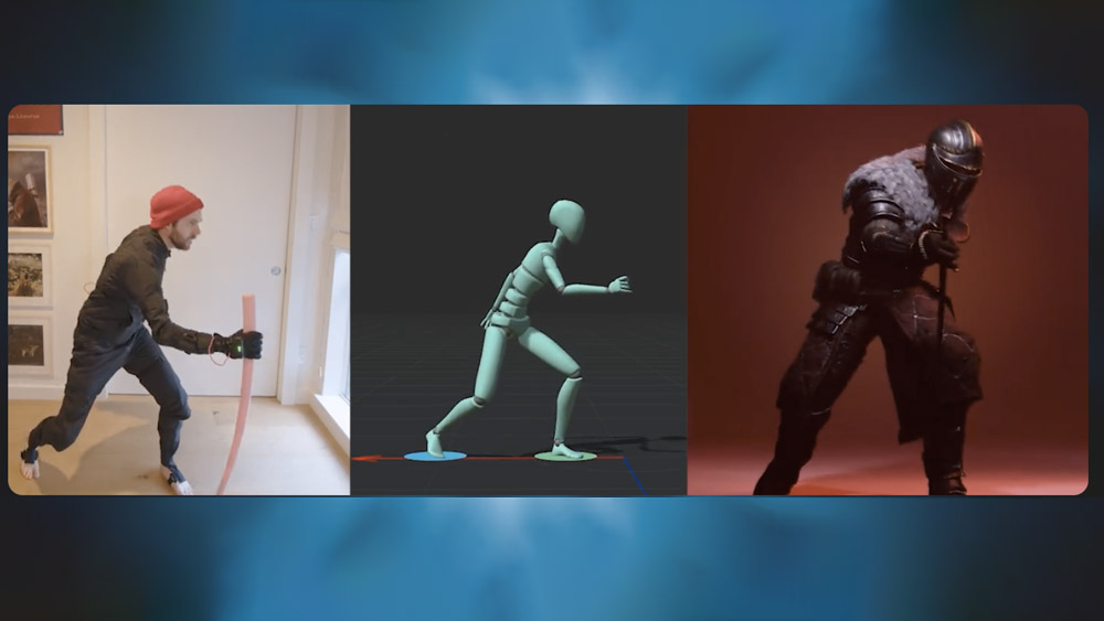
Rokoko ➔
45% off the indie creator bundle with code: RKK_SchoolOfMotion (revenue must be under $100K a year)
Shapefest ➔
80% off a Shapefest Pro annual subscription for life (11/29 - 12/2)

The Pixel Lab ➔
30% off everything
Toolfarm ➔
Various plugins and tools on sale

True Grit Texture ➔
50-70% off (starts Wednesday, runs for about a week)

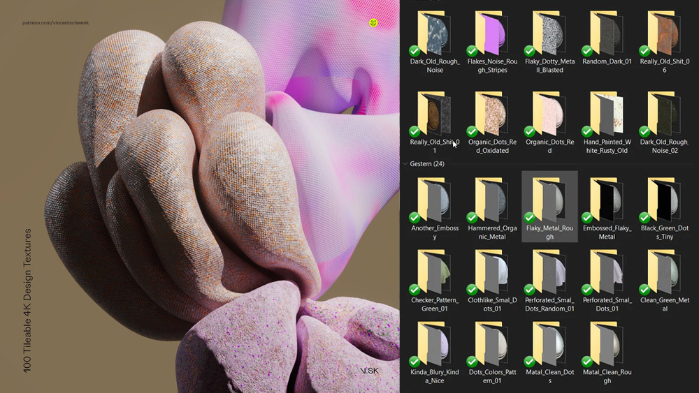
Vincent Schwenk ➔
50% discount with code RENDERSALE
Wacom ➔
Up to $120 off new tablets + deals on refurbished items


Learn After Effects the Right Way

Master the After Effects interface and build a real animation skillset. Enroll in All-Access to unlock AE Kickstart and 50+ other courses.
