All-Access Pass
Unlimited access to 50+ courses, unlimited critique, live events, and 24/7 community. Join School of Motion All-Access today.

A traditional animation technique—Stretching and Smearing—has been brought back to life in with this snazzy text animation trend
One of the hottest trends to hit the motion design scene takes inspiration from a classic technique used in cartoons for decades: Stretching and Smearing.
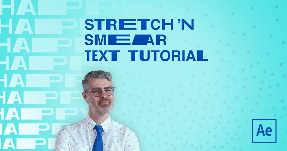
Stretching and smearing type has become a mega-trend for hip and edgy brands, and boy is it fun to watch. What's really cool is that it's not too hard to learn, and the technique itself is very forgiving.
Nol Honig breaks down how to achieve this very effect using his work from Verizon as an example.
Strap-in, buckle-up, grab-hold, lean back, and any other preparatory metaphors you need; it's time to learn how to stretch and smear typography!

Stretch and Smear Text
If you want to take a look at the final scene developed in the tutorial, download Nol's project file. There's a lot to glean from looking at easing values in the graph-editor, and taking a scene frame by frame. You never know what will spark your next big idea.
{{lead-magnet}}
Limber Typography
Text in After Effects is bound by several parameters that keep it editable, and we'll need to free it up if we'd like to start stretching it out. So, to get started, you'll need to convert the type to a shape.

The text becomes an editable shape path that can keyframed!
Smears and Match Cuts
Once you're able to bend type shapes to your will, it's all about movement and editing.
Please note, that everything has to morph into one another. Nol uses a very popular technique called the Match Cut in combination with stretching and smear type to transition from one word to another.

This workflow will take a good bit of finessing to get just right, but soon you'll realize what makes a good smear and muscle memory will take over.

Time to Explode
If you're not familiar with this workflow then you're quickly going to notice the pain of working with type from shape layers. Each letter is tucked away in neat little folders that require a lot of twirling open. Luckily, there is a solution that can really help make your workflow faster. We highly recommend checking out Explode Shape Layers 3 on aescripts + aeplugins.
Get Your After Effects In Shape!
If you think it's impressive to watch Nol do his thing, imagine working with him to improve your skills. That's why we put together After Effects Kickstart, a course designed to get you into the thick of it with real-world projects.
After Effects Kickstart is the ultimate After Effects intro course for motion designers. In this course, you'll learn the most commonly used tools and best practices for using them while mastering the After Effects interface.
-----------------------------------------------------------------------------------------------------------
Tutorial Full Transcript Below 👇:
Nol Honig (00:00): Hello, I'm Nol Honig keen after effects observer and frequent wear of ties. Now I hope you're ready to expand your minds because today I'm going to show you how to stretch the heck out of some time. So no matter what level you're at with your motion design skills, the techniques that I'll be going over today, shouldn't be too difficult to grasp. Just make sure to download the project files that I'm using in this video so that you can work along with me or practice them on your own. After watching details are in the description below. Now grab a coffee because I'm definitely going to go to some great lengths to demonstrate this
Nol Honig (00:51): In the last bunch of years, motion designers have begun to bend and stretch and distort type like crazy. It's kind of a trend now. And if you don't know what the hell Vertica I'm talking about, I would look no further than DIA studios, who in my mind kind of helped pioneer this a really great example of the kind of stretchy type that I'm going to be talking about today can be found in this piece by worship studio called beyond the arc. So check this out. Yeah, there, you can see it and there and there, and there more specifically, here's a really fun shot that I animated for Verizon recently in which I had the word energy turn into the word efficiency. So today I'm going to go over two examples of stretchy type one. That's more simple where a word stretches into a stop easing onto screen. And another one that's like the example I just showed where one word stretches and transforms into another word
Nol Honig (01:53): Before we begin. I just want to note that in order to do this kind of stretchy animation, we're going to need to turn our live type layers and after effects into shape layers. And that means that our type will no longer be live. So just like in real life, you should choose your word carefully before you begin. Okay. So if you've never converted type two shapes in after effects before, let me just roll through this really quick. So if you right, click on your type layer and go to create, you can grab, create shapes from text, okay. That turns off your type layer and creates a shape layer with the same name, basically. And then if you open this up, you see that there's a pretty convenient folder structure or tab structure in here. Each letter has its own tab. And within those tabs, each one has kind of the things you'd expect from a shape layer, like a stroke and a fill. This is kind of act as a group and then you've got your own transform. This is really great. Okay. But what we're going to work on today is this, okay. Each group for each letter has a path. Okay. And we're going to be animating the heck out of those paths.
Nol Honig (03:05): So first things first, we need to create path key frames for the completed state of the type. Okay. Because once you start changing those paths, if you don't have key frames that are like the perfect S and the perfect ear, whatever, you're never getting those back. Okay. So I'm going to roll to like one second or whatever, and then I want to make path key frames for all of these letters. Now there's a lot of digging through sub folders here to get this. So what I usually do is, uh, I press you, you okay? And then I just tick off all the path, uh, stopwatches till I have key frames there. And then I'm just going to press you again, just to show all the properties that have key frames. Okay. So great. Just make sure to do that first.
Nol Honig (03:54): All right. So now that I have key frames for the completed state ly, just want to make sure that I'm back here at the beginning. Okay. And I'm going to copy and paste these key frames. All right. And with all of these key frames selected here, that means that all of the points on the paths are selected. So I could just take this and I can kind of move this off screen and kind of create what's sorta like a position animation, but which is only happening along the path. Okay. The only thing that's animating are the paths of these letters and not actually to position. All right. So what I want to do is put some ease on these path, key frames, or I'm going to press F nine. I'm going to take it into the speed graph. Unfortunately, you have to work in the speed graph with paths cause they don't really have values.
Nol Honig (04:40): Right. And what I want is for this word to very much ease into place. Okay. So I'm not going to crank this a hundred percent, maybe something like around 90 there, and then here, I'm going to push this back. So it starts faster, not a hundred percent, but something like 10% should be good. Okay. And I think you all know what this would look like. All right. It's something like that. Right. And that's pretty obvious, but just what I want you to think about in terms of stretching is that the faster, the word is going okay. So higher up in the speed graph, the more it should be stretching. All right. So it's like, as the word whips quickly down from here to here, it should move. It should stretch the most as it's whipping and moving the quickest. Okay. And kind of at the same time, the letters that are closer to the resting point, like this T here, this should stretch a little bit less at the start.
Nol Honig (05:33): Then the first tee, which is kind of farther away from the end. So I feel like this letter's sort of moving a little bit slower and this letter is moving a little bit faster. So I would stretch this one, the least than this one. And then this one and this one the most, you know what I mean? So that's just something to think about. Right. So I'm going to jump out of here. Okay. And now let's just look at this with the T. All right. So I'm going to get in closer here and we kind of have to work off here, but it's fine because we can see the paths really well. I mean, we can always choose like yellow here or something, so it'd be more clear. All right. So basically, uh, I want to work on this T first and the way that you would select any of these points.
Nol Honig (06:11): Um, for example, you could just select one and then it would be selected and you could move it, et cetera. All right. So, uh, what I want to do here is kind of grab all of the points for the paths, for all the letters, except for this side of the T and kind of pull this back this way. Right. Because the words moving left to, right. So I want to be aware of sort of keeping the leading edge where it is in terms of the animation and only stretching backwards. All right. So I'm going to do that in here. Actually. Let's preview just that.
Nol Honig (06:44): Right. So you can see that the T is kind of gently stretching into place here, which we're basically already getting the effect that we want. It's not very difficult to talk about a special circumstance with the S okay. Because the T and the E and the other T here, these are all gonna stretch very easily. Cause it's all right. Angles and straight lines. Right. But when you're stretching curved letters like S's or owes or GS or JS or cues or whatever, um, it's a little bit trickier. Okay. Because if I were to just say, take this and stretch this out this way, it would look pretty weird and ugly, and you'd kind of lose the, the beautiful curves and it just looks messy. All right. So there is a fix for this. I want to go over real quick, and this would work for any curved letter, like an O or a G or a C two.
Nol Honig (07:32): Okay. It just basically, you get in real close to sort of the peak of the curves and I'm going to choose my pen tool. I press G that's the shortcut, and I get as close as I can to the middle point here. And when it makes that little plus sign on the cursor, I know I can drop another point along this curve. That's really close to that one. Okay. And I would do the same thing on this inner path here. Okay. And now this here is just kind of at a diagonal, and I'm just not going to worry about that. It's mostly these curves that I need to kind of concentrate on. So I'm just going to get here, click there, and then go down here and click there. Okay. So now I can kind of pull out just a little bit and kind of try to select just those and all of these points over there.
Nol Honig (08:20): And it looks like I missed, so let me just go through a little bit closer and grab those and all right. That's selected. And, um, de-select that and great. So I've got those selected and just make sure that I'm selecting these two. Okay, cool. So now when I pull this, I can stretch the S like that, and it's just neater. It's just an overall neater shape. I mean, I don't think I love it, but it's kinda, it's kinda cool. It's sort of interesting. Okay. So, uh, fun. Uh, I think that's fun. So now, like I said, we want the S to stretch a little bit longer than the T, so I'm going to that. Okay. Now I'm just going to grab these and pull this over and get the E to be even longer than the S now I think it's also nice to pull this over. So we get sort of a wide thick area here in contrast to these thinner kind of horizontal lines. So I'm going to do that. And then finally, I pull back a little grabbed the T I'm just going to make this the longest of the letters. Right. Cool. So let's check out what that looks like.
Nol Honig (09:24): Yeah. And there you go. I mean, you know, that's pretty good. So depending on what you want or your client wants, this could be done, but if you want to do a little bit more work on it, we could definitely make this a lot more dynamic and stretchy. Okay. And the key to doing that is to add some overlap into this animation here on these key frames. Okay. So let's just start by essentially putting some, you know, two frames, let's just say overlap for all of these key frames. Okay. So let's move these back, like two frames and these back two frames and this back two frames. Okay. I'm just hitting option and right arrow to do that. Okay. Right. You see, like, we've basically just created more space now between the letters and it's our job now to just fill that in more, this is looking a little bit slow to me at this point.
Nol Honig (10:16): So let's just do that. Cool. Yeah. That's a little bit better. Maybe we can even make it faster if it's not moving too quickly. There's no real reason for it to be stretching so cool. But you can still see that there's plenty of space between here and we're going to now fill that in. Okay. And let's start with this sort of final T here, um, which is what's moving on first. Okay. So, um, what we want to just make sure to do is just have the leading edge of this. Like I said before, keep going the way that it is, and kind of stretch this backwards. So that's how I'm going to think about this. And I'm going to move till about here, and I'm just going to basically kind of start hand adjusting this, and I'm going to make a lot of key frames and it's in some sense, like I'm animating this frame by frame at this point, but I think it's kind of cool and I won't take too long.
Nol Honig (11:07): Right. So I'm going to pull this back and I'd go here. And basically, I'm just going to try to keep this kind of spacing roughly between the S and the T as I go for every frame. Okay. And so it's responding to the S so I know that I can just, I'm using my arrow keys now, just a little more convenient and just moving those path points over at a certain point. This will probably be good enough. Uh, let's check that out now. Yeah. So you can see we've added in a little bit more stretch at the beginning for that. Cool. And now it should be okay. On the end. We can try to see if we can kind of like, what would happen if we pull this here, like that just don't want to add too much of a, I'm going to take that.
Nol Honig (11:53): I just don't want to add a little sudden jarring animation right there at the end. Right. I'll go ahead and do the same thing to the rest of the layers on fast-forward. So I don't bother you with the inevitable nitpicking. Cool. Let's check that out. Right. So I think you could see how adding in more overlap here is definitely going to add a lot more stretch into this now. So let's just finish this up. Let's go to the first frame of the E maybe back one. Okay. Where's the, yup. Uh, and drag this back, Oop, and now just do the same thing I was doing before. Well, it looks like we'll have to adjust the S a little bit.
Nol Honig (12:38): I'm really doing this quickly and just by eye, just to kind of get through this, um, if it were you, I would probably do this with a little bit more, uh, carefulness. Uh, but I, I think you're getting this, it looks really cool. So let's just finish this off. Um, and you could even potentially delay that final T key frame coming in. If you want it to give it a little bit more something, and then like, interpolate that even more hard at the end there, if you wanted, and then just basically do the same thing as before. Figure out the first place, the first frame make this longer, just kind of randomly. And I think what we want actually is it looks like the E is now off. It does require a little bit of fiddling. I told you, just because I put so much more space at the end of the T I didn't really think about it, how that was going to affect my EA, but I definitely had to stretch that back out. So yeah, this is what it looks like after I put in a little bit of manual key framing work, and I'm feeling really good about it.
Nol Honig (14:00): Okay. It's time to take this to the next level. I want to show you how you can make a super smeary stretchy transition from one word to the next, like I did with the energy, two efficiency shot that I showed you in this case, because I love you so much. Uh, I want to have happy transition to healthy, which is also nice because like the energy and efficiency, uh, they both start with the letter H and N with Y. So I think we can have some fun with that. So I have the words happy and healthy here, and I've already converted the shapes and gone through the tedious process of putting key frames on all of the paths. Okay. So you didn't have to watch me do that. So now basically, uh, what I want to do is pretty precisely set guides to help me with this animation just a little bit, at least for the edges.
Nol Honig (14:49): Okay. So I'm going to get in close and I have, um, snap to guides, uh, enabled. Okay. So for happy, just gonna get over here and make sure for happy. I'm going to select all of my points, but before I move on, I want to set up down guides because it's very easy when animating path to accidentally bump the letters up or down just a pixel or two. So I definitely want to set guides here. So now with all of these points selected, I'm just going to slip that back. So that's at the edge there. Okay. Now I'm going to select all the key frames for healthy, and I'm going to drag this back while holding down the shift and move that there. And yep. That has, for some reason shifted up, like I thought, so pull that down. Definitely want to work with those top bottom guides here.
Nol Honig (15:39): Okay. So right now I've set this with the two H's lineup. Right. And actually I want these to be my first key frames. So let me pull these to the start. All right. And now I just want to do the same thing, but on the other way, I want to make a guide. Uh, let's see here basically. Right? Okay. Roughly, and now drag these bag this way and snap that there, and then I bet you, this shifted up. Yep. Move that back down. Okay. And then I'll do the same thing for my healthy over and it's place. Cool. Now the why's are lined up. All right. Great. So, unsurprisingly, this just looks like that now. Not a big deal, and I'm going to take this and press F nine and go into the speed graph. And basically now in this case, right. I want something that starts real slow, gets very fast and then slows down again, pretty drastically at the end.
Nol Honig (16:37): So basically I just want this, like, I don't know, like 90% or so on both ends. Right. I want to create a really nice big peak here in the middle. All right. So I think also, obviously you all know what this would look like, but, um, here here's the real thing is if I find the exact point at which this is moving the fastest, like right here. Okay. I'm going to back up one frame and I'm going to cut happy there. I'm going to option bracket. We have one more frame and I'm going to trim healthy to start here. Okay. So already this is going to be a fairly seamless transition between these two, right? I mean, it's very hard to see the transition actually happened because it's occurring when it's moving very, very fast. Right? So that's like kind of the, the basis for this animation, right?
Nol Honig (17:28): From the start. Now that we've got some of the basic timings of the animation down, it's time to take kind of a boring technical step, but one that's really important. Basically. I'm going to break down these shape layers so that each letter is its own layer. Uh, it's a little bit easier for me to deal with than having a ton of animation happening in sub folders, all in one layer. And it'll also allow us to kind of adjust the cut point later on and add overlaps in a way that's just a little bit better. Okay. So there's two ways of doing this one is incredibly useful and easy, and one is really tedious. Um, so I'm going to suggest we use the easy one, but first, let me just show you that you could sort of basically like duplicate this like a whole bunch of times and then get in and delete the app Y folder from one and that's your age.
Nol Honig (18:22): And then on the next one, delete the age and then the PPY and just have the AA, et cetera, et cetera. Uh, I've done that a million times, but there's actually like a really great tool for that made by my friend, Zach, love it. Uh, and so I'm just gonna plug that. Okay. So it's called explode shape layers. If you haven't heard of it, you should definitely get it because it allows you to just basically take both of these and with the click of one button. Now you have outlines, I mean, paths rather for all of your letters on individual layers. Okay. So I'm going to delete the original ones and look at how nice that is. Thank you, Zach. Okay. So we got our basic key frame timings in place, and it's looking pretty good. So what we gotta do now is play with the spacing to make this better. Right? So for example, um, let's look at the H here. Now, remember these are paths. So if I go to the end of this layer here, and if I take this, I want to move this back, I need to select the path, right. I'm going to take this and just push this back. Not all the way to the start, but just so there's a little bit of a gap between there and there and just watch that alone.
Nol Honig (19:30): Right. It's kind of got this interesting, like really nice delay at the start. And then this really hard snap through the middle, which is a little bit exaggerated by the fact that, um, you know, there's such a big gap between the H when it crosses over, but nonetheless, I think this is already starting to look really cool. So let's go ahead and try that also for the Y. Okay. So at the end here, we want the Y to be further down, uh, toward this side. Okay. It'll exaggerate this whole animation a little bit and just make sure to stay in these guides. Uh, this gets really finicky sometimes. Okay, good. So let's just move this over to like there and just check that out.
Nol Honig (20:09): Right. You can see that, like, by stretching out that word there at the start, it was what we've done. It just really kind of adds to the animation and makes it just a little bit nicer. So, uh, let's now go ahead and do all the spacings for all these letters at the cut point. All right. And what we have to remember is that, like I said before, this word is, it's accelerating out from here. Right. And the next word is going to be kind of decelerating in from the center. Okay. So what we basically want is a small gap here at the start, and then a little bit of a bigger gap between H and a, and then an even bigger gap between the a and the P and so on. So that the biggest gap is between the final P and the final, Y it's like the word is spacing out and stretching out.
Nol Honig (20:57): Okay. So what I would do, whoops, is take my a and remember there's two paths there. You got to watch out for this. Okay. And I'm going to drag this back. I don't know exactly how far yet, but here's the gap that I put for that. So this should be at least twice that, so that's probably okay. We're gonna probably have to adjust this a little bit, take my P and I'll shove that back so that that's a bigger space there. And then finally, Hmm. Put this around. There may be, I might have to adjust this P back. Whoops. Whoops. Is a little bit there, something like that. Okay. Just so that it's widening out. Right. And you can see that at work here. Let me move this over.
Nol Honig (21:47): Okay, cool. That's looking really good. So now the next thing is, is to remember that, uh, basically we have two redundant letters here. Um, the H and the Y you know, because of the way that we set this up in the first place, I don't really need these from healthy. I just want the H and the Y from happy to take their place. Okay. So first things first is that the, the Y will be landing in the correct position from the way we set it up before, but the opening H will need to be moved over. Cause that's landed like around here, because happy is a bunch, couple of letters shorter. Right. So what I want to do is just get into this final, uh, key frame here for the H and just kinda shove that over so that it lines up with the other H so I'm just know that it's going to land in the right place here.
Nol Honig (22:32): Okay. And then I think I can go ahead and just delete the H in the Y from there. And I could take this Y and just drag this back, and now that should still work. Yeah. I mean, it's changing the timing's a little bit, but, um, it's still working pretty well. Right. Okay, great. So that's looking good for the H and the Y. All right. So now I just need to get in here and do the same thing with the healthy letters and kind of space those out, um, between here and here. Right. Okay. So let me see, let me grab, Hmm. So again, the space between the Y and the H here will be the shortest and the space between the H and the E will be the longest. So I could figure this out one way or the other, but I'd probably, I don't know, this is going to eyeball that roughly, and then just try to, Hmm. Maybe it's better if I work backwards at this point. So I'll put this kind of close there and this for a little bit more, again, that's a little bit of a dance, I guess, that would need to come over and now the a is in the wrong.
Nol Honig (23:48): So what I don't want to, okay. All right. Good. Hmm. Hmm. Well, fiddling, fiddling, fiddling. This is probably, actually one of the trickiest parts is just getting this spacing. Right. But once we get this, it's really gonna make the rest a lot easier. So bear with me. Okay, cool. Let's just say that's good. Uh, and I think maybe this can come over a little bit that way. Great. So let's, uh, let's look at that animation now, just like that. Yeah. And you can see that there's definitely like a little bit of a shift when it cuts from one to the other now, but we'll definitely be able to fill that in with the fun funds stretching apart next, like I said, this part, shouldn't be that hard now that we have everything set up, we just have to remember that, you know, for the word happy, these letters should be stretching backwards.
Nol Honig (24:50): And for the word healthy, they should be stretching from left to. Right. Okay. So there's a little bit of a shift there. So I would just start with, um, the H okay. So I'll start here and just going to kind of pull this over like that and for the a, I can now Alrighty. So I'm going to take this point here and this point here, and I'll pull that back there. Okay. My P I will, let's see, I'm going to do some of this and some of this. All right. And the other P remember each one of these is getting longer. That's already set up though. So we don't have to worry about it too much. Just remember to follow the guides that we already have by the other letters. Okay. Maybe keep that a little bit longer there. So it's like, they're each getting a little bit longer.
Nol Honig (25:47): Okay. Now the why the, why is it funny case? Because at first here, it's sort of like moving very fast and it's, it's, it actually needs to start decelerating kind of right here, because if we move to the next frame, we're going to have the, the Y there is, can already be kind of crammed in there. So now that I think about it, probably don't want the Y to be moving as fast as everything else, um, or be as stretched. So I take that back. Now, take this, and I'm gonna, let's see, take this, move this here.
Nol Honig (26:24): I'm cheating. I'm stretching this out in a different way now, but, uh, let's see. Oops. Grab these and just trying to get this. Oh, about right. Cool. So that would now look like this right now. Let me just work the healthy letters on this side. So I'll take the E and I'll pull it back. It may be whoops, you know, closer. So it's easier to see what I'm doing and pull this like that. Okay. Let's work the a now, um, I'm going to just grab this and this and pull this back. Right. Good. And the L pretty easy.
Nol Honig (27:15): And then we've got the T and I'm just eyeball on this, trying to do the super quickly. And now the H, which is a little bit messed up because of the, why, what I'm going to do now is just push the Y the frame or two, just so I can adjust the H okay. And I'll get this right. I'm going to make this go over here. Okay. And let's see. Now, what would that look like? Just like that, even with the Y over there? Well, weird. Okay. So we got to get this right. And it might involve just making the Y a little bit smaller at the transition point, and that might require thinking the P a little bit longer, et cetera. Well, let's maybe do that. That's a little bit closer. So this is just very unstretched at this point. Okay. That's fine. And so let me go ahead and adjust the P so that, uh, maybe we don't want this to be as stretched as much if this is sort of decelerating a little bit.
Nol Honig (28:25): So let me go ahead and pull this out right on. So actually I think this looks really awesome already, um, and kind of like our test that we just did. I think we could still use overlap to make this look a little bit better. All right. So the one thing that is stopping this from being a little bit more seamless is that all of the letters cut at once and since healthy has seven letters and happiest five, the shift is a little bit noticeable in there. Okay. So I think if we stagger this cut point so that some of the letters come on a little earlier, and some of them come on a little bit later, we can smooth this out. Okay. So the why is kind of already doing its thing. And we did pull this up one, so I'm going to leave that alone, but let's, um, let's look at the second to last H here.
Nol Honig (29:17): Okay. What if I go to the beginning of there and go like two frames and actually like, start this here. Okay. And, um, and what I'm also gonna do is go back one more frame and trim the P there. Okay. So that the H can kind of like take the place of the P okay. So I might have to put this key frame, and now I'm going to have to kind of just adjust this to get it in the right place, but I can do this. And what actually might be nice is in the next frame. I mean, in the previous frame, the, this descender on the P is really wide and here, I think it would match better as a cut if I made this like, wide as well. So that's a little bit more seamless there. Okay. So that's helpful. So check that out.
Nol Honig (30:11): Yeah. And now what we have to do is we kind of have to adjust this just like before a little bit frame by frame, we could start by just like looking at the, um, interpolation right here. And, you know, seeing if perhaps we can have this slow to, uh, start to smooth some of that out. So that might help with that. Yeah. That does help with that actually. And we could also potentially like pull this in if we want this to start a little bit faster. Right. And that might not be good. Just don't want to mess up your other animation at the end here. So let's just be careful with that. I think what we're going to have to do is just kind of finesse this in frame, by frame at this point. So let me do that really quick and we'll take a look at the end result.
Nol Honig (30:59): So there you go. Ooh. And it looks like, oh yeah. Oh yeah. I made a mistake. So that's really good. Actually super instructive. I forgot to make a key frame right here for the a hole. Sorry. Uh, so it's, it's going off. So what I just need to do is just find the EA and just press that there and that'll make a key frame in the right place. Cool. So, yeah, so I think this is looking really good and I don't want to bore everybody to death by fiddling with this. So I'm going to stop there, but I think you could see how this isn't really that labor intensive. Um, you can get it off the ground pretty easily. And then with some adjustments, make it look really good if you've watched this far, I don't think it would be a stretch to assume that you learned a few cool new tricks and that is wide. I'm going to stop now and say so long. Oh. And before I go subscribe for more and click that bell icon. So you'll be notified when we drop more videos. And if you really want to step up your game, check out after effects, kickstart to learn the most commonly used tools and the best practices. Thanks for watching.
ENROLL NOW!
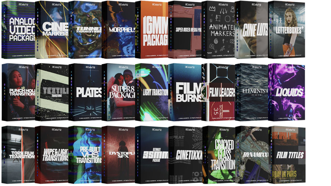
Acidbite ➔
50% off everything
ActionVFX ➔
30% off all plans and credit packs - starts 11/26

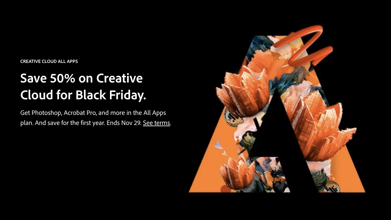
Adobe ➔
50% off all apps and plans through 11/29
aescripts ➔
25% off everything through 12/6
Affinity ➔
50% off all products

Battleaxe ➔
30% off from 11/29-12/7
Boom Library ➔
30% off Boom One, their 48,000+ file audio library
BorisFX ➔
25% off everything, 11/25-12/1
Cavalry ➔
33% off pro subscriptions (11/29 - 12/4)
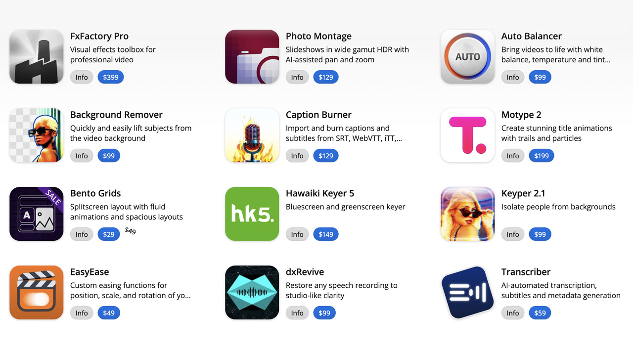
FXFactory ➔
25% off with code BLACKFRIDAY until 12/3
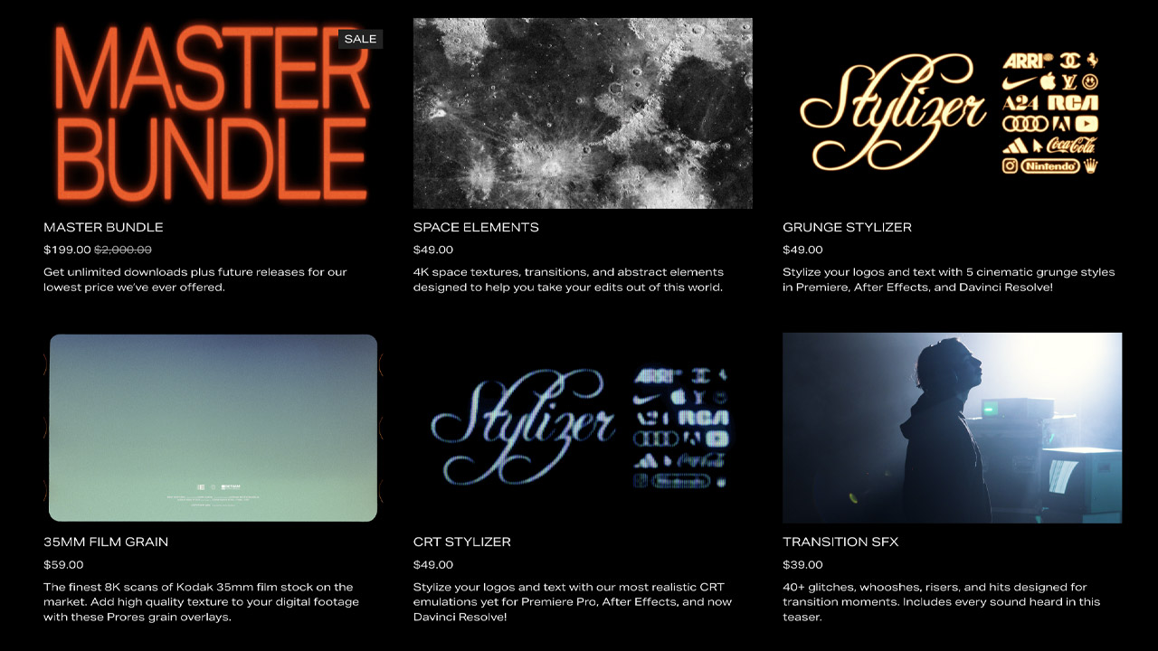
Goodboyninja ➔
20% off everything
Happy Editing ➔
50% off with code BLACKFRIDAY
Huion ➔
Up to 50% off affordable, high-quality pen display tablets

Insydium ➔
50% off through 12/4
JangaFX ➔
30% off an indie annual license
Kitbash 3D ➔
$200 off Cargo Pro, their entire library
Knights of the Editing Table ➔
Up to 20% off Premiere Pro Extensions
Maxon ➔
25% off Maxon One, ZBrush, & Redshift - Annual Subscriptions (11/29 - 12/8)
Mode Designs ➔
Deals on premium keyboards and accessories
Motion Array ➔
10% off the Everything plan
Motion Hatch ➔
Perfect Your Pricing Toolkit - 50% off (11/29 - 12/2)

MotionVFX ➔
30% off Design/CineStudio, and PPro Resolve packs with code: BW30
Rocket Lasso ➔
50% off all plug-ins (11/29 - 12/2)
Rokoko ➔
45% off the indie creator bundle with code: RKK_SchoolOfMotion (revenue must be under $100K a year)
Shapefest ➔
80% off a Shapefest Pro annual subscription for life (11/29 - 12/2)

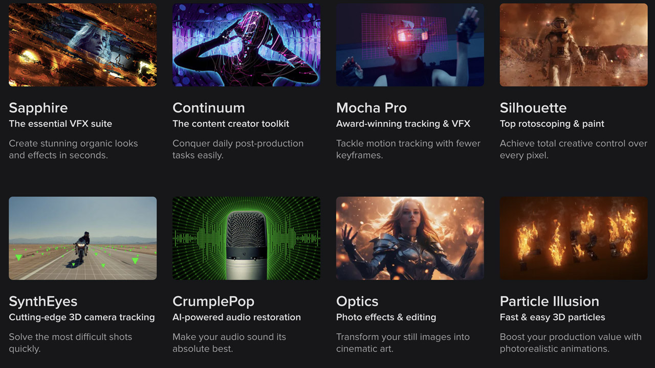
The Pixel Lab ➔
30% off everything
Toolfarm ➔
Various plugins and tools on sale

True Grit Texture ➔
50-70% off (starts Wednesday, runs for about a week)
Vincent Schwenk ➔
50% discount with code RENDERSALE
Wacom ➔
Up to $120 off new tablets + deals on refurbished items


All-Access Pass

Unlimited access to 50+ courses, unlimited critique, live events, and 24/7 community. Join School of Motion All-Access today.
