Learn After Effects the Right Way
Master the After Effects interface and build a real animation skillset. Enroll in All-Access to unlock AE Kickstart and 50+ other courses.
Here are some workflow tips for After Effects and Mocha.
This was a short but REAL gig Joey did for a client. The client happens to be a bad-ass guy, Ian McFarland. He's a documentary / commercial / music-video director based out of Boston who is also a die-hard metal fan like the rest of the School of Motion team. He came to Joey recently with a small gig that needed to be done, like, yesterday.
“When time is short and you have to get a good result to your client with no room for error, there are some tricks to make your life easier.
”In this video I'll try to take you through the process of working on something like this, showing you a few workflows in After Effects / Mocha, and also talking about some clever ways to get to "approved" a heck of a lot faster.
This work was done for the Kickstarter campaign for The Godfathers of Hardcore, a SWEET looking documentary about the legendary hardcore band, Agnostic Front.
-----------------------------------------------------------------------------------------------------------------------------------
Tutorial Full Transcript Below 👇:
Joey Korenman (00:11):
I want you to meet my buddy, Ian McFarland. He's half of a directing cinematography duo called McFarland. And PECI Ian is not only a great dude and an absurdly talented director, shooter and editor, but he's also like myself, a metal head. Ian has directed music videos for some of the biggest metal bands out there like kill, switch, engage, miss sugar, love my sugar fear factory, and a little band called agnostic front. Now, maybe you're not familiar with them, but they are legends in the hardcore and punk scenes. Ian has been doing a lot of documentary work lately. And so he was approached by the band to direct a documentary about agnostic front. So to raise money for the film, he shot a Kickstarter campaign promo and asked his buddy Joey for a little help with some graphics and compositing. Here's the email that I got from Ian.
Joey Korenman (01:10):
And I want to highlight a couple of points. First. I would basically only have a few hours to work on this too. There would not be time for any revisions, so I have to get it right the first time three Ian trusts me. Great. Now I've worked with the Inn before. Here's a clip from a video we did a few years ago with a ton of visual effects work in it. So having done jobs together, I knew what sort of style he liked. And I knew that I could make something cool looking, but with only a few hours of free time to actually dedicate to this, I had to be surgical. And so I used a trick it's one of my go-to moves when timelines get compressed like this, don't just show one option. So let's first take a look at the rough cut of the promo that Ian sent over.
Music (02:05):
[soft music]
Ian McFarland (02:25):
My name's Ian McFarland and I'm directing the godfathers of hardcore.
Joey Korenman (02:34):
You can see where Ian tried to mock up what he was going for. He also sent over this poster that was going to accompany the film and that's it. That's all I had to work with. So let's jump into after effects and let's work our way through this together. So the first shot we're going to work on is this one where we're going to put the logo on this wall. And if you look back at the reference, you can see kind of the mock-up that, uh, Ian did for me, just to kind of let me know what he was thinking. Um, so the first thing we're going to need to do is get a track so we can actually track, uh, the, the logo onto the wall. And you'll see here that, you know, the, the footage is moving. This is like a slightly handheld camera move, but it's not moving very much.
Joey Korenman (03:16):
And there's nothing over here to track. This is just a completely white wall. Um, so unfortunately we can't just do like a nice easy mocha plane or track. So what I'm going to do is just kind of do my best. So let's, uh, let's double click on the shots. We can go into a footage viewer, I have my tracker open and I'm just going to say track emotion, and I'm going to zoom way in here. And what I'm gonna try and do is track two points that are, you know, on this surface somewhere. And I'm gonna try and just get a position and rotation to D track. And so I'm looking over here at this spot right here, and there's a lot of contrast there. So I think that'll be a decent track point. Um, and you know, I, I expanded this inner box out a little bit because the, the feature that we're tracking is very small expanding this inner box a little bit.
Joey Korenman (04:11):
It's going to force the tracker to look for more pixels on each frame, which tends to give you a little bit more of a lockdown result. This outer box. This is the search area. And since the shot is barely moving, I can make that pretty small. Okay. So now I'm going to select a rotation and I need a second track point. Now I want to, you know, I want to basically use this line here as a reference this, this edge. Um, and actually now that I'm thinking about it, it might make more sense to try and track this point, because what that's going to let me do is if I can find another tracking point somewhere along this line, I can actually use this as a visual guide to see how my tracks doing. Um, so one of the things that you can do with a tracker is you can track things that are not actually features, but are just kind of intersections between two features.
Joey Korenman (04:59):
So for example, this black pole and the white wall form a pretty good trackable feature, right, right. About there, let's say, and, you know, you can see that the line that's drawn between those two trackers, it lines up perfectly along that edge. And so this is going to give me, um, a good visual representation of the success of my track, right? So let's make this a little bit bigger and make this, uh, make the search area smaller. And I'm going to make sure I'm on the first frame and I'm just going to hit track and we're going to see how this does and hopefully attracts. Okay. All right. So if we zoom out and I just hit the space bar and we play this right, it's a little difficult to tell, but it looks like we've got a track. And, you know, one thing I should point out is that I made sure to pick two points that are far apart.
Joey Korenman (05:55):
And the reason I did that is because this, like it was shot with kind of a wider lens, a wide angle lens. And so that means that you're going to get some lens distortion towards the edge of the frame and in the center of the frame, you're going to have a lot less distortion. So that's going to make this point move a lot more than this one relative to the actual shape of the wall. So, um, if you're in a situation like this, where you're kind of doing a hacky two point track, cause you can't actually track a surface, try to track points that are as far apart as possible, it'll get you a more accurate result. All right. So now that I've got that track, I'm going to add a no logic to my scene, and I'm just going to call this my track Knoll.
Joey Korenman (06:33):
And I like to apply tracking data to a novel instead of actually applying it to the logo, because then I can move the logo around. And if I need to, I can even key frame it and adjust it, but I'm not screwing up the original tracking data. So I've made a new tracking. No, I'm going to go into my tracker settings and say, edit target, and make sure that I'm applying the motion to that tracking null, that track null, and then I'm going to hit apply and make sure X and Y dimensions are selected. And there we go. All right. So now this, uh, this tracker in theory, it should line up and you can kind of see that it's been rotated and it lines up pretty much right on with that. The ledge. Now let's see how well that actually tracks. So what I'm going to do is grab the logo and I need to, uh, import that logo.
Joey Korenman (07:21):
Um, and I've got a little folder here from Ian and here is the McFarland and PECI films logo. So first thing I'm going to do is bring that into its own comp because as you can see, it's a black and white image. So what I'm going to do is make a black solid, um, or a dark gray. That's fine too. And I'm going to tell it to use this image as a Luma matte. Okay. And let me turn on transparency and show you exactly what that did. So now it's just taking the white parts of that logo and using them as an alpha channel. And we're getting a little bit of transparency here because this, this logo probably wasn't truly black and white. It was probably like a CMY K file as opposed to RGB. So the black level's going to be a little brighter.
Joey Korenman (08:04):
So what I need to do is add a levels effect to that image, um, and just push the white values a little bit more, push the black values a little bit more, and now we've got this nice, you know, knocked out logo. So I can take this, put it in the shot and I can parent it to my track and I can get rid of this reference shot. Now I don't actually need that anymore. All right. So here is our logo and, you know, I need to map it to the wall, but, you know, I can just kind of roughly scrub and see that. Yeah, it looks like it's tracked in there and it's kind of hard to tell until we get the perspective, all worked out and all that. So to actually get this thing to feel like it's on the wall, I could make it a 3d layer and mess with the rotation, but I'm just gonna do it the easy way.
Joey Korenman (08:49):
And I'm going to grab distort a CC power pin, and I'm using the power pin as opposed to the corner pin, because the power pin lets you actually grab edges like this and scale them up and down. It's a little bit easier way to work so I can take the bottom edge and I can actually line them up with this edge here. Right. And then I can just sort of eyeball the rest of it. Right. And make sure that it looks okay and then I can grab these edges and slide them around. Right. And, and it stays in perspective. So I can kind of get a good perspective here. Um, and I can make it bigger and maybe needs to come over a little bit. And I want to make sure that it's readable. Okay. That's the key. Um, now the reference, it was further over here, but I think that this makes it a little bit more readable and I'm probably, I think I want it to be even bigger.
Joey Korenman (09:40):
All right. I really want this thing to read. All right. McFarlane and PECI films. That looks pretty good. Cool. And then I'm just going to do a Ram preview and see how this feels. All right. And see if we're, I mean, it's actually amazing. There's a little bit of slippage happening, but that is pretty good. And it's a short shot and I think that's going to work well. So you could say, okay, that's good. We're done with that shot. Um, but I like to add little details and I like to make things feel a little bit more interesting. So I'm going to go into this pre comp and I have a bunch of stock kind of stuff that I've collected over the years. Some grunge maps from CG textures.com. Um, and I grabbed one of those. So here's a grunge map. Okay. Let me scale it down and try to get it, you know, something like that.
Joey Korenman (10:29):
So it's covering up the logo and I could even scale it down a little bit like this to get a little bit more that detail in there. And I am going to put a levels effect on there and I'm going to crush the levels like this. I'm going to crush the blacks, push the whites up. So I'm getting maximum contrast. And then I'm going to set the transfer mode to silhouette Luma. And what this is going to do is it's going to use the luminance of this layer as a Luma matte for the entire comp, everything underneath it. It's kind of a, it's kind of a nifty way of doing this without having to pre comp both of these together. And then you set the track mat setting to Luma matte. And so now with this setup like this, I can actually push the blacks a little more mess with the gamma.
Joey Korenman (11:11):
Um, and then I can actually go in and set the black level, sorry, the white level down a little bit. And I'm basically just breaking up this texture, sorry, breaking up the logo with a texture. So it feels a little bit less perfect. Like it, maybe it was, you know, a decal or it was painted on the wall and it's just been scraped away a little bit, you know, and it looks a little bit more realistic. Okay. So already I like the way that's looking a little bit better. It just feels, it feels a little neater to me. Okay. Now another thing that I want to do, you'll notice there's this big glare here, this big hot spot from the light. And if this was painted on there, if this was a sticker or something that would show up over the, um, you know, over the logo and it's not.
Joey Korenman (11:54):
So we need to add that back on top. So what I'm going to do is I'm going to duplicate my final, you know, this is my footage layer. I'm going to rename this glare. I'm going to put this on the very top and I'm going to duplicate my logo, put it on top and I'm going to rename this mat. And then I'm going to set my glare layer to use mat as its alpha mat. Let me just solo that so you can see what it's doing. Okay. So all I'm doing is I'm basically knocking out this footage layer so that it only shows up over the footage. And the reason I'm going to do that is because now I can color correct it. Okay. So I'm going to crush the blacks. I'm gonna push the whites up a little bit. We're getting a lot of color out of this.
Joey Korenman (12:35):
So I'm going to de-saturate this too, cause I don't want all that color. So let me just bring the saturation way down like that. Okay. And then I'm going to unsold this and you'll see what it's doing. Okay. And I can actually let me change this, this mode to screen. Okay. And I might even push this black a little further and you'll see what it's doing. I'm basically taking the glare that was on the wall and I'm color correcting it. So only the brightest parts are visible. And then I could just adjust the opacity and I'm just bringing back a little bit of that glare on the wall. And so now it really looks like that was, you know, painted or like a decal or something on that wall. Okay. And it really sticks on there. Kind of nice. Now it's not perfect, but it's a short shot.
Joey Korenman (13:25):
There's really not a good, easy way. Given, you know, we have some pretty serious time constraints in this project. There's not a great way to get a good track without a ton of work. So this is going to be pretty much good enough. Now let me show you, um, so, so this is definitely like good. This is one version I'm going to actually, I think I might, you know, I want to make sure that this is really legible. So I'm going to bring that glare down a little bit. There we go. So this is, this is good. And so I'm going to go ahead and go into my columns here and let's see, of course I didn't, I didn't name this correctly. So let me bring this down here. So I'm going to call this, um, logo R one. Now this is great, but I'd like to try something a little extra to one of my favorite things to do when I'm working for a client or, or anybody is give them options.
Joey Korenman (14:14):
It's just a smart thing to do. Um, it generally ensures that your client's going to pick something, um, rather than just try to figure out what they don't like about what you just showed them. So I'm going to duplicate this and we're going to do another version. And what I thought would be cool, you know, because there's movement down here, you see a person walking on the frame. You may not notice this because now it's composited on there. You know, not perfectly, but it's fairly convincing. You may not even notice it. So I want to make sure you do notice it, right, because this is, this is the production company. This is the director of this film. So what I want to do is make another version, this animates on. All right. And so here's how we're going to do that. Um, so I've got this, uh, I've got this logo comp here.
Joey Korenman (14:58):
Okay. And it's in that comp lives here. And so what I'm going to do, I'm going to organize this a little bit better. I usually make a PC folders stands for pre comp and I keep that in my comms folder. So I'm going to duplicate this, right. And I'm going to call this animated. All right. And then in this animated comp, what I want to do is animate this on and you know, this whole film, it's, it's about, you know, this, this, these guys that started this hardcore band, they are covered in tattoos. Um, and so I like to kind of look around and see what else is already present in the material. If I'm trying to come up with some sort of look for titles or something like that. Um, and so Inc as cliche as that may be with motion graphics, Inc. Sorta makes sense.
Joey Korenman (15:43):
Um, and so I wanted to try and bring this on in some cool kind of organic inky way. I can't believe I just said organic. So what I'm going to do is I have a bunch of stock, um, of ink, right? And you can find this stuff just about anywhere, just Google ink footage, and you can get it on pond five. Um, I actually don't even remember where I got this, but so, you know, for example, here's one of the shots, it's just a blob of ink that someone sort of dropped onto maybe some paper or onto some glass and it's been color corrected a little bit and it creates this very beautiful kind of effect. Okay. And what you can do with that, um, is you can take it, put it on top here. And what I need is for the ink to be white and the rest of it to be black.
Joey Korenman (16:27):
So I can use it as a mat. So I'm going to, uh, I'm going to go to channel and invert my footage, and then I'm going to go to levels and I'm just going to push the level so that this actually turns fully white and I can leave. The black word is I may have to push a little bit, but I think that's all I need. And if I then set the mode of this to, um, stencil Luma, then now what I can do is I can use this to reveal the logo. Okay. Now here's the problem. All right. Let me set this back to normal. The problem we have is that this blob is not big enough. Okay. It doesn't cover the logo so I could scale it up. But when you scale it up, you're going to kind of blow out some of the detail, right.
Joey Korenman (17:10):
And you're going to lose some of these nice edges and stuff, and I don't want to do that. So here's what I'm gonna do. Um, I am going to set this to screen mode, um, and the reason I'm doing this, let's see here. So let me, let me try it. Let me actually set this to normal up, not dissolve normal. Right. And I'm going to just turn it down like this and turn the opacity way down. And what I want to do is, is combined multiple ink drops to eventually cover up this whole thing. So here's one. Okay. And then what I could do is I could just duplicate and let me see it. What happens if I set this to screen, I should be able to, there we go. All right. And, um, and then maybe this one, I could flop it, right. Like this, and I could rotate it like this and stick it over here and offset at like three frames.
Joey Korenman (18:07):
Okay. And then I could, you know, duplicate it, but I could replace it with a different ink drop footage and maybe stick that in drop there. Right. And offset it slightly differently. Um, and let's take a look what that looks like. Cool. That looks looking pretty good. All right. And I can see there's a little gap down there that needs to be filled in. So I'm gonna then offset and grab another clip and put this one down here. All right. And I basically just need to make sure that by the end, I've got the entire title covered up with these ink watches. Okay. That's pretty good. So then I can pre comp this whole thing and we'll just call this ink. Pre-camp, um, let's hop in here and set all of these to screen and a hundred percent transparency. And because they're set to screen, they're just going to basically overlap each other and create this nice little ink transition.
Joey Korenman (19:01):
And then I can set this to be a stensul Luma. Okay. And so this is what it's going to do. It's going to actually reveal this in this cool inky. You know, I mean, it looks really neat already. It's just kind of, this is, this is a very old trick. Um, but it, it works. It really looks cool. And another thing that you can do with this is duplicate this. Um, and actually I can't the way I've got this set up. I can't do it in here. What I need to do. Let's come in here, pre-camp this one more time and say ink two. And what I'm gonna do is I'm going to set the opacity to 50% and I'm going to duplicate it and set this opacity to a hundred percent and I'm going to take the a hundred percent version and offset it by like a frame.
Joey Korenman (19:51):
And then I need to set this to screen mode and what that's going to do. Right. You can see it's going to basically always have one extra frame of that ink at 50% opacity being composited. Okay. And it's going to give you a little bit more, it's almost like a, like a feathering effect, right. Because some of the transitions, when these inks come on, it's pretty quick. It's pretty harsh and this kind of softens it a little bit. Okay. So now in logo are two. What I'm going to do is, um, just go ahead and replace these two clips with, uh, with this animated version. So now at the beginning of the shot, this thing's going to animate on, right? Like it was, you know, ink kind of revealing it onto the wall and it looks neat. All right. Which is cool. It's kind of nifty on top of that.
Joey Korenman (20:44):
More importantly, it draws your eye to the logo. Okay. So it's just sort of an extra layer of, oh, okay. So this is like, this film has a little bit of production value behind it. Cool. And what's great is the client didn't ask for this. So he may not like it. He may think it's too much. Well, cool. I'm going to give him this one too. And you know, one thing that might be another kind of cool option, um, is to have this a little bit smaller. This is kinda matching the size of the reference, you know, the size of the logo and the frame for the reference. But, you know, one thing I like to do a lot is go full frame, take a look at my comp at a full 1920 by 10 80, gives you a much better idea of how something feels, you know, size wise.
Joey Korenman (21:26):
Um, and this feels really big, which might be okay. Um, but it'd be an easy enough option to just say, okay, let's do logo are one small, right? So we could also have a small version of this logo, um, you know, and really all I need to do, let me parent the mat to this and let me scale this down a little bit. Um, and let me actually go full frame and kind of take a look and figure out like, where, like, where does this want to be? And what's cool is because everything's parented the way it's working that glare and everything. It's cool. It stays put, and it moves through, uh, it moves through the logo as I move it. Um, but you know, like maybe, maybe a little closer to the center of the frame, you know, would help. Um, so that our eyes kind of already here and then it, and it doesn't have to travel too far, um, to see Ian walking in the frame.
Joey Korenman (22:18):
So I dunno somewhere about there feels pretty good. Um, cool. And so then what I could do is I could just copy, um, the position and scale of this, and then I'll do logo are too small, right. And, uh, I'm going to parent the mat to this, and then I'm just going to paste that on there. And now I've got the same thing and the animated version. Okay. So you, you know, you could see how quickly and easily you can build up. Like now I'm giving him four options for this one shot. And it literally didn't take more than an extra, you know, five minutes, maybe 10, because I'm talking my way through it. Um, but it's gonna, it's gonna add a lot of value to this transaction between Ian and I, he's gonna look at this and say, you know, this is fantastic. I have options and I can try things and see what works.
Joey Korenman (23:08):
Um, you know, personally, I kinda like the small version. I'll probably recommend that to him. Um, but it's totally up to him. He's the director. All right. So let's move on to the next shot. So here's the reference of the second shot where Ian walks in and turns the light on, and you've got some credits kind of on the right side. Um, and again, this was just referenced, kinda mocked up by, um, by the editor Tony. And, um, I liked the idea of having, you know, credits like embedded in the environment, like this thing. It's great. One problem. And you can probably already see is that, you know, you kind of have to like work around what's in the shot. You got these posters on the wall, and really this would be great if the type was right in here, but you've got this poster on the wall.
Joey Korenman (23:49):
Um, luckily this is a pretty simple planar track situation. Um, and I think we can probably without too much trouble remove that third poster and put type there. I think it'll, it'll make the shot feel a lot more balanced than a lot more planned out, um, which will be very nice. So, uh, here's the actual shot. Okay. And, um, one thing that I realized to my dismay is that in the actual cut, um, which has changed a little bit and does walk in front of that poster. So there will be like a tiny bit of roto. It's only like three or four frames of Rodo. So not, not the end of the world, but we do need to remove this poster. So how the heck are we going to do that? Let me show you. So we need to first get a good planar track on this shot, and we really only need it once the shot starts moving, which is, you know, there.
Joey Korenman (24:39):
So what I'm going to do is duplicate this layer and I'm going to trim it. That was the option left bracket key. It trims the layer to wherever the playhead is. Uh, and then I need to track this shot in MOCA. So I'm going to go up to animation and see track and mocha a E. Okay. And that's going to open up a mocha for me. It's opening, it's bouncing around. There we go. And, uh, and so then I want to make sure that I have cash clip turned on. Um, and I usually leave everything default, so that's good. Um, yes, we can overwrite. Cool. All right. And you can see there's an in and, and out there. So that's the only part of the clip that's going to get cashed. Okay. So we're not caching the beginning. We're only doing the part right before the camera starts to move.
Joey Korenman (25:22):
Okay. And I'm going to have this loop like this. So what I'm going to do is just grab, um, you know, basically an area like this. I mean, this is kind of perfect. You've got two perfectly rectangular things on the wall. This is going to be a very easy track for mocha. I'm gonna hit track and MOCA is going to step through and track. And as Ian starts to cross over this poster, right, right about here, I'm just going to grab these points and move them over. I'm going to keep tracking, I'm going to stop and move them over a little more. Right. And I'm basically just going to keep doing this to ensure that we get a good, accurate track, but that we're not tracking Ian. Okay. And this really doesn't take that much time. I wish there was a little bit more that we could track here. Um, and that's really, you know, these are like the last couple of frames. All right. And we're pretty much done.
Joey Korenman (26:26):
Okay. So we've tracked that area. And now what we need to do is set up, um, an image plane. So I'm going to come up here and I'm going to click this. And in mocha, this is called a surface and a surface is basically a corner pin. And to just test out how well this works, I'm going align the up with these corners of the posters, just like this. All right. And, um, then I'm going to tell mocha to insert a grid and eight bay grid. And now when I hit play, you can see that that sticks perfectly to that wall, which is fantastic. Okay. So the next step is I am going to be using this track, um, kind of in two ways, actually, there's going to be sort of two separate tracks here. All right. And so, uh, what I'm going to do, let me, let me rename this.
Joey Korenman (27:15):
Okay. So I'm going to be using this tracking information to track the type on the wall. All right. So that's going to be the first track. So let me go back to the first frame here, and I need to position this, um, this corner pin a little bit more, I guess, you know, in an area where the type is going to be. Um, so let me just take this whole surface and I'm just going to move it over like this. So remember, we're going to remove the poster and we're going to have something like this. Um, right. And what I can do is, uh, insert a different type of clip, like a logo clip. Um, so now I'll be able to tell like, okay, am I stretching anything out that shouldn't be stretched out? Um, and actually now that I'm thinking about this, this is the beauty of, uh, the stream of consciousness type of, um, you know, teaching that we're doing here.
Joey Korenman (28:04):
So, um, now that I'm thinking about this, there's a better way to approach this a much better way. Okay. So here's what we're going to do. Um, ignore this. I'm going to turn this off. So let, let me try and explain. What's going through my head right now. If I have a corner pin like this, right? And I want a corner pin, some type to this, it's going to stretch out and distort my type. And I'm going to have to like jump through hoops to make sure that the types not distorted and all that kind of stuff. And it's going to be kind of a pain. It's not really going to it it's possible, but it's going to be hard versus I could do something like this. I am gonna, um, I am going to go and click this button here and what this is going to do.
Joey Korenman (28:44):
It's going to make the surface, the entire size of the frame. It may not make sense why I'm doing this yet. Okay. But when I hit play now, you'll see that now the entire frame distorts and sticks to the wall. Now, why is that important? Well, now all I need to do is paint a clean frame in Photoshop, and it will track perfectly to the wall. And then I can also place my type. Let me turn off this logo for a minute. I can also place my type in a 1920 by 10 80 frame. And it will automatically look correct it'll distort correctly. And I won't have to worry about squishing it or stretching it or doing anything, um, unintentionally to it. So this technique, this little button here, this makes it possible to corner pin an entire frame, not just a piece of that frame, that makes it a lot easier in a lot of cases to place things or clean things up.
Joey Korenman (29:38):
It's very important that I know what frame this is. This is frame 348. Okay. I need to remember that. So, um, I'm going to leave this open for a minute and I'm going to go back into after effects and I need to go to frame 348. Um, and it's not 348 in my comp it's 348 in this footage. Okay. So let me actually scrub through here. Um, and I want, I want to view this in, um, in frames, but I'm seeing it in seconds. Um, so I'm just going to go up to, um, I'm going to go file project settings and I'm going to change this to, um, frames. Okay. So now I can see my frames and I'm looking for 3 76. Is that right? 3 76, no, sorry. 3 48. I'm glad I double-checked 3 48. Okay. So this is the frame matches this frame. And what I need to do is export this frame out.
Joey Korenman (30:41):
So I am going to hit command option S and what that does is it takes this frame and it puts it in the render queue as a still, and I can save it as a Photoshop file. That's fine. Um, let me put that in my, let's see here, let me put it in my job folder and I'm gonna make a new folder called outputs a E, and I'm gonna put today's date, which is April 20th. All right. Um, and then I'm just gonna render that frame out. Alright. Um, I'm gonna hop into Photoshop and open that frame.
Joey Korenman (31:17):
And what I need to do is paint out this poster. Okay. Uh, and it should be pretty easy actually. I'm first going to try it. You know, the first thing I usually try, um, let me first make a copy of this, just so I have a copy of the original to go back to I'll turn that off. And then this is going to be the clean plate in for something like this. I might be able to get away with just a selection and edit Phil content aware fill. Yeah. That, that was amazing. I can't buy, I love photo shop. All right. So that's done. We now have a clean frame. We've gotten rid of that poster. We're good to go. I'm going to hit save close this hot back to after effects. So now what I need to do is import that file. All right. So let me grab that.
Joey Korenman (32:09):
And I'm just going to bring into this footage, cause I don't need all the layers. Now, what I need to do is put this in this comp like this. Okay. And what I need to do is go into mocha and go to, um, adjust track and say export tracking data. Okay. And I want an aftereffects corner pins. I'm going to copy the clipboard, go back to after effects. And then on this frame, I'm going to hit paste. Okay. And I made sure that I was on the starting frame here and you can see I've got corner pin, um, key frames on every single frame. All right. And I'm gonna, I'm gonna, let me just turn off, let me solo this. So when I, when I play this through, now, you can see, it takes that clean frame out of Photoshop and its corner pinning it for me.
Joey Korenman (33:00):
So then what I could do is draw a mask on it. So I'm going to draw a mask, you know, where that poster used to be and let me unsold it. And I can literally just, just crop out just the part I need. Cause I only need to get rid of that poster. That's literally the only thing in the frame that has to go. Um, and it's, I mean, because this wall is white and you know, Photoshop did such a bang up job of fixing it. I may need to feather it a little bit just to, you know, like as the, as the camera turns, you're going to get a little bit of, um, you know, just a tiny bit of lighting change, you know, and it might give it away. So I'm gonna put like a 20 pixel feather on there and then I'm going to hit em twice and expand my mascot just a little bit.
Joey Korenman (33:50):
Let me turn this off. All right. And pretty much we have created a clean plate just like that. Okay. And obviously Ian goes in front of it. We'll have to do a few frames of Rodo to get him to go back in front of that. But now we have a clean plate there let's deal with this, right at the beginning here, it's totally black. And really, we only need it to start showing up. Let me go back here, frame by frame. So then that's really the first frame. You can even see it. So what we're going to need to do, um, is basically key frame, some sort of brightness effect so that it starts out dark and matches the wall. Um, so let's put a level's effect on here and just start there. And so let me go to the first frame and I'll put a key frame on the histogram zoom in, and I'm actually going to, um, crank up my, uh, my exposure control here a little bit.
Joey Korenman (34:46):
Now this doesn't actually affect the output. When you render this, doesn't do anything. It's just, while you're working, you can see, you know, a brighter version or darker version of your shot, which can be helpful if you're trying to match values. Right? So what I might start with is the white output, just bringing it way down. And one thing that you're going to notice is that, you know, the way things look when they get darker and brighter in the real world is not necessarily the way after effects, treats things, right? So as this wall gets darker, what's actually happening is the light is turning on. And when it's starting to turn on, it's very orange and then it gets a little bit brighter and it becomes more white. Like I guess the hotter it gets well. So we sort of have to mimic that unfortunately in after effects.
Joey Korenman (35:32):
So, um, what I would do is, um, you know, maybe use some combination of like the color balance effect. Um, you know, another thing we could do is maybe go into the red channel, right. And then just do this one channel at a time. This is kind of another way. Um, so we, we could take a look at this and say, okay, well, let's get the red channel to sit in there and then we'll get the green channel. And I'm just hitting option one for red option two for green, option three for blue. Um, and one at a time coming in here and just doing my best to match that color. And then we can go to blue. Right. And blue needs to be a little darker too, just like that. Okay. And once you get all three channels dialed in, you should be pretty close.
Joey Korenman (36:18):
Okay. And then we go to the next frame and then we do it again. All right. So, uh, I'm just gonna finish off this process. Um, I'm going to pause it and I'm gonna come back. So what I've done is I've just gone frame by frame and adjusted the levels on every frame. And you can see if you look really closely, you can see a little discoloration happening, but when we ran preview this and just play it and you know, the audience is not expecting some sort of like effect to be happening here. I don't think you'll notice it, especially once we have, um, some type there. So the next thing we need to do is lay out our type. Um, and so what I'm going to do is just pull up my reference here. I'm going to turn on my reference and let me turn off the Slayer here.
Joey Korenman (37:01):
And I just want to make sure that I, that I get everything I'm supposed to get, right. So I'm just gonna do this really quickly. Um, and the font that we're using, uh, is called keep calm, right. And it's keep calm a regular. So I'm going to do shot by and let me put this up here so I can actually see it. And all I'm really doing right now is just getting the information, um, set up. I'm not really, you know, I'm not worried about layout or anything like that. So we've got Mike PECI and all this stuff needs to be left justified. So let me, let me go to my paragraph tab and set that up. All right. Um, and Mike PECI is more important than shot bias. Let's do that like PECI um, and then we're going to have, let me turn my, uh, my layer handles back on here.
Joey Korenman (37:56):
Here we go. Mike Petchey and then we've got Anthony Jarvis and, you know, a lot of times I like to actually lay type out in illustrator or Photoshop. Um, but again, this is one of those gigs where it just needs to be done really, really quickly. Um, and unfortunately we just don't have the luxury of time to, um, spend a lot of time noodling around with, you know, kerning and all that kind of stuff. So we're just going to do it all in after effects, um, and, and just try and get, you know, a good result really quickly. All right. So then we've got Tony Fernandez. Cool. Okay. Um, and now I'm going to turn on my clean plates again. Well, let me turn off the reference and let me lay these, let me lay these out. Okay. And let's find like a good spot for them.
Joey Korenman (38:47):
Right. So something like that looks pretty good. They're kind of aligned with the posters. I'm going to go full framework real quick, because again, when you're working in a smaller window, sometimes you might make the type too big. Cause you're, you're thinking, oh, this is a really, you know, this is a small little frame here. I need to make sure I can read everything. Yeah. Actually the frame is bigger than you think. All right. So take a look at it. Um, full screen. It, it helps me a lot to keep my tight from being too big. Um, and the edited in the shot by those were at TeleSign. Um, and I don't have an Italian weight of that. So I'm actually just gonna use the little fo metallic, which, you know, you probably shouldn't do, but you know, what are you going to do? We're quick and dirty here.
Joey Korenman (39:30):
All right. And, um, I do want to take all of these and I'm going to pre comp them. Um, and then I'm going to colorize them. So I'm gonna call this type pre-camp all right. And I'm just going to come in here, let me make the background a different color. And I just want to make sure that I've spelled everything right. That there's no really glaring kerning issues that are going to bother me. This font actually seems to have current itself pretty good. I might be able to like, you know, tighten up couple letters here and there. Um, but other than that, and I hit escape instead of enters, there we go. Um, you know, maybe the D and the E maybe the why, and the B could be a little tighter other than that, this feels pretty good. Um, so I'm gonna come back here and now I'm going to put a, uh, a fill effect on this, and I'm going to colorize it based on a color from the shot, which is kind of a little thing I like to do.
Joey Korenman (40:25):
And then what I need to do is I need to copy this corner pin onto this layer, and I need to make sure I copy it on the first frame of the corner pin that has key frames. Okay. And what this is going to do is, and let me, let me actually just get rid of all these extra layers here. I don't need these anymore. Um, and I've got this extra copy of this I don't need. Okay. And so what this is going to do is it's going to let that type stick to the wall perfectly, just like that. Okay. Cool. All right. So the last thing we need to do to have a version of this shot, that's going to work perfectly is to do some quick Rodo on Ian. And, um, this is really, it's not going to be as bad as it could be because it's literally one.
Joey Korenman (41:17):
So this frame, it's just like, there's a little bit of maybe his key fob or something there. And then 1, 2, 3, 4, 5, 6, 6 frames, that's it. Okay. So not a lot. Um, and it's, you know, he's not moving that much. I might actually just be able to do this with paint, um, which is, which is kind of a neat way to do it. Um, so let's set that up. So what I'm going to do is I'm going to have a copy of this shot, um, which is going to be my, my paint. Rodo all right. And I only want that shot to exist as long as I need it, which is only these few frames. And let me, um, let me close down some of these windows, cause we're going to need a little bit more screen real estate here. Um, and I'm going to move this roto layer up to the top because it's going to be covering up everything.
Joey Korenman (42:08):
And so if we look at this, what I basically want to do is create an alpha channel for this roto layer. That's only going to bring back the pieces of, and that I need. And if I look right now, you can see that I'm looking at the alpha channel. I hit option four to show me the alpha channel. Uh, so the channel is totally white. That means I'm seeing the entire frame. So the first thing I need to do is set this alpha channel to black. So I'm going to do that with a set mat effect, uh, sorry, set channels effect, and then I'm gonna set the alpha channel to off. So that basically makes this layer invisible. Okay. Um, so if I solo this, you can see there's nothing right. You just see through it. What's cool. Is if I double click this now and I open up a layer browser, okay.
Joey Korenman (42:52):
So this is a layer window. And then this is a, um, this is a comp window and I have them, um, open at the same time. What I can do is grab my paintbrush and let me come over here and set my paints to alpha single frame. So I'm only painting on the alpha channel and, uh, and everything else looks good. And so what's going to happen is if I paint over here like this right over here, I'll be able to see the result. And I'm basically bringing back that part of my Rodo layer. All right. And so I'm in this mode here, so there's different modes. You can, you can look just at your alpha channel, which does us no good. You can paint in this kind of weird mode where when you paint, it creates this pink line around your, your, you know, what you're painting.
Joey Korenman (43:36):
Um, but this, this mode, the little red button works a little bit better and it lets you basically create like a little red overlay and I can zoom into it and I wanna make my brush. Um, I want the hardness to be 0% and I may have to make it a little bit bigger. You can also do that by holding command and clicking and what this is going to let me do is paint with softness. Right. And I can paint a little bit and then I can kind of look and I can turn this, uh, I can turn this down quite a bit, so I can really see when I'm painting on. Um, and the footage is kind of dark, but, you know, so you can see now I've rode out that frame. I'll go to the next frame. I'll do the same thing. I just need to, again, just paint out his hand and you can see because, you know, the details are really small.
Joey Korenman (44:21):
Um, and the, the shots moving really quickly doing this with like a mask or something, it might actually take longer than just kind of doing it this way. And if I, you know, I kinda screwed up here, I painted a little too much. Um, I can just grab my eraser tool and come in here and just erase. Right. And fix that. There you go. Now that frames done. So there's only six of these frames to do so this isn't actually going to take all that long to do so I'm just going to pause it now. Uh, and I'm going to finish this up and we'll come back when the rodeo is done. All right. So the rodeo's done. And, uh, you know, I just used the paint effect and basically just frame by frame, just painted in just the parts that we needed. Didn't take too long.
Joey Korenman (45:02):
Um, so let's take a look at this shot. All right. And light turns on the type is there and boom. Right. So pretty cool. We removed the poster. We put the type in, not that big of a deal. Now I do want to do the same thing I did before, um, and actually pop into make sure I have my arrow tool here. I want to go into the type and I want to put that same kind of texture on that I had, um, on the logo shot. So let me pop into the logo and I'm just going to pop in here and grab my grunge map. Right. And I'm going to copy here and make sure that I extend it. So it covers the entire comp and it's already got a silhouette Luma on it. Um, and I just need to position it over the type like this.
Joey Korenman (45:52):
And I think I have snap on, uh, let's see here, which is why. Nevermind Snapchat guides. There we go. That's why I was getting all that snapping. Oh, it's still snapping. I don't want it to, I'm not sure why, but what are you going to do? All right. So we've got a, you know, we've got this whole texture on here, snuff. I look on this shot, you get a little bit of that texture coming back, which is cool. Um, and there's not really like a glare or anything I need to add back on top, but I do want to darken this a little bit. I think it'll make it pop a little bit more. Um, and I'm also going to grab my levels effect and adjust the alpha of the levels. And I'm just going to play with it just to see, you know, if I want to eat away a little bit at this more, or if I actually want to go back the other way and make it less transparent, you know, somewhere in there, it looks pretty good.
Joey Korenman (46:45):
Cool. All right. So then this is going to be one version of this shot. This looks great. Okay. Um, cool. So that's, that's going to be our one and let me make my little, uh, let me throw this in the comp folder here. So I've got credits are one and then for our two, because of course I like to give options. I want to have that same kind of inky paint kind of reveal thing happening. Okay. So I'm going to need another copy of tight pre-com. So I'm going to duplicate this type pre pre-camp animated, and I'm going to replace it, pop in here, and then I can just come. I can actually just come right back to, uh, to my ink. Pre-con, let's take a look at this, something like this, maybe. So that's ink pre-camp. So what if I just grabbed that, throw it over here and I set this to, um, stensul Luma, right? So now you get that kind of inky reveal, which is cool. And because, uh, the type is a lot smaller, um, than the logo, what I could do. Oh, actually it's not that much smaller, so let's just make sure it's actually gonna cover everything up the way we need, but I want to scale it down to maintain a lot of that detail right. In the edges and stuff.
Joey Korenman (48:03):
Cool. All right. So then turn this back up and turn this to stencil Luma, and now we'll get this cool reveal like this, and I want that to, um, to basically trigger when the light turns on. So what I'm going to do is move the end point of the layer to here and then slide the whole layer. I want to make sure the key frames don't move. Okay. Um, and actually, maybe it'd be better if it was sort of already there, like on the wall a little bit. So we have time to really, really read it, you know, fully let's see what that looks like. I can play with the timing a little bit, but I want to make sure that when we see the shot, there we go. Uh, I don't know. Maybe we should see it actually reveal on like that, that might be cool. And you could even, we could even offset it a little bit more. Maybe like this, I'm going to set this to half rest so we can preview it a little bit quicker. There we go.
Joey Korenman (49:08):
Yeah, I think that's nice. It just adds a little bit of, you know, just a little bit extra production value, a little bit of interest to it now, because the type is so small. I do need to be careful. This kind of looks like it says snots by Mike PECI and not shot by. Alright, so I'm gonna come in here. Um, and I'm just going to scale this up a little bit and make sure that it, there we go. Cool. Um, all right. So now we've got another version of this shot that has the animation, which is great. Right. And make sure that this looks good on the, in the end we should does. All right. So we've got one version without that animation and another one with, so that's great. So now let's move on to the next shot. So in the name of brevity, I'm going to actually just walk you through, um, the comps that I set up already for the title shot, where we actually have to reveal the title of the film, the godfathers of hardcore. And it did a few versions of that. So this is the one that I liked the best. All right. So let me just do a quick Ram preview and show you what that looks like.
Joey Korenman (50:16):
All right. So we start on the shot of Ian and that's obviously just a place holder still, he's talking to camera. He says the godfathers of hardcore, you get this awesome inky reveal of you, the photo and the type. And this is a really simple setup. All right. So let's hop into this pre comp here. So basically all I have is, um, I have a photo that was given to me. This is part of the artwork for the poster, uh, for the film. And this is the chest of one of the guys in agnostic front. It's very, well-known tattooed chest, very, very tough, very hardcore looking. And so what I wanted to have happen was I wanted the type, you know, we'd been playing with this kind of inky motif, um, in the previous shot. So I wanted to do the same thing with the type.
Joey Korenman (51:06):
And so I needed to build a little bit of a mat, um, to make that inky, that inky thing, take up enough room on screen to be able to use it. Um, so if we come into, uh, the pre-camp for the type, and then we come into this pre comp, which is my ink mat. You can see what I did. I basically just took like an ink blot footage. Right. And I, you know, I have a whole bunch of this stuff and I just started layering them on top of each other in screen mode. All right. Because, you know, they're, they're all white because I've inverted them. Um, I mean the footage actually looks like this. It's white with black ink, but I inverted it. Uh, and I screened all of these on top of one another and scaled them and moved them and rotated them to build up kind of a big area of ink.
Joey Korenman (51:54):
At the same time, I have an adjustment layer. That's gradually brightening the entire thing to get rid of those little black spots. And then at the end of the transition, I have a white solid that just animates on from 0% to 100% opacity. Right. So all I'm doing is building a little mat and then I'm using that to reveal the type. Cool. So that's, it, it reveals the type, um, there's a little bit of, uh, of a layer. Uh, so this layer here, this is called my glow layer. This is just a copy of the type blurred in ad mode. Let's literally all it is. And there's a little bit of a mask so that it glows kind of in the middle, but not on the edges. All right. Um, and that's it. And then I just faded up this information here. Now I wanted the whole thing to animate on over Ian's face.
Joey Korenman (52:44):
And so what I did was I just used that same ink mat and I just made sure that it was positioned so that you'd be able to read this. And it just transitions on just like that. It's really, really simple. This is using, um, a Luma matte to do that. And that's, that's the key when you have, um, a map that you want to use, that's black and white. You don't use an alphabet, use a Luma matte, all right. This setting right here and look at that. Beautiful. Cool. Um, now this isn't actually the version that ended up in the cut and I thought that that might actually be a problem because although this looks really cool, I liked the way it looks. It, uh, it takes a lot longer to come on. Then Ian had sort of planned for in the cut. So this cut happened before any of these graphics existed.
Joey Korenman (53:31):
And so I knew that this might be too long. So I did another version where I'd made it a lot simpler. And I basically just created a little bit of like a light burn that kind of cuts to this. Okay. And the way I did that was really simple. Um, I have a pack of these film burn clips, and all I did was add one over and then faded out at the end. And that was it. All right. And then, so I literally just cut boom to this, and I think that's what ended up in the cut. Now, these colors that are in this film burn clip are really cool, but they're colors that are not really seen anywhere else in the piece. So I did another version and all version where I de-saturated the film burn, I just tinted at black and white. So that way, you know, it would, it would match the style of the documentary a little bit more.
Joey Korenman (54:23):
Um, and I rendered these when I gave these to Ian, I rendered them without the shot on actually, because I knew he was probably going to need to color correct that. And I gave him instructions to add this clip on top of your shot. And then once you get to this part, you can just cut and go to this full frame and it will work perfectly for you. Um, all right. And so I did a couple of other versions. So this was, um, right. Here's another version of the title where the type doesn't come on separately, it comes on at the same time. I thought that might be a way to get this effect to actually work because then you don't have to take extra time to wait for the type to reveal on. If you look at R three, right. It takes longer because the type is delayed before it comes on.
Joey Korenman (55:13):
I think it looks neat, but I think you really need an extra two, three seconds. If you're going to use this title. And by the time I was brought into this, it was probably already too late. So that is why I ended up doing a simpler version for Ian. And that's a very, very smart thing to do, even, you know, as a motion graphics artist, it can like kill you a little bit. Like this is the kind of stuff I like to do. It's really neat. It's really cool and interesting looking, but I knew it may not be what my client needed. All right. So I had to provide this alternate version that was simpler and that's the one that ended up going in the cut, but that's okay. All right. Um, cool. So that was the title shot. And then the very last thing I needed to do was I was given this photo, um, of sort of the two main guys in the band from a long time ago.
Joey Korenman (56:02):
And, you know, there, it was one of those things where I was like, oh, we need you to put a move on this still. Now I literally had like 10, 15 minutes left at this point. I wasn't going to cut him out and do a full kind of 3d treatment of this. I just didn't have time. So what I did was I used one of my favorite plugins, a magic bullet looks, and I just built up a little bit of a look with some chromatic aberration, some lens distortion, stuff like that. Um, and the lens distortion, I hit it pretty hard. Okay. And if I ran preview this, let me go to half Raz and I'll do it. Every other frame room preview, look at the edge here. That lens distortion, what it does is it makes things move a lot faster at the edge of the frame than it does in the middle.
Joey Korenman (56:44):
And even though there is no parallax, there's no 3d in the scene, you sort of get a little bit of a 3d field. It makes it feel a little more interesting if I turn the treatment off and just show you the original, this is just the original move on the still, if you do nothing to it, and just adding magic bullet looks and tweaking the look a little bit, by the way you don't need magic bullet looks. It's just such a fun plugin to play with. It's really good for color correction and doing stuff like this. Um, but it just, it gives it a little bit more production value. Okay. Um, and then I did a few different versions, one with a little bit more of a blur on the edge. Um, I did one here where at the beginning, there was a little bit of that film flash.
Joey Korenman (57:24):
I love to give my clients options because there's many reasons. Uh, but the main reason is by giving your client options, you're forcing them to think a little bit harder about what it is they like about one over the other. And if you just show them one thing, then they are in this weird position where they may like it, but they may think, well, I can't just say it's done. I need to say something. I need to tweak something, give them options. And generally that goes away. Um, and in fact, when I sent all this stuff over to Ian, uh, that was it. He just used it. Part of that was probably because he didn't have time for me to do any revisions. But, uh, I think also because I gave him all these tools, he was able to go through and pick out what he needed. Okay. So let's take a look at the actual video and how these things got used.
Music (58:21):
[soft music]
Ian McFarland (58:37):
My name's Ian McFarland and I'm directing the godfathers of hardcore
Music (58:40):
[hardcore punk].
Ian McFarland (58:51):
This film is about two of the most respected individuals and underground music.
Joey Korenman (58:57):
A few days after launching this promo video, the campaign got fully funded. $15,000 was the original goal, but now Ian has added stretch goals and the rewards are really, really amazing and they've raised even more money. So there you go, a successful project and hopefully a semi-interesting lesson in using after effects to very, very quickly make your client with no revisions.
ENROLL NOW!
Acidbite ➔
50% off everything
ActionVFX ➔
30% off all plans and credit packs - starts 11/26
Adobe ➔
50% off all apps and plans through 11/29
aescripts ➔
25% off everything through 12/6
Affinity ➔
50% off all products
Battleaxe ➔
30% off from 11/29-12/7
Boom Library ➔
30% off Boom One, their 48,000+ file audio library
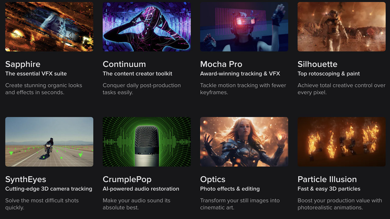
BorisFX ➔
25% off everything, 11/25-12/1
Cavalry ➔
33% off pro subscriptions (11/29 - 12/4)
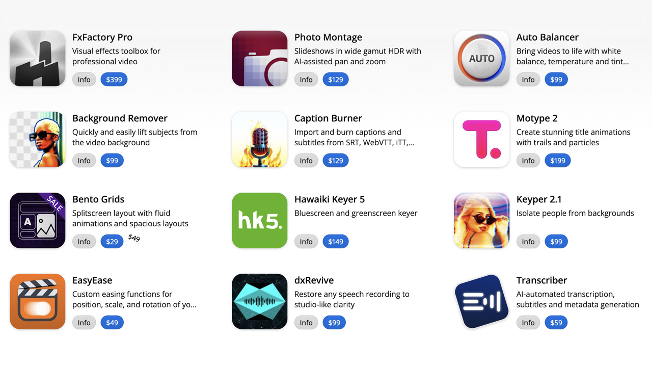
FXFactory ➔
25% off with code BLACKFRIDAY until 12/3
Goodboyninja ➔
20% off everything
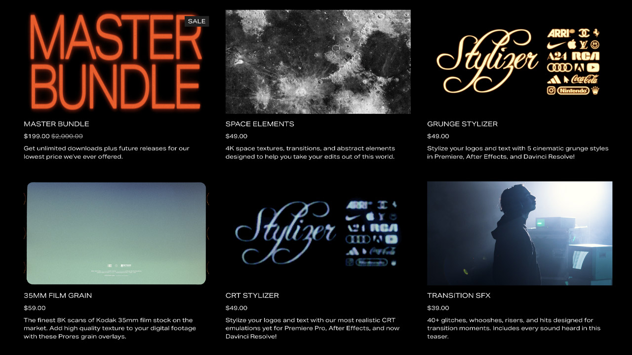
Happy Editing ➔
50% off with code BLACKFRIDAY
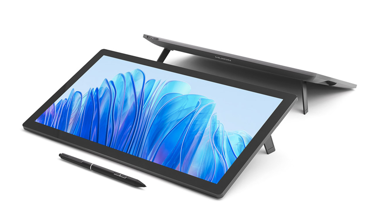
Huion ➔
Up to 50% off affordable, high-quality pen display tablets
Insydium ➔
50% off through 12/4
JangaFX ➔
30% off an indie annual license
Kitbash 3D ➔
$200 off Cargo Pro, their entire library
Knights of the Editing Table ➔
Up to 20% off Premiere Pro Extensions
Maxon ➔
25% off Maxon One, ZBrush, & Redshift - Annual Subscriptions (11/29 - 12/8)
Mode Designs ➔
Deals on premium keyboards and accessories
Motion Array ➔
10% off the Everything plan
Motion Hatch ➔
Perfect Your Pricing Toolkit - 50% off (11/29 - 12/2)

MotionVFX ➔
30% off Design/CineStudio, and PPro Resolve packs with code: BW30
Rocket Lasso ➔
50% off all plug-ins (11/29 - 12/2)
Rokoko ➔
45% off the indie creator bundle with code: RKK_SchoolOfMotion (revenue must be under $100K a year)
Shapefest ➔
80% off a Shapefest Pro annual subscription for life (11/29 - 12/2)

The Pixel Lab ➔
30% off everything
Toolfarm ➔
Various plugins and tools on sale
True Grit Texture ➔
50-70% off (starts Wednesday, runs for about a week)
Vincent Schwenk ➔
50% discount with code RENDERSALE
Wacom ➔
Up to $120 off new tablets + deals on refurbished items

Learn After Effects the Right Way

Master the After Effects interface and build a real animation skillset. Enroll in All-Access to unlock AE Kickstart and 50+ other courses.
