Unlock Your Motion Design Potential
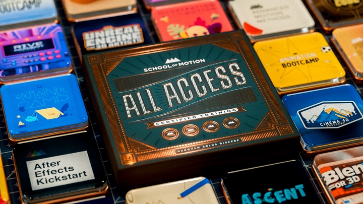
Get unlimited access to 50+ courses, workshops, and resources from the best instructors in motion design. Join School of Motion All-Access today.
Cinematic shots can be "cool," but the principles of cinematography shown in Hollywood can also be applied for character animation in Motion Design
MoGraph artists succeed when they employ the rules and techniques of classic character animation. Why don’t we do this with the camera and lighting? The rules and techniques of Hollywood cinematography can be as effective as character animation principles when applied to motion graphics.

The whole history of motion design is rooted in breaking the rules of so-called "realism" to show us the world in a way we’ve never seen it before. Yet using tried and true camera techniques—from depth of field, to camera movement, heck, even lens flares—as mere tricks can be a huge missed opportunity.
We motion designers have learned that flouting the laws of physics, even a little bit, can sink an entire animation. So what would happen if we paid more attention to how cinematographers use the constraints of the camera to make magic?

In this article we’ll explore five principles of what makes a shot "cinematic" that have direct analogues in animation in terms of how they are used. Together these constitute something like a secret weapon for mograph:
- Less is more. Cinematographers show as little as possible, but no less
- Cinematic images—right down to the still frame—show us where to look
- The true purpose of movie lighting is to create emotional impact
- The camera is a character in the film
- Camera shot designs convey a point of view
By looking at reference—like we do with animation—we find that the so-called "real" world of lenses, lighting, and optics is full of more surprises than our creative minds can easily comprehend.
Less is more in cinematic shots
Cinematographers show as little as possible, but no less. Just as keyframe animations contain far less motion information than raw motion capture data, cinematic images remove detail and color from the natural world—like, seriously, most of it.

Examine the “singular” quality of a classic movie still, such as the ones below, and you’ll see their iconic status is no accident. To understand how "less can be more," pay particular attention to what we don’t see.
One common missing detail is...most of the color spectrum. These images are taken from the full-color real world, yet they all are dominated by three colors or fewer—right down to zero in the case of a black and white movie.
More than that, much of the image detail that does appear in the image is obscured by soft focus, what we call “depth of field effects.”
We don’t even see all of the motion. In an era where computer games can exceed 120fps, film still uses the 24fps standard established a century ago.
What’s left after throwing away so much image data? Only the magic...which is to say, only what matters to the shot. That might be a human face or figure—as with these examples—in such strong relief that they appear almost as in a dream.


Iconic cinematic images show us where to look
Cinematic images also seem to make what’s left seem to jump off the screen. More than simply aiming and focusing the camera propery and following the action, these sequences carefully direct your attention within the shot itself.


Actors deserve much credit for what they bring to the scenes that make them stars, but the best among them understand that they are at the mercy of the skills behind the camera to lend them superpowers.
At the same time, compelling animation can work despite zero use of lighting, color, composition, or optical effects to highlight it. But by making use of these extras, we can lift these designs to another level.
Cinematographers aim for the strongest appropriate lighting choices (and this is an understatement)
Great movies need great lighting. To anyone who knows film productions, this might be a little like saying “actors make strong emotional choices.” Cinematography is about knowing camera technology, sure, but just think for a moment about the title of one of the classic books on this craft: “Painting with Light” by John Alton.


Graphic designers love their work as-created. But to simply show us the artwork that way is a little like leaving a film set fully, evenly lit. And particularly as mograph artists move to renderers that provide fully naturalistic lighting and detail, it’s crucial that they learn to dynamically reveal (and conceal!) the action.
The camera is itself a character in the story
A film might open with a static establishing shot, then cut to a handheld camera view. What do we, as viewers, perceive just happened? We moved inside someone’s head, dared to see and feel what they did.
On the other hand, a motion graphics animation might start out by showing off the design in the flashiest possible way. Does it tell you anything about the dramatic point of view, or just follow the action?
When the camera becomes itself a character, it draws in the audience by leading them in the dance of the shot.


The job of lighting and camera is not to simply to reveal everything, but to convey emotional truth
Just as the neutral walk cycle has a place in animation, the camera can likewise play a neutral part in a scene. In such cases, the composition and lighting of the shot convey emotion.
Here are a couple of shots that use symmetry, dimension, and a locked-off camera to create an effect that is anything but neutral. How do they do it?


Here is an awesomely comprehensive overview from the cinematographer of Bohemian Rhapsody, Drive, and We Three Kings, chock full of great ideas for creators who work with cameras.
Conclusion
Filmmaking is by necessity a collaborative art form, while motion graphics is—at its core—most often executed by an individual.
With great power comes great responsibility. Creativity has a funny way of thriving amongst constraints and being thwarted by endless possibilities. Introducing the natural laws of optics and physics to digital cameras and lighting can lead to delightful surprises similar to those we discover in the best animations.
Learning these laws doesn’t mean being chained to them in all cases. But it can save you from that supreme insult aimed at visual effects and motion graphics animation alike: “IT LOOKS FAKE!” We use artifice and technique learned from the natural world to prevent this happening. And in the best cases we can learn to create movie magic.
Want to Make Some Magic of Your Own?
Now that you've been inspired to watch more movies, why not make a little movie magic? Mark isn't just great at dissecting cinematic shots, he also teaches one of our newest courses: VFX for Motion!
VFX for Motion will teach you the art and science of compositing as it applies to Motion Design. Prepare to add keying, roto, tracking, matchmoving and more to your creative toolkit.
ENROLL NOW!
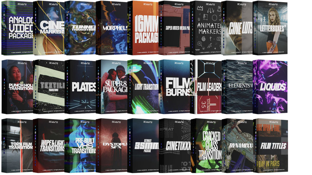
Acidbite ➔
50% off everything
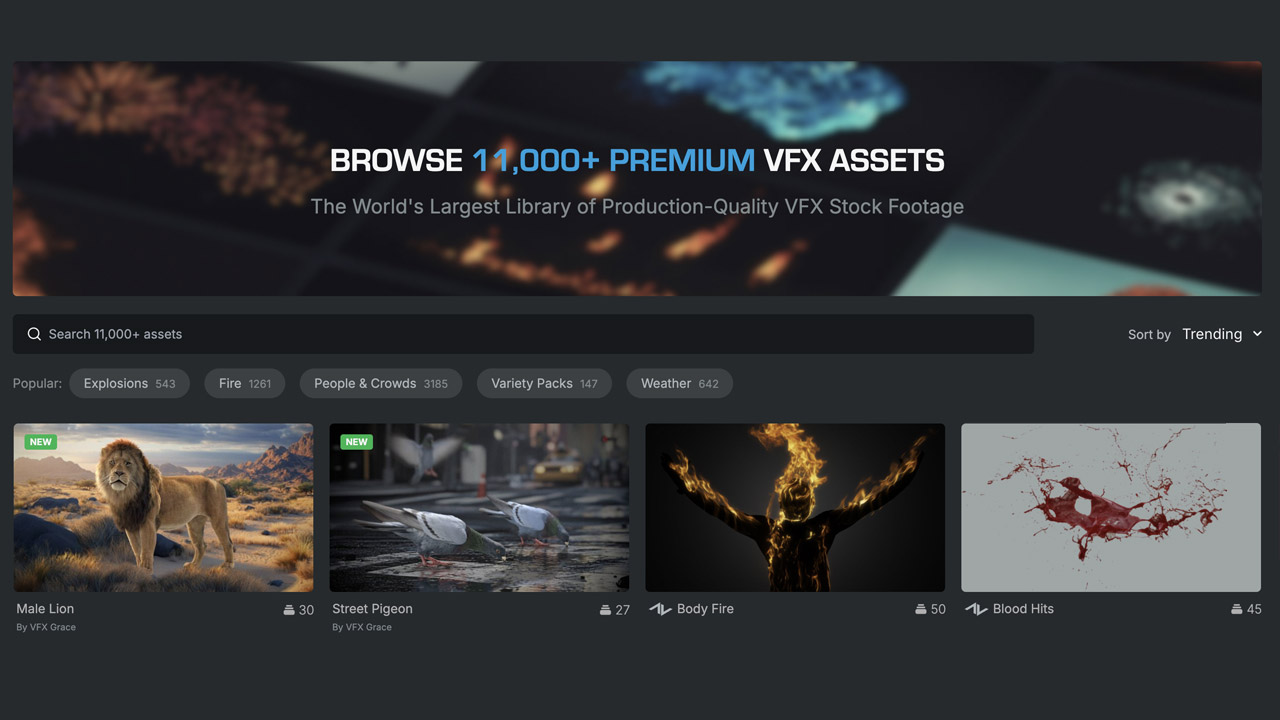
ActionVFX ➔
30% off all plans and credit packs - starts 11/26
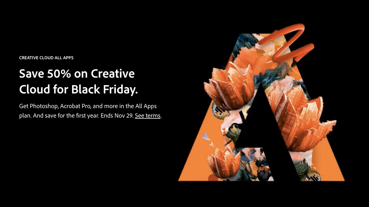
Adobe ➔
50% off all apps and plans through 11/29
aescripts ➔
25% off everything through 12/6
Affinity ➔
50% off all products
Battleaxe ➔
30% off from 11/29-12/7
Boom Library ➔
30% off Boom One, their 48,000+ file audio library
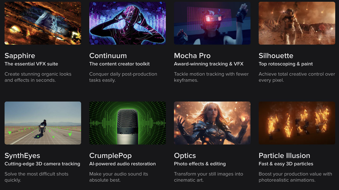
BorisFX ➔
25% off everything, 11/25-12/1
Cavalry ➔
33% off pro subscriptions (11/29 - 12/4)
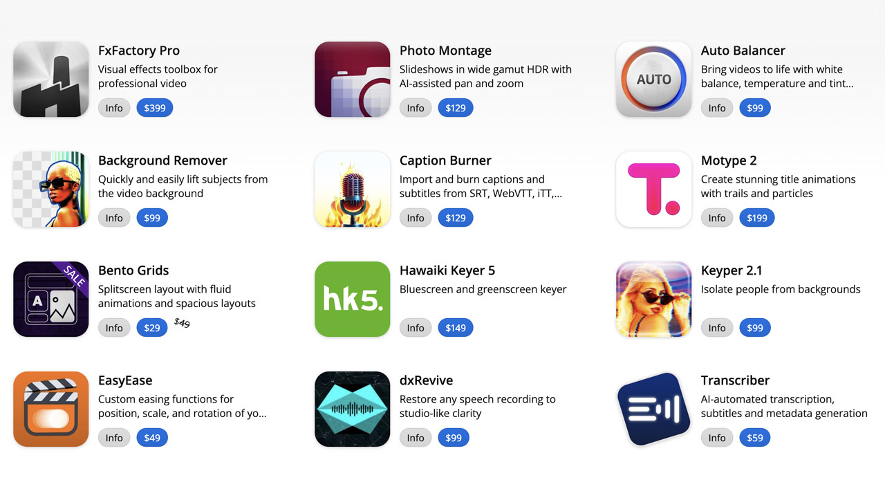
FXFactory ➔
25% off with code BLACKFRIDAY until 12/3
Goodboyninja ➔
20% off everything

Happy Editing ➔
50% off with code BLACKFRIDAY
Huion ➔
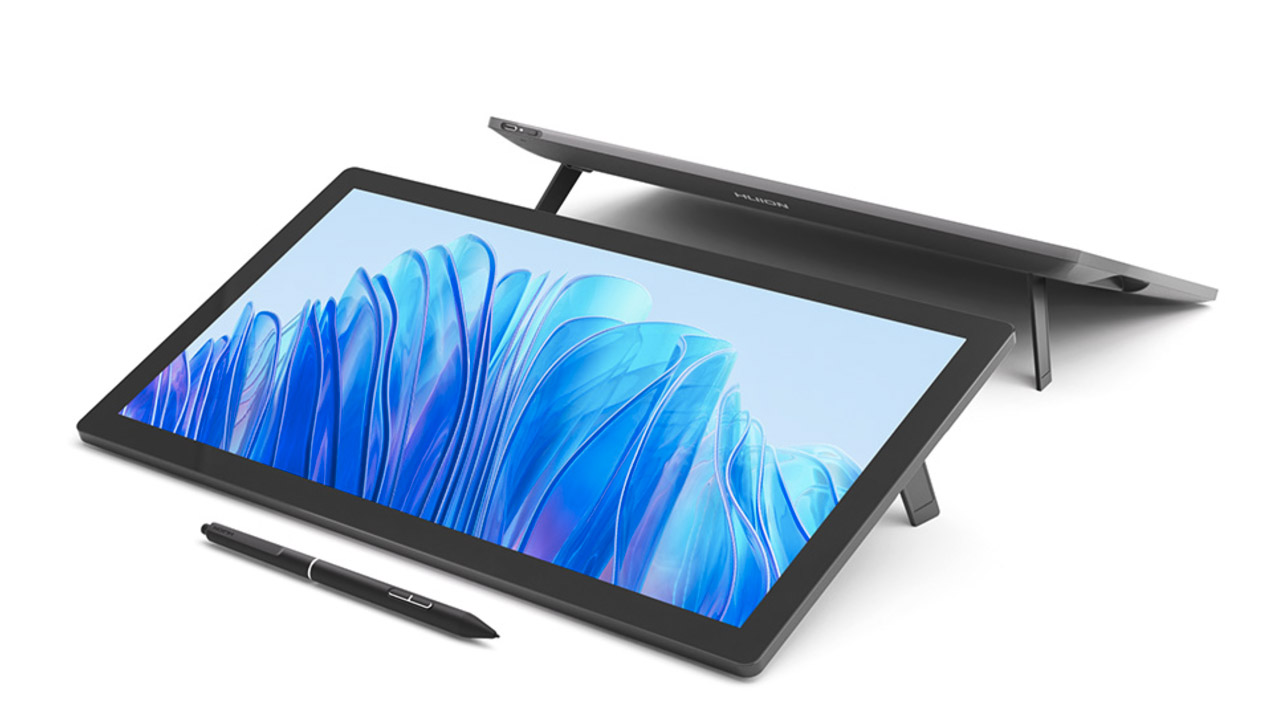
Up to 50% off affordable, high-quality pen display tablets
Insydium ➔
50% off through 12/4
JangaFX ➔
30% off an indie annual license
Kitbash 3D ➔
$200 off Cargo Pro, their entire library
Knights of the Editing Table ➔
Up to 20% off Premiere Pro Extensions
Maxon ➔
25% off Maxon One, ZBrush, & Redshift - Annual Subscriptions (11/29 - 12/8)
Mode Designs ➔
Deals on premium keyboards and accessories
Motion Array ➔
10% off the Everything plan
Motion Hatch ➔
Perfect Your Pricing Toolkit - 50% off (11/29 - 12/2)
MotionVFX ➔
30% off Design/CineStudio, and PPro Resolve packs with code: BW30
Rocket Lasso ➔
50% off all plug-ins (11/29 - 12/2)
Rokoko ➔
45% off the indie creator bundle with code: RKK_SchoolOfMotion (revenue must be under $100K a year)
Shapefest ➔
80% off a Shapefest Pro annual subscription for life (11/29 - 12/2)

The Pixel Lab ➔
30% off everything
Toolfarm ➔
Various plugins and tools on sale
True Grit Texture ➔
50-70% off (starts Wednesday, runs for about a week)
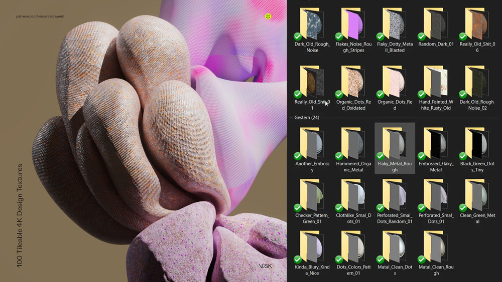
Vincent Schwenk ➔
50% discount with code RENDERSALE
Wacom ➔
Up to $120 off new tablets + deals on refurbished items


Unlock Your Motion Design Potential

Get unlimited access to 50+ courses, workshops, and resources from the best instructors in motion design. Join School of Motion All-Access today.
