Learn After Effects the Right Way
Master the After Effects interface and build a real animation skillset. Enroll in All-Access to unlock AE Kickstart and 50+ other courses.
Want to tell better stories? Add some motion.
With the digital age, it is more difficult than ever to catch and maintain a viewer’s focus. Some studies say the human attention span is less than that of a goldfish! No matter what you produce and edit, adding an additional layer of visual interest in the form of motion graphics can help tell your story and keep a viewer engaged.

Anything from a small social ad to a documentary can utilize motion graphics for various benefits like comprehension and engagement.
Most professionals say keeping a video under a minute is key, but you will find Vox Media, Five ThirtyEight, and likely many others have longer length (6-10+ minutes) engaging videos that appear to do well on YouTube. Much of their success can be attributed to their ability to keep viewers’ attention by mixing a variety of assets skillfully. This can include video, motion graphics, sound design, and more.
How to incorporate motion graphics into your videos
REINFORCING AUDIO WITH ANIMATED GRAPHICS
Sometimes people say something, but it takes a moment to comprehend? I like to reinforce words being said with motion graphics, especially when someone is listing things in interviews. I’m including an example from a video project I worked on a few years ago on an automated vehicle testing ground.
I made icons in Illustrator and added animation as an interviewee listed off involved parties (universities, hospitals, corporations, transit). It was by no means advanced animation, but the client loved these small touches to the video on what was a heavily technical topic.
Another example of reinforcing audio would be this animation Vox included in their video about how it’s difficult to get unemployment benefits. They had this animation appear as they discussed filling out forms as a visual example to what the topic was. This animated clip immersed the viewer on the journey they take in filling out these forms, and why it was such an issue in Florida as they compared the two different processes and the resulting issues.
DEFINING A WORD OR TOPIC
Animating text as if it were being typed in makes a viewer wonder and anticipate what will pop up. I used this in a video on Sustainability and Resiliency Planning. Since “sustainability” and “resiliency” might have different meanings in the dictionary depending on context, we introduced the meaning our target audience could understand.
This example is one of the easiest to start with, and luckily for you readers, School of Motion has already prepared a tutorial on text animators.
LOCATING THE SUBJECT OR MAPPING OUT THE AREA
Something I’ve learned from dabbling in different forms of media is that there is almost always more than one way of visualizing something. If I told a video editor the topic is NYC ,they would look for stock video of the city skyline or the Statue of Liberty. If we were to look at it from a different perspective, such as a motion graphics designer, we might animate some maps or the journey because that is the tool we would reach for first.

If you are going on a journey or showing a path from Point A to B, you might show a dashed line connecting them. I mocked up a quick example of this above to demonstrate.
x
To give an industry example, here’s an animation I did for the automated vehicle testing ground project mentioned earlier to show the contributing factors to the chosen location. This helped stakeholders better understand why the location was key for the success of the project.
Another example of this would be Vox’s explainer on why American public transit is so bad. They interviewed a social worker on her commute. While the interview took place virtually—and they had webcam footage—the editor layered this animation showing the difference between a car commute and a bus. Having this visual as a comparison showed how inconvenient taking public transportation could be compared to taking a car. If they had only shown the interviewee talking, I believe it would not have been as easily understood, especially for people who are unfamiliar with the Chicago metro area but the visual helps the viewer comprehend what the options are for this commuter.
How to use motion graphics to point out detail or highlight focus
There are many ways to bring attention to certain parts of your video.
x
ONE WAY IS TO USE CALLOUTS.
In the example above, a client wanted to highlight two features in a streetscape. One was the gazebo design, and the other was the charging station. These were amenities and helped the viewer understand the changes being proposed. While this is a moving camera angle, callouts can be used to add movement and interest to still photos or videos where the camera is stationary.
As you can see, callouts are made up of a few components, usually a target point, a connecting line, and a text box. The animation is simple in the example above, but you can get simpler or more complex and design it to match the brand.
I have also seen callouts used most often in drone videos and product videos. In drone videos as you are flying overhead, you may want to bring focus to a certain building or area. And in product videos, think about key features that stand out from competitors. Almost any shot can benefit from a callout animation, especially when you are working with viewers that might not be familiar with the topic of your video.
THE SECOND WAY IS TO HIGHLIGHT THE OBJECT OF INTEREST.

I drafted up one of the most basic examples of this in the example above. Highlighting text is an easy way to bring in research and quote sources. For the example above, I simply drew a path along what I wanted to highlight then used Trim Paths to draw the yellow highlight.
I have seen this technique most used in Vox’s explainers. You can click on almost any explainer they have and they use this trick to bring attention to parts of their text-focused clips or give credibility to their work by including scanned archival documents and other research.
Here’s an example by Vox where they talk about the intricacies of highway fonts. They highlight why we need a differentiator between uppercase letter I and lowercase letter L and they highlight to bring attention to it rather than just relying on the visual of the interviewee speaking.
How do you learn these techniques?
Consider taking one of the fundamental classes at School of Motion. The Path to Mograph is one of the first classes, is great for beginners, and, best of all, free! It will also help you learn more about motion graphics and all the different ways you can take your skills.
After you dip your toes into motion graphics with that, there are many more options to learn more about motion graphics. AE Kickstart, Photoshop and Illustrator Unleashed, Animation Bootcamp or Design Bootcamp could easily get you where you want to be. The course descriptions can be found here on the website. Best of all, with those options you can get constructive criticism from teaching assistants which will help your skills grow even faster.
You already knew all of this? Were the tricks too easy?
Alternatively, Explainer Camp or Advanced Motion Methods may be your next bet.
Explainer Camp has Jake Bartlett taking you along on the complete journey of creating an explainer video. If you are looking to level up your videos with more intermediate to advanced motion graphics, this course can take you there.
Advanced Motion Methods is not for the faint of heart, but if you looked at this and yawned, thinking that you wanted to hear some advanced motion design secrets, Sander van Dijk can let you in on some of them.
ENROLL NOW!
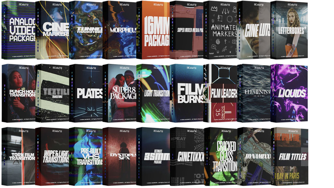
Acidbite ➔
50% off everything
ActionVFX ➔
30% off all plans and credit packs - starts 11/26
Adobe ➔
50% off all apps and plans through 11/29
aescripts ➔
25% off everything through 12/6
Affinity ➔
50% off all products
Battleaxe ➔
30% off from 11/29-12/7
Boom Library ➔
30% off Boom One, their 48,000+ file audio library
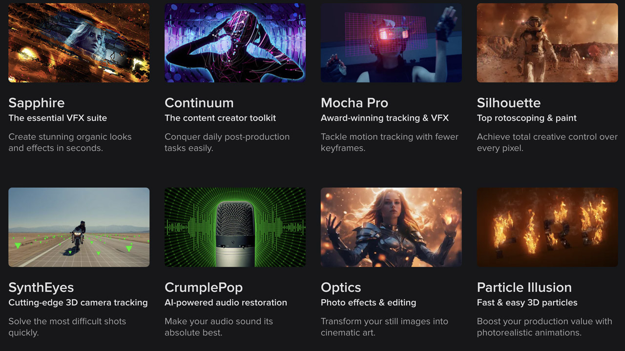
BorisFX ➔
25% off everything, 11/25-12/1
Cavalry ➔
33% off pro subscriptions (11/29 - 12/4)
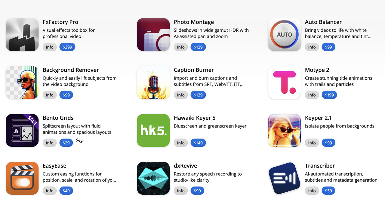
FXFactory ➔
25% off with code BLACKFRIDAY until 12/3
Goodboyninja ➔
20% off everything

Happy Editing ➔
50% off with code BLACKFRIDAY
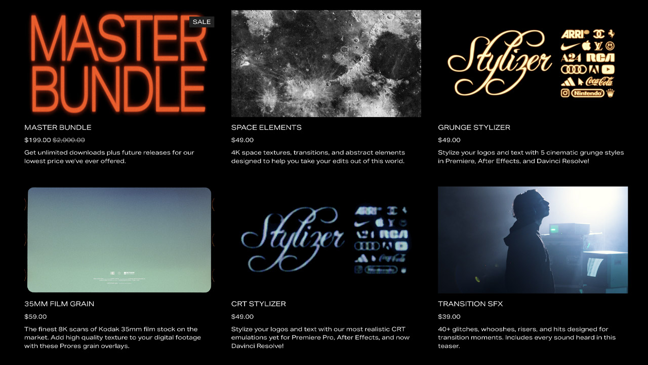
Huion ➔
Up to 50% off affordable, high-quality pen display tablets
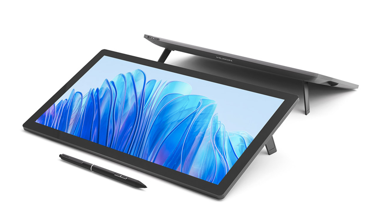
Insydium ➔
50% off through 12/4
JangaFX ➔
30% off an indie annual license
Kitbash 3D ➔
$200 off Cargo Pro, their entire library
Knights of the Editing Table ➔
Up to 20% off Premiere Pro Extensions
Maxon ➔
25% off Maxon One, ZBrush, & Redshift - Annual Subscriptions (11/29 - 12/8)
Mode Designs ➔
Deals on premium keyboards and accessories
Motion Array ➔
10% off the Everything plan
Motion Hatch ➔
Perfect Your Pricing Toolkit - 50% off (11/29 - 12/2)

MotionVFX ➔
30% off Design/CineStudio, and PPro Resolve packs with code: BW30
Rocket Lasso ➔
50% off all plug-ins (11/29 - 12/2)
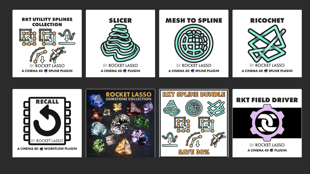
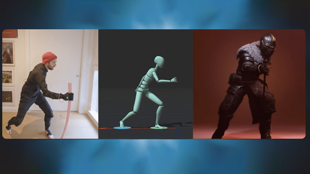
Rokoko ➔
45% off the indie creator bundle with code: RKK_SchoolOfMotion (revenue must be under $100K a year)
Shapefest ➔
80% off a Shapefest Pro annual subscription for life (11/29 - 12/2)

The Pixel Lab ➔
30% off everything
Toolfarm ➔
Various plugins and tools on sale

True Grit Texture ➔
50-70% off (starts Wednesday, runs for about a week)
Vincent Schwenk ➔
50% discount with code RENDERSALE

Wacom ➔
Up to $120 off new tablets + deals on refurbished items


Learn After Effects the Right Way

Master the After Effects interface and build a real animation skillset. Enroll in All-Access to unlock AE Kickstart and 50+ other courses.
