Unlock Your Motion Design Potential
Get unlimited access to 50+ courses, workshops, and resources from the best instructors in motion design. Join School of Motion All-Access today.

Here's how to create a simulated claymation animation in Cinema 4D.
In this lesson we’ll be creating a very cool claymation look in Cinema 4D. Joey originally started messing around with this look to help out his good buddy, Kyle Predki, for a project that he was working on. He needed to achieve a claymation look for some characters and this is what they came up with. And now he's going to pass along what they learned about creating this look to you.
By the end of this lesson you’ll be know how to make a shader that looks like clay and animate something that looks like stop motion, all in Cinema 4D.
{{lead-magnet}}
-----------------------------------------------------------------------------------------------------------------------------------
Tutorial Full Transcript Below 👇:
Joey Korenman (00:16):
Hey there, Joey here for School of Motion. And in this lesson, we'll be creating a very cool Claymation look in Cinema 4d. I originally started messing around with this look to help out my good buddy Kyle pred key for a project that he was working on. He needed to achieve a Claymation look for some characters, and this is what we came up with. And now I'm going to pass along what we learned about creating this look to you. By the end of this lesson, you'll be able to texture and animate something that looks like clay right out of Cinema 4d. Pretty cool. Right. Don't forget to sign up for a free student account. So you can grab the project files from this lesson as well as assets from any other lesson on this site. And now let's jump in.
Joey Korenman (00:56):
So here we are, I have a cinema scene set up, um, and I don't want to walk you guys through the whole process because it would take too long. I just kind of want to show you guys the Claymation part of it. Um, but just to show you guys, what's in the scene, I have a camera, um, I'm using the physical renderer for this scene, um, because I want it to feel realistic and I want to have global illumination and ambient inclusion and depth of field and things like that. And the physical render is much, much faster at those things than the standard renderer. Um, also in the scene, I have a lighting set up. These are, uh, these are just Omni lights with, um, area shadows. And I kind of have a three point lighting set up here. Um, and then this guy, uh, that says psych, this is actually a plugin that I have developed, um, to make seamless backgrounds, um, which is something that we have to do constantly at toil and, um, you know, there's many ways to do it, but what I did was sort of create a rig to, to give you tons of options.
Joey Korenman (01:56):
Um, so you can pick color, you can add gradients, you can, uh, have you have a lot of options with the way the floor looks. Um, if you look over here, if I do a quick render, you'll see, I have a pretty standard white psych environment. The lights are reflecting onto it, and I've kind of put this noisy texture on it, just to kind of give it like a little bit of a dirty look. Um, but there's a million options with psych and I will be releasing it shortly. Um, so watch out for that. Um, so anyways, so let's get started with the Claymation looks. So what I want to do is create a really simple animation, um, where maybe, you know, we have a ball and it sort of drops into frame and splits into two more balls and it looks kind of like clay.
Joey Korenman (02:37):
Um, so there's a few keys to the Claymation look and it doesn't have to just be Claymation. It could just be any kind of stop motion. Um, but after having done a few stop motion projects, uh, it's clear to me that there's a few things that specifically give stop motion that look. So one of the things is animating at a slower frame rate than normally do. Um, normally we work at 24 frames, a second or 30 frames a second, or if you're, um, you know, in Europe or somewhere else, it might be 25 frames, a second for stop motion. We use 12 frames a second. So half the number. Um, so I'm going to set my, uh, I'm going to hit command D and I'm going to set the frames per second 12. Then I'm going to go to my render settings and I'm going to set the frame rates 12 here as well.
Joey Korenman (03:26):
All right. So that's step one. Um, step two is, um, instead of animating everything using key frames, that cinema will automatically interpolate for you, which is going to give you a really smooth motion. You're better off using a lot of key frames and trying to hand animate every single frame because in real stop motion, that's what you have to do. And unless you're Leica or some amazing stop motion artists, um, you're going to have a lot of little imperfections in your movement, and this is going to give it a handmade look that is kind of inherent in stop motion. Um, and then, uh, and then the last part is the texture, which I'll spend some time explaining. So why don't we just start out by making a sphere? All right. Um, and I'm just going to lift it up. So it's kinda resting on the floor.
Joey Korenman (04:18):
All right. And if I render this, you'll see that, you know, just, we know on the surface with some lighting, it doesn't look like clay at all. It's very smooth. Um, it's too perfect. All right. And that's the main thing that you have to kind of figure out, um, you know, when you're trying to come up with a material or a shader that looks organic and looks real, a lot of times what you're really doing is making it less perfect. Kind of beating it up a little bit. So let me show you guys this shader here that I, that I've already made. All right. And when I render it, you'll see, um, that it does a little bit, it kind of adds a little bit of bumpiness and noise to this fear. Um, but the, but what I need to do is actually make the sphere editable because this texture has, it is placement channel displacement channels do not work on, um, on objects that have not been made editable. So I'm hit see, make the sphere editable. Now, when I render this, it's gonna look a lot different. All right.
Joey Korenman (05:21):
So you can see now it's kind of getting a little bit a regular, um, and it almost looks like someone's kind of mushed it. It's not a perfect sphere anymore. Um, and just to amplify that, let me go into the displacement channel here. Um, and I can up the height to 10 centimeters. This will probably look funky, but, um, it'll show you even more that this sphere is being totally squished and turned into a completely different shape when you render. So we have this nice fear that we can animate with, but when we render, it's kind of turned into this other thing. Um, so what I'm going to do now is I'm going to show you how I created this texture. Um, and we're going to kind of try and dial in a look and then I'm going to show you how to animate it.
Joey Korenman (06:03):
All right. So let's take this texture tag off. So when you, um, double click make a new texture, when you work with textures and cinema, um, it's helpful to understand what all the texture channels do. So let's call this texture clay too. Um, because, you know, once you really understand what these channels are used for, um, you know, you can, with some experimentation, you can pretty much, you know, get close to any real texture. There are some textures that you may need V-Ray for, you may need a plugin, um, or you may need someone who really knows what they're doing to, um, to kind of help you out. Um, but a lot of times, all you have to do is think about surface properties to help you with these channels. All right. So let's start with the color channel. Um, the color channel is pretty obvious.
Joey Korenman (06:53):
It, it dictates the color of the object. All right. So I was kind of going for a silly putty look. So I picked this pink color. All right, now let's apply this so we can see what's going on. Um, all right. So that's that one, specular is one that I see a lot of people have trouble with. So specular is, is basically like the glossiness or shininess of a surface, um, color is, you know, in other 3d packages, it would be considered the diffuse channel. Um, it's sort of the overall lighting, but specular is sort of like the hotspots you get when you see a light sort of reflected in a shiny surface. Um, and there's two main options for specular there's width and height, so height, and you can see this little preview here. It actually shows you pretty good. What's going on. Um, height is sort of the, the intensity of this hotspot.
Joey Korenman (07:49):
And you can even see up here on our model that as I tweak the height, it changes a little bit in the preview. Um, and then the width is sort of how much that hotspot spreads out over the surface. Okay. So if you think about clay or silly putty, it's a little bit glossy, just a tiny bit. Um, but not very much. Um, it's kind of like a big matte surface with a tiny bit of glossiness. So, um, the width of your specular might be pretty big, but the height is going to be very, very small. Okay. And let's just render what we have just so we can kind of see where we are. All right. So, you know, this, this sort of looks like clay a little bit. It's, it's kind of got this, this matte surface, um, and the lighting's definitely helping. And just so you guys know, I don't have ambient inclusion or GI turned on yet, um, or depth of field because that's sort of, you know, something you save until you're rendering, um, because the renders will take much longer as we're working here.
Joey Korenman (08:51):
Um, all right. So this specular feels pretty good to me. Now, if we were trying to make this feel metallic, like it was, you know, a marble, like a, you know, like a metal ball, or if it was something shiny, like a marble, then you would need probably a, um, a thinner width, but a bigger height. So you'd get more of like a, a sharp, hard surface look. Um, all right. So, so those are the two, those are color and specular. Um, so now let's kind of go through the rest of these. So luminance, if we turn luminance on, by default, it turns this white luminance is a channel that is not affected by lights. Okay. So if I make this, if I make this ball have pink in the luminance channel, and I render this, you'll see that it almost appears to be glowing.
Joey Korenman (09:39):
Um, and if I turn the specular channel off and the color channel off and use luminance, there's no shading at all. It's just a pink ball. Um, so the luminous channel can be used for a few different things. Uh, but what I like to use it for sometimes it's kind of like a cheap way of simulating subsurface, scattering, um, and some service scattering is, is kind of this technical thing that happens. Think of if you, uh, if you hold a leaf up to the sun, you kind of see the sun through it. Um, and so certain kind of soft materials actually absorb some of the light and it kind of wraps around and you see it on the other side of the object. Um, and you can simulate that in cinema 4d, but it takes a lot of render time. So I'm an easy way just to kind of flatten things out and simulate that a little bit is to have the color and the luminous channel have the same texture or the same color in them.
Joey Korenman (10:36):
And then in the luminance channel, you can just adjust the brightness. So at zero, it looks the same as with just the color channel at 50%, we're getting some shading, but you can see it's kind of washed it out a little bit. Um, so I'm just going to keep that at like 10 and what it's basically doing is it's just going to brighten up these dark areas a little bit. I'm going to go up to 20 and see what that looks like. And it's just kind of flattening it out a little bit more kind of like clay would be, um, all right. So that's the luminous channel. Um, then you've got the reflection channel, uh, which by default in Cinema 4d, that, you know, allows you to see the reflections of other objects in an object, silly putty, or clay is not reflective at all.
Joey Korenman (11:21):
So we don't need that channel. Um, all right. Fog, normal glow. These are ones that I'm, I don't use very often, uh, and then diffusion, um, is a channel that can help you make parts of this clay shinier than others or dollar than others. Um, and we may end up using that. Um, I'm not sure yet. Um, all right. Transparency is pretty obvious environment, uh, is sort of like the reflection channel. Um, it actually lets you, uh, have sort of global reflections, um, in every object based on an HTRI or another image. Um, the bump map is interesting and we are going to use that. So when we start using that, I'll kind of explain what it does. Uh, an alpha channel is used to cut out parts of an object with a, with a matte specular color works with the specular channel. Um, and you can change the color of these highlights that are falling onto this object.
Joey Korenman (12:16):
If you want to, we don't need to, in this case, now this placement is the key to this whole clay thing. So let me show you what the displacement channel does. Um, if we add the displacement channel, um, first we need to assign a texture to that channel. Um, and what, uh, what the displacement channel does, is it literally reshapes the geometry of the object when you render? So what I usually use in this placement channel, uh, is noise. All right. And if I just render this, you'll see, it's going to really weird. All right, let me crank this up so you can really see what's going on. All right. So you see how it's kinda made a mess out of this thing. So by default, uh, what it's doing is it's taking all of the points of this sphere and moving them kind of out from the object based on this noise right here.
Joey Korenman (13:12):
So things that are black don't really move things that are white move outward. Um, however, it's kind of limited by the number of points in the object. So it's not very smooth if you click this button here, sub polygon, displacement, and now we render and it's going to take much longer now. Um, but you'll see you, it actually creates new geometry and renders. All right. So you can get some really funky results with this. And what's great about this is if you had this object as a model, it would have a ton of polygons and it would be kind of a pain to work with. Um, but instead you have this sphere and when you render it, it kind of looks like what you want it to look like. Um, so it's kind of a nice way to work and you can get a lot of cool results without a lot of processor while you working.
Joey Korenman (14:05):
All right. So what I want to first use this noise channel for, um, is I want to just have it generally kind of mush this fear out of, out of shape a little bit. Um, and so we can use just your normal noise for this. Um, but obviously right now, this noise is kind of too small. Um, even if I take the height way down, let's say to 20 or something, um, you'll see that it's, it's just two, th there's like little pits in it. What I need is for it to look like a big fist kind of took it and squeezed it, and it just didn't quite make a perfect circle. Um, so what I'm going to do is go into this noise shader, and I'm going to turn the global scale up, let's try 500. Um, and they basically scales the noise up overall.
Joey Korenman (14:51):
All right. And you can see that now we're kind of getting this core result. Now we're getting, um, a lot of these little facets here because of, uh, the faces of this fear. So what we need to do is turn on round geometry. All right. And now you'll get a smoother result. All right. So this kind of looks like a lump of silly buddy, and then you're kind of there, but it's still very, very smooth. Okay. Um, and that this may be a little harsh. We may, we may not really need that much displacement. All right. But now we're getting somewhere. This is kind of like a little lumpy ball of clay. All right. Um, so the next thing I wanted to do was in addition to this overall lumpiness, I wanted some little divots and grooves in it. Like it was, you know, like when you kind of the silly putties in different pieces and you squish them back together, but this kind of the seams and these were little bits.
Joey Korenman (15:43):
Um, so what I want to do is have some different noise affecting this. Um, and this is where the layer shader comes in. And if you've never used it, it's super duper powerful. And it's sort of like a little mini Photoshop inside of cinema. So the way it works is this. We already have a noise shader in our texture channel here. All right. Um, so since that's already in there, if I click this arrow and I go up to layer and click that, you'll see, now it's changed the noise, lay the noise shader into a layer shader. And if you click that, you can see what we have now is our noise shader inside the layer shader. So it sort of copies what you already have into a layer shader, but now you can add more things to it. So you can add effects. You can, um, Brighton adjust to saturation colorize things, but you can also add more layers.
Joey Korenman (16:36):
So let's say, I want to add another noise layer. I now have two noise layers. All right. I have the one that I've scaled up and now I have another one. And if I change this from normal to screen, I can mix between the two and create kind of a mishmash of them. Um, so what I'm going to do is I'm going to click this little icon here to go into the new noise shader. Now the default noise doesn't really look the way I want. I'm kind of looking for something a little gritty, you know, um, almost like, like your fingernails kind of dug into the clay. Um, so when you're working on the noise shader, there's a million options here. Um, and it can be a little confusing, but really, um, the only ones we're really going to be messing with are the type of noise, the global scale.
Joey Korenman (17:22):
And then down here, we're going to adjust the brightness and contrast all this other stuff can be useful, but in this case, you don't even have to worry about it. Um, so I want to find a dirty looking noise. So over here, you can see there's a, if you click on this noise, there's a lot of different noises and you won't know what they are. However, if you click this little arrow that they've hidden over here, you get this nice little browser that shows you what they look like. Um, and there are tiny little thumbnails, but once you click, it kind of gives you a preview up here. So I clicked on this. Uh, I clicked on this guy down here, which is called [inaudible], and I'd love to know where these names came from, um, because there's some really silly ones. What is gaseous come on.
Joey Korenman (18:02):
Um, so [inaudible] kind of looks like a little bit dirty. Um, and you know, what would it kind of looks like to me is, is black dirt with little white specks in it. Um, which is kinda cool. So what I'm gonna do is I'm gonna hit this back arrow here to go back to the layer shader, and I'm going to set this to screen and you can see that if I, if I adjust the opacity, I'm kind of bringing this little white flecks up, um, along with my noise. So if I render this now, um, you'll see that I've got my overall smushed effect, but now I've also got all these little bumps in it, and those are way too heavy. So I'm going to turn those way down. Um, and I think they may also be a little bit big. I may want them to be a little bit smaller. Um, so I'm going to go into this noise channel. I'm gonna change the global scale to 50.
Joey Korenman (19:01):
All right. Now we're getting somewhere and, and these bumps, I don't know, it's not quite looking like I wanted, so I'm going to look for a different, a different shade, or maybe that the specs are a little much. Maybe we need things that are a little bit more connected to each other. So I'm going to try this Buddha one. That is great. That it's called boo-yah all right. That's not too bad. Let me look at one more and see if I like anything better than that. How about this one? This one's funny, wavy turbulence. That's kind of interesting. See, that's feels a little bit better to me. I just need to tone it down a little bit. It almost feels like someone was, was touching the clay or like they rolled it on a surface and it kind of picked up the properties of that surface. So now I can actually just adjust the influence of this noise.
Joey Korenman (19:52):
Okay. So now we're getting kind of a clay texture. Um, and then let's say I also wanted to try and find something that maybe felt almost like, like fingerprints or something. Um, so I'll click shader again at another noise shader, um, and go in and try to find something that's a little bit wavy, like fingerprints. Um, and there's actually, there's a few different ones. This one Verona it's, it doesn't really look like fingerprints, but if we, if we manipulate it, it might sort of feel like fingerprints kind of overlapping. Um, so why don't we try that? So, uh, what I want to do, and actually instead of having the, uh, because what you'll see when I render this, the, um, the white areas come out of the clay, right? So, and the black areas stay where they are. So what I actually want is these wavy white to be indented into the class. So what I'm going to do is actually swap color one in color to some, a set color, one to white color to black. So now the wavy parts are white, and I'm going to come here, set this to screen, and I'm going to turn this way down and let's see what we're getting now.
Joey Korenman (21:09):
Okay. So you could see we're mixing all these things are getting this really interesting noise. And as I turn up this new one, I can see that the scale of it feels way too small. So I'm going to turn this scale up to 500, see what that does for me. Okay. Just kind of adds a little bit more kind of a Regina to it. Um, and this feels pretty good. So, um, in terms of the overall shape, I'm happy with what the displacement channel is doing. Um, now the surface steel still feels very, very smooth. Um, and so one thing I like to do if I use a displacement channel is just copy the channel. Um, and, and I just click this little arrow next to layer to copy that. And it copies the whole layer set up if I come to basic, uh, and now turn on the bump channel and click this arrow and hit paste channel paste the whole setup into the bump channel.
Joey Korenman (22:08):
So now what the bump channel does is, um, it affects the, it affects the brightness of, um, of the surface, um, based on a gradient and it, and it's basically simulating the displacement channel, but it doesn't actually change the geometry at all. So it renders a lot faster. And a lot of times that's all you need is a bump channel. In our case, we really do want to change the shape of the object. So you use the displacement channel. However, if you have the same texture in the displacement and the bump, um, it sort of, uh, amplifies the light on pieces where, um, you know, on pieces where the displacement is expanding the object and it kind of keeps them a little bit darker where they're not being expanded. Um, so if we render this now with the displacement and the bump channel, um, it just gives us a little bit more contrast.
Joey Korenman (23:01):
You can kind of see over here, you're starting to get some nice kind of highlights here. Um, and if I, you know, if I crank this up a little bit, um, you know, you'll see it kind of darkens this area a little bit, brightens this area. Um, and what I want to do in that bump channel is I want to, I want to lessen the influence of the big sort of overall noise because, um, you know, that's, that's really like manipulating the shape of the object a lot. So it's changing what the light's doing to it, but these little textures that we've added, um, these could actually just help sort of add a little bit of grit to the surface. All right. So you can see now it's, it's sort of getting L this lumpier, um, kind of dirty look. Um, and what I'm going to do actually is I'm going to get rid of this fingerprint noise here, and I'm going to change it into something that's a little bit more kind of grainy. Um, let's try this, this Luca. All right. And see what this looks like. And I'm going to turn the strength of this bump down because it was a little bit, a little bit heavy.
Joey Korenman (24:15):
All right. And that's feeling good. It might, I may want to scale down these textures a little bit. Um, they're feeling a little bit big that one's fine. And then this one I've turned all the way off and let's check this. Okay. So this is, this is pretty decent. Um, it might be a little bit irregular. Um, you know, I could keep messing with the displacement channel and try to get this perfect if I wanted to. Um, but for now, I'm actually pretty happy with this. Um, so, um, so now we have all of our, uh, all of our channels that we're going to need. Um, and just to see what happens, I'm going to take the bump channel and I'm going to copy my set up there and put it in the diffusion channel. Um, and I want to show you guys what it does and if it looks cool, we'll keep it.
Joey Korenman (25:06):
And if it doesn't, we'll toss it. Um, so what it does is it, it keeps areas that are white and it keeps them shiny and areas that are black, it kind of makes them dull. Um, so you can see it kind of has the effect of making the object feel dirty a little bit. Um, so if I turn the brightness of this down a little bit, here we go. Try it yet. When you have, um, when you have a texture in here yet you actually have to change the mix strength. All right. So let's, let's change that down to 50 and see if it's just going to help us get a little bit, and even that's too heavy. I just want a little bit grid on this thing.
Joey Korenman (25:48):
All right. I actually liked that. It, it kinda makes it feel, you know, like, like, like these grooves are actually kind of blocking the light and maybe they're a little dirty. Um, and that feels pretty real. And, um, you know, this'll, this'll take a minute to render, but just to show you guys, if I turn on, um, ambient occlusion, turn on indirect illumination on the physical renderer, um, as this is rendering, when you have, um, you know, like pretty detailed, um, you know, really nuanced textures and you have a decent lighting set up, and then you let the renderer kind of use all of the tricks. It has up its sleeve. Um, you can get a pretty photo realistic result, um, you know, without doing any compositing or anything. And there's also no depth of field on here. So you look at that, you know, I mean, you know, I could nitpick some things, but I bet if you showed that to somebody and said, look, I took a picture of a ball of Play-Doh.
Joey Korenman (26:45):
They would believe that that was real. Okay. Um, so now we're going to use this as our texture, and now I'm going to show you guys how to animate a quick little animation. Um, and then we're going to set it up to render and fire off that render. And now we're going to show you how it looks like. So, um, we have our texture as we're happy with that. Um, so what we're going to animate here is, uh, this sphere and what I thought would be cool is if it sort of fell into the frame and sort of splattered outwards, and then, uh, split into two balls. Okay. So a pretty simple animation. Um, but you know, it'll give you an idea of sort of the workflow you can use and you can, um, you can definitely go crazy with this technique, um, and make, you know, full on Claymation movies if you wanted to.
Joey Korenman (27:32):
Um, all right. So in order to, um, make this feel like stop motion, um, we're going to need to animate pretty much every frame. Now we can have cinema help us a little bit every once in a while. Um, but to get that imperfect look, we really want to try and do as much of the work ourselves as possible. Um, and so in order to do that, especially when we're deforming the ball, we want to use point level animation point level animation means we literally, um, go into like Pointe mode or polygon mode. Um, and we use a tool, um, by the way, I'm bringing this, this modeling menu up by hitting M and then looking at the options. It gives me in deciding I want the brush, which has a scene next to it. So I hit C and it switches to the brush tool.
Joey Korenman (28:18):
Um, so literally coming in here and, and manipulating this mesh with the brush tool, um, and, um, and I want cinema to put key frames on the actual shape of the mesh by default, uh, point level animation is turned off. So the way you turn it on is down here in your standard layout, you see position, scale and rotation, uh, are on, and this P is for parameter. Um, the, these little dots here, these are for point level. Um, and so what you want to do is turn this on and you want to turn on automatic key framing and, uh, and then you need to actually add a point level animation track to your object in the timeline. All right. Um, but before we do that, why don't we first animate the, uh, animate the dropping of the ball? Okay. Um, so when you're doing stop motion animation, and this is one of the things that is really cool about it is, um, it doesn't really let you cheat very easily.
Joey Korenman (29:20):
You have to plan out your moves ahead of time. Um, now in cinema, the beauty is that we can always go back and fix things really easily in real stop motion. You can't do it very easily. So you really have to be precise and think about what you're doing when you're animating and use animation principles and things like that. Um, so I want this to feel pretty quick and pretty bouncy. Um, so I'm thinking this ball is going to drop into frame pretty fast, you know, like this quick, right? So if we're animating at 12 frames a second, it's going to fall probably in two frames, maybe three, probably probably three, just so we can, we can actually do something here in this tutorial. All right. So what we're going to do is we are going to start with this ball out of frame. Okay.
Joey Korenman (30:08):
Um, and I'm going to actually put a protection tag on this camera because we're going to have to switch. Um, we're going to have to switch between our, uh, our editor camera and our, uh, actual render camera quite a bit. Um, and I can see now I wasn't actually looking through my render camera, so let's bring the ball back down and let's line up this camera where we want it. Okay. That's pretty good. Um, all right, so now I'm gonna put the protection tag back on the camera, so we don't accidentally move it. Um, and if you've never used one of those, it's very handy because now I can't move the camera. Literally won't, won't let me move it. Um, but if I click here and go to the editor camera, I can move around. So when I start modeling the ball and, and sculpting it like clay, uh, I can see what I'm doing.
Joey Korenman (30:59):
Um, so we're going to start with the sphere up here, out of frame. All right. We're going to set a key frame. So then we're going to go to the next frame and here, I'm going to turn on automatic key frame. All right. So I want the ball to fall pretty far into the frame. So this is the floor, so I don't want it to quite hit the floor yet. Okay. And maybe what we do is we have it, just enter the frame here. So we'll go to the next frame. Then it falls almost all the way to the floor. Okay. And then on the next frame, it's on the floor, but it's going to be really smushed and flattened. Okay. Okay. So if we just do a quick preview, all right. That's pretty quick splat.
Joey Korenman (31:44):
And we're going to have to add some good sound effects here too. Okay. Um, and you can see, it feels a little jerky. It doesn't feel perfect because I kind of hand did those. I just sort of decided I want this to be fast. It's going to be a certain number of frames. Um, the beauty of cinema though, is that you can always change it. So if I decide that, that this move to this move feels a little too much, I can just come up here and fix it. Okay. Um, now, uh, because this ball is moving fast at the beginning, it should also be a little bit stretched out vertically. Okay. Um, now I could sculpt that and that's probably what I would do. Um, but it would just take longer. So in this case, I'm going to just use the, um, the Y scale. So I'm going to start on a frame where I can tell, um, you know, it should be like this and it should be a little bit smaller on X, two, and Z. Those should match. Okay. All right. Now that's really a long game. That's pretty cartoony, but it's kinda funny. Um, now as it's falling, it's accelerating. So it's a little bit, if we step backwards, it should be a little bit, um, less elongated here. Okay.
Joey Korenman (32:57):
And then as it hits, it's going to totally flatten out very quickly. All right. So the why is going to flatten out like this, and then the X is going to be like this. Okay. Um, and then now that we've done that, we're going to have to move it down again. Cause now it's not on the floor. All right. So now it is. All right. So what we've got so far is this, this kind of animation. Okay, great. Um, now what, what you could do at this point, um, is go into point level animation mode and start making this feel like someone handed this. Um, and we could even go in and tweak and just kinda mush around some things here. So it feels a little less perfect. Okay. So what I'm gonna do is I'm going to switch my layout to animation. So it's a little easier to work with.
Joey Korenman (33:46):
Um, and I'm going to, uh, take my sphere, drag it onto my timeline. Um, and you can see I've got some position and scale key frames on there. So with sphere selected, what I want to do is say, I'm sorry, create and add a special track PLA. Okay. Um, and then with PLA on auto key framing on, I can go to a frame like this hit M and then C for brush, and I can mush some of these points around a little bit. All right. Kinda mess it up a little. Um, and you can see it added a key frame for point level. All right. And so I could do the same on this frame. Um, and then on this frame, I want it out of frame. All right. Now, when it lands here, I want it to kind of, I want this what's going to happen is it's going to land and split into two balls.
Joey Korenman (34:36):
Okay. So the, the center is going to kind of drop down like this, and these ends are going to split out like this. Okay. So it's going to start like this. Okay. And then it's just going to keep spreading out fairly quickly. And I think I want to try and make it feel like it's splats and splits and it's, and it, it almost snaps back. Like it know it's kind of hangs for a second. Like it's going to return to its normal shape and then it pops into two different balls. All right. Um, so it's gonna basically very quickly splat. So on the next frame here, this part's going to be a little lower. These parts are going to be a little bit more stretched out and you can see I'm really not trying very hard to make this perfect. And I'm going to kind of scrub back and forth, you know, a few frames at a time and just try and try and get this to feel good. All right. Alright. So that feels good. And we'll go to the next frame and, and I should probably have the bottom of this start to come up too. Um, and one thing I do want to be careful of, because what I'm noticing is that, um, the bottom of this, uh, it may not be intersecting the floor anymore once I move these. So I just need to make sure that it's always intersecting the floor. Okay.
Joey Korenman (36:02):
All right. So if I do a quick little preview of this, all right, it's feeling pretty good. Splat splat, all right. Now, uh, it feels like it probably needs to come out a little bit further there and, and you want to start a long gating these two, because you know, the, uh, the, the mass of this clay, a sort of splitting here. Okay. So now here's a good, here's a good example of why cinema is actually a lot easier than Claymation from this frame to this frame feels like a little bit of a big move. All I have to do is take this PLA and move it one frame, and I will now get two frames. It will interpolate that for me. And as long as you don't do that very often, um, you can, you can get away with it. Um, and, and, you know, in, in, in stop motion, you would have to, um, you would actually have to go back and try and make this frame and put it in the middle of it. And it's a pain. You really don't want to have to do that. Um, so once I played it back, it actually felt pretty good. So, um, let's see here. All right. Um, so I think I may actually want to get rid of that frame.
Joey Korenman (37:18):
There we go. Yeah. And needs to feel fast. Okay. So that splits. All right. So now at this point, um, this move is going to start decelerating because, you know, basically the tension wants to pull this back together. So it starts to decelerate. It's still moving a little bit. All right. And it's going to hang there for a second, but it's, it wants to pull back. All right. And I think it'll pry, hang for a, may be like another frame or two. All right. And really start to stretch, like it's reaching. Okay. Let's see what we got.
Joey Korenman (38:03):
Okay. I think I want it to be a little bit more extreme. So I might just delete, I might, you know, realize that I'm, um, having too many frames. There we go. And I may want to start to, you know, I mean, when I actually speed things up after I animate a couple of frames. All right. So let's have one more frame here where starts to even, it almost starts to pull back a little bit, like the top starts to pull back the bottom still kind of moving away. Alright. And here is where we're going to have a big pop. Okay. So what at, what I'm actually going to do is replace this model with two spheres. Okay. Um, and the easy way to do that first, let me name this sphere one. Um, I'm going to put a display tag on this and, uh, I'm going to say, use the visibility setting. And at this frame, it's 100, I'm going to go four with one frame and set it to zero. There we go. Um, so now this is what the animation looks like so far. Okay.
Joey Korenman (39:22):
There you go. All right. It's quick. And there's some things that I don't love about it. I think where it's really, I think it's really just a, this frame to this frame. I think this frame might be a little extreme and may want to pull that back a little bit. There we go. So that now it feels like it's still moving out or it's a little bit, and then I feel like these need to move in a little bit. Okay. Um, so now what I'm gonna do is I'm gonna make a, on this frame, I'm going to turn off automatic key framing for a second. Um, so I'm going to make a new sphere, uh, and I am going to apply, let me go back to standard layout for a second. Um, so what I want to do is, uh, sort of add one sphere here and one here and kind of match the position as closely as I can. Um, so I'm going to make that sphere smaller, going to object mode and, uh, try. And I'm going to use some of these views here to help me figure out how big that sphere should be. It probably wants to be about that big. Okay. Um, and it needs to be on the floor, uh, and the floor let's see, I must have moved my floor. It's actually at nine centimeter. So, um, that's a mistake board with that. All right. So that is now on the floor and we're going to scoot it over here.
Joey Korenman (41:00):
All right. And you can see that, uh, because of the way I've been using the, um, my mush tool, my brush tool, I haven't actually, uh, shaped this object, you know, that correctly, but from the viewpoint of the camera, it's working fine. Um, and that's really, all we need to do is just faking this whole thing anyway. So, uh, I'm just going to make this look correct. So that ball's there. All right. I need to make it editable. Um, and this would be sphere L all right. Then I'm going to take this other name it's sphere are, and I'm going to move it over here. Okay. And I'm going to apply the claim material to both.
Joey Korenman (41:47):
And then, uh, I'm going to put a display tag on both of these as well. Um, and I'm going to have the opposite happen to them. I'm going to have them be invisible until this frame and visible, you know, invisible in this frame, visible in this frame. So, uh, if I say use visibility on this frame, it's a hundred percent on the previous frame. It's zero. And then I can just copy that display tag onto, onto this fear. Um, and so now I've got this, and then it turns into two spheres and I must've done something wrong because let's see here 100 go, oh, I know what it did. Sorry, folks, let me do this one more time.
Joey Korenman (42:45):
Uh, this always confused me, the visibility tag. It has actually two things you can key frame. Uh, you can key frame this use, or you can keep him the visibility. And what I want to keep for him is the visibility. Uh, so visibility 100 visibility zero. There we go. Uh, and now copy that onto here. And so now when we go to this frame, it switches to these two spheres. All right. Now these two spheres are two perfect right now, for sure. So what I'm going to do is I'm select them both, and I'm going to use the, um, the brush tool again. And I want them to feel a little bit stretched at the beginning. Like they're kind of pulling away from each other. Right. Um, and what I'm going to do is have them start, and I can just kind of go back and forth like this until it feels like a good match.
Joey Korenman (43:46):
Okay. Um, so I'm also going to, uh, animate the position to them. So I'm going to, um, turn on automatic key framing now, and I want, uh, I'm going to move them. Uh, so let me, let me put a, uh, let me switch back to animation mode here. Um, and I want a position, key frame on them, um, on X and Z. So I'm going to select both of these, and I'm going to put key frames on X and Z. All right. So now, uh, I want them to basically, um, move away from each other pretty quickly and then decelerate and, and kind of really come to a stop a little bit slowly. All right. Um, so what I'm going to do, uh, I'm going to go into my overhead view here, cause it'll be a little easier because we're kind of looking at them at an angle. Um, so on the first frame, after the pop, I actually want them a little bit further apart.
Joey Korenman (44:49):
Okay. Then on the next frame, um, on the next frame, even further apart, like really far apart there, I think I put it on the wrong key frame. There we go. Um, and the reason it's not showing up in my timeline is probably because my view is set up wrong. If I go view, show animated, and then turn off, uh, turn on automatic mode. So now it's actually going to show me, um, sphere Ellen's feeler sphere are, um, okay. So we have this splitting into two, they fly apart and they need to be a little further apart on this frame.
Joey Korenman (45:49):
Maybe a little further apart on this one. Alright. And now they're kind of getting, um, they're kind of moving like where they're kind of framed weird in the camera now. Um, so what I think I, I can always move the camera and maybe we'll do a stop motion camera move to that might be kind of cool. Okay. Um, all right. So we have, they break apart 1, 2, 3, let's do one more move, but they're already starting to slow down now. And then on the next frame, they move a little bit more, just a tiny bit. And then one more frame where they move a little bit.
Joey Korenman (46:42):
All right. And if we preview this okay, so you can see there's a little hitch in the movement. And if we figure out what frame it is, it's this frame here where this, this object doesn't move very much. Um, so let's fix that frame. Um, and if we come in here, you can actually see, it's kinda tough to see, but you can actually see the, uh, where the key frames are. Um, and you can kind of see the line it's creating. And, um, and what's more important is you can see the space between them. Um, and, and if they, you know, so you can kind of imagine your curve, like, do you have this quick move then a little slower than a little slower than a little slower, and then this last one should be even slower. All right. So if we go the last frame, here we go. Even slower. All right. And then let's do the same thing with the other sphere. Um, and what I'm doing is I'm, I'm hitting an object and hitting S which will zoom this view to the selected object. So we have a big move, a little smaller, a little smaller, a little smaller, and a, actually this one animated much better than the other one. Um, all right, so now let's preview this.
Joey Korenman (47:59):
Okay. Um, it's working. Okay. Now, obviously we still need to do a little bit of sculpting on these. Um, so, uh, now we can do the point level animation on these guys. Um, so they start out flattened like this. I'm gonna go into my modeling brush tool. Um, and then as they decelerate, they will slowly form back into spheres. And I'm going to go ahead and just go into my editor camera here so I can actually see what's happening. All right. And so now what I want to do is, is make it feel like right at this moment here, they're really still pretty stretched. Okay.
Joey Korenman (48:48):
And then it snaps back and snaps back pretty quick and maybe even kind of overshoots and pushes them a little bit and then comes back out. All right. Um, so let's see what that's looking like. All right. That's actually kinda what I had in mind. Um, now it feels a little slow that move at the end. Um, so what I could do is speed that move up, or I could slow this move down in the beginning because the speed that they kind of split apart, I kinda like, um, and the, and the beginning now it feels a little fast to me. Um, so what I'm going to try and do is just speed up, or, sorry, just slow down, up to there. Um, so what I'm going to do is I'm just gonna take all these key frames, moving down, take all these key frames and just stretch them out three or four frames, and then move this back.
Joey Korenman (49:51):
All right. And let's do what we get now. Yeah, there we go. So we get this nice little splat. All right. So now let's deal with this camera. Um, so let's figure out. So at the beginning here, the camera's in a good spot at the end. It's not in a good spot. All right. And this is a really short animation I'm realizing, but that's okay. It's really okay. Um, so what we're going to do is let's take off the protection tag, turn off automatic key framing cause we've got the animation in pretty good spot. So, uh, our camera here, um, I like where it, so I'm going to put a key frame on it. I'm just gonna hit F nine, um, and have the key frame on. Okay. Um, and then when, by the time it ends here from 20, um, I actually want it to be looking that way, um, which is kind of weird.
Joey Korenman (50:48):
It's very imperfect and the, you know, the beauty of stop motion. Um, so now, um, what, what, what I just did, they're putting a key frame here and a key frame here on the camera. Um, you can actually do that now. Uh, if you have software like Dragonframe, you can have motion control systems that will actually smoothly move your camera, but we're not going for that. Like, we're going for the imperfect look. Um, so what I want to do is come into my curve editor. I just hit space bar over the, over the timeline, bring up my camera curves. Um, I don't need the scale key frames. We'll delete those and the rotation I do, but I really only need, I believe let's see here.
Joey Korenman (51:36):
Oh, I think I just erased my camera key frames. It's undo this. There we go. Um, stress one more time. Delete the scale key frames. There we go. All right. So we're going to go into the curves, check out the position curves here. Um, and you can see that there's an ease out and an ease in, um, and I don't want that because that's too sort of, you know, computer generated, um, someone hit option L actually need to go back into key frame mode, select all the key frames, hit option L and then do the same on rotation and what that will do if I go back to the curve editor, as it makes linear, uh, linear moves instead of ease and he's out. Um, and then what I'm going to do is I'm going to, um, I'm going to go back to my key frame editor here, and I'm just going to go every so often. Uh, and I'm going to slight position rotation, and I'm going to add keys like this.
Joey Korenman (52:41):
All right. I'm just going to create, hitting add key at. Okay. And then I'm just going to move these around a little bit, and what I'm doing is I'm overall keeping the same move, but I'm just kind of, um, adjusting the speed that the move happens at. So instead of this perfect move, it's going to be a little bit jerky C all right. Um, and, uh, then maybe what I can do is, um, let's take all of the action, you know, the, the balls dropping and splitting, and let's delay them half a second, you know, six frames, uh, and then let's spread out this camera move. So it lasts another, you know, another few frames afterwards, uh, and let's make this 30 frames. All right. And here's their animation again, we need it. We're going to need a good splat noise here. All right. Um, and let me do a quick render here and let's see what this is going to end up like.
Joey Korenman (53:44):
And I think I still have, uh, ambient occlusion and indirect illumination turned on. So this will give you a pretty good idea of what this is going to look like when it renders. Um, and, uh, for the final render, all I'm going to do is turn on depth of field and make sure that we're following focus. Um, so that we get a little bit of depth of field and just kind of helps soften things up a little bit. Um, I'm not really going to do, um, any, any post compositing or anything on this, because this tutorial was really all about how you can get this look in cinema. Um, there's other things you could do in after effects or nuke. You could, um, you know, you could sort of simulate a little bit of light flicker. Um, if you don't have a very tightly controlled studio, it's pretty hard to, to get rid of flicker when you're shooting stop motion.
Joey Korenman (54:32):
That's one of the things you have to avoid. Um, so you could add that you could add film grain, which always sort of makes things look a little bit more like they were shot. Um, especially if you have depth of field and you're sort of selling the idea that you shot this on, you know, your, your, um, your five D or something. Who am I kidding? Most people don't have five D 70, and, uh, I really hope this was helpful. Um, I hope you guys learned about, you know, a few different ways to key frames, some pointless point level animation, um, you know, the, uh, the texturing system, how you can use displacement and bump to get things to look realistic. Thank you guys so much for watching this. I really appreciate it. And I will see you guys next time. Thank you.
Joey Korenman (55:16):
Thank you for watching. I hope you learned a lot and enjoyed making this Claymation style animation in cinema 14. If you have any questions or thoughts, definitely let us know. And we would love to hear from you if you use this technique on a project. So give us a shout on Twitter at school emotion and show us your work. And if you learn something valuable from this video, please share it around. It totally helps us spread the word about school emotion, and we appreciate it a lot. Don't forget to sign up for a free student account to access the project files for the lesson that you just watched, plus a whole bunch of other awesome stuff. Thanks again. And I'll see you on the next one.
Speaker 1 (56:00):
[inaudible].
ENROLL NOW!
Acidbite ➔
50% off everything
ActionVFX ➔
30% off all plans and credit packs - starts 11/26
Adobe ➔
50% off all apps and plans through 11/29
aescripts ➔
25% off everything through 12/6
Affinity ➔
50% off all products

Battleaxe ➔
30% off from 11/29-12/7
Boom Library ➔
30% off Boom One, their 48,000+ file audio library
BorisFX ➔
25% off everything, 11/25-12/1
Cavalry ➔
33% off pro subscriptions (11/29 - 12/4)
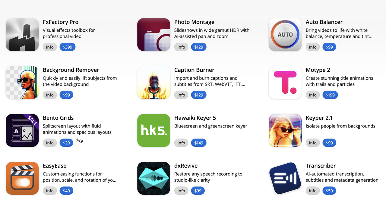
FXFactory ➔
25% off with code BLACKFRIDAY until 12/3
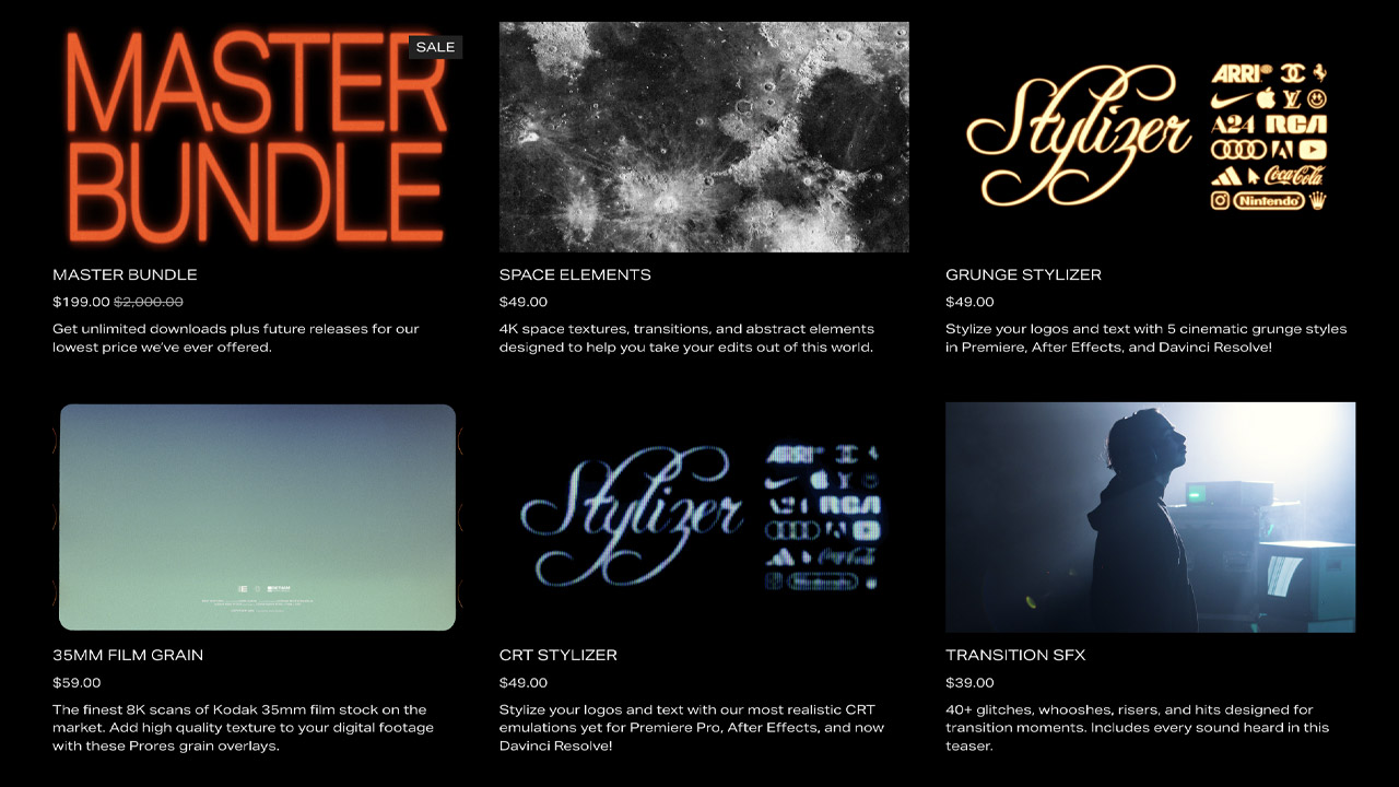
Goodboyninja ➔
20% off everything

Happy Editing ➔
50% off with code BLACKFRIDAY
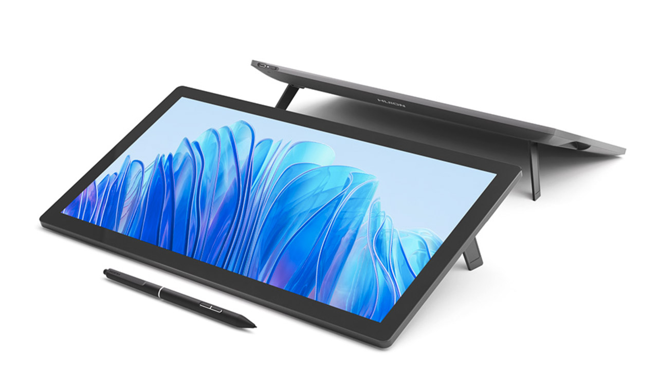
Huion ➔
Up to 50% off affordable, high-quality pen display tablets
Insydium ➔
50% off through 12/4
JangaFX ➔
30% off an indie annual license
Kitbash 3D ➔
$200 off Cargo Pro, their entire library
Knights of the Editing Table ➔
Up to 20% off Premiere Pro Extensions
Maxon ➔
25% off Maxon One, ZBrush, & Redshift - Annual Subscriptions (11/29 - 12/8)
Mode Designs ➔
Deals on premium keyboards and accessories
Motion Array ➔
10% off the Everything plan
Motion Hatch ➔
Perfect Your Pricing Toolkit - 50% off (11/29 - 12/2)

MotionVFX ➔
30% off Design/CineStudio, and PPro Resolve packs with code: BW30
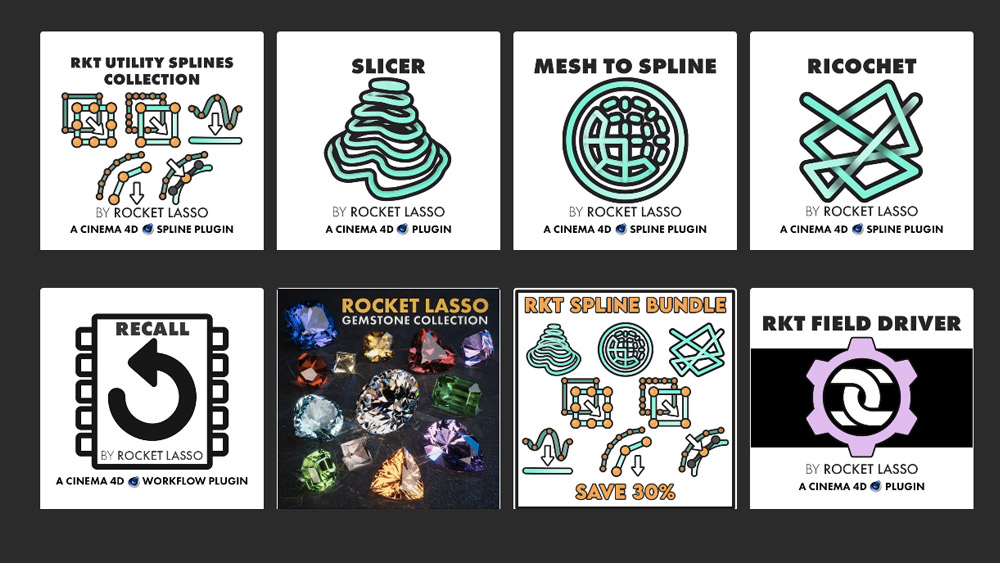
Rocket Lasso ➔
50% off all plug-ins (11/29 - 12/2)
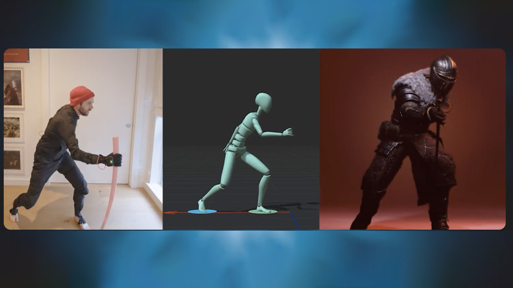
Rokoko ➔
45% off the indie creator bundle with code: RKK_SchoolOfMotion (revenue must be under $100K a year)
Shapefest ➔
80% off a Shapefest Pro annual subscription for life (11/29 - 12/2)

The Pixel Lab ➔
30% off everything
Toolfarm ➔
Various plugins and tools on sale

True Grit Texture ➔
50-70% off (starts Wednesday, runs for about a week)

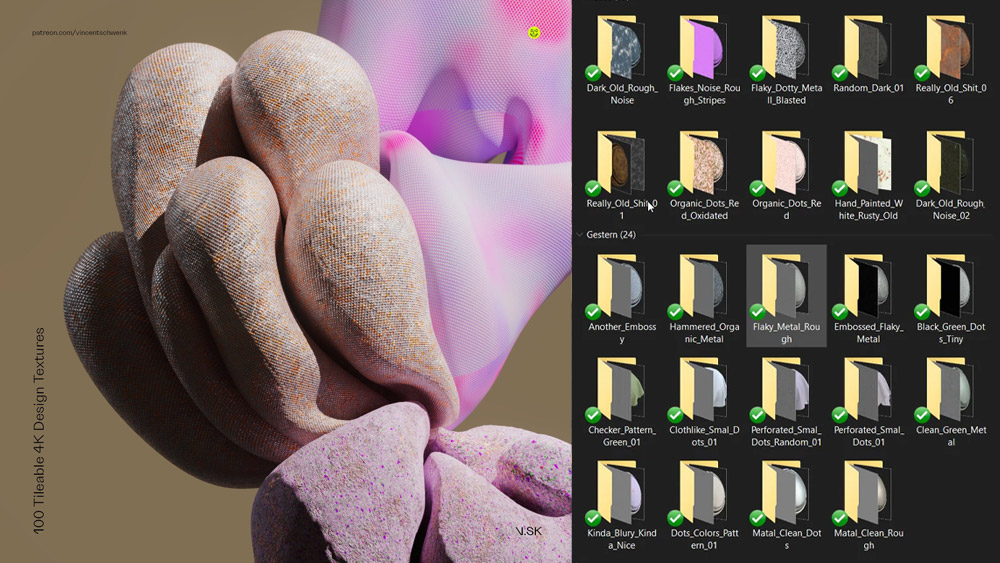
Vincent Schwenk ➔
50% discount with code RENDERSALE
Wacom ➔
Up to $120 off new tablets + deals on refurbished items

Unlock Your Motion Design Potential

Get unlimited access to 50+ courses, workshops, and resources from the best instructors in motion design. Join School of Motion All-Access today.