Creatively Using Text Animators in After Effects, Part 2
THINKING FURTHER OUTSIDE THE [TEXT] BOX
If you watched the first half of our two-part series on using Text Animators in After Effects, you already understand that the Text Animator is a procedural (or, step-by-step) effector-based animator for vector shapes (and, specifically, text).
You've also practiced creating tapered strokes, path arrows, abstract dots and extruded rotating patterns.
And, as a result, you know — better than most — that this powerful, complex tool can do a lot more than add a fade to your type.
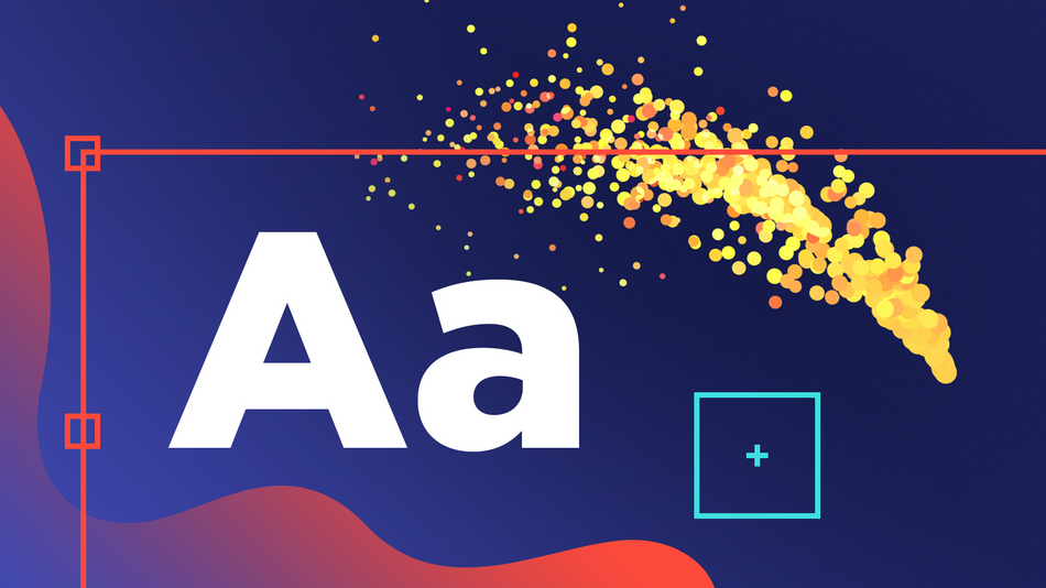
Today, follow along with Kansas City-based designer, video editor and SOM Teaching Assistant and alum Kyle Hamrick, as we take it a step further, using simple rigs and some — gasp! — Expression Controllers to (mathematically) control various elements of your text-based animation.
MASTERING TEXT ANIMATION WITH EXPRESSION CONTROLLERS IN AFTER EFFECTS: TUTORIAL VIDEO
{{lead-magnet}}
MASTERING TEXT ANIMATION WITH EXPRESSION CONTROLLERS IN AFTER EFFECTS: (PARTLY) EXPLAINED
USING .repeat IN A LAYER'S SOURCE TEXT PROPERTY
If you want to clone your text character(s), all you need to do is use .repeat.
To try it out:
- Type a single character into a text layer
- Create an Expression in your source text by alt/opt-clicking the stopwatch, which will automatically insert "text.sourceText"
- Add .repeat() to the end of that line of code
- Inside the parentheses, insert the number of times you want your character(s) repeated; if you want to repeat it 100 times, it should look like this:

To avoid returning to the Expressions editor to tweak and re-tweak your hard-coded values, you can create a Slider: Effect > Expression Controls > Slider Control.
Select and delete that "100," keep your cursor between the parentheses, and then use the expression pickwhip to select the Slider.

Your code will update to this (unless, of course, you've renamed your Slider):

Now you can use this Slider control to change — or animate — the length of your text line.
Be mindful of the paragraph alignment (Left/Center/Right), as it will determine the beginning and end of your line and, thus, where your repeated characters are added.
BUT THAT'S NOT ALL
Also included in Kyle's tutorial are several other useful Expressions features and functions, including:
- Pickwhips/Property links
- Basic expression math
- time
- speed
- Math.abs
- clamp
- valueAtTime
Kyle also hand-writes a six-line Expression; and demonstrates how to create and use variables.
WHY THIS MATTERS
Text Animators and Expression Controllers are not necessarily intuitive or easy to use, but when leveraged effectively and at the initial stage of your design, they can significantly improve and expedite your workflow.
Learn More about Text Animators and Expression Controllers
If you haven't yet watched our founder and CEO Joey Korenman's Animating Type tutorial or part one of our Creatively Using Text Animators in After Effects duology, we highly recommend it.
For a collection of tutorials on using Expressions in After Effects, click here.
Invest in Your Education
Now that you know more about animating text with Expressions in After Effects, it might be time to start mastering the After Effects animation process itself. Fortunately, we can help with that.
As the number-one online motion design school in the world, we specialize in providing determined motion graphics artists with intensive online-only courses on 2D and 3D animation.
This year, we surpassed 5,000 alumni from more than 100 countries, with a satisfaction rate higher than 99%!
Learn why for yourself...
ANIMATION BOOTCAMP: ANIMATE LIKE A PRO
Taught by our founder and CEO Joey Korenman, Animation Bootcamp teaches you the art of beautiful movement. You’ll learn the principles behind great animation, and how to apply them in After Effects. You'll hear from some of the best After Effects animators in the world, and receive comprehensive, personalized critiques from fellow students and staff. By the end of this course, you'll be animating like a pro.
-----------------------------------------------------------------------------------------------------------------------------------
Tutorial Full Transcript Below 👇:
Kyle Hamrick (00:10): Hey there. This is Kyle Hamrick with school of motion. In a previous tutorial, we looked at creative ways of using the after effects, text animator. Today, we're going to take some of those ideas even further and combine them with a few expressions to create some really cool, useful elements that would otherwise be really difficult or even impossible to build. If you didn't have a chance to watch the previous tutorial at a highly recommend watching that first, that lesson has an in-depth explanation of all the properties within the text animator. And while I'll be giving some explanations during this tutorial, you might get lost. If you don't already have a good grasp on how these work, there's a free project file included with the article on school of motion.com. But all the examples are things we'll be building from scratch directly with an after-effects. So let's get started.
Kyle Hamrick (00:53): The techniques we'll be covering are things I use all the time. And hopefully after this, you will too. We're going to begin by creating a simple rig that we'll use for the other examples. In this tutorial, it's also just generally really handy for this kind of stuff, and it helps to take some of the trial and error aspect out of it. I'm going to take a second here and show you my text settings. Everything we're using today is available on Adobe fonts. And just a reminder that you can use any type face you like your settings may just be a little different than mine. In the previous tutorial, we did a lot of creating these long lines of dots and then compressing the tracking to make a solid line. We're going to do that same strategy here, but we're going to make it more controllable.
Kyle Hamrick (01:30): So I'm going to begin by double clicking to highlight this whole line of text, and then just type one period. Now I'm going to hit you, you to reveal all properties that have been changed from their default. In this case, the source text is the only one that has. Then I'm going to click on this stopwatch here and we actually need the part that had already gave us. So we'll just hit the end key to go to the end of that. And then I'm going to type dot repeat with the parentheses. See the auto complete helps us out there, and then I'm going to type 10, right between the parentheses. So now it's taking a single character and repeating it 10 times. If you give it more characters, it would repeat that entire character string. This seems pretty helpful, right? So let's go ahead and set this up to 100.
Kyle Hamrick (02:15): Nice. And let's maybe come down here. We're going to condense the tracking. I found that about minus 2 75 is a pretty good value for this example. This is great, but I don't want to have to keep changing this value every time that I want to change the length, that's even worse than manually typing characters. But if we add effect, expression controls, slider control, open this up here. You could obviously access it over here as well. Let's go ahead and type 100 right here. If we link this up, now we can use the slider control to control this instead of a hard coded value. So I'm just going to click right here and then highlight this portion with the hard coded value. Let's use the expression, pick whip here, just drive that right to the cider control.
Kyle Hamrick (03:04): And now this controls how many characters there are. And in this instance, that to me feels like length. So I'm going to go ahead and rename my slider to that. You can see we've got this handy link slider. Now the controls exactly how long this is. This values may be a little abstract in terms of the actual length of the thing, but it's definitely easier than manually adding characters. Since we're going to be reusing this several times, I'm going to go over to my project panel, select my composition here, and I'll hit control or command D to duplicate it. And then I'm going to name this length rig.
Kyle Hamrick (03:42): I'm also going to come back to my composition and highlight both the text and the effects. And then I'm going to go to animation, save animation preset. You could save this with whatever title, whatever location you want, and then you'll be able to call it up whenever you need it. Okay, we've got this all set up. Now let's do something with it. I'll select my layer, press G to get the pin tool and draw a nice soft S curve here. Then I will control or command click this twirly right here to expose all the properties on the layer. Let's choose path, set it to the mask. We just drew. Now I'm going to create an animator for scale. Set that to zero. As I explained in the previous tutorial right now, the entire range of these characters is being set to scale zero. If we want to change which characters are being affected by whatever we've done to it, that's what the range selectors for.
Kyle Hamrick (04:38): So we'll open this up and I'll set the shape to round. So that's almost what we want, but I would actually like the opposite. So to easily get the opposite, we can set the mode to subtract. Now we have this nice double ended, taper shape. There's a couple of fine tuning things I'd like to do here. So you can see this is actually sitting sort of next to our path. And the characters are actually scaling from the baseline, not the center. So I'm going to change the grouping alignment, which is the per character anchor point. You can see it moving around there. I'm going to just going to try to get that as centered up as I can about minus 8.8. In my case, I also like things to be centered up. So I'm going to adjust the baseline setting here so that it sets right about in the middle of my shape.
Kyle Hamrick (05:22): You could also do that with another position animator, if you wanted, I'm going to go ahead and rename my animator to taper. Since that's what it's doing, then you can see, we have a little issue up here with a bit of separation. We can fix that by just changing the tracking a bit. We could round it up to minus 300, make it nice and dense. Although you'll see now it's way too short. Well, that's easy to fix because we give ourselves a length slider. You can just kind of eyeball this in my case, looks like right around two 20 is about right. There is also a force alignment property here, which will make your shape fit exactly to the path you drew that would make your length slider, that we created more of a density slider. This is essentially how the stroke effect actually works.
Kyle Hamrick (06:08): So we've got our shape. Let's actually animate it on and off. So I'm going to duplicate this animator. I'm going to change the name to on off since that's what going to do. And then let's open this up. I'm going to add property opacity, set that down to zero as well. This doesn't make a huge difference here, but I think it looks just a little bit nicer. And then we actually don't need advanced this time. We're going to leave that the same, but what we are going to do is play with the offset property and see how we can kind of push the shape through this path now. So if you animate it from, in my case, I want to go from 100 to minus 100. And I'll just kind of stretch that out over about two seconds. Let's do a quick preview. We have this nice little snaky tapered shape that goes from one end to the other. I'm sure you could come up with some cool uses for this. If you created a couple copies of this, maybe offset the position just a little bit, offset the timing just a little bit. You have this nice cartoony steamline look that you could maybe put over a illustrated teacup or something like that.
Kyle Hamrick (07:15): I'd like us to make one other variant of this. So let's come over to our project panel. We'll rename this one to steam line and then control or command D to create a duplicate and named this one speed line. So we'll open up speed line here. The first thing I'm going to do is get rid of the on-off and get rid of the mask. We don't need this. Then I'm going to set my alignment to right aligned because that's how we're using this one. I'm going to create another animator for opacity. Let's open this up, set the opacity to zero, and then we can change this shape to ramp down. You can see just a little bit at the end here. Let's crank in this ease high value. So we get a nice long fade out and we'll go ahead and rename this fade because that's what it's doing.
Kyle Hamrick (08:05): Close that up. Then we can add a simple expression to our length slider that we created to give this a little bit more of a dynamic organic feel. So I'm going to click on the stopwatch for the slider and right there we'll type wiggle. I'll let the auto-complete at our parentheses and all type one, comma 50, close that out and do a quick preview. Okay. So we have this nice kind of flowy length going on. That's nice. I feel like this could use one more little punch here to really make it special. Let's add one more animator anime position, and we'll call this wiggle because that's what it's going to do. You might be ahead of me here. We're going to add selector wiggly, but we're going to use the range selector as well. So let's go ahead and crank up the Y value on this position so that we can kind of really see what's happening.
Kyle Hamrick (09:01): The wiggly selector is going to take this property and value that we feed it and kind of randomly feed that to the characters, but I don't want it quite so scattered. So we're going to use the range selector to clamp that down. We'll open up the advanced set, the shape to ramp down, and you can see that clamps down the beginning and then expands out to letting it wiggle. I'd like to ease into that more. Let's crank the ease low, uh, quite a bit. You can see, we can really ease into that shape. So I don't want this to scatter quite so much. I want it more to kind of be swimmy and wiggly. So let's open up the wiggly selector and the way to really get things to sync up like that is the correlation I'm going to set mine to 99 so that these shapes are doing almost the same thing.
Kyle Hamrick (09:46): Just slightly offset. Let's do a quick preview. Okay. That's not too bad. It sort of feels a little bit more swimmy than like the kind of flow that I want though. Personally, I like to set the wiggles per second to zero and animate either the spatial or temporal phase. You can scrub through those real quick and kind of see it's basically doing the same thing. I just feel like this is a little more controllable. So I'm going to click on the spatial phase and type time times 400. We're actually taking the time of this comp and feeding that to this value, but then multiplying it so that it actually goes fast enough for us to see. So now we have this nice kind of swimmy flowy look here, which I like for what we're doing. Now, if you take just a little time to do some coloring, maybe some simple parenting like this, and you can even create a gradient over the life of this shape, which I showed you how to do in the previous tutorial.
Kyle Hamrick (10:42): You could make some nice swimmy speed lines on whatever shape you like. So that wiggle on the tail length is pretty cool, but I'd like to explore making this a little more reactive here. I've taken our length rig. You can see here's the slider. So it's 200 and there's that same code we were using. I've tapered that a bit by creating an animator for scale set to 20 so that it fades away to a smaller size, but not all the way to zero. So that, and then setting to ramp up are the only changes I made there. And then you can see, I created a path for this to move along. I animated the first margin property and I created a key frame where the lead character hits the bottom of each of these bounces.
Kyle Hamrick (11:29): I then spend a little bit of time finessing these in graph editor. You can use my example in the downloadable project file, or you can do this yourself and then your values will be slightly different here. So this is pretty cool already, but the tail doesn't feel very dynamic right now. Of course we could animate this length slider manually, but that feels like a lot of work. And it's not very adaptable. One thing I do want to point out about this technique, these values right here, if you change the path, they're not going to land you in the same place anymore, because this is based on the overall length of the path.
Kyle Hamrick (12:06): So if you end up having to manually key frame, several things on here, it's going to be kind of a pain. If you end up having to adjust the path quite a bit. So that's why I'd like to make this very dynamic and adaptable using some more expressions. So the first thing that I'm going to do is duplicate our length property. I'm going to rename that speed. And I'm going to go ahead and push that above the link property. We're going to be feeding a couple expression controls into a larger expression that we create in length. So I'm going to keep length at the bottom because it's kind of the cumulative result of all these things that we're doing. Another thing you're going to see me do a couple of times is hide properties. I don't need to see if you hold alt and shift or option shift on the Mac and click on a property.
Kyle Hamrick (12:49): It will hide it. It's still there. It's just hidden. One annoyance is that expression controls still come with the compositing options that are very useful on other effects, but meaningless here. And they just kind of get in the way. So I'm going to take this speed slider, and I'm going to pick with this up to my first margin property. So right now it's just giving us the same value. But what I would like to do at the end of this is type dot speed. Now it's going to give us the speed of the changes of that property.
Kyle Hamrick (13:24): So you can see that value here gets to the end. It hit zero. Pretty cool. It's not doing anything yet. While I could have just plugged this directly into the length slider, we're going to be doing some other things. So I think it makes more sense to keep it separate, but let's go ahead and just pick with our link slider directly to this. Okay, well, it's going to break because this is negative and our length can't be negative. Let's go ahead and undo that. So this is just because of the way that I have animated this. I could have used the last margin property. It could have reversed the path, et cetera, but it was a good opportunity to point this out. If you need to force a property to be positive, you can use a function called math dot absolute. So I'll type that in here, math dot absolute open parentheses, go to the very end of the line, close parentheses.
Kyle Hamrick (14:18): Now it's always going to give us a positive version of that number, whether it's positive or negative. So now if we pick with the length slider to our speed slider, we're going to get a tail length that represents the speed at which the position is changing here. I mean, that's okay, but, uh, probably not exactly what we're after. So the easiest way to fix that is probably just to do a little easy division here. Right? We could just add something at the end, like divided by 50 and now it'll always be much shorter. Well, that's too short. Maybe we want divided by five.
Kyle Hamrick (14:56): Uh, well that's clearly not the right case either. Let's go ahead and take that off there. Let's create another expression control here. I'll duplicate speed and call this one divider. I'll open this up and just set this to 10 for now. Now we certainly could just divide this right here, but we're going to be adding more to this expression. So to keep things clean, I'm going to start establishing some variables. So let's say variable SPD for speed equals and then it's pick whipped to that speed slider, right? We'll add a semi-colon to end the line, go to the next line, variable divide DVD equals, and we'll just pick what to that divide or value semi-colon. So now we could simply type speed divided by divider and that'll work the same as if we were hard, coding the value, but now it's a lot more accessible.
Kyle Hamrick (16:00): You can see we're getting closer, but things obviously aren't quite right yet. You need to add a little bit more. The next thing I'd like to do is use the clamp function to establish a minimum and maximum value for this tail length. One of the problems you can see is that our dot disappears when we get to the end of the path. And then there's also some times where it's sort of extending back into a previous bounce and that's just not really what we want. So I'm going to create another expression, control effects, expression controls, point control. Now, obviously I'm not really using this as a point, but I really like point controls. If you need two values contained within a single control, I'm going to go ahead and push that above the length. I'm going to name this clamp and then I'll set these values to, I don't know, 2, 1 50, again, you can just ignore this. This is just here to hold both of these values. I'll open this up.
Kyle Hamrick (16:59): Let's come down to our expression. So since we're going to be using clamp, let's go ahead and set this speed divide to another variable. We'll call this variable tail equals speed divided by divider semi-colon. So now we need to link to our clamp minimum and clamp maximum, which is what we're using the X and Y of this 0.4. So let's create a variable called clamp min equals variable clamp max equals. So for clamp men, we'll just use this pick whip right here. Pick me up to that first value. The minimum semi-colon come down to clamp max pick whip to the maximum semi-colon okay, so now we're going to put all this together to call the clamp function. We just ride clamp and then it gives you some parentheses. So we feed it the property we want to clamp. And then the minimum maximum, we just established all those. So tail comma, clamp, men, comma clamp, max. So now the tail will never be less than two. Never be more than one 50, but it's still reactive to the speed of the change here. Almost there. You can see, we have one little problem. And so things are just a little bit jittery.
Kyle Hamrick (18:30): I explored a couple of different ways to fix this, including the smooth function, but I ended up landing on value at time, which I think is really useful to know for a lot of other things too. So I'm going to add one more, little bit to this expression and then we'll be done. Now, if this were a real life object, the change in the length of the tail would be very slightly delayed from the actual bounces. So we're going to use value at time to approximate that to the end of this first line, I'll come just to the left of the semi-colon. Then I'm going to type a dot value at time. Again, you can see the auto-complete took care of it for us, and I'm going to type time minus 0.1. So now this speed value is actually referencing a very slightly different moment in time than the current one, which will help offset at just a little bit and makes it look a little bit smoother.
Kyle Hamrick (19:21): Go ahead and close this out. Take a look at that and see how that's a bit smoother. It doesn't have those kind of jerky points from where it's hitting the bounces, right? You could certainly be using variants of this on things that aren't text layers. You could use this to drive a trim paths, for example, to do something similar with a shape layer. I found this to be pretty handy doing these little Zippy tail rigs like this. And again, if you save this as a preset, then you can use it all the time and not have to set all these expressions up again, manually. We can take this idea even further by adding a couple more text animators and using some basic expressions to make those dynamic as well. Here, you can see, I have basically the same rig. I just changed up the path and some of those key frames on the first margin property, so that it moves a little differently. You can create your own path like this, where you can find mine in the downloadable project file.
Kyle Hamrick (20:15): So instead of just a tapered stroke tail, we're going to make this more of a magic wand trail. The first thing I'm going to do is disable the visibility of the layer controls. Cause they're going to kind of get in our way here. You can do that right here from your view menu, where there's a hockey for it as well. We have our taper animator from before. We want to make sure that's not selected. I'm going to animate position. So again, we could be changing the whole thing. That's not what we want to do. I'm going to go ahead and name this scatter, and then we're going to add selector wiggly. So if we crank these values up, now you can see we get that nice randomness, just like we did an earlier example, but I'd like to start linking some of these properties to some of the other things that we've already set up so that they're all reactive. Let's take this position property and just pick, whip it straight up to that speed slider. Okay. That's a little bit much, but if we divide it by, let's say 40, it's actually pretty good. You could obviously create another divider control if you wanted to, or you could connect this to the existing one and multiply it by four. It's all about how much control you want to give yourself, but also how many controls you want to deal with. It just depends on what works for your specific example. Let's do a quick preview.
Kyle Hamrick (21:36): Okay. That's already pretty interesting, right? Maybe a little more chaotic than I'd like it to be. Let's clamp that in a little bit, using that range selector technique we saw before open up advanced ramp up in this case, and we can probably just leave everything else alone. Let's take a quick look at that. Pretty cool. I think there's one other property I would like to mess with here in the wiggly selector. You can actually determine the range of these wiggle values here. You could clamp them in a bit if you want it to. So we're going to link that up and then I'm also going to tweak this correlation, set that to zero, just to make it as random as possible. You're obviously welcome to tweak all of these until you're happy with the way they look. I'm going to link this Maxim out to the speed slider up here, open this up. And again, just divide by 40. I found that worked pretty well. Now our maximum amount of wiggle is taking that speed property divided by 40 let's take the minimum value, just link it to the max. And if you just put a minus sign at the beginning, it'll take the negative of that value. It just helps smooth everything out a bit. Again, feel free to tweak yours to make it look however you'd like.
Kyle Hamrick (22:54): I'm going to do one more thing to add a little bit more complexity. I'll take this whole scatter animator duplicate and change the name to color random. I'll open this up, delete the position property and add property, fill a color RGB. So now it's randomizing the fill color of these characters over the life of the path gives us this nice particle trail look right, but it's all speed reactive. Just for one more little flourish I'd like to add on here. Let's find a good frame kind of there. Great. I'd like to add the echo effect time echo and you can see it just adds additional copies of this, that kind of follow just barely behind it in time more properties that you're welcome to tweak if you like. I think this looks pretty good stock, but when it's in motion, it kind of just looks like you fattened everything up and added a little bit of extra sparkle on top of it here.
Kyle Hamrick (23:56): Now you've got this great particle Chasey sort of look, this worked really well for maybe a magic wand or just a cool magical trail sparkly trail that needs to follow something. You could obviously be using different characters for this alternating characters, randomizing some of these characters. I think the possibilities here are really cool. If you just take some of these techniques and combine them in different ways, see what you can do. Let's finish up with one last example that uses some of these ideas in a slightly different way. We're starting off with a very similar build here. This is essentially just the length rig. You can see, we have the same expression here tied to the link slider and everything. I've drawn this curvy path for it to follow. The only major change is that I'm using Quatro slab this time because I wanted squares instead of circles. The first thing I'm going to do is extend out the length over here, because we're actually going to be pushing these characters along the path like this. So we're going to need more of them. Let's go ahead and set this up to 500. You can see it extends the bounding box. It's actually just extending this way off the end of the path here in a straight line and zoom back in. I'm going to start by choosing animate position, and then we can set this to 0, 1 70.
Kyle Hamrick (25:15): We can actually get rid of this range selector. We're not going to use it. You can just highlight and delete it and then I'll choose, add selector weekly. Now you can see it's randomizing these characters up to one 70 and Y off the path in both directions. If we do a quick preview, you can see what's happening now. That's way too fast for my taste. And like I said earlier, I kind of like to animate the wiggles per second in a different way. So I'm going to set that to zero. Let me go ahead and set my correlation to 10. So it's almost totally random, but has a little bit of linkage. And then for the spatial phase, that's another way to advance this. I'm going to create a simple expression here, time times 100.
Kyle Hamrick (26:00): And that's what we're dealing with now. Just a nice little vertical flow. Let's take a second. Rename this position, randomness, close that up. Now we're going to advance this along the path, using the first margin property. Let's come to the first frame, see how this just scrubs it along the path here. Let's go to where that's just barely off. Make a key frame, come up to the end. And I'm going to scrub this into the negatives I'm holding shift. So this goes faster, maybe somewhere around minus 2000. See how that feels pretty good. And you see how that slight vertical position wiggle that we did is giving it a little bit of a swim. Almost like it's twisting the path a little bit. Just gives it a nice look. Next. I would like to randomize the shapes of some of these a little bit. So making sure that we do not have this other animator selected, I'm going to choose animate scale.
Kyle Hamrick (26:59): Let's go ahead and name this one, rectangles and we'll set the scale to 300, 100. You can see it stretched all of them out. I don't quite want all of them. If we open up our range selector, let's choose maybe 80% of them. And we can't really see a difference now because it's off the end of the screen. So if we go into advanced, let's maybe set our shape to smooth and randomize order on. Now you can see, we have kind of a nice mixture of squares and rectangles. Some of them are all the way to that. 300% rectangle. Some of them are kind of in the middle, just gives it a nice randomization, right? Mix this stuff up.
Kyle Hamrick (27:43): We're done with that so we can close it up. So I'd like to add a little bit more slide to this, but it wouldn't really work if we did it in that same animator as before. So I'm going to duplicate this one. Let's rename that slide and open this up. All we really need to change here is the position. Let's change that to 500 zero. So now this is going to give us a nice horizontal slide along the path. It's just kind of upping that randomization kind of making it look like we've almost got some parallax going on here. Just add some more visual complexity, right? Like the previous example, I'd like to add a little bit of color randomness to this, just to make it a little more interesting. So we could copy paste it from the previous example where we can build it real quick here.
Kyle Hamrick (28:27): I'll just duplicate my slide, rename this to color, open this up. We can delete the position, add property, fill color RGB. Let's open this up real quick. We can just alt click to kill that expression. Go ahead and set the correlation to zero. And that's pretty good. So once again, we have a nice randomization in the look of the characters, but it's very easy to control and to tweak. So we probably could call this done, but I wanted to point out a couple of ways that you can make this even more interesting. Obviously you've got this nice path. You can have all these characters flow along this path like this. So real nice way to do sort of a flow of particles in a very specific direction. One thing that's cool about this is you have this path here, so you can still do other stuff on this.
Kyle Hamrick (29:18): Like you could add effect generate stroke. Let's crank this up so we can actually see it. You can use the stroke effect on the path on this layer. Let's set the brush really high up to maybe like 200 and the hardness to zero. Let's set the opacity down to 14 and then let's make this, I don't know, kind of a warm yellow color. I could probably, I drop her that one, but I'm kind of just eyeballing it here. Maybe for this data flow that we've been kind of making here. We want to have something that kind of represents maybe like the big chunk of data coming through. So this might be a good way to do it. You could animate your start and end values here. Maybe you could animate and from zero up to 100 here, then you could animate start from zero up to 100 to wipe it back off.
Kyle Hamrick (30:15): Let's hit you to reveal those key frames and you'd spend a little time finessing that end up with something that looks kind of like this. That's sort of interesting. Maybe not exactly what you want, but it could be an idea. Maybe another interesting way to use this is actually to reveal the data flow. You could set this to reveal original image, crank that opacity back up. And you know, you'd probably want to tweak some of your settings a bit, but you could use this as kind of a way to wipe this on and off. That could be interesting. I'm going to go ahead and turn this off. I like that, but I'm going to show you one other idea too. I think this is pretty cool, like this with this kind of chunky techie feel, but it's also really easy affect stylize Ruffin edges to make this kind of a blobby cartoony look. And even with just the stock settings, you can see you're getting this nice kind of swimmy paint glob trail here. And again, this is all totally controllable. If I wanted to, I could come in here and just kind of reformat the way this path is curving around.
Kyle Hamrick (31:24): Now it swims this way, or I could have this following a shape, moving around. There's all kinds of really cool possibilities here, because this is essentially an effector setup. It's very easy to tweak the overall look and motion of this thing without having to do a whole bunch of stuff manually. Hopefully I've gotten you excited to continue exploring these techniques and to expand upon them, yourself, finding new ways to approach the tools you were already using is a great way to freshen things up and maybe help you think differently about a lot of the other tools as well. If you want to learn more, check out the article over@schoolofmotion.com. There you can download the free project file, which has all the elements we built today. If you want to learn more about motion design, check out all the other great tutorials, podcasts and articles@schoolofmotion.com. And of course, if you want to step up your skills, even further, check out the awesome courses they offer. I've taken auntie aid for several of them, myself, and they really are an excellent way to level up your skills. If you'd like to share anything cool, you've created using the text animator like this. Please let us know in the comments or on our social media channels. And if you have any questions, of course, feel free to send those our way too. Thanks for watching. This has been Kyle Hamrick for school of motion. We'll see you next time.
ENROLL NOW!
Acidbite ➔
50% off everything
ActionVFX ➔
30% off all plans and credit packs - starts 11/26

Adobe ➔
50% off all apps and plans through 11/29
aescripts ➔
25% off everything through 12/6
Affinity ➔
50% off all products

Battleaxe ➔
30% off from 11/29-12/7
Boom Library ➔
30% off Boom One, their 48,000+ file audio library
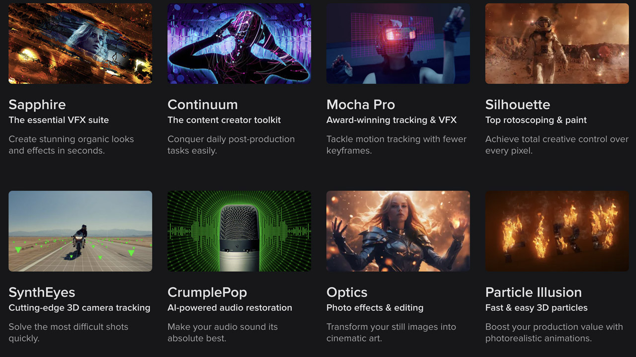
BorisFX ➔
25% off everything, 11/25-12/1
Cavalry ➔
33% off pro subscriptions (11/29 - 12/4)
FXFactory ➔
25% off with code BLACKFRIDAY until 12/3
Goodboyninja ➔
20% off everything

Happy Editing ➔
50% off with code BLACKFRIDAY
Huion ➔
Up to 50% off affordable, high-quality pen display tablets

Insydium ➔
50% off through 12/4
JangaFX ➔
30% off an indie annual license
Kitbash 3D ➔
$200 off Cargo Pro, their entire library
Knights of the Editing Table ➔
Up to 20% off Premiere Pro Extensions
Maxon ➔
25% off Maxon One, ZBrush, & Redshift - Annual Subscriptions (11/29 - 12/8)
Mode Designs ➔
Deals on premium keyboards and accessories
Motion Array ➔
10% off the Everything plan
Motion Hatch ➔
Perfect Your Pricing Toolkit - 50% off (11/29 - 12/2)

MotionVFX ➔
30% off Design/CineStudio, and PPro Resolve packs with code: BW30
Rocket Lasso ➔
50% off all plug-ins (11/29 - 12/2)
Rokoko ➔
45% off the indie creator bundle with code: RKK_SchoolOfMotion (revenue must be under $100K a year)
Shapefest ➔
80% off a Shapefest Pro annual subscription for life (11/29 - 12/2)

The Pixel Lab ➔
30% off everything
Toolfarm ➔
Various plugins and tools on sale

True Grit Texture ➔
50-70% off (starts Wednesday, runs for about a week)

Vincent Schwenk ➔
50% discount with code RENDERSALE
Wacom ➔
Up to $120 off new tablets + deals on refurbished items


