Level Up Your Animation Skills
Learn to make things move beautifully using the principles of animation. Enroll in All-Access to unlock Animation Bootcamp and 50+ other courses.
Here's how to use text animators in After Effects.
Some people think that the Text Animator presets that ship with After Effects are cheesy and hard to use. In this tutorial Joey is going to prove those people wrong by showing you how Text Animators work, and more importantly, how to use them for fun and profit!
You’ll learn some new techniques for working with Text Animators so you can modify existing effects and create some of your own new ones. By the end of this lesson you'll have a new tool in your MoGraph tool belt, and be able to start building your own library of Text Animation effects to use in your work.
ENROLL NOW!
Acidbite ➔
50% off everything
ActionVFX ➔
30% off all plans and credit packs - starts 11/26

Adobe ➔
50% off all apps and plans through 11/29
aescripts ➔
25% off everything through 12/6
Affinity ➔
50% off all products

Battleaxe ➔
30% off from 11/29-12/7
Boom Library ➔
30% off Boom One, their 48,000+ file audio library
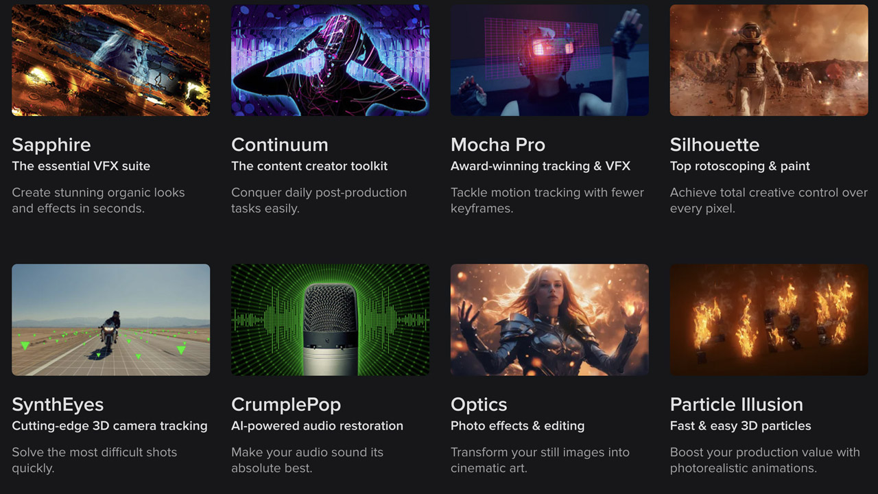
BorisFX ➔
25% off everything, 11/25-12/1
Cavalry ➔
33% off pro subscriptions (11/29 - 12/4)
FXFactory ➔
25% off with code BLACKFRIDAY until 12/3
Goodboyninja ➔
20% off everything
Happy Editing ➔
50% off with code BLACKFRIDAY
Huion ➔
Up to 50% off affordable, high-quality pen display tablets

Insydium ➔
50% off through 12/4
JangaFX ➔
30% off an indie annual license
Kitbash 3D ➔
$200 off Cargo Pro, their entire library
Knights of the Editing Table ➔
Up to 20% off Premiere Pro Extensions
Maxon ➔
25% off Maxon One, ZBrush, & Redshift - Annual Subscriptions (11/29 - 12/8)
Mode Designs ➔
Deals on premium keyboards and accessories
Motion Array ➔
10% off the Everything plan
Motion Hatch ➔
Perfect Your Pricing Toolkit - 50% off (11/29 - 12/2)

MotionVFX ➔
30% off Design/CineStudio, and PPro Resolve packs with code: BW30
Rocket Lasso ➔
50% off all plug-ins (11/29 - 12/2)
Rokoko ➔
45% off the indie creator bundle with code: RKK_SchoolOfMotion (revenue must be under $100K a year)
Shapefest ➔
80% off a Shapefest Pro annual subscription for life (11/29 - 12/2)

The Pixel Lab ➔
30% off everything
Toolfarm ➔
Various plugins and tools on sale

True Grit Texture ➔
50-70% off (starts Wednesday, runs for about a week)
Vincent Schwenk ➔
50% discount with code RENDERSALE
Wacom ➔
Up to $120 off new tablets + deals on refurbished items


Download the project files and dive in!
Tutorial Full Transcript Below 👇:
Music (00:00):
[intro music]
Joey Korenman (00:19):
What's up Joey here at School of Motion and welcome to day 26 of 30 days of after effects. Today, we have a pretty cool video. We're going to talk about text animators in after effects. Text animators are this feature of after effects that was added and it came with all these presets. It's amazingly powerful and really useful, but the problem is it's kind of confusing and things really aren't labeled in a way that makes it easy to use. So I'm going to help you figure out how it all works. And I'm going to show you some easy techniques to start building your own library of text animations and give you some insight as to why it's important for you to learn this feature of effects. So let's hop into after effects and get started.
Joey Korenman (00:58):
So let's talk about text animators. Um, now most people that I've actually seen use the text animators and after effects just sort of use the built-in presets that come with after effects, because there's really not a ton of great resources out there. I found to, to learn how to use these things. And, uh, you know, it's also, sometimes it's just easier to just manually animate type and make it do exactly what you want. But when you're doing a project that has a ton of type in it, and it's one of those jobs that, you know, I mentioned from time to time, not everything is going to go on your reel. Not everything is going to be the most amazing thing you've ever created. And sometimes you just got to get stuff done and text animators can let you do fairly sophisticated type animation, but in a way where it's super easy to change it.
Joey Korenman (01:46):
And so that's what we're going to talk about today. So let's, let's just dive right in and I'll show you how I made all these little animations here. So let's make a new comp and we'll call this one bounce. I'm just going to add a type layer in there. We'll just type in the word bounce and, uh, and we'll get started. So, uh, the way text animators work, it's, it's actually in a weird way. It's similar to the way a MoGraph works inside of cinema 4d. So if you're familiar with that, then this may make a little bit more, more sense to you. Um, but if not, don't worry, I'm going to try and break this down and make it a little bit easier to understand. So the way you add a text animator is you, you have a text layer, right? And you open up the text options right there.
Joey Korenman (02:35):
And, uh, and you can see over here, there's a little button that says animate with a little arrow. And if you click that arrow, you get all these neat things you can animate. So to make this bouncy animation, let me open up the original one I made here. Here's the bouncy animation. All right. So here's how I made this. Let me close all these two. So I don't confuse myself. Here we go. All so the way, one way you can use these, these text animators is to basically create positions and sort of states for your type and then animate between them to create, you know, bouncy animation or, um, you know, have things scale up and scale down or rotate into position or stuff like that. So what, what I do sometimes when I use these is all first all create, um, I'll click on this button and I'm gonna, I want these letters to sort of fly up from the bottom and sort of overshoot and come back and bounce and land.
Joey Korenman (03:38):
So what I'm gonna do is I'm going to be animating the position. So when you say animate position, here's what happens. This animator one gets added. So the first thing I'm gonna do is rename that. So it's something that means a little bit more. So this is actually going to be the initial position and the way this works is you've got two parts to this text animator. You've got the actual property that's being changed, which is the position. And you'll see if I move this, it's going to move every single letter. Okay. Uh, and then you've also got the range selector, and this is the key to text animators. Okay. When I change this position like this, okay. If I move it to the bottom, now I've got this range selector. And right now the range is set from zero to 100, meaning the entire string of letters is being affected, but you can animate this, right.
Joey Korenman (04:29):
If I animate the end, then it's going to sort of one at a time have each of these letters be influenced, right? And so that's sort of the simplest version of using a text animator. You can just set a key frame here, come over here, so that another key frame and Ram preview it. And there's your, your type animation. Right? And, and the thing is that the default settings for these are pretty ugly. Um, you know, every letter goes one at a time. There's no overlap to them. There's no easing. And it just, just doesn't really feel good. And it's kind of, it's a lot of steps, you know, like to try and make this feel good. It w this is I think the trouble with text animators and the reason they aren't more widely used is that they're just not that user-friendly right now.
Joey Korenman (05:17):
Um, and maybe, maybe in a future version of after effects, that'd be changed, but, you know, it's just not that intuitive. So anyway, so what I'm going to do is I'm actually going to, uh, I'm going to stack a few of these texts, animators, not just going to use one and try, try to get it to do everything I'm gonna use multiple text animators. So what I did was I used one text animator, which is actually not animated at all. All it's doing is it's setting the initial position of my type down here. Okay. So then what I'm gonna do is I'm just going to duplicate this, right? So you just click on it, command D duplicates it, and now I'm going to say position oh one. All right. So now position, oh, one is actually going to be negative 6, 6, 3. Okay. And actually it's going to be even a little bit less than that, because what I want to happen is I want, I want the type to overshoot and then come back down. So this is going to be the first position. This type sort of ends up in. Okay. And now if I use this range selector and I animate from zero to 100, right. You can see that now because the type of starting down here and the purpose of this text animators to move it back up when I animate the end, right from left to right. The letters kind of fly back into, into the screen. So that's great. Um, another thing you can do is you can leave this at 100% and you can animate the offset.
Joey Korenman (06:42):
Okay. So this is what I'm going to do. And just gotta be careful. Cause if you go too far, it'll start to come back around. Okay. So let's put some key frames on, you're going to start negative 100. We'll go forward to one second and we'll set this to zero. All right. Now let's play this. All right. So we've got the letters doing what we want them to do. That's the first move, but they, what I really don't like is that they it's like one letter at a time and there's no overlap, which, which sucks, frankly. And then there's no easing either. They just kind of stick their flying in and they just stick. And it's just really kind of just doesn't feel good. So this is where some of these advanced range selector settings can come in. So there's two settings you've got to mess with a one is, and there's actually a lot of settings you can mess with.
Joey Korenman (07:32):
But, you know, text animators are actually a pretty deep topic and we're not going to get, be able to get to everything in this video, but I just want you to get kind of the basics out of the way. So if you look at the shape, okay, the shape right now is defined as a square. And what that shape is referring to is it's sort of the shape of the, uh, influence of the range selector as you change this offset amount. Right. And it's square right now, meaning that it goes from one letter and then to the next letter and then to the next letter, but you can change the shape and there's a whole bunch of different ones, right. And there's ramp up and ramp down. And, and so let's just kind of go through them a little bit, so ramp up, right. You can see that it's sort of making things go backwards.
Joey Korenman (08:14):
So that's, that's not what we want. So let's go down to ramp down. And now as we move through, you can see now the letters are overlapping a little bit. It's not the B and then the own. And then the, you, they're all sort of happening, um, together, right? There's some overlap, which is great. Um, and because we've changed it to ramp down now the animation isn't finishing. So we need the offset to actually go all the way to 100. So let's set that to 100. Cool. So that's better, but there's still no easing. It's still really stiff. Right. But at least there's some overlap. So now the next thing we can do is we can actually add easing. So there's two settings here there's ease and ease low. Uh, and it's really weird that they're called ease high and he's low. Like why aren't they called ease in and he's out, but watch what happens if I crank up the E's high to 100 boom.
Joey Korenman (09:07):
Now they ease in beautiful. And actually, this is what I want. What basically ease high is, is ease in and ease low is ease out. Meaning the initial position here. There's no easing happening there. If I crank this up, then there will be, and they'll ease out of this position and then ease into this position. But I don't want that. I just want them to let me set back to zero. I want them to shoot out of the initial position and then I want them to ease into the final position. So ease high is making them ease into that. All right. So now there you go. We've got the first part of our move. Fantastic. Next thing I'm going to do is I'm going to just duplicate this and call this position two, and you can see I've, you know, the, our, um, our type is being messed up now.
Joey Korenman (09:51):
So what I'm gonna do is first reset, this position, set that to zero. Okay. Because this position is relative position. It's not an absolute position, so I want it to move down relative to its current position. So I'm just going to decrease the Y position a little bit. All right. And then I'm going to go into the range selector, and I'm going to take these key frames and I'm just going to knock them over like two frames, because I want this move to happen slightly after this move. Right. And so what that's going to do is it's going to let the letters come down and you can see it's happening very slightly right now. So let's actually, let's amp this up a little bit more so you can see the effect better. All right. And let me scoot these key frames over even a little bit further.
Joey Korenman (10:38):
There we go. And now you can see that the letters come up and then they kind of come down a little bit. So they're overshooting pretty cool. Uh, and now I want to go to the advanced properties here and I do, I want them to ease out of there, you know, when they overshoot, I want them to ease out. And then when they land, I want them to ease in. So I want both of these eases to be set to a hundred percent. Okay. And you can see that now that's created some problems. And, uh, so what's happening is if you have both the east high and east low set to 100%, uh, than sometimes the, the easing can sort of get funky. So I'm going to set both of them to 50, and now we get a nice little settling. Um, cool. And, and so, you know, the, the more delay I have between this set of key frames and this set of key frames, the longer it sort of hangs up there. Right. And if I have them closer together, it's like a much quicker little transition.
Joey Korenman (11:36):
Okay. So you can sort of play with the timing between it. Um, and that's, I mean, that's the basics of how you can stack type of factors to, or text effectors to get this right. And so then let's say you wanted it to just overshoot down the other way a little bit. Well, you could, you could just duplicate this, right. And then come to the position and just make this like a negative 45 or something. Um, so now it's going back the other way, and then you offset these key frames, right. And now, and, and you can see, we've got to kind of play with the timing a little bit. May have to kick these out a little bit more right now. It goes too far and it comes back down and it, and it shoots up a little bit. Um, and you know, what I found is that if you, if you start going too crazy with these, if you, uh, if you start stacking a whole bunch of them, you can see that the timing can start to, um, it can start to create kind of, it can sort of minimize the animation that you're trying to create.
Joey Korenman (12:32):
So, um, you know, you may have to push these, these key frames a little bit further apart to really see everything. There we go, bounce, and then I can just grab all these key frames and move closer together. Right. And there's your bounce. All right. And so just by playing with the timing, you can, you can really get the exact result you want. Cool. All right. And then the beauty of this, right. You've done all this work and it's, it's a little weird, but once you get it working the way you want, then you can just type in, you know, if you have like some weird, long, last name, it doesn't matter. Like you can type in absolutely anything and you can get this cool result and you can type in entire sentences, you know? And, and now, and then, you know, this is a longer word, so I want it to take a little bit longer.
Joey Korenman (13:28):
Okay. Just move the key frames a little bit. Um, so this is the beauty of taking the time to set up something like this is now, if you have a, you know, you're doing like a corporate piece and you have a hundred titles, you don't have to, you know, and this is what you want it to look like. You don't have to like split this into layers and do some kind of crazy pre-camp and animate each one. It's like, you just, you know, you're just copying paste this type layer types on Nelson. All right. So let's look at, uh, some other stuff you can do with type layers. So that's the balance. Um, let's look at this one. This was kind of a, an interesting one. This glitch, right. Uh, glitches are very hot right now. Glitches are so hot. Actually red giant just came out with a new, uh, glitch plugin as part of their universe package.
Joey Korenman (14:13):
Um, which is really awesome. And it does this stuff, uh, very easily for you. So check that out if you're into glitches. Um, so let's talk about how I did this. So let's first make our type layer, right. Let's call it glitch. And, uh, so this, I started by just doing, um, I started this kind of in the same way. So when you make a type layer, the anchor point of each letter is at the bottom by default. And so if I wanted like scale up some of these letters, but have them scale from the middle, I need to change the anchor point of the letter. So the first thing I'm going to do is I'm going to animate the anchor point, and I'm just going to rename animator one to anchor point fix, and I'm just going to move the anchor point so that it's in the middle.
Joey Korenman (14:58):
And then I can just move my type layer up like this. So it's in the middle and there we go. And so now every T text animator I put after this is going to use that new anchor point. So again, you can stack these things to, to get the result you want. So now the next thing I want to do is animate the scale of some of these letters. And so if I, you know, what, one thing that's pretty cool about the text animators is that it works on a per character basis. So if I hit scale, it's going to scale up each letter, which gives you this interesting result that it's, you actually wouldn't be that easy to do any other way. Um, but what if I only want some letters big and I want it to be kind of random, right? There's um, you know, the, the default range selector is not going to give you that control.
Joey Korenman (15:45):
It's only going to let you do things kind of sequentially, right? Um, so what you can do though, is you can, you can add a different type of range selector called. And so if you click add, once you've added something that you can animate, right? You can click on these individual text animator groups, and there's a little arrow to the right of them, and you can add more stuff to them. So if I want to add another property, I can do that. I can also add a different selector. And remember the selector is the key to the text animator. You set the property that you want to be changed, but then what you're animating is the selection of letters. Or you can even have it be a selection of words. You can, you can change that to, there's a, there's a setting down here that you can base this on characters or words or lines.
Joey Korenman (16:35):
Um, this is a lot of settings here, um, but you're animating the selector. And so if I grab a Wigley selector, this is sort of a random selector and you can see right away, it's sort of randomizing what's going on here and it's, and it's animated by default. Right. Um, and so it kind of creates this funny, silly, rubbery looking thing, just kind of interesting. Um, and what's interesting is you've got two selectors on here now, range selector and a wiggly selector, and they can work together in different ways, right? So right now the range selector, this is how you should think about it. The range selector, the start is zero. The end is 100. That means the entire frigging thing is selected. Okay. And there's zero offset. If I move the offset this way, you can actually see the beginning and the end. This is the, it shows you these two lines.
Joey Korenman (17:23):
It shows you what selected. Okay. So that's, what's being selected now in the wiggly selector, the mode right now is set to intersection. Okay. What that means is it's only going to affect things that are already selected. So if I set this range selector, you know, to have an offset of 60, or it make this even easier, let's say zero to 50%. So only the first half of the word is selected. The selector, the mode is set to intersect. This selector will only affect the first 50% of the word. Now, if you set this to add right, then it, actually, what it's going to do is it's going to add a wiggly selection to this that's already selected. And the stuff that's not selected is just going to get a normal selection. So that's why you can see these letters look bigger than these letters.
Joey Korenman (18:13):
So you can actually sort of use, you know, transfer modes, I guess, with these selectors. So what, so this is cool because what you can do, first thing I want to do is I want to turn the wiggles per second to zero. I don't want these animated. Okay. What I do want is I want to lock the dimensions. So if I say on now, when it scales these things up, it's only going to scale them up the same on X and Y. So you won't get these weird, stretched out letters, unless you want that. Um, there you go. And so then what you can do is you can animate, you can, you can, you know, say how big do you want these things to get, right. Um, so I want, uh, you know, I want them to get pretty big. And so the way this is working, right, I've set the scale to 200 and let's just set it to two 50.
Joey Korenman (19:00):
The scale is set to two 50. The wiggly selector is sort of creating random selection values. And the way that text animators work is if a letter is a hundred percent selected, it will be assigned a scale of two 50. If it's 50% selected, it will be assigned a value, uh, less than two 50, right? It would be assigned 1 25. And because the wiggly selector has a maximum out of 100% and a minimum amount of negative 100%. What that means is that, you know, you could actually end up with a letter that has a negative selected value. It's negative, 50% selected, which means that it can actually have a negative scale. So if you don't want that, you set the minimum out to zero. So that way either the letters are their normal size or they're bigger than that. Okay. So now I'm going to set that to negative 100, cause I think it would be cool if some of the, some of these letters became, um, smaller.
Joey Korenman (20:01):
All right. So I'm going to, I'm going to set the, uh, the range selective to a hundred percent. So every one of these is selected. Okay. And what I want to do is, uh, I want to have sort of the letters randomly sort of Twitch. So the way I did that was I just changed the random seed. Right? If you just change this number, it's going to give you different results. And what's interesting is it actually kind of does it in a way that's, that's kind of correlated, I guess. So like, as I animate this random seed, the values changed smoothly. So what I want to do is I'm going to just pick, I'm just going to pick, okay. I think that looks pretty, that's cool right there. So I'm going to put a key frame there and I'm going to set that to be a hold key frame.
Joey Korenman (20:42):
So command option, click the key frame, go to the next frame and then just change this and change it to something that looks different, right. Then go to the next key frame, change it to something that looks totally different. Right. And then I'm gonna go forward to key frames, change something else. And, and there you go. And so then, uh, the next thing I want to key frame, I want it to basically Twitch a few times like this, and then I want, I want them to sort of settle. So now what I can do is I can actually animate this, right. I can animate the initial range selector and I could change the start to go all the way up to 100. And the effect of that is if the start is 100 and the end is 100, that means nothing is selected. And because the wiggly selector is set to intersect, it's not going to affect anything.
Joey Korenman (21:31):
Right. So on this, maybe on this frame here, I'll put a key frame, then I'll go forward like three frames and set that to 100, uh, easy, ease those. And let's just do a quick Ram preview. Right? Cool. So now you've got this little twitchy glitchy thing, right. And let's, um, let me just nudge this forward a few frames. So it starts on black. Cool. So that's kind of neat, but I want, you know, I kind of want a little bit more movement to this. I want a little bit more of an effect. So what I'm going to do is I'm going to let me rename this. So this is the, um, the wiggly scale, and I want to do the same thing with the position of these letters too. So let me just duplicate Wigley scale for a minute. Let's say wiggly position. Okay.
Joey Korenman (22:21):
And let's open up this. And what I want to do is instead of having the scale be animated, so let me, let me, you can actually click on scale and just hit delete. And now that property doesn't get effected anymore. And then I can go over to this add button and say property position, and I can adjust the Y. So now, in addition to the scale moving, we get the Y right. And I've got these things separated out and that's kind of handy. I mean, what I could do is I could just go into wiggly scale like this and add the position property to this. So now you would have scale and position being affected, but I kind of like having them separated out because now I could really easily, you know, if I wanted, if I wanted to have a little bit less of sort of, um, you know, an in sync animation, I could just move these key frames over a little bit.
Joey Korenman (23:15):
And so now the position isn't, so in sync with the scale, right. And you can play with that. You could have, uh, or you, you know, you could have the position Twitch even a little bit after the, uh, after the scale is, is done animating. So it's kinda nice to have everything separate out. So there you go. So now you have this cool little glitchy animation, right. And, you know, I'm not really loving where that T is ending up. Right. So what I could do, let's see. So that is happening because of this position, key frame here. So I'm just going to change the random seat on that key frame. There we go. So now we'll get a different result. Cool. I kind of dig that. Right. So that's cool that, that, that shows you how you can use the Wigley, um, the wiggly little selector to get kind of random stuff.
Joey Korenman (24:09):
And now of course, like you get the same benefits here. You can, you can literally type in whenever you want, and you've got this cool glitchy kind of animation, and you don't have to do anything else. And you can make a hundred of these in, in like a few minutes now. Um, so again, I want to keep reinforcing this. These are very powerful and you don't have to just think of them as all there's these canned type animations that ship with after effects in. Yes, they are cheesy. And yes, they, a lot of them really, you know, they look like, um, I don't know, like a bad video toaster preset or something, but you can make your own. Um, so I'll show you, um, let me just kind of show you a, another one. I did this one here, the slide one, right? This is similar to the bounce one I did, except, ah, you know what we're doing?
Joey Korenman (25:01):
These were, you know, you guys understand that my videos can be long, so I don't, I just do this. Let's let me stop talking about it and actually do it. Um, the slide one, the way I did this one was, um, so first thing I did was I, I, um, I set the initial, you know, anchor point. So I did the same thing as, uh, I set the anchor point. Now, before I, before I do that, actually what I want to do is I want to enable per character 3d. So right now, uh, you know, this is a 2d type layer. You can actually animate each of the letters using the text animators as if they're 3d objects. So if you say enable per character 3d, you get this neat little icon in your 3d checkbox. And now any of your position, scale rotation transforms you do are going to have X, Y, and Z.
Joey Korenman (25:49):
So what I want to do is I'm going to set my anchor point first. I want the, uh, I want the anchor point in the middle again, but then I want the anchor point actually back like a hundred pixels in Z space. Now it's not really going to in here, just I'll make it really obvious. Let me get 200 pixels. And this is just going to be our initial setup. Right? And so again, this is an animated, it's just setting up what we're about to do next. And the next thing I'm going to do is I'm going to animate the rotation. Okay. And actually, I need to make sure I don't have this selected when I do that. So it'll give me a new text animator. So this is going to be rotation. And what's cool is because I've moved the anchor point. If I rotate these, now you can see the actually rotate around the anchor point.
Joey Korenman (26:37):
So you can move them. You can get these kinds of complex movements. Right? So what I did was I had start, you know, back here somewhere. Okay. So this is going to be my initial, oops, oopsy, Daisy, let me open this back up. So I have my initial setup and this is going to be my initial rotation and this doesn't need to be animated. And then I'm just going to duplicate this and I'm going to call this rotation. Oh one. So this will be my first sort of move. And what I'm going to do is go back to my white rotation and just make this plus 1 42 0.5. Oops, sorry. There we go. 1 42 0.5. There we go. And because remember these are relative values. And so since we set the initial rotation to negative 1 42 0.5, to get it back here, I needed to go to 1 42 0.5 and then I can just use my range selector and we'll animate the offset again.
Joey Korenman (27:36):
Uh, and first let's go to the advanced tab and remember the, the default square shape. Isn't very nice. Uh, so we're going to use ramp down and let's set the ease high. Let's just set that to 50 and set the ease load of 50 as a start. And now we animate the offset. So the offset is going to start at negative 100, but a key frame there, uh, go forward to one second and 100 and we play that. And there you go. Now you've got kind of a nice little easing slide. Now at the beginning of this, you don't want to see these letters you kind of, and so you can decide how you want them to appear. Um, an easy thing to do is to just animate their opacity. And so what I'm going to do is I'm going to duplicate this right here and I'm going to call this opacity and let me open this up.
Joey Korenman (28:29):
And I need to, um, I need to delete this rotation stuff. Cause this, this text animator, I'm only going to be dealing with opacity. And the first thing I'm going to do is in the initial setup, I'm going to add a property of opacity. So now, in addition to changing the anchor point, I'm going to set the opacity to zero. And now in the, uh, in this opacity, a factor here, what I'm going to do, I just called it an effector. That's how much this, this sort of works like cinema 4d. Uh, I'm gonna S I'm going to add the property of opacity to this and set the opacity to 100%. And now for the rain selector, all right, the range selector already has the animation on there. And so what's happening is it's moving through the letters one by one and fading them on as they rotate up pretty nifty.
Joey Korenman (29:20):
Right. And so I didn't really have to do much more than that. If you want, you know, let's say that you don't actually want the letters to start appearing until there, you know, here you can just offset these key frames a little bit. Right. And so now they look like they're kind of sliding in, but there's kind of this interesting rotation to them. Um, all right, now I kind of liked it better the way it was initially. All right. And so if we look at the one that I created, the only other thing I did was I also added, um, some zero rotation, right. So I had them kind of lean in as they were, as they're kind of animating on, but again, it's the same concept. We're just starting with an initial setup and just stacking these type animators. And then once you get some animation going, you can just offset the animated ones by a little bit.
Joey Korenman (30:11):
All right. So the last thing I want to show you is how I made this one, just because I want to just demonstrate, and this is not really gonna this. Isn't going to be that useful for you unless you already know some expressions, but, uh, I want to show you just how powerful these things can be. This it's, it's pretty crazy the power built into these texts animators. And, you know, I think the more people that play around with them, um, and, and sort of try to really crack them open and figure them out, uh, the better all of us are going to be at understanding the power of them. Um, you really can do a lot of stuff with them. So what I, what I thought was, wouldn't it be cool if I could sort of have them alternate, you know, some come from the top, some come from the bottom and have them, um, you know, sort of work like a slot machine or something.
Joey Korenman (31:00):
So the way, you know, let's, let's, let's just sort of dive in and start talking about how to do that. So I'm going to animate the position. All right. Now here's the tricky thing I need every other letter to go in a different direction. Right. So I can't just say, you know, there's, there's not, there's not really an obvious way to do it, like using just a range selector, you know, I could, I could, you know, I could like do this. Right. And then just make sure that only that first letter selected and then add another one and make sure only the second letter selected. I could do that. That would be a huge pain. Um, but I was sort of thinking about how to approach this. And I looked at the selectors and I noticed there was an expression selector. Okay. So you click on this and it adds another selector expression selector.
Joey Korenman (31:54):
And if you click on this arrow by amount, there's an expression in here. All right. And so, you know, looking at these variables here, um, I'm thinking, okay, well the selector value, that's probably, you know, the amount of, uh, selection that's going to end up on each letter and the text index while I'm guessing, that's, you know, like this is the first letter. So that has an index of one, and this is the second letter. So that has an, an index of two and texts. Total must be the total amount of numbers. So I figured out that there's these variables that you can work with. Um, and so what, what you want to do and what you can do, which is awesome, is you can make a little if then expression, uh, using these variables. So you've got selector value and text index and text total.
Joey Korenman (32:44):
So here's what we're going to do. Um, we are going to first write a little if then, okay. So we're going to say if and what we want to check, here's what we want to check. We want to see if, you know, cause these, these texts animators, they're evaluating each letter on its own. So letter by letter, it's going to evaluate and it's. So we want to say, okay, well, if, if this is an odd, sorry, if this is a, an odd numbered text index, right? So if this is the first letter or the third letter or the fifth letter, I want you to move that letter by whatever this position is. But if it's an even letter, if it's number two or four, six, or eight or whatever I want you to do, basically the opposite of what this position is set to. So I need to be able to check if each letter is an odd or an even, you know, index.
Joey Korenman (33:39):
And there's an easy way to do that with a little programming trick, and I'll teach it to you guys. And I don't want to get too deep into the, into the programming side of this, but here's the way it works. So if the text index and remember this text index variable is going to be, whatever letter is being looked at, right. And I'm going to use a percent sign here and say two, okay. Now what this is. Okay. And let me put this whole thing in parentheses. So we've got if open parentheses and then another open parentheses text, index percent sign to now, what the heck is that percent sign? Well, that is actually, um, an it's an operator it's called an operator, but what it does is it basically takes this number, divided it by two, and then gives you the remainder. So if you remember learning long division in school, uh, the remainder is whatever's left over after you divide something.
Joey Korenman (34:33):
And so if you have, um, an even numbered letter, right? So 2, 4, 6, you divide it by two, you're going to have no remainder. So that's going to equal zero. Okay. So if the text index percent sign two and then equal zero, and when you're checking something in an aftereffects expression, you need two equal signs. This is basically saying, is this an even numbered letter? Okay. So if it is, then I want you to use the selector value, right? And the selector value is remember the amount of selection that gets assigned to each letter. So if it's a hundred percent selected, it will be effected by this. If it's negative 100% selected, it's going to be negatively affected by whatever my position set to. Okay. So, you know, I'm going to copy and paste this and put this on the site. So you can just copy and paste this.
Joey Korenman (35:30):
You don't have to type this in, but if you want to learn expressions, you need to type it in because that's how your brain is going to remember this. And look the, make sure you get the syntax, right? If this equals zero open bracket, the next line is what will happen if this is true, then on the next line, I close the bracket. And now I'm going to add another little piece to this. I'm going to say else and open another bracket. What this lets you do is it lets you check if this is true, if it is, this happens. If not something else happens, negative selector value. Okay, there you go. So now we've got this expression on there and watch what happens when I animate the position now boom, the odd numbered ones, right? They move in the opposite direction because they have a negative selector value, but the even ones have a positive selector value.
Joey Korenman (36:26):
Okay. So there you go. Now you've got that set up. Um, and so let's rename this. Let's just call this initial value again, right. And duplicate it and call this position. Oh one and now set this to negative 100. Remember this is a relative value. So the initial value is 100 to move it back to zero. We need to make it negative 100. Let's go to the range selector advanced. Let's do a nice ramp down, uh, east high let's at that to 100% and then we'll animate the offset. So it starts here. Right? Go forward one second. There you go. Right. And here's this animation and you can see that there's no easing out of the position. It just shoots in. Right. And let's actually, let's make this a, a little bit more amplified here. Let's have it start at 300 and then set this to negative 300. Cool. All right. And so now you could do the exact same thing we did with the, um, with the slide where you add an opacity animation to so, so that the letters are not visible when they're up here and down here, but as they start moving, they get visible. Right? So initial value, just add the opacity property to it. So it's a zero.
Joey Korenman (37:53):
I, now this is, this is going to be interesting. Okay. So because this initial value has this, uh, expression selector on it, the odd numbered letters are not going to be set to zero because, um, you know, it's, it's basically saying negative 100% of zero it's, it's basically not going to work. So what we're going to have to do is set an initial opacity. Uh, we're going to have to make this a separate text animators. So we'll just say animate opacity, and we'll move this up here and we'll call this initial opacity, we'll set the opacity to zero and then we can just, um, we can just duplicate this and call this opacity change. And now on the O Patsy on the position, we need that, uh, expression selector. But on the opacity, we don't, we can just delete that expression selector and let's make sure that, that we get rid of this position and on opacity change, we'll add the opacity property.
Joey Korenman (38:57):
We'll set it to 100%. And then in the range selector, it's already got, um, key frames on it. And so there you go, right? So now we're stacking and we're getting, you know, a more elaborate kind of animation. And again, I want to just point out that why this is useful and really powerful is because now you can type in anything you want and get that crazy motion and you can just stretch out your key frames to make it take longer. If it's a longer piece of type, there you go. Um, and all of these by the way, work with motion blur. So if you have, you know, some neat kind of overlapping animation, you can use motion blur and get a nice little result there. And there you go. Uh, so w what I hope the takeaway, okay. There's always a takeaway with my videos.
Joey Korenman (39:47):
What I hope that you take away from this is that, um, you know, text animators, if you break each little bit of animation down, this is the first position, the initial position, then you got the second position. Then the third position, then the fourth position, and all of those positions just have offset key frames. You can build some really complex moves. I mean, you can, you could have these things have 20 different things happen and, you know, and really make it intricate. And then all you have to do is copy the layer and type in something else, and it's done. So these are extremely powerful. They do take some getting used to, and I'm still sort of figuring them out. I mean, you sort of saw me stumble through it a little bit. Um, but super useful when you're doing long form pieces that have a ton of type, and you just want to get, you know, you want to make something that looks nice. That looks custom, but you don't want to have to do 10 minutes of work every single time. There's new piece type. So I hope you guys dug this. I hope you find it useful. Thank you guys so much. I'll see you next time.
Joey Korenman (40:49):
Thank you so much for watching. I hope you learned something new today about text animators, which are one of those things that a lot of pros don't use that often, because the stereotype is that they look very canned and they look cheesy, but they don't have to. If you build your own from scratch and you use animation principles and you really take the time to make them look good, they can be very, very useful time savers for you. If you have any questions or thoughts about this lesson, definitely let us know. And if you learn something valuable from this video, please share it around. It really helps us spread the word about school emotion, and we will owe you a beer. Also, don't forget to sign up for a free student account to access project files from the lesson you just watched. Thanks again for watching, and I'll see you on the next one.
Level Up Your Animation Skills

Learn to make things move beautifully using the principles of animation. Enroll in All-Access to unlock Animation Bootcamp and 50+ other courses.

